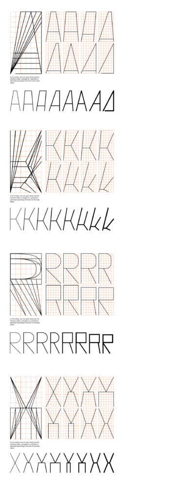
In my last post, I explored forms in the context of permutations. Now I want to explore how to actually create a typeface on the basis of different grids, moreover I want to show how different the output can be by using the same grid. I will generate unexpected graphical elements, all of which would be difficult to create without using this kind of analytical approach. Mainly I want to explore the different outcomes of this exercise and how the grid will lead me in different directions and how many different ways there actually be of design f.e. just one letter.
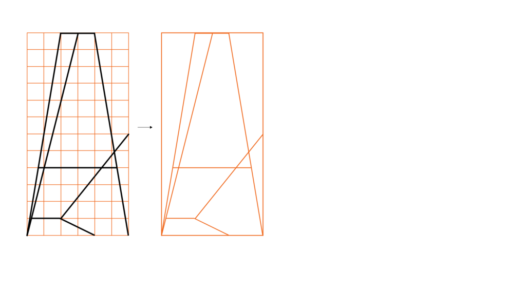
So let’s start with an easy one, I created an orthogonal grid 1:2, in this case with a width of six units and to a height of 12 units.

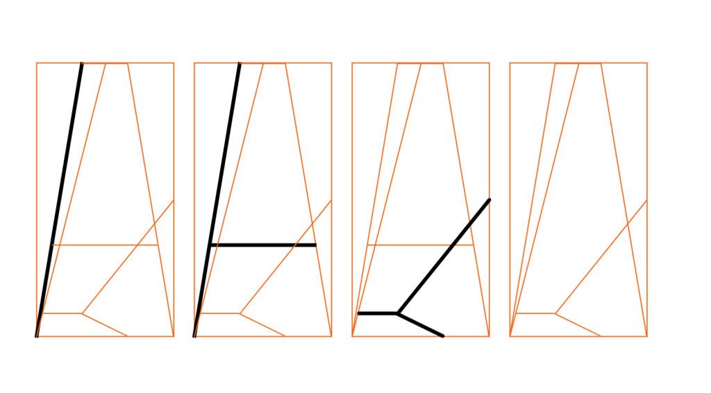
This process can go on for all 26 Latin capitals and generate a great variety of letter systems. Now I want to go one step further. Since grids do not always have to be square-based, they can literally be based on anything. So I want to give it a try and create a grid based on an already existing typeface and use this as the basis for creating graphics, icons, or patterns. First, I am going to take the two letters from which a created above and will put them into one matrix.

In creating a grid one already determine the character of the shapes that will be generated. So it would make a lot of difference if one would choose closed, rounded, open, linear, etc. In my example, I took letter forms which are linear, one open and one closed, so I can achieve a broader range of outcomes. After having developed the final grid I can now fill it in various ways, always on the base of the used typeface, its proportions and aesthetic will generate a set of homogenous graphical elements which can be integrated coherently into an existing design.

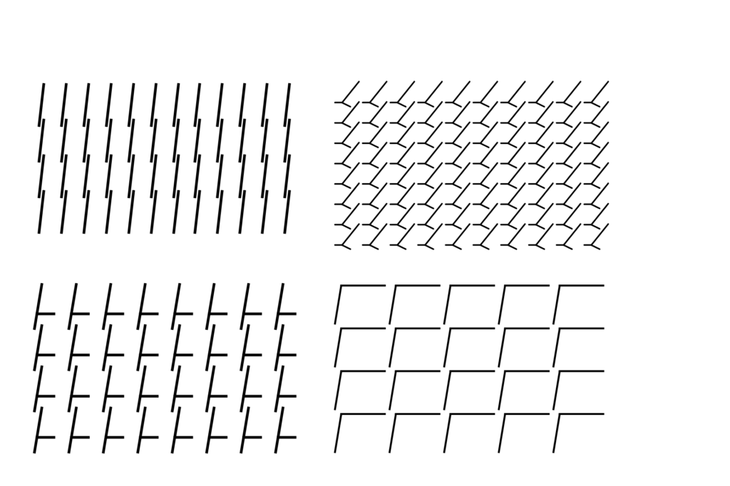
Now let’s create patterns out of the shapes we generated from our typographical grid.

So as we can see, there are infinite ways of using a grid & creating things out of a grid. It is also a great tool for creating flexible visual systems which are great for recognition & association of a design.