My first meeting with my supervisor left me very inspired and motivated – I had the feeling to be able to explore almost any direction I wanted while still receiving full support. I communicated that the walking soundscape was definitely my favorite concept and in turn received some further input and keywords to look into.
One of those keywords was RjDj. The company Reality Jockey Ltd., which was founded in 2008, coined the term reactive music, which could be described as music that reacts to its listener or the environment in real time (Barnard et al., 2009). RjDj released a number of apps on iOS, which all seemed to be able to technically do exactly what I wanted to achieve with my walking scape – just in a much more broad sense. They built a framework based on Pure Data that allowed people to create music that reacts to a phone’s sensors. Basically anybody could create music (or “scenes” as they called it) for those apps, with the help of RjDj’s open source library rjlib. Unfortunately, neither the RjDj website, nor its apps are available anymore.
Earlier, we talked about software that has revolutionized the way we organize our jobs and enable collaborative work. We focused on free software that was accessible to professionals and academics. But we discovered that both novice and experienced users have problems performing specific tasks, and these results were discovered through user testing. And today we are going to discuss a user test done by students of L’École de Design, realized by Arslan Sifaoui, Théo Geiller and Raphaël Perraud.
Test process
They started with a test of 5 seconds followed by a survey for a general understanding of the software. They then moved on to a more complete and progressive course followed by a survey to verify the understanding of the actions performed. Finally, they asked users for their impressions using open-ended questions to evaluate the quality of the product, as well as the quality of their tests.
For this preliminary test of 5 seconds (Rapid desirability test), the user will be installed in front of the computer and then be exposed for 5 seconds in front of the system so that he can express his impression. He will have to answer a series of quick questions spontaneously and describe on a blank sheet of paper the elements of the interface that he has retained. They asked for their impressions of the aesthetics of the system, the elements of the system they retained, and the functionalities they identified.
Before moving on to the pathways, they asked a sample of people to complete an introductory questionnaire on their profiles to target those who were interested in the tool and to highlight their uses/behaviors using a comparative table.
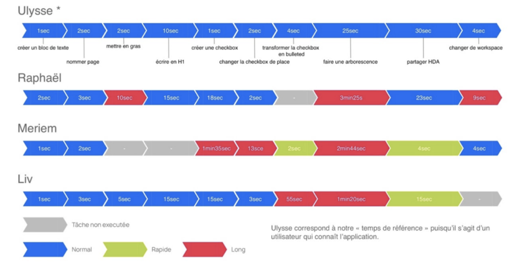
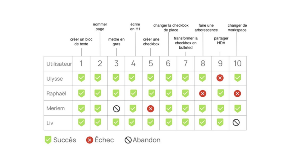
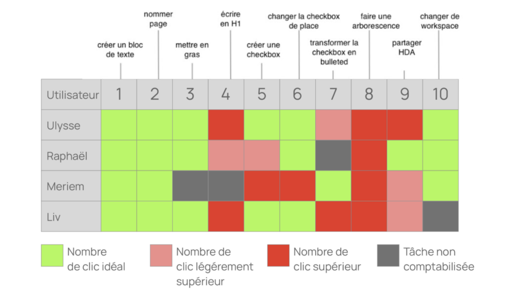
The course consisted, first of all, of editing a page where the user will have to operate as follows: write a text, put it in bold, create a checkbox, change the checkbox of place and finally transform it into a smart list. The next step will consist in creating a tree structure which will have to be shared and finally to change the workspace. This path will allow the desirability of this product and also measure tasks success and time spent. This data was compiled into a timeline, a table of numbers of clicks, and a timeline of activities.
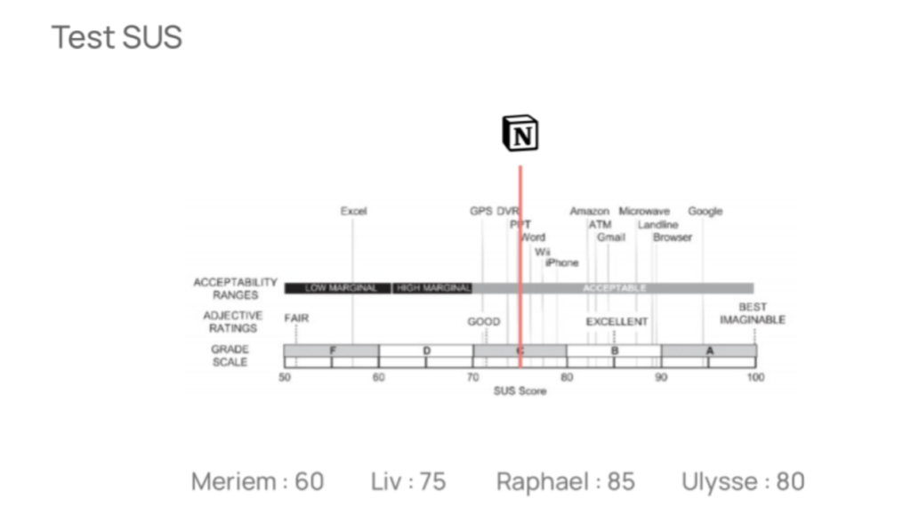
They administered a SUS test to the users with ten questions on a scale of 1 to 5 points to determine their views on the system to assess accessibility. The results of this questionnaire will be collected to compare the scores between users.
Finally, a qualitative questionnaire with sentence completions was administered to determine the weak and strong points of the concept, to measure the desirability of the product.
Analysis results
The introductory survey showed that the users were digital natives, so they were among the potential users, but three of them answered that they preferred to take notes on paper. In the five-second test, the users had a rather good impression of the system, they could identify the navigation area, the structure of the page, the content, and the overall functionality.
With this time analysis, they were able to judge whether the user was able to complete a task over a normal (blue), fast (green), or long (red) time spent. The first competitor (Ulysse) is a regular user of Notion and uses it only for note-taking. On the other hand, the other users had more difficulties on some tasks than others and could perform simple actions, but we can observe that the novice competitors could quickly share a document.
All the tasks were completed, but we can notice that they got stuck on some steps that took them a little bit more time as we had previously seen on the time analysis, such as creating a check-box, changing the workplace, making a tree structure, sharing a document and putting in bold. This time-consuming task is the result of a fairly large number of clicks.
We can notice a correlation between the duration of the task and the number of clicks. The longer the task is going to be, the higher the number of clicks is going to be. That this is remarkable with the creation of a tree structure.
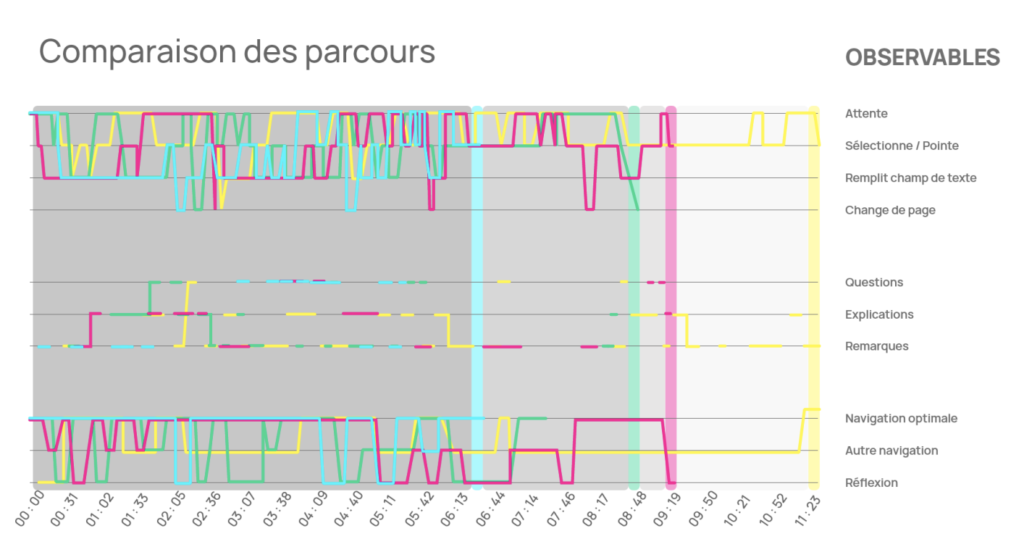
We can notice a clear difference in the user path since the fastest user (blue) serves as a reference among the other users who took time to perform certain tasks because they were exploring the software in depth.
The result of the SUS test qualified the notion software as a good software in terms of its acceptability.
Following the qualitative questions, users reported a good understanding of the system with content creation, prioritization, and work sharing. They were able to experience a tool that breaks the standards of other note software. However, they expressed frustration with the completion of certain tasks, such as the need for time to learn and get used to the system.
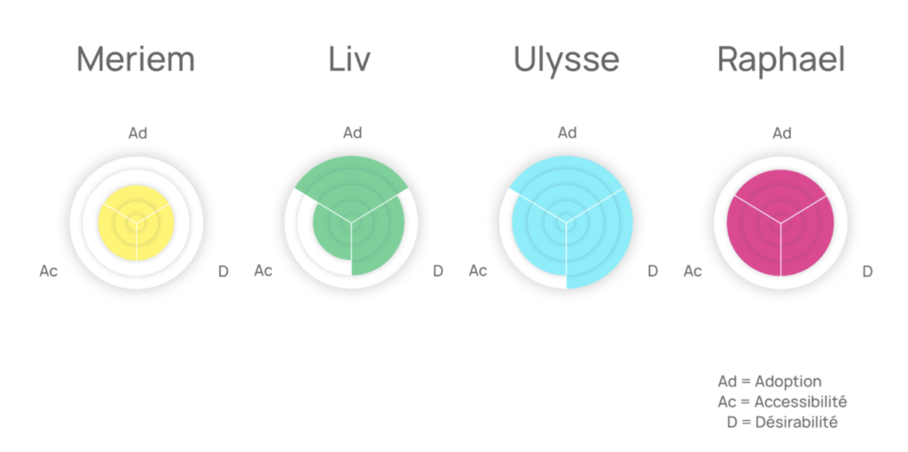
They summarized the results using three criteria: desirability (D), accessibility (Ac), and adoption (Ad). These indicators show the interest in the product (5 seconds test), the understanding of the functionalities (user path), and the ease of use of the product (SUS test).
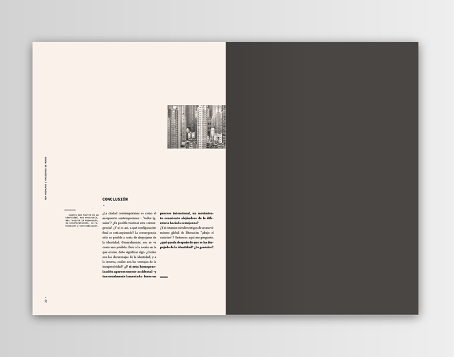
Conclusion
We can notice that with the help of this user test that the users feel satisfied with the use of this product despite the problems encountered through this tool that has affected the accessibility of this product. The uncluttered aspect of the interface can make the user get lost in the very dense windows and feel frustrated when failing to perform certain tasks. The synthesis of the experience could show that the product is understood by the user even if features like workspace and tree structure are sometimes despised.
This could give me a perspective in this research, as the FH Joanneum University is appropriating a multitasking software to perform online courses as well as online assignment delivery.
I would like to explore in more detail the possibilities that Microsoft teams bring to the daily life of students and teachers. I would also like to investigate the use and usability of this product.
Symmetrische Ornamente spielen in Südosteuropa eine sehr wichtige Rolle. Sie zeichnen sich durch die Harmonie und der stilistischen Perfektion geometrischer Formen aus. Eine solche Ornamentform stellt die traditionelle Stickerei Zmijanjski vez dar. Die Ethnografin Jelica Belović Bernadzikovska, hält diese Stickerei für eine der ältesten Verbindungstechniken auf dem Balkan, doch was macht diese so besonders?
Das Hauptmerkmal dieser Technik ist, dass diese auf der Rückseite durchgeführt und gezählt wird. Auch primäre Ornamente, wie Räder und verschiedene Rauten, stammen noch aus dem Neolithikum. Die blauen Fäden auf der weißen Leinwand ist die Grundlage der Schlangenstickerei. Das Material auf dem die Muster der Stickerei gezeigt wurde, erfuhr eine Verwandlung, aber die Stickerei behielt ihre authentischen Besonderheiten. Zuerst wurden Muster auf Hanf- und Leinentüchern gestickt, dann auf Baumwolle und heute wird diese auch auf modernen Industriestoffen präsentiert.
Ornamente sind Zeichen und können Symbolkraft haben. Sie ermöglichen uns Zuordnung, Zugehörigkeit und Individualisierung.
Irmgard Frank
Die häufigsten Ornamente, die in der Schlangenstickerei vorherrschen, sind stilisierte Pflanzenformen mit regelmäßiger und symmetrischer Basis. Das rautenförmige Kreismotiv ist am häufigsten in der Serpentinenverbindung zu sehen. Es gibt eine Vielzahl von Autokombinationen mit kleineren Motiven. Der Kreis symbolisiert den Himmel, eines der Symbole der Gottheit sowie das Bild des Lebens und der Welt als ewige Bewegung, bedingt durch den harmonisierten kosmischen Rhythmus der Gegensätze. Die Raute ist auch das weibliche Symbol von Sexualität und Fruchtbarkeit.
Zmijanski vez StickereiZmijanski vez Leinen
Die Stickerei vereint viele Elemente des kulturellen Erbes wie Musik, Rituale, mündliche Überlieferungen, Kunsthandwerk und Symbolik aber auch Design. Daher wurde die traditionelle Stickerei aus Zmijanje, 2014 als erstes immaterielles Kulturerbe aus Bosnien und Herzegowina, in die Repräsentative Liste der Menschheit der UNESCO eingetragen.
Quellen:
Zemaljska Štampa: Gradja za tehnološki rječnik ženskog ručnog rada. (Materialien für ein technologisches Wörterbuch für Handarbeiten der Frauen). Sarajevo, 1906.
Belović -Bernadzikowska, Jelica: Srpski narodni vez i tekstilna ornamentika. 1907.
Muzej istočne Bosne Tuzla Izložba: “Zmijanjski vez – svjetsko kulturno nasljeđe”. 15. lipnja 2017.
Kelly, Mary B.: Folklore. Cooperstown, 1989.
Turnau, Irena: Recent Publications on the History of Costume and Textile Handicraft in Eastern Europe: Textile History. 1982. Zmijanje Stickerei: 2019. In: http://zmijanje.com/ger/knjizevnici.htm (17.10.2021).
Hello again! My second blog entry will be about the the differences between four concepts: Extended Reality (XR), Augmented Reality (AR), Virtual Reality (VR) and Mixed Reality (MR).
XR, AR, VR, MR,… What??
Extended Reality (XR): XR is a “catch-all”-term for technologies that enhance or replace our view of the real world. This can be done through overlaying or immersing computer text and graphics into real-world and virtual environments, or even a combination of both. XR encompasses AR, VR and MR.
Augmented Reality (AR): AR enhances our view of the real world by overlaying the real-world environment with digital content across multiple sensory modalities. It detects objects in the real-world environment and overlaps those with computer-generated data such as graphics, sounds, images, and texts. In other words: AR comines the real world with the digital world. Users can experience AR very easily through an smartphone application, but also through special AR wearables (i.e. headsets, glasses), displays, projectors or even contact lenses.
Virtual Reality (VR): While AR enhances the user’s real environment, VR completely replaces it with a virtual one. By using full-coverage headsets the user’s real-world surroundings are completely shut out while using. Advanced VR experiences even allow users to move in a digital environment and hear sounds. Moreover, special hand controllers can be used to enhance VR experiences.
Mixed Reality (MR): MR is the newest of these immersive technologies and combines aspects of AR and VR. When experiencing MR, virtual content is not only overlaid on the real environment (as in AR) but is anchored to and interacts with that environment. Instead of relying only on remote control devices, smart glasses, or smartphones, users can also use their gestures, glancing or blinking, and much more to interact with the real and the digital world at the same time.
Long Story short:
Extended Reality (XR) is an umbrella term for technologies that enhance or replace our view of the real world
Augmented Reality (AR) overlays virtual objects on the real-world environment
Virtual Reality (VR) immerses users in a fully artificial digital environment
Mixed Reality (MR) not just overlays but anchors virtual objects to the real world
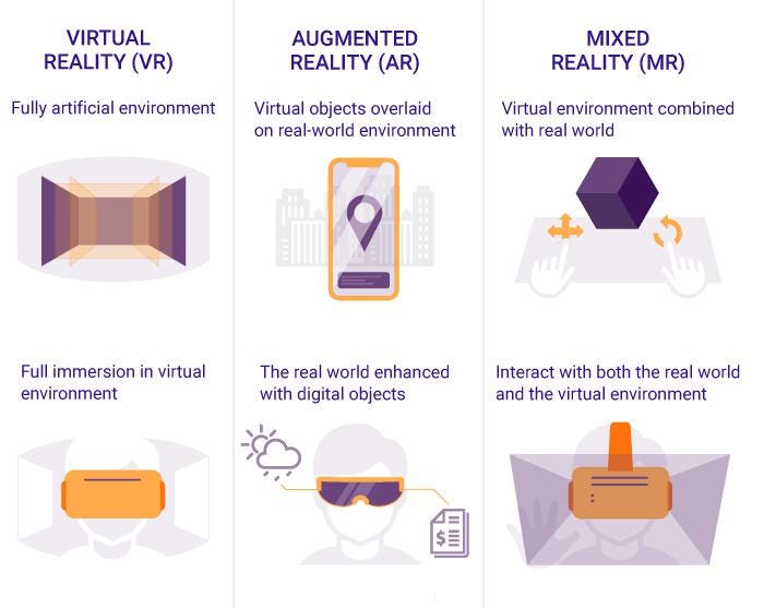
For a better understanding, I found this nice infographic:
Comparison of VR, AR and MR
Okay, got it. But why AR?
As far as I know at this point, all three techniques – AR, MR & VR – can be useful for educational purposes. The choice of the technology might depend on several factors like the field of education, the equipment or the target group. Still, I chose to focus on AR for several reasons: 1) I like the idea of learning new things by enhancing the user’s environmental view instead of replacing it like it is with VR (my subjective opinion); 2) AR is easily accessible via smartphones or tablets, while VR and MR need more advanced technology (i.e. headsets). There might come up more advantages (and maybe some limitations and disadvantages too) the further I dive into the topic, let’s see. But that’s it for now! 🙂
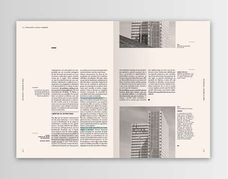
Mit Rastern können Designer eine Geschichte erfinden und übermitteln. Sie können diese aber auch gezielt manipulieren, um Ideen visuell und kreativ auszudrücken.
Wird dem Raster ein gewisser Ausdruck verliehen, hebt dieser die Kommunikationsebene zwischen dem Leser und dem gestalteten Sujet erheblich und der Informationsübertragung wird somit erleichtert. Immer zu wird von einem schlüssig Designkonzept gesprochen. Ist allerdings jede Seite / jedes Asset einer Kampagne 1:1 gleich, langweilt sich der Leser / Konsument schnell. Das Variieren der Struktur auf den verschiedenen Seiten / Assets bringt Leben in das Design und erhöht somit die Aufmerksamkeitspanne.
Das Perimeter
Weiterführend möchte ich gleich noch auf den Perimeter, den äußersten Rand einer Seite eingehen. Oft wird er als tote Fläche angesehen, jedoch kann dieser wirkungsvoll den gewünschten Ausdruck einer Seite unterstreichen.
Setzt man z.B. ein Bild in den Bereich des Perimeters, kann dies den Gesamteindruck des Designs stark beeinflussen und mehr Dynamik erzeugen. Anstatt diesen Bereich unantastbar zu lassen, kann dieser durch kreative Nutzung das Design positiv beeinflussen.
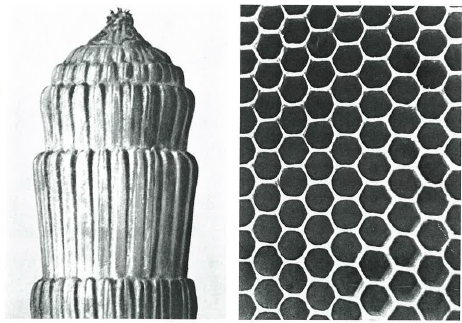
Seit jeher werden Ordnungssysteme als Ausdrucksmittel nicht nur im Design sondern auch in zahlreichen unterschiedlichen Anwendungsformen verwendet. Folgend werden verschiedenste Ordnungssysteme im Altertum, jene der Neuzeit gegenübergestellt und analysiert. Dies soll zeigen, dass wir Inspiration in allen unterschiedlichen, alltäglichen Formen wieder erleben.
„Das Verlangen, die verwirrende Vielfalt der Erscheinungen zu ordnen, entspricht einem tiefen Bedürfnis des Menschen.“
Pythagoras lehrte, dass einfache Zahlen und ihre Beziehungen zueinander sowie einfache geometrische Figuren mit solchen Massen das innerste Geheimnis der Natur abbilden.
Wie in der Natur Ordnungssysteme das Wachstum und den Bau der lebendigen und der toten Materie bestimmen, ist auch die menschliche Tätigkeit seit frühesten Zeiten vom Streben nach Ordnung ausgezeichnet. Bereits die ältesten Völker schufen Ornamente mit mathematischen Formen, die von großer Schönheit sind. Ebenso fanden die Griechen das Verhältnis des Goldenen Schnittes im menschlichen Körper.
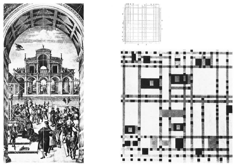
Zahlreiche Philosophen, Architekten und Künstler, von Pythagoras, Vitruvius, Villard de Honnecourt, Dürer u.a. bis zu Le Corbusier, hinterließen Proportionslehren, die uns einen faszinierenden Einblick in die mathematische Denkweise ihrer Zeit gewähren. Die Bilder der folgenden Seiten versuchen durch die Gegenüberstellung von historischen und zeitgenössischen Beispielen, die zeitlose, starke Wirkung mathematischer Ordnungsformen zu illustrieren.
Natur
In der Pflanzenwelt begegnet uns eine Vielfalt an symmetrischen Ordnungen. Die Vielfalt umfasst alle erdenklichen Gestalten, vom strengen, plastischen Aufbau bis zu feinster, eleganter Auffächerung der Form.
Zeichen und Signale
Viele Zeichen der Vergangenheit beeindrucken durch strenge Formgebung. Oft sind sie auf der Basis eines Kreises, eines Quadrates, Dreieckes oder der Kombination dieser Grundformen zustande gekommen. Zeichen, wie die der Steinmetze durch die Unterteilung z.B. einer Kreisform, in die verschieden große Quadrate, horizontal und diagonal gestellt, eingezeichnet wurden. Die vertikalen, horizontalen und diagonalen Verbindungslinien und ihre Überschneidung bestimmten die Länge und Richtung der Teile, aus denen die Zeichen bestanden.
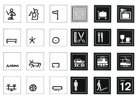
Piktogramme
Bildliche Zeichen von Gegenständen der Umwelt sind in den Schriftsystemen von zahlreichen Völkern zu finden. Sie stehen als Symbole für die Worte der jeweiligen Sprache. Sie sind teils Nachahmungen von Objekten des täglichen Gebrauchs. Andere entwickelten sich allmählich aus überlieferten Vorstellungen. Immer aber bedeuten sie Reduktionen der Formen auf das Minimum der für das Verständnis noch notwendigen Details.
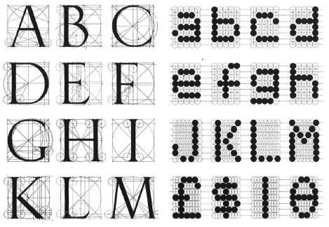
Typography
Die Typografie arbeitet seit Gutenberg mit festen Regeln, die bei der Gestaltung von Druckwerken Anwendung fanden. Die Beachtung dieser Regeln erleichtert die funktionale wie auch die ästhetische Gestaltung. Die typografischen Regeln beziehen sich nicht nur auf die Abstände von Buchstaben und Worten, auf den Durchschuss von Zeilen, auf die Schriftgrade usw., sondern ebenso auf die Proportionierung des Satzspiegels, der Satzkolonnen, der Ränder und der Seitenformate. Vielfach wurde die typografische Seitenaufteilung mit Hilfe des Goldenen Schnittes gesucht. Die schönsten Beispiele der Typografie zeichnen sich durch ein hohes Maß an gesetzmäßiger Ordnung aus. Diesem Anspruch nach Gesetzmäßigkeit und ästhetischer Qualität sollte auch die moderne Typografie entsprechen. Sie steht in Gefahr, zeitgebunden Trends zuliebe, missbraucht zu werden.
Malerei
In der Malerei walten formale und ästhetische Gesetze, die dem Bild Harmonie und Spannung vermitteln. Auf vielen Kompositionen ist die Verwendung des Goldenen Schnittes nachweisbar, ein System mit harmonischen Proportionsverhältnissen. Zahlreiche Künstler arbeiteten nach strengen Proportionsregeln. Der mathematischen Konzeption des Bildaufbaues wurden alle wichtigen Bildelemente untergeordnet. Sie bestimmt den Rhythmus, die Architektonik und Spannung des Bildaufbaues. Im 20. Jahrhundert haben besonders die Vertreter der konkreten und konstruktiven Richtung in der Malerei Werke geschaffen, die ganz der mathematischen Denkweise verpflichtet sind. Die mathematisch orientierte Kunst stellt die einzige Kunstrichtung im 20. Jahrhundert dar, die sich geradlinig weiterentwickelt hat.
Mit diesem kleinen Exkurs in die generelle Anwendung von Ordnungssystemen im Altertum, sowie in der Neuzeit ergänzend mit den unterschiedlichsten Anwendungsformen, möchte ich diesen Artikel nun abschließen und hoffe dadurch ein wenig Aufmerksamkeit geschafft zu haben. Ordnungssysteme finden sich in all unseren Lebensbereichen wieder, lassen wir uns davon inspirieren. Oft liegt das Schöne gar nicht so weit entfernt, wie wir manchmal zu denken mögen. Wir müssen lernen die Einfachheit in den Dingen nicht nur zu sehen, sondern zu erkennen und sie auch zu nutzen.
In the 60’s, a wave of visionaries had big ideas of developing an ideal way of living through creating perfect societies in big cities. The famous Corbusier pioneered with his project named “Ville Radieuse”. Its intentions of being realized in the middle of Paris were never carried out, as it meant the demolition of huge amounts of built areas. It did however spark ideas of similar projects such as Walt Disney’s EPCOT and Oscar Niemeyer’s Brasilia, both designed in the late 60s. They all shared the fact that they were built on empty plateaus, or “clean slates”.
Visions of these places was to build an ideal society. Their mission consisted of correcting the chaos of existing big cities with an aim of creating well-functioning systems for people to thrive in together.
Le Corbusier’s Ville Radieuse vision of perfection was a city strictly divided into districts where business, entertainment and residential areas are separated. In the residential areas the goal was to accommodate the maximum amount of natural daylight, a minimum of noise and immediate closeness to recreational facilities. In his vision he also wanted to provide efficient communication networks and reduce urban traffic, which was largely considered as an enemy.
Largely inspired by Le Corbusier’s methods were the “Pilot Plan” of Brasilia developed by Costas and Oscar Niemeyer. If you cross Brasilia by plane in the night you’ll see concentrated neon lights in the shopping area, while other areas are diffusely lit, because of the segregation of uses, vehicles and people. The city is built in the form of an airplane, hence the name “the pilot plan”. Every block in the city has local facilities for everyday use and a primary school within 800 meter of every home. The city was initially built without classical architecture, without slums. Rational planning, heaps of space and clean lines makes the layout, and the city was to be traversed by car.
Closeness to facilities were key aspects for all these plans. The initial idea was to fulfill the 5-10-15 rule. 5 minute commute to the things you use every day, 10 minutes to the places you go once a week, and 15 minutes to places you go the once a month.
Another ideal for these visionary plans was the separation of cars to the rest of the city. The plans were made to optimize mobility within the population. Also it was made to reduce the noise pollution in residential areas.
Recreational areas were highly prioritized as the visionaries recognized peoples needs also after work or school. Daylight and green areas with room for culture were means to the solution. However, when carried out in practice, these plans didn’t develop into the dreamy places they were meant to be.
Aftermaths of the plans of Ville Radieuse was that it was criticized for ignoring residents’ habits. As was Brasilia which didn’t provide public spaces for urban encounters in it’s strictly planned layout. Today two and a half million citizens live in the capital of Brasilia, that’s five times the originally planed mass. The consequence is an insufficient transport system, segregation and neglected public spaces. The same issues of healthy living, traffic, noise- and air pollution as well as transportation are still issues for urban planners today.
Ultimately, I think that these plans failed because they put a common stamp on all the needs and motivations of their users. As the scale of the plans grow, they also lost their room for change and diversity. Symmetry and predictability make up for efficient cities at a macro level, but the micro communities all over the cities might suffer from it. We can’t carry many times our own weight, we’re not ants. We also don’t thrive in monotone surrounding, and we have a big need to be heard. I do however think that extensive planning to achieve long-term infrastructural goals are necessary for a sustainable future. My initial thought is however, that planning for ideal societies from blank slates have to happen a smaller level than the macro-level these visionaries set out for.
The end game for this research is for now to find the place for interaction design within this vision of a development for a ideal society built in a more isolated environment. To get there, there initial questions I want to answer is:
How have big projects from scratch started, and what failed?
How are similar more recent projects like?
What are common working methods between urban planners, architects, designers and political deciders?
What is co-creative design contributing to this perspective?
How did they present the projects for everyone to understand and carry it through?
… Using computers, these patterns can be simulated by creating simple rules and combining them. This is known as emergent behavior, and can be used in games to simulate chaotic or life-like group movement. …
Im Jahr 1968 wagte Craig Reynolds einen revolutionären Schritt in der KI-Animation. Er erstellte viele individuelle Objekte, welche mit den jeweils anderen in Interaktion traten. Diese Objekte nannte er “Boids”. Ziel des Projektes war es, das Verhalten eines Vogelschwarms zu simulieren.
In der einfachsten Form folgten diese Boids 3 Grundregeln.
Separation: wähle eine Richtung, die einer Häufung von Boids entgegenwirkt
Angleichung: wähle eine Richtung, die der mittleren Richtung der benachbarten Boids entspricht
Zusammenhalt: wähle eine Richtung, die der mittleren Position der benachbarten Boids entspricht
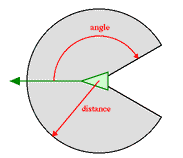
Jeder Boid hat direkten Zugriff auf die gesamte geometrische Information der Szene, aber der Flocking Algorithmus erfordert, dass er nur auf Boids innerhalb einer bestimmten kleinen Umgebung (Neighbourhood) um sich selbst reagiert. Die Nachbarschaft ist durch eine Entfernung (gemessen vom Zentrum des Boids) und einen Winkel, gemessen von der Flugrichtung des Boids, gekennzeichnet. Boids außerhalb dieser lokalen Nachbarschaft werden ignoriert. Die Nachbarschaft könnte als ein Modell der eingeschränkten Wahrnehmung (wie bei Fischen in trübem Wasser) betrachtet werden, aber es ist wahrscheinlich richtiger, sie als die Region zu betrachten, in der die Artgenossen die Steuerung eines Boids beeinflussen.
In Zusammenarbeit mit einigen Mitarbeitern der Symbolics Graphics Division und Whitney / Demos Productions haben wir einen animierten Kurzfilm mit dem Boids-Modell namens Stanley und Stella in: “Breaking the Ice”. Dieser Film wurde erstmals im Electronic Theater auf der SIGGRAPH ’87 gezeigt. Auf der gleichen Konferenz wurde auch ein technischer Aufsatz über Boids veröffentlicht. In den Kursnotizen für die SIGGRAPH ’88 gab es einen informellen Beitrag über Hindernisvermeidung.
Seit 1987 gab es viele weitere Anwendungen des Boids-Modells im Bereich der Verhaltensanimation. Der erste war der Tim-Burton-Film Batman Returns von 1992. Er enthielt computersimulierte Fledermaus- und Pinguinschwärme, die mit modifizierten Versionen der ursprünglichen, bei Symbolics entwickelten boids-Software erstellt wurden. Andy Kopra (damals bei VIFX, das später mit Rhythm & Hues fusionierte) produzierte realistische Bilder von Fledermausschwärmen. Andrea Losch (damals bei Boss Films) und Paul Ashdown erstellten eine Animation einer “Armee” von Pinguinen, die durch die Straßen von Gotham City marschieren.
1
Das ist vorallem in diesen zwei Filmausschnitten zu sehen:
Für die objektorientierte Programmiersprache Processing gibt es ebenfalls eine sehr representative Darstellung zu Boids und der Programmierung.*
Im letzten Eintrag wurde die Frage nach emotionalem Verpackungsdesign und dessen Wirkung behandelt. Dabei wurde festgestellt, dass emotionales Design von Verpackungen eine Wirkung auf die Wahrnehmung und Erwartung von intrinsischen Produkteigenschaften haben kann.
Aufgrund dieser Thematik bin ich für diesen Blogeintrag auf die Thematik des “subjektiven Designs” gestoßen und habe mir die Frage gestellt, inwiefern emotionales Design und Ästhetik im Design im Allgemeinen Wirkung haben kann, wenn wir doch alle einen unterschiedlichen Geschmack für Design haben und beim Kauf andere Faktoren in den Vordergrund stellen.
Somit wollte ich diesen Eintrag dem Thema widmen, ob Design nicht eigentlich “Geschmackssache” ist, und was im Design dann doch unabhängig von der Person und subjektiven Wahrnehmungen als ansprechend empfunden wird. Diese Frage ist schließlich auch für die Wirkung von emotionalem Design von Bedeutung (Heimann & Schütz, 2018).
Gefallen und Wirkung
Wichtig zu Unterscheiden ist hier zwischen dem Gefallen und der Wirkung eines Produktes. Nur weil ein Design/Produkt als ansprechend empfunden wird, muss es nicht gleichzeitig auch die Wirkung auf Betrachter*innen haben, die es haben soll. Genau so kann es beispielsweise aber auch die Intention eines Designs sein, besonders abschreckend zu sein (Beispiel: Warnungen). Dieses Design soll uns dann nicht gefallen – es soll eine bestimmte Wirkung erzielen. Umgekehrt kann ein Design als besonders ansprechend empfunden werden und trotzdem nicht die erwünschte Wirkung erzielen, weil wir vielleicht den eigentlichen Zweck des Designs nicht verstehen oder durch ein schönes Design davon abgelenkt werden. Diese Aspekte können auch im emotionalen Design besonders von Bedeutung sein – hier geht es ja genau darum bestimmte Emotionen in den Vordergrund zu stellen und Wirkungen zu erzielen.
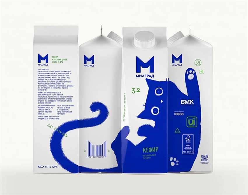
Dieser Milchkarton (designed von Depot, einer russischen Designagentur) ist zwar ein gutes Beispiel für emotionales Design. Doch für welche Zielgruppe ist dieses Design nun ansprechend und für welche eher nicht? Subjektive Präferenzen spielen hier eine Rolle (Quelle: https://www.frankie.com.au/gallery/curious-milk-cartons-553460)
Wichtig ist die richtige Balance zwischen Gefallen und Wirkung. Ist es für ein Produkt entscheidend, dass dieses ansprechend auf Betrachter*innen wirkt? Dann sollte das Gefallen in den Vordergrund gerückt werden. Ist es hingegen wichtiger eine bestimmte Wirkung zu erzielen (beispielsweise bei Medizinprodukten etc.) ist es oft wichtiger das Gefallen als sekundär anzusehen und auch auf unangenehmen Aspekte hinzuweisen.
Was hat das alles nun mit subjektivem Empfinden zu tun? Persönlich gefällt uns, was zu uns passt. Passt das Produkt oder das Design zu unserem Lebensstil oder einem erwünschten Lebensstil, unserer aktuellen Lage, passt es zu unseren Werten, so werden wir das Produkt am ehesten ansprechend finden. Somit ist subjektives Empfinden im Design auch ein Urteil über uns selbst und womit wir uns gefallen.
Hinzu kommen schließlich übergreifende, globale Wunschbilder, die uns Menschen ansprechen und somit dazu beitragen, ob wir etwas als ästhetisch und ansprechen finden oder nicht. Hier wird von vielen Menschen dann die gleiche Meinung geteilt, da diese Wünsche und Gefühle in uns Menschen verankert sind, und es sich nicht um einen spezifischen Lebensstil handelt. (Beispiel: Viele Personen werden Bilder vom Meer oder Sonnenaufgängen etc. als ansprechend empfinden – es passt zu unserem Bedürfnis nach Freiheit, nach Neuanfängen) Beeinflusst werden diese globalen Wunschbilder schließlich wieder von subjektiven Bedürfnissen und Lebensstilen. Und spricht eine Ästhetik schließliche eine ganze Generation/Kultur/Zeit an, so kann man auch vom “Kult” sprechen. An diesen Dingen bleiben wir häufig auch hängen. Sie können uns prägen, wie bestimmte Kleidungsstile eine bestimmten Generation, oder eben, welche Designs wir als ansprechend finden und welche nicht.
Ein zusätzlicher Faktor ist der Kontext und der Bereich eines Produktes. Wir erwarten beispielsweise vom Design einer Website für eine Bank eine andere Wirkung als für die Website eines Festivals. Das gleiche Design würde bei beiden Szenarien ganz anders wirken und gut oder entsprechend weniger gut ankommen. Hier kann man von “inhaltlicher Stimmigkeit” sprechen. Selbes gilt wenn uns gewisse Dinge nur in einer kurzen Lebensphase oder zu einer bestimmten Jahreszeit gefallen (Heimann & Schütz, 2018).
Das Design von Apple wirkt auf viele Personen vielleicht gerade deswegen ansprechend, weil es zu ihrem modernen, fortschrittlichem Lebensstil passt, dieser Lebensstil erwünschenswert ist.
Ästhetische Grundprinzipien
Objektive, ästhetische Grundprinzipien haben die Wirkung, dass viele Personen diese als ästhetisch empfinden – überlagert werden diese schließlich wieder vom subjektiven Empfinden. Dazu gehört das Empfinden von Stimmigkeit im Design, also die Passung von Farben, Schriftbild, Bildern etc. auf einander zu einem stimmigen Gesamtbild. Ähnlich dazu die Balance zwischen Symmetrie und Assymmetrie im Desing. Grundsätzlich ist Symmetrie gut. Zu viel davon kann allerdings als langweilig oder leblos empfunden werden. Assymetrie kann ein Design hingegen spannender gestalten – ähnlich auch der goldene Schnitt im Design. Ein drittes Prinzip ist der Kontrast. Auch dieser ist wichtig um Spannung und gleichzeitig Harmonie im Design zu erzeugen. Kontrast kann durch Farben oder Gegensätze erzeugt werden.
Auch bei diesen Grundprinzipien spielen natürlich kulturelle oder persönliche, subjektive Einflüsse eine Rolle. Ist man zum Beispiel eher künstlerisch veranlagt, empfindet man vielleicht komplexere, assymetrische Layouts als besonders ansprechend, für andere Personen ist das vielleicht zu viel Assymetrie (Heimann & Schütz, 2018).
Subjektivität im Prozess des Designens
Geht man die Thematik von einem anderen Blickwinkel an, ist es auch wichtig zu hinterfragen inwiefern das subjektive Empfinden eines Designers den Designprozess und das finale Design eines Produktes beeinflussen kann. Schließlich hat auch jeder Designer und jede Designerin einen persönlichen Designstil und trifft somit vielleicht subjektive Designentscheidungen. Auch Designguidlines und Prinzipien sind zu einem gewissen Grad subjektiv, da Menschen immer in einer gewissen Hinsicht subjektiv agieren. Wir bringen subjektive Erfahrungen, Intuitionen und Fähigkeiten ins Design und treffen Entscheidungen. Entgegensteuern kann man dieser Subjektivität nur, indem man sein Design kritisch betrachtet (Bradley, 2014).
Fragestellungen für das Design
Zusammenfassend sind folgende Fragestellungen im Design also von Bedeutung:
Möchte ich ein ansprechendes Design schaffen oder eines das wirkt?
Welche Wirkung soll mit dem Design erzeugt werden? Muss ich dazu vielleicht auch in der Gestaltung anders vorgehen, um beispielsweise auch negative Emotionen hervorzurufen?
Wer ist meine Zielgruppe und von welchem Selbstbild oder Lebensstil sind diese geprägt. Was könnte dieser Zielgruppe gefallen und auf diese besonders ästethisch wirken. Worauf legen diese den Fokus in einem Produkt? Die Funktion, die Ästhetik?
Arbel, L. (2021). Aeolis: A Virtual Instrument Producing Pitched Tones With Soundscape Timbres. In NIME 2021. https://doi.org/10.21428/92fbeb44.64f66047
Till the 1970s only a few sound artists and musicians paid attention to sounds that are constantly produced by nature. Because of the work of Pierre Schaeffer (The World Soundscape Project – 1969) artists started to use sounds made by our environment for experimental and artistic purposes. Intentionally made sounds and melodies (= Anthropophony) made by humans are not the only sounds that affect people´s feelings. The wide variety of sounds that nature provides are also altering emotions. Sounds can be made by a singing bird (Biophony), or just by the wind that moves some leaves over the street (Geophony). I believe that sound gets its relevance from the context between itself and the space it is embedded in. Sounds can be either limited by time or completely separated from it – but it can somehow never be separated from a physical space.
By recording soundscapes sound artists unintentionally also take a snapshot of the space. By listening to the soundscape people try to imagine the place where the sounds might have been recorded. As a soundscape artist, you kidnap your listeners to another alternate place. So people can get amazed by the pure form of the recorded soundscape. It´s upon the artist how and how much he processes the audio for artistic purposes. More processing does not necessarily mean more pleasure for the human ears. In my opinion, the way Aeolis designed his filters for the subtractive synthesis is very interesting and unique. Even though the real-time visuals are part of his art, Aeolis takes his listeners in a different sphere by altering the recorded sounds in his own way. Aeolis designed his filters in certain way that the listeners are still able to hear the parts of the original and unprocessed audio – this is where the magic happens. In the future, I would like to hear which soundscapes in combination with his subtractive synthesis can sound more musical.
As the title suggests, this blog entry will be concerned with suitable effects for the “Extended Guitar Performance” project. Admittedly, one could argue that any effect can be triggered by a guitar player’s hand movements. However, I want to discern certain effects that are especially suitable for this kind of expression control and sound well when modulated by the natural hand gestures of a guitarist.
There is also a decision to be made if the effects should be activated (turned on and off) by certain hand gestures/movements or if the intensity of the effects (like a dry/wet knob) should be modulated by certain hand gestures/movements. Of course, implementing both options is also possible.
Additionally, as my idea involves placing a sensor on each of the guitar player’s hands, there are effects that will be triggered by the movement of the picking hand and others that will be triggered by the movement of the fretting hand.
Automatic Solo-Mode
The first idea for an effect is based on the following observations:
A typical guitar solo takes place higher up the neck (fret-wise) than the rhythm guitar part.
Rhythm guitar tone and lead guitar tone almost always differ a little and often differ a lot.
It is stressful to activate all lead tone effect pedals when your solo comes up in a live situation.
It is stressful to disactivate all lead tone effect pedals when the solo ends and the rhythm guitar part must be continued.
The effect I came up makes use of this observations. The idea is to automatically activate an assortment of effects, typical for a lead guitar tone, if the guitarist reaches for higher frets up the neck and to subsequently disactivate the lead tone effects as soon as the guitarist comes back to lower frets with his/her fretting hand.
This “Solo-Mode” effect is achieved with an accelerometer (for details check blog XY), placed on the back of a guitarist’s hand, that interprets the length of the neck as the X-axis. According to the position of the guitarist’s hand along the neck (and thereby along the sensor’s X-axis), the “Solo Mode” effect is turned on or off. A certain fret which serves as the point of reference when to switch the Solo Mode on or off must be determined.
I really hope that this works the way I picture it XD.
Individual effects that the “Solo Mode” could include are:
Overdrive/Distortion/Fuzz/Booster
Delay
Chorus
Reverb
Octaver
Harmonizer
(Different) equalizer settings (compared to rhythm tone)
(Higher) volume settings (compared to rhythm tone)
Neck position as altering factor
IF the system works, the fundamental idea of using the fretting hand’s position along the neck to modulate sound could also be extended to other effects. The intensity of an effect could be increased for instance as the fretting hand moves up or down the neck.
Possible examples include:
Faster/slower delay times according to neck position