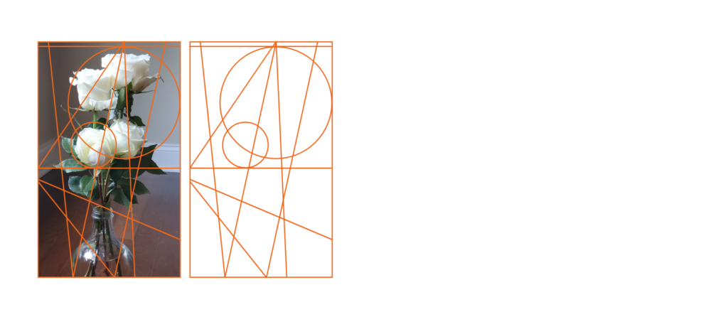
In this post, I want to continue my exploration of letters based on a grid, but this time I am going to take a picture as a base, from which I am going to generate a grid and furthermore a great variation of letters out of it. The reason why I want to try to generate a grid out of pictures is simply, that good pictures can always be analyzed by composition lines. There are many works dealing with this subject clearly and logically (e.g. Michaelangelo, Dürrer, etc.) from the renaissance to other periods of art history.
In fine art, the composition is the term for the formal construction of artworks, in the sense of the relationships between the various constituent graphical elements. The compositional line is almost always only partially materialized. Many sections of such lines will disappear, as it were, beneath the surface of the picture, but they remain very much present as an organizing principle in the image’s overall effect. The picture derives a large part of its impact from the attractors generated by its structuring vertices and lines.
In recent times, artists have played with construction lines, leaving them visible in the foreground as a sculptural element in their work. My intention in this chapter is to isolate the principle of the construction line and repurpose it as a design grid. We can attempt this with any picture that is relevant to the project. To introduce an additional layer of variation, we can modulate parameters to create a series of images from a single, shared source as the specification for our grid. This technique can be used in a partially reversed design process, to design typefaces.

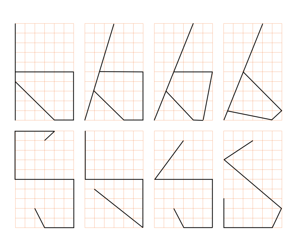
So having defined a grid based on the composition of a picture. I am not going to create letters out of it.

To sum up, for a lot of letters it worked out quite nicely, however, there are a few ones that don’t quite work right now: f.e. p, q, i, j, z, s. So now I am going to simplify the grid to a square-based one I had in my previous but, on which I am going to try to create variations based on letters I created on the image-based grid.

By shifting some parameters in the square grid one can easily adjust those letters which are not geometrically correct.
to be continued…