How far productivity tools can improve our experience and performance for management and collaboration?
This topic is focused on the productivity tools that we use every day and that are more accessible nowadays. It is a revolution in the software market because the productivity tools emancipate themselves from the standards of the interfaces of editions (spreadsheet, text editor, slideshows, blog…) by proposing a hierarchy of more advanced and complex features such as collaboration, management, planning, sharing, and communication. All these interfaces meet the needs of collaboration and management while minimizing their visual importance to make navigation simple.
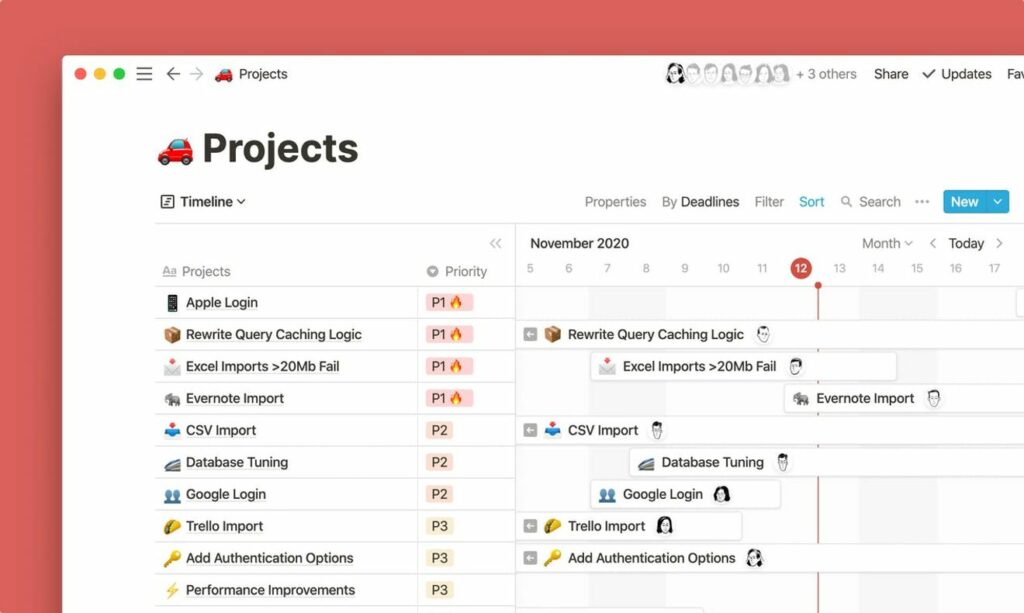
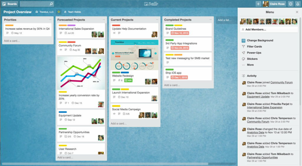
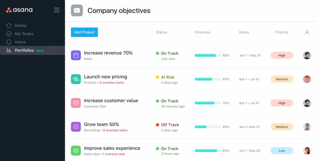
We find elaborate software such as Notion for note-taking, but which has many features such as task organization, collaborative work, planning, database creation, etc. Trello, a project management software where the user distributes tasks on cards arranged on boards. Or Asana, which is a team communication software that includes features such as workspaces, projects, tasks, tags, notes, comments, and a mailbox with real-time updates. Other productivity applications such as Miro, Harvest, Evernote, Zapier, etc.
How well are these tools designed to allow quick actions?
We can say that these softwares have been designed to break the standards of note-taking, tabulation, presentation, and other software. Their visual impact has great importance in the understanding of the actions related to their functionality. The great strength of these tools is the capacity for quick actions and the extension of the new possibilities offered.
However, is the global understanding of these interfaces allowing the facilitation of these actions? Would a novice user feel confused by some of the interface’s biases? Can we evaluate the accessibility of these interfaces by novice users?
But how to allow potential users to take control of these tools?
Students from l’École de Design Nantes Atlantiques have demonstrated through a usability test of Notion that novice users make redundant mistakes. Furthermore, they must go through a learning phase to get to know the software. Despite knowing how to master some features, the results show that users have difficulty creating a tree structure, creating a workspace, and modulating some elements.
Through these researches, I would like to focus on usability reports of this software to understand their efficiency at the user level and to interview experimented users about their regular use of these tools.
Best Practice:
Library:


