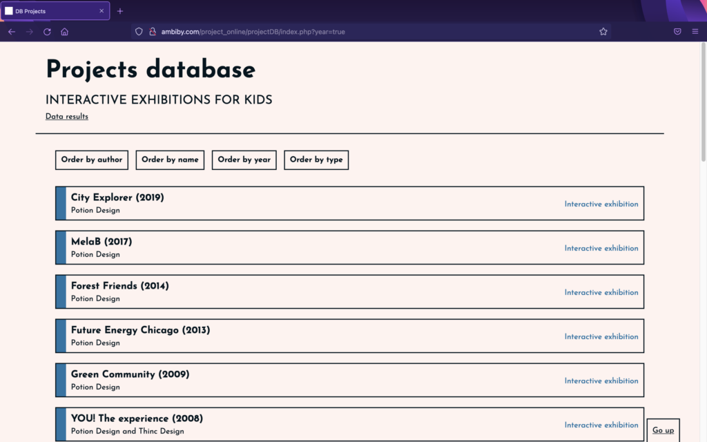
Projects have continued to be added to the database over the last few days in order to gather sufficient information to help us verify the reality of the points analysed in previous posts. The database can be found online in the link: http://ambiby.com/project_online/projectDB/index.php
For this reason, several projects have been added (13 so far), but I would like to add even more to the database. Even so, and taking into account the long list of references pending to be analysed, the data collected are similar to those previously studied. With this, the important points that are usually repeated in any interactive exhibition for children are checked.
It has to be said that, due to the current situation with COVID, the analysis has been a bit hard. Not being able to visit certain places either because of the pandemic or lack of time, there are details that are missed. The aim was to collect information from visual materials, which limited the number of projects to be analysed.
Now, a short analysis of the different sections of data found from the analysed projects is discussed.
Interaction data
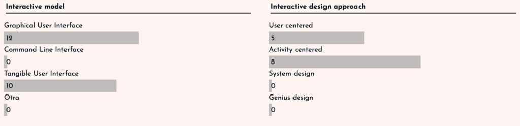
In terms of interaction, we find that the vast majority of exhibits mix GUI and TUI models, making them much more attractive to children. In addition, the spaces are usually activity-centred or user-centred. This depends on whether the project aims to teach or influence the user, or is focused on simply discovering or hanging out.
User experience for kids
Focusing on the user experience for children, and using the questions and data studied in posts II and III, we have found very similar answers to those studied in those posts. In some cases the answers were obvious, but in others, they have varied from point to point.
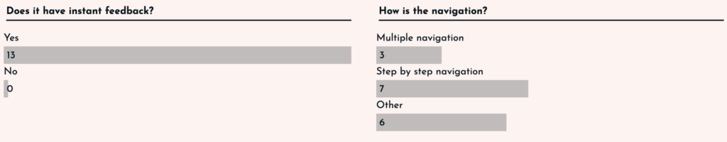
All the interfaces analysed had instant feedback to the user, whether it was a GUI or a TUI, as the user was always aware of what changes were being made.
In the case of navigation, the responses were more varied. Both navigation through the digital interface and navigation through the physical space were taken into account. For this reason, there are some projects that have more than one type of navigation. Even so, navigation by steps has been the most common, as the aim is to organise the information by steps so that it is told in the form of a story and is easier to understand.
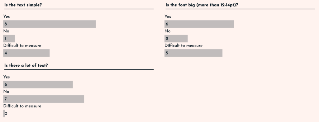
In terms of text, three parameters were taken into account: simplicity, size and quantity. In the case of simplicity and size, it was complicated in some cases to analyse it, as there were very few visual references. Even so, it has been shown that the texts are usually simple (adapted to the children’s vocabulary) and the text sizes are usually larger than usual. Surprisingly, the amount of text has been more adjusted, in some cases there was a lot of text (6 projects), and in others the text was scarce (7 projects).
If we think about the visual and auditory inputs, we find three points to analyse: sounds, animations and vivid colours. The case of sound has been complicated, because with the visual material it was difficult to observe this point. On the other hand, animations were present in 10 of the 13 projects, so it can be determined that the use of animations is common. Finally, the use of colours was clearly vivid. In almost all of the exhibits (11 out of 13), bright colours are used to create a good atmosphere. The only ones using more muted colours are those related to nature, as they are more earthy colours.
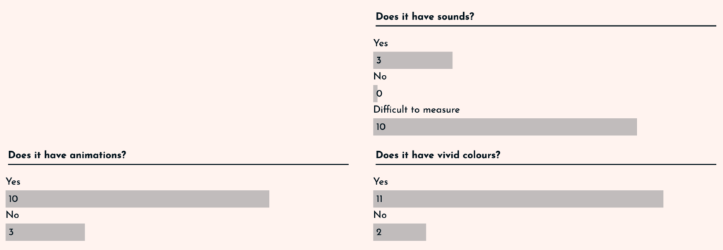
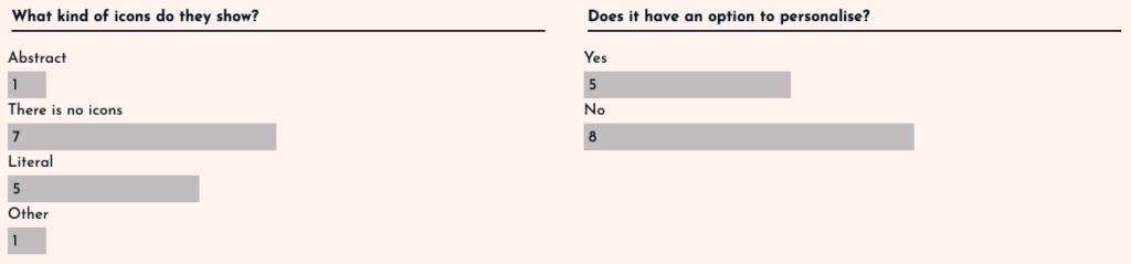
Finally in this section, two points should be taken into account: the icons and the option to customise. In the case of the icons, it was studied that in order to address children, care must be taken, as understanding them can be complicated. This is why it has been observed that in 7 projects there were no icons, and in those that did have them, the vast majority (5 of the 13) were literal, i.e. they resemble reality and leave no room for doubt. The case of personalisation was surprising. In only 5 of the projects is this option available.
The 125 Universal Principles of Design
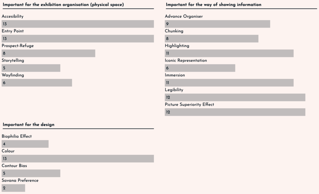
The vast majority of the principles explained in posts V and VI are used in the projects, even so, there are big differences between them. In order to better understand the contents, the principles have been divided into three types: related to the physical space, related to the way content is displayed and related to the design.
In the important principles for the organisation of the physical space, it is clear that accessibility and the entry point to the exhibition are clear. All projects rely on these as it is necessary to adapt the interface to children. For this, it is not only a question of simplifying the text, but also of adjusting the sizes and heights of the stations to those of the youngest children.
In those related to the way information is displayed, legibility and the use of images over text are key, as well as the importance of highlighting information in texts and immersion. It should also be noted that the vast majority (8-9 out of 13) use methods such as chunking or advance organiser to divide information into islands and make it easier to remember. Finally, the use of icons is again taken into account, and how this is reduced to only 6 of the 13 projects.
In terms of design, the results were low. It is true that the importance of colour is maintained in the 13 projects analysed, but the points related to the environment (biophilia effect and savannah preference) are not very much taken into account, as the spaces are looking for a sense of immersion and leave aside the use of nature so as not to distract the user. Finally, the use of more rounded and unaggressive designs has only been observed in 5 of the 13 projects, which seems surprising.
With this we conclude that although there are points that seem to be well determined, there are others such as the amount of text, the option of personalisation or the analysis of the design (contour bias) that need more referents to determine a result. But even so, it is understood that interfaces for children follow a series of principles that tend to be repeated in the vast majority.
The results have certainly been interesting, but more time is needed to add projects. In any case, the intention is to use this website as a base and add all the references in order to keep an updated database of projects that can help me in the future.