Following the discoveries made in the past search phase, it was time to analyse existing exhibits on the basis of the findings.
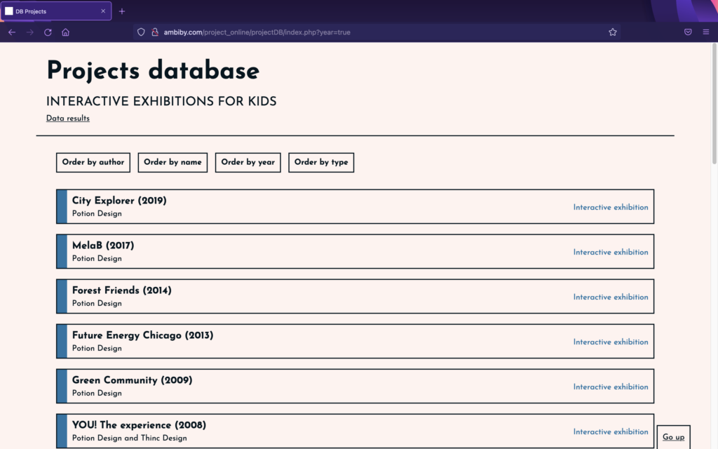
To facilitate this, work has been carried out over the past few days on the creation of a project database. This has been designed and programmed from scratch, and is not only a great help in keeping the information together, but also shows data taken from the analyses.
The idea is to collect information from different installations and to be able to read details related to usability (UX) aimed at children. For that purpose, certain questions have been determined to answer while analysing projects in order to obtain results that demonstrate, or not, whether the aspects explained in previously reviewed articles are applicable to interactive exhibitions for children.
The questions are:
- Which interaction model is used (GUI, TUI, CLI, Other)?
- What is the focus of the interaction (user-centered, activity-centered, system design or genius design)?
- Does the installation provide instant feedback?
- What type of navigation is there (multiple, step-by-step or other)?
- Is the text simple and understandable?
- Is the text size large?
- How much text is there?
- Does it have sounds?
- Does it have animations?
- Does it have bright, contrasting colours?
- What kind of icons are displayed (abstract, literal, no icons, other)?
- Is the experience customisable (user choice: characters…)?
With the database prepared and programmed, we started to analyse works in order to receive the data. For the moment it only has exhibitions by the Potion Design group, which in many cases directs its works to the very young. Even so, over the next few days we intend to add many more installations to be analysed, in order to have more realistic results.
Access to the database published online: http://ambiby.com/project_online/projectDB/index.php?year=true
