_Hands-on experience with DEATH STRANDING by SONY and Kojima Productions. This game is a beautifully crafted dark apocalyptic sci-fi game with an enigmatic story, a masterpiece in convoluted narrative, futuristic designs and rather complex systems and even more complex UIs.
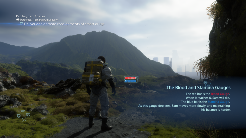
_Last year I played the ‘base version’ – the PS4 edition – quite a lot and found my way around the complex systems after a while. I learned how the different features work and how to use them properly; and even how to exploit them as much as possible to make my life easier with this game. But there were many things which annoyed me, like non scalable text size which made me often scooch even closer on the couch to my rather big screen, only to read some menu texts. So even for me, it wasn’t satisfying from the beginning and now, almost more than a year later, the “Directors Cut” for PS5 got released – rumor has it, this version is now more accessible. So, I tried the new version of the game after a yearlong break on a PS5 and immediately notices many improvements, mainly quality-of-life improvements. Now the question came up, how good were those improvements really? For a start, I researched some accessibility reviews on DEATH STRANDING and gathered their findings.
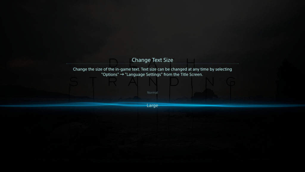
_The 1st review was made by Steve Saylor, a blind gamer – his general thoughts and opinions on the accessibility of this game were very intriguing. The crazy and wild story did really impress him, yet did he feel held back by the limitations of accessibility. He tested the PS5 version, where they implanted a “large text” option to enlarge the text size in the whole UI – whereas text in the base PS4 version initially was considered rather small. But even with this new option, often it seems hard to tell where large text was applied, and small text remains. Paired with that, the game has a lot of Button prompts, menus, button maps and texts which take up a lot of the screen, making it rather crowded. To identify everything correctly, one is required to lean back and forth to the screen – which is tiresome.
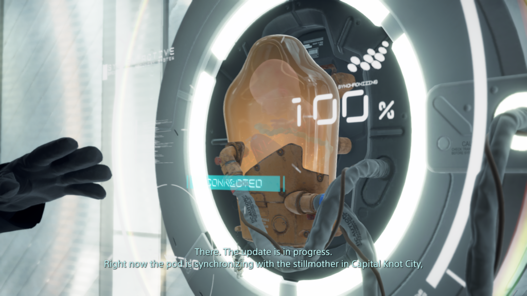
Staying with visual barriers, subtitles exist through the whole game; yet they do not have any high contrast or background to them – no further settings except on/off. But weirdly enough, in some situations – like any open menu – where there is dialogue experienced, the subtitles get a nice black gradient as background, but only there. Besides that, hearing impaired people might also find difficulties: there is no menu narration, but there are audio feedback/cues, that play on selecting inputs. The two main accessibility barriers he identified were for people with motor or cognitive disabilities. Starting with the latter; in the game there are a lot of different subsystems, which require you to memorize complex input patterns and often it’s hard to determine, what the most important information on the screen is right now – or what is just eye candy. There are subtle visual cues to those vital elements, but often you are left with a ‘lost’ feeling in all these menus.
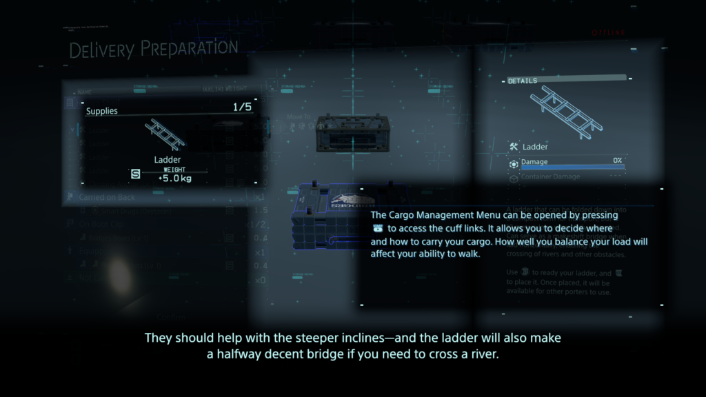
The lack of any in-game remapping of controls (PS5 version) comes to play at one of the core aspects of the game: while you deliver your items/cargo you will cross different types of terrain (water, rocks, mud, snow…) and for that you to balance your cargo. This is done by ‘ready yourself’ – pressing down left & right shoulder trigger – to prevent yourself from toppling over. The need to push them down constantly to stay upright might be a barrier for some people with motor disabilities. The adaptive triggers of the Dualsense controller do feel nice, but even without any dexterity problems it can get annoying and exhausting, because you will press the shoulder triggers a lot – fortunately you can disable the adaptive feedback. Later in the game you do get access to vehicles, which will help you with that, but it will take some time and exhaustion to get to that point. But that being said, these helping game features possess a durability system and do have to be maintained to work properly.
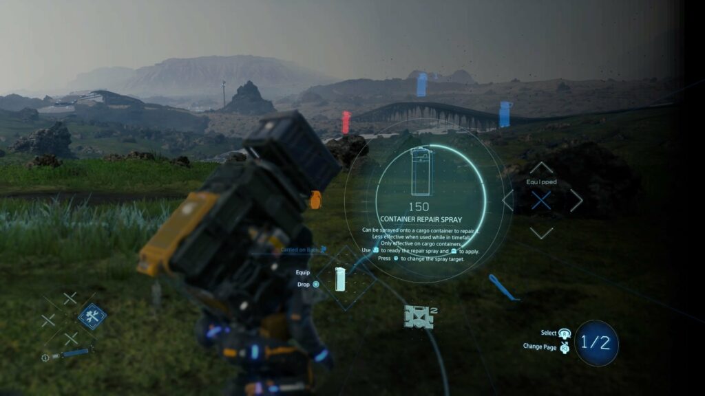
Buttons in DEATH STRANDING do have many different functions, depending on what subsystem you’re in. A good example would be the item “Repairspray”, which is used to repair worn out cargo containers.
To use this item, you will have to:
- Press the D-Pad right and hold it, that opens the item wheel
- Select with your right analog stick the item
- If it’s not on the first page of items, press the right analog stick to switch pages (often referred as R3)
- Let go of the D-Pad, item is now equipped
- Press left shoulder trigger (L2) to ready it (it now points forward)
- Press square to point it backwards to your cargo mounted on your backpack
- Press right shoulder trigger (R2) to activate it (until it runs out of gas)
- Now you either but it back with D-Pad right or you hold D-Pad right, access the item again in the item wheel and press circle to drop it
Everything has such complex interactions und requires multiple button presses, even in combat and other stressful situations. His final words were that the “Directors Cut” does have some neat little improvements, but it remains just an upgraded & polished version with minor changes to the PS4 edition. It could be, that for many people the advances made are still too little.
_The 2nd review is by Michael Matlock who also came to mainly the same conclusions. Multiple button presses at once are difficult, and even remapping them within the PS5 integrated system options (which is possible nonetheless) is tiresome and exhausting. An interesting aspect which joined the barriers for people with motor disabilities was the camera: the right stick must be adjusted constantly to look around and an automatic camera would help a great deal; this would center/adjust the camera always behind the player character. It was mentioned that the difficulty setting “Very easy” was overhauled that everyone could beat the game, where penalties for dropping cargo are very small and combat is fairly simple – this would have to be tested, I might add.
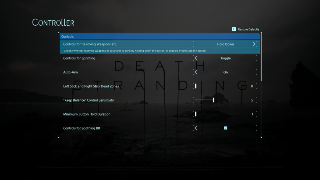
Concerning accessibility options, the aim-assist is by default activated (changeable) and there is an option for “Keep balance”-sensitivity, which controls who difficult the balancing part is for the player. Also, there is now a “Hold Button”-option, resulting in overriding any quickly repeated button presses (quick time events) to just holding the button down. The analog sticks have adjustable dead zones, and some motion-based inputs can be remapped to ‘normal’ button presses. The HUD can be adjusted with selecting & deselecting shown icons to reduce visual clutter; and the brightness can be easily adjusted. Another interesting barrier, everything has subtitles – expect the frequent appearing music pieces. Yet not hearing them will not stop you from advancing further in the game, but sadly do they add a lot to the atmosphere of the game.
A big burden is lifted through the rather smart game design – the online component. As one might never meet another player in his own game world, yet these other online players might alter your own game world by leaving objects and structures to help you traverse the world easier – this feature often helps a great deal getting through the game. For example, at one moment you might struggle crossing a river and when you return later someone left you a bridge in the meantime. Final judgement of this review was partially accessible and again, a lot of helpful accessibility options, but still room for a lot of improvements – yet it has gotten substantially better considering earlier Kojima titles.
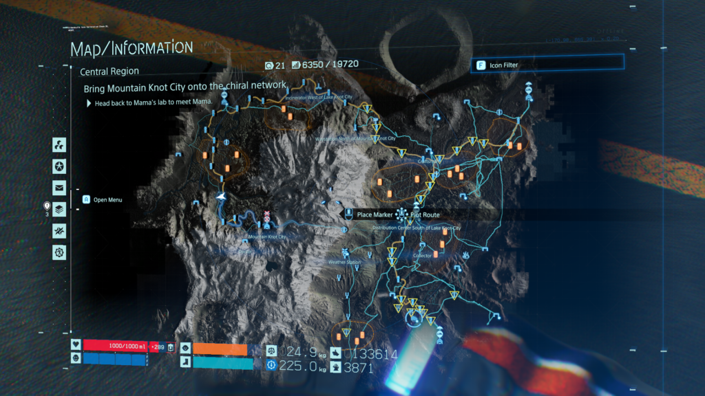
_3rd review of the game was done by Courtney Craven at CAN I PLAY THAT?: again, iterating many of the given problems. Interesting enough, the ability to plot routes, which will then be visible in the game world as dotted lines was praised as helpful tool while being deservedly difficult to operate (speaking again of multiple button presses). Also, the “very easy”-difficulty could eliminate combat completely, but I doubt stripping away this aspect completely does the game any good, but maybe there could be a workaround by maybe leaving the combat situation in the game yet removing the possibility for a “game over”.
The statement was made, that if you struggle with holding down the triggers, you will not really be able to play DEATH STRANDING – which, given the number of times you will have to press it, is most likely true. Regarding the font sizes, it was mentioned that even the “large text”-option looks like rather ‘normal’ text size. I agree on that; the ‘large’ text was just right for me, yet somebody might need it even bigger – and that’s just not supported. Final words in that review that this game is one of the most barrier-ridden games in a long time but not a complete accessibility failure – although many people might not be able to enjoy this game.
_For the 4th review I found a rather detailed and extensive piece by FAMILY VIDEO GAME DATABASE, which I will only feature as a link on their site, given the size of it: https://www.taminggaming.com/en-gb/accessibility/Death+Stranding
_My own small notes on this game are that I was rather surprised by the given accessibility options, because Japanese productions often suffer from a poor approach to accessibility – maybe it was SONY helping hand – but it was nice to see that there were some ideas, thoughts and time spent on making the game more easily enjoyable for a broader audience. What I still struggle with, which is funny no one mentioned it in my research; the sheer amount and variety of complex, new and unknown icons often leave me pondering, what they want to tell me – although this is for another time.
_Literature & Resources
