My research was dedicated to emotional design and how to create delightful experience. The article is based on Don Norman book “Emotional Design” and “Seductive Interaction Design” by Stephen Anderson.
1. Levels of design
In “Seductive Interaction Design” by Stephen Anderson the process of product maturity forms the basis for the User Experience Hierarchy of Needs model (Figure 1). Moving from bottom to the top, you have a basic product maturity continuum:
- Functional. Typically something useful
- Reliable. Users need to trust the service, if they buy tickets online, they need to be sure that nothing happens with their money and they will get a ticket in return.
- Usable and Convenient. Usable means being easy to use and possible to use. Convenient means to be convenient for users in their surroundings and be better than okay.
- Pleasurable. These aspects focus on affect and emotions. How can we make something emotionally engaging? This can be implemented by aesthetic, language, humor and doing things like arousing curiosity.
- Meaningful. Meaning is something personal and subjective. You can design for meaning by focusing on the preceding levels as well as shepherding beliefs and the communities surrounding the product or service experience (Anderson, 2011).
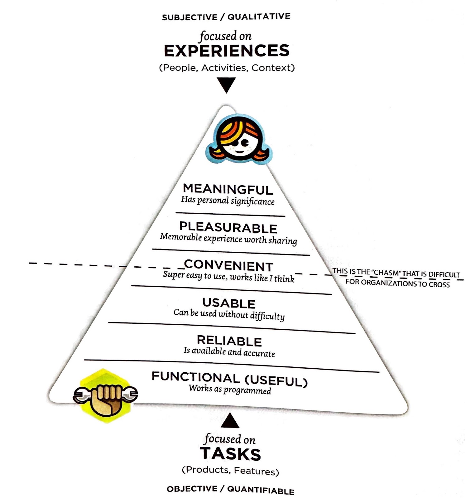
Figure 1. User Experience Hierarchy of Needs model (Anderson, 2011)
Designers built different theories around aesthetics. I will marshal some of them.
Designer Cennydd Bowles has identified three types of beauty on his blog: universal, sociocultural, and subjective.
- Universal beauty relates to the basic aesthetic concepts of design, such as symmetry, harmony, the rules of thirds, and the golden ratio.
- Sociocultural beauty is determined by what is considered attractive within a particular culture at a certain time. This can be seen through the changing standards of beauty throughout history, from the Middle Ages to the 20th century and from the 1950s to the 1990s.
- Subjective beauty is what a person finds appealing based on their personal preferences.
In 1951, Raymond Loewy proposed another theory of beauty, which states that people are drawn to aesthetics that are both advanced and familiar. This balance of new and familiar stimuli creates a sense of enjoyment and security.
Don Norman divides design on 3 levels: instinctive, behavioral, reflexional
- Instinctive level subordinated to our nature. Due to the evolutionary process humans developed the ability to get emotional signals from the environment which we interpret on an instinctive level. We instinctively find flowers and fruits appealing, we like symmetrical bodies and faces, humans don’t like the smell of poops or spoiled products because it is interpreted by our biological system as dangerous. The meaning of instinctive level is the same for different cultures and nations. The design that follows this level will always be attractive. On this level what is important is how the object looks, sounds and what you feel touching it. This design will be appealing and understandable to all.
- Behavioural level is focused on usage. Appearance doesn’t matter much, only functionality. Here usability specialists come for work. Main components of the product on a functional level are functionality, clear purpose of the product and easy usage.
- Reflexive level is about the meaning of the product, the interpretation in a culture. Sometimes it is personal memories with the product, sometimes it is about the message to others. It is when you think if the socks are matching your trousers or if your look is suitable for an event. It can be beauty standards in different cultures or how you express yourself with your possessions. Quite often people buy products on a reflexive level to show their relation to a particular social group. The design on a reflexive level is under risk of being outdated quickly since this level is sensitive to cultural differences, fashion trends and continuous changes.
2. Aesthetic, Beauty and Behaviour
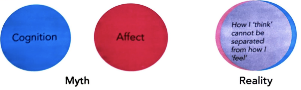
Anderson (2011) speculates about how visual aspects help users to understand the interface, give hints about usage, and make the interface predictable for a human being.
The author breaks the popular opinion about enjoyable products. It is believed that something that is easy to use and efficient is enjoyable. However, the way emotions influence interactions, it’s closer to trust to say things that are enjoyable are perceived as easy to use and efficient (Figure 2).
2.1. Attractive things work better
A well-known study is discussed in Donald Norman’s 2003 book “Emotional Design”. In this study, researchers in Japan set up two ATMs that were identical in function and button arrangement, but one machine was aesthetically more pleasing. The research was conducted in both Israel and Japan to account for cultural differences. Participants perceived the more attractive ATM to work better. One explanation is that when the brain is relaxed, it is more open and better able to find solutions to problems. On the other hand, frustration can cause tunnel vision and a focus on only the problem at hand. Norman offers an alternate interpretation, suggesting that people are more tolerant towards problems with things they find pleasing and want them to succeed.
A number of other researchers have explored connections between visual aesthetics and usability. Many of these studies have demonstrated a correlation between attractiveness and perceived ease of use. More recent studies in the field of emotions suggest that cognition and affect cannot be separated. Both economics and neuroscience have established that our thoughts and emotions are intertwined and constantly shape our evaluations and interpretations of the world around us (Frank Spillers, “Emotion as a Cognitive Artifact and the Design Implications for Products Perceived as Pleasurable,” Design and Emotion, 2004).
2.2. Perceived personality
While mature industries use for decades emotional factors to appeal to customers (think about car industries with distinctive personalities in design of cards, brands of watches, apparel), user interface development adopted this approach recently (Anderson, 2011). The personality can be referred to as a reflexive level in the model of Norman (2003).
The personality of a product affects our perception of it, just like in the social world where we form opinions of people based on their appearance and presentation. In the automobile industry, companies invest significant resources in creating vehicles with specific personalities that their target customers can relate to. For instance, the Dodge Ram exudes strength and ruggedness, while the Mini Cooper is perceived as lively and playful (Figure 3).

Anderson (2011) marshal examples of self expression with different products and give examples of how personalisation is important for people:
- Sites where you can replace actors from the music video with yourself or your friends are super sharable.
- Tattoos and stickers on your laptop are variations of self expression
- Online identity – groups on facebook, games, insta profile.
- Online identities tend to be idealized versions of a person in reality.
- Players in Farmville can be very expressive when planting their crops.
- Self expression can be encourage by reactions of users (thumb, great picture, love it).
- Any kind of customization, especially visible for other people enhance self expression (that could be aesthetic of the page, selected widgets).
The visual design enhances the performance features, resulting in the expression of these attributes in each vehicle’s form. To sum up, the personality of the product is important because:
- Individuals associate with or steer clear of certain personalities;
- trust is linked to personality;
- perception and expectations are tied to personality;
- consumers select products that reflect their own personalities;
- advanced technology is often treated as though it were human.
2.3 Time perception
Anderson (2011) speculates about the time perception and mentioned how in Disneyland the lines are handled. Through distractions and illusions, the experience of waiting seems to be not so bad.
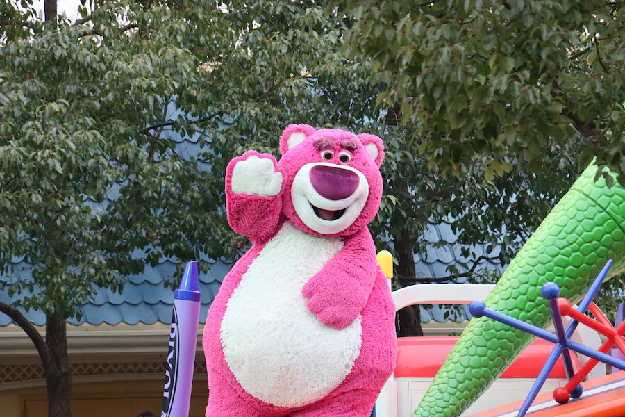
Figure 4. Character greeting line that tends to be long.
New Scientist magazine conducted an experiment in which they tested nine different variations of web download progress bars. They found that:
- Making the pulses more frequent as the bar progressed created the illusion of faster movement.
- Bars filled with ripples moving towards the left made the progress bar appear to be moving faster.
The magazine discovered that using these illusions could make a file seem to be downloading 11% quicker, as the brain tends to count cycles instead of seconds (Anderson, 2011).
“… something that takes longer but that is perceived to be efficient is superior to something that is shorter but perceived differently”
Donald Norman
3. Some tricks that leads to seduction
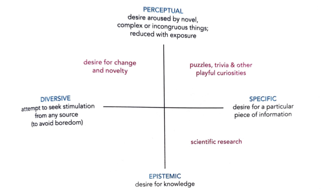
3.1 Pattern seeking behaviour
We delight in bringing order to chaos. Author mentions that our brains get “high” from solving difficult problems. We like to solve the puzzle so including patterns and puzzles into the interface can enhance positive stimulation and overall experience of usage.
3.2 Mystery
In a pattern seeking behavior the base is curiosity. The author mentions the carton box for toy cars that makes it very mysterious what is inside for buyers and a coupon from a restaurant that does not reveal what a gift a visitor will have next time, until the guest will come. To be really curious about something unknown we should like it and expect to get some pleasure. It can be your favorite restaurant or a toy, maybe the service that you already like.
3.3 Curiosity.
There are some examples mentioned in the book “Seductive Interaction Design” by Stephen Anderson that use curiosity in their interfaces.
- LinkedIn subscription business model. Pay to get more information. LinkedIn gives a personalized glimpse of what could be known.
- Quantcast shows metrics related to the website. In order to show data related to your business they show a sticker that hides some information. And you can even see that something is behind the sticker. It used to be their strategy in 2011, now they are expanding and do not show data for free any more.
- Netflix used to have a strategy that shows you two hidden movies that you probably will like, if you rate the movie you are watching.
Next, Stephen Anderson information you can use to tease people:
- make your tease interesting, or at least proportionate in appeal to the cost.
- make info relevant to the user
- establish trust through previous experiences and context clues
- use visuals to suggest or create the immediate perception of mystery
- don’t lure users with something that is given away freely elsewhere
3.4 Removing the pain
n an interview conducted by the book author with Giles Colbone it was discussed how the delightful experience works on opinion of Colbone:
“… I think that anxiety, present or vividly remembered, is an important part of experiencing delight. The contrast makes the delight intense and memorable”.
Giles Colbone suggests to see pain points of customers in their journey and give them delights. For “super pro” level he suggests even creating them artificially to give people delight.
Sometimes delightful experiences do not mean play or humour. We should ask users: tell me about the times you felt anxious. Fix the problems the users remember and fear the most.
3.5 Small first steps
- Shaping the path. Help people to do action – give a map, maybe ask them when they will do it to make them think about the plan, suggest a particular call to action.
- Make a small trigger that will remind people about the action
- Commitment and consistency. We tend to be consistent with the commitment even if we give it to ourselves.
- Once one startup were gathering photos of favourite places of people. It simply ask take a photo of your favourite place whatever it was. It was a big behavioural change, since people didn’t use to share their pictures (before instagram). So they just structured a big with some questions : what are three of your favourite places to eat. Your ideal evening would include a trip to.., what is the most interesting place to shop in your city? When you want to feel culturate, you go to..
- A shop chain had an online catalog, where people placed items on hold but never picked them from stores. The solution was to add a form field that asked people “what time do you think you’ll pick this up?” The shop run AB test to check if it would work according to expectations. The outcome is unknown.
- Empowered progress effect. Car washing service gave people cards with stamps. Every time you wash your car with their service you’ve got a stamp. There were two kinds of cards with stumps – one with 8 stamps. Second was with 10 stumps, where 2 stumps were already pre filled for them. The experiment showed, that in the month that followed 19% of the customers with the 8 stump card earned their free car wash. 34% with 10 stumps cards get their cars washed in the end. Someone already started the process for them. How you can create the perception of progress in your application?
- Sequencing. Motivate people to do something by breaking down on small steps.
- Shaping. Shaping is used to reinforce desired habit. To teach something new, you start with the simplest form of behaviour, and build on that, to reinforce increasingly accurate approximations of desired behaviour.
3.6 Fewer options
Numerous researchers have found that the more options we have, the less chances we will take any actions at all. The most famous research is about jam flavours in supermarket, that showed that people with more choices tend not to choose at all. So if you want your users to act, reduce the options. Sometimes it can be tricky in hotel booking services for instance, since the user wants to see all options with all possible times. In this cases, the recommendation is to reduce the cognitive load by making less text, illusion of less by hiding information, simplify design, and nudge a person where it is possible to make less things to think about during the journey.
References
Norman, D.A. (2004). Emotional design : why we love (or hate) everyday things. New York, Ny: Basic Books.
Anderson, S.P. (2011). Seductive Interaction Design. Pearson Education.
Pictures and illustrations are taken from:
Anderson, S.P. (2011). Seductive Interaction Design. Pearson Education.
Unsplash (n.d.). Photo by Taha on Unsplash. [online] unsplash.com. Available at: https://unsplash.com/photos/eqD3yWOuHWM [Accessed 6 Feb. 2023].
Unsplash (n.d.). Photo by Brock Wegner on Unsplash. [online] unsplash.com. Available at: https://unsplash.com/photos/5k_YVwgMi_U [Accessed 6 Feb. 2023].
Unsplash (n.d.). Photo by Lance Anderson on Unsplash. [online] unsplash.com. Available at: https://unsplash.com/photos/ixBBY-WuFRU [Accessed 6 Feb. 2023].