_Alphabet of Barriers – A Guide to better Game Design Accessibility

This Blog post is about a preliminary Exposé for my Master’s Thesis in the field game accessibility.

Problem

The state of the art of game design accessibility has improved significantly in recent years, with a growing emphasis on making games more inclusive for all players. Techniques such as colour-blindness simulation and the use of text-to-speech technology have been integrated into game design to make games more accessible to a wider range of players. Additionally, game designers have begun to focus on creating game mechanics and controls that are more intuitive and easier to use for players with physical disabilities. Overall, the field of game design accessibility is constantly evolving and improving. But there is little to no easy and compiled way for game designers to check if their game meets certain accessibility standards or where it still could be improved.

Research

The current research regarding game design accessibility is focused on identifying best practices for making games more inclusive and accessible to players with disabilities. This has included studying the specific needs and challenges faced by players with different types of challenges and developing game design techniques and technologies that address these needs and challenges. Furthermore, research in this area has involved studying the impact of accessible game design on player experience and engagement and exploring ways to measure the effectiveness of different accessibility features. Overall, the goal of this research is to improve the accessibility of games and make them more inclusive and enjoyable for players of all abilities.

Question

How can information on accessibility in game design be made more easily accessible to find and help improving game concepts?

Objective

The outcome of this thesis will be a book titled “Alphabet of Barriers – A Guide to better Game Design Accessibility” and could potentially be a reference guide for game designers looking to create more accessible games. The book will contain information on best practices for designing games that are accessible to players with a wide range of disabilities, including physical, visual, and auditory impairments. Also, include a glossary of terms related to game design accessibility, organized alphabetically for easy reference. Additionally, the book could feature case studies or examples of successful game design accessibility practices in action. A book of this nature also could help raise awareness and understanding of the importance of game design accessibility. By providing detailed information on the challenges faced by players with disabilities and the ways in which game design can address these challenges, it could help educate game designers and other stakeholders about the need for accessible game design. This could in turn lead to more games being designed with accessibility in mind, making the gaming industry more inclusive and accessible overall.

References

There are a lot of good references to this topic, but this thesis will draw upon various game studies, known design principles and on the modern insights of state-of-the-art accessibility.  

Method

There are several methods that will be used for writing and researching this thesis. One approach will be to conduct a literature review of existing research on game design accessibility. This involves reading and summarizing relevant academic articles and other sources and identifying key themes and ideas that could potentially be included in the completed book. Another possible approach is to conduct interviews or surveys with game designers and players with disabilities to gather first-hand information and insights about the challenges and opportunities in game design accessibility. These interviews and surveys could provide valuable first-person perspectives on the issues at hand and could be used to inform the content of the book and provide real-world examples and case studies. In addition to these methods, the thesis could also incorporate information and stories from the personal experiences and expertise gathered by game designers with experience in creating accessible games, where they could share their own insights and lessons learned from their work in the field. This will provide valuable practical advice and guidance for other game designers looking to create more accessible games.

Material

There is a wide range of research material available on game design accessibility. This material includes academic articles and studies published in peer-reviewed journals, as well as books and other publications on the subject. Additionally, there may be conference papers, presentations, and other materials from workshops and events focused on game design accessibility. The research material on game design accessibility could cover a variety of topics, including best practices and techniques for designing accessible games, the impact of accessibility on player experience and engagement, and methods for measuring the effectiveness of different accessibility features. Additionally, the research material could include case studies and examples of successful game design accessibility practices in action. To access this research material, one could search for relevant articles and publications using online databases such as Google Scholar or the ACM Digital Library. Also, there is the option of conference proceedings or other materials from events focused on game design accessibility. Additionally, one could reach out to researchers and experts in the field to ask for recommendations or suggestions for further reading on the subject.

Bibliography

Cairns, Paul u.a.: Future design of accessibility in games: A design vocabulary. In: International Journal of Human-Computer, 2019, Vol.131, S. 64-71

Greogory, Sue u.a.: Learning in Virtual Worlds: Research and Applications. Edmonton/Alberta: AU Press 2016

Lidwell, William/Holden, Kritina/Butler, Jill: Universal principles of design. 2.Aufl. Beverly: Rockport 2010

Polzer, Mikel Elias: Designing Casual Games for Subverting (Hetero-)Normative Attitudes. Master’s Thesis, University Vienna, 2017. In: https://utheses.univie.ac.at/detail/42249 (zuletzt aufgerufen am 01.12.2022

Suter, Beat/ Kocher, Mela/Bauer, René: Games and Rules. Game Mechanics for the “Magic Circle”. Bielefeld: transcript 2018

Wikipedia. Die freie Enzyklopädie (10.10.2022), s.v. Computer accessibility, https://en.wikipedia.org/w/index.php?title=Computer_accessibility&oldid=1115269099 (zuletzt aufgerufen am 10.11.2022)

Structure

The structure of the thesis could potentially be organized alphabetically, with each chapter or section focused on a different letter of the alphabet. For example, the first chapter having the focus on the letter “A” and discuss key concepts and terms related to game design accessibility that begin with “A”, such as “accessibility”, “assistive technology”, and “audio description”. Subsequent chapters then follow the same format, with each focusing on a different letter of the alphabet and discussing the key concepts and terms related to game design accessibility that begin with that letter. This kind of glossary would make it easy for game designers to quickly find and understand key concepts and terminology in the field.

Alternatively, the book could be organized around different themes or topics related to game design accessibility. For example, having chapters focused on specific types of disabilities and the unique challenges and opportunities they present for game design accessibility. These chapters would cover topics such as visual impairments, hearing impairments, and physical disabilities, and could provide detailed information on best practices for designing accessible games for each of these groups.


_TASK III: Critical Evaluation of a Master’s Thesis


For my review of a Master’s Thesis, I chose the work of Mikel Elias Polzer with the title “Designing Casual Games for Subverting (Hetero-)Normative Attitudes”. I came across this work by researching with the Austria-wide online tool of the FH library.


_Level of design

There was almost no design aspect to it, other than the most basic formatting was done in terms of layout. Structure was done quite okay and there were the occasional pictures and visualisations in it, but they only served the purpose to explain certain points in the thesis. Although the choice of font and typography was done in a very safe way, where nothing can go wrong that easily – from a readability standpoint the forced full justification text is a quite difficult to enjoy whilst reading; so, there is room for improvement on this front. The use of bright red and blue on text looks in the end – mainly just off. It makes certain things look like the rough outline or something, which still needs to be discussed – for me it does not give the impression of being done when text is highlighted red.

_Degree of innovation

The thesis deals with interesting and important topics for our current century, mainly the perception of gender in games – there is only little work done on this field because it is a rather unexplored discipline. To now quantify it by just that parameter would be possible, but not justified. Therefore, I consider this thesis as an innovative piece of scientific work.


_Independence

It relies heavily on citations, but the experimental and scientific approach of this work would qualify it as a very good independent thesis.


_Outline and structure

Something which struck me a little odd was the fact that the author included a full curriculum vitae on the 4th page. It was straight after the cover and the acknowledgements before the table of contents. I guess it must be some requirement of the university where this thesis was published; yet I do not see the need of giving a detailed look at the person’s life before I read their thesis. Also, on another note, the CV was equipped with the full name, nationality, birthday, and even email address – form a data protection standpoint a problem. Otherwise, was the structure well laid out, you had enough introduction to the upcoming topics, and nothing felt out of place. The ending was merely a quote and had only little conclusion to offer, it ended all rather abruptly. At least the whole PDF was formatted as an interactive file, so you could easily use the in-file links to hop between chapters, sources, and citations.


_Degree of communication

The heavy use of parentheses makes reading and following – on top of very long constructed sentences which could use a break here and there – makes reading this thesis a little bit more challenging. It’s not your everyday easy evening read.


_Scope of the work

The work did not try to get everything under one hat, it clearly decided for one aspect and honed right into this. The author talked about the talking points they wanted and had to and then got straight into experiments which they called ‘semi- quantitative testing’ to get a grasp on the subjective perceptions of various participants.


_Orthography and accuracy

Sometimes poor wording and occasionally spelling mistakes in terms of misplacing commas into words. Besides that, I was not able to locate any graver mistakes. The only thing I would point out is the misuse of the basic hyphen “-“ instead of the classic “–“ en-dash – but that’s more of a style and typography issue which I take a bit personal, otherwise it’s alright.


_Literature

The literature consists of a huge and vast library of books from different fields, but all coming from a certified scientific aspect. There were also a lot of books which I also already came across in my research or I knew already.


_Source

Polzer, Mikel Elias: Designing Casual Games for Subverting (Hetero-)Normative Attitudes. Master’s Thesis, University Vienna, 2017. In: https://utheses.univie.ac.at/detail/42249 (zuletzt aufgerufen am 01.12.2022)

_International Week: Thoughts and Conclusions

_The international week 2022 hosted by FH JOANNEUM was an interesting event. I attended Luis Daniel Martínez Álvarez workshop (#9) called “Aesthetic Echoes of Terror: Construction of the sound Atmospheres of the Uncanny Valley for Videogames and Cinema”. I tried to gather as many thoughts as possible here in this post.

I will start with a short summary of the workshop; the lecturer was Danny from Mexico, and his profession is sound design combined with storytelling – mainly scary stories. He gave us a deep dive in how and why specific sonic patterns appear frightening to us, and how to fabricate such experiences. It was a fascinating topic with even better insights, even for a person like me, which has little experience with sound design. We then went on and collectively wrote a little horror story inspired by our deepest fears; the result was “No-Scream//Nose-Cream”. It’s about a hellish clown, which steals noses while the whole world is falling into the hands of ice cream zombies. Sounds like a weird, and that’s because how it was created: We took a piece of paper, and everybody wrote one sentence and then handed the paper to the next person, to continue the story from this point. This approach created this fever dream of a story within two passes.

After that was done, we then collected a vast array of different sounds of noises in the city, grabbed a Zoom-Recorder and ventured into the city to record said noises. We spent the whole first Day in the city, listening to various sound emitters and recorded those. The goal was to generate a composition for our scary story with these sounds, and so we searched up different places with different atmospheres (like a church) and collected enough sound samples to accommodate every detail of our story.

As I mentioned before, I’m not a sound designer – although I enlisted for this specific workshop because of my previous occupations; game design and cinema enthusiast. The attentive reader might remember that I recently wrote a blog post about how some colleagues and me did an attempt on creating a horror game in unity. So, it was an easy decision for me, what workshop to attend when I read the possible options. I wanted to learn more about the soundscapes of the horror genre and how they are made, and I was not dissatisfied.

But one little hiccup which me (an interaction designer) and a colleague (a media designer) faced, was the fact that we were both a little out of our fields here. So, as we now had all our sounds together, we had to quickly learn an audio software (through an excellent crash curse by Danny) and get to composing – something none of both of us ever did. The tasks for this week were to create two compositions; one for our story and one where we did the score for a little 60 second snippet of a horror movie/series/etc of our choice.

We were both thrown into cold water in a workshop with no prior knowledge of its topics, having no clue of composing and trying to figure out baby steps in this field. Naturally, the sound designers did a task which took as nearly two Days in under 10 minutes and it the results sounded amazing. This was kind of demoralizing to be honest, but it was nice to see what can be achieved when you profile in this topic. To not be completely emotionally destroyed we settled on the taking-part-medal, and just played and experimented around with the sounds, and although our lacking skill had interesting outcomes. Although we had little to no experience, we had great fun and really enjoyed ourselves. Turns out, it’s not always about being good in something from the get-go, but it’s about committing and having fun on the way.

All in All, it was an interesting and wonderful experience and I want to commit some special words to our lecturer, Danny – a wonderful and friendly guy from Mexico who studied music and composition. He knew a great deal about his topics and had great fun in relaying all those information to us; but I think what made the week such a success for our group was his inviting and open personality. If I could rate Danny as a lecturer, I’d give him a 10/10 – it was an absolute blast.

_Accessibility in Horzion Forbidden West

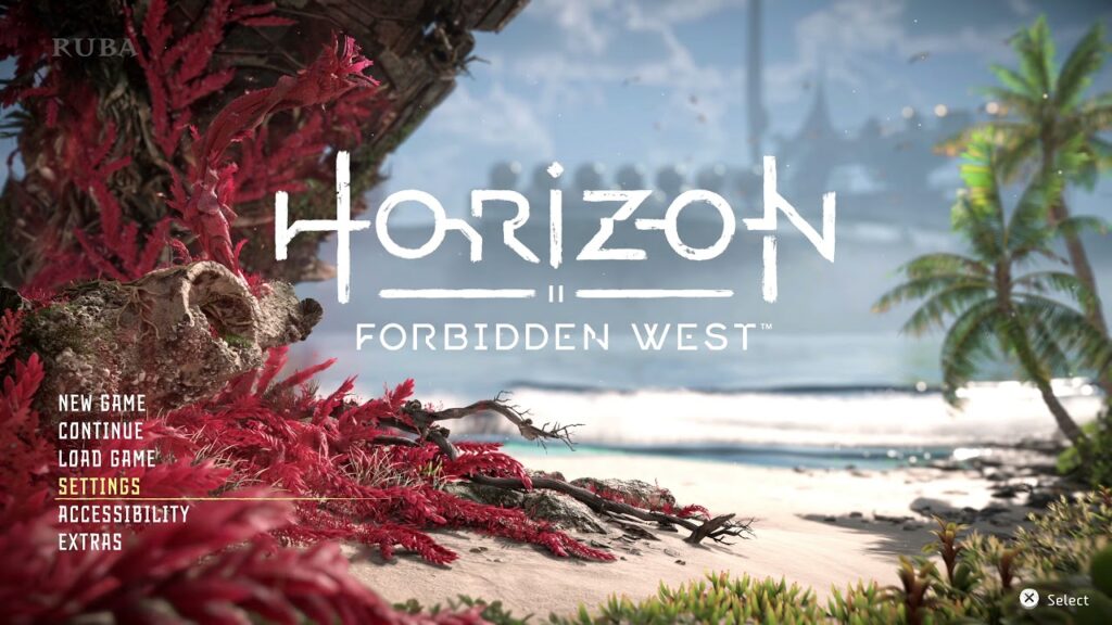
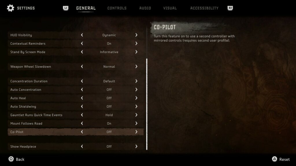
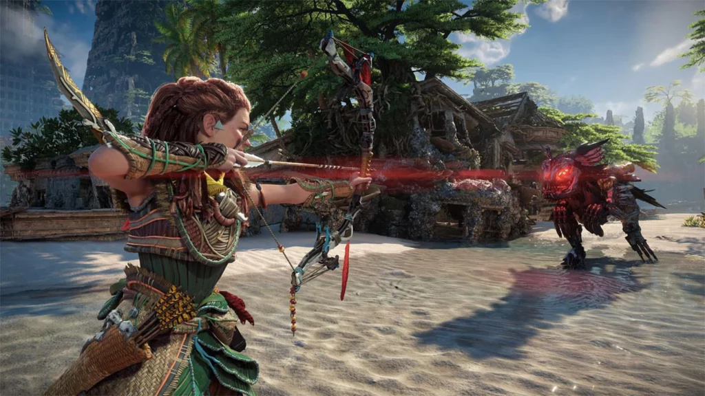
_Horizon Forbidden West is apparently considered one of the new contenders for best Accessibility in Games for the year 2022; and since I had the opportunity to get my hands onto that game, I’d say it’s time for a little case study of my own. Also, this game runs on the same Engine which made DEATH STRANDING possible, but a different Studio. Since I kind of already evaluated this other game, I was curious how they did it, giving the fact that DEATH STRANDING didn’t do that well. When I booted it Horizon for the first time, I immediately noticed one of the big points in the main menu – ACCESSIBILITY – and I was curious, which and how good their Accessibility measures & efforts were.

I took a quick gander over their accessibility options and was generally impressed by their efforts in the first moments. Scrolling through the different modifications, I headed to the menu points I always search up every time I start a new game, to language and subtitles. Generally, am I interested in which languages (audio/video) that game is available and how the default subtitles are set up.

Straight of the bat, the default subtitles are quite hard to read – small, white, and mostly on bright backgrounds. You can though, change them quite easily to a slightly larger version with also a black background – but there is still room for improvement.

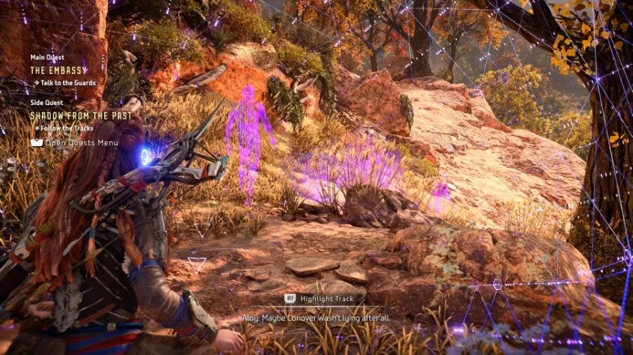
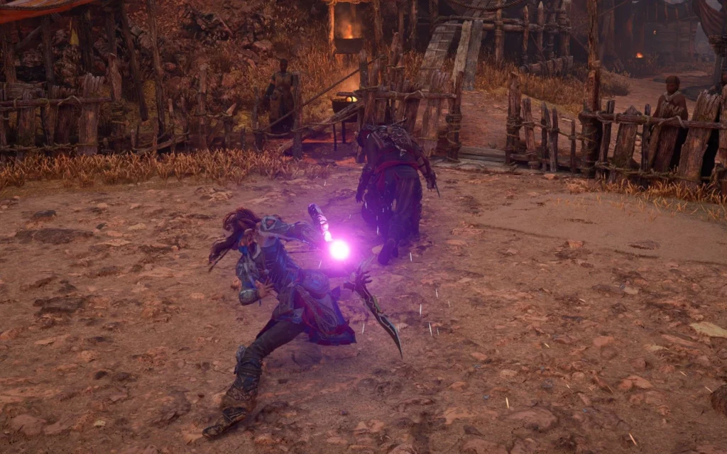
Staying with graphic settings; in the game there is a mechanic called “using the Focus”, meaning that you can press a button to enable an ‘virtual’ overlay in the game world to highlight important objects or crucial information. In this universe, the “Focus” is a little apparatus which sits on your temple (close to your ear, where all your four skull bones join) and projects some sort of augmented reality view into your sight. This is a nice concept, but poorly executed in my opinion. What it does, is it brings a pinkish overlay – which is not changeable from the get-go – to everything in the game world to show said information. In the end, it has small and hard to see icons and often it takes me more time to differentiate what is important or just pinkish noise accidently misinterpreted by my eyes as crucial data. In the first game there was this option after finishing the game to unlock new styles for said focus, so you could change the colour schemes to your liking – or to better say, needs. Such an accessibility option should not be locked away behind the barrier of ‘finishing the game’.

While talking about the functions of the game mechanic Focus, one other use of it while combat – or should I say strictly before engaging/combat, that’s what bothers me – is to plot our plan to engage and attack your enemies. You look at their walking patters, their strengths and weaknesses, the works. But this is inherently where the problem; often you are faced with a vast array of different foes, which all have different ways to be brought down efficiently. So, you often must, in the middle of stressful combat, enter the focus view to see the enemies’ weaknesses. This context info is there to make it easier for you, but ultimately it either annoys you the get a hold of this information, you struggle to get a quick glance, or it rips you completely out of the fight/immersion; because you pressed the touch bar fast enough to open your enemy database overlay menu. Now you can, in all silence and peace read everything up to your hearts content about a specific enemy, just to press the touch bar again and are maybe, quite possibly, be overwhelmed by all the action what was going on and you kind of forgot about it. Such information is just not easily available, but it should be.

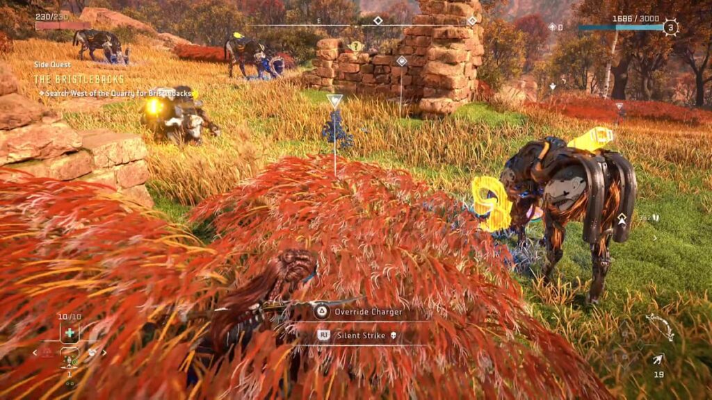
Even before you even engage in a fight, often you enter the hostile premises in stealth mode – the enemies are completely oblivious to your presence. To hold up this fragile status quo, you use the environment to conceal your movements, while you close in on them to get the first strike. You sneak around in some read flora, which is conveniently sprinkled generously around the whole map – but the only way the game communicates to you, that you are now in fact considered ‘in stealth’ is through a soft and gentle rumbling of the controller while you traverse said reddish plants. There is no other visual indicator (e.g., an icon or else) except your character crouching in the bushes and some faint and distant rustling noises from the grass, which gets also easily drowned out by all the other sounds. So, now you often are not sure where you are being in stealth begins and where it ends, leading to some little hiccups in your predatory path to your victim and they may see you approaching. The way of how haptic feedback is generally used in this game is interesting and enjoyable, but for some folks it might be to much of a barrier to enjoy the game properly.

Some of the input patterns in the game can be very complex, and cannot be made easier, for example it took me quite a long time to get a grasp of their grappling hook jump boost mechanic, which needs serval factors to get a satisfying result. You need to be in reach of a grappling point, jump, smash the x-button to connect to the point, and while you are pulled towards it, start smashing the o-button to use your momentum to boost yourself to higher heights. Once I figured it out, it works quite well for me, but I can’t imagine not everyone gets that far with it. Also, while in close combat, there are several combos with varying uses to overpower you enemies – they offer some interesting telegraphing points to show you when exactly to press an attack button, but in the end, in the heat of combat it boils down to you just repeatedly smashing both attack buttons interchangeably and hoping for the best. There is room for some people to perfect this craft for sure, but some will stay on smashing level – but it also works out to have fun with the game.

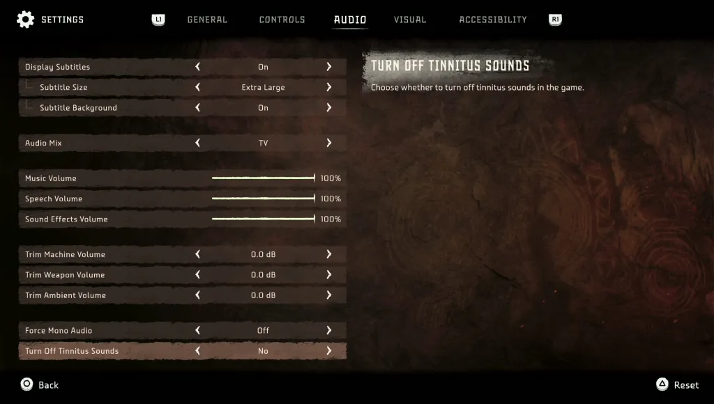
But not to say they didn’t offer the opportunity to automate some input tasks; I’ve spotted the opportunity to enable the automatic deployment of your parachute while falling great hights – a welcome and handy option. It spares you from demoralisation of jumping of some cliff accidently and then loosing your progress to an untimely death caused by gravitational pull on your existence and the following impact force. Talking about loosing your progress, this is a part they got exactly right; they often and on smart points set very well designed autosaves, so your progress isn’t that lost all together. They track and keep most of your picked up items (except story items), your map discoveries and so on. While also browsing some of the settings, I even discovered another nice accessibility/quality of life option – the possibility to turn off all tinnitus sounds. For some people, the constant sound of ‘phiiiiiiiii……’ while you battle against the enormous machines with their metric ton of explosions in this game can get really tiresome, so this helps a great deal I’d say.

Lately, they even rolled out a big update to the game, adding new modes and features. Maybe, there also were some improvements to accessibility – but I got to check it out again. All in all, I’d say it there was an attempt on inclusiveness as far as I am concerned, but not as a deep dive as some other games (e.g., TLOU: PII) have already achieved.

One interesting Idea or Theory I stumbled upon while reading randomly through various accessibility reports was, that each attempt to create more immersion in games somehow keeps adding more and more barriers for others – like adding a highly sophisticated system for locating game objects through sound. A cool feature for everybody who can hear, but as soon you start to rely on this technology for you game design, it could get inaccessible for some people with hearing problems.

As a concluding insight I’d say, an opportunity for me to use all these rather specific and far spread knowledge about approaches to Universal design in Games and other coherencies in this industry would be to work as an UX/UI consultant for games. I’d see myself doing that and I am growing quite fond of that idea – but to digging deeper into this concept is for another time.

_Literature & Resources

  1. https://blog.playstation.com/2022/02/10/accessibility-features-in-horizon-forbidden-west/
  2. https://caniplaythat.com/2022/02/14/horizon-forbidden-west-accessibility-review-can-i-play-that/
  3. https://gamerant.com/horizon-forbidden-west-accessibility-features-good/

_Making Sound playable

One could summarize the paper by Christopher Ariza with ‘using a controller as interface for live music performances’ – how it works, what benefits and limitations there are. A controller, in the paper often referred as ‘Dual-Analog Gamepad’ is originally designed as a gaming peripheral/interface, for consoles and computers. But some folks figured it out back then, that all its inputs also could be interpreted by a computer as MIDI signals and subsequently used to map certain sounds or modifiers to these inputs – thus generating music by making inputs to the buttons on the controller. This not even limited to one instrument or soundscape alone, because there are various buttons left on the device, some could be used to alternate between different instruments which have either different constraints on using or are just controlled completely different from others. Since there is also the possibility to create complex interaction patterns, like to simultaneous button presses, the amount of immediately available instruments vastly increases.

This whole approach isn’t not the newest invention, the concept of repurposing any digital interfaces to transfer their various interactions into inputs to a machine to generate anything, yet it’s not being seen everywhere though. In most live musical performances, theses ‘input methods’ are very rare – although they could greatly enhance the audience’s perception of the artist; meaning that they don’t only interact with their laptop and just use ‘conventional’ input methods, like mouse and keyboard. As the paper correctly stated, it would create the impression that the artist actually ‘plays an instrument’ and have profiled in its use.

Coming back to the paper, it mostly focuses on explaining existing interface mappings for controllers, but the goal of this paper is mainly to promote the use and experimentation of literally ‘playing’ with a controller to create new experiences in music making.

What me struck me as most interesting, since the paper is now roughly ten years old, there have been numerous improvements and advances made in controller technology. So, if someone now would harness the various sensors, input and feedback methods of a newest generation controller – like the PlayStation5 DualSense Controller – the possibilities would be mind boggling.

To reiterate, what this little piece of plastic and electronics can do:

  • 16 discrete buttons
  • 2 Thumb sticks (essentially Joysticks) which also can be pressed
  • Adaptive triggers for haptic feedback (creating various resistance experiences when pressing the triggers), which also can differentiate various strengths of button presses
  • (Also, pressable, like a button) Touchpad which can track up to 2 fingers very precise and differentiate between certain various button press locations, like left and right
  • Vibration motors for haptic feedback (precision rumble sensations)
  • Acceleration sensor
  • Gyro sensor
  • LED light panel capable of displaying a lot of covers
  • Built in Speaker
  • Built in Microphone
  • Headphone Jack
  • Bluetooth Connectivity (to Apple products it is even optimized out of the box)

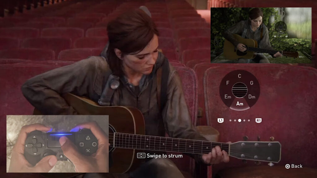
So, it’s quite a list of things of what a new generation controller can do. For example, I thought of changing the different instruments by dividing the Touchpad in segments and touching different segments of said Touchpad could correspond to activating different instruments. Adding to that, the current state of the instrument selection could be represented through a corresponding colour trough the LED panel – adding insult to injury, the successful switch to another instrument could be communicated trough a short rumbling of the controller, like a little shockwave; to give more haptic feedback to the change in instruments. Also, since the Touchpad can detect touch/swipe inputs, an interaction like scratching done by DJ’s could be emulated. There is one example, where a game uses the Touchpad to detect inputs for a guitar playing minigame – in TLOU Part II. You choose a chord (from a radial menu of presets) via the Thumb stick, and then strike individual strings or all of them via the Touchpad to get a sound.

Staying on the topic of the LED panel, communicating different events or states with light and even sound directly could be used to tell the rhythm, or the Haptic feedback with Vibration or adaptive triggers could be used to indicate rhythm and enable precision timing. Coming back to the various ways of haptic feedback, with the precision vibrations or rumblings, either the current beat timing could be felt like a little bass drum – or even wilder, whatever sound has been currently created with the controller, the beats vibration pattern could be used to make the newly made music ‘tactile’ and add an interesting layer of immersion/feedback experience.

To address the other options of input methods which take advantage of the different sensors, like the Gyro sensor to map movements to music, similar to the theremin or the Accel sensor to map events, like a change in tempo, drop, etc. The option to use the speakers as output in extreme situations could also be very helpful – but maybe just for something small like a metronome – but the headphone capability of the controller could come in handy at every opportunity.

All in all, utilizing a modern age controller like the DualSense controller could really open up new and various other ways to make and literally ‘play’ music.


_Literature & Resources

_Horror Games & Accessibility

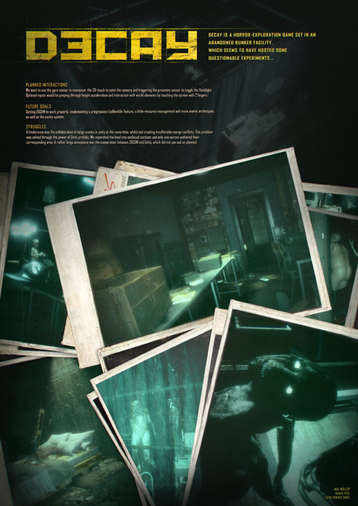
_We recently started a small game called DECAY in UNITY, a horror-exploration game set in an abandoned bunker facility.

_While we were hard at work building the game, we thought about implementing future, rather simple accessibility options; like making collectibles easier to see and find, adding an optional item counter to help you keep track of your needed collectibles and maybe some kind of colorblind mode (yet we weren’t sure how to implement such a feature in such a game with it making sense). But the easiest and nicest solution we came up with, besides a difficulty setting which would influence the time it would need for the game to result in a game over in certain moments, was the idea to optionally remove enemy encounters entirely from the game, so one could explore to their hearts content, since we poured a lot of love and detail into level itself, like little micro-narratives and so on. Finally, since the music can get creepy sometimes (as it should in a game like that) we considered if would be available to influence the game music, e.g., adjusting the volume or turning it off completely. Yet we are still on the fence on these topics, since we try to decide what is needed for our game to function in its core and what can be made more easily accessible.


_Literature & Resources

  1. DECAY by Max Müller and David Fesl

_Accessibility in Multiplayer games

_The thought came across my mind, how does accessibility handle in online and competitive games? In an MMO (Massively Multiplayer Online Game), how can these games accommodate accessibility features, just besides a colorblind setting or UI scaling? Turns out, there is a limit of accessibility in these games, because some issues just can’t be worked around.

Some examples, where some things can be addressed do exit though:

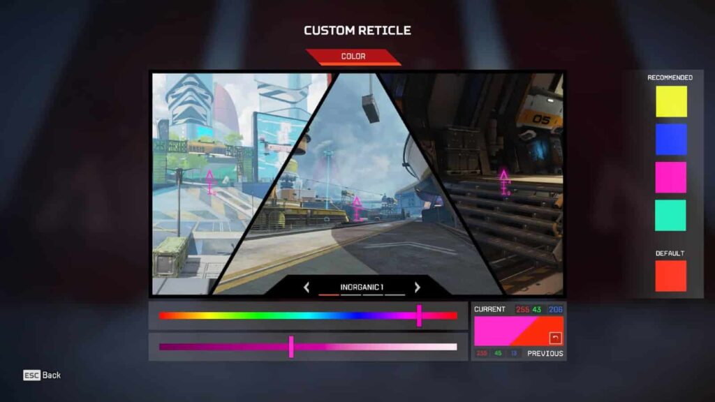
_Any customization, which do not add any unfair advantage to the game for some users. Like reconfiguring your controls, customizing colors or sizes of UI elements, or even change little details in the game, like in shooters, change the color of the reticle – like in APEX LEGENDS.


_Entry barriers on lower levels of play can be helpful in many games, like matchmaking of similar ranked players, say by level or skill. Yet the later, also known as SBMM (skill-based match making) often leads to more frustration than satisfaction with players due to it’s basic logic: if you play very good in some games in a row, the algorithm deems you more skillful and matches you with people which it thinks are equal to you now – yet you might have just gotten a lucky streak, and now you actually are being paired with players which are way more invested in the game and proceed to walk all over you for some rounds. Only for the algorithm to realize its misinterpretation of your skill level and putting you back to the rather less invested people – which you best again with ease and the cycle begins anew. The system might work in theory, but in the practical world its just an awful up and down rubber banding. Matching people by level often can go awry if the game allows an easy access to a new account, giving the opportunity to a frowned upon practice called ‘smurfing’. Here a player of a very high level of play creates a new account and abuses the system, which deems them as a new player, a beginner, and matches them with other – often real – beginners. This leads to the player absolutely destroying the fun for the beginners with the massive skill gap between the two parties and leaving the new one rather unsatisfied with their performance, which is immediately projected onto the game and the dissatisfaction with the game itself drives new players away.

_Other ways to lighten up entry barriers in games can be features which help players in lower levels of play but in higher levels of play turns out more than a burden and disadvantage. For example, aim assist, which helps new players acquire targets more easily by slightly adjusting their aim to stay or snap to targets can be beneficial to them, while in higher levels this slow, and less accurate method is easily bested and faster with a player manually aiming. Actually, in these high levels often the slight and trailing adjustments by the algorithm leads the players unintentionally loosing their aim on the target, because an adjustment which had to be done several milliseconds ago, which was already corrected and accounted for by the player comes way to late and results in an unwanted adjustment – ultimately losing the target for a brief moment. And this little moment can be defining in competitive gaming.

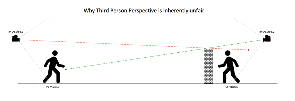
_Matchmaking isn’t a lost cause yet because players can be matched on other deciding factors. Like in GTA V, only players who chose to play with auto-aim on get paired together. Or in HALO REACH players with enabled voice communications will play together and in PUBG players who play in third person instead of first person will go against each other. This is because of a mechanic called ‘third person peeking’. If a player with third person view enabled hides behind cover, they can look over the cover with their camera, while their body stays hidden. An approaching enemy would not know that they have already been spotted, since the players camera is invisible to the enemy.

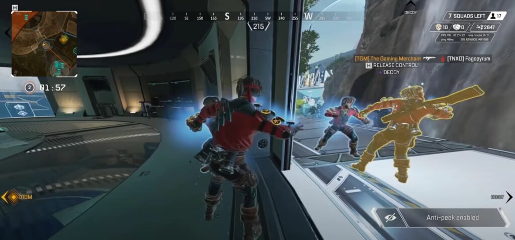
Some competitive games, which feature certain moments where a third person instead a first-person view, they activate a so called ‘anti-peek’ function – it hides every other dynamic gameobjects, which are currently not able to be seen from the point of the character which just switched to 3rd person (e.g., APEX LEGENDS when using emotes).


_To sum up, designing multiplayer games within the aspect of accessibility can be very hard, because sadly, some competitive games are made not to be easily accessible by everyone in their core, which isn’t their fault – it’s just in their nature, so to say. But every other factor besides these core mechanics, which can be made more accessible in this game is a step further and should be done without a second thought spent.


_Literature & Resources

  1. https://medium.com/potato/the-right-to-play-accessibility-in-gaming-a954b01023f

_The Advances of XBOX: COPILOT & Adaptive Controller

_XBOX made great efforts into the field of accessibility and implemented a wide array of software and hardware for this purpose. Like a highly sophisticated text-to-speech for system UI elements, a mono toggle of unilateral hearing loss (impairment in only one ear while the other ear is in ‘normal’ limits) and a zoom function. They also included features for real time speech-to-text and text-to-speech ingame – the tech is yet not perfect, also because its difficult to cope with the game specific terminologies and lingo, which can change rather quickly.

_I myself tried speech-to-text out of curiosity in APEX LEGENDS, cause often teammates are very hard to understand or just way too quiet to hear them, but the algorithm may hear them. But to put it shortly, speech-to-text works rather horribly. Often, it’s just an unintelligible array of random words which hardly approximate what has been said; it seems to work best with the English language, then it sometimes gets it right. Mostly. Yet does generate absurdly funny combination of sounds resulting in a fun time at least. But the technology will get better eventually and can enable hearing or sight impaired people to take part in conversations which would otherwise be inaccessible to them.

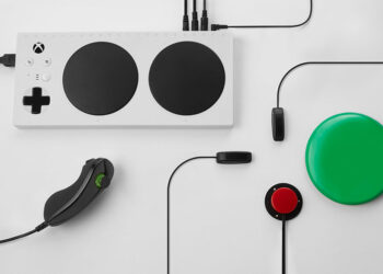
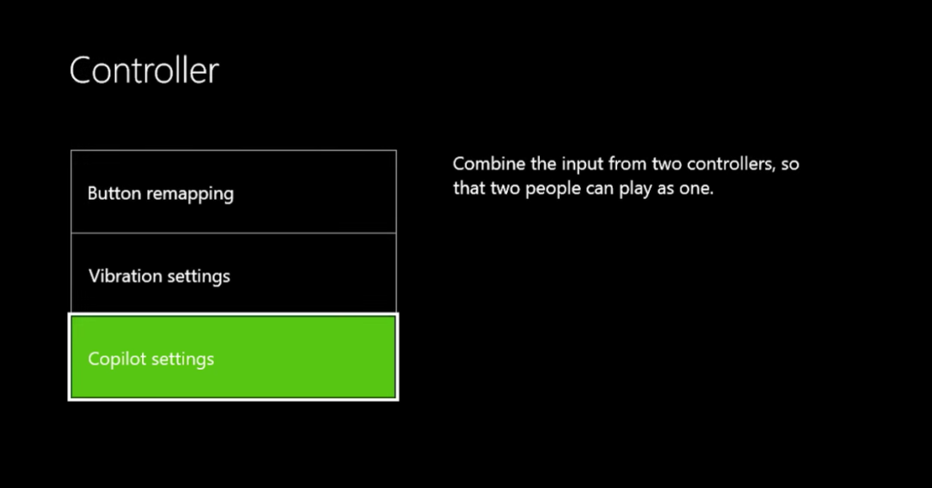
_Also, XBOX introduced the copilot mode, a simple but brilliant solution. Two controllers are connected to the same console and give the same input simultaneously – making it possible for someone else to jump in and help if it is needed. For example, a parents could help their kids getting through difficult sections, while everything else is handled by the kids themselves. Or a blind person could play a game by hearing alone, while another person helps with the walking through the level, which could only be accessible trough sight. Originally it was designed to split the controls between two separate controllers; therefore, maybe controlling one side of the controller with one limb and the other parts of the controller with some other body part, which might not reach the other side of the initial controller. This method can make highly expensive customized controllers obsolete and democratizes technology further. They also published the adaptive controller, a tool for people with various impairments to make it possible for them to customize their inputs even further to their needs.


_Literature & Resources

  1. Xbox Copilot (Satya Nadella 2021 Ready Keynote) https://youtu.be/BsuDHoIwIzM
  2. Introducing the Xbox Adaptive Controller https://youtu.be/9fcK19CAjWM
  3. https://medium.com/potato/the-right-to-play-accessibility-in-gaming-a954b01023f

_3D Audio and its Accessibility with PS5

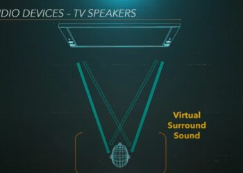
_Back in early 2020, Mark Cerny, the lead system architect for the SONY PlayStation Company held a talk about the soon to be released PlayStation 5 console an its technological aspects and achievements. He explained how they ventured into the field of a new audio technique, the 3D audio engine TEMPEST – it makes it possible for users, to hear ingame sounds with a feeling, as if they were happening around them, by some clever tricks outsmarting our brain and the way it detects sounds. This is, shortly speaking, by measuring the time between an incoming sound signal on the one ear and the arrival on the other ear, defined by the inner distance of our ears to each other, which the brain knows inherently. So, timing sounds just with the right time between left and right headphone speakers the illusion of the sound happening in real life can be achieved.

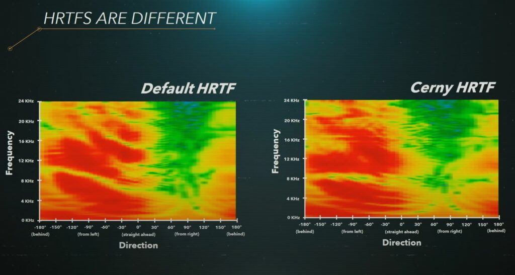
_To get this done, they scanned several hundred peoples hearing data, there known as HRTF (Head Related Transfer Function) and handpicked some of the most common ones to put it into the TEMPEST engine. He also explains that given the fact if this complex and very subjectional/individual perception – and the fact not every user can be scanned to get their personal HRTF – maybe not everyone is physically able to perceive 3D audio correctly – for some it only seems like a bit better stereo audio.

So, in the end one could say future technologies can open the doors for some, but slam the doors shut for others. Although they will try to synthesize HRTF data in the future to maybe make it able to even a wider range of people it may be locked aways for some forever.


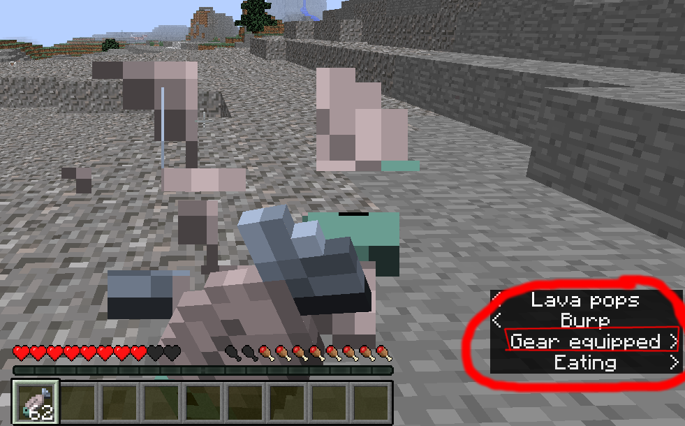
_On a side note, MINECRAFT (MOJANG) also did some development into a highly sophisticated system for full 3D spatialization for ingame sounds as an optional feature, meaning you could determine the location of a noise emitter very accurately by hearing it alone. In the end, this system was turned down serval notches (pun intended) to it only determining, if a sound offscreen comes more from either the right or left side and indicated this with an arrow appended to the subtitles pointing in either one of these to directions. They scrapped the idea of spatial sound effects because they realized in competitive games this feature could, if turned on, help players gain an unfair advantage against other which chose not to play with it.


_Literature & Resources

  1. The Road to PS5, Mark Cerny https://youtu.be/ph8LyNIT9sg
  2. How PlayStation 5 Was Built (feat. Mark Cerny) https://youtu.be/cJkx-OLgLzo
  3. https://blog.de.playstation.com/2021/05/11/3d-audio-der-ps5-die-entwickler-von-returnal-und-resident-evil-village-sprechen-ueber-die-tempest-engine-technologie/
  4. https://medium.com/potato/the-right-to-play-accessibility-in-gaming-a954b01023f

_DARK SOULS & the problem with Accessibility

_The debate about the game DARK SOULS (FROMSOFTWARE) and its lack of accessibility due to a missing feature of some difficulty setting seems to never stop. But why is this a problem?

_In the previous post we talked about what makes a barrier and what makes a game? If you take away its core feature or game mechanic, which makes it unique, what also be considered as a barrier – what is left of the game? Often only the narrative.

_In the DARK SOULS series, the main game mechanic are the overwhelming odds you face as a player as you traverse the game, and the feeling of being stuck endlessly on a portion of the game only to finally overcome the impossible seeming odds and beat the boss which decimated you relentless in your last tries – only to face such a challenge very soon again. Many people though don’t get the luxury to just ‘get over it’ and due to its high skill cap and rather complex controls, many players just don’t get far enough to enjoy the game properly. They ultimately abandon the game and choose not to play it any further. Because the narrative is one of a kind, it’s a shame that this is locked aways for many players. But the game being hard is in the end, its core feature which makes it stand out and what makes it DARK SOULS; so it would be no wonder if nothing ever comes to this game in the regards of accessibility.


_Literature & Resources

  1. Should Dark Souls Have an Easy Mode? Mark Brown, GMTK https://youtu.be/K5tPJDZv_VE
  2. https://medium.com/potato/the-right-to-play-accessibility-in-gaming-a954b01023f