Background
Touch interfaces for musical applications have been first introduced in the early 90s by Schneiderman. They started out controlling vocal synthesis. Since then the Monome grid has developed into the standard of interfaces for musical equipment over the last 15 years.
The article I read explains how they made an effort to provide an other solution to it. Their suggested solution is a grid device with capacitive touch technology to use swipe gestures as a menu system, expanding the interface capabilities of the popularized Launchpads nowadays.
One of the reasons that might have made the launchpad keep it’s simplicity and popularity is the fact that most instruments rely on haptic feedback, but almost none rely on visual feedback.
These two grid controllers, Tenori-On and Monome Grid har pushed their interfaces into the music industry which have been the same for 15 years now.
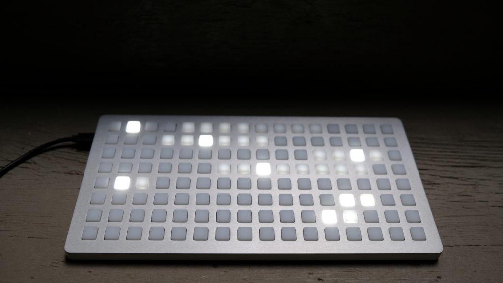
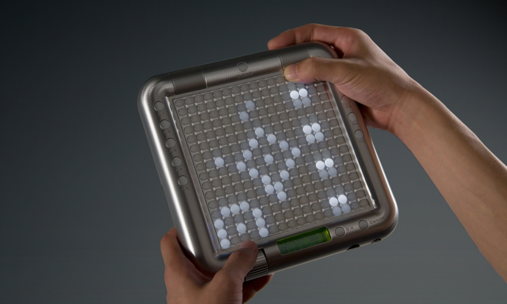
It’s now in more recent times adopted by the more popularized and professional standards in the different Launchpads.
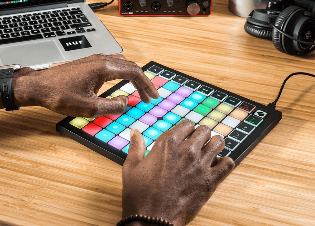
The great thing about the interface and allegedly why it’s been adopted is it’s generic layout which allows any artist to customize and play however they want.
Added functionality to the grid layout is the buttons around the “core” allowing the launchpad to control different hardware interfaces with specific software.
Their project
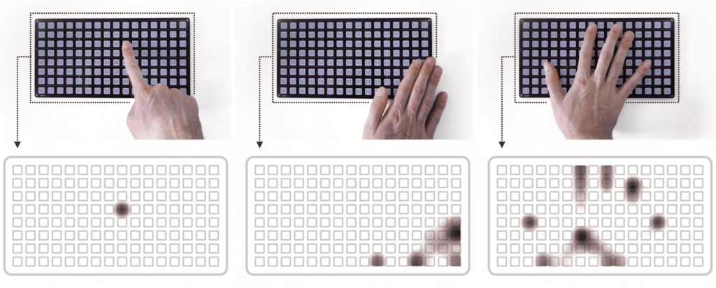
Touchgrid was developed to solve problems from limited resolution and restricted space provided by grids using touch interfaces. It keeps the generic button layout of the launchpad, but uses capacitive touch to extent it’s possibilities.
1st iteration
Their solution was the capacitive touch display consisting of 16*8 grid of touch areas. By using time-based date they recognized different interactions such as swipes and bezel interactions.
Problem: Due to their now huge processing requirements, the system ran on a slower maximum sample-rate than preferred.
2nd prototype
For their next prototype they used a Adafruit NeoTrellis M4 which is a readymade DIY kit. Using LEDs and silicone buttons to expand their Launchpad.
Chosing from a wide range of possible interactions they chose the “Drag from off-screen” and “Horizontal swipe” as their interactions as they are well known from smart devices adopted by the common public today.
with a more restricted but better hardware layout they manage to fix their problem with high sampling rates and hence performance was bettered.
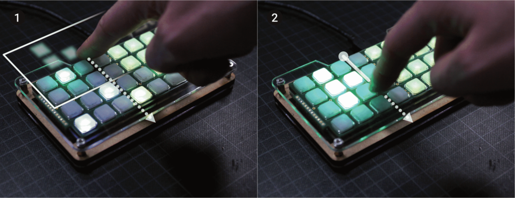
In an innovative solution this group made interactions replace the buttons from the Launchpad, allowing more space for music, less for navigation. The buttons allocated to menu-changing actions from the launchpads were now replaced with swiping motions we learned using our phones.
Their new menu layout is made in a spatial context to reduce the learning curve and mental workload of learning their device. Using the swiping interactions mentioned earlier they make an intuitive mapping as shown below.

In the end they managed to gather user insight from 26 people with prior knowledge of how to use similar instruments. Answers from their survey revealed that the touch patterns are recognized and their mapping works. There is however worries that the suggested interaction system might add complexity and interferences with an already working product.
Conclusion
As they are saying themselves, they will make the argument of expanding the capabilities of tangible devices instead of making touch screens more tangible. Meaning that they will take their learning from touch screen interactions and implementing them on the grids and tangible devices for a haptic screen feel.
Being an interaction designer it’s refreshing seeing a well developed tangible interaction system stand its ground towards more “modern” screen touch-based ones. In a very human way this project combines what we know and adopted from before with another dear interaction to us from another system.