I am going to kick off with a phrase from Viktor Baltus, he is a typography guru who gives very interesting talks and online classes, and in it’s last course he mentioned something, which describes my topic very well:
“Everyone can look at a laid outspread and judge if it’s professionally done, it’s harder to quantify that professionalism. Why do some layouts work and others do not? And more importantly, how can you recreate that professionalism? – Viktor Baltus
This semester I want to focus on designing layouts, and how style changes are perceived by the audience,I will also include a lot of typography and compositions.
“A grid is only useful if it is derived from the material it is intended to handle.” – Derek Birdsall
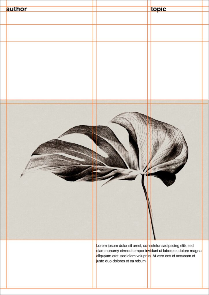
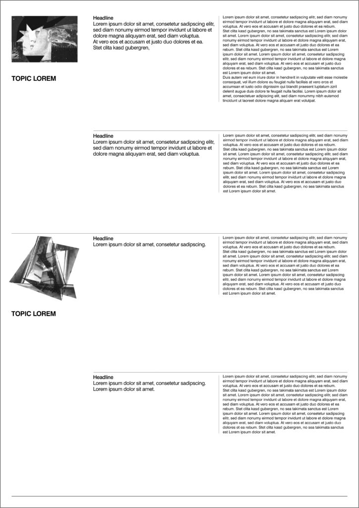
The secret to professional-looking designs lies in the arrangement of visual elements and how they are positioned in relation to each other. It’s a combination of layout and grids. The words layout and grid are related but are different things. The layout is the overall way of presenting your text and images and includes things like size and product. Grids are the backbone of a layout and are used to create the hierarchs of your text, images, and other visual elements. So in this post I played a lot with different grids and created random layouts out of it. Following I am going to list some of the most common grids which are used as a base to create layouts out of it.
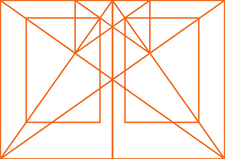
Gutenberg Grid
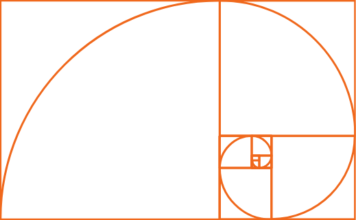
Golden Ratio
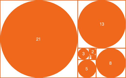
Fibonacci Sequence
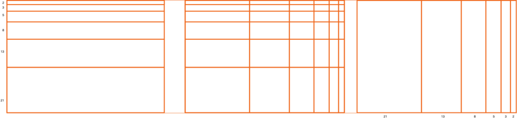
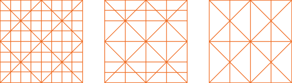
Fibonacci Sequence as a Grid
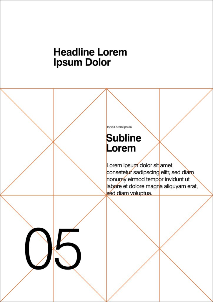
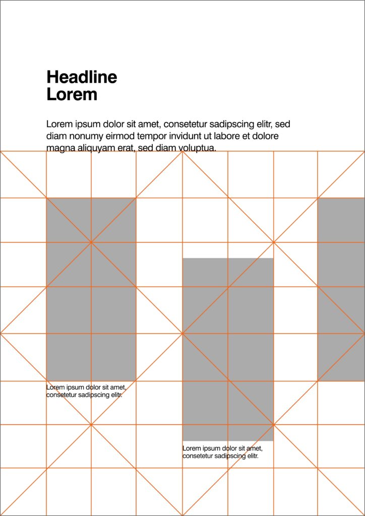
Rabatment Composition
Not every design needs a perfect Golden ration of 1:1.61. A lesser known composition method can often replace this theory and is called Rabatment. Rabatment is a composition method that consist of overlapping squares in a horizontal or vertical rectangle, regardless of the dimensions.
When you overlap two Rabatment squares in a rectangle, they create another rectangle. We call this secondary Rabatment.
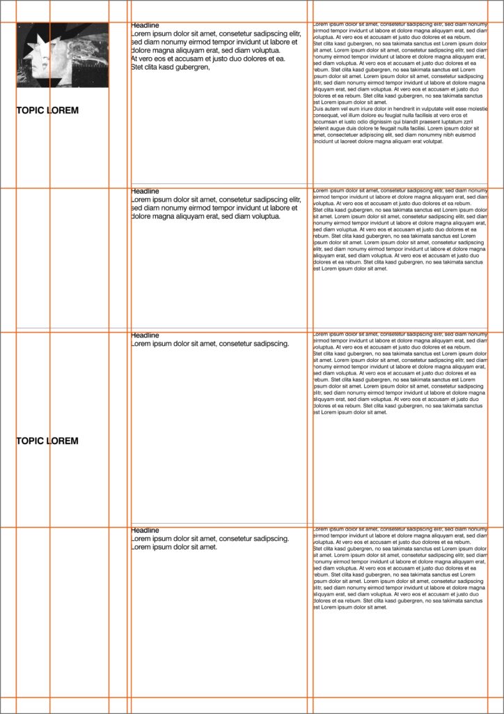
In layouting, this method can help you align columns and images for structured look. Following there will be shown how this grid can be applied.
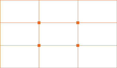
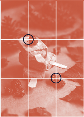
Rules of third
Rules of third can be used to align elements to either the lines or the cross sections for a better composition. Because we’re so familiar with perceiving the world this way, looking at a layout which is in line with the Rule of Third is often pleasing to the eye.
Gestalt Theory
Besides all the mentioned mathematical and optical composition theories there is an another theory: Gestalt, the psychological theory behind compositions.
Simplicity
The theory of simplicity states that forms are easiest perceived in its simplest form. We see this clearly when looking at typography: Letters that are grouped together form words; letters that are separated on your artboard are more actively perceived as single shapes. A good layout design makes use of simplicity to balance the components on your artboard.
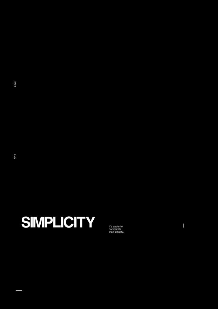
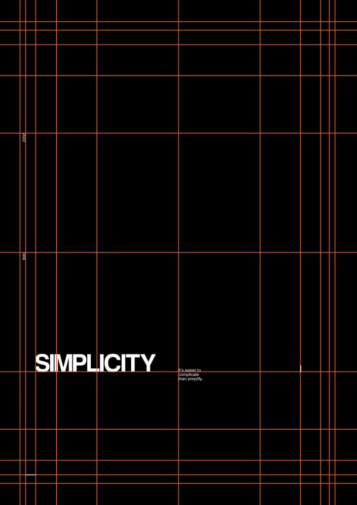
Figure Ground
The figure and ground theory will help you make your layout more dimensional. The so-called „figure“ is often perceived by the mind as the focused object white the „ground“ is automatically placed in the background. A figure doesn’t have to be an actual figure, it simply indicates the text, image, or another object that the observer should pay most attention to.
The ground frames this element so it stands out more. Keep in mind that convex elements are often perceived as figures while concave elements are often perceived as ground elements.
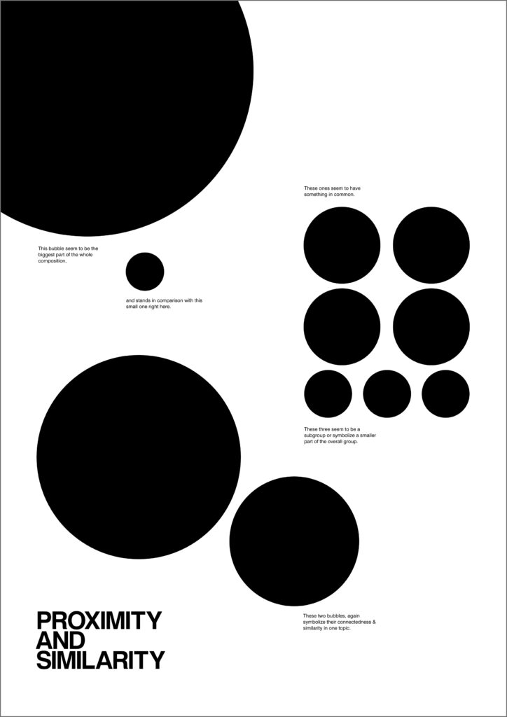
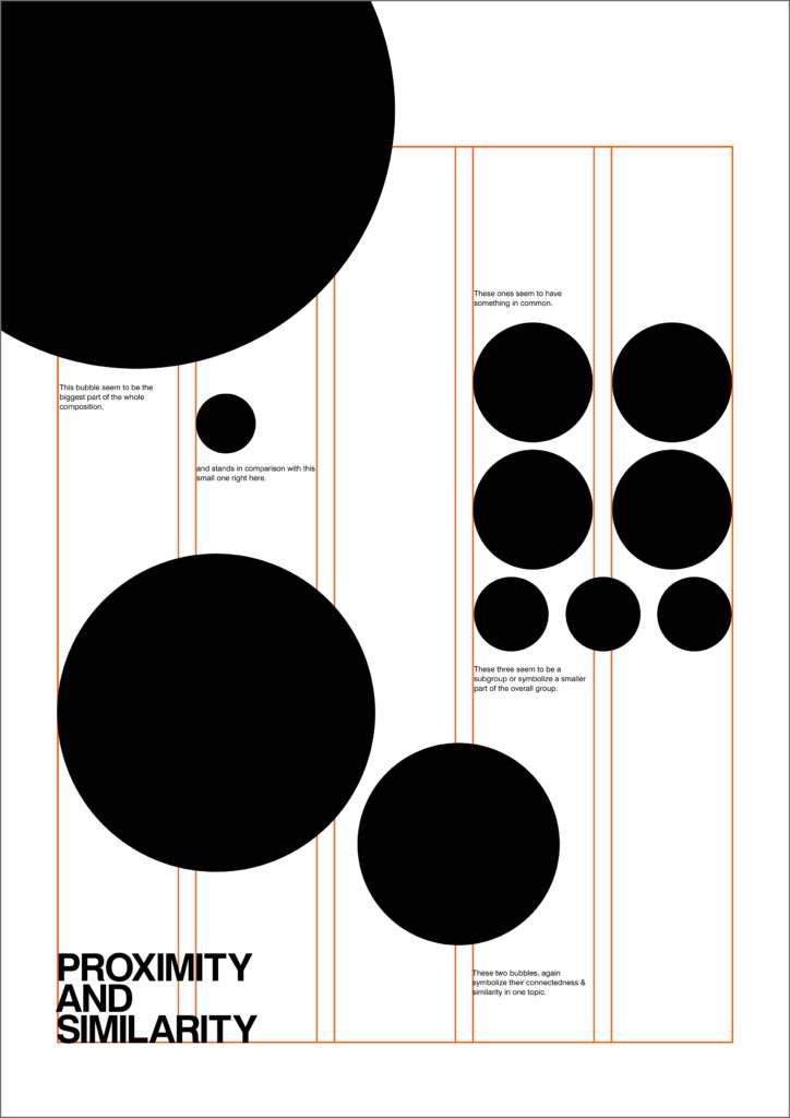
Proximity and similarity
Elements that stand in close proximity to each other are often perceived as being from the same group. This does not only apply to columns or images but also to elements that have a similar shape, color, direction, or font size. When designing a layout, for instance, a music program with lots of information about the music, times, and musicians, it will help the viewer better understand the structure if items about the same event or grouped together or when all times are displayed in a timeline.
Symmetry
Design elements that are symmetrical are perceived as part of the same group. We can see this in the layout of spreads, where the right page is mirrored copy of the left. This can also be applied to the layout of elements that have the same value in terms of importance.
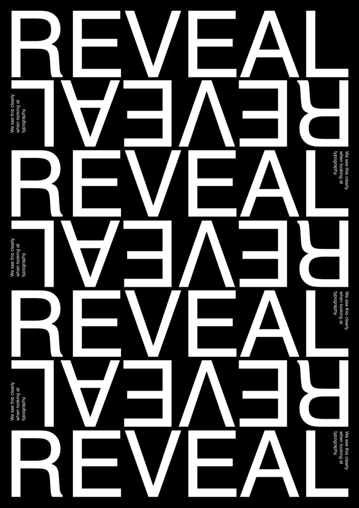
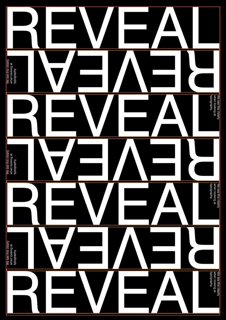
Continuity
Design elements that are aligned with each other are. perceived as being from the same group. The example above has letters of the title missing, but because they are placed in line with the beginning of the word, we can extend the word easily in our mind. The sam theory can be applied to placing the columns on different fields of the modular grid, forming a structure the viewer can follow.
Connectedness
Connecting elements like lines, dots, and shapes are perceived as connected. A good example of this theory can be found in the layouts of infographics, flowcharts, or timelines, where arrows, lines, and dots help connect one topic to the next.
As seen, there are endless possibility to make layouts based on grids.
So I wanna end this post with a phrase from Massimo Viglenni:
„Styles come and go. Good design is a language, not a style“