by Laura Varhegyi, Mira Kropatsch and Marton Szabo-Kass
Design is a discipline, but also an approach and a mindset.
/Emilio Lonardo/
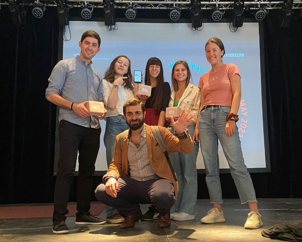
During this year’s International Design Week (10.-13.05.2022) at the FH Joanneum’s Institute for Design and Communication, we participated in the workshop of Emilio Lonardo. He is a designer and CEO of the company D.O.S. Design Open Spaces in Milan, Italy, and was invited to do a four-day workshop with the title “Augmented Habitat (AugH)”. We were a group of 7 students participating, coming from the master courses Communication Design, Exhibition Design and Interaction Design of FHJ.
Each day we had icebreaker exercises and larger tasks which taught us about the approach of augmented habitats. At the end of the week, we were able to use our newfound understanding, to produce a final product. On Friday, all results had to be presented to the whole audience of the International Design Week.
Speed Dating
It takes 7 seconds to generate a first impression of a person. To get to know the group at the beginning of the week, everyone had 7 seconds to talk with each participant and form an idea about them (we didn’t know all the participants before). After the seven seconds were over, we wrote down our personal thoughts about the person, who he/she might be and what trades they probably have. Afterwards, we collected the anonymous notes and read them out loud, one after the other. Each note had to be accepted and taken by someone. We of course never knew for sure if the trades were meant for us, but we had to think about how others might perceive us (in a speed dating situation). As the last part, we summed up our chosen notes and presented ourselves in front of the group, with those trades and a little story about us combining them.
It was insightful and challenging to think about our outside perception and image we show others.
Our own spaces
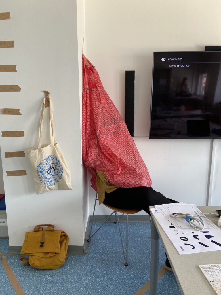
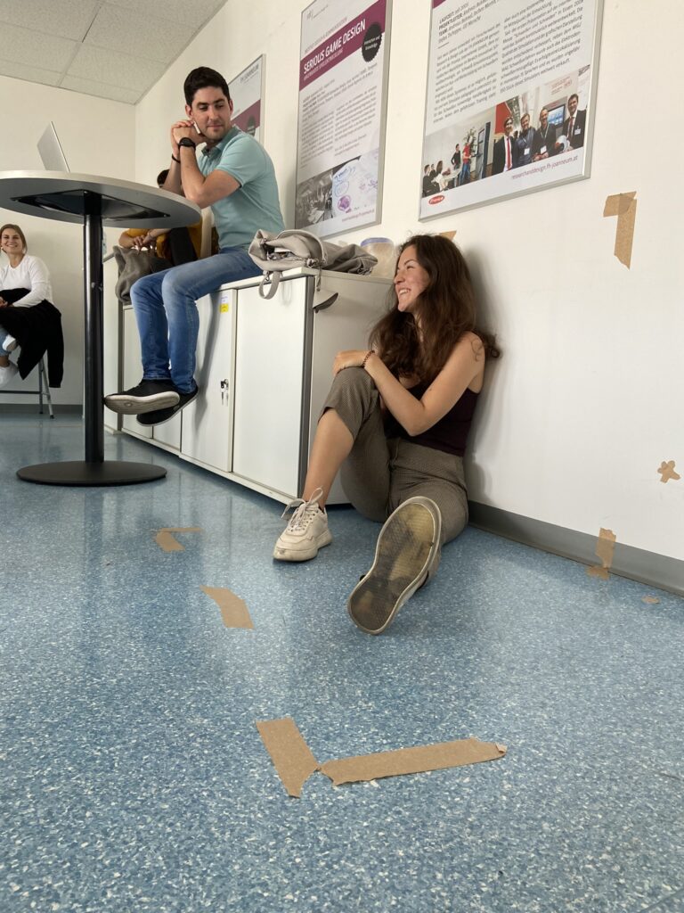
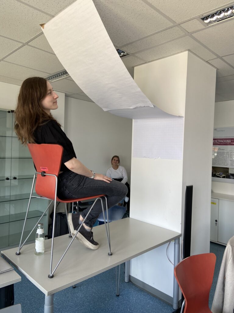
We wanted to actively use the space around us and therefore selected a space in the classroom we could modify with furniture, our stuff, masking tape and paper in several ways. And not only to change the set up, but also think about the way we want to function and the type of relationship we want to create. We defined the dimensions with masking tape and someone also left a gap open for the entry of the defined space. We started to see many elements we didn’t consider before, like the light and the view, so the way we positioned ourselves to the windows became crucial, just to have the perfect lighting condition. These spaces turned out to be multi-functional and very minimalistic. We presented our ideas to the group. These spaces were meant to be separating us, but also to share it and to have visitors coming over. We also had to come up with a pose for the space, because our own body was also a parameter in the realm we created and to showcase the relationship we fostered in the space.
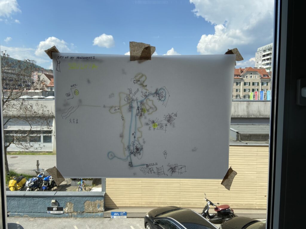
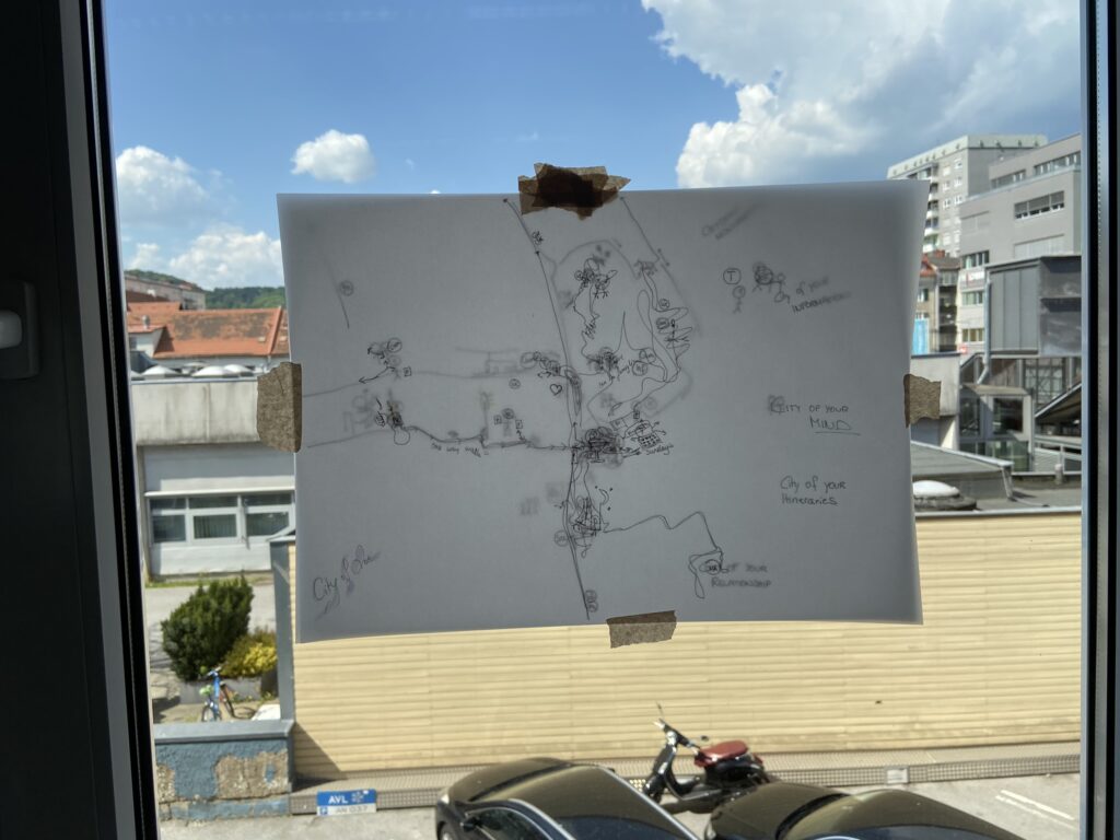
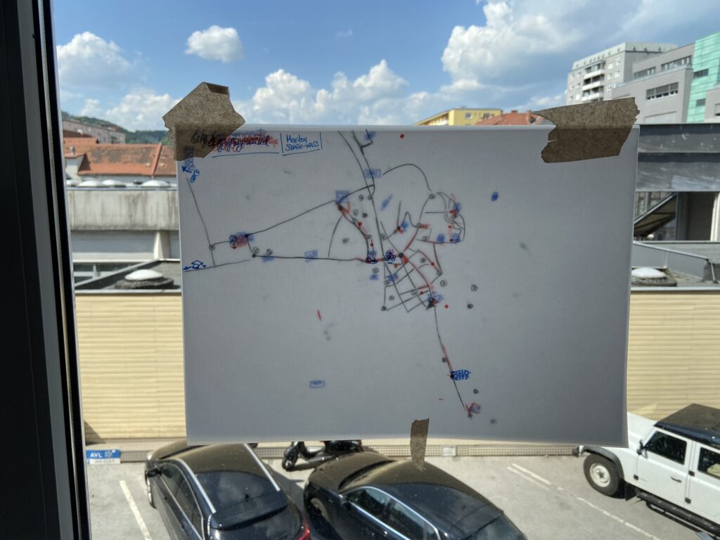
Our personal city maps
Through five different topics, we have created our own city maps by drawing on see through paper on top of the real city map of Graz. We highlighted locations, streets and areas to draw our own
- City of monuments: orientation signal elements, symbols and images that serve as visual references,
- City of information: all the places where we talked on the phones, took photos, got or gave information,
- City of itineraries: all the places where we commuted or parked or left a trace,
- City of our mind: all the places where we had spiritual or emotional events or experiences,
- City of relationships: all the places where we met, joined, hugged, flirted or kissed someone.
By putting these different maps on top of each other, we could reveal our personal spatial areas of interests in Graz. It gave us a birds-eye view on the streets and places that we use the most or not at all. By comparing the personal maps of the participants, the city’s hotspots could be highlighted, as well as the differences in their lives, motion ranges and individual favourites. As in other exercises, here we could also see how different the perception of people can be about the same city.
A day in the life of
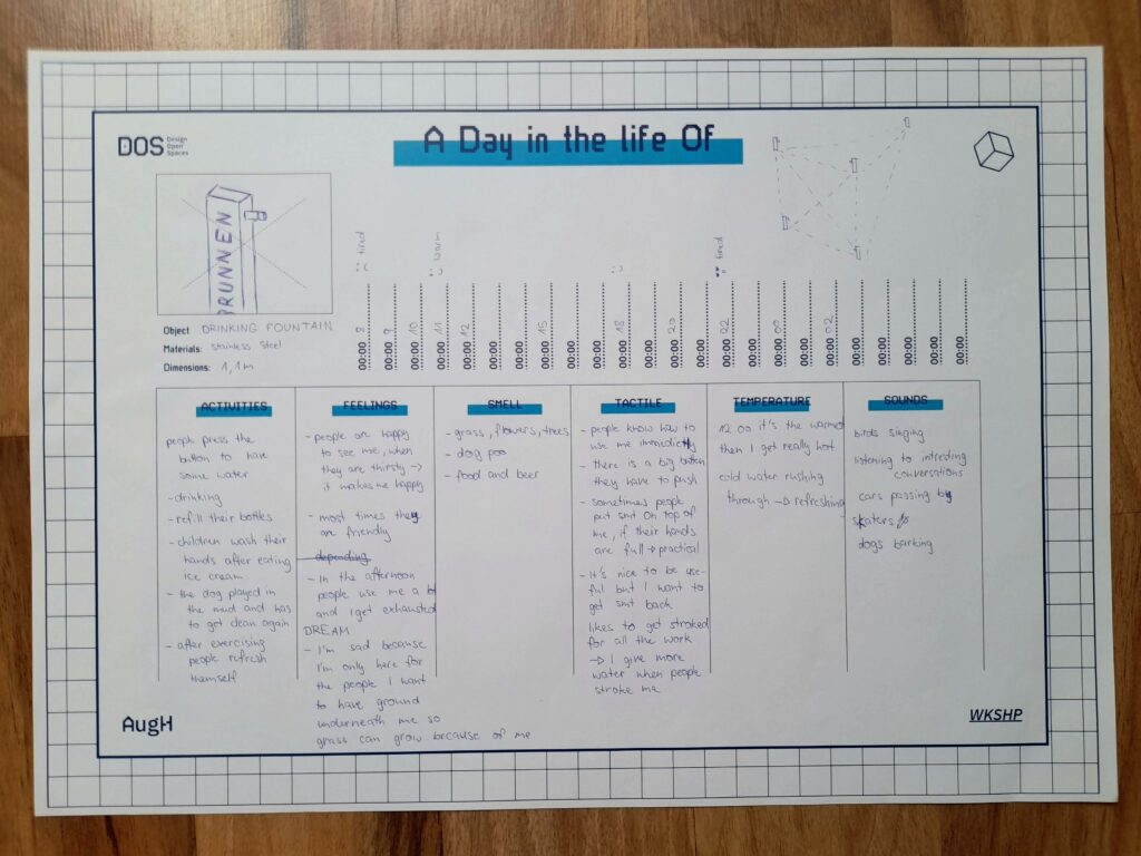
For this exercise we had to select an urban artefact and write down their “daily routine”. This was all about the meaning an object could hold when they are alive and finding deeper understanding in their needs, feelings and relationship with their surroundings, people and animals. We put ourselves in the shoes of a storyteller, gave the artefacts a backstory and filled out the template for the daily routine with time stamps and the categories: Activities, Feelings, Smell, Tactile, Temperature and Sound. Emilio gave us some great input and we knew we had to dig deeper to find new connections in the stories and came up with new ways these objects could communicate with each other and the outer world. The stories couldn’t get crazy enough, so that was very fun, and also insightful to change the perspective and think about interactions in another way.
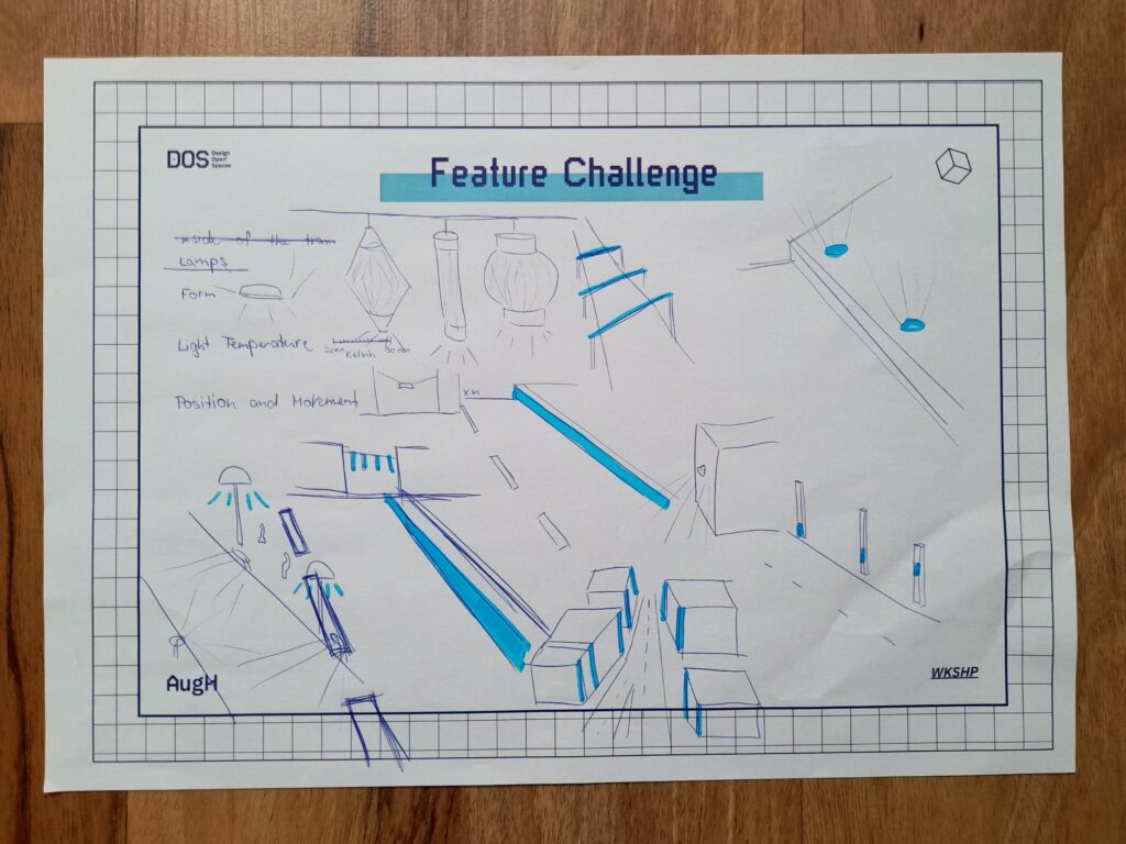
Redesigning city objects – Feature challenge
Every object in the public spaces has its purpose and was (mostly) designed to fulfil some specific needs. In this task, we first had to choose an object in the urban public space, and write down their three main physical characteristics – like materials, forms, dimensions, etc.
Next, we had to redesign the chosen object without using its earlier mentioned three features.
By this, we were forced to think outside the box and concentrate on solving the main problem and purpose of the object in new ways. It was interesting to think about the habits of citizens in interaction with city objects, and how these habits can change if we redesign the objects.
SAugHFari
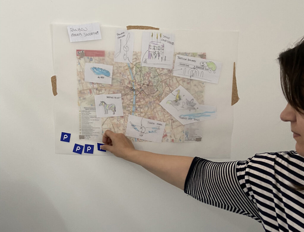
Everybody sees the city differently, and the inspiration and possibilities bound to certain places. In this task, we created Safari Tour concepts through the city of Graz with 6 to 7 stops we found interesting, that are also attractions of the places. There we had to take pictures, observe what was happening, pay attention to the people and take notes. The next day we chose a theme for our SAugHFari and made a presentation with the SAugHFari route on the map – explaining the concept, our ideas and the specific features of the tour. We then rated the trips we would join with 6 sticker coins for each of us to vote with. The trips were about places to hang out with friends, enjoy the city atmosphere, see animals or have different sensory experiences. The SAugHFari with the topic: restaurants not to visit won in the end. The selected concept was the base of the final task.
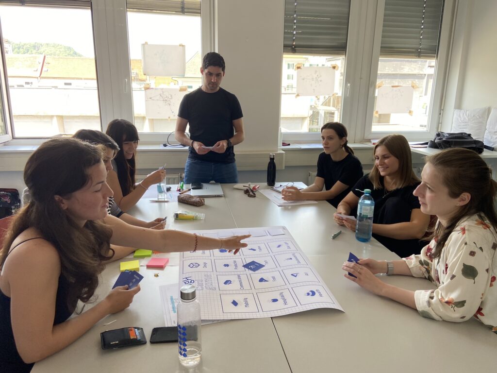
AugH Card Game
Emilio introduced a new brainstorming method to generate ideas for the final product concept. It was a simple card game about communication and connecting different goals in the project. A big sheet of paper had many fields with disciplines on it, like production, finance, mobility, etc. and we got six hand cards from piles like topics, technologies and action. We could put a card on a field and then had to say something linking the two areas together, to keep the conversation going. When we had no cards left, we could draw six cards from the piles again. The actions were fun, because if someone was talking for too long we had the option of a card with “stop talking” or we could just ask further questions by putting the action card down. We were talking for a long time until we had said everything, and then we could use some of the ideas we had and go to the implementation phase of the final project.
Final task: Restaulution
As a final task and project, we chose the most liked SAugHFari trip – from Jasmina Dautovic about the worst restaurants in Graz – and created an Augmented Habitat project concept based on it. The SAugHFari was dealing with the phenomenon of restaurants throughout the city that are not looking very trustworthy or inviting and giving some examples, where you wouldn’t go if you had a chance. So we thought about solutions, how to help these places to change.
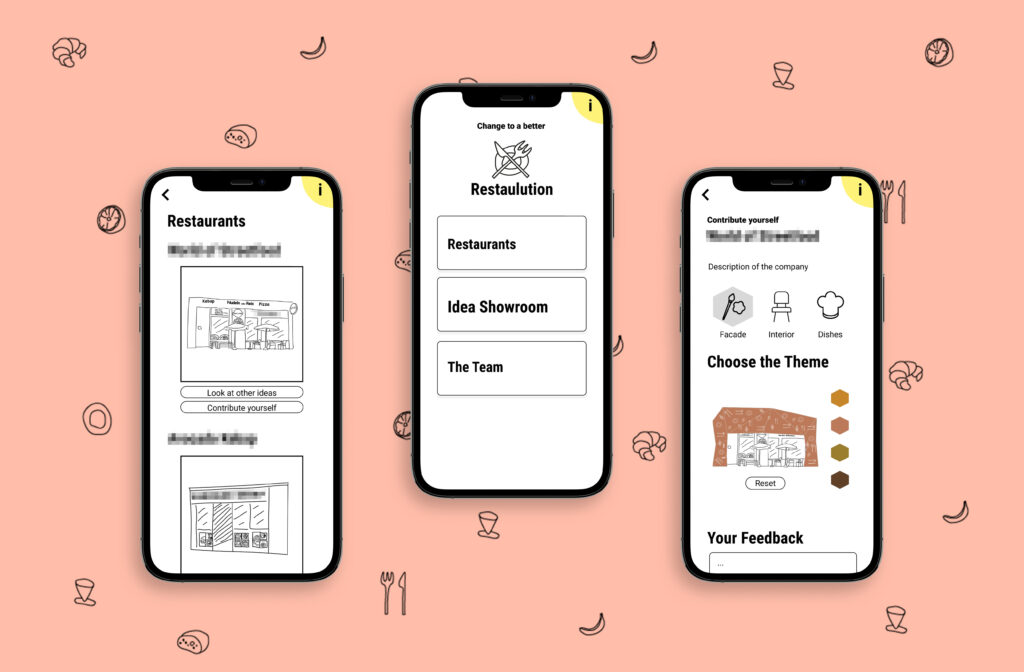
After brainstorming about different implementation possibilities, we described the idea of a platform to help these uninviting restaurants with professional advice and community support.
We named the concept “Restaulution”: the restorative solution to revolutionize restaurants.
The base of the concept is a toolbox consisting of professional design solutions by architects and chefs, that serve as guidance and idea collection for every restaurant owner, who wants to upgrade and redesign their facility and service. Architects, interior architects and chefs could provide building blocks (well proven designs, style guides, recipes, etc.) combined with individual consultation options to the toolbox, from which the participating restaurants could choose from.
The framework would be a digital platform (app and website) to host all features of the concept:
- Listing the toolbox contents (design and culinary) and cooperation possibilities with professionals
- Providing different configuration options for the restaurants
- Providing feedback possibilities for old and new customers to assess current designs → get feedback on what the customers want and expect
- Showcasing design concepts and new ideas for the public – with possibility for the audience to rate them → get real customer feedback on new ideas
- Announcing and showcasing newly implemented design upgrades of the restaurants to attract attention and convince the audience
- Listing all participating restaurants and giving a guide to citizens and tourists about the ongoing projects – advertising possibility
We also built a provisional clickable prototype of the app to visualize the concept. This was made available during the final workshop presentations (read below).
With this concept, we wanted to enhance the city itself as our habitat and improve the quality of living. Uninviting restaurants are mostly neglected and not considered to be a problem, but how much better would the image of the city be if there were only high quality services everywhere?
Dear Reader!
If you have interest, further ideas or feel the potential of the concept and have some possibility and resources to develop the platform further with us, don’t hesitate to contact us – we are open for collaboration to bring Restaulution to life!
CoDE – Continuation, Deterioration, Ending – evaluation
For the execution of this project there would be a leading management team who would cooperate with the city. There are funds to improve certain neighbourhoods and it is also meant to improve the city as a whole enhancing the uniqueness of the communities. We want the restaurant owners to perform their best and with professional support from many disciplines they can also reach their goal and therefore also contribute to the prosperity of their community.
The second important link to the refinement of their establishment is the voice of the people living in the city. They can give feedback and also be part of the design development and vote for their favourite design of the facade and interior.
We evaluated the journey of the Restaulution with the CoDE principle (2 scenarios: Continuation, Deterioration, Ending), in the future, 30 years from now. If the project is doing well, we can update all the restaurants and shops that need our support and this project can be extended to more cities in Austria and Germany.
The project could also get really successful for a couple of months or years, with a lot of support, but then later drop in interest and eventually die.
If the project isn’t managed wholeheartedly from the beginning and the team isn’t well selected or the communication and management fails at one point the project can’t be executed and start to function. But with all the weaknesses eliminated, a great team setup and a lot of support from leading design agencies and the Creative Industries Styria the project can open whole new possibilities for the city.
Final Presentation
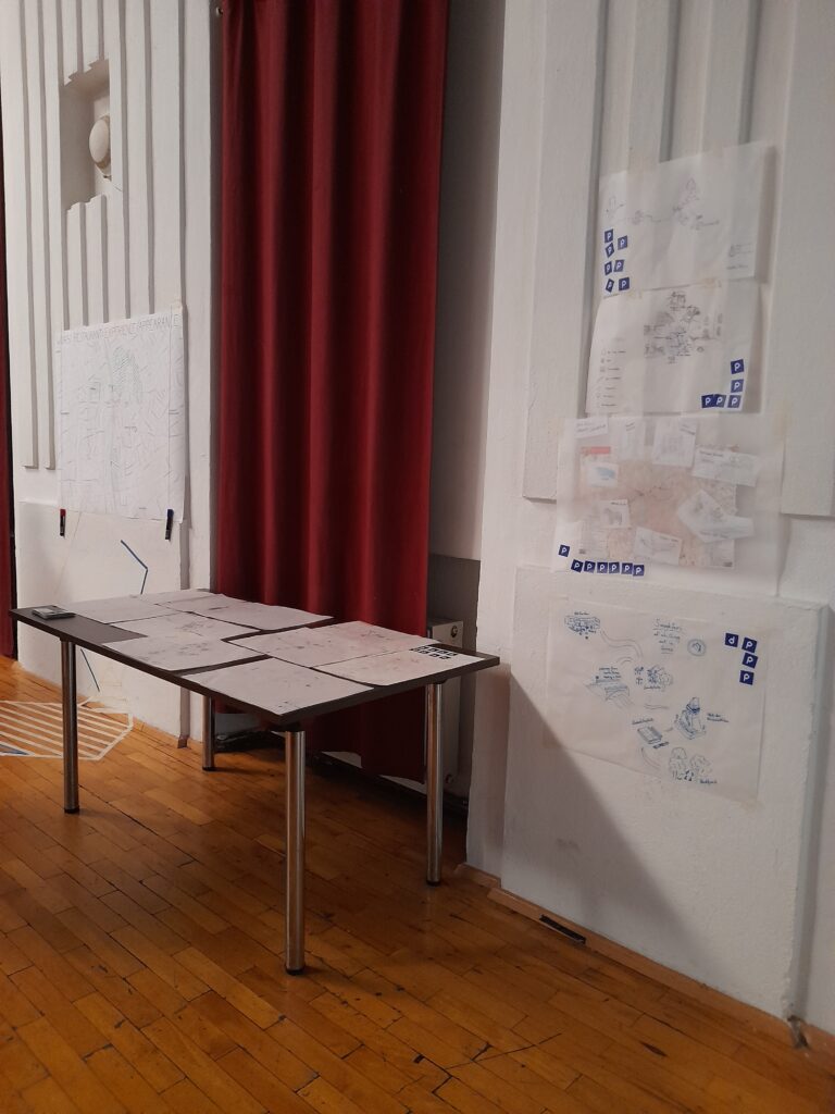
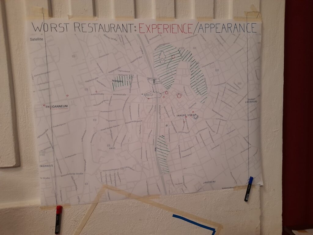
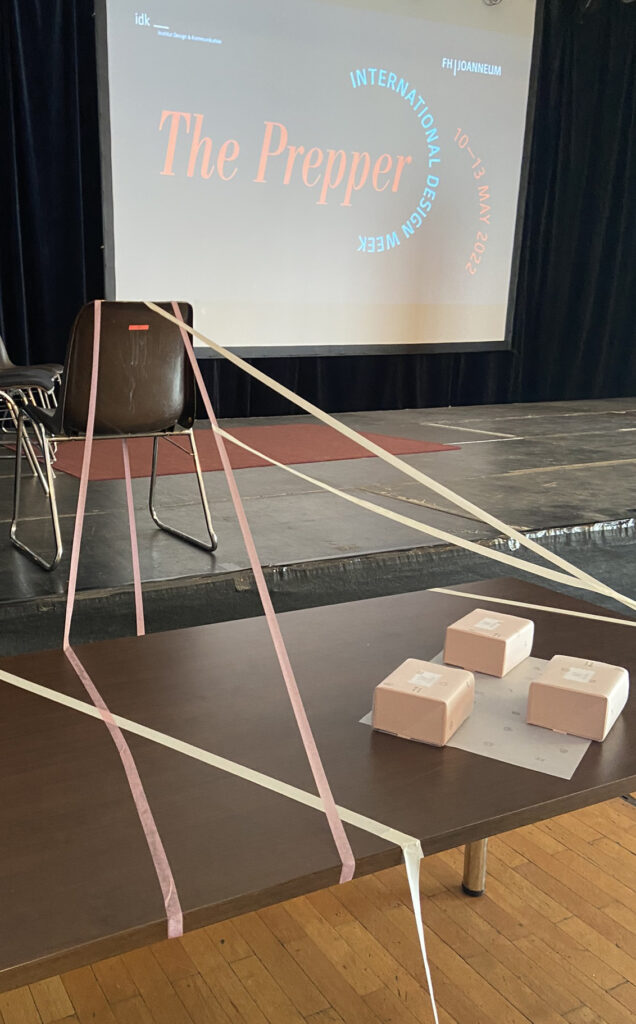
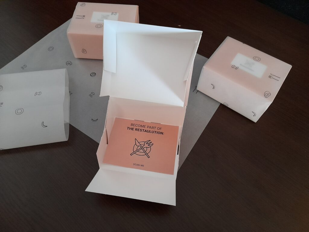
We showcased our workshop results on the last day, but not like every other group of the International Design Week via Powerpoint presentations on the stage. Instead, we built stands around the hall, so people had to stand up and come to us, and also try out our final product. In one corner, people could scan the QR-Codes that would forward them to PDF slides and show the activities we did that week. On the other side people could look at our maps and mark on a big map their worst restaurant experiences and memories in Graz. In the front people could try out our product and open the imaginary “toolbox” packaging with our Restaulution logo, which invited them to become part of the project. The packaging had a hidden NFC chip which redirected people to our prototype they could try out, when they scanned it with their phone. We were all at different stations explaining our project and helping them to navigate through our stands and on the prototype. The audience was very interested and liked the ideas and the execution.
Final thoughts about our workshop
The way a space is designed determines how we use it and behave in it. As designers, we are trained to adapt our solutions to the behaviour of the target group. But it is through more visionary approaches, such as in this workshop, that we begin to think about the fundamental essence of the relationship between people and spaces. This way of thinking allows one to find new approaches that reshape behaviour and, by extension, society.
We had a great time with Emilio, who gave us a lot to think about and handed us tools we could use to broaden our imagination when it comes to problem-solving. With all the activities, he challenged us to think in new ways and starting from other directions when designing. We were fortunate to have an interdisciplinary group of people who could inspire and complement each other with different skills, backgrounds, interests and experiences.
With a multidisciplinary approach in design, it is much easier to tell a story and reflect other parts and aspects of a place, brand, product, etc.. We broke down places into separate compartments when it comes to reimagining and shaping a space. This made it a lot easier to think of pieces coming together and the use of a place / space. Not only things like thresholds, facades and ceilings define a space, but also soft components like light, sound, pollution and time.
We were tackling design, design thinking, public urban space & product design and our habitats from different points of views. The tasks challenged our creativity to perceive and think about our surroundings differently, including not only objects, but humans and their relationship as well.
If one had to describe the feeling of the workshop in one sentence, it would be: a fresh wind of new approaches, which were brought closer to us in a playful way.
Such international cooperations like this workshop are essential for designers to broaden their perspectives and get to know different people with unique mindsets. We will hope and search for similar opportunities in the future as well.
