Excursus: Data Tracking

As data tracking and cookie consents play a big role in developing deceptive design patterns* I would like to make an excursion and dive into privacy and data protection in today’s blogpost. Due to a recent ruling of the Austrian Data Protection Authority on a case filed by noyb, using Google Analytics violates the General Data Protection Regulation (GDPR, dt. DSGVO) and is therefore illegal. Other EU-countries are expected to follow this example. Reason for this is the ruling in 2020 that banned US providers within the European Union, because they violate the GDPR by giving away personal data to the US authorities.

What is noyb?

noyb is an organization founded by Max Schrems – an Austrian lawyer and privacy activist – that focuses on data protection and fights for compliance with the GDPR, thus actively protecting the privacy rights of individuals. The platform combines the work of lawyers, legal tech specialists, hackers and consumer right groups and uses PR and media as a tool to create awareness in order to force companies to comply with the European privacy laws set out in the GDPR. Their strategy is to analyze and find infringements all over Europe and litigate them afterwards. The main goal of the operation is to maximize privacy and digital freedom for all citicens. 

What is Google Analytics?

Like I already mentioned in the intro of this blogpost there has been a pioneer ruling in 2020 – the „Schrems II“ ruling – which legally defined that data transfer to US providers is violating the GDPR, making the „Privacy Shield“ inadmissible. The main reason for this decision was that US authorities have access to personal data, eg. user identification numbers, IP address and browser parameters, by US law. However the big players in the tech industry like Microsoft, Facebook, Amazon and Google tried to find loopholes by editing statements in their privacy policies instead of actually making their services comply with the new laws. Consequently Schrems filed 101 complaints in many European states to against those companies. The Austrian Data Protection Authority was the first one to react on this complaint by declaring Google Analystics an illegal service in Austria. As other countries are likely to follow this will create pressure on Google and other US providers to adapt their services and protections. If they don’t choose to adapt or host foreign data inside Europe, EU websites are forced to use different tracking tools, even if Google Analytics is the most common statistics program at the moment by far. For now there is no further information on possible penalties. In the long run the responses of the US government will determine wether US providers will eventually comply with the GDPR or there will be different products for US and EU in the future.

Sources:
https://noyb.eu/en/austrian-dsb-eu-us-data-transfers-google-analytics-illegal
https://orf.at/stories/3243496/
https://www.derstandard.at/story/2000132495447/behoerde-google-analytics-verstoesst-gegen-die-datenschutzverordnung

* formerly called “dark pattern”
Analyse Deceptive Design Pattern (part2)

This week I found another „good“ example for a deceptive design pattern* to analyze.

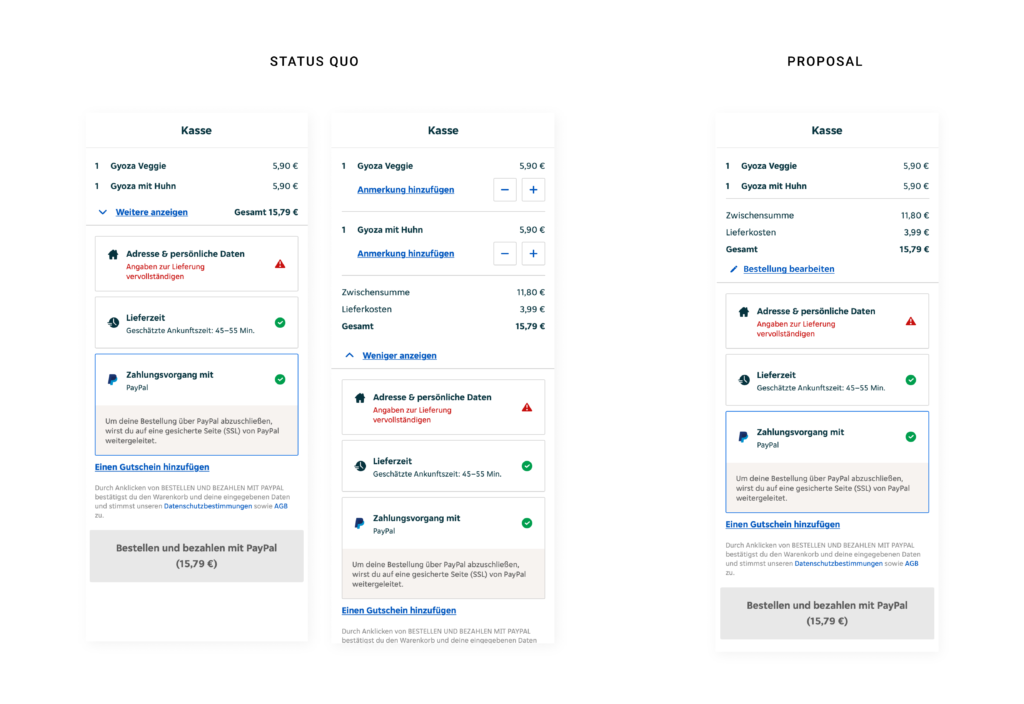
Within the checkout process on Lieferando.at they provide a short summary about the order and give feedback on filling out all relevant data to place an order. It seems like they list ALL cost and sum them up, but if you have a closer look the amount is bigger than the summary of the listed products. So the user has to click the button „Weitere anzeigen“ to see, that they add additional cost for delivery. As there would be enough space within viewport height to make the delivery fee visible from the start, it is clear that they want to hide it on purpose. Apart from additional cost they also give the options to edit the order or add notes for specific dishes in the extended version. Consequently it would increase the usability of the site to also change the wording from „Weiter anzeigen“ to „Bestellung bearbeiten“ („Edit order“). On the right hand side I added a quick-fix-design-proposal to cancel this deceptive design pattern* and enhance usability.

* formerly called “dark pattern”

How to deceptive design pattern

This week I’ve been looking at what makes good design and what rulebooks can be consulted. Conversely, I thought about whether these could be used as a guide for creating deceptive design patterns* by following the respective opposite. Therefore I reviewed rules, principles and heuristics from design legends and usability experts like Ben Shneiderman, Don Norman, Dieter Rams and Jakob Nielsen. And this would probably work pretty well.

Rule 1: Aim for inconsistency

Strive for consistency (Ben Shneiderman)
Consistency (Don Norman)
Consistency and standards (Jakob Nielsen)

If an interface is not coherent the user will have a hard time to operate and navigate. Therefore it is more likely that he makes a mistake by selecting options he did not intend to. Example are to switch „Yes“ and „No“ buttons or introduce new functionalities to established triggers.

Rule 2: Do not provide any feedback

Offer informative feedback (Ben Shneiderman)
Feedback (Don Norman)
Visibility of system status (Jakob Nielsen)

By not giving back information about the last action or current system status, users will not recognize mistakes made. As a result they will carry on with the process until it is too late to reverse it. For example, warnings should be refrained from issuing as additioal costs are added.

Rule 3: Make reversal of action as hard as possible

Permit easy reversal of actions (Ben Shneiderman)
User control and freedom (Jakob Nielsen)

By making it impossible to go back one step without reloading the entire page and loose all previous actions, users might be persuaded to stick with their minor mistakes. Additionally reversing a completed process, like a subscription, should be fairly difficult for example by only providing analog cancellation. 

Rule 4: Make interface utmost unclear

Good design makes a product understandable (Dieter Rams)
Help and documentation (Jakob Nielsen)

If the user is not completely sure how to reach his goal and there is more than one possibility how it could work out, he would just have to guess. Therefore he might complete unintended actions. A common tool for this strategy is implementing trick questions.

Resumé

To sum it up it is the opposite of Dieter Rams famous principle: „Good design is honest“.

If these rules were actually applied to the entire interface, users would probably give up before they could be manipulated. Nevertheless, some similarities and contrasts to deceptive design patterns* can be found here. Thus, it would be a possibility to establish so-called “light patterns”.

Even if this blog entry contains less scientific facts, it was an exciting change of perspective for me. Next time I am going back to psychology and dive in deeper.

Sources:
Norman, Donald A., and Basic Books Verlag. The Design of Everyday Things. Revised and Expanded ed. 2013. Print.
Nielsen, J. (1994a): Enhancing the explanatory power of usability heuristics. Proc. ACM CHI’94 Conf. (Boston, MA, April 24-28), 152-158.
Dieter Rams: The power of good design. In: https://www.vitsoe.com/us/about/good-design
Shneiderman, B., Plaisant, C., Cohen, M., Jacobs, S., and Elmqvist, N., Designing the User Interface: Strategies for Effective Human-Computer Interaction: Sixth Edition, Pearson (May 2016)

* formerly called “dark pattern”

Deceptive Design Patterns – Psychology of decision making

Within todays blogpost I tried to focus more on the psychological aspect of decision making in general and researched some psychological models.

Decision making is the key element of user interaction, hence a big opportunity to manipulate user behavior purposely. For this we need to understand how the process of decision making works. Cognitive psychology research states that there are two opposing systems within human decision making. One works unconsciously, quick and without any effort as it is based on emotions and finding a simple solution. The other one is rather slow and conscious, because it relies on processing data, thinking through possible outcomes and making reasoned choices. Most of the time (95 % of cognitive activity) decisions are made unconsciously – using the first system. Those are intuitive choices and usually linked to going with your gut („Bauchgefühl“). Another important factor in the decision making process is the mood of the user. This in turn can be consciously controlled by various design aspects (e.g. color, visuals or creating experiences). A common way to influence user decisions is nudging. Nudges are defined as following: “changes in choice architecture that predictably influence decisions without restricting freedom of choice” (Peer, E.: Nudge me right: Personalizing online nudges to people’s decision-making styles. SSRN Electronic Journal. 2019, January 29). A famous (positive) example for this is the default choice for organ donors to make it an effort to opt out. Of course this can also be implemented in a negative way and be turned into a deceptive design pattern*.

Don Norman also researched on how emotions influence user behavior in his book „Why we love (or hate) everyday things“. He refers to three levels of the emotional system: the visceral, behavioral and reflective levels. Firstly visceral design is all about the visual aspect of objects or websites. As many objects and companies offer one and the same function, the „looks“ or branding is the only way to differentiate between them. Especially colors, shapes or styles play a big role here. Secondly behavioral design is defined by usability and the way the products works in an environment. Creating pleasure and enjoyment by using the product is the main goal to create positive emotions. Last but not least reflective design is about rationalization of a product. Reflecting on all known information about this product and making a thoughtful decision. So this aligns with our second system of decision making – the conscious one.

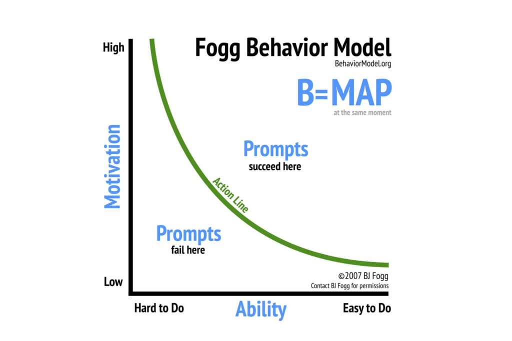
Source: https://behaviormodel.org

In Foggs behavior model he describes how behavior can be changed with a trigger depending on motivation and ability. The higher the motivation and the easier the task, the more likely is a trigger to succeed. Motivation itself can be divided in intrinsic motivation, triggered through curiosity or meaning, and extrinsic motivation, referring to money or rewards. While extrinsic factors work better for basic routine tasks, complex tasks usually need intrinsic drivers. Examples for ability factors, that can be shaped by designers, are time, resources, effort, …

Next steps:

  • Analyze specific tools of „dark psychology“
  • Find best (or in this case worst) practice examples for each tool
  • Find out if they can be reversed / turned into a light pattern

Sources:

https://www.interaction-design.org/literature/article/norman-s-three-levels-of-design

https://dl.acm.org/doi/10.1145/3173574.3174108

https://doi.org/10.17011/ht/urn.202008245641

https://behaviormodel.org

* formerly called “dark pattern”