Home is a place where you feel comfortable. And that’s exactly how it should be with your smart home app. The app should offer all important functions and be visually appealing. Animations are also important in the home automation app, because they can improve the user experience, help to stand out from the crowd and can draw attention to important details.
In the following blog post, I set out to find visually appealing apps that have a presentation and layout that matches what makes a smart home app enjoyable to use for me.
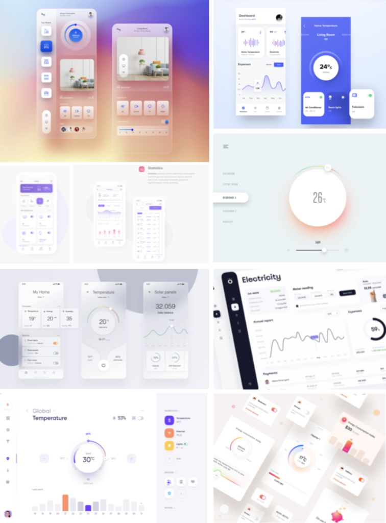
I find designs that clearly visualize the house’s internal data, also take into account the energy balance and play with colors to allude to normal or increased energy consumption particularly sophisticated. I find it practical to subdivide the rooms, list finances and link them to my own smart home devices.
SOURCES:
https://www.behance.net/gallery/106131421/Smart-Home-Concept-App?tracking_source=search_projects_recommended%7Csmart%20home%20device
https://dribbble.com/timovaknar
https://www.behance.net/gallery/109073993/Smart-Home-UI?tracking_source=search_projects_recommended%7Chome%20automation%20dashboard
https://www.behance.net/gallery/111058123/Smart-Home-Dashboard?tracking_source=search_projects_recommended%7Csmart%20home%20dashboard
https://dribbble.com/shots/15607438-Smart-Home-mobile-app-design
https://dribbble.com/shots/16742459-Public-Services-application-Dashboard
https://dribbble.com/shots/9975286-Household-Energy-Monitor-components