Volta & the world of data visualisation.

Are you tired of estimating your energy consumption and not being able to track it in real-time? Then this blog post is for you. My master thesis VOLTA – the smart energy application will innovate the way you monitor your energy usage. VOLTA visually represents your real-time energy consumption, making it easier for you to understand and control your energy usage. In this blog post, we’ll delve into the research I’m currently in, the features and benefits of interactive data visualisation and how the thesis and especially the project Volta can help you become more energy efficient. Let’s go.

Why do I want to research in this topic?

Smart energy applications that visualise your own consumption behaviour can be incredibly useful for helping you better understand your energy use and identify opportunities to save money and help you to live more sustainable. By providing a clear and intuitive visual representation of your energy consumption, Volta can make it easier to track your progress and stay motivated to reduce your energy consumption.

What’s this all about?

In this blog post I want to kick-off my research with the topic of data visualisation, to share the insights I’ve already gained and to provide a starting point for discussion. So, let’s dive into the topic and get inspired.


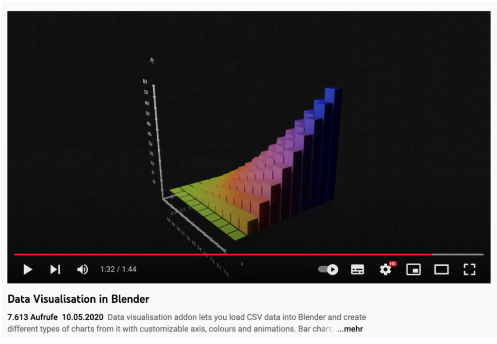
Hello World of Data. The aim of data visualisation is to communicate information clearly and effectively through visuals. There are several different visualisation options that can be used to display your energy consumption data, and the best option will depend on your personal preferences and the goals you have for reducing your energy use. The visualisation is mostly done in geometries, which can be divided into different categories: they show quantities or comparisons, relationships or proportions or distributions, as well as compositions. In addition, data sets can be visualised in different ways, but say the same thing.

Some common visualisation options include:

  • bar plot
  • heatmaps
  • traditional pie chart
  • stacked density plots, mosaic plots, and treemaps
  • box plot
  • the histogram
  • Violin plots and density plots
  • popular scatterplot
  • line geometries

Representing data graphically in the form of graphs, charts, and maps helps users quickly spot trends and assess the status of KPIs. Allowing direct interaction helps users dig deeper to identify patterns and find new relationships in their data. ¹

But ultimately, interactive data visualisation helps turn raw data into business insights and value for the users. Interactive data visualisation leads to better decision making, data accessibility, and user engagement. It boosts collaboration and knowledge sharing, user trust in data, frequent data engagement, and higher satisfaction with analytical tools. The modules of Data Visualisation are: Visual Literacy, Visual Analysis, Visualisations for Business (including Dashboard, Scorecard, Analytic Reports, Analysis), and Visualisations of Tomorrow. 2

With our understanding of interactive data visualisation established, let’s now discuss the benefits it offers:

The benefits of using interactive data visualisation include quicker decision-making due to the brain processing visual information faster than text, easier identification of correlations and connections, ability to spot emerging trends, and opportunities for fresh discussions and insights by telling a story with data. This method of presenting data can lead to better insights, improved business performance, and increase brand awareness by engaging the target audience. 3

What are the features of an interactive dashboard?

Interactive dashboards have features such as quick filters, drill down, chart zoom, hide cells and widgets. Quick filters allow users to easily change data without altering the dashboard for others. Drill down lets users see deeper layers of data. Chart zoom allows zooming in on a specific section of a chart to see detailed data. Hide cells lets users view only selected data. Widgets allow integrations between business intelligence software and other business software to import data automatically.4

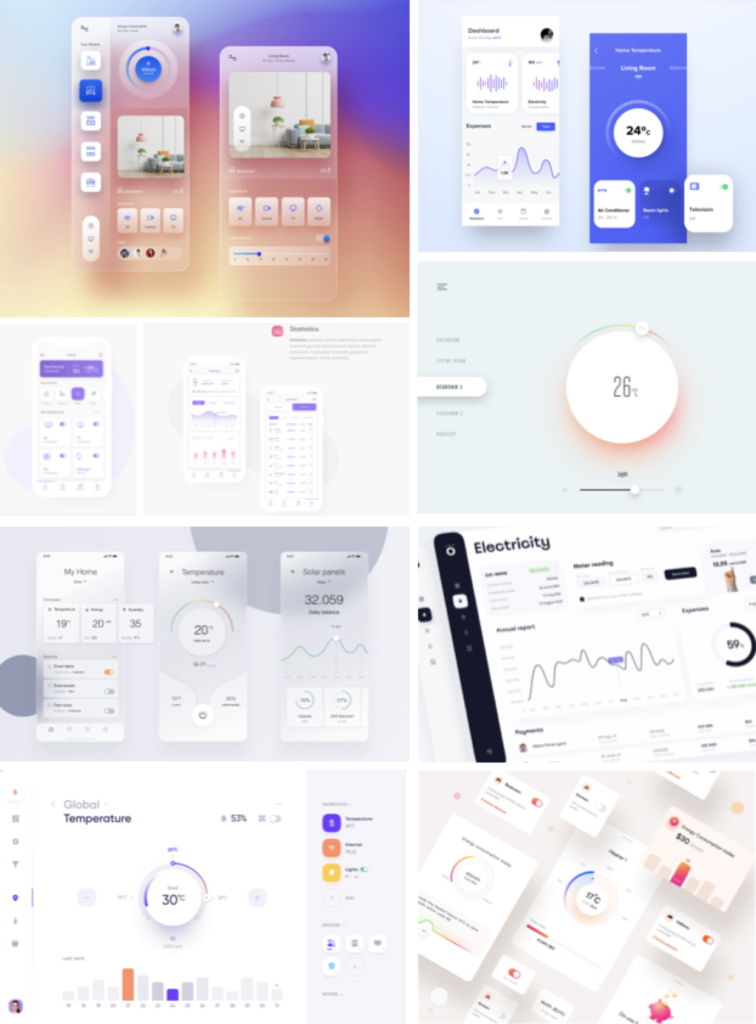
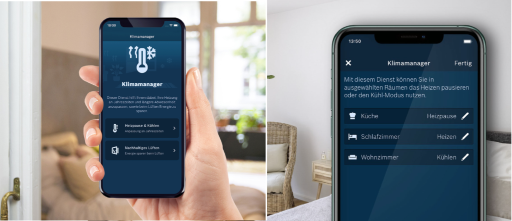
By considering these criteria and choosing the right visualisation options regarding the user’s needs, Volta is a smart energy application that is both effective and enjoyable to use. Whether you are looking to save money on your energy bills or simply reduce your environmental impact, Volta will serve a well-structured dashboard screen with an interactive experience as a powerful tool to help you keep track & manage your energy consumption.

Should you have any inquiries or are keen on the subject, I welcome any questions or input on the topic and look forward to engaging in discussions with you.

Sources:

(1) Stephen R. Midway: Principles of Effective Data Visualization. In: Patterns: Perspective, 1,9 (2020), doi.org/10.1016/j.patter.2020.100141

(2) Jagreet Kaur: Data Visualization: Real-Time Streaming Data Visualization| Advanced Guide, In www.xenonstack.com/blog/streaming-data-visualizations (zuletzt aufgerufen am: 31.01.2022)

(3) Bernardita Calzon: Take Advantage Of The Best Interactive & Effective Data Visualization Examples, In: The datapine Blog: Data Visualization, (2022), www.datapine.com/blog/best-data-visualizations/#benefits (zuletzt aufgerufen am: 31.01.2022)

(4) Andrew Conrad: What Is an Interactive Dashboard?, In: GetApp, Blog & research, (2022), www.getapp.com/resources/what-is-interactive-dashboard/ (zuletzt aufgerufen am: 31.01.2022)

Evalulierung Masterarbeit

Echtzeit. Daten. Haushalt. Die Schlagwörter für meine Masterarbeit stehen fest, jetzt ist die Frage, wie man sie gemeinsam verständlich unter einem Dach kombinieren kann.

Da der nächste Schritt die theoretische Recherche, sowie das Verstehen der technischen Umsetzung sein wird, hab ich bewusst eine Masterarbeit ausgewählt, die folgendes intensiv behandelt.

Masterarbeit von Micha Severin

“Konzeption und Realisierung einer Plattform zur Echtzeit-Netzwerkdatenanalyse” der Fakultät Technik und Informatik der Hochschule für Angewandte Wissenschaften Hamburg, aus dem Jahr 2017

Gestaltung.

Da bei dieser Arbeit das Design nicht im Vordergrund steht, beinhaltet sie keine visuelle Umsetzung, dennoch ist die Arbeit schlicht, verständlich und ordentlich aufgebaut. Auffällig ist die bewusste Hervorhebung der Quellen durch rote Schriftfarbe.

Innovationsgrad.

Der Autor beschreibt in seiner Motivation, das Unternehmensentscheidungen immer mehr auf Datenverarbeitung und -analysen basieren. In einer immer digitaler werdenden Gesellschaft finde ich, vor allem hinsichtlich des Erscheinungsjahr von 2017, ist dies eine sehr innovative Thematik.

Selbstständigkeit & Gliederung und  Struktur.

Die Arbeit beinhaltet einen Autor und ist daher selbstständig verfasst, hinsichtlich Arbeitsweise habe ich allerdings keinen Einblick in den Entstehungsprozess. Durch die Arbeit selbst, zieht sich ein ersichtlicher roter Faden, und sie ist sehr strukturiert aufgebaut. Besonders hervorzuheben sind die Zusammenfassungen am Ende eines Kapitels, in dem der Autor seine Erkenntnisse kurz wiedergibt.

Kommunikationsgrad & Umfang der Arbeit.

Die Arbeit beinhaltet 123 Seiten, das Thema, sowie die Forschungsfrage sind klar und verständlich formuliert und durch einen strukturierten Aufbau der gesamten Arbeit kann man den Forschungsweg klar nachvollziehen, wodurch die Arbeit in Kommunikation und Umfang ordentlich ausgearbeitet ist.

Orthographie sowie Sorgfalt und Genauigkeit.

Sachlich und professionelle Formulierungen, sowie die Verwendung von Fachjargon spiegeln Professionalität und Sachlichkeit wieder. Die Arbeit wurde sorgfältig gelayouted, sowie auf Rechtschreibfehler überprüft, folglich sind keine Auffälligkeiten zu finden.

Literatur.

Sechs Seiten der Arbeit sind reines Literaturverzeichnis, welches representative Quellen aus der Informatikbranche aufweisen. Die angegebenen Zitationen mit Onlinezugang, sind ebenfalls von vertrauenswürdigen und professionellen Herausgeber:innen, wodurch die Arbeit einen thematischen und hochwertigen Content aufweist.

Bring Data Art into your home.

The starting point.

Smart home, smart meter, these terms are sprouting from the floors in the home sector like no other. Everyone wants to live more comfortably and more simply. Everything should be smart and make everyday life easier. Mostly, however, these are lifestyle products, but less about things that inform about the general own consumption. Ok. For the most part understandable – you’d rather be entertained instead of seeing what you’re consuming. I think, however, something fundamental must be changed in this attitude and rather the advantage to be seen, if one understands the own consumption, analyzes and in the best case responsibly can steer.

Searching for the right data. 

My concept should be mostly about the own energy budget, it should be prepared data that arise from water and electricity consumption and generation. Therefore, data of the suppliers, costs, and the various influences on the price, the energy network in particular of the suppliers, as well as the own data in the household, through electricity meters, smart meters, etc. are of interest to me. This data should then be put into a meaningful relation, updated in real time and reflect the information in two modes: informative + abstract. Thus, the product can be used as an informative overview and control terminal, but also as regenerative data art to become a lifestyle product.

What is Data Art?

Data art or also referred to as data-driven art is based on data sets and thus conveys emotions. Compared to data visualization, which only visualizes data, or generative art, which creates emotions by chance, the art of creating data art is that it is explained in an understandable and appropriate way. Data art can be many things, from images, videos, interactive works or physical representation, so-called data physicalization can also be encoded sounds or music, this is then called data sonification. But this is relatively difficult, because pleasant tones and a sound spectrum generated by data do not always harmonize.

Source: https://www.kirellbenzi.com/blog/data-art-definition#:~:text=Data Art or data-driven,come from the artist’s imagination

Next steps.

The next steps will be: Clearly define the concept and also the scope and find out the perfect target group for it. Also, I want to get more familiar with the already existing tools for energy budget measurements and determine which program and tools I need to implement the project.

Tutorials I’ve watched.

Source: https://www.youtube.com/watch?v=qIF7QPu2cOI
Source: https://www.youtube.com/watch?v=wxmqG_jxJiw
Source: https://www.youtube.com/watch?v=23o6I3x6Cbw

Spire Muse: A Virtual Musical Partner for Creative Brainstorming

Every musical creation starts with an idea, which can be a phrase, a sound object or a rhythmic pattern. Musicians are inspired by the individual sounds, bringing compositions to life and playing around the idea by improvising and adding parts to increase complexity. In the context of songwriting sessions of music groups, new compositions are often created through improvisational interactions between the musicians – this is called jams.

Spire Muse is a co-creative agent that supports musical brainstorming. The following is a brief explanation of how it works.

During jam sessions, basic musical ideas emerge, and the more one subsequently interacts with this idea, the more diverse the musical form develops. Creative interaction during improvisation is therefore very important for the emergence of further ideas. In general, musical interaction is a strategy built up from iterative phases.

The more one interacts with the idea, the more diverse the musical form can change. To make an open-ended creative interaction possible, improvisation is very important. A musical interaction is a strategy built from iterative phases. This means that improvising musicians decide whether they want to change something in their sequences, which can either be an initiative (new) change or a reaction. Reaction categories are adoption, augmentation and contrast.

Feedback during improvisation is essential; if it is positive, it can reinforce certain ideas; if it is negative, it can extinguish the spark of an idea or lead to new ideas different from the previous one.

Creativity cannot be defined in a uniform way, but is a process of multiple interactions that trigger unpredictable and undefined results. Through emergence of human-computer interaction (HCI), as well as artificial intelligence (AI), the perception of creativity is changing. With the help of AI, there are two ways that have an impact on the creativity process. Systems that have a supportive effect on human intelligence, so-called “creativity support tools” or those that generate results that are classified as creative from the perspective of an unbiased observer. The symbiosis of human and computer-assisted idea generation or creative process is then a co-creativity.

We have focused on designing a co-creative system that realizes the concept of a virtual jam partner.

by Notto J. W. Thelle and Philippe Pasquier

Spire Muse focuses on creating such co-creativity through a virulent jam partner. The strategy behind this is that the human or computer components interact with each other.

In a human interaction, action and decision interact, so the human is often the decision maker, which a computer cannot be. To avoid a dominant side in a co-creation, interactive behaviors are analyzed and defined in 4 categories, which are classified based on Reactive and Procative properties.

  • Shadowing – user follows what he does synchronously
  • Mirroring – Information or musical content is mirrored back in a novel way.
  • Coupling – system, can clearly take the lead
  • Negotiation – attempts to achieve goal through output modification.

When switching between the three behaviors – Shadowing, Mirroring, Coupling – Negotiation occurs, either autonomously or by the user.

The Spire Muse agent was generated on MASOM (Musical Agent based on Self-Organising Maps) and in MAX.

The learning process of the agent starts in the 1st stage by slicing the audio data in the source folder (the corpus) and then labelling the individual audio slices with feature vectors. This results in 55 dimensions of melodic and harmonic data.

Duration, loudness, fundamental frequency and chroma are used to encode the harmonic dynamics.

The feature vectors are then mapped onto a selforganizing map (SOM), an artificial neural network that employs unsupervised learning, so that the feature vectors can be displayed in a two-dimensional topological grid. Then, the tempo for each song is derived from the Python script via OSC to match the original tempo of the music piece. The last training part focuses on creating one sequence per song, so that repetitions and interaction dynamics can be shown.

The four influence parameters are rhythmic, spectral, melodic and harmonic.

The influences can be adjusted with sliders, so any combination of relative influences is possible.

Interactive modes

  • Shadow mode: Agent is reactive here. It plays the most appropriate audio slice in the corpus for each registered onset in the input.
  • Mirroring Mode: agent is reflexive interaction, respond with similar phrases after prolonged listening to single phrases.
  • Coupling Mode: song is automatically selected from the corpus and chosen with respect to two criteria:
    • Harmonic dynamics on the meso-time scale:.
    • Tempo similarity:

The program starts in Shadow mode, which is the initial mode, as well as the evasive mode. The program returns to this mode if the requirements for activating Mirror or Coupling Mode are not met.

In addition to the automated behaviors of the agent, there is also a button with the functions Back, Pause/Continue, Change and Thumbs Up.

Thumbs Up indicates to the system that the current interaction is good and then maintains the current state for the next 30 seconds. All keys are operated with foot pedals.

“Throwback” is supportive of call-and-response interactions, but can become unpredictable in some SOM regions. These interfaces allow manipulation of behaviors and provide sufficient room for automated operations.

→ Spire Muse is not intended to enhance the agent’s musical performance, but rather to get the user to create ideas with a sense of shared exploration.

→ Ultimately, we believe that the most promising feature of Spire Muse is not the agent’s musical performance per se, but rather its ability to get users to explore ideas with a sense of shared ownership.

Spine Muse is expected to learn more algorithms in the future to reduce unpredictability through repeated use. By observing multiple sessions, the agent should be able to generate a profile that recognizes behavior and thereby play out different responses based on the situation.

Personal Comment:

Encouraging creativity is always a great approach, just by engaging with this new interface artists can already break out of their usual environment and be inspired. Such systems can be very useful in artistic development, especially when there are blockages or lack of creativity. Nevertheless, as an artist, one should not only rely on digital systems, but also be able to and be inspired by analog.

I would find a stronger integration of human-human interaction very exciting, in order to bring more emotions into the generated ideas. Maybe an implementation of Jam-with-Friends-Feature would be a good approach to bring together several artists with computer support in different places and to create a kind of community.

Source: Spire Muse: A Virtual Musical Partner for Creative Brainstorming – by Notto J. W. Thelle and Philippe Pasquier (https://nime.pubpub.org/pub/wcj8sjee/release/1)

Smart-Home-UI – Visual Moodboard

Home is a place where you feel comfortable. And that’s exactly how it should be with your smart home app. The app should offer all important functions and be visually appealing. Animations are also important in the home automation app, because they can improve the user experience, help to stand out from the crowd and can draw attention to important details.

In the following blog post, I set out to find visually appealing apps that have a presentation and layout that matches what makes a smart home app enjoyable to use for me.

I find designs that clearly visualize the house’s internal data, also take into account the energy balance and play with colors to allude to normal or increased energy consumption particularly sophisticated. I find it practical to subdivide the rooms, list finances and link them to my own smart home devices. 

SOURCES:

https://www.behance.net/gallery/106131421/Smart-Home-Concept-App?tracking_source=search_projects_recommended%7Csmart%20home%20device
https://dribbble.com/timovaknar
https://www.behance.net/gallery/109073993/Smart-Home-UI?tracking_source=search_projects_recommended%7Chome%20automation%20dashboard
https://www.behance.net/gallery/111058123/Smart-Home-Dashboard?tracking_source=search_projects_recommended%7Csmart%20home%20dashboard
https://dribbble.com/shots/15607438-Smart-Home-mobile-app-design
https://dribbble.com/shots/16742459-Public-Services-application-Dashboard
https://dribbble.com/shots/9975286-Household-Energy-Monitor-components

Smart-Home-App – the features in detail

When it comes to smart device usage in the home, the question is how a smart app development look like and be built that it can be used easily and informatively. In the following blog post, you will find an analysis of the key elements of the smart app user interface.

Key values of a smart home app for the user

The first contact with the device offers onboarding and setup. For the optimal operation of the devices, the user should receive a tutorial of the app, which can also be referred to in the later course of use. After the introduction to the use, it is possible to set the product to his liking, open an account and register for the product. Most smart home products have a minimalist user interface with few buttons and a small display, while the user interface of the device allows you to make all the necessary settings. 

This app function should make it possible to assign different roles for the smart home system. In this sense, admin, user, or guest roles can be assigned and thus different permissions can be set. It should also be possible for the user to group devices by room and to control different devices within a room at the same time. 

For the proper use of the smart system, it is also important that push notifications inform about problems or activity. However, so that it is not perceived as intrusive, the notifications must be filtered according to urgency and value.

With remote control, certain actions should be able to be activated or called up smoothly while on the move, ideally via a mobile app. It should also be possible to automate certain processes and functions, programming regimes based on usage data and thus creating routines. It should also be possible for users to create their own scenarios. For a morning scenario, it should be possible for the user to have things happen automatically after waking up, such as the curtains opening and the coffee starting to brew. For these scenarios, it is ideal to work with a voice control system.  

In order to know one’s home and its functions in the best possible way, it is important that sensors collect and evaluate data. Users should have direct access to the data via their mobile application, so it is important that the evaluations are clearly visualised and provide accurate insights into the use of the devices, as well as household-relevant consumption, such as through an energy management system. 

To understand the relationship between the different functions, I tried to arrange them in a user flow to show how each category interacts with each other:

Smart-Home Application User Flow

Sources.
https://www.digiteum.com/create-smart-home-application/
https://www.homeandsmart.de/beste-smart-home-apps
https://www.mobindustry.net/blog/how-to-build-a-smart-home-app-a-guide-for-developing-a-home-automation-system/

The world of smart home applications

Smart Home – the new way of living. A hype whose end is not foreseeable and is gaining more and more attention. But how is it all controlled, what do these applications have to contain and how difficult is it to create your own app for it? 

Why are the applications so popular.

Humans have become accustomed to interacting with and controlling smart products. The market for them is booming – and control is mostly via smartphone. But why are smart home applications flourishing so much all of a sudden? The reason is the technical development and globalization of the last years, which made it possible that hardware components are more available and microchips, sensors, boards, components and ready-to-use kits are becoming cheaper and cheaper, which makes it very easy to develop a smart home prototype. It also adds to the fact that cloud providers and services are expanding more and more. There are large providers for IoT platforms, such as Amazon, Google and Microsoft, which already offer all-in-one solutions for data analysis, security, network and device management. There are also smaller providers, such as Blynk or Upswift, which make it possible to create IoT projects at low cost or even for free. In terms of environmental protection, people are also looking more and more at building smart home applications and devices into homes to meet environmental standards and regulations and to guarantee a more sustainable future. The hype of owning a smart home seems unstoppable, according to statistic, the value of the smart home market will double in the next years, and many applications and developments from smart home security and network solutions to futuristic household robots are emerging. The pandemic has pushed many people into the home office, and smart home technologies have been used to make the home more comfortable, sustainable and also safer, among other things. 

What kind of home automation apps are on the market already?

For configuration, remote control, monitoring and automation, most of the products are coupled with a mobile application. Depending on the application area and function of the device and also on the category and manufacturer, it can be an app for a single task or for the entire device category. Different types and approaches to a smart app are presented below.  

An app for a device.

Here, one brand specialises in one smart home device and controls all functions of this product in the app. (eg. Brand iRobot, product Roomba, vacuum cleaner robot, feature-rich mobile application iRobot Home App).

One app for one category of devices.

In a multitasking app, companies that make multiple smart home products offer the entire category of devices, which has the advantage of reducing development costs by expanding one app instead of developing multiple new apps. (eg. Nest app for Nest products).

All-in-one application for hubs.

Hubs are standalone solutions. They unite cross-category and cross-brand devices in the home and act as a central control and automation point. Good examples include Amazon Echo devices with the Amazon Alexa app or Smart Things Hub with the SmartThings app, which lets you connect hundreds of devices in one place.

Sources.

https://www.mobindustry.net/blog/how-to-build-a-smart-home-app-a-guide-for-developing-a-home-automation-system/
https://www.digiteum.com/create-smart-home-application

Smart living – a luxury?

Life can be so simple when you can preheat the oven, dim the lights or open the blinds while on the go. But what exactly is this smart system that makes my everyday life easier?

Definition.

Smart home or home automation is an umbrella term about various smart technologies that includes and controls different factors such as lighting, climate, entertainment systems, kitchen appliances, ventilation or even the security systems such as access control and alarm systems. What is important here is that the devices include the feature of connecting to the Internet and are part of the Internet of Things (“IoT”). 

The smart home system combines these devices through an overview platform, a central smart home hub or also known under the term “gateway”. The user interface used to connect, control and monitor the systems is usually a wall-mounted terminal, tablet or desktop computer, a mobile application or a web interface that can be operated from outside the home via internet access. 

There are already some products on the market, which are configured according to one’s own interest or offered as starter sets, mostly combined with a smart home app. The purchase of the devices is definitely a costly effort, yet these systems simplify the everyday life of many people and provides information about their own consumption. 

Can this be sustainable?

Sustainability is on everyone’s lips and this is also reflected in the various smart home applications. The Bosch Smart Home app, for example, includes the climate manager function. Rooms can be cooled and heated more smartly, and rooms can be ventilated more sustainably. As a result, rooms are used more effectively, heating costs are saved and energy consumption is reduced. In addition, the system also monitors the radiator valves, thereby extending the service life of the devices and protecting the radiator from calcification in summer and a smooth reactivation in winter. 

Sources.
https://www.onpulson.de/lexikon/smart-home/
https://www.bosch-smarthome.com/at/de/produkte/starter-pakete/
https://www.bosch-smarthome.com/at/de/blog/klimamanager/

ENERGY DATA VISUALISATION

BE THE ENERGY YOU WANT TO ATTRACT

What better way to start a blog post series than with a motivational quote. With this in mind, sit back and dive into a world of data visualisation of your own energy household. Sustainability and securing our resources play a big role in the current times. In one’s own household, however, one relies on external providers to take care of one’s own resources and energies such as water, gas and electricity. With the help of smart home systems, it is possible to live intelligently, because heating, lighting, shading, the energy household and also security and surveillance systems can be monitored and controlled from the smartphone while on the move. A smart home system involves sensors (thermostats, motion detectors, weather stations, smoke detectors, daylight sensor, smart meters, etc) and actuators (switches, dimmers, blinds, ventilation, air conditioning, etc). These sensors collect data that activate certain activities in the actuators. These systems are controlled either at a permanently installed control center, switches or with the help of mobile devices. Smart metering in particular is computer-controlled measurement, determination and control of energy consumption and supply. Smart metering is an aspect of Big Data and generates large amounts of data from the user’s own household and the energy industry, giving the user key figures on what amount was consumed at which point in what time. One speaks of intelligent energy management when smart metering is applied and one’s own energy use is efficiently monitored and controlled.

But how comprehensible and transparent is this for the end user? And what form can the visualisation of in-house consumption data take so that it is comprehensible and has a lasting effect on the user and his behaviour?  

I will deal with these questions and with the individual areas and sensors of in-house energy management in more detail in the next blog posts. Let’s see which energy will attract me. 

Sources.
https://wirtschaftslexikon.gabler.de/definition/smart-metering-53998
https://www.energie-experten.org/haustechnik/smart-home
https://www.dke.de/de/arbeitsfelder/home-building/normung-roadmap-smart-home-living/energiemanagement
https://www.talend.com/resources/what-is-data-visualization/