This week I found another „good“ example for a deceptive design pattern* to analyze.
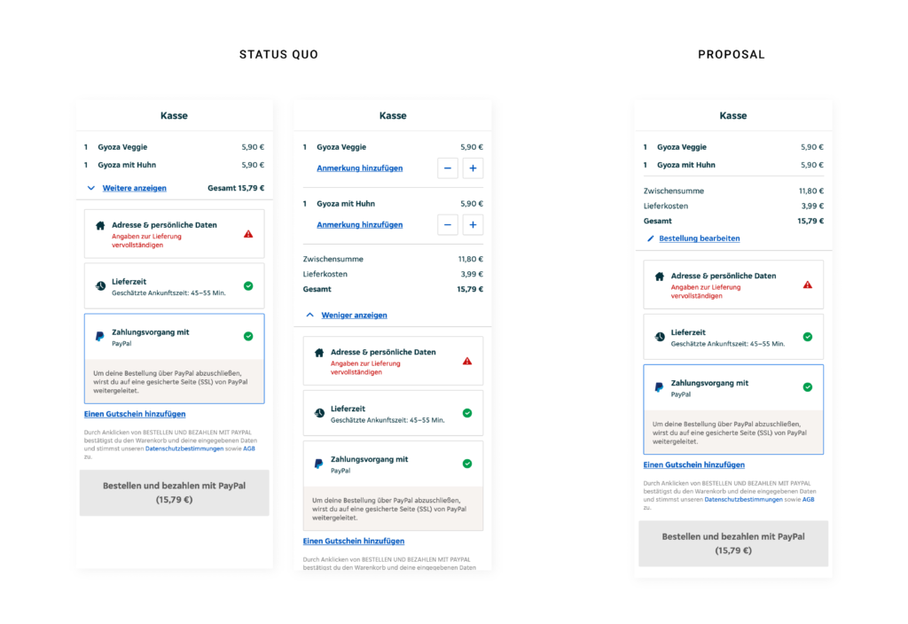
Within the checkout process on Lieferando.at they provide a short summary about the order and give feedback on filling out all relevant data to place an order. It seems like they list ALL cost and sum them up, but if you have a closer look the amount is bigger than the summary of the listed products. So the user has to click the button „Weitere anzeigen“ to see, that they add additional cost for delivery. As there would be enough space within viewport height to make the delivery fee visible from the start, it is clear that they want to hide it on purpose. Apart from additional cost they also give the options to edit the order or add notes for specific dishes in the extended version. Consequently it would increase the usability of the site to also change the wording from „Weiter anzeigen“ to „Bestellung bearbeiten“ („Edit order“). On the right hand side I added a quick-fix-design-proposal to cancel this deceptive design pattern* and enhance usability.
* formerly called “dark pattern”