Kids and Interaction (VII): 125 Universal Principles of Design. Part 3. Another principles to have in mind.

As discussed in the previous post, it is again intended to mention principles that may be important for the design and organisation of children’s exhibitions. Although it is true that they all have a certain importance when designing a new project at any point. I will mention those that have caught my attention.

In this case, we will mention those principles that may be important, but are difficult to analyse, so they cannot be added to the data included in the database mentioned in post number III.

These principles are taken from the book Universal Principles of Design, Revised and Updated: 125 Ways to Enhance Usability, Influence Perception, Increase Appeal, Make Better Design Decisions, and Teach Through Design. Listed below are those that may be important to keep in mind when making interfaces for children, they will be organised in alphabetical order.

Garbage in – garbage out

This principle aims to explain the importance of getting the right input in order to get the right output. For this purpose, the use of warnings and confirmations when pressing buttons is recommended.

In the case of children this can be a way to avoid errors, as it may be easier for them to misinterpret the content.

Gutenberg diagram

A diagram that describes the general pattern followed by the eyes when looking to information. It will be important to keep this in mind in order to place the little information in an organised and understandable way.

3 Design Layouts: Gutenberg Diagram, Z-Pattern, And F-Pattern - Vanseo  Design
Gutenberg diagram

Okham’s Razor

Implicit in Ockham’s razor is the idea that unnecessary elements decrease a design’s efficiency and increase the probability of unanticipated consequences. Adding unnecessary content can be distracting, especially in interfaces aimed at children. Children tend to click on everything (as we studied in post II), so avoid adding content that could be clicked on by mistake.

Readability

It is important to target the content of an interface to our audience. In this case, the idea is to target children (to reduce, children between 6 and 8 years old), so the ease of reading is very important, especially because of the amount of vocabulary that is understood by children at this age.

There are many formulas to check that a text is easy to read, in this case the Fry graph is presented, in which certain calculations must be made from a piece of text of about 100 words to determine the complexity of the text. In our case, we should focus on fitting levels 1, 2, 3 for children between 6 and 8 years old.
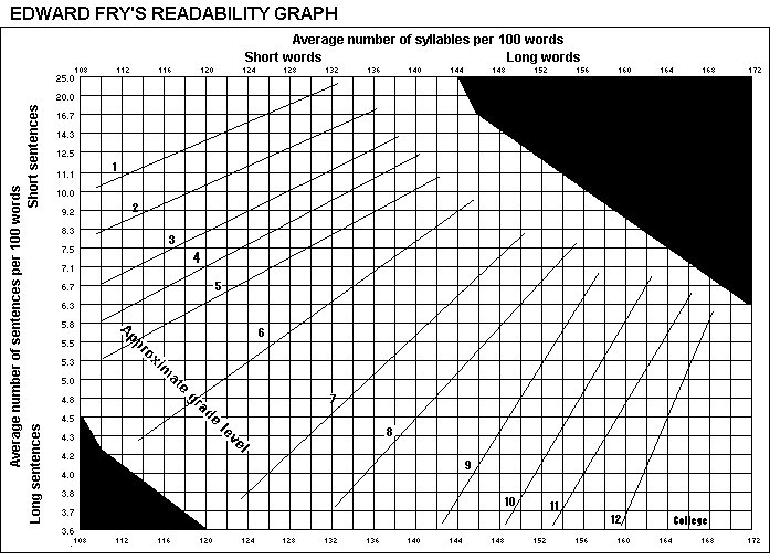
Fry's Graph
Fry’s readability graph.

REFERENCES

Fry, E. B. (1969). The readability graph validated at primary levels. The reading teacher22(6), 534-538.

Hernandez, A., & Resnick, M. L. (2013, September). Placement of call to action buttons for higher website conversion and acquisition: An eye tracking study. In Proceedings of the Human Factors and Ergonomics Society Annual Meeting (Vol. 57, No. 1, pp. 1042-1046). Sage CA: Los Angeles, CA: SAGE Publications.

Lidwell, W., Holden, K., Butler, J., & Elam, K. (2010). Universal Principles of Design, Revised and Updated: 125 Ways to Enhance Usability, Influence Perception, Increase Appeal, Make Better Design Decisions, and Teach Through Design. Rockport Publishers. https://books.google.at/books?id=3RFyaF7jCZsC

Kids and Interaction (VI): 125 Universal Principles of Design. Part 2.

This second part is a continuation of the previous analysis of the 125 Universal Design Principles. In this case, I will mention the principles that are easy enough to analyse so they can be included in the database generated previously in the post III. This ones were found in between the last 95 principles of the book Universal Principles of Design, Revised and Updated: 125 Ways to Enhance Usability, Influence Perception, Increase Appeal, Make Better Design Decisions, and Teach Through Design.

When reading the rest of the principles, I realised that a lot of them are useful, although difficult to analyse on site, especially without being able to access the exhibits in person and having to rely on texts, videos and images. Therefore, another post will be dedicated to mention interesting principles for children’s interface design.

The principles and the reasons why they might be interesting are listed below. Some of them will be grouped together because of their similarities.

Important for the exhibition organisation (physical space)

Entry point

The Entry Point principle aims to explain the best ways to give a good first impression of the exhibition. For this, both Points of Prospect and Progressive Lures should be taken into account. The aim is to achieve a good navigation of the space, so that it is not only easy, but also attractive.

The clear example shown in the book is the queues at theme parks, where not only the long queue is hidden, but on the way to the attraction there are various distractions (televisions, stories…).

Prospect-Refuge

Similar to the previous principle, the aim is to organise the space in the best possible way. To this end, what are called unobstructed views (prospects) and areas of concealment and retreat (refuges) are taken into account. A good space is one in which people will be able to see what is there without needing to be seen. It is about giving some privacy in a shared space.

In the case of children’s exhibits, you could create walls that resemble mazes.

Wayfinding

In this principle, many points are taken into account, such as orientation and decision making.

For a children’s exhibition, it may be interesting to allow them freedom of play and discovery, but there may be other installations that seek order, so a navigation map could be included to give the children a sense of adventure (immersion).

Immersion

In order to get the user to concentrate on the installation, it is necessary to distract them from the real world. That’s why the installations that provide the most fun and satisfaction are those that get the user out of the real world and into the adventure.

As previously mentioned in the Wayfinding principle, it can be interesting for the child to experience his or her own adventure with a map of the room included.

Storytelling

In order to attract users, it often helps to use storytelling, i.e. a story that brings the user closer to the content of the exhibition.

This detail can help the child’s immersion much more, as having a story that guides them through the different points could be a favourable detail.

Savana Preference

Related to the principle of Biophilia Effect (seen in the previous post), this indicates that savannah landscapes are usually preferred over other landscapes.

The book itself explains that this is a very common detail in the perception of children, who prefer more park-like spaces.

Important for the way of showing information

Highlighting

It is important how much text we want to highlight using highlighting methods such as bold, italics or underlining. However, it is important not to overuse this concept.

You can use methods such as colours, typeface or even the blinking effect (which is used more in lights than in text).

Legibility

In the same way, the text sizes as well as the contrast of the background with the text have to be taken into account.

This can be a difficult principle to analyse from photos or videos alone, but it can be reduced to questions posed in post III such as:
Is the text size large?
How much text is there?

Iconic Representation

This was an important point mentioned in previous posts, since when looking at interfaces aimed at children, they tend to take everything they see seriously. That is why special attention should be paid to the type of icon displayed. The most appropriate for children would be similarity (images that are visually analogous) and examples (commonly associated).

Picture Superiority Effect

This principle seems obvious, but it becomes even more important when addressing children. As discussed in post II, it is important to reduce the amount of text in interfaces aimed at children and increase the amount of images. In the end, images are remembered much more than text.

REFERENCES

Lidwell, W., Holden, K., Butler, J., & Elam, K. (2010). Universal Principles of Design, Revised and Updated: 125 Ways to Enhance Usability, Influence Perception, Increase Appeal, Make Better Design Decisions, and Teach Through Design. Rockport Publishers. https://books.google.at/books?id=3RFyaF7jCZsC

Kids and Interaction (V): 125 Universal Principles of Design. Part 1.

After analysing a few examples of interactive children’s exhibits and looking at the results obtained from the database, they went on to read and research the 125 Universal Design Principles.

To this end, it was decided to update the progress found, as the book is very comprehensive and detailed.

After reading the first 30 principles, we found some very interesting details that we considered very important to use in exhibitions for children.

These principles and the reasons why they might be interesting are listed below.

Accessibility
This is a very important concept in design, but especially in design for children, as it is necessary to adapt the devices so that children can access and understand them. That is why, within the concepts of this principle, operability (everyone should be able to use the design) and simplicity (everyone should be able to understand the design) stand out.

Advance organiser
This principle is very important and is somewhat related to the simplicity seen in the previous section. This principle stresses the importance of being able to explain concepts so that everyone is able to understand them. To do this, the idea of using words that children already understand is used, from which the main concept is generated and explained.

Biophilia Effect
Spaces reminiscent of nature reduce stress and increase concentration. When planning an interactive exhibition for children, it is necessary to understand that children need to be as concentrated as possible in order to carry out the actions. That is why trying to create a natural environment can help.

Chunking
This concept also relates to the way in which information is displayed. It is necessary to divide the content into units in order not to launch too much content in too little time.

Colour
Obviously colour is a very important point, which was already analysed previously. In the case of children, more saturated colours should be used to give more excitement and dynamism.

Contour Bias
In this case, we talk about the importance of using more rounded edges that make the user feel closer to the object. Still, it is true that straighter edges can be aggressive but they certainly attract the user’s attention. Still, in my opinion, I don’t think it is a necessary thing to use with children.

Constraint and control
I place both concepts together as they are related. They consider the importance of knowing how much control the user should have. The constraint relates to the limitations that should be placed on the user. In this way, both work together to limit and leave the necessary freedom to the user.

Obviously there are many more important concepts, but these listed above are, in my opinion, the most important for children. The idea is to finalise the list of principles and add some details about these principles to the databases, to continue analysing interactive exhibits in order to understand the correct and best use of resources to generate the most impactful exhibits for children.

REFERENCES

Lidwell, W., Holden, K., Butler, J., & Elam, K. (2010). Universal Principles of Design, Revised and Updated: 125 Ways to Enhance Usability, Influence Perception, Increase Appeal, Make Better Design Decisions, and Teach Through Design. Rockport Publishers. https://books.google.at/books?id=3RFyaF7jCZsC