As discussed in the previous post, it is again intended to mention principles that may be important for the design and organisation of children’s exhibitions. Although it is true that they all have a certain importance when designing a new project at any point. I will mention those that have caught my attention.
In this case, we will mention those principles that may be important, but are difficult to analyse, so they cannot be added to the data included in the database mentioned in post number III.
These principles are taken from the book Universal Principles of Design, Revised and Updated: 125 Ways to Enhance Usability, Influence Perception, Increase Appeal, Make Better Design Decisions, and Teach Through Design. Listed below are those that may be important to keep in mind when making interfaces for children, they will be organised in alphabetical order.
Garbage in – garbage out
This principle aims to explain the importance of getting the right input in order to get the right output. For this purpose, the use of warnings and confirmations when pressing buttons is recommended.
In the case of children this can be a way to avoid errors, as it may be easier for them to misinterpret the content.
Gutenberg diagram
A diagram that describes the general pattern followed by the eyes when looking to information. It will be important to keep this in mind in order to place the little information in an organised and understandable way.

Okham’s Razor
Implicit in Ockham’s razor is the idea that unnecessary elements decrease a design’s efficiency and increase the probability of unanticipated consequences. Adding unnecessary content can be distracting, especially in interfaces aimed at children. Children tend to click on everything (as we studied in post II), so avoid adding content that could be clicked on by mistake.
Readability
It is important to target the content of an interface to our audience. In this case, the idea is to target children (to reduce, children between 6 and 8 years old), so the ease of reading is very important, especially because of the amount of vocabulary that is understood by children at this age.
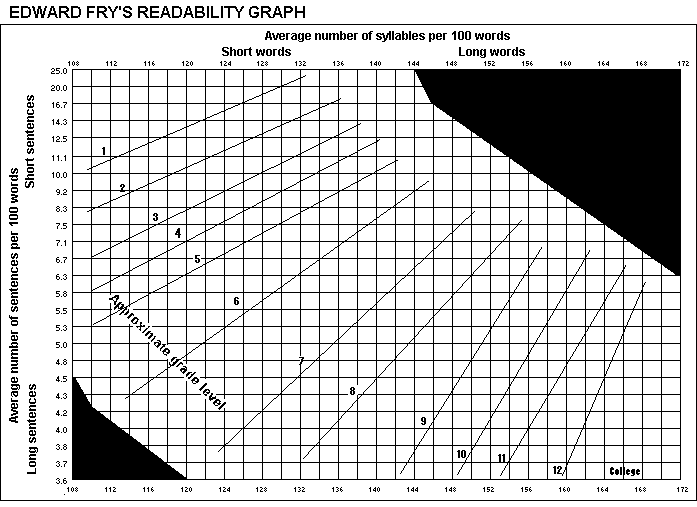
There are many formulas to check that a text is easy to read, in this case the Fry graph is presented, in which certain calculations must be made from a piece of text of about 100 words to determine the complexity of the text. In our case, we should focus on fitting levels 1, 2, 3 for children between 6 and 8 years old.
REFERENCES
Fry, E. B. (1969). The readability graph validated at primary levels. The reading teacher, 22(6), 534-538.
Hernandez, A., & Resnick, M. L. (2013, September). Placement of call to action buttons for higher website conversion and acquisition: An eye tracking study. In Proceedings of the Human Factors and Ergonomics Society Annual Meeting (Vol. 57, No. 1, pp. 1042-1046). Sage CA: Los Angeles, CA: SAGE Publications.
Lidwell, W., Holden, K., Butler, J., & Elam, K. (2010). Universal Principles of Design, Revised and Updated: 125 Ways to Enhance Usability, Influence Perception, Increase Appeal, Make Better Design Decisions, and Teach Through Design. Rockport Publishers. https://books.google.at/books?id=3RFyaF7jCZsC