It is very important to bear in mind that a children’s space must be suitable for its users. Children’s facilities are often the most complex to accommodate, as they need to be accessible to accompanying adults as well. In addition, as in any other facility, it is necessary to take into account people with reduced mobility, adapting heights and sizes.
Let’s remember that all the above details are determined according to the age range of 6 to 8 years old. Not only because this is the target public of this project, but also because at this age it is necessary to limit the range as it is a time when physical and personal changes occur rapidly.
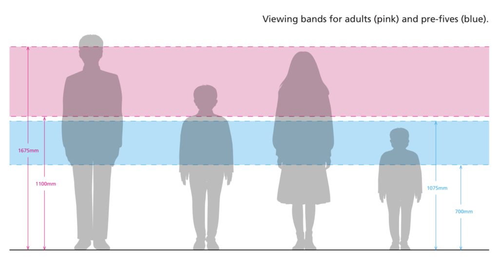
Taking into account this range, it is necessary to know the approximate height of our audience. In this case, it is very similar between the sexes and is between 115 cm and 127 cm tall. This means that any table, chair, device or sign should be within the range of vision and accessibility of a person of that height.
Knowing this, an analysis of the correct heights and spaces can be carried out. Reference is made to a guide for Glasgow museum exhibitions and a standard accessibility guide for exhibitions.
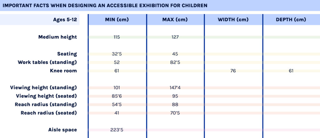
These guidelines determine that for ages 5-12 years, seating should have a minimum height of 32.5 cm and a maximum height of 45 cm; while standing desks should be between 52 cm and 82.5 cm. The knee space under these tables should be 61 cm high, 61 cm deep, 76 cm wide.
In addition, a child’s viewing height is between 101 cm and 147.4 cm when the child is standing; and 85.6 cm and 95 cm when the child is sitting. This allows a reach radius of between 54.5 cm and 88 cm when standing and 41 cm and 70.5 cm when seated.
This includes the recommended widths between tables, walls or shelves. This should be a minimum of 183 cm to allow space for two wheelchairs. In any case, a space of 223.5 cm is recommended for specific areas for children.
A summary table of all these concepts is included below.
Using text in designs for 6-8 year olds can be tricky, especially because at first, you try to avoid showing a lot of information. Even so, it is important to know that the little text that is shown should be very understandable and pleasant.
When children learn to read or even learn what letters are, they start by recognising each character one by one. This is a very slow process and can be very boring and frustrating.
This is why, in children’s books, the typeface usually has a warm and friendly look, with simple letterforms. The aperture of the letters should be rounded and open, not angular or rectangular.
To facilitate legibility, it is not only necessary to take into account the use of adapted language, but also to be aware that the use of condensed typefaces, in italics or the exclusive use of capital letters can be a problem. All these details make typefaces complex and difficult to understand for people who are still in the learning phase.
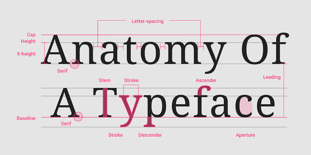
Apart from avoiding decorative or complex typefaces (realistic typefaces should be adopted), there are other details related to the properties of typefaces that should be taken into account: line spacing, size, x-height and single-storey “a” and “g”.
To easily understand these details, an image is shared from Material Design, a page that contains information on all kinds of design elements. In this image you can clearly see the different parts of a typeface.
Firstly, it’s recommend the use of typefaces with a size between 14pt and 24pt (depending on the age). Related to this idea, think about the line spacing of the text, which is recommended to be between 4pt and 6pt bigger.
Regarding the x-height, it is important to know that typefaces with larger x-heights are usually easier to read than those with short x-heights, especially for children.
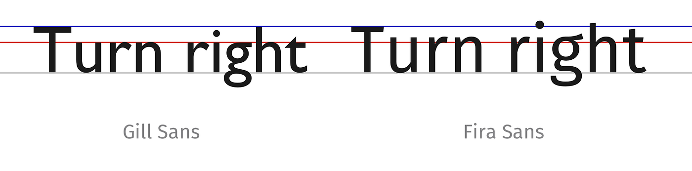
Not only that, but this x-height is a very important point for creating typeface pairs, if their height is similar, it will create more harmony. To better understand this concept, Ricardo Magalhães gives as an example in his article the typeface Gill Sans and Fira Sans.
Although both appear to be the same size with respect to their first letter (in capitals), it can be seen how the x-height (marked by the red line) of the second typeface is larger than the first, so the harmony might not be good.
Finally, for very young readers, texts should use typefaces that have the single-story “a” and “g” (also called children’s characters), as these are the lowercase forms that pre-school and school-age children learn to write. This concept refers to the way the two letters are written.
Double-story letters can be reminiscent of older typefaces, while single-story letters look more modern and simplified. For this reason they are more suitable for a child audience, as they are undecorated, simple and straightforward.
Projects have continued to be added to the database over the last few days in order to gather sufficient information to help us verify the reality of the points analysed in previous posts. The database can be found online in the link: http://ambiby.com/project_online/projectDB/index.php
For this reason, several projects have been added (13 so far), but I would like to add even more to the database. Even so, and taking into account the long list of references pending to be analysed, the data collected are similar to those previously studied. With this, the important points that are usually repeated in any interactive exhibition for children are checked.
It has to be said that, due to the current situation with COVID, the analysis has been a bit hard. Not being able to visit certain places either because of the pandemic or lack of time, there are details that are missed. The aim was to collect information from visual materials, which limited the number of projects to be analysed.
Now, a short analysis of the different sections of data found from the analysed projects is discussed.
Interaction data
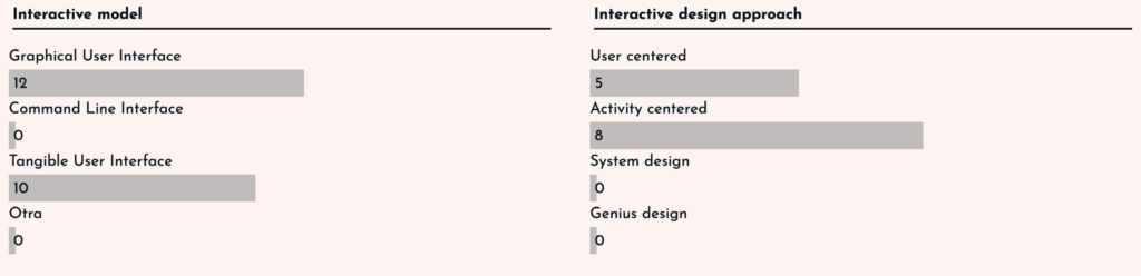
In terms of interaction, we find that the vast majority of exhibits mix GUI and TUI models, making them much more attractive to children. In addition, the spaces are usually activity-centred or user-centred. This depends on whether the project aims to teach or influence the user, or is focused on simply discovering or hanging out.
User experience for kids
Focusing on the userexperience for children, and using the questions and data studied in posts II and III, we have found very similar answers to those studied in those posts. In some cases the answers were obvious, but in others, they have varied from point to point.
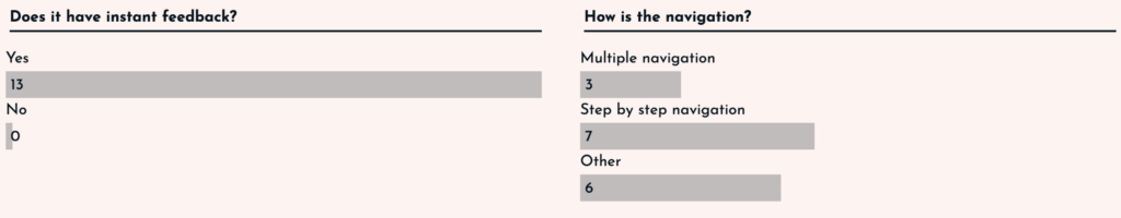
All the interfaces analysed had instant feedback to the user, whether it was a GUI or a TUI, as the user was always aware of what changes were being made.
In the case of navigation, the responses were more varied. Both navigation through the digital interface and navigation through the physical space were taken into account. For this reason, there are some projects that have more than one type of navigation. Even so, navigation by steps has been the most common, as the aim is to organise the information by steps so that it is told in the form of a story and is easier to understand.
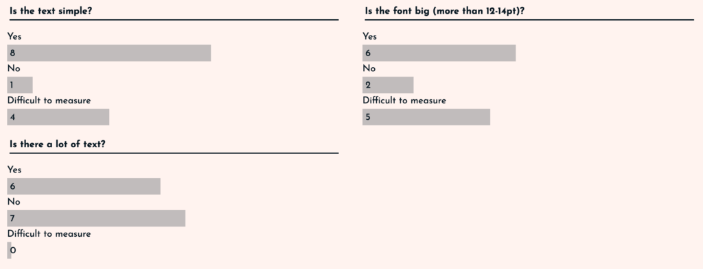
In terms of text, three parameters were taken into account: simplicity, size and quantity. In the case of simplicity and size, it was complicated in some cases to analyse it, as there were very few visual references. Even so, it has been shown that the texts are usually simple (adapted to the children’s vocabulary) and the text sizes are usually larger than usual. Surprisingly, the amount of text has been more adjusted, in some cases there was a lot of text (6 projects), and in others the text was scarce (7 projects).
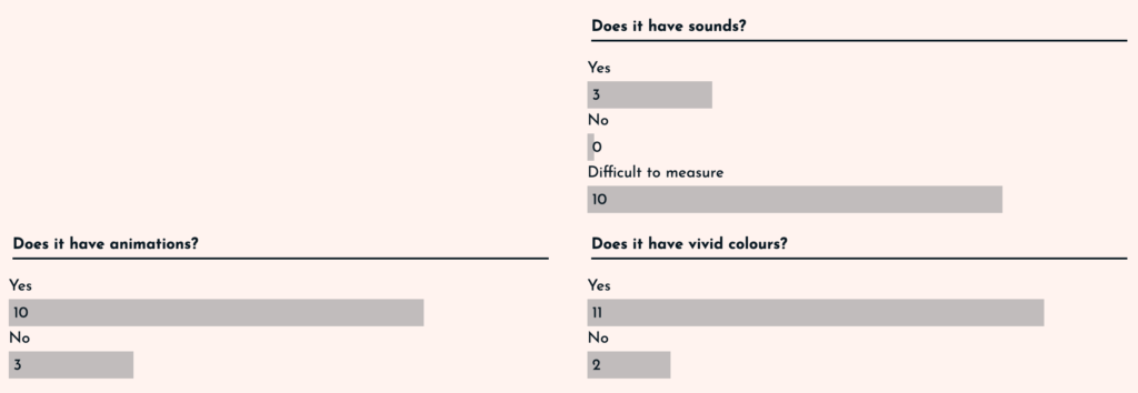
If we think about the visual and auditory inputs, we find three points to analyse: sounds, animations and vivid colours. The case of sound has been complicated, because with the visual material it was difficult to observe this point. On the other hand, animations were present in 10 of the 13 projects, so it can be determined that the use of animations is common. Finally, the use of colours was clearly vivid. In almost all of the exhibits (11 out of 13), bright colours are used to create a good atmosphere. The only ones using more muted colours are those related to nature, as they are more earthy colours.
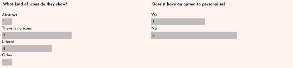
Finally in this section, two points should be taken into account: the icons and the option to customise. In the case of the icons, it was studied that in order to address children, care must be taken, as understanding them can be complicated. This is why it has been observed that in 7 projects there were no icons, and in those that did have them, the vast majority (5 of the 13) were literal, i.e. they resemble reality and leave no room for doubt. The case of personalisation was surprising. In only 5 of the projects is this option available.
The 125 Universal Principles of Design
The vast majority of the principles explained in posts V and VI are used in the projects, even so, there are big differences between them. In order to better understand the contents, the principles have been divided into three types: related to the physical space, related to the way content is displayed and related to the design.
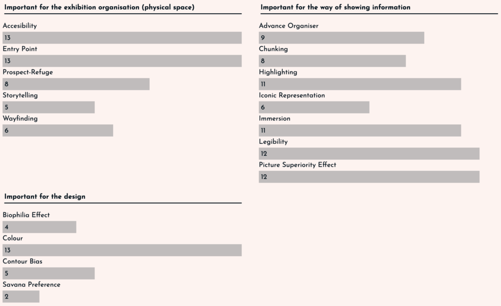
In the important principles for the organisation of the physical space, it is clear that accessibility and the entry point to the exhibition are clear. All projects rely on these as it is necessary to adapt the interface to children. For this, it is not only a question of simplifying the text, but also of adjusting the sizes and heights of the stations to those of the youngest children.
In those related to the way information is displayed, legibility and the use of images over text are key, as well as the importance of highlighting information in texts and immersion. It should also be noted that the vast majority (8-9 out of 13) use methods such as chunking or advance organiser to divide information into islands and make it easier to remember. Finally, the use of icons is again taken into account, and how this is reduced to only 6 of the 13 projects.
In terms of design, the results were low. It is true that the importance of colour is maintained in the 13 projects analysed, but the points related to the environment (biophilia effect and savannah preference) are not very much taken into account, as the spaces are looking for a sense of immersion and leave aside the use of nature so as not to distract the user. Finally, the use of more rounded and unaggressive designs has only been observed in 5 of the 13 projects, which seems surprising.
With this we conclude that although there are points that seem to be well determined, there are others such as the amount of text, the option of personalisation or the analysis of the design (contour bias) that need more referents to determine a result. But even so, it is understood that interfaces for children follow a series of principles that tend to be repeated in the vast majority.
The results have certainly been interesting, but more time is needed to add projects. In any case, the intention is to use this website as a base and add all the references in order to keep an updated database of projects that can help me in the future.
As discussed in the previous post, it is again intended to mention principles that may be important for the design and organisation of children’s exhibitions. Although it is true that they all have a certain importance when designing a new project at any point. I will mention those that have caught my attention.
In this case, we will mention those principles that may be important, but are difficult to analyse, so they cannot be added to the data included in the database mentioned in post number III.
These principles are taken from the book Universal Principles of Design, Revised and Updated: 125 Ways to Enhance Usability, Influence Perception, Increase Appeal, Make Better Design Decisions, and Teach Through Design. Listed below are those that may be important to keep in mind when making interfaces for children, they will be organised in alphabetical order.
Garbage in – garbage out
This principle aims to explain the importance of getting the right input in order to get the right output. For this purpose, the use of warnings and confirmations when pressing buttons is recommended.
In the case of children this can be a way to avoid errors, as it may be easier for them to misinterpret the content.
Gutenberg diagram
A diagram that describes the general pattern followed by the eyes when looking to information. It will be important to keep this in mind in order to place the little information in an organised and understandable way.
Gutenberg diagram
Okham’s Razor
Implicit in Ockham’s razor is the idea that unnecessary elements decrease a design’s efficiency and increase the probability of unanticipated consequences. Adding unnecessary content can be distracting, especially in interfaces aimed at children. Children tend to click on everything (as we studied in post II), so avoid adding content that could be clicked on by mistake.
Readability
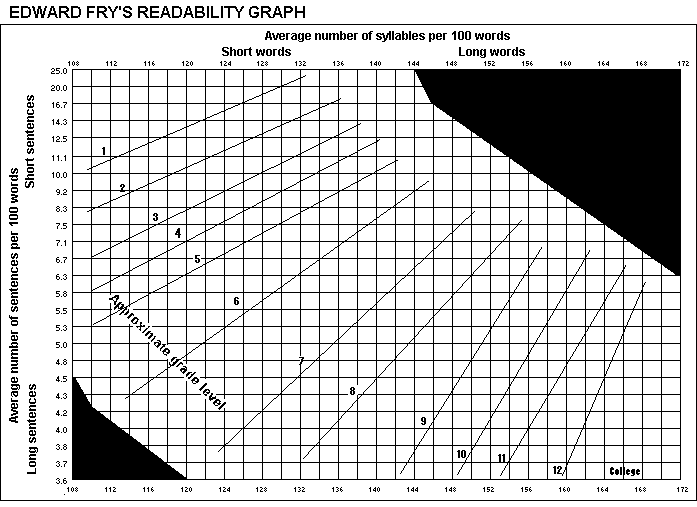
It is important to target the content of an interface to our audience. In this case, the idea is to target children (to reduce, children between 6 and 8 years old), so the ease of reading is very important, especially because of the amount of vocabulary that is understood by children at this age.
There are many formulas to check that a text is easy to read, in this case the Fry graph is presented, in which certain calculations must be made from a piece of text of about 100 words to determine the complexity of the text. In our case, we should focus on fitting levels 1, 2, 3 for children between 6 and 8 years old.
Fry’s readability graph.
REFERENCES
Fry, E. B. (1969). The readability graph validated at primary levels. The reading teacher, 22(6), 534-538.
Hernandez, A., & Resnick, M. L. (2013, September). Placement of call to action buttons for higher website conversion and acquisition: An eye tracking study. In Proceedings of the Human Factors and Ergonomics Society Annual Meeting (Vol. 57, No. 1, pp. 1042-1046). Sage CA: Los Angeles, CA: SAGE Publications.
Lidwell, W., Holden, K., Butler, J., & Elam, K. (2010). Universal Principles of Design, Revised and Updated: 125 Ways to Enhance Usability, Influence Perception, Increase Appeal, Make Better Design Decisions, and Teach Through Design. Rockport Publishers. https://books.google.at/books?id=3RFyaF7jCZsC
This second part is a continuation of the previous analysis of the 125 Universal Design Principles. In this case, I will mention the principles that are easy enough to analyse so they can be included in the database generated previously in the post III. This ones were found in between the last 95 principles of the book Universal Principles of Design, Revised and Updated: 125 Ways to Enhance Usability, Influence Perception, Increase Appeal, Make Better Design Decisions, and Teach Through Design.
When reading the rest of the principles, I realised that a lot of them are useful, although difficult to analyse on site, especially without being able to access the exhibits in person and having to rely on texts, videos and images. Therefore, another post will be dedicated to mention interesting principles for children’s interface design.
The principles and the reasons why they might be interesting are listed below. Some of them will be grouped together because of their similarities.
Important for the exhibition organisation (physical space)
Entry point
The Entry Point principle aims to explain the best ways to give a good first impression of the exhibition. For this, both Points of Prospect and Progressive Lures should be taken into account. The aim is to achieve a good navigation of the space, so that it is not only easy, but also attractive.
The clear example shown in the book is the queues at theme parks, where not only the long queue is hidden, but on the way to the attraction there are various distractions (televisions, stories…).
Prospect-Refuge
Similar to the previous principle, the aim is to organise the space in the best possible way. To this end, what are called unobstructed views (prospects) and areas of concealment and retreat (refuges) are taken into account. A good space is one in which people will be able to see what is there without needing to be seen. It is about giving some privacy in a shared space.
In the case of children’s exhibits, you could create walls that resemble mazes.
Wayfinding
In this principle, many points are taken into account, such as orientation and decision making.
For a children’s exhibition, it may be interesting to allow them freedom of play and discovery, but there may be other installations that seek order, so a navigation map could be included to give the children a sense of adventure (immersion).
Immersion
In order to get the user to concentrate on the installation, it is necessary to distract them from the real world. That’s why the installations that provide the most fun and satisfaction are those that get the user out of the real world and into the adventure.
As previously mentioned in the Wayfinding principle, it can be interesting for the child to experience his or her own adventure with a map of the room included.
Storytelling
In order to attract users, it often helps to use storytelling, i.e. a story that brings the user closer to the content of the exhibition.
This detail can help the child’s immersion much more, as having a story that guides them through the different points could be a favourable detail.
Savana Preference
Related to the principle of Biophilia Effect (seen in the previous post), this indicates that savannah landscapes are usually preferred over other landscapes.
The book itself explains that this is a very common detail in the perception of children, who prefer more park-like spaces.
Important for the way of showing information
Highlighting
It is important how much text we want to highlight using highlighting methods such as bold, italics or underlining. However, it is important not to overuse this concept.
You can use methods such as colours, typeface or even the blinking effect (which is used more in lights than in text).
Legibility
In the same way, the text sizes as well as the contrast of the background with the text have to be taken into account.
This can be a difficult principle to analyse from photos or videos alone, but it can be reduced to questions posed in post III such as: Is the text size large? How much text is there?
Iconic Representation
This was an important point mentioned in previous posts, since when looking at interfaces aimed at children, they tend to take everything they see seriously. That is why special attention should be paid to the type of icon displayed. The most appropriate for children would be similarity (images that are visually analogous) and examples (commonly associated).
Picture Superiority Effect
This principle seems obvious, but it becomes even more important when addressing children. As discussed in post II, it is important to reduce the amount of text in interfaces aimed at children and increase the amount of images. In the end, images are remembered much more than text.
REFERENCES
Lidwell, W., Holden, K., Butler, J., & Elam, K. (2010). Universal Principles of Design, Revised and Updated: 125 Ways to Enhance Usability, Influence Perception, Increase Appeal, Make Better Design Decisions, and Teach Through Design. Rockport Publishers. https://books.google.at/books?id=3RFyaF7jCZsC
After analysing a few examples of interactive children’s exhibits and looking at the results obtained from the database, they went on to read and research the 125 Universal Design Principles.
To this end, it was decided to update the progress found, as the book is very comprehensive and detailed.
After reading the first 30 principles, we found some very interesting details that we considered very important to use in exhibitions for children.
These principles and the reasons why they might be interesting are listed below.
Accessibility This is a very important concept in design, but especially in design for children, as it is necessary to adapt the devices so that children can access and understand them. That is why, within the concepts of this principle, operability (everyone should be able to use the design) and simplicity (everyone should be able to understand the design) stand out.
Advance organiser This principle is very important and is somewhat related to the simplicity seen in the previous section. This principle stresses the importance of being able to explain concepts so that everyone is able to understand them. To do this, the idea of using words that children already understand is used, from which the main concept is generated and explained.
Biophilia Effect Spaces reminiscent of nature reduce stress and increase concentration. When planning an interactive exhibition for children, it is necessary to understand that children need to be as concentrated as possible in order to carry out the actions. That is why trying to create a natural environment can help.
Chunking This concept also relates to the way in which information is displayed. It is necessary to divide the content into units in order not to launch too much content in too little time.
Colour Obviously colour is a very important point, which was already analysed previously. In the case of children, more saturated colours should be used to give more excitement and dynamism.
Contour Bias In this case, we talk about the importance of using more rounded edges that make the user feel closer to the object. Still, it is true that straighter edges can be aggressive but they certainly attract the user’s attention. Still, in my opinion, I don’t think it is a necessary thing to use with children.
Constraint and control I place both concepts together as they are related. They consider the importance of knowing how much control the user should have. The constraint relates to the limitations that should be placed on the user. In this way, both work together to limit and leave the necessary freedom to the user.
Obviously there are many more important concepts, but these listed above are, in my opinion, the most important for children. The idea is to finalise the list of principles and add some details about these principles to the databases, to continue analysing interactive exhibits in order to understand the correct and best use of resources to generate the most impactful exhibits for children.
REFERENCES
Lidwell, W., Holden, K., Butler, J., & Elam, K. (2010). Universal Principles of Design, Revised and Updated: 125 Ways to Enhance Usability, Influence Perception, Increase Appeal, Make Better Design Decisions, and Teach Through Design. Rockport Publishers. https://books.google.at/books?id=3RFyaF7jCZsC
We are all aware that Information and Communication Technologies (ICT) are making inroads and entering each and every sector of our society, including educational institutions, an area in which ICT has become a means of educational innovation.
Educators and students are currently facing a “galaxy of technologies” (Cabrero Almenara 2010), which allow educators to break down barriers that include space-time, among others. A galaxy that is governed by the Internet, a great current competitor to textbooks, which opens the doors to information, to sharing personal visions and also to transmitting knowledge.
Today’s classrooms are full of technology, although it is true that there is a great “digital divide” (Cabrero Almenara 2004), the reality is not the same in all schools, institutes or centres, nor in all countries. Even so, many of them replace traditional blackboards with projectors and other technological resources in their classrooms.
So, if there are so many technologies, what is the problem, and where does this fear of ICT come from? Mark Prensky presents a possible answer to this question in 2001, with the difference between “Digital Natives” and “Digital Immigrants”. The world is changing, and so should education: “Our students have changed radically. Today’s students are no longer the people our educational system was designed to teach. (Prensky 2001).
These individuals are the first generations to be born surrounded by computers, video games and technologies in general, making digital language their native language. This makes their way of thinking completely different from that of previous generations, which creates a significant gap when it comes to speaking the same language. Here is the problem, these Digital Immigrants do not believe that their students can study in front of ICT because they cannot (they were not born surrounded by ICT, they are not used to it) (Prensky 2001). This leads them to keep the same educational methods that were applied to them, missing great learning opportunities for these Digital Natives.
So, is it the Digital Natives who must give up their way of thinking, or is it the Digital Immigrants who must adapt? The first option will largely involve forgetting to educate these individuals until they are old enough to educate themselves. The second option will simply consider introducing these new media into the classroom.
This option is straightforward, as there are now a wide variety of video games or interactive experiences focused on education. When a student interacts with his or her environment, plays games and even has fun, he or she will internalise more of the content received (Sanford & Madill 2007; Schaaf 2012).
Therefore, we must lose the fear of ICT in education, and start to see it as a way to improve it. Educating with and for ICT.
REFERENCES
Cabero Almenara, Julio. «Los retos de la integración de las TICs en los procesos educativos. Límites y posibilidades». Perspectiva Educacional, Formación de Profesores, 2010.
Prensky, Marc. «Digital Natives, Digital Immigrants». On the Horizon, October 2001.
Prensky, Marc. «Digital Natives, Digital Immigrants Part 2». On the Horizon, December 2001.
Sanford, Kathy, y Leanna Madill. «Understanding the Power of New Literacies through Video Game Play and Design». Canadian Journal of Education, 2007.
Following the discoveries made in the past search phase, it was time to analyse existing exhibits on the basis of the findings.
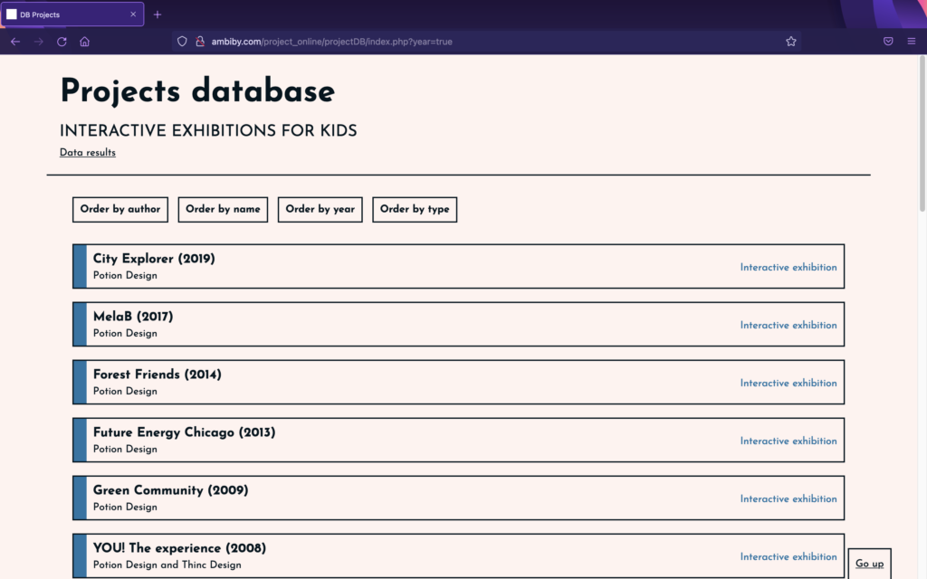
To facilitate this, work has been carried out over the past few days on the creation of a project database. This has been designed and programmed from scratch, and is not only a great help in keeping the information together, but also shows data taken from the analyses.
The idea is to collect information from different installations and to be able to read details related to usability (UX) aimed at children. For that purpose, certain questions have been determined to answer while analysing projects in order to obtain results that demonstrate, or not, whether the aspects explained in previously reviewed articles are applicable to interactive exhibitions for children.
The questions are:
Which interaction model is used (GUI, TUI, CLI, Other)?
What is the focus of the interaction (user-centered, activity-centered, system design or genius design)?
Does the installation provide instant feedback?
What type of navigation is there (multiple, step-by-step or other)?
Is the text simple and understandable?
Is the text size large?
How much text is there?
Does it have sounds?
Does it have animations?
Does it have bright, contrasting colours?
What kind of icons are displayed (abstract, literal, no icons, other)?
Is the experience customisable (user choice: characters…)?
With the database prepared and programmed, we started to analyse works in order to receive the data. For the moment it only has exhibitions by the Potion Design group, which in many cases directs its works to the very young. Even so, over the next few days we intend to add many more installations to be analysed, in order to have more realistic results.
In order to approach the problem from the initial topic, which aims to study interaction for children in educational exhibitions, it is necessary to divide the problem into parts.
Therefore and starting from the beginning, it is time to study and analyse the differences in UX for adults and children. Creating an interface for kids is not simply a matter of using something made for adults and then changing the language for “dummies”. Designing interfaces for children goes much further than that.
One of the most important and most frequently mentioned issues throughout the different articles reviewed is the importance of focusing the design on the right age group. The age steps in children are much stronger than in adults. When we create a prototype aimed at older people, we can determine a target with an age range of 20 years difference. In contrast, in children the difference of 4 years of age already implies big changes related to skills and abilities. That is why in the next analyses we will try to focus the search on a target age range of 6 to 8 years, ages at which children are able to read, but still have a limited vocabulary.
After reading a large number of articles related to the subject, we have extracted the most important points (even though they may sometimes seem obvious) that have been most frequently repeated among authors. Some of the things to keep in mind are:
Children need instant feedback with every action. This means not only informing the user that something has been clicked, but also keeping in mind that problems need to be broken down into small pieces.
Multiple navigation is complicated to understand, so it is easier for them to receive information in the form of a story. This means that storytelling is key in children’s interfaces.
Reading ability varies with age, but it is true that children usually avoid reading. So, if texts are added, they should be very concise, adapted and direct.
The adaptability of the interface takes into account several concepts such as font size and colour. In case of interfaces for children, font sizes should always be between 12pt and 14pt and colours should be saturated and vivid. This is a concept that normally in interfaces for adults can be distracting, but it is something that keeps children interested and connected with the content. A similar idea includes the use of sounds and animations.
Children tend to have an explorative attitude towards interfaces, “mine-sweeping” the screen.
Finally, it is important to bear in mind that children tend to take everything they see literally, so it is necessary to think deeply about the use of icons and images.
With this little research, it is time to look at existing children’s displays that may or may not meet these points.
As we have seen recently, the health systems of the countries can be subjected to great burdens of responsibility and work for medical staff who must monitor the well-being of patients and in turn, seek psychological wellness during medical procedures to which such patients are subjected.
Since 2005, the World Health Organization (WHO) recognized eHealth as an essential part of healthcare systems and since then it has not stopped growing, expanding in multiple directions such as mHealth (use of mobile technologies to shorten the distance between patients and medical services ), TeleHealth (as a way of offering medical services over a distance – about 80% of consultations not related to covid were made by telematic means in 2020), the integration of AI (to suggest treatments or clinical diagnoses – the so-called Clinical Decision Support) or Data visualization (to bring the understanding of patients concerning their own health and facilitate to medical staff the sharing of data about their patients). These are just some of the central topics in this growing field.
#Intention
Within this infinite topic, I am especially interested in everything that is focused on the patient experience, meaning everything that in some way will improve the patients’ experience from when he/she decides to go to the consultation until he/she obtains the recommendations for treatment and subsequent follow-up.
There are already many things done in this regard, even not related to technology and making use of more analog processes, but I would like to see what are the possible improvements or development of new functions in the field of AI (for example, assistance to patients outside of consultation) or imaging/data visualization (focused on the understanding and engagement of the patient in their health status).
#Good practices
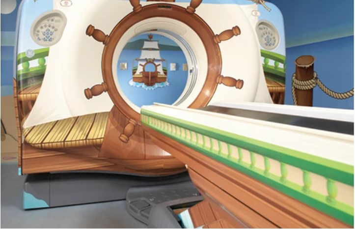
MRI Scan to improve childrens’ experience – by Doug Dietz from GE Healthcare
#Design Challenges
Health systems are an environment where designers encounter many pain points that could be addressed. Trying to find a solution to these pain points entails certain challenges such as:
_To try to focus on only one thing at a time: There are many issues that need to be addressed, but it is important for designers to choose one of them and keep the focus clear during the whole design process.
_ The field requires a lot of time spent on research, understanding, and empathizing with users’ needs. There are thousands of people, both medical professionals, and patients, who might be affected by the same issue. It is important to take the time to collect all information and insights related to the topic.
_ To keep aware of what is going on out there. Since healthcare is a worldwide topic, many companies, designers, and institutions may be way ahead in their discoveries regarding the same issue. To be part of the huge healthcare community is mandatory to move forward in making improvements.
_ To become familiar with the treatment of sensitive data, data visualization, and techniques/machines which are commonly used in medical practices to treat different medical conditions.
_ To be mentally prepared to face a long design process with possible significant unanticipated changes.