Using text in designs for 6-8 year olds can be tricky, especially because at first, you try to avoid showing a lot of information. Even so, it is important to know that the little text that is shown should be very understandable and pleasant.
When children learn to read or even learn what letters are, they start by recognising each character one by one. This is a very slow process and can be very boring and frustrating.
This is why, in children’s books, the typeface usually has a warm and friendly look, with simple letterforms. The aperture of the letters should be rounded and open, not angular or rectangular.
To facilitate legibility, it is not only necessary to take into account the use of adapted language, but also to be aware that the use of condensed typefaces, in italics or the exclusive use of capital letters can be a problem. All these details make typefaces complex and difficult to understand for people who are still in the learning phase.
Apart from avoiding decorative or complex typefaces (realistic typefaces should be adopted), there are other details related to the properties of typefaces that should be taken into account: line spacing, size, x-height and single-storey “a” and “g”.
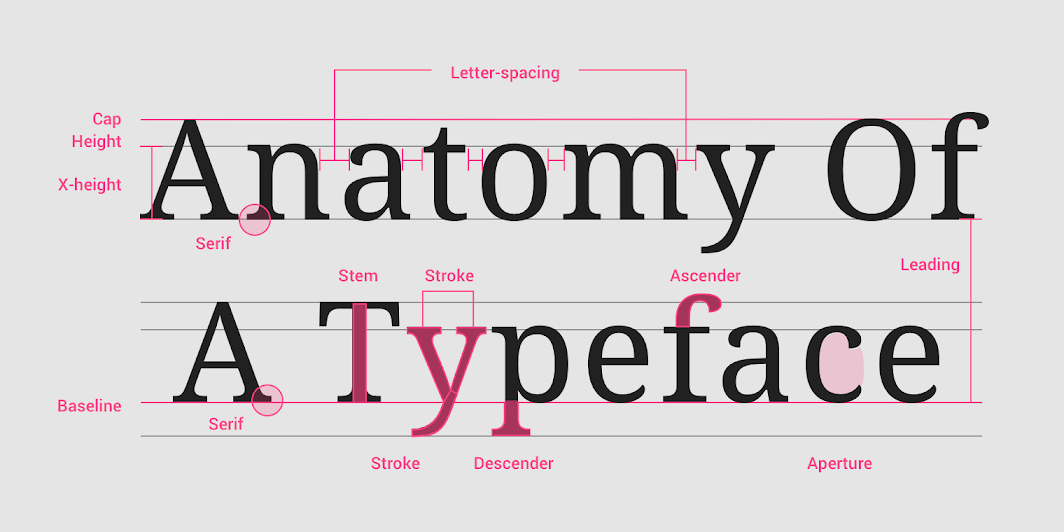
To easily understand these details, an image is shared from Material Design, a page that contains information on all kinds of design elements. In this image you can clearly see the different parts of a typeface.
Firstly, it’s recommend the use of typefaces with a size between 14pt and 24pt (depending on the age). Related to this idea, think about the line spacing of the text, which is recommended to be between 4pt and 6pt bigger.
Regarding the x-height, it is important to know that typefaces with larger x-heights are usually easier to read than those with short x-heights, especially for children.
Not only that, but this x-height is a very important point for creating typeface pairs, if their height is similar, it will create more harmony. To better understand this concept, Ricardo Magalhães gives as an example in his article the typeface Gill Sans and Fira Sans.
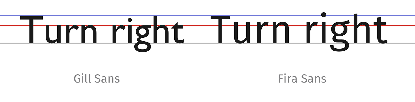
Although both appear to be the same size with respect to their first letter (in capitals), it can be seen how the x-height (marked by the red line) of the second typeface is larger than the first, so the harmony might not be good.
Finally, for very young readers, texts should use typefaces that have the single-story “a” and “g” (also called children’s characters), as these are the lowercase forms that pre-school and school-age children learn to write. This concept refers to the way the two letters are written.
Double-story letters can be reminiscent of older typefaces, while single-story letters look more modern and simplified. For this reason they are more suitable for a child audience, as they are undecorated, simple and straightforward.
References
Varro, J. (2021, September 16th). The easiest fonts for kids to read. https://varrojoanna.com/the-easiest-fonts-for-kids-to-read/
Strizver, I. (n.d.). Typography for Children. fonts.com. https://www.fonts.com/content/learning/fyti/situational-typography/typography-for-children
Material Design. (n.d.). Understanding typography [Material Design]. https://material.io/design/typography/understanding-typography.html#type-properties
Magalhães, R. (2017, May 24th). To choose the right typeface, look at its x-height. Prototypr. https://blog.prototypr.io/to-choose-the-right-typeface-look-at-its-x-height-instead-d5ef0967d09c
Cruz, A (2019). Why do some letters like “a” or “g” look different on a computer than when normally written? https://qr.ae/pvFGMS