Since my studies at FH JOANNEUM University of applied sciences, I have had to use a tool imposed by the University to communicate by video conference with our professors and organize meetings between students on the progress of projects. Since the university imposed the use of this tool, I have been able to explore the many possibilities that the application could offer through its pedagogical use (writing comments, responding to information, delivering documents, etc.). The university has imposed the use of this tool on students and teachers since the covid-19 epidemic to continue the courses in a synchronous or asynchronous. Since the event, the tool is used to its full potential to ensure the continuity of online courses. Before I started using the software, I was a bit reluctant to have to download it to use it daily, because I did not know all the possibilities that this tool could offer. It took me some time to master them after short use. Some of the tasks I performed while using it took a long time to be accomplished, and I repeated the mistakes in a redundant way that sometimes I gave up. After a short week of immersion in this software, it was almost impossible for me to forget the steps to perform the tasks. The tasks to be performed seemed more and more obvious to me, whether for collaboration or document sharing. This allows me to conduct a small usability study of this software.
Microsoft Teams is a collaborative workspace that acts as a central hub for workplace conversations, collaborative teamwork, video chats, and document sharing, to enhance user productivity through a multitude of possibilities.
Since the covid-19 pandemic, there have been 75 million daily active users through this software. It was a boon for academic institutions to continue classes efficiently. Microsoft reported 2.7 billion meeting minutes recording on 31 March 2020. And most of the active time is spent on calls and video conferencing.
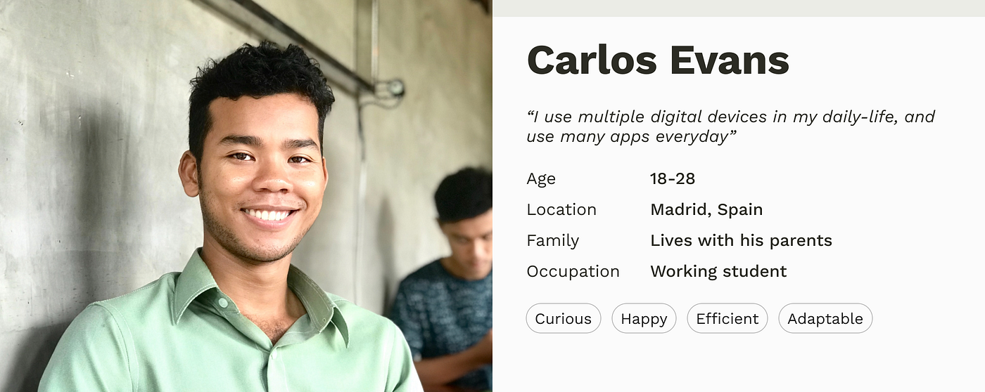
persona snapshot
Target group
In a general sense, the software is accessible to everyone. But Microsoft has positioned itself to provide a solution for academic and professional institutions due to the pandemic by bringing new features. The most particular targets for universities are students and teachers who have a regular grip on IT tools, especially students who are, for the most part, born of the Z generation. They are, therefore, digital natives who have a better understanding of the uses and are more likely to adapt to a digital transition.
This week I’ve been looking at what makes good design and what rulebooks can be consulted. Conversely, I thought about whether these could be used as a guide for creating deceptive design patterns* by following the respective opposite. Therefore I reviewed rules, principles and heuristics from design legends and usability experts like Ben Shneiderman, Don Norman, Dieter Rams and Jakob Nielsen. And this would probably work pretty well.
Rule 1: Aim for inconsistency
Strive for consistency (Ben Shneiderman) Consistency (Don Norman) Consistency and standards (Jakob Nielsen)
If an interface is not coherent the user will have a hard time to operate and navigate. Therefore it is more likely that he makes a mistake by selecting options he did not intend to. Example are to switch „Yes“ and „No“ buttons or introduce new functionalities to established triggers.
Rule 2: Do not provide any feedback
Offer informative feedback (Ben Shneiderman) Feedback (Don Norman) Visibility of system status (Jakob Nielsen)
By not giving back information about the last action or current system status, users will not recognize mistakes made. As a result they will carry on with the process until it is too late to reverse it. For example, warnings should be refrained from issuing as additioal costs are added.
Rule 3: Make reversal of action as hard as possible
Permit easy reversal of actions (Ben Shneiderman) User control and freedom (Jakob Nielsen)
By making it impossible to go back one step without reloading the entire page and loose all previous actions, users might be persuaded to stick with their minor mistakes. Additionally reversing a completed process, like a subscription, should be fairly difficult for example by only providing analog cancellation.
Rule 4: Make interface utmost unclear
Good design makes a product understandable (Dieter Rams) Help and documentation (Jakob Nielsen)
If the user is not completely sure how to reach his goal and there is more than one possibility how it could work out, he would just have to guess. Therefore he might complete unintended actions. A common tool for this strategy is implementing trick questions.
Resumé
To sum it up it is the opposite of Dieter Rams famous principle: „Good design is honest“.
If these rules were actually applied to the entire interface, users would probably give up before they could be manipulated. Nevertheless, some similarities and contrasts to deceptive design patterns* can be found here. Thus, it would be a possibility to establish so-called “light patterns”.
Even if this blog entry contains less scientific facts, it was an exciting change of perspective for me. Next time I am going back to psychology and dive in deeper.
Sources: Norman, Donald A., and Basic Books Verlag. The Design of Everyday Things. Revised and Expanded ed. 2013. Print. Nielsen, J. (1994a): Enhancing the explanatory power of usability heuristics. Proc. ACM CHI’94 Conf. (Boston, MA, April 24-28), 152-158. Dieter Rams: The power of good design. In: https://www.vitsoe.com/us/about/good-design Shneiderman, B., Plaisant, C., Cohen, M., Jacobs, S., and Elmqvist, N., Designing the User Interface: Strategies for Effective Human-Computer Interaction: Sixth Edition, Pearson (May 2016)
Earlier, we talked about software that has revolutionized the way we organize our jobs and enable collaborative work. We focused on free software that was accessible to professionals and academics. But we discovered that both novice and experienced users have problems performing specific tasks, and these results were discovered through user testing. And today we are going to discuss a user test done by students of L’École de Design, realized by Arslan Sifaoui, Théo Geiller and Raphaël Perraud.
Test process
They started with a test of 5 seconds followed by a survey for a general understanding of the software. They then moved on to a more complete and progressive course followed by a survey to verify the understanding of the actions performed. Finally, they asked users for their impressions using open-ended questions to evaluate the quality of the product, as well as the quality of their tests.
For this preliminary test of 5 seconds (Rapid desirability test), the user will be installed in front of the computer and then be exposed for 5 seconds in front of the system so that he can express his impression. He will have to answer a series of quick questions spontaneously and describe on a blank sheet of paper the elements of the interface that he has retained. They asked for their impressions of the aesthetics of the system, the elements of the system they retained, and the functionalities they identified.
Before moving on to the pathways, they asked a sample of people to complete an introductory questionnaire on their profiles to target those who were interested in the tool and to highlight their uses/behaviors using a comparative table.
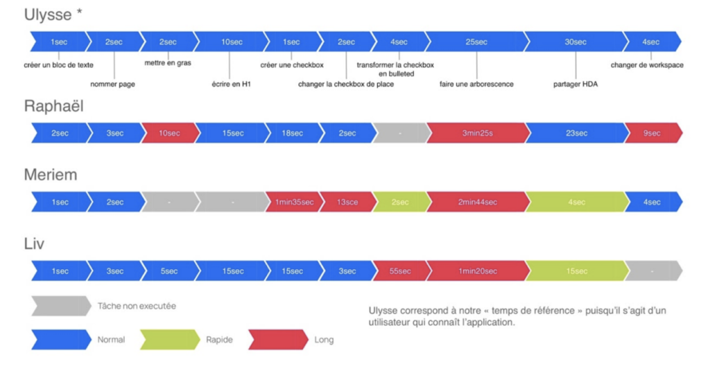
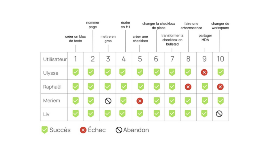
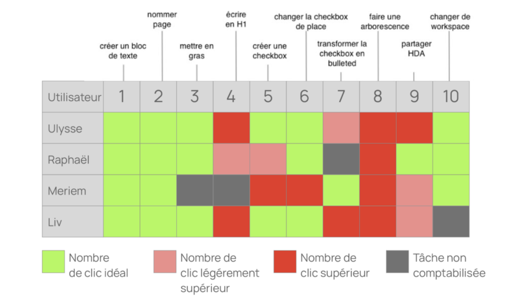
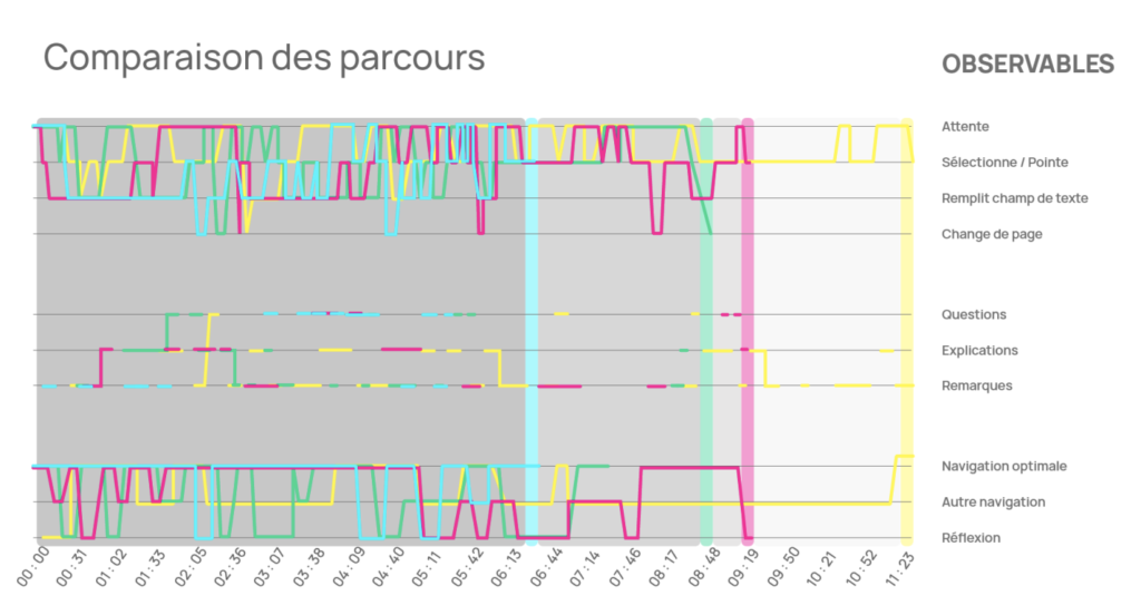
The course consisted, first of all, of editing a page where the user will have to operate as follows: write a text, put it in bold, create a checkbox, change the checkbox of place and finally transform it into a smart list. The next step will consist in creating a tree structure which will have to be shared and finally to change the workspace. This path will allow the desirability of this product and also measure tasks success and time spent. This data was compiled into a timeline, a table of numbers of clicks, and a timeline of activities.
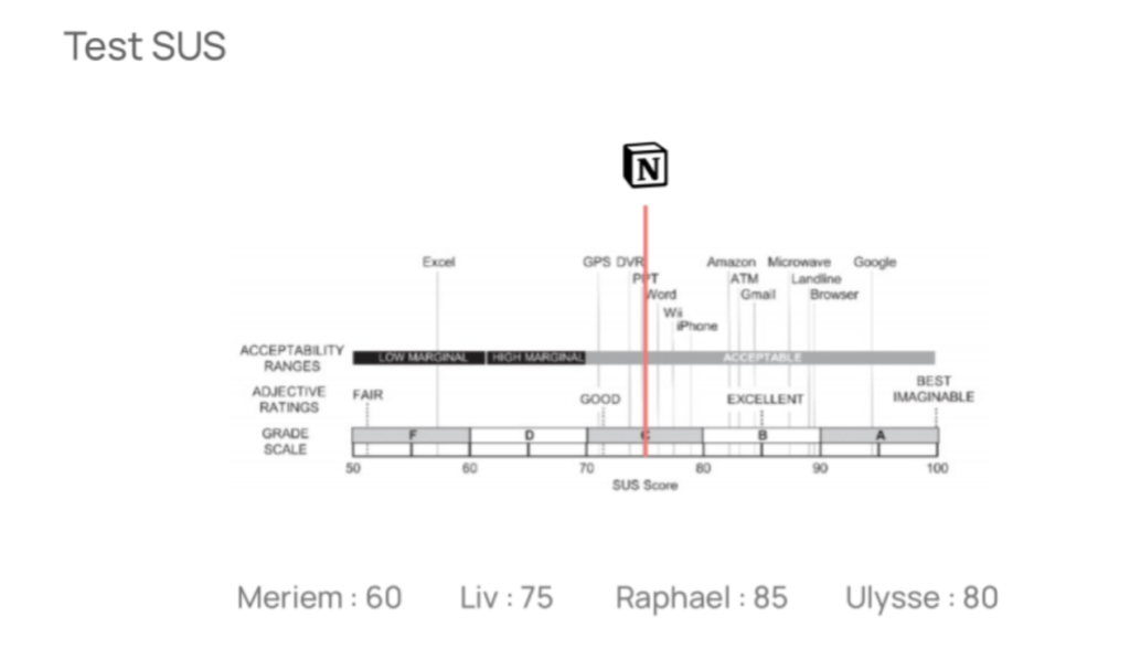
They administered a SUS test to the users with ten questions on a scale of 1 to 5 points to determine their views on the system to assess accessibility. The results of this questionnaire will be collected to compare the scores between users.
Finally, a qualitative questionnaire with sentence completions was administered to determine the weak and strong points of the concept, to measure the desirability of the product.
Analysis results
The introductory survey showed that the users were digital natives, so they were among the potential users, but three of them answered that they preferred to take notes on paper. In the five-second test, the users had a rather good impression of the system, they could identify the navigation area, the structure of the page, the content, and the overall functionality.
With this time analysis, they were able to judge whether the user was able to complete a task over a normal (blue), fast (green), or long (red) time spent. The first competitor (Ulysse) is a regular user of Notion and uses it only for note-taking. On the other hand, the other users had more difficulties on some tasks than others and could perform simple actions, but we can observe that the novice competitors could quickly share a document.
All the tasks were completed, but we can notice that they got stuck on some steps that took them a little bit more time as we had previously seen on the time analysis, such as creating a check-box, changing the workplace, making a tree structure, sharing a document and putting in bold. This time-consuming task is the result of a fairly large number of clicks.
We can notice a correlation between the duration of the task and the number of clicks. The longer the task is going to be, the higher the number of clicks is going to be. That this is remarkable with the creation of a tree structure.
We can notice a clear difference in the user path since the fastest user (blue) serves as a reference among the other users who took time to perform certain tasks because they were exploring the software in depth.
The result of the SUS test qualified the notion software as a good software in terms of its acceptability.
Following the qualitative questions, users reported a good understanding of the system with content creation, prioritization, and work sharing. They were able to experience a tool that breaks the standards of other note software. However, they expressed frustration with the completion of certain tasks, such as the need for time to learn and get used to the system.
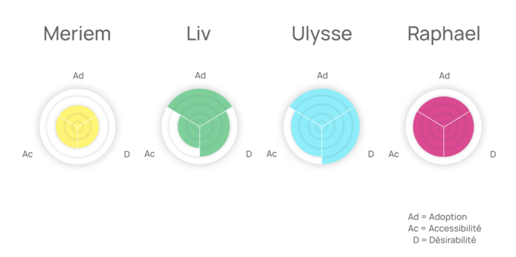
They summarized the results using three criteria: desirability (D), accessibility (Ac), and adoption (Ad). These indicators show the interest in the product (5 seconds test), the understanding of the functionalities (user path), and the ease of use of the product (SUS test).
Conclusion
We can notice that with the help of this user test that the users feel satisfied with the use of this product despite the problems encountered through this tool that has affected the accessibility of this product. The uncluttered aspect of the interface can make the user get lost in the very dense windows and feel frustrated when failing to perform certain tasks. The synthesis of the experience could show that the product is understood by the user even if features like workspace and tree structure are sometimes despised.
This could give me a perspective in this research, as the FH Joanneum University is appropriating a multitasking software to perform online courses as well as online assignment delivery.
I would like to explore in more detail the possibilities that Microsoft teams bring to the daily life of students and teachers. I would also like to investigate the use and usability of this product.