Within todays blogpost I tried to focus more on the psychological aspect of decision making in general and researched some psychological models.
Decision making is the key element of user interaction, hence a big opportunity to manipulate user behavior purposely. For this we need to understand how the process of decision making works. Cognitive psychology research states that there are two opposing systems within human decision making. One works unconsciously, quick and without any effort as it is based on emotions and finding a simple solution. The other one is rather slow and conscious, because it relies on processing data, thinking through possible outcomes and making reasoned choices. Most of the time (95 % of cognitive activity) decisions are made unconsciously – using the first system. Those are intuitive choices and usually linked to going with your gut („Bauchgefühl“). Another important factor in the decision making process is the mood of the user. This in turn can be consciously controlled by various design aspects (e.g. color, visuals or creating experiences). A common way to influence user decisions is nudging. Nudges are defined as following: “changes in choice architecture that predictably influence decisions without restricting freedom of choice” (Peer, E.: Nudge me right: Personalizing online nudges to people’s decision-making styles. SSRN Electronic Journal. 2019, January 29). A famous (positive) example for this is the default choice for organ donors to make it an effort to opt out. Of course this can also be implemented in a negative way and be turned into a deceptive design pattern*.
Don Norman also researched on how emotions influence user behavior in his book „Why we love (or hate) everyday things“. He refers to three levels of the emotional system: the visceral, behavioral and reflective levels. Firstly visceral design is all about the visual aspect of objects or websites. As many objects and companies offer one and the same function, the „looks“ or branding is the only way to differentiate between them. Especially colors, shapes or styles play a big role here. Secondly behavioral design is defined by usability and the way the products works in an environment. Creating pleasure and enjoyment by using the product is the main goal to create positive emotions. Last but not least reflective design is about rationalization of a product. Reflecting on all known information about this product and making a thoughtful decision. So this aligns with our second system of decision making – the conscious one.

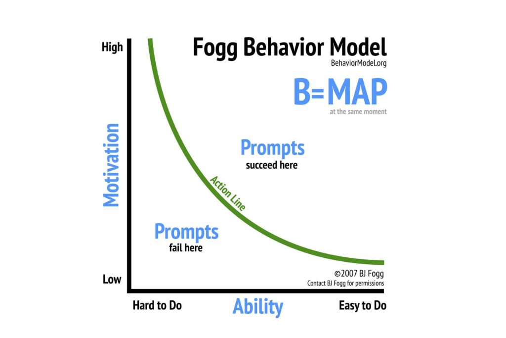
In Foggs behavior model he describes how behavior can be changed with a trigger depending on motivation and ability. The higher the motivation and the easier the task, the more likely is a trigger to succeed. Motivation itself can be divided in intrinsic motivation, triggered through curiosity or meaning, and extrinsic motivation, referring to money or rewards. While extrinsic factors work better for basic routine tasks, complex tasks usually need intrinsic drivers. Examples for ability factors, that can be shaped by designers, are time, resources, effort, …
Next steps:
- Analyze specific tools of „dark psychology“
- Find best (or in this case worst) practice examples for each tool
- Find out if they can be reversed / turned into a light pattern
Sources:
https://www.interaction-design.org/literature/article/norman-s-three-levels-of-design
https://dl.acm.org/doi/10.1145/3173574.3174108
https://doi.org/10.17011/ht/urn.202008245641
* formerly called “dark pattern”