Theories of Deceptive Design Patterns

The foundation for the starting point of the work is the “Dark patterns Taxonomy”, developed by Harry Brignull, which provides a detailed classification of different types. (Brignull, 2011) Additionally, there are several explanatory approaches or theories that have been proposed to explain the use of dark patterns in user interface design. One theory is that dark patterns are the result of a conflict between the interests of the designers, who are often motivated by profit or other commercial goals, and the interests of the users, who may not be aware of the manipulation. This theory suggests that designers use dark patterns because they are more effective at achieving their goals than other, more transparent methods of persuasion. (Fogg, 2003, p. 16)

Another theory is that dark patterns are the result of a lack of ethical awareness or consideration on the part of designers. This theory suggests that designers may not be intentionally trying to deceive or manipulate users, but rather they may be unaware of the potential negative consequences of their design choices.

There has been much debate in the field of human-computer interaction (HCI) about the ethical implications of dark patterns and the role of designers in promoting or preventing their use. Some HCI researchers argue that designers have a responsibility to consider the ethical implications of their work, and to design interfaces that respect the autonomy and well-being of users. (Harris & Light, 2012, p. 51) Others argue that it is not the role of designers to dictate user behavior, and that users should be empowered to make their own decisions about how to interact with technology.

There are several principles that have been proposed to guide the ethical design of user interfaces, including transparency, fairness, choice, and respect for user autonomy. These principles can help designers to create interfaces that are more transparent and less manipulative, and that give users more control over their interactions with technology.

Persuasion is the act of influencing someone’s beliefs, attitudes, or behaviors through communication. It is a common goal of marketing and advertising and is often achieved by various techniques such as appeals to emotion, appeals to authority, and framing. In the context of dark patterns, persuasion is used to manipulate users into performing actions that they might not otherwise perform and is often achieved through deceptive or manipulative techniques. (Hassenzahl & Tractinsky, 2006, p. 92)

Sources:

Brignull, Harry. ‘Dark Patterns: Deception vs. Honesty in UI Design’. A List Apart (blog), 1 November 2011. http://alistapart.com/article/dark-patterns-deception-vs.-honesty-in-ui-design/.

Fogg, B. J. ‘Persuasive Technology: Using Computers to Change What We Think and Do’. Ubiquity 2002, no. December (December 2002): 2. https://doi.org/10.1145/764008.763957.

Harris, J, and B Light. 2012. “Ethical Design and the Responsibility of HCI.” Interactions 19 (5): 50-53.

Hassenzahl, M, and N Tractinsky. 2006. “User Experience – A Research Agenda.” Behaviour & Information Technology 25 (2): 91-97.
Deceptive Design Patterns – State of Research

As a designer, it is important to be aware of the potential for deceptive design patterns and to avoid using them in your own work. As UX designer Harry Brignull explains, “dark patterns are interfaces that are designed to trick people into doing things they might not otherwise do” (Brignull, 2010).

Furthermore, using dark patterns can have serious negative consequences for users. These design techniques are often designed to trick users into taking actions that they might not otherwise have taken, such as signing up for a subscription or making a purchase. This can lead to situations where users feel deceived or frustrated, which can damage their overall experience of the product or service (Nunes et al., 2018).

On a broader level, the use of dark patterns can also contribute to a culture of mistrust and skepticism among users. As more and more products and services employ these manipulative design techniques, users may become increasingly wary of interacting with digital products and services (Cheshire & Fox, 2014).

Research on deceptive design patterns is ongoing, and there is currently no consensus on the best ways to avoid them. However, some sources recommend following ethical design principles and considering the potential consequences of your designs on users. For example, the Nielsen Norman Group, a user experience consulting firm, offers professional insights and some principles on how to avoid deceptive design patterns, such as being transparent about the goals of your design, avoiding manipulations that could harm users, and giving users control over their own actions. (NNGroup, 2021)

My own work will build on this and add up on not only understanding what makes deceptive design patterns unethical or how to avoid them, but also on how they can easily be reversed and turned back into user-friendly designs.

Sources:

Brignull, H. (2010). Dark patterns: 10 examples of online trickery. Retrieved from https://www.theguardian.com/technology/2010/jun/18/dark-patterns-examples-online-trickery

Cheshire, C., & Fox, S. (2014). The dark side of user-centered design. Communications of the ACM, 57(7), 24-26.

NNGroup. “The Role of Design Ethics in UX”. July 2, 2021. Conference Recording, 4:24. https://www.youtube.com/watch?v=cySX_CmFGcc

Nunes, J., Cunha, J., Verissimo, P., & Lopes, J. (2018). Dark patterns: A dark side of user experience design. In Proceedings of the 2018 CHI Conference on Human Factors in Computing Systems (pp. 1-14). ACM.

EVALUATION OF MASTER’S THESIS

Task 3 – Proseminar Master´s Thesis

Title                   Investigating Dark Pattern Blindness

Author               Matthias Sluijpers

University         Utrecht University (UU)

LEVEL OF DESIGN

The author of this master’s thesis kept the design rather minimalistic and probably used a standardized preset given by university. Simple headings, a single-column grid, and even margins define the layout. The only visible personalized design element is a very simple and low-impact graphic on the front page. However, a clear structure is given to the reader, which is of course crucial for a scientific paper.

DEGREE OF INNOVATION

The term “deceptive design pattern” (formerly “dark pattern”) is very young for a scientific topic and was first mentioned only in 2010. Nevertheless, the topic is very present and often dealt with in the context of ethics in digital design. Furthermore, there are already various studies about dark pattern-blindness, so it is nothing completely new. As stated by the author himself the question on useful countermeasures for deceptive design patterns would have been a step further and more innovative.

INDEPENDENCE

The work contains both a comprehensive search of the literature and a very detailed empirical method of data collection, analysis and interpretation. This suggests a neat and independent work. It can be said that the work stands on its own and does not require any swerving, additional research or deep prior knowledge on the part of the reader.

OUTLINE AND STRUCTURE

According to the table of contents, the thesis is divided into seven chapters, which in turn are broken down into up to three further sub-levels. The theoretical research, the objectives of the thesis, the method and the results are clearly delineated from each other. The literary and empirical parts complement each other well and result in a coherent overall concept.

DEGREE OF COMMUNICATION

In general I would say that the text is easy to read and understand. The author does not use a lot of technical jargon and most unknown terms are explained within the thesis. Tables, screenshots of the web applications shown and various infographics support the textual presentation of the results of the experiment. The appendix also contains the transcript of the experiment for review.

SCOPE OF THE WORK

The entire work comprises 230 pages, which makes it seem very time-consuming and precisely elaborated. In addition, the planning, execution and evaluation of the experiment is carried out in above-average detail. Even if, according to the author, some results did not turn out as desired and as a result the hoped-for comparisons could not be drawn, the work standard for a master’s thesis is definitely met.

ORTHOGRAPHY AND ACCURACY

Since English is not my native language, I found it a bit harder than usual to evaluate the orthography and accuracy of the text. All in all I would say that it is pretty well written and I could not find any obvious mistakes. The only thing I noticed is that the author often repeats the same words and phrases in sentences or paragraphs.

LITERATURE

It can be seen from the bibliography that the sources used cover a lush period from 1970 to 2022, and thus older and very recent works are consulted. The quotations are largely from conferences and articles and only very occasionally from experts’ books. Additionally a lot of internet sources are cited, however those are mostly from known authors in the field and trustful sources. Within the citations, the download links (e.g. Researchgate) of the full texts have been inserted, which looks a bit unprofessional.

Sluijpers, Matthias: Investigating Dark Pattern Blindness. Unpublished. Master’s Thesis. Utrecht University. Utrecht 2022

Deceptive Design Patterns #7

This Blogpost is rather intended to help me shape my research topic than actually gathering a lot of new information/dive in deep into a subtopic as I am currently working on my research proposal. To get back on track I am going to start with a short summary about what happened so far.

Summary

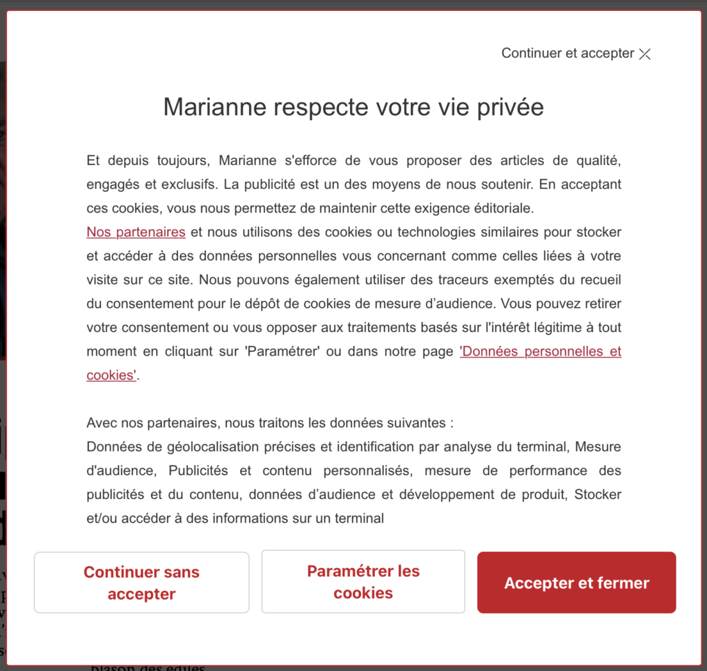
By definition, making deceptive design patterns means „designing an interface or experience in a way to manipulate users on purpose for the companies sake.“ This can be translated into using a design approach to trick user into doing something they did not intend on doing. There are various different types of deceptive design patterns (11 types according to Brignull), which was the starting point of my research. However the prime example tangential to each of us is the cookie consent manager. Usually the acceptance-button is way bigger than all the others and additionally adjusting Cookies-Settings is difficult and time consuming. Almost never you can find „Decline all“ as primary button. This is an ethical question and we as designers are definitely responsible to find a balance between clients/their business and the user. Therefore we need to rethink all our UX decisions in order to know when it turns into a deceptive design which should always be avoided. Deceptive design patterns are usually influencing decision making and there are two ways of doing this: Finding quick and simple solutions based on our emotions and slower, conscious decisions by processing all available data. 95 % of the time we decide unconsciously and just go with our gut. A quite common way to influence decision making is Nudging, which is achieved by changing process without limiting choice, for example opt in organ donors by default to increase the number of them. To use this strategy in a negative way turns it into a deceptive design pattern real quick. Within my research I also analyzed to examples of deceptive design patterns and showed a suggestion on how it is would be more user friendly. In both cases the UI and visual feel do not change at all with this small adaptations, which proves that they did it on purpose and it could be reversed easily. I also did an excursion in my research on data tracking since it is a related topic. For 2 years there have been new privacy rules in Europe, however the big players still ignore this. But in the future there will be consequences for instance a recent ruling that would make google analytics illegal. I also had a closer look on principles of good design by legends like Donald Norman, Ben Shneiderman, etc. Doing the opposite of those rules is basically an instruction for deceptive design patterns. But this also means this is the way to reverse/avoid them. Just follow the most important rule: Good design is honest. 

Main focus points of the thesis and next steps

In my thesis I want to start with a more detailed research phase on the topic, then use the knowledge to apply it on real life examples and develop something new out of it. Following theory will be tackled:

  • Ethics in UX Design (Universal Design, Codes of conduct in UX, Critical Design)
  • Psychology of Perception (Human senses, Persuasion, Manipulation/Deception)
  • Existing Design Guidelines in UX (Golden Rules of interface design, Usability Heuristics, …)

My next steps are to collect a lot of different examples, analyze and try out ways to revert them. Furthermore I want to define a good way how to communicate the problem of deceptive design with clients and make them understand why this is not the smartest way to design and that satisfied users increase profits in the long run. Hence the thesis is a handbook for designers how to actively work against deceptive design.

Idea of a new platform for designers

The idea is to use all this research to create a new platform for designers to fight deceptive design. The main inspiration is Harry Brignull’s website deceptive.design, but instead of just collecting examples in a hall of shame I want to create a community that turns those examples into light patterns. This will be achieved by making weekly, open for public, design challenges with the goal of reverting a specific dark pattern of a company and increase its usability. Consequently companies have free access and input on how to change their products for the better including possible designers that they can hire. Furthermore the platform should serve as a place of exchange for designers about deceptive design and thus give more attention to the problem. The aim of the thesis is to shape the concept of the platform, do research on target group and stake holders, design a functioning prototype and evaluate it in a usability test or execute a heuristic evaluation.

Dark Patterns to Deceptive Design

There has been a very recent change in the wording of dark patterns. In order to be more clear, inclusive and prevent the further association between the words „dark“ and „bad“, many companies and individuals adapted the term to deceptive design patterns. Taking action against racism by reflecting and actively avoiding negative linguistic stereotypes is very important in todays society in my point of view, which is why I decided to change the term in all my previous articles and am going to use the term „deceptive design patterns“ from now on.

List of Literature

In order to check if there is a reasonable amount of literature on my topic available I decided to start a collective list of books and articles to quote in my thesis.

  • Alrobai, Amen, John McAlaney, Huseyin Dogan, Keith Phalp, und Raian Ali. „Exploring the Requirements and Design of Persuasive Intervention Technology to Combat Digital Addiction“. In Human-Centered and Error-Resilient Systems Development, herausgegeben von Cristian Bogdan, Jan Gulliksen, Stefan Sauer, Peter Forbrig, Marco Winckler, Chris Johnson, Philippe Palanque, Regina Bernhaupt, und Filip Kis, 9856:130–50. Lecture Notes in Computer Science. Cham: Springer International Publishing, 2016. https://doi.org/10.1007/978-3-319-44902-9_9.
  • Gray, Colin M., Yubo Kou, Bryan Battles, Joseph Hoggatt, und Austin L. Toombs. „The Dark (Patterns) Side of UX Design“. In Proceedings of the 2018 CHI Conference on Human Factors in Computing Systems, 1–14. Montreal QC Canada: ACM, 2018. https://doi.org/10.1145/3173574.3174108.
  • Nielsen, Jakob. „Enhancing the Explanatory Power of Usability Heuristics“. In Proceedings of the SIGCHI Conference on Human Factors in Computing Systems Celebrating Interdependence – CHI ’94, 152–58. Boston, Massachusetts, United States: ACM Press, 1994. https://doi.org/10.1145/191666.191729.
  • Norman, Donald A. The design of everyday things. Revised and Expanded edition. New York, New York: Basic Books, 2013.
  • Shneiderman, Ben. Designing the user interface: strategies for effective human-computer-interaction. 3rd ed. Reading, Mass: Addison Wesley Longman, 1998.
  • Shneiderman, Ben, Catherine Plaisant, Maxine Cohen, Steven M. Jacobs, und Niklas Elmqvist. Designing the user interface: strategies for effective human-computer interaction. Sixth Edition. Boston: Pearson, 2017.
  • Rams, Dieter: The power of good design. In: https://www.vitsoe.com/us/about/good-design
  • Komninnos, Andreas: Norman’s Three Levels of Design. In: https://www.interaction-design.org/literature/article/norman-s-three-levels-of-design
  • Fogg, Brian Jeffrey: Fogg Behavior Model. In: https://behaviormodel.org
  • nyob(Jan 13, 2022): Austrian DSB: EU-US data transfers to Google Analytics illegal. In: https://noyb.eu/en/austrian-dsb-eu-us-data-transfers-google-analytics-illegal
  • Maier, Maximilian, und Rikard Harr. „Dark Design Patterns: An End-User Perspective“. Human Technology 16, Nr. 2 (31. August 2020): 170–99. https://doi.org/10.17011/ht/urn.202008245641.
  • Ardito, Carmelo, Paolo Buono, Danilo Caivano, Maria Francesca Costabile, und Rosa Lanzilotti. „Investigating and Promoting UX Practice in Industry: An Experimental Study“. International Journal of Human-Computer Studies 72, Nr. 6 (Juni 2014): 542–51. https://doi.org/10.1016/j.ijhcs.2013.10.004.
  • Bardzell, Jeffrey, und Shaowen Bardzell. „What Is ‚Critical‘ about Critical Design?“ In Proceedings of the SIGCHI Conference on Human Factors in Computing Systems, 3297–3306. Paris France: ACM, 2013. https://doi.org/10.1145/2470654.2466451.
  • Conti, Gregory & Sobiesk, Edward. (2010). Malicious Interface Design: Exploiting the User. 271-280. 
  • De Martino, Benedetto, Dharshan Kumaran, Ben Seymour, und Raymond J. Dolan. „Frames, Biases, and Rational Decision-Making in the Human Brain“. Science (New York, N.Y.) 313, Nr. 5787 (4. August 2006): 684–87. https://doi.org/10.1126/science.1128356.
  • Edwards, Ward. „The Theory of Decision Making.“ Psychological Bulletin 51, Nr. 4 (1954): 380–417. https://doi.org/10.1037/h0053870.

NIME: Creating an Online Ensemble for Home Based Disabled Musicians: why disabled people must be at the heart of developing technology.

by Amble Skuse, Shelly Knotts

Generally the article addresses the use of universal design for software products that are accessible to musicians with various disabilities. Although I am not specifically involved with music interfaces myself, both privately and professionally, it was very interesting for me as an interaction designer to gain more insights into the field. Even if the article is about two different softwares and how they could be improved in order to be more accessible, there is a lot of information and input that can be applied to any other area or digital product.

Disabilities

Within the first paragraphs of the text the authors tackle the term „Disability“. Rather than seeing disabled people as a minority group, who are not able to act the same way non-disabled people can, they want to create a framework with all people and their individual needs working together and being equally included without having one dominant group. This is also a reassuring theme throughout the whole article: Working with the knowledge and experience of disabled people instead of assuming or trying to „solve“ problems for them. One key finding of their research is to bring disabled persons in the process, begin with an equitable approach and make technology more flexible, robust and inclusive.

Universal Design

As previously mentioned the approach of designing for disabled musicians sets its focus on Universal Design, especially on the first principle – „Equitable Use“, which is summed up in following four points:

1a. „Provide the same means of use for all users: identical whenever possible; equivalent when not.

1b. Avoid segregating or stigmatizing any users.

1c. Provisions for privacy, security, and safety should be equally available to all users.

1d. Make the design appealing to all users.“ [1]

Research Goals

The overall goal of this article is to inspire other designers and spread awareness that there is a lot of potential to make music technology systems accessible by providing information and support. As the title of the paper suggests, the project focuses on home-based disabled musicians in order to to provide access for them to collaborate with each other and perform live, both online and at physical events. Particularly important in this project was, that it is „disabled-led“ by putting disabled people in the foreground and actually start with their input instead of sprinkling in on top in the end.

Interviews

The first stage of the project was an interview phase with 15 home-based disabled musicians from all over the world. They had a diverse range of disabled identities, eg. mobility issues, d/Deaf, Autism, …, however the interviewees were not as demographically diverse as they wished for. For me this was very interesting to see how they handled this by just communicating it open and honest. The following categories of questions were included in the interviews:

  • the approach of making music
  • their personal requirements from music making applications (setup, handling, …)
  • their personal requirements for learning (concentration span, explanation, …)
  • their personal requirements for performance (real time or pre-recorded, duration of performance, …)

Analysis

At first the project laid its focus on live coding, because it does not require additional hardware like MIDI controllers and can be controlled with various assistive technology like eyegaze or head mouse controllers. Furthermore the bandwidth requirements are reduced in comparison to audio transmission. However the workshop with the target group showed that they are not really into live coding, but would prefer using their existing hardware, which is why the authors decided to shift the focus to audio streaming platforms. Following software tools were analyzed in the paper: Estuary, a live coding interface, Icecast, an audio streaming software, and LiveLab, an open source browser-based interface for sharing video and audio. 

Findings

Besides some technical issues with the software there were major political issues in the project. Overall the companies had the feeling that making their products accessible does not fully pay off, so they wanted to restrict the needs to their availability of time and money. One of the main approaches was to make an easy version of the software, which would never be a real part of the main program and therefore not adapted or updated over time. This of course did not match the findings of the interviews at all. Here it was a great concern to put the whole structure and the working process itself above small, surface adaptations. Specifically the musicians wished for a flexible layout, a quick response time, a well documented help, captions in videos, robustness with assistive hardware, accessibility as a part of the main software and including disabled people in the design process. Another main finding was that experiencing being in the community generates and expert knowledge of accessibility, which should always be considered and used in this context. 

Conclusio

Personally I felt that the major issue here was definitely a political one. Companies would rather not make it fully accessible due to financials and since it is not regulated by law or state funded they don’t feel obligated to do adapt their products. „Half accessibility is no accessibility“ was definitely a key statement for me in this article. To end my post on a positive note: I liked how the article stressed the importance of including a broad span of needs in any design work and prioritizing workflows and flexibility in order to be accessible for all. 

Sources

Amble H C Skuse and Shelly Knotts. 2020. Creating an Online Ensemble for Home Based Disabled Musicians: Disabled Access and Universal Design – why disabled people must be at the heart of developing technology. Proceedings of the International Conference on New Interfaces for Musical Expression, Birmingham City University, pp. 115–120.

[1] National Disability Authority: What is Universal Design. The 7 Prinicples. In: https://universaldesign.ie/what-is-universal-design/the-7-principles/#p1 (zuletzt aufgerufen 4.6.22)

Excursus: Data Tracking

As data tracking and cookie consents play a big role in developing deceptive design patterns* I would like to make an excursion and dive into privacy and data protection in today’s blogpost. Due to a recent ruling of the Austrian Data Protection Authority on a case filed by noyb, using Google Analytics violates the General Data Protection Regulation (GDPR, dt. DSGVO) and is therefore illegal. Other EU-countries are expected to follow this example. Reason for this is the ruling in 2020 that banned US providers within the European Union, because they violate the GDPR by giving away personal data to the US authorities.

What is noyb?

noyb is an organization founded by Max Schrems – an Austrian lawyer and privacy activist – that focuses on data protection and fights for compliance with the GDPR, thus actively protecting the privacy rights of individuals. The platform combines the work of lawyers, legal tech specialists, hackers and consumer right groups and uses PR and media as a tool to create awareness in order to force companies to comply with the European privacy laws set out in the GDPR. Their strategy is to analyze and find infringements all over Europe and litigate them afterwards. The main goal of the operation is to maximize privacy and digital freedom for all citicens. 

What is Google Analytics?

Like I already mentioned in the intro of this blogpost there has been a pioneer ruling in 2020 – the „Schrems II“ ruling – which legally defined that data transfer to US providers is violating the GDPR, making the „Privacy Shield“ inadmissible. The main reason for this decision was that US authorities have access to personal data, eg. user identification numbers, IP address and browser parameters, by US law. However the big players in the tech industry like Microsoft, Facebook, Amazon and Google tried to find loopholes by editing statements in their privacy policies instead of actually making their services comply with the new laws. Consequently Schrems filed 101 complaints in many European states to against those companies. The Austrian Data Protection Authority was the first one to react on this complaint by declaring Google Analystics an illegal service in Austria. As other countries are likely to follow this will create pressure on Google and other US providers to adapt their services and protections. If they don’t choose to adapt or host foreign data inside Europe, EU websites are forced to use different tracking tools, even if Google Analytics is the most common statistics program at the moment by far. For now there is no further information on possible penalties. In the long run the responses of the US government will determine wether US providers will eventually comply with the GDPR or there will be different products for US and EU in the future.

Sources:
https://noyb.eu/en/austrian-dsb-eu-us-data-transfers-google-analytics-illegal
https://orf.at/stories/3243496/
https://www.derstandard.at/story/2000132495447/behoerde-google-analytics-verstoesst-gegen-die-datenschutzverordnung

* formerly called “dark pattern”

Analyse Deceptive Design Pattern (part2)

This week I found another „good“ example for a deceptive design pattern* to analyze.

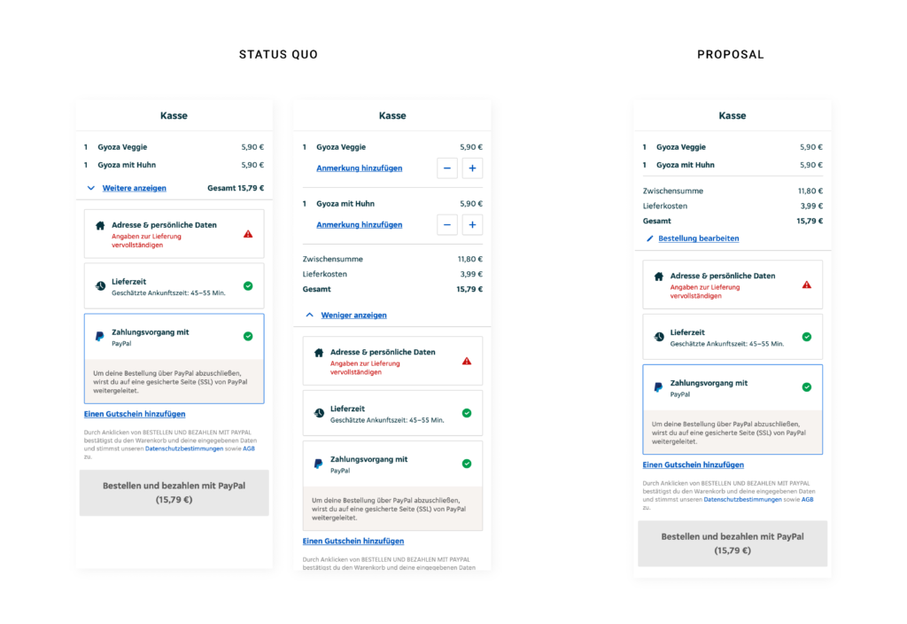
Within the checkout process on Lieferando.at they provide a short summary about the order and give feedback on filling out all relevant data to place an order. It seems like they list ALL cost and sum them up, but if you have a closer look the amount is bigger than the summary of the listed products. So the user has to click the button „Weitere anzeigen“ to see, that they add additional cost for delivery. As there would be enough space within viewport height to make the delivery fee visible from the start, it is clear that they want to hide it on purpose. Apart from additional cost they also give the options to edit the order or add notes for specific dishes in the extended version. Consequently it would increase the usability of the site to also change the wording from „Weiter anzeigen“ to „Bestellung bearbeiten“ („Edit order“). On the right hand side I added a quick-fix-design-proposal to cancel this deceptive design pattern* and enhance usability.

* formerly called “dark pattern”

Analyse Deceptive Design Pattern

In this short blogpost I want to analyze one examples of a deceptive design pattern* that I stumbled across during my research in detail.

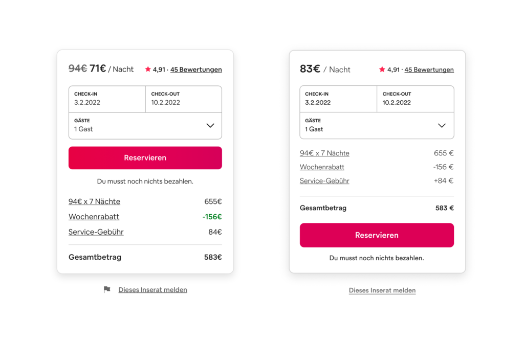
On every detail page of an apartment on airbnb there is a small overview on booking dates and prices (left image). The whole container is basically divided in two parts: a summary with a CTA and the calculation underneath. The hierarchy within this module is clear as the price per night is highlighted with big, bold font style. They use this number as the most representative value even if there are some additional fees added later on and it is not possible to book the apartment at that price. So to get the „real“ price per night the user has to manually divide the overall price for the stay including the service fee by the nights. The CTA is placed above the calculation, therefore some users might click on the pink button before they read about additional fees. Furthermore the weekly discount is displayed twice and highlighted whereas the fee is just in default text style. My suggestion to correct this deceptive design pattern* is to use the correct price per night including all fees, add a plus to the service fee amount and move the CTA to the bottom (right image).

* formerly called “dark pattern”

How to deceptive design pattern

This week I’ve been looking at what makes good design and what rulebooks can be consulted. Conversely, I thought about whether these could be used as a guide for creating deceptive design patterns* by following the respective opposite. Therefore I reviewed rules, principles and heuristics from design legends and usability experts like Ben Shneiderman, Don Norman, Dieter Rams and Jakob Nielsen. And this would probably work pretty well.

Rule 1: Aim for inconsistency

Strive for consistency (Ben Shneiderman)
Consistency (Don Norman)
Consistency and standards (Jakob Nielsen)

If an interface is not coherent the user will have a hard time to operate and navigate. Therefore it is more likely that he makes a mistake by selecting options he did not intend to. Example are to switch „Yes“ and „No“ buttons or introduce new functionalities to established triggers.

Rule 2: Do not provide any feedback

Offer informative feedback (Ben Shneiderman)
Feedback (Don Norman)
Visibility of system status (Jakob Nielsen)

By not giving back information about the last action or current system status, users will not recognize mistakes made. As a result they will carry on with the process until it is too late to reverse it. For example, warnings should be refrained from issuing as additioal costs are added.

Rule 3: Make reversal of action as hard as possible

Permit easy reversal of actions (Ben Shneiderman)
User control and freedom (Jakob Nielsen)

By making it impossible to go back one step without reloading the entire page and loose all previous actions, users might be persuaded to stick with their minor mistakes. Additionally reversing a completed process, like a subscription, should be fairly difficult for example by only providing analog cancellation. 

Rule 4: Make interface utmost unclear

Good design makes a product understandable (Dieter Rams)
Help and documentation (Jakob Nielsen)

If the user is not completely sure how to reach his goal and there is more than one possibility how it could work out, he would just have to guess. Therefore he might complete unintended actions. A common tool for this strategy is implementing trick questions.

Resumé

To sum it up it is the opposite of Dieter Rams famous principle: „Good design is honest“.

If these rules were actually applied to the entire interface, users would probably give up before they could be manipulated. Nevertheless, some similarities and contrasts to deceptive design patterns* can be found here. Thus, it would be a possibility to establish so-called “light patterns”.

Even if this blog entry contains less scientific facts, it was an exciting change of perspective for me. Next time I am going back to psychology and dive in deeper.

Sources:
Norman, Donald A., and Basic Books Verlag. The Design of Everyday Things. Revised and Expanded ed. 2013. Print.
Nielsen, J. (1994a): Enhancing the explanatory power of usability heuristics. Proc. ACM CHI’94 Conf. (Boston, MA, April 24-28), 152-158.
Dieter Rams: The power of good design. In: https://www.vitsoe.com/us/about/good-design
Shneiderman, B., Plaisant, C., Cohen, M., Jacobs, S., and Elmqvist, N., Designing the User Interface: Strategies for Effective Human-Computer Interaction: Sixth Edition, Pearson (May 2016)

* formerly called “dark pattern”

Types of deceptive design patterns

In todays blogpost I want to get a bit more specific and list types of deceptive design patterns* with some extraordinary bad examples for those technique. I am going to use the 12 defined types of deceptive design patterns* from Harry Brignull. 

Bait and Switch

This pattern works with previous experience and common user interactions. The user wants to complete an action, but something different, undesired or even the exact opposite thing happens. The most famous example for bait and switch is the Microsoft update pop-up to Windows 10. Normally clicking the „x“-button in the upper right corner means closing the window without completing any action. In this case they switched the meaning to „Yes, let’s do this update“. Another common strategy is to simply switch „Yes“ and „No“ Buttons for additional add-ons in an e-commerce process.

Source: https://www.darkpatterns.org/types-of-dark-pattern/bait-and-switch

Disguised Ad

In this case ads are hidden and they seem like they are actually part of the interface. Since they look like content or any kind of navigation, users are clicking them assuming it is a genuine interaction of the website. Prime example here are download buttons linking to different websites.

Forced Continuity

This pattern tricks users into continuing any kind of paid membership by charging them after a free trial without a warning or making it really hard to cancel on automatic renewed subscriptions.

Friend Spam

Users grant access to numbers or emails in their phone or connect their social media accounts in order to „find friends“ within this environment, but the product actually spams all contacts pretending to be the user himself. 

Hidden Costs

A design that intentionally hides costs and makes product or service seem cheaper by adding additional costs or fees later on. As the user is already in the checkout process, it is more likely that he continues anyway even after realizing the price change. Usually those hidden fees are delivery costs or service fees.

Misdirection

This pattern is also known as aesthetic manipulation. Focusing the user’s attention on an interaction to distract them from something else. There are many different approaches on how to use this dark patterns as it does not have a simple context like many other types.

Price Comparison Prevention

Showing the price of products or service in a way that makes it difficult for the user to compare two items. One way of achieving this is work with different units and not showing price per weight. Another one is to show prices of products only on each subpage and never next to each other so the user has to remember the price and go back and forth to actually compare them.

Privacy Zuckering

Maybe the most famous of all deceptive design patterns*: tricking users into agreeing to share all their personal information. Most users are aware that cookie-concent-managers make it difficult to opt out on purpose. Additionally this one is regulated by law. 

“X”-Button is not simply closing the pop-up, but accepting all cookies. Screenshot: https://www.darkpatterns.org/types-of-dark-pattern/bait-and-switch

Roach Motel

The model describes that users easily get into a situation, but find it difficult to get out of it. This mostly happens when a user signs up for something quickly, but then is having a hard time to cancel the membership (e.g. with a phone call during business hours).

Users can not cancel by filling out a form, but have to interact with an employee. Screenshot: https://help.nytimes.com/hc/en-us/articles/360003499613-Cancel-your-subscription

Sneak into basket

Sneaking products into the users basket, that they did not add themselves. Sometimes this pattern is justified with making suggestions to enhance the user experience, but actually it is just tricking them into buying something by mistake.

Trick Questions

Using unnatural language, like double negatives, to confuse the user and manipulate their actions. Especially often this pattern is used in forms to get users to subscribe to the newsletter.

That’s it for today 🙂 

Source: Harry Brignull: Types of Dark Patterns. In: https://www.darkpatterns.org/types-of-dark-pattern

* formerly called “dark pattern”