Summary on possible focus points for my Master Thesis

| a final summary of the ideations about my first master thesis topic option.

During this third semester of my studies, I researched different aspects of the topic around Trust in In-Vehicle Driver Assistant Systems. I formulated the following first proposal, to summerize the direction:

Working Title: UI design solutions for trust in driver assistance systems
Advanced driver assistance systems (ADAS) are broadly present in today’s vehicles. Their contribution to driving could possibly increase in the future until reaching full autonomy, but only if the drivers are willing to let them take over control. Trust in such safety-critical automated systems is key to their acceptance and use. The user interface design of ADAS should be intuitive and suitable for all users to ensure comfort and prevent doubting or misinterpreting the system’s actions.
With my master thesis, I am aiming to explore the communication and interaction elements of ADAS user interfaces, how can they be intuitive and individually suitable for different user needs. After a theoretical research and analysis of the existing systems, I want to carry out user tests comparing different design solutions to answer following questions:

  • Which properties of ADAS user interfaces are neccessary for users’ trust?
  • Which UI elements could and should be individualized?
  • How can a framework for individualizing ADAS UIs look like to maximize users’ trust in the system?

Further work was put into formulating the exposé of the thesis. Within the exposé, the following main and sub-questions were defined:

Main question:
What should a framework for individualizing ADAS UIs contain to maximize users’ trust in the system?

Sub-questions:

  • Which properties of ADAS user interfaces are necessary for users’ trust?
  • Which factors influence the users’ mental models of the system?
  • Which UI elements could and should be individualized?
  • Which control possibilities are necessary in autonomous driving mode for maintaining trust?

After discussions and feedback from an expert in this field, I looked further for a more specific focus points, that could distinguish the master thesis more from the existing research.

I came up with following areas to look into and asked the help of OpenAI [1] to get more insights into the specific topics, with the aim of better understanding the backgrounds and having more foundation to choose the right topic for the thesis.

  • Locus of control / UI control systems design >> which control options are essential in autonomous driving to ensure occupant comfort?

The degree to which a person feels they have influence over how things turn out in their life is referred to as locus of control. [2] The locus of control in the context of autonomous driving refers to the control options available to the passengers and their perception of their level of control over the vehicle’s operation.
It is crucial to offer a variety of control options that give passengers a sense of control over the operation of the vehicle in order to assure occupant comfort in autonomous driving.
This can include controls for changing the vehicle’s speed and direction, regulating the interior environment (such as the entertainment systems and climate control), and giving feedback and information on how the vehicle is operating and the surrounding traffic conditions.
Striking a balance between giving people control and preserving the safety and dependability of the vehicle is an important factor to take into account when designing control options for autonomous vehicles. For instance, having too much control over how the car operates could make it more likely to have accidents or malfunctions, while having too little control could make the occupants feel uncomfortable and powerless.
It’s crucial to take into account the various preferences and expectations of various occupant groups when designing control options in order to guarantee occupant comfort and satisfaction. This can entail offering a variety of control options, letting users customize their control preferences, and giving consumers clear, understandable feedback on how the vehicle is doing.

  • Antropomorphism >> Individualization options when the vehicle becomes “Alexa” and has a personality

Antropomorphism is the process of giving non-human creatures, such as objects, animals, or technology, human-like traits. [3] Antropomorphism can be employed in the context of in-car driver assistance systems to make the vehicle feel more human-like and unique to the driver, which can then improve trust in the technology.
The availability of personalization options can significantly contribute to the antropomorphism of in-car driver assistance systems. For instance, a car can resemble a personal assistant or friend more if its voice and personality can be customized by the driver.
The implementation of AI would be the next step, where the system would learn about the drivers or occupants habits and preferences and adapt itself to their needs.

  • XAI – explainable AI >> UI interfaces and information about the vehicle’s AI system

Explainable AI (XAI) is a field of research that aims to make AI systems more transparent and interpretable, so that their behavior can be understood and trusted by users. If AI systems are applied in vehicles, their understanding by the user would be highly important, supported by the user interface. The UI design therefor can be a crucial challenge from this point of view as well.

After discussing these topics with other experts, questions came up about the influence of cultural differences on the perception and trust in automated systems. There can be factors like cultural norms, values, beliefs and attitudes towards technology that play a role, but also the preferences in receiving information – more shorter and straightforward or more detailed explanations. Cultural psychology would be an area to dig deeper for insights on different perceptions. Besides that, the topic of individualizing the user interfaces appear highly relevant and necessary in this respect as well again.

After these thoughts, I came up with following summarizing problem statement for the thesis:

“How to design anthropomorphic user interfaces for autonomous vehicles that are sensitive to cultural and individual differences in drivers’ preferences and expectations for anthropomorphic design, and support personalization and inclusive user experiences?”

To create a thesis work on this question statement, I applied the steps of Human-Centered Design (HCD): research, ideate, prototype, test – that could be implemented in following way:

  1. Research to understand the cultural and individual differences in drivers’ preferences and expectations for anthropomorphic design
  2. Generate ideas for how to design an anthropomorphic UI that is sensitive to cultural and individual differences
  3. Build a prototype out of the ideated solutions
  4. User testing with drivers from different cultural backgrounds
  5. With the help of the testing results, refine the concept
  6. Ideally, test the refined prototype again to gain insights on the refinement
  7. Document the results

As these steps would not suffice completely as a thesis content, I searched for other methods to combine the HCD approach with. Finally I stumbled upon the Design Science Research method [4], that can complement the HCD steps with the problem definition phase.

By combining the two methods, I could define possible chapters / parts of the thesis in following order:

  1. Introduction: Outlining the research question, discussion of importance and backgrounds.
  2. Literature review: Review of existing literature on the topic of designing anthropomorphic UIs for autonomous vehicles, and the challenges and opportunities involved in designing UIs that are sensitive to cultural differences. Also including relevant design methodologies, such as Human-Centered Design (HCD) and Design Science Research (DSR), as well as specific challenges and considerations related to designing UIs for autonomous vehicles.
  3. Research methods: Description of the research methods used to gather insights into drivers’ preferences and expectations for anthropomorphic design – interviews and surveys.
  4. Results: Presentation of the results and interesting insights from the research.
  5. Design concepts: Description of the design concepts developed based on the research and the principles of HCD and DSR.
  6. Implementation and testing: Process of prototyping and testing the design concepts, including challenges or obstacles and how they were overcome.
  7. Evaluation and refinement: Discussing the results of the testing and evaluation, and description of how this information was used to refine and improve the design.
  8. Conclusions and future work: Summary of key findings, implications of the work. Outline of potential avenues for future research on this topic.

A timetable and preliminary bibliography were also put together for the exposé, but these are not relevant any more for the following reasons, so I won’t include them in this post.

I approached some companies with my master thesis proposal to ask for a collaboration / support / employement with this topic, yet didn’t receive any positive offer. After assessing my possibilities and the necessity of industrial support and insights on the state-of-the-art development to be able to create useful results that are not outdated already, I came to the decision not to continue with this topic as my master thesis.

I found a similarly interesting research project at the university to write my thesis on, so I am not sad about the decision. But still I won’t loose interest in the ADAS UI development and the topic of trust, individualisation, antropomorphism and cultural psychology. I hope to be able to dig into these areas later on during my career as a UX designer and automotive engineer.

Sources:

[1] ChatGPT by OpenAI – https://chat.openai.com/chat
[2] Locus of control – Wikipedia article. Last opened on 06.02.2023 https://en.wikipedia.org/wiki/Locus_of_control
[3] Antropomorphism – Wikipedia article. Last opened on 06.02.2023 https://en.wikipedia.org/wiki/Anthropomorphism
[4] Design Science Research Methodologie – shribe.de, 09.03.2021. Last opened on 06.02.2023 https://shribe.de/design-science-research-methodologie/
Evaluation of a master thesis: Creating Appropriate Trust for Autonomous Vehicles

| Personal evaluation of a Master Thesis submitted to a foreign University, that is dealing with topics in our own research field 

I chose the master thesis by Fredrick Ekman and Mikael Johansson with the title: “Creating Appropriate Trust for Autonomous Vehicles – A framework for HMI design”, as the topic has many overlaps to my research field and intended thesis topic. 

The level of design and first feeling of this thesis is positive. The cover looks attractive, the length of 76 pages (101 in total) and a structure with 9 main chapters gives a solid first impression. A basic point that I can only criticize is the formatting of the text in two columns, which made the reading and navigation through the content difficult.  

The chapters separate the phases of the work in the overview of backgrounds, literature and methodology and practical user testing. Afterwards the framework, the concept development and the validation are documented. It is completed by an example concept and the discussion of the results, including future perspectives. The outline and structure are done well, but still it is not very easy to find specific parts of the methods, unless you studied the structure thoroughly beforehand. 

The introductory part gives a fair overview of the autonomous driving context and the aims and limitations of the work. The thesis states to be limited to the scope of Level 3 automation, which is understandable, as further derivations could be made for Level 4 scenarios. 

I would assess the scope of the work as sufficient. The literature analysis excessively describes the topic of trust, showing a solid understanding of the main and most important aspects of human trust in automation and in autonomous driving. Afterwards it discusses the relevant aspects to build the framework and validates main points. 

Regarding independence and innovation, the authors worked with scientific methods throughout the whole research process of the literature and user testing.  

The user testing was carried out in an interesting way lacking a fully automated vehicle, with a simulation setup using a right-hand drive vehicle to give the left-hand test driver the autonomous ride feeling.  

A novel graph called Optimal Life Cycle of Trust was also created to visualize the change of trust through the user journey. The framework is based on the information gathered from the research, but it sums up the necessary areas of interest regarding trust thoroughly.  

This framework is one of the main results of the thesis and can be helpful for HMI designers. It is probably not a highly innovative solution but gives a solid basis for concept development. An iterative concept development was also done with the use of this framework, that gives as further results three example concepts of new user interfaces. 

The degree of communication is clear, the explanations and concept derivations are understandable. Once the reader has understood the whole methodology and structure of the work, the explanations are comprehensible. 

Regarding orthography and accuracy, the texts were written in an understandable yet scientific form. Abbreviations were explained beforehand, and no grammatical mistakes were found. 

The bibliography is not formatted in the most readable way and misses some source details at a few points, but in general it is thorough and excessive, including many books as well as other media, which appear to be reliable sources. 

Source

Ekman, Fredrick/Johansson, Mikael: Creating appropriate trust for autonomous vehicles. A framework for HMI design. Master Thesis at: Chalmers University of Technology Department of Product and Production Development, Division of Design & Human Factors, Gothenburg, Sweden (2015), 
https://publications.lib.chalmers.se/records/fulltext/226342/226342.pdf (last opened on 29.11.2022) 

Thoughts on Trust with regard to HCI and automotive user interfaces

| a summary on first thoughts and findings on my possible master thesis topic

While I was continuing my research about different in-vehicle interface solutions and future trends, it became clear for me, that driver assistance systems and “autopilot” (autonomous driving) functions play a major role in the cockpits’ features. By assistance systems I mean on the one hand features like lane-keeping, speed control, parking and front distance controls, and on the other hand speaking assistants like Siri or Alexa built in to control navigation and other features. When thinking about the needs of interfaces and the human-machine-interaction with these assistants, for me the most interesting topic is how to get humans to trust the machine that they give the control over?

If Alexa cannot tell the exact weather outside or doesn’t find the song you want to hear, you forgive her and try another time. But if your car does an emergency braking without any reason or does not stop at a red light in autonomous mode, possibly threatening your life, you won’t forgive it and will probably never hand over the control again.

These are my thoughts why I would like to research this topic further:

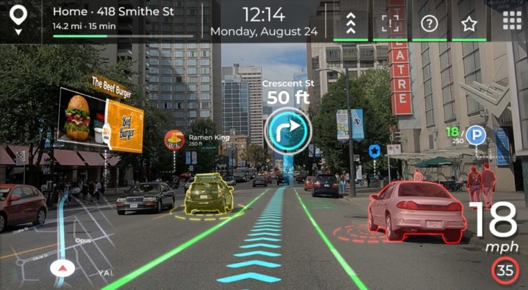
How can we create trust in the vehicles’ assistance systems via interfaces and newest technologies, like augmented reality?

With carrying out case studies, user surveys and user testing of different concepts about existing solutions and new proposals, whether they help to build trust or not, I could imagine to create a master thesis on this question. But for that I start now with researching existing articles and papers on the topic of trust in the context of product design, UX and HCI. While researching keywords for the topic, I came across some scientific papers and articles available online, from which I want to sum up some interesting ideas here. These are only the first ideas I found, at the end I list up all publications that I found to be relevant to the topic as well.

Attributes of a product to build trust

In an article on uxdesign.cc about designing better products by building trust, Aimen Awan [1] mentions Erik Erikson’s stage model, where trust and mistrust is the first psychosocial development phase of a human being, until it has reached about 18 months of age. This period shapes their view of the world and their personality, so it is regarded as the most important period in a child’s life. [2] While the psychologists like Erikson see trust as a personal attribute and behavioral intention, there are other disciplines which handle the topic differently. Sousa, Dias and Lamas [4] describe the approach of computer scientists as observing trust as a rational choice against measurable risks. Further their second aspect of trust is the user’s cognition and affection, meaning the confidence in the system and their willingness to act. [4]

Awan further discusses the results of a study and experiment by P. Kulms and S. Kopp that people’s willingness to trust computer systems depend on the fundamental attributions of warmth and competence. When lacking the time and cognitive resources, people’s interpersonal judgements are mostly based on these two dimensions of social perception. [3]

Warmth can be described in HCI as confidence in the product, that it will help us reach a given goal. The overall user experience, design quality and visual consistency are largely influencing our perception of “warmth”, like transparent information display throughout the user’s journey with the product. E.g. if all details of a transaction are shown before decision making, we perceive the system as trustworthy and having good intentions. [1][3]

Competence is related to perceived intelligence – that a product can perform a given task accurately and efficiently. [1][3] As Awan mentions, Don Norman’s and Jacob Nielsen’s basic principles about usability represent the features of a product to be perceived as competent. Here Nielsen’s heuristics of “User freedom and control” are highlighted in particular. Unlike in human-human relationships, in HCI competence is not overruled by honesty, but is a crucial factor to build trust. [3]

She further discusses the importance of competence at the early stages of trust, depicted by expanding the trust pyramid model of Katie Sherwin. [5] In this new expanded concept, the foundational levels are the baseline relevance and trust that needs can be met and the interest and preference over other available options. These are definitely relying on the competence of the system and if these basic requirements are met, deeper trust can be built with personal and sensitive information (Level 3). From this level on the trust is deepened by perceived warmth, that could further lead to the willingness to commit to an ongoing relationship and even to recommendations to friends. [1] These stages may be more simple in the specific regard of automotive assistance systems, as in a car there aren’t several available options for the same task to choose from and only few tasks would require personal information. Nevertheless the concept can be relevant to an overall analysis of the topic.

Deriving design elements from theory to support trust

Four professors of the University of Kassel, Germany have made an experiment in 2012 on how to define Trust Supporting Design Elements (”TSDE”) for automated systems using trust theory. [6] They validated their findings through a laboratory experiment / user testing with 166 participants on a “context sensitive, self-adaptive restaurant recommendation system”, the “Dinner Now” app. Although this app has no similarities to driver assistance systems, the concept of deriving TSDEs could work generally.

Their motivation to write a work-in-progress paper was the often perceived lack of consideration of behavioral research insights in automation system design. There is potential to raise the achievable utility of products when behavioral truths are implemented into the development process. [6]

Here, the definition of trust by Lee and See [7] was highlighted as “the belief that an agent will help achieve an individual’s goal in a situation characterized by uncertainty and vulnerability”.

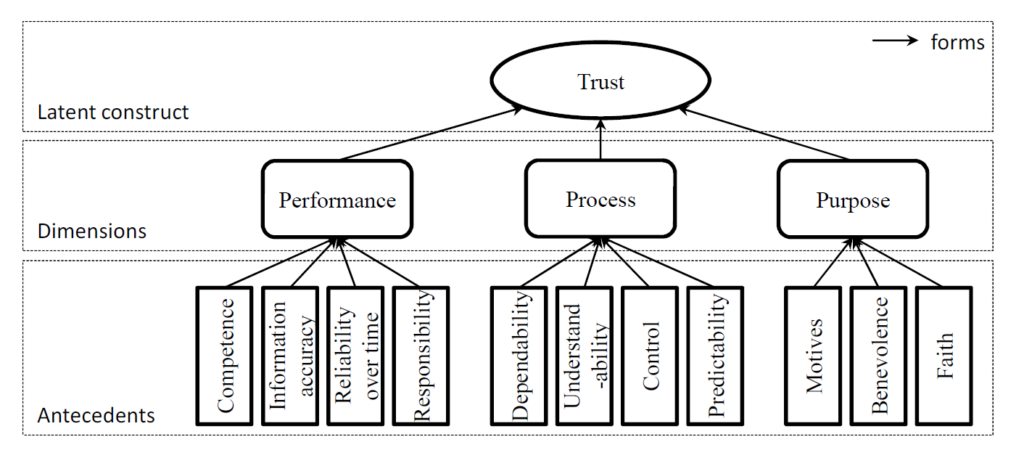
By applying the behavioral study concept of three identifiable dimensions of a user’s trust in automated systems (performance, process and purpose), Söllner et Al. created the following model of formation of trust (see Figure 1). The three dimensions are further based on indicators / antecedents [8], that cover different areas of the artifact and its relation to the user.

Figure 1: The formation of trust in automated systems – by Söllner et Al. [6]

These antecedents are in short detail [8]:

  • Competence – helping to achieve the user’s goal
  • Information accuracy – of the presented information by the artifact
  • Reliability over time
  • Responsibility – the artifact having all functionalities to achieve the user’s goal
  • Dependability – consistency of the artifacts behavior
  • Understandability – how the artifact works
  • Control – how much the user feels to have the artifact under control
  • Predictability – anticipation of future actions of the artifact
  • Motives – how well the purpose of the artifact’s designers is communicated to the user
  • Benevolence – degree of positive orientation of the artifact towards the user
  • Faith – general judgement, how reliable the artifact is

The paper describes a four-step model to systematically derive TSDEs from behavioral research insights (Figure 2) [6]:

  1. Identifying the uncertainties of the system that the user faces and
    Prioritizing the uncertainties based on their impact
  2. Choosing suitable antecedents to counter each uncertainty
  3. Interpreting and translating the antecedents into functional requirements
  4. Including these requirements into the design process and creating TSDEs
Figure 2: The process steps to derive TSDEs – by Söllner et Al. [6]
  • In the case study, the specific uncertainties based on test-user prioritization were the quality of restaurant recommendations, the loss of control in the app and the reliability of user ratings.
  • Thus the selected antecedents were understandability, control and information accuracy. For keeping developments costs in acceptable range, only one factor was considered for each uncertainty.
  • From these antecedents, new requirements and features of the app were derived – like additional information to for more transparency, additional filtering possibilities for more control and friend’s ratings option for more reliability.

The final user studies and questionnaires resulted in the validation of the model to be effective and suitable to derive valuable design elements – the TSDEs were appreciated by the participants and the trust and chances of future adoption of the app were enhanced. [6]

To enhance in-vehicle user interfaces a similar approach could be applied to find helpful solutions strengthening the trust in the system.

Building trust in self-driving technology

In 2020, Howard Abbey, an autonomous car specialist ar SDB Automotive gave a presentation on “How Can Consumers Understand the Difference Between Assisted and Autonomous Driving?”. Emily Pruitt summed up the five key takeaways of this talk, how to increase the user’s understanding and adoption of ADAS systems. [9]

  1. Design out potential misuse
    Users will push the limits of reasonable safety of automated systems. Therefor the systems have to be designed in a way to prohibit any misuse possibility. E.g. warn the driver if hands are off the steering wheel or eyes are not on the road, or stop self-parking assistance when doors get opened. It has to be clarified for the user, what is assistance and what is autonomous.
  2. Use common naming
    Safety critical features should have naming conventions across different OEM platforms. As long as there are different descriptions for similar systems, the driver cannot rely on their previous experiences and has to learn the systems in case of change of vehicles again and again. (Currently there are 100+ names for emergency braking, 77 for lane departure, 66 for adaptive cruise control and 57 for blind spot monitoring. Though progress is already made by SAE International together with other organisations to recommend common naming, so that drivers can be educated on the same fundamentals)
  3. Be clear
    SDB Automotive carried out a user study on driver interaction with HMI systems – assigning them tasks to use assistants and and measuring completion time and mental workload. The assessment was done in regard to differences in HMI systems of several manufacturers. Results show three issues that lead to comprehension difficulties when finding the right system, engaging it and reading its feedback:
    1. confusing display graphics
    2. unclear system status
    3. inconsistent icons
  4. Unify Systems
    Several industry experts believe that ADAS systems should be simplified or combined if possible, as the number of seemingly similar systems is growing. Drivers shouldn’t think about the functionality of systems to choose for the specific situation, instead of focusing on the road. One holistic overall system should work in the background and “take care of the complexity for the user”.
  5. Give simple choice
    Within the holistic system, there is no need to let the driver choose from seemingly similar systems and get confused (e.g. cruise control vs. automated cruise control vs. traffic jam assist). The options should be held simple with driving states: manual, mixed or autonomous.

[9]

Further questions

Further questions arise if we think about state-of-the-art (2022) and future technologies – also with regard to the possibilities of multimodal interaction and augmented reality.

  • Are the further above mentioned antecedents applicable for fully automated, safety critical systems and are there further ones?
  • How can we find the most suitable design solutions to fulfill the specific requirements to build more trust?
  • What augmentation technologies apply the best as additional solutions? Visual, sound or haptic feedbacks, or all of them?
  • Vehicles can be used for many tasks. Are there different use cases with special uncertainties to be consider?
  • Vehicles’ user groups vary a lot. Are there design solutions that can fulfill requirements for different use cases and user groups?
  • What different trust aspects arise when the automated system is equipped with Artificial Intelligence?

During my research per date I found many more scientific publications that are of interest and have to be read next. I hope to find material to be able to answer these questions. I just found a master thesis from the Chalmers University of Technology written in 2020 (see at the bottom of the list below) that already discusses my proposed topic very similarly. So further on I have to focus on the still to be researched areas to build my master thesis on, like probably the AR implementations in regard of the trust issues.

Literature sources to consider further:

Sources

[1] Awan A. (2019): Design better products by building trust; article on uxdesign.cc, retrieved on 10.07.2022 from: https://uxdesign.cc/design-better-products-by-building-trust-94639617c81

[2] Cherry K. (2021): Trust vs. Mistrust: Psychosocial Stage 1; article on verywellmind.com; retrieved on 11.07.2022 from: https://www.verywellmind.com/trust-versus-mistrust-2795741

[3] Kulms P., Kopp S. (2018): A Social Cognition Perspective on Human–Computer Trust: The Effect of Perceived Warmth and Competence on Trust in Decision-Making With Computers. Front. Digit. Humanit. 5:14. doi: 10.3389/fdigh.2018.00014 retrieved on 11.07.2022 from: https://www.frontiersin.org/articles/10.3389/fdigh.2018.00014/full

[4] Sousa S. C., Dias P., Lamas D. (2014) A Model for Human-Computer Trust; retrieved on 08.07.2022 from: https://www.researchgate.net/publication/266087967_A_Model_for_Human-Computer_Trust

[5] Sherwin K. (2016): Hierarchy of Trust: The 5 Experiential Levels of Commitment; Nielsen Norman Group; retrieved on 13.07.2022 from: https://www.nngroup.com/articles/commitment-levels/

[6] Söllner, M.; Hoffmann, A.; Hoffmann, H. & Leimeister, J. M. (2012): How to Use Behavioral Research Insights on Trust for HCI System Design. In: ACM SIGCHI Conference on Human Factors in Computing Systems (CHI), Austin, Texas, USA retrieved on 09.07.2022 from: https://www.researchgate.net/publication/254005515_How_to_use_behavioral_research_insights_on_trust_for_HCI_system_design

[7] Lee, J.D. and See K.A. (2014): Trust in Automation: Designing for Appropriate Reliance. Human Factors 46, 1, 50-80. retrieved on 14.07.2022 from: https://journals.sagepub.com/doi/abs/10.1518/hfes.46.1.50_30392

[8] Söllner, M.; Hoffmann, A.; Hoffmann, H. & Leimeister, J. M. (2011): Towards a Theory of Explanation and Prediction for the Formation of Trust in IT Artifacts. In: 10. Annual Workshop on HCI Research in MIS, Shanghai, China.

[9] Pruitt E. (2020): HOW CAN OEMS BUILD CONSUMER TRUST IN SELF-DRIVING TECHNOLOGY?, Article on AutoVisionNews. retrieved on 14.07.2022 from: https://www.autovision-news.com/adas/consumer-trust-self-driving-technology/

Augmented Habitat – workshop within the International Design Week at FH Joanneum

by Laura Varhegyi, Mira Kropatsch and Marton Szabo-Kass

Design is a discipline, but also an approach and a mindset.

/Emilio Lonardo/

During this year’s International Design Week (10.-13.05.2022) at the FH Joanneum’s Institute for Design and Communication, we participated in the workshop of Emilio Lonardo. He is a designer and CEO of the company D.O.S. Design Open Spaces in Milan, Italy, and was invited to do a four-day workshop with the title “Augmented Habitat (AugH)”. We were a group of 7 students participating, coming from the master courses Communication Design, Exhibition Design and Interaction Design of FHJ.

Each day we had icebreaker exercises and larger tasks which taught us about the approach of augmented habitats. At the end of the week, we were able to use our newfound understanding, to produce a final product. On Friday, all results had to be presented to the whole audience of the International Design Week.

Speed Dating

It takes 7 seconds to generate a first impression of a person. To get to know the group at the beginning of the week, everyone had 7 seconds to talk with each participant and form an idea about them (we didn’t know all the participants before).  After the seven seconds were over, we wrote down our personal thoughts about the person, who he/she might be and what trades they probably have. Afterwards, we collected the anonymous notes and read them out loud, one after the other. Each note had to be accepted and taken by someone. We of course never knew for sure if the trades were meant for us, but we had to think about how others might perceive us (in a speed dating situation). As the last part, we summed up our chosen notes and presented ourselves in front of the group, with those trades and a little story about us combining them.

It was insightful and challenging to think about our outside perception and image we show others.

Our own spaces

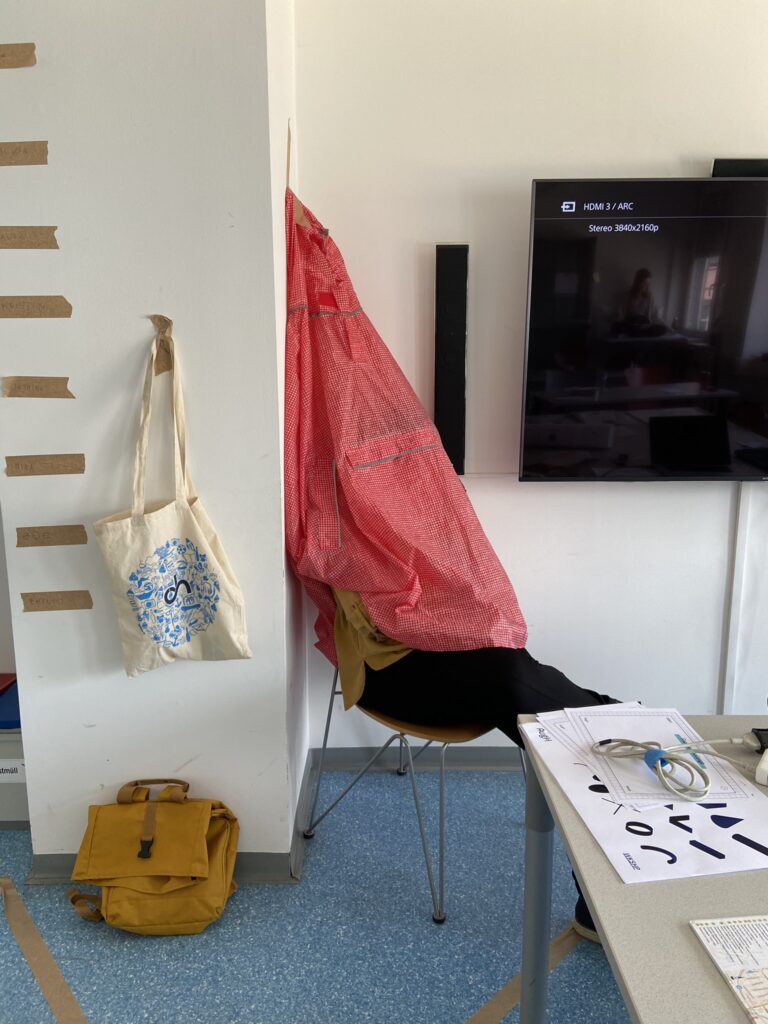
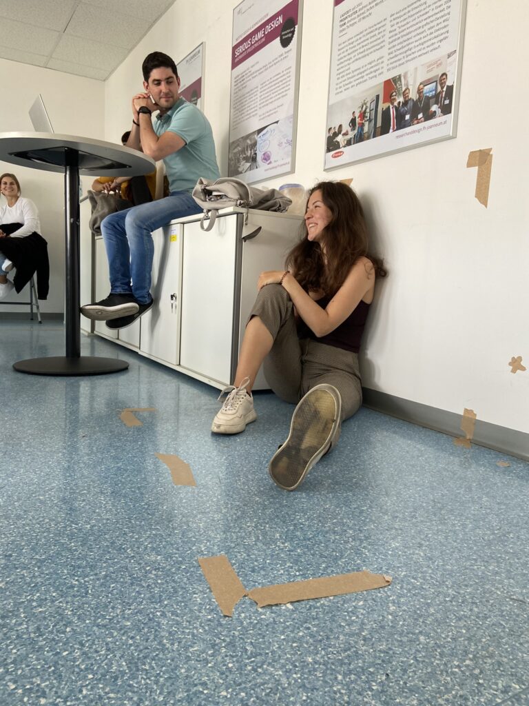
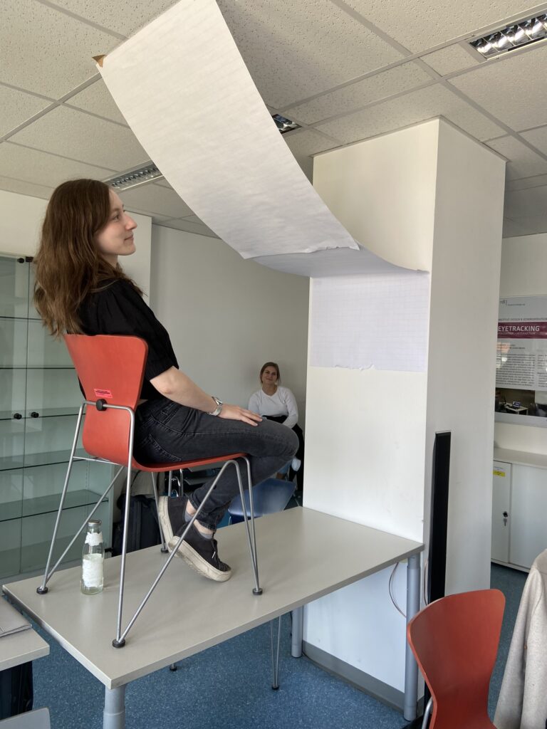
We wanted to actively use the space around us and therefore selected a space in the classroom we could modify with furniture, our stuff,  masking tape and paper in several ways. And not only to change the set up, but also think about the way we want to function and the type of relationship we want to create. We defined the dimensions with masking tape and someone also left a gap open for the entry of the defined space. We started to see many elements we didn’t consider before, like the light and the view, so the way we positioned ourselves to the windows became crucial,  just to have the perfect lighting condition. These spaces turned out to be multi-functional and very minimalistic. We presented our ideas to the group. These spaces were meant to be separating us, but also to share it and to have visitors coming over. We also had to come up with a pose for the space, because our own body was also a parameter in the realm we created and to showcase the relationship we fostered in the space. 

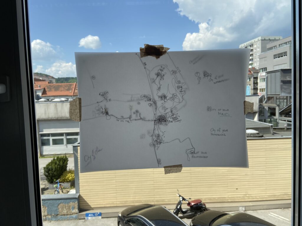
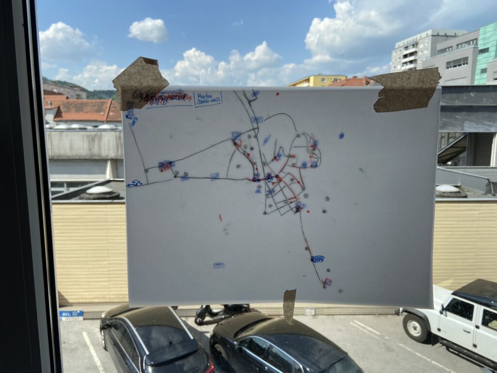
Our personal city maps

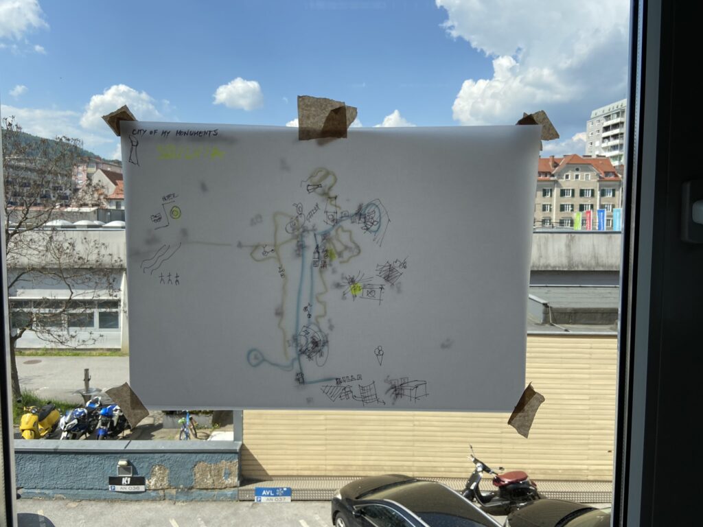
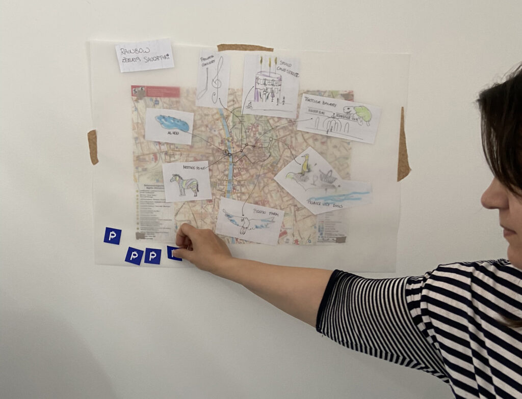
Through five different topics, we have created our own city maps by drawing on see through paper on top of the real city map of Graz. We highlighted locations, streets and areas to draw our own

  • City of monuments: orientation signal elements, symbols and images that serve as visual references,
  • City of information: all the places where we talked on the phones, took photos, got or gave information,
  • City of itineraries: all the places where we commuted or parked or left a trace,
  • City of our mind: all the places where we had spiritual or emotional events or experiences,
  • City of relationships: all the places where we met, joined, hugged, flirted or kissed someone.

By putting these different maps on top of each other, we could reveal our personal spatial areas of interests in Graz. It gave us a birds-eye view on the streets and places that we use the most or not at all. By comparing the personal maps of the participants, the city’s hotspots could be highlighted, as well as the differences in their lives, motion ranges and individual favourites. As in other exercises, here we could also see how different the perception of people can be about the same city.

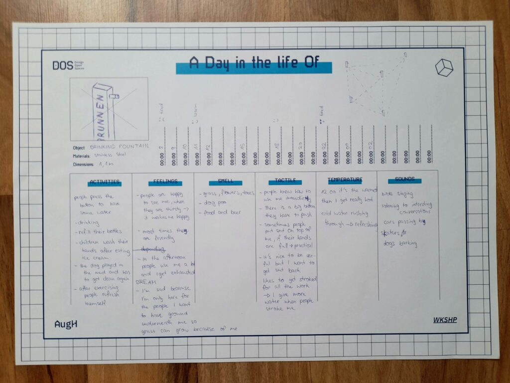
A day in the life of

For this exercise we had to select an urban artefact and write down their “daily routine”. This was all about the meaning an object could hold when they are alive and finding deeper understanding in their needs, feelings and relationship with their surroundings, people and animals. We put ourselves in the shoes of a storyteller, gave the artefacts a backstory and filled out the template for the daily routine with time stamps and the categories: Activities, Feelings, Smell, Tactile, Temperature and Sound. Emilio gave us some great input and we knew we had to dig deeper to find new connections in the stories and came up with new ways these objects could communicate with each other and the outer world. The stories couldn’t get crazy enough, so that was very fun, and also insightful to change the perspective and think about interactions in another way.

A Day in the life Of… Template by D.O.S.

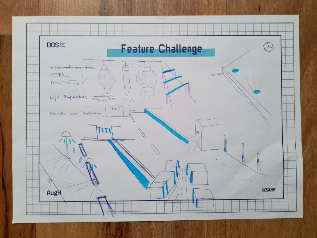
Redesigning city objects – Feature challenge

Every object in the public spaces has its purpose and was (mostly) designed to fulfil some specific needs. In this task, we first had to choose an object in the urban public space, and write down their three main physical characteristics – like materials, forms, dimensions, etc.

Next, we had to redesign the chosen object without using its earlier mentioned three features.

By this, we were forced to think outside the box and concentrate on solving the main problem and purpose of the object in new ways. It was interesting to think about the habits of citizens in interaction with city objects, and how these habits can change if we redesign the objects.

Feature Challenge draft example for city lights

SAugHFari

Everybody sees the city differently, and the inspiration and possibilities bound to certain places. In this task, we created Safari Tour concepts through the city of Graz with 6 to 7 stops we found interesting, that are also attractions of the places. There we had to take pictures, observe what was happening, pay attention to the people and take notes. The next day we chose a theme for our SAugHFari and made a presentation with the SAugHFari route on the map – explaining the concept, our ideas and the specific features of the tour. We then rated the trips we would join with 6 sticker coins for each of us to vote with. The trips were about places to hang out with friends, enjoy the city atmosphere, see animals or have different sensory experiences. The SAugHFari with the topic: restaurants not to visit won in the end. The selected concept was the base of the final task.

A SAughFari map example

AugH Card Game

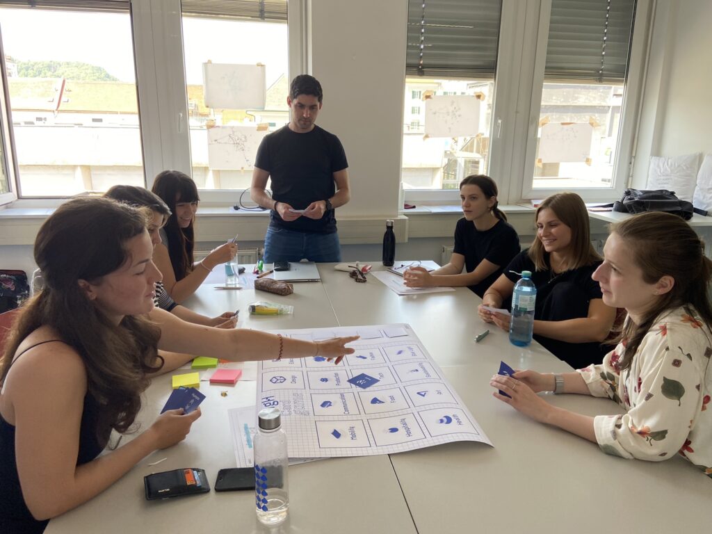
Emilio introduced a new brainstorming method to generate ideas for the final product concept. It was a simple card game about communication and connecting different goals in the project. A big sheet of paper had many fields with disciplines on it, like production, finance, mobility, etc. and we got six hand cards from piles like topics, technologies and action. We could put a card on a field and then had to say something linking the two areas together, to keep the conversation going. When we had no cards left, we could draw six cards from the piles again. The actions were fun, because if someone was talking for too long we had the option of a card with “stop talking” or we could just ask further questions by putting the action card down. We were talking for a long time until we had said everything, and then we could use some of the ideas we had and go to the implementation phase of the final project.

Brainstorming with the AugH Card Game

Final task: Restaulution

As a final task and project, we chose the most liked SAugHFari trip – from Jasmina Dautovic about the worst restaurants in Graz – and created an Augmented Habitat project concept based on it. The SAugHFari was dealing with the phenomenon of restaurants throughout the city that are not looking very trustworthy or inviting and giving some examples, where you wouldn’t go if you had a chance. So we thought about solutions, how to help these places to change.

After brainstorming about different implementation possibilities, we described the idea of a platform to help these uninviting restaurants with professional advice and community support.

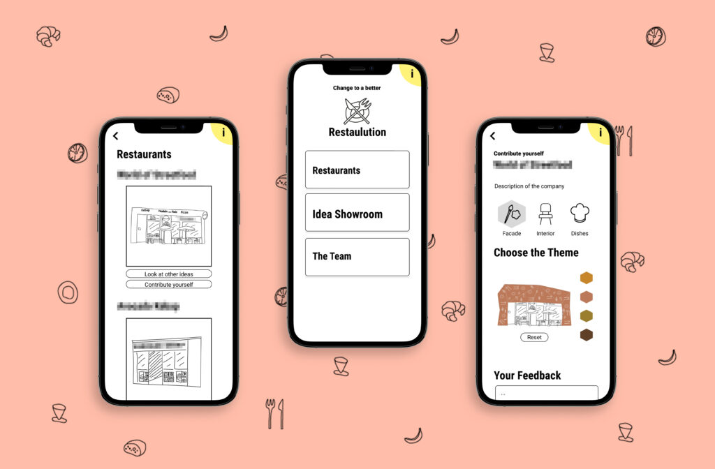
We named the concept “Restaulution”: the restorative solution to revolutionize restaurants. 

The base of the concept is a toolbox consisting of professional design solutions by architects and chefs, that serve as guidance and idea collection for every restaurant owner, who wants to upgrade and redesign their facility and service. Architects, interior architects and chefs could provide building blocks (well proven designs, style guides, recipes, etc.) combined with individual consultation options to the toolbox, from which the participating restaurants could choose from. 

The framework would be a digital platform (app and website) to host all features of the concept:

  • Listing the toolbox contents (design and culinary) and cooperation possibilities with professionals
  • Providing different configuration options for the restaurants
  • Providing feedback possibilities for old and new customers to assess current designs → get feedback on what the customers want and expect
  • Showcasing design concepts and new ideas for the public – with possibility for the audience to rate them → get real customer feedback on new ideas
  • Announcing and showcasing newly implemented design upgrades of the restaurants to attract attention and convince the audience
  • Listing all participating restaurants and giving a guide to citizens and tourists about the ongoing projects – advertising possibility

We also built a provisional clickable prototype of the app to visualize the concept. This was made available during the final workshop presentations (read below).

With this concept, we wanted to enhance the city itself as our habitat and improve the quality of living. Uninviting restaurants are mostly neglected and not considered to be a problem, but how much better would the image of the city be if there were only high quality services everywhere?

Concept Logo

Dear Reader!

If you have interest, further ideas or feel the potential of the concept and have some possibility and resources to develop the platform further with us, don’t hesitate to contact us – we are open for collaboration to bring Restaulution to life!

First mockups of the Restaulution App

CoDE – Continuation, Deterioration, Ending – evaluation

For the execution of this project there would be a leading management team who would cooperate with the city. There are funds to improve certain neighbourhoods and it is also meant to improve the city as a whole enhancing the uniqueness of the communities. We want the restaurant owners to perform their best and with professional support from many disciplines they can also reach their goal and therefore also contribute to the prosperity of their community.

The second important link to the refinement of their establishment is the voice of the people living in the city. They can give feedback and also be part of the design development and vote for their favourite design of the facade and interior. 

We evaluated the journey of the Restaulution with the CoDE principle (2 scenarios: Continuation, Deterioration, Ending), in the future, 30 years from now. If the project is doing well, we can update all the restaurants and shops that need our support and this project can be extended to more cities in Austria and Germany. 

The project could also get really successful for a couple of months or years, with a lot of support, but then later drop in interest and eventually die. 

If the project isn’t managed wholeheartedly from the beginning and the team isn’t well selected or the communication and management fails at one point the project can’t be executed and start to function. But with all the weaknesses eliminated, a great team setup and a lot of support from leading design agencies and the Creative Industries Styria the project can open whole new possibilities for the city.

Final Presentation

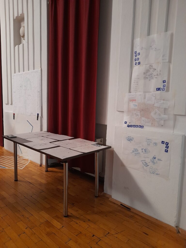
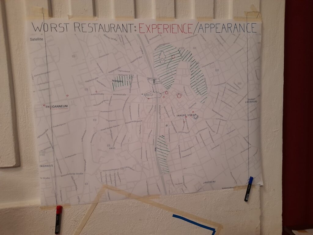
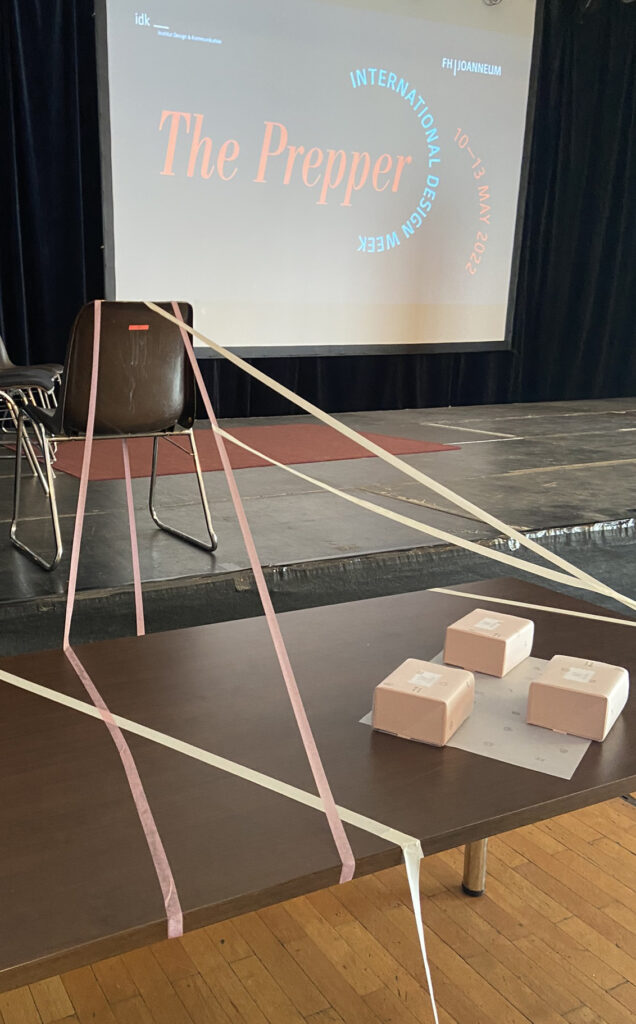
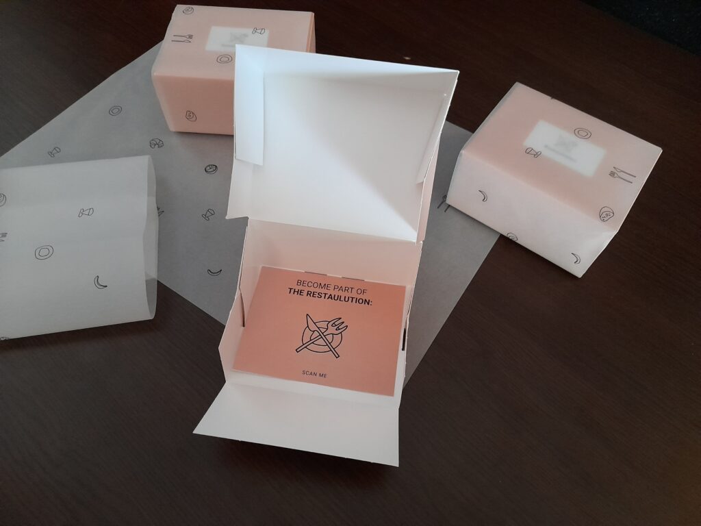
We showcased our workshop results on the last day, but not like every other group of the International Design Week via Powerpoint presentations on the stage. Instead, we built stands around the hall, so people had to stand up and come to us, and also try out our final product. In one corner, people could scan the QR-Codes that would forward them to PDF slides and show the activities we did that week. On the other side people could look at our maps and mark on a big map their worst restaurant experiences and memories in Graz. In the front people could try out our product and open the imaginary “toolbox” packaging with our Restaulution logo, which invited them to become part of the project. The packaging had a hidden NFC chip which redirected people to our prototype they could try out, when they scanned it with their phone. We were all at different stations explaining our project and helping them to navigate through our stands and on the prototype. The audience was very interested and liked the ideas and the execution. 

Final thoughts about our workshop

The way a space is designed determines how we use it and behave in it. As designers, we are trained to adapt our solutions to the behaviour of the target group. But it is through more visionary approaches, such as in this workshop, that we begin to think about the fundamental essence of the relationship between people and spaces. This way of thinking allows one to find new approaches that reshape behaviour and, by extension, society. 

We had a great time with Emilio, who gave us a lot to think about and handed us tools we could use to broaden our imagination when it comes to problem-solving. With all the activities, he challenged us to think in new ways and starting from other directions when designing. We were fortunate to have an interdisciplinary group of people who could inspire and complement each other with different skills, backgrounds, interests and experiences.

With a multidisciplinary approach in design, it is much easier to tell a story and reflect other parts and aspects of a place, brand, product, etc.. We broke down places into separate compartments when it comes to reimagining and shaping a space. This made it a lot easier to think of pieces coming together and the use of a place / space. Not only things like thresholds, facades and ceilings define a space, but also soft components like light, sound, pollution and time. 


We were tackling design, design thinking, public urban space & product design and our habitats from different points of views.  The tasks challenged our creativity to perceive and think about our surroundings differently, including not only objects, but humans and their relationship as well.
If one had to describe the feeling of the workshop in one sentence, it would be: a fresh wind of new approaches, which were brought closer to us in a playful way. 

Such international cooperations like this workshop are essential for designers to broaden their perspectives and get to know different people with unique mindsets. We will hope and search for similar opportunities in the future as well.

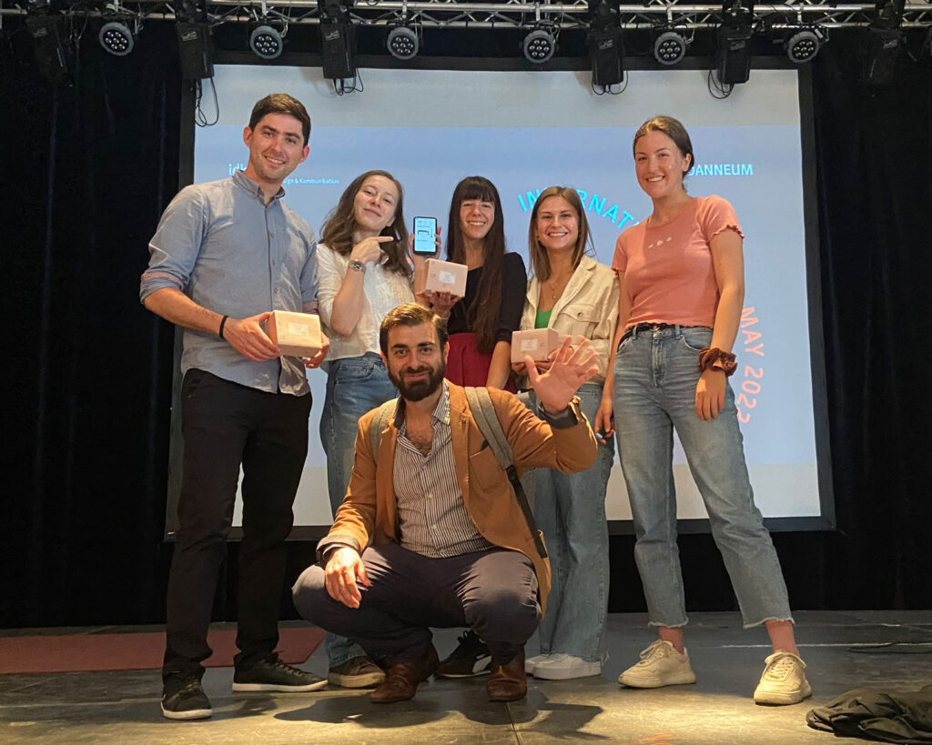
The (almost complete) workshop team

NIME: On Parallel Performance Practices: Some Observations on Personalizing DMIs as Percussionists

| Summary and reflection on the article with the above title by: Timothy Roth, Aiyun Huang, Tyler Cunningham – University of Toronto.

As Digital Music Instruments (DMIs) are usually designed and used by technicians rather than everyday musicians and performers, the authors of the article carried out a case study with classically-trained percussionists to analyze their intuitive approach to using digital technology.

In their research of other studies, the authors found performance practice to be an important aspect while creating a DMI. Further on, customizability of electronic instruments could be a helpful way to offer classical musicians (used to only acoustic instruments) an easier way to incorporate electronics into their work.

The study was following the practice-based research methodology and “grounded theory”, carried out as a 2-day introductory workshop, free time to experiment and a final questionnaire. The participants were 10 musicians with many years of musical experience, but almost none with DMIs.

They were all given Arduino Uno microcontrollers with some electronic components and speakers, and an introduction into building and programming a simple instrument with them. Afterwards the participants had two months to experiment, build and expand their setup on their own.

All 10 participants went in different directions, their results can be seen in the following YouTube playlist: Participant Étude Excerpts

YouTube playlist of the study participants’ final performances

The study authors refer to the two approaches from a study by T.Mudd, adressing the “entanglements of agency” in musical interactions, namely: communication-oriented and material-oriented perspectives.

They could categorize the participants in these two groups according to their approach of experimenting. Mapping buttons to create a scale, using visual gestures like a finger vibrato on buttons or playing a predefined groove with the Arduino while playing on drums as well could be defined as clear communications of their musical expressions.

Though the majority of participants aimed for the material-oriented approach, experimenting with the speakers, cables and other physical components to alter the dimensions of sounds generated by the Arduino.

From the experiments, the authors could draw conclusions and parallels between percussion and DMI performance practices. According to composer Vinko Globokar, percussionists can be separated into two groups: ones who use separate instruments for different timbre when striking, and others who use one instrument in several ways to create different timbre. This can also be seen in the study, as the manipulation of timbre played a significant role in the majority of the experiments. This was seen within the “material-oriented” participants.

Another finding of the study was the importance of practice and the influence of improvisational music creation attitude. The participants could develop their playing skills on their DIY built instruments within the given weeks of experimentation. This was crucial for precision in the same way as it is with acoustic percussion instruments.

As a result it was underlined that percussion, being a relatively young discipline, can be an optimal area to incorporate digital musical instruments – though braking, or better said “re-adjusting” their tradition.

My Conclusion

Combining the digital DMI with analog percussion instruments can be an interesting way of creating a hybrid digital-analog music by a single percussionist on their own. From this study group, I would have expected a larger number of participants to try the multi-percussion approach and not only focus on the digital components. Additionally I also expected more experimentations with rhythm and melodies, altough there were no real constraints and almost everyone was improvising while creating their music.

I find the approach with Arduino to be a perfect method of getting into simple MDI design, which was also justifyied in this study. I am not quite sure about the further takeaways and lessons learned from this case study, but it is interesting to see the results of experienced musicians when stepping into the new era of using basic digital equipment and trying to express themselves in this new way. Personalisation possibilities of digital interfaces are almost limitless today, which can play a big role not only in getting used to new technologies but also in the performance of the musicians. As music is a very individual and subjective field, DMIs could have a bright future.

Source

Roth, T., Huang, A., & Cunningham, T. (2021, April 29). On Parallel Performance Practices: Some Observations on Personalizing DMIs as Percussionists. NIME 2021. https://doi.org/10.21428/92fbeb44.c61b9546

Retrieved on 15.06.2022 from https://nime.pubpub.org/pub/226jlaug/release/1

User-Centered Perspectives for Automotive AR

| a short summary of a paper on human aspects related to automotive AR application design

A research paper, titled like this blog post, by experts from the Honda Research Institute (USA), the Stanford University (USA) and the Max-Planck-Institut für Informatik (Germany) [1] discusses benefits, challenges, their design approach and open questions regarding Augmented Reality in automotive context with a focus on the users.

Augmented Reality can help drivers in pointig out important and potentially dangerous objects in the driver’s view and increase the driver’s situation awareness. Though if the information is presented incorrectly, the distraction and confusion of the driver can lead to dangerous situations.

The authors of the paper put up a design process with focusing on the appropriate form of solution to a driver’s problem (rather than just describing ideas technically).

To understand the drivers’ problems in the first place, they conducted in-car user interviews with different demographic groups to gather information about driving habits, concerns and the integration of driving into daily life.

After the interviews they ideated prototype solutions and tested concepts in a driving simulator with a HUD. One realization was that at a left turn, drivers needed more help in timing the turn according to oncoming traffic rather than an arrow or graphical aids for the turning path – which even distracted them from the oncoming traffic. The design solutions of the authors therefor focus on giving the driver additional cues to enhance awareness rather than giving only navigation commands. After researching different graphical styles of turning path indication, results showed less distraction with solid red path projection – that is visible in the peripheral vision while focusing on traffic – than simple chevron style lines.

Human visual perception

Regarding human perception, the authors of the paper analized influences of visual depth perception and the field of view. The human eye is built to focus on one distance at a time, so AR displays / Head Up Displays can cause a problem due to their see-through design. The driver’s focus has to remain on the road ahead and not change to the windshield’s distance, blurring out the farther imagery.

The eye’s foveal focus with the highest acuity is only at a ca. 2° center area of the vision field. This determins the so called “Useful Field Of View” (UFOV), the limited area from which information can be gained without head movement. These restrictions imply the use of augmented systems only in the driver’s main field of view, and not throughout the whole windshield. Objects in the peripheries should be therefor signalized either inside of the UFOV or through other methods.

Distraction

The National Highway Traffic Safety Administration (NHTSA) of the USA states three types of driver distraction:

  • visual distraction (eyes off road)
  • cognitive distraction (mind off driving)
  • manual distraction (hands off the wheel)

Each of these types can be aided but also caused by Augmented Reality applications in vehicles.

The authors discussed the human attention system and cognitive dissonance problems further.

  • Attention system
    Regarding the human attention system, the so called “selective visual attention” and the “inattentional blindness” can be problems in driving conditions. Important visual cues can be suppressed when the driver is focusing on secondary tasks or if they are outside of the focus of attention. Warning signs on a HUD can either help by attracting attention, but also distract from other objects that are outside of the augmented field of view. The study states the need of further research on the balance between increasing attantion and avoiding unvanted distraction.
  • Cognitive Dissonance
    Cognitive dissonance, the perception of contradictory information, could occur e.g. with bad overlapping of 2D graphics on the 3D vision of the surroundings, causing confusion or misinterpretation of the visual clues.

Human behaviour

As a third category, the study discusses the effects of AR technology on human behaviour.

Situation awareness – maintaining state and future state information from the surroundings – is detailed by a source in three steps:

  1. Perception of elements in the environment
  2. Comprehension of their meaning
  3. Projection of future system states

Augmented Reality can help drivers not only in perception but also in the further steps. State-of-the-art computers, AI technology and connected car data from surroundings can be especially of help in cases where additional computational power can predict traffic dynamics. [comment of MSK]

One aspect is the behavioural change of drivers after longer use of assitance systems. A study implies that the reduced mental workload could lead to the retention of the drivers’ native skills. Further, the phenomena called “risk compensation” can occur after getting used to the aids. This means a riskier behaviour of the driver than normal, due to higher confidence in the surroundings. These behavioural changes can have dangerous consequences, why the authors suggest the use of driver aids only when needed.

According to one source, the user’s trust in a technology is can be increased with more realistic visual displays, like AR rather than simple map displays. Further, AR can also help to build trust in autonomous cars, communicating the system’s perception, plans and reasons for decision making.

Some open questions were stated at the end of the paper, to be considered further on.
Such were for example how multiple aiding systems can interact at the same time? Or how will the use of AR over longer time effect the drivers’ behaviour and skills when they have to switch back and drive a non-AR vehicle? Will the drivers’ skills deteriorate over and will they become dependent on these aiding systems?

My conclusion

This paper was published in 2013, since when the technology was significantly developed further. Nevertheless the basic principles and human factors are still the same, which have to be considered when designing safety critical automotive applications.

Reliability and understanding the behaviour of autonomous vehicles will be an essential aspect in creating acceptance by the driver / passengers. Augmented Reality can be of much help not only for extra driving assistance systems, but also for the complete user experience at different automation levels.

The mentioned topics of human factors in this paper were only focusing on visual augmentation and assistance. These could be expanded to other modalities like sound and haptic augmentation, and analyse the perception of a combined driver assistance as well.

Source

[1] Ng-Thow-Hing, Victor & Bark, Karlin & Beckwith, Lee & Tran, Cuong & Bhandari, Rishabh & Sridhar, Srinath. (2013). User-centered perspectives for automotive augmented reality. 2013 IEEE International Symposium on Mixed and Augmented Reality – Arts, Media, and Humanities, ISMAR-AMH 2013. 13-22. 10.1109/ISMAR-AMH.2013.6671262.
Retrieved on 30.01.2022. https://www.researchgate.net/publication/261447349_User-centered_perspectives_for_automotive_augmented_reality

UI principles of in-car infotainment

| design challenges and principles from the car navigation system developer company TomTom

As it was stated in my earlier blog entry, one of the current cockpit design trends is the multiplicity of screens in cars. This increasing display real-estate is creating challenges for automotive UX designers in creating an effective driver experience instead of displaying as much beautiful information as possible and as a result distracting the driver.

The navigation system and mapmaker company TomTom is also discussing this topic with their principal UX interation Designer Drew Meehan in a blog post, with insightful content about the design principles to be considered.

Finding balance in information overload

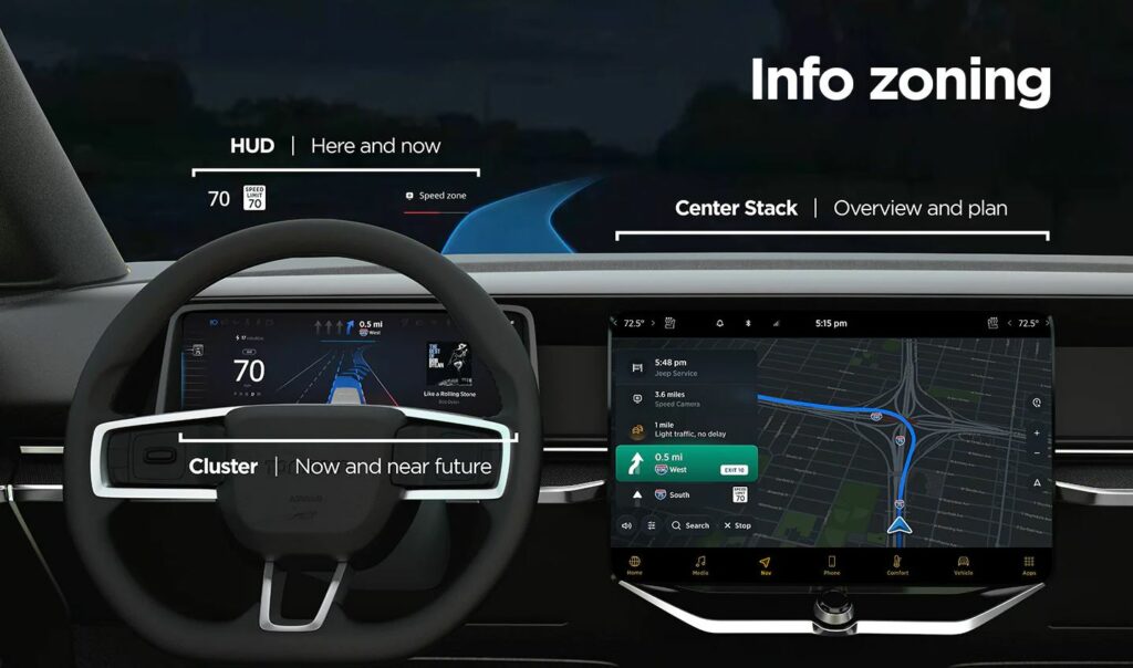
The keyword of building an interface with informational balance is: “action plus overview”. When looking at several screens, the shown information should be clustered to provide hints for next actions, and further give an overview of the car’s journey. This should be achieved by sorting the information shown on separate screens to compensate each other.

An example would be a car equipped with head-up display (HUD), a cluster behind the steering wheel and a central display. On the HUD only the current status information would be shown, about the “here and now”. The cluster would show information about oncoming actions in the near future. The central stack would have the job to give the complete overview about the journey, arrival time and complementary info such as refueling/recharging possibilities.

This structure creates a flow of eye movement, which helps the driver will understand the information placing easily and know where to look for specific interests.

Information structure by TomTom for in-car interfaces (source: see below)

Challenges in automotive interface design

There are some aspects and strategies that need to be considered when designing in-car interfaces:

  • Responsive and scalable content according to screen size: complying with different screen sizes in different vehicle models of a brand
  • Adaptive content: displaying only the needed information for the current driving situation. This requires prioritization of the information according to drivers’ needs. —> if the fuel/battery charging is critical, the next stations should be displayed. If the tank/battery is full, the screens can focus on less data. —> if there is no immediate route change action necessary, e.g. straight highway for 50 km, other data from other driver assistance systems could be shown (e.g. line keeping). —> in the city with intense navigation needs, the best could be to show prompt actions on the HUD, closest to the drivers’ eyeline for easy help.
  • Creating one interface ecosystem: all screens should be connected and not segregated. The screens and the shown information should create continuity and complement each other.
  • Customization options: despite good information balance, some people could be overloaded and stressed by multiple screens. They should be allowed to change screen views and positions of content.

TomTom’s UX department has done user research with varied screen info content. They found that “users want easy, glanceable and actionable information”, which reduces cognitive load and stress.

In summary, the UI design has to support the drivers’ actions by showing essential, easily digestable information. It should be placed where the driver mostly expects the content to be and have just the right amount of detail, according to the current driving situation.

Source

Online article by Beedham, M.: Informing without overwhelming, the secret to designing great in-car user experiences, 13.10.2021.
Retrieved on 09.01.2022.
https://www.tomtom.com/blog/navigation/designing-effective-in-car-user-interfaces/

Automotive intelligent cockpit design trends

| short summary of a cockpit design trends report, published early 2021

According to a report of 2020 looking at new car models and concepts cars released in the last years, following major directions of intelligent automotive cockpit design trends can be summarized:

  1. Richer versatilities
    New products are getting introduced with developing automotive electronics, such as driver monitoring systems, driving recorders, rear row and co-pilot entertainment displays. Additionally, intelligent surfaces allow further versatility – window or sunroof glasses can become displays and intelligent seat materials can become interfaces as well.
  2. Multi-channel, fused human-vehicle interaction
    New ways besides touch and voice control are active voice assistants, gesture control, fingerprint reader, sound localization, face recognition and holographic imaging. These multi-channel interaction modes can contribute to safer use and driving as well as deliver an extended user experience.
  3. 3D and multiple screen cockpit displays
    We see dual-, triple- and quint-screen and A-pillar display implementations for delivering control, co-pilot and rear row interactions.
  4. “User experience”-centricity and scenario-based interaction
    In-vehicle scenario modes are getting in focus – the car interior should serve as an intelligent, connected, flexible and comfortable personal space, for e.g. driving, resting, working or even shopping. As a UX-centered implementation example the Mercedes-Benz S-Class ambient lighting system was named, that uses 263 LEDs to adapt to driving situations (warnings) or give a real-time feedback of interactions with the onboard computer.
  5. Interaction with every surface via intelligent materials
    New surface materials are introduced in concept cars to explore touch control possibilities like displaying fuctional buttons in new ways.
  6. Touch feedback as key technology for higher level of safety
    Besides TIER-1 suppliers also several start-ups are developing touch feedback technologies for supporting less distraction and more effective driver-car interaction.
  7. Software systems will be keys of differentiation
    The introduction of Android to in-car entertainment systems was a big step. The need for personalization and simultaneous software and hardware iterations and 3D vision are new challenges for the operations system development in realizing intelligent cockpit systems.

Source

[1] Summary of: “Automotive Intelligent Cockpit Design Trend Report, 2020” by ReportLinker. Retrieved on 09.01.2022
https://www.reportlinker.com/p06003502/Automotive-Intelligent-Cockpit-Design-Trend-Report.html?utm_source=GNW

Haptics & driving safety

| A summary of an interesting research paper that fits well into the multimodal view of my research on in-car AR solutions.

All information summarised in this blog post was taken from the research survey cited at the end of the post, which contains the exact sources of the statements.

“The Use of Haptic and Tactile Information in the Car to Improve Driving Safety: A Review of Current Technologies” – by Y. Gaffary and A. Lécuyer, 2018

The paper summerizes results of experimental studies in the above mentioned topic, categorizes them and discusses findings, limits and open ends.

Several instruments and devices on a car’s dashboard require visual attention from the driver, who is already busy with the driving tasks. While the visual and auditory channels are highly engaged, the tactile and kinesthetic channels could be used for additional, parralel input.

Several sources of the paper state that the haptic feedback can be perceived despite of high cognitive load, more effectively than visual or auditory feedback.

Within the haptic modality there are two kinds of possible feedback:

  • tactile feedback: perception from the skin
  • kinesthetic feedback: perception through muscular effort (force feedback)

Haptic technologies in cars

For transfering haptic feedback, the actuators need to be fitted to specific positions in the car’s interface, to have a direct connection to the driver: steering wheel, pedals, seat, seat belt, clothes and the dashboard.

A source, Van Erp and van Veen classified the information that could be transferred through haptics in cars:

  • spatial information about surrounding objects
  • warning signals
  • silent communication only with the driver
  • coded information about statii
  • general information about settings

This paper focuses on two groups: haptic assistance systems (feedback triggered by voluntary action) and haptic warning systems.

Haptic assistance systems

Controlling the car’s functions

Several sourced of this paper analysed the influence of tactile feedback on the “eyes-off-road time” with rotary knobs and sliders on the dashboard, central console and steering wheel (the main sources of haptic feedback). The devices had clicking effects or could change their movement friction or vibration frequency. The results were the most effetive with visuo-haptic-feedback (combining visuals and haptics), reducing the glancing time by ca. 0.5 s and 39%. One study resulted in the preference of 230 Hz vibration on the steering wheel over lower frequencies. At this input method the vibrations of the road are a limiting factor.

Maneuver support

The paper states that the main source of haptic help for maneuvring is kinetic feedback on the steering wheel. Several studies were mentioned looking at difficult driving situations: parking, driving backwards with a trailer, low visibility. In all of these cases the results showed positive improvements (lower mental demand while same performance), when force feedback was helping the driver to steer in the right direction at the right time.

Navigation

For preventing additional visual or auditorial load and distraction, studies were described on using different actuator placements to give directional feedback to the driver. Such examples were besides the steering wheel the augmentation of waist belts or the driver’s seat with actuator matrices, indicating navigational directions. The results showed less distraction than with only auditory guidance, and even a 3.7 times less failure rate with haptic-auditory feedback.

Haptic warning systems

Awareness of surroundings

Similarly to the navigational purposes, current studies described in the paper propose the augmentation of waist belts and seats for giving directional information as warning signals about surrounding cars or other objects – most importantly in blind spots or behind the vehicle.

Collision prevention

Collision prevention needs fast driver reactions, once the danger is noticed. According to the paper, haptic feedback can significantly improve reaction times. As collision warnings are also based on spatial information, therefor same methods were analysed in studies as for helping navigation or awareness of surroundings – augmented belts, seats and pedal. One system with actuators in the seat showed improvements in spatial localization of threats by 52% compared to only audio warnings.

Lane departure

The main methods to warn about lane departure were tactile and kinesthetic feedback on the steering wheel. As the direction has to be corrected by turning the wheel, the drivers responded intuitively on the augmentation of the wheel with vibrators and motors. These solutions can be found widely spread in the automotive industry. Vibrotactile seats and pedals were also tested and found to work better, be less annoying and cause less interference than audio warnings.

Speed control

As the accelerator pedal is the device of controlling speed, this survey reports many studies to be found on its augmentation. They are looking at implementation of tactile feedback and also force feedback (resistance to pressure and controlled reaction force). Both methods lead to positive results in adjusting too high speeds and maintaining a given speed, and reported by users to be satisfying and useful.

Limits of existing experimental protocols

There are several limiting factors described, which should be considered for further analysis:

  • The age of users and the differences in perception of haptic feedback. Older people seem to be more affected by them.
  • Augmented seats: the thickness of clothing, the height and the weight of the users.
  • Different ways (habits) of holding and turning the steering wheel.
  • Static vs. dynamic signals can have different effects (dynamic signals were seen to be more effective).
  • Effects of multiple haptic feedback systems working parallel in the same car have to be analysed.

Almost all of the described researches were done with the help of driving simulators. They can deliver compareable results but do not fully represent the real driving environment. Realistic stress and also overconfidence in the feedback systems were not analysed either.

My Summary

During driving the driver is under high visual and auditorial cognitive loads from th basic tasks. In these cases haptic feedback can be a very effective solution to trigger reactions of the driver. The interfaces to be used are limited to the areas with which the driver is permanently in contact (steering wheel, seat, pedals, clothes), except the dashboard for changing car functions and settings.

It can be concluded that it makes sense to augment those interfaces with haptic feedback which are relevant for the specific tasks the feedback relates to. For example tactile or force feedback on the steering wheel for maneuvring support or lane departure warning and haptic feedback from the accelerator pedal for speed keeping warnings.

It is interesting to see that spatial information can be perceived well through the body via vibrator matrices in augmented seats. This method carries more limitations than interfaces touched by the hands though.

The most effective solutions seem to be combinations of modalities (visual-haptic, auditory-haptic feedbacks), but in all cases the situations and possible use cases have to be considered as well. E.g. a vibration of the seat can be percieved well while parking slowly, but not while driving fast on a bumpy road…

As the information gathered from this paper is based on simulated experiments, I will also try to find further studies or at least reports on currently implemented haptic systems in production cars.

Source

Gaffary, Y. and Lécuyer, A., on Frontiers in ICT 5:5: The Use of Haptic and Tactile Information in the Car to Improve Driving Safety: A Review of Current Technologies; 2018.
Retreived on 12.12.2021.
https://www.frontiersin.org/articles/10.3389/fict.2018.00005/full

Further automotive AR examples

| continuing my last blog entry on examples

In the past week I was searching for further examples of AR implementation in car’s user interafaces. Currently, after three weeks of research in this topic I have the impression that the industry is mainly focusing on visual augmentation as a help for the driver. Here are some further examples that offer some new aspects and features.

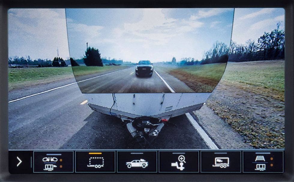
GMC Sierra HD trailer camera

The 2020 GMC Sierra HD pickup truck featured a novel implementation of AR technology. The truck was designed to tow heavy duty trailers and has in sum 15 cameras to help the driver navigate the really large truck. One camera can be mounted at the back end of the trailer looking at the road behind. This image can then be displayed added to the built-in rear camera view of the truck, letting the trailer almost disappear. [3]

I personally find the solution to be a nice gimmick but would actually question its practical benefit. The view for sure doesn’t help manoeuvring with the attached trailer.

GMC trailer camera [3]

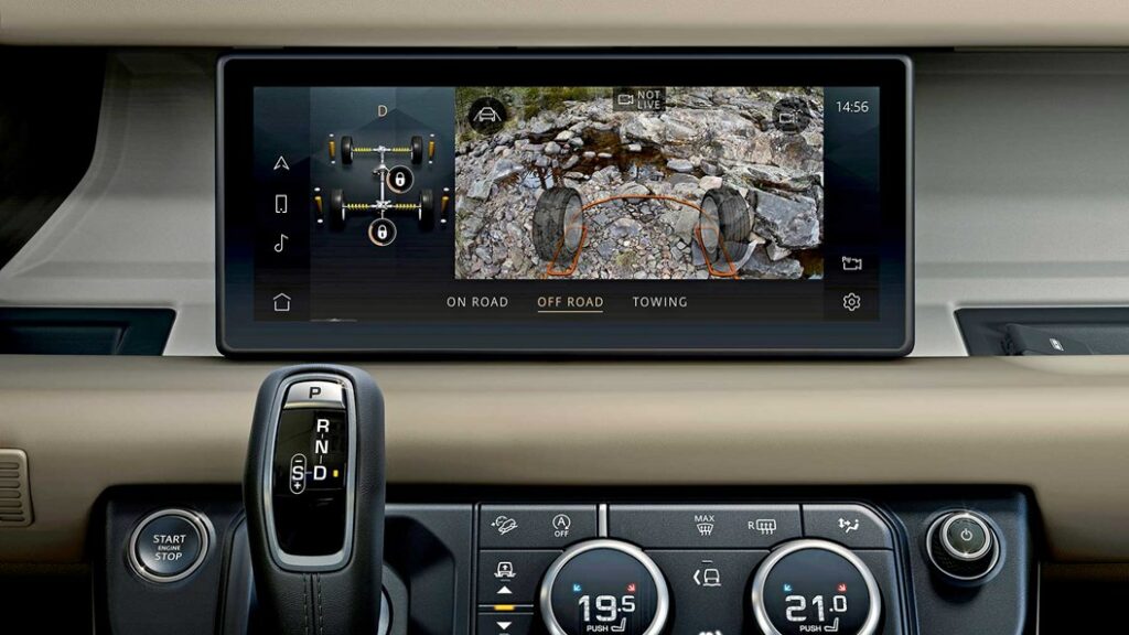
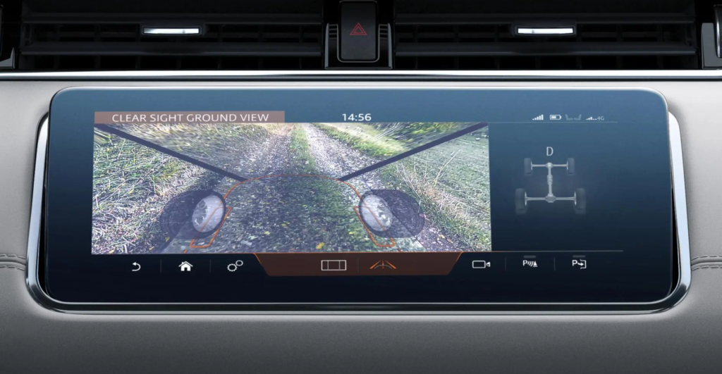
Land Rover Clearsight ground view

Looking at special utility solutions, LandRover also implemented a camera augmentation in the Evoque and Defender models – on the main screen. The system works with cameras on the side mirrors and on the front grille and help the driver to see a 180° ground view in front of the car and between the front wheels, below the normal vision field. As LandRover targets off-road enthusiasts, this feature could be welcomed for showing any dangerous obstacles on rough terrains, or simply when climbing steep hills. A similar system is also implemented in the higher-class Bentley Bentaiga SUV. [7]

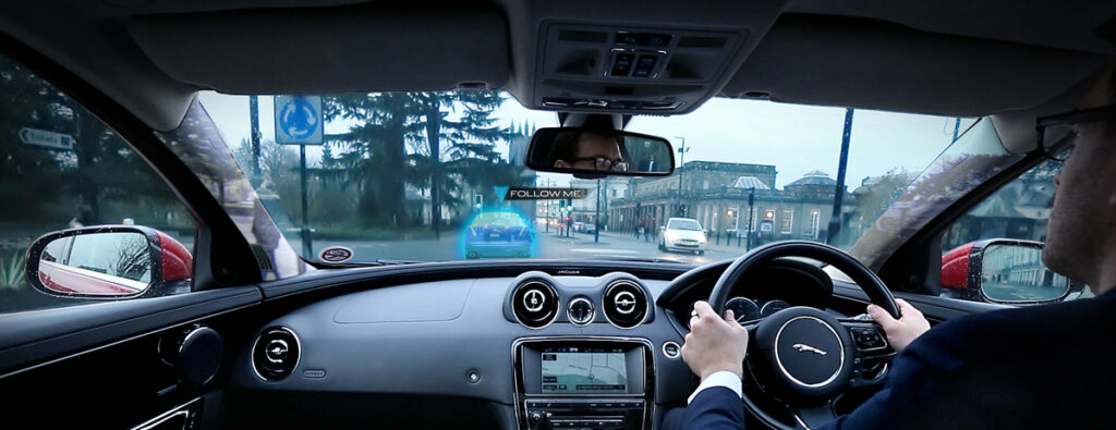
Besides this “transparent bonnet” system, the company Jaguar-LandRover was also conducting research also on a “transparent pillar” solution. That should help drivers in a more urban environment to see their surroundings in 360°, including objects hidden by the roof’s pillars with the help of cameras and AR. The research was done in 2014 and I couldn’t find any further outcome of the idea. Additionally they have also shown a unique way of AR navigation help: a ghost car projected in front of the driver that has to be followed along the route. [8] [9]

Jaguar transparent pillar and ghost car concept [8]

Panasonic’s state-of-the-art AR HUD

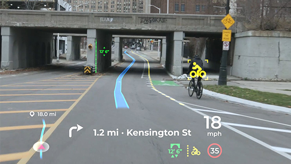
Panasonic Automotive is an other supplier (like Continental, etc.) who is developing onboard systems for automotive OEMs, like an AR Head Up Display with high-end features. Their product was shown on the latest CES 2021 exhibition and is claimed to get implemented in a series production car of an unknown brand in 2024. The system stands out from the other existing HUDs in following features:

  • AI software for 3D navigation graphics, supporting smooth responses to sudden changes ahead of the car. It also uses information from all the onboard ADAS systems (e.g. a 180° forward facing radar with 90 m range) and generates updates in less then 0,3 seconds. (the spatial-AI, AR navigation platform is a patent by Phiar)
  • Eye tracking technology to ensure that the driver always sees the projected information on the right place at any head movement.
  • Vibration control: image stabilization for bumpy roads.
  • Advanced optics, 4K resolution with laser and holography technology (by Envisics).

[5] [6]

To cover all relevant sensory fields in a car interior interface, next week I want to focus on the topic of haptics and tactile feedback solutions on the market.

Sources

[1] YouTube video from Roadshow: Car Tech 101: The best ways AR is being installed in cars | Cooley On Cars. Retrieved on 11.12.2021.
https://www.youtube.com/watch?v=PHhvCRexjWQ

[2] YouTube video from Roadshow: 2020 GMC Sierra HD: Heavy-duty hauler debuts “Transparent Trailer” tech. Retrieved on 11.12.2021.
https://www.youtube.com/watch?v=U0gZ9HaCWsA

[3] Online article by Road And Track: The 2020 GMC Sierra HD Can Make Your Trailer “Invisible”. Retrieved on 12.12.2021.
https://www.roadandtrack.com/new-cars/future-cars/a26009122/2020-gmc-sierra-heavy-duty-invisible-trailer/

[4] YouTube video by About Cars: Panasonic’s Innovative Augmented-Reality HUD Could Be in Cars by 2024. Retrieved on 12.12.2021.
https://www.youtube.com/watch?v=cLgMnSTSxog

[5] Online article by Panasonic: Panasonic Automotive Brings Expansive, Artificial Intelligence-Enhanced Situational Awareness to the Driver Experience with Augmented Reality Head-Up Display. Retrieved on 12.12.2021.
https://na.panasonic.com/us/news/panasonic-automotive-brings-expansive-artificial-intelligence-enhanced-situational-awareness-driver

[6] Online article by Auganix.org: Panasonic collaborates with Phiar to bring real-world AI-driven Augmented Reality navigation to its automotive solutions. Retrieved on 12.12.2021.
https://www.auganix.org/panasonic-collaborates-with-phiar-to-bring-real-world-ai-driven-augmented-reality-navigation-to-its-automotive-solutions/

[7] Online article by Car Magazine: Does it work? Land Rover’s ClearSight handy X-ray vision tech. Retrieved on 12.12.2021.
https://www.carmagazine.co.uk/car-news/tech/land-rover-clearsight/

[8] Online article by Autocar: Jaguar Land Rover previews transparent pillar technology. Retrieved on 12.12.2021.
https://www.autocar.co.uk/car-news/new-cars/jaguar-land-rover-previews-transparent-pillar-technology

[9] Online article by Jaguar: Jaguar Land Rover Develops Transparent Pillar And ‘Follow-Me’ Ghost Car Navigation Research. Retrieved on 12.12.2021.
https://media.jaguarlandrover.com/news/2014/12/jaguar-land-rover-develops-transparent-pillar-and-follow-me-ghost-car-navigation