| design challenges and principles from the car navigation system developer company TomTom
As it was stated in my earlier blog entry, one of the current cockpit design trends is the multiplicity of screens in cars. This increasing display real-estate is creating challenges for automotive UX designers in creating an effective driver experience instead of displaying as much beautiful information as possible and as a result distracting the driver.
The navigation system and mapmaker company TomTom is also discussing this topic with their principal UX interation Designer Drew Meehan in a blog post, with insightful content about the design principles to be considered.
Finding balance in information overload
The keyword of building an interface with informational balance is: “action plus overview”. When looking at several screens, the shown information should be clustered to provide hints for next actions, and further give an overview of the car’s journey. This should be achieved by sorting the information shown on separate screens to compensate each other.
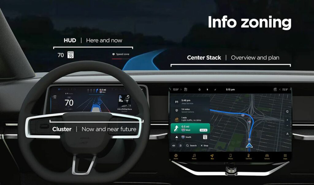
An example would be a car equipped with head-up display (HUD), a cluster behind the steering wheel and a central display. On the HUD only the current status information would be shown, about the “here and now”. The cluster would show information about oncoming actions in the near future. The central stack would have the job to give the complete overview about the journey, arrival time and complementary info such as refueling/recharging possibilities.
This structure creates a flow of eye movement, which helps the driver will understand the information placing easily and know where to look for specific interests.
Challenges in automotive interface design
There are some aspects and strategies that need to be considered when designing in-car interfaces:
- Responsive and scalable content according to screen size: complying with different screen sizes in different vehicle models of a brand
- Adaptive content: displaying only the needed information for the current driving situation. This requires prioritization of the information according to drivers’ needs. —> if the fuel/battery charging is critical, the next stations should be displayed. If the tank/battery is full, the screens can focus on less data. —> if there is no immediate route change action necessary, e.g. straight highway for 50 km, other data from other driver assistance systems could be shown (e.g. line keeping). —> in the city with intense navigation needs, the best could be to show prompt actions on the HUD, closest to the drivers’ eyeline for easy help.
- Creating one interface ecosystem: all screens should be connected and not segregated. The screens and the shown information should create continuity and complement each other.
- Customization options: despite good information balance, some people could be overloaded and stressed by multiple screens. They should be allowed to change screen views and positions of content.
TomTom’s UX department has done user research with varied screen info content. They found that “users want easy, glanceable and actionable information”, which reduces cognitive load and stress.
In summary, the UI design has to support the drivers’ actions by showing essential, easily digestable information. It should be placed where the driver mostly expects the content to be and have just the right amount of detail, according to the current driving situation.
Source
Online article by Beedham, M.: Informing without overwhelming, the secret to designing great in-car user experiences, 13.10.2021.
Retrieved on 09.01.2022.
https://www.tomtom.com/blog/navigation/designing-effective-in-car-user-interfaces/