“Minimalism is the right way to go” – at least, this was the consensus of many up and until 2017. Brands became more focused on the idea that ‘less is more’, content became cleaner, living simpler and haircuts A-symmetrical. So, what would be the counter-reaction to the simple and pure way of being? – Right, maximalism (Culture, 2019). para 1-3
Maximalism is based on excess, variety and being elaborate. It is all about exploring the potential of space, for example in a room or on a page. An example for maximalism would be the repetition of words or images to create a certain effect (Culture, 2019). Para 4
“If it hurts your eyes, it’s probably maximalism, or a solar eclipse.” – Maria Driver, content producer at Webflow.
Maximalism is the rebellion against minimalism. It ignores traditional conventions and emphasizes the expressive and playful that often refers to historic design and/or combines high culture with pop culture. For some, maximalism can be summarized as the following: magic and madness (Culture, 2019) (para 5-8).
How can a brand incorporate Maximalism?
The graphic design tool website Canva, shows ten steps how to create amazing maximalist designs by decadence, excess and extravagance (Gross, n.y.)
I) Be brave with color
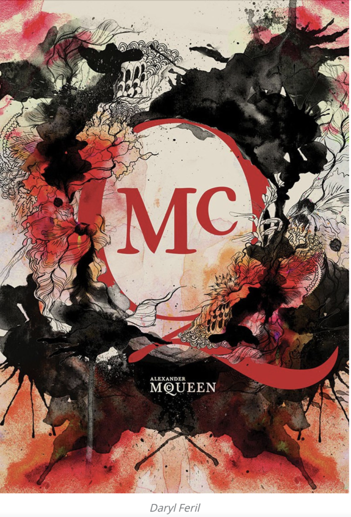
In maximalist designs there is no room for being cautious with colors. The more outrageous, the better. The key is to use bold, bright, and saturated hues and experimenting with color pallets. Good colors are, for example hot reds, pinks, and oranges (Gross, n.y.)
II) Play with patterns and motifs
In a maximalist design patterns and motifs can be bold and contradictory. However, it is important to still aim for consistency across the pattern pallet or color scheme. This ensures harmony and an integrated design. Naturally, not every pattern needs to regular and repeated. Irregular patterns and a lack of formal arrangements are allowed, however in this case a consistent color pallet should be used to keep the images in harmony (Gross, n.y.)
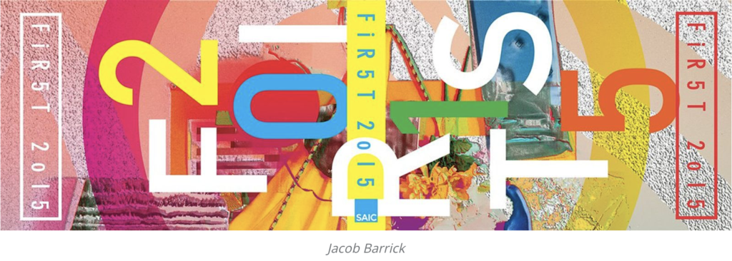
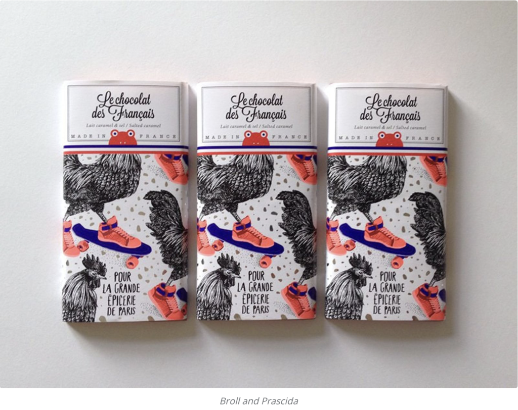
III) Repeat, Repeat, Repeat
Sometimes, repetition really gets the point across, especially when it is used for aesthetic effects. This can be done, for example, through a repeated motif which reappears on different packaging’s of your product, or, by a range of repeating, clashing patterns.
IV) Create optic illusions
Optical illusions appear where the visual perception of images is different from the objective reality. Used in maximalist design, optic illusions make your brain think longer about what is sees right now. The result is that viewers will soak in your artwork longer to understand message and meaning.
V) Fill the page
While enough white space and room to breathe is the rule of thumb for minimalist design, certainly the difference is asked for is maximalism. But this does not mean filing the page just for the sake of it, but rather a fully integrated piece of design.
VI) Layer images
Layered images and graphics help to create a denser look. This not only helps to create more depth but also more decadence.
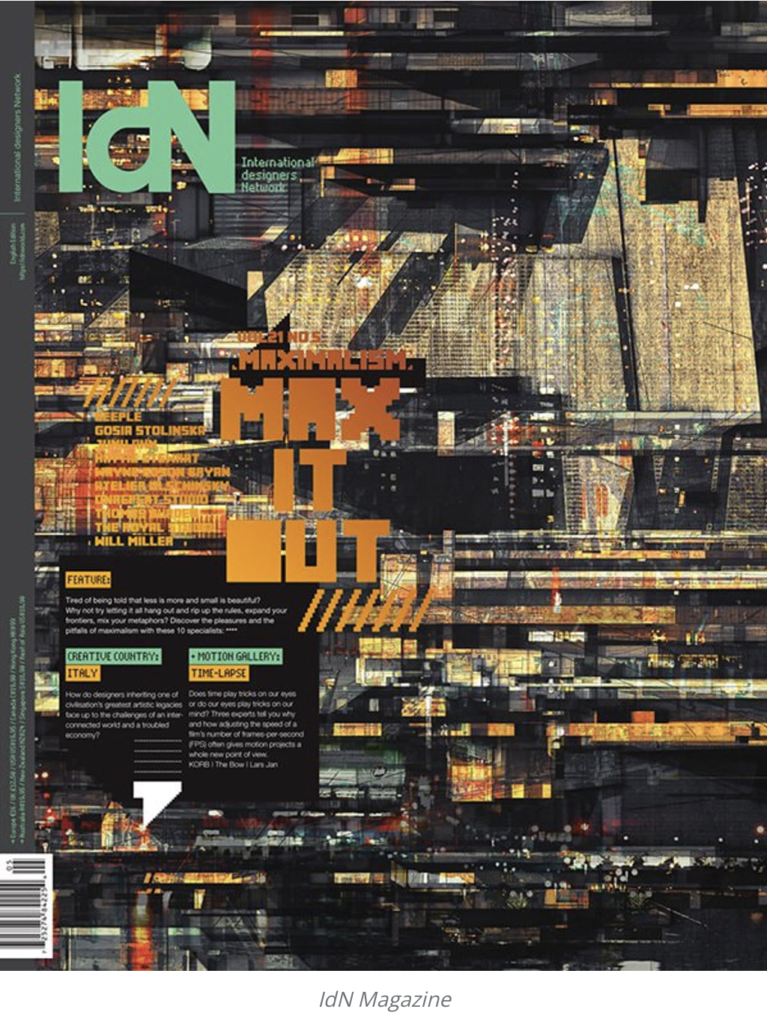
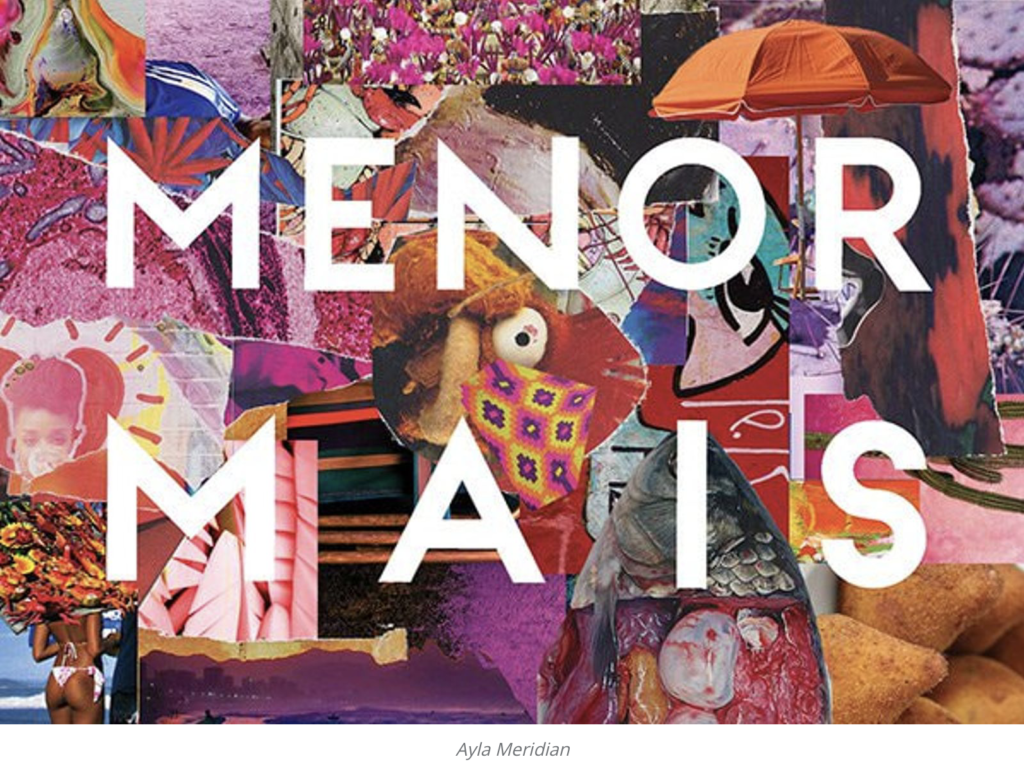
VII) Collage it up
Like the bullet point above, also collages full of layered images and graphics are typical for maximalism. Still, despite all the layering to aim should always be to create a consistent image, meaning and message.
VIII) Create fantasy
Maximalism is more about creating fantasy than creating excess. To create that fantasy, you need vivid colors, showy patterns, decadent imagery, and rich design.
IX) Take a postmodern approach
Postmodern design was a reaction against modernism and its strict rules. A postmodern approach forgoes traditional conventions for the sake of playful and expressive graphic design, which often combines high culture with pop culture.
X) Create organised chaos
In maximalism, colors, patterns, images, and repetition are used to capture the attention. But the aim is not uncontrolled excess but organized chaos, which appeals to the senses and conveys a message.