Kritische Bewertung einer Masterarbeit


CG Pflaumbaum – 2013 – espace.curtin.edu.au
Shock Advertising – A sensationalised media construct?
School of Design and Art
Christine G Pflaumbaum
This Thesis is presented for the Degree of
Doctor of Philosophy
of Curtin University
February 2013

Gestaltungshöhe:
Zumindest nach dem, was online gefunden wurde, ist diese Arbeit eine rein
wissenschaftliche, die keinerlei Ambition in eine Design Richtung zeigt. In dieser Arbeit geht es um die wissenschaftlich erlangten Kenntnisse, und nicht um die physische Gestaltung der Arbeit selbst oder eines Produktes daraus.

Innovationsgrad
Die Arbeit basiert stark auf Literatur, Erkenntnissen, Terminologien und Schlüssen, die bereits von Autorinnen getroffen wurden. In der Arbeit sind sehr viele Kapitel enthalten, die dem Leser/ der Leserin helfen sollen, die Thematik zu verstehen bzw nötig sind, um die richtigen Schlüsse zu ziehen. Auch Fallstudien wurden in der Arbeit inkludiert. Nichtsdestotrotz hat die Arbeit einen hohen Innovationsgrad. Eine qualitative Studie wurde anhand von Experteninterviews durchgeführt. Laut der Autorin diene die Literatur dazu, die Aussagen der Fachpersonen in Relation zu setzen. Durch Experteninterviews kann man außerdem einzigartige Denkprozesse und Aussagen wiedergeben und analysieren.

Das Ziel dieser Studie ist es, die Lücken und Diskrepanzen zwischen der Theorie und der Praxis von Schockwerbung zu untersuchen. Die Leitfrage dieser Untersuchung lautet: Wie funktioniert die Praxis der Schockwerbung im Vergleich zur Theorie? Da diese Frage anhand einzigartiger Experteninterviews beantwortet wird, die so in keinem Lehrbuch zu finden sind, sehe ich einen hohen Innovationsgrad in dieser Arbeit.

Selbstständigkeit

Zur Selbstständigkeit kann ich leider keine Angaben geben, da ich nicht weiß, wie die Autorin gearbeitet hat, aber jedenfalls haben keine anderen Menschen bei dieser Arbeit als Autorinnen mitgewirkt.

Gliederung und Struktur
Die Arbeit ist sehr gut und umfangreich strukturiert. Das erste Kapitel wird als Einführung bezeichnet. Dort findet man Ziel und Signifikanz der Arbeit sowie eine Anzahl an Begriffserklärungen. Dann geht es über in Kapitel 2, in dem der Leser/die Leserin die notwendige Hintergrundinformation bekommt. Die Hauptthemen der Arbeit werden erklärt und beleuchtet – jedoch immer mit der notwendigen Relevanz zum Thema. Das dritte Kapitel enthält die Forschung und die Methodik, das vierte Kapitel beinhaltet die Fallstudien und Experteninterviews. Im fünften Kapitel werden alle zu erforschenden
Themen nochmals zusammengetragen (Analyse und Diskussion) und im sechsten Kapitel erfolgt die Schlussfolgerung.

Kommunikationsgrad
Der Kommunikationsgrad der Arbeit kann ebenfalls nicht von mir bewertet werden, da ich nicht weiß, wie die Kommunikation der Autorin mit ihrem Betreuer/ihrer Betreuerin war.

Umfang der Arbeit
Die Arbeit umfasst meiner Meinung nach alle relevanten Kapitel, die für die
Beantwortung der Forschungsfrage und dem Grundverständnis der Arbeit wichtig sind. Außerdem wurden diese Kapitel sehr sorgfältig und umfangreich gestaltet. Die Arbeit enthält sehr viele Experteninterviews und Fallstudien, sodass diese einen sehr wichtigen Beitrag zur Relevant der Arbeit und Beantwortung der Forschungsfrage beitragen.

Orthografie sowie Sorgfalt und Genauigkeit
Zumindest in den Teilen, die ich mir durchgelesen habe, sind mir keinerlei
Rechtschreibfehler oder Fehler im Layout aufgefallen. Die Arbeit scheint sehr sorgfältig geschrieben und gestaltet worden sein.
Jedoch: Am Schluss ist mir aufgefallen, dass auf der Titelseite im Datum ein
Rechtschreibfehler zu finden ist. Das sollte auf keinen Fall passieren.

Literatur
Die Arbeit enthält ein sehr umfangreiches Literaturverzeichnis ergo, die Arbeit stützt sich auf ein sehr gutes Fundament an seriösem Quellen. Es wurde ältere sowie (damals) sehr aktuelle Literatur hinzugezogen.

Inclusive character design try 3

In my latest experimental session, I experimented with the character design of native American people. As in my latest approach I did some research on features and characteristics which are typical for this ethnicity. I also wanted to give them a neutral/ordinary clothing because I thought about illustrating native Americans how they would live today in the modern society. (Not living in tribes but in the modern society).

It is really challenging to draw/illustrate people of a specific ethnicity in general because obviously they all don’t look the same and features vary from person to person. Still, I think it helps to draw different characters in order to learn and identify characteristics which everyone (more or less) has in common.

Inclusive character design 2nd try

In my last blog entry, I experimented with inclusive character design in the field of: having one common theme (doing yoga) and then drawing different people in this situation. This time I focused on ethnicity and gender (Japanese (young) man) and tried to really understand:

  • Features
  • Clothing
  • Characteristics

I realized that it’s hard for me to stick to drawing people how they really look like and not to “Europeanize” them aka giving them features which are typical for Europeans like bigger lips or eyes etc.

I think it needs a lot of practice to really understand ethnicities and to draw them correctly without making them too European or too stereotypical.

Inclusive character design: first drafts

After I read those inspiring two articles I decided to start right away with experimenting. I opened my procreate app and made up the following scenario:

If I were to draw illustrations for a healthcare magazine about the pros of yoga. Whom will I depict? How would I normally do it vs what did my findings on inclusive character design say how I should to it?

I really tried to play with different body shapes, skin colours, hair and outfits which put no character in a weaker or stronger position as well as reflecting their cultural background appropriately. I noticed that very often I had to ask myself: is what I want to draw a stereotype or does it reflect the reality? I did some research on hairstyles and textures in order to get it right and to match it to their cultural background.

I will continue experimenting. The next blog post will be specifically about depicting young male Japanese characters. In order to depict those characters as accurate as possible I will do some research on facial features, hair, as well as clothing. Stay tunes.

New topic: Inclusive character design

I actually came across the beginning of the semester, ditched it and now really want to come back to it again: inclusive character design.

What does inclusive mean? How can we achieve it? What is inclusive and what is just insulting and stereotypical? What can you do as a designer to make your illustrations inclusive in a natural way?

How to achieve inclusive character illustrations

What factors are important to consider when you want to create an inclusive character design?

  • Age
  • Ability
  • Body type
  • Facial features
  • Ethnic hair types
  • Non-Western clothing
  • Non-traditional family models
  • Non-binary gender representation

 It might help you to use real photos of real people as an inspiration. Diverse representation and inclusive design is still an area where we need to push ourselves.

Illustrations are a meaningful way to bring abstract ideas into something tangible. With illustrations you can visualize stories, ideas, concepts in a creative way so they stand out. Illustrating people needs to have a bit more thought into it than illustrating objects. How you illustrate people will tell a lot about your company, brand, mindset etc and how people see your organization. 

Representing diversity, multiculturalism, equality and disabilities in illustrations is a fundamental part of depicting an inclusive identity.

As the illustration style of a person is more refined with details such as facial features, skin tones, hair colours, accessories and clothes, the more accurate diversity is represented. Subsequently, when an illustration has less details there is less accuracy of representation.

In order for those illustrations to be good and authentic we must question our internal assumptions and biases. “Diversity in illustration doesn’t just mean changing a skin colour or adding cultural features but also challenging the ‘default’ pre-assumed biases we have.“

The idea of „deafault” is really affecting our judgement of an illustration. For example, when we think of a scientist, we may default think that a scientist may be a Caucasian older man, or that a teacher is a middle-aged woman.

This article says: 

„We can challenge these pre-assumed biases by putting underrepresented groups of people into positions of power in our illustrations. For example, challenge the idea that teachers are just women by choosing illustrations or illustrating a teacher as a man of colour with hearing aids or with a prosthetic. Illustrations should reflect our reality, and that is that the world is diverse, multiculturalism is the norm, and people around us may have disabilities too.“

Furthermore, it is also important not to fall for stereotypes when illustrating. While it’s important to equip your character with enough features in order for it to be distinctive enough, there is a thin line between respectful representation and disrespectful stereotypes.

Bibliography

Hand, L. (2020). Leading Hand. Retrieved from DIVERSITY AND DISABILITY IN ILLUSTRATIONS: PART 1: https://www.leadinghand.com.au/insights/diversity-and-disability-in-illustrations-part-1/

Dockendorf, A. (n.d.). Lemonly. Retrieved from CREATIVE WORKSHOP: INCLUSIVE CHARACTER DESIGN: https://lemonly.com/blog/inclusive-character-design

Designers can’t change the world- but what we can do instead

After one of the Designmonat lectures I just needed to research a bit about what it means to be sustainable/environmental conscious as a designer.

Designer can’t change the world – But what they can do instead

Sustainable graphic design

Social and environmental issues are forcing designers to acknowledge that also their design process is most of the time the very opposite of eco and social friendly. 

As the population is continuing to grow, natural resources are becoming more and more scarce. There need for fresh air, water, food, dependable transportation, safe jobs, and housing is increasing. Apparently, paper distribution and use have contributed heavily to the elimination of our world’s forests. 

Lead a sustainable design revolution.

What does it mean for graphic design to be sustainable?

The US Environmental Protection Agency (EPA) defines sustainability as ‘allowing for current economic needs to be met while preserving biodiversities and ecosystems to maintain the same quality of life for future generations.’ 

To know what sustainability means for graphic design, one must examine the tools and resources designers use on a daily basis. 

A main material which is used is paper. Paper is usually made from wood pulp which is taken from trees and requires a great amount of energy and water to produce. After the paper is manufactured designers use it for printing that also requires water, energy and, of course, ink (which is made from petroleum products requiring energy and water to refine and manufacture.) It is pretty clear that all of this has a huge impact on our planet. 

So, for designers to work in a sustainable way, all of their materials and energy must be renewable, recyclable and/or reusable. As a starting point, graphic designers should be more aware and better educated of their actions. 

  • Which ways are there to significantly reduce our tree-fiber paper use?
  • Learning more and switching to the Cradle to Cradle model
  • Reducing our carbon emissions in our studio
  • As well as: cooperating with vendors that utilize both renewable energy sources and environmental policy
  • Reducing unnecessary packaging in our designs
  • Use inks that are organic, non-toxic and vegetable-based

Working sustainably should be at the beginning of every design process. At first the designer should decide if the project deserves to exist in a tangible form, should be communicated digitally or should work as something else e.g as an intellectual system (e.g. cooking classes instead of printed recipe cards)

It is very important for graphic designers to think about and discuss the project goals before starting with any design measures. As a designer: educating yourself is just as important as educating your client. The solution of the project then should follow these four sustainable design principles:

  • Respect and care for the community
  • Improve the quality of life, conserves Earth’s vitality and diversity
  • Minimize the depletion of non-renewable resources
  • Change personal attitudes and practice to keep with the planet’s carrying capacity

These goals should then motivate the designer to engage in more specific tasks like:

  • Choose local, sustainable and recycled materials
  • Choose renewable energy
  • Educate the consumer about the life cycle of the object through messaging/marketing
  • Cooperate with vendors which are environmentally and socially aware/friendly

(Benson, 2007)

Bibliography

Benson, E. (2007). What is sustainable graphic design? Design Philosophy Politics.

Maximalist design experiment

Of course, I could not give up on my maximalist design of a carrot juice and I tried out more things. I looked again in the research I had already done about maximalist design and try to come up with ideas. In the end, I have 2 drafts that in my opinion, reflect a rather maximalist design approach. I know that there is a lot of room for improvement, but it was quite fun to tackle this challenge. Of course, I could spend soooo much more time on these drafts, but I think that experimenting means trying out things without the aspiration to make it perfect.

Like I said in the minimalist design experiment blog entry: maybe there are just some products which “demand” either a minimalist or a maximalist approach. Although I like try 1 of the maximalist approach, I still think that a minimalist design is a better fit for a carrot juice.

maximalist design try 1
maximalist design try 2

Minimalist design experiment

In the first semester, I did a lot of research on minimalist and maximalist design characteristics. As for the second semester the plan is to experiment in this field, I thought about something:

I will choose a product, for example Carrot juice and then crate a minimalist as well as maximalist design for it (according to what I’ve learned) The aim for it is not to be perfect but rather the process behind it.

As for the carrot juice, creating a minimalist design was fairly easy. A lot of ideas came immediately to my mind, and I knew exactly in which direction I want to go. But, for the maximalist design, it was very different. I hand no idea how to do it. I’ve made a lot of drafts, but they all turned out wrong.

Now I’m thinking: Are there products which can’t be advertised in a maximalist way? Is carrot juice to pure, clean, and organic to be advertised in a maximalist way?

minimalist design try 1
minimalist design try 2

Minimalist packaging attention and perception (part 1)

The past couple of days I have looked into a very interesting study from Michael Garaszczuk which deals with the topic of packaging design. Here are some of the most important findings:

Originally, the role of packaging design was to store the product in a protective container while it was transported through different distribution channels. However, over time the purpose shifted to a more marketing-oriented role. Therefore, the packaging becomes to be a very important communicative factor. From a customer’s point of view, well-designed packaging conveys positive information about the product, therefore increasing the product’s benefits which again increases the value of a product as a whole. Therefore, many purchase decisions depend on the expectation of how well a product will perform. The purchase of a product can be prompted through the packaging design. Therefore, consumers’ impulsive purchase intention is heavily influenced by the message communicated by the package, especially when the consumer has not deeply thought about the brand options before entering the store. Without the previous evaluation of the product, the message delivered by the packaging is interpreted more indifferently, resulting in a more positive purchase decision (Garaszczuk, 2015).

Two important categories of product packaging which have been classified are visual and informational elements. Visual elements include graphics, color, placement, size, and shape whereas informational elements include product informational and technology (Garaszczuk, 2015). Some authors have also classified into verbal and on verbal elements. Non-verbal packaging elements are similar to the visual elements, they consist of color, form, size, images, graphics, material, and smell. Verbal components consist of brand name, country of origin, information, special offers, and instructions. In the end, visual and informational (verbal) packaging elements work together to strengthen a brand in customers’ minds (Garaszczuk, 2015).

In order to communicate value, the most effective way, packaging must not only attract consumers’ attention but also align the product’s properties with market preferences. Therefore, strategies concerning market positioning try to determine which qualities consumers associate with the visual character of a product packaging. As an example, high-end products have been associated with bold colors, straight lines, and bold typography. In another study by Smith and Brower, it was found out that 26% of respondents attribute brands that use a clean package design, the color green, and pictures of nature a “green” personality (Smith & Brower, 2012).

It is crucial for marketers to think about traits a brand must personify to be attractive for the target group. Therefore, cereal brands typically use vibrant and playful colors no their packaging which is attractive to children (Garaszczuk, 2015). P. 7

Comparing Millennials View on Minimalism And Maximalism in Web Design

In my last research session I came across a very interesting study. The aim of this study was to see if millennials who grew up with minimalism prefer a minimalist or maximalist website design.

Authors:

Ulrik Söderström

Lovisa Carlsson

Thomas Mejtoft

Minimalist web-design is characterized by portraying necessary information, content, and features in the most straight-forward and clean-cut way. On the other hand, maximalist web-design aims for bold color combinations, different textures, images, graphics, and animations. The year of 2018 was truly the year of maximalist web-design, though, some designers claims that the “less is more” movement is on its way (Söderström, Carlsson, & Mejtoft, 2019) p. 92

Naturally, both minimalist and maximalist webpages should be designed in a way which does not harm user experience and the information intake. In the article “Feature Richness and User Engagement” Jakob Nielsen summarizes that the more engaged users are, the more features an application can sustain. But most users have low commitment. Therefore, especially websites must focus on simplicity, rather than features (Nielsen, 2007).

(Söderström, Carlsson, & Mejtoft, 2019) p. 92

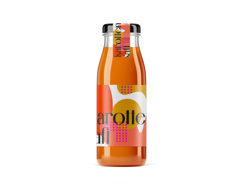
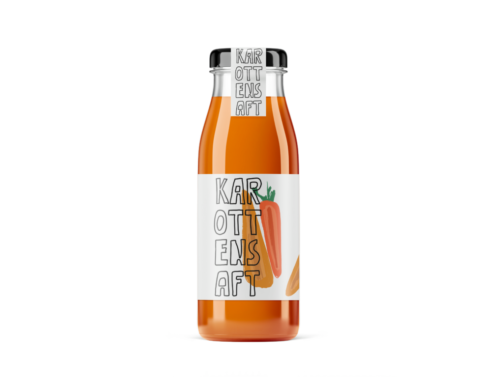
Minimalism in web-design means reducing all (unnecessary) elements which are unimportant for user tasks. A minimalist web interface has a clear hierarchy in elements, highlights the most important ones and gets rid of anything which might disturb the user’s perception. This helps to make important messages clearer ergo: it helps the consumer to navigate more easily on the website (Söderström, Carlsson, & Mejtoft, 2019) p.93

Web design, just like language is defined by the way people use it. As the term “minimalism is used widely, it is often hard to pinpoint the exact features of it. To get a clearer picture of minimalist web design features, this thesis refers to a study of the Nielsen Norman Group. In this study 112 minimalist websites were analyzed to find defining features of minimalist websites. The author(s) included a characteristic to be defining if it was present in at least 75% of the websites (Moran, 2015)

  1. Flat Patterns and textures
    Flat interfaces do not contain any elements like shadows, highlights or gradients or other textures which make the UI elements look three-dimensional. In the survey 96% of the minimalist websites were flat. Removing unnecessary elements totally falls into the philosophy of minimalist design. But: flat design often refers to textures, icons, or graphics of an interface whereas minimalism rather refers to larger content, features, and layout. So, an interface might be flat without being minimalistic. The problem with flat design is that the user often does not see if an element is clickable or not (as all the elements are flat). Clickable elements should be recognizable for the user easily, therefore it might be better to not work with flat icons there.
  2. Limited or Monochromatic Color Palette
    This trend was recognized in 95% of the sampled interfaces. In most minimalist websites color was specifically used to create visual attention without adding additional design elements of graphics. With less visual information, color palettes will stick out even more for the consumer. Many minimalist designs are often monochromatic or are using one bold color. Almost half of the investigated website (49%, 55 websites) used a monochromatic color palette and almost as many (46%, 52 websites) used one or two accent colors additional to the otherwise monochromatic color palette. Of those 55 monochromatic websites, 51 sites were exclusively using white, black, and grey shades.
  3. Restricted features and elements
    These characteristics were used in 87% of the investigated interfaces. In a minimalist environment, designers need to eliminate any element which is not required to support core functionalities or the message. Those elements could be: 
  • Menu items
  • Links
  • Images
  • Graphics
  • Lines
  • Captions
  • Textures
  • Colors
  • Fonts
  • Icons

As it is often hard to tell which elements are unnecessary a popular mantra of designers is “subtract until it breaks” which means that unless the absence of an element would cause serious problems, they get rid of it. It can be hard to find the right balance between having clean and reduced website and making sure to not make the primary tasks for the user overly complicated or difficult (Moran, 2015).

4. Maximize negative space
Through the elimination of certain elements, negative space, also called white space, is automatically created on a website. A maximization of white space was used in 84% of the examined websites. White space can help the user to absorb the presented information more easily as well as directing the user’s attention. The right use of white space helps to draw the users attention to the important content. 

5. Dramatic use of typography
When there is a reduced number of elements on the webpage, typography can be a great tool for communicating meaning. In this case the typography can compensate the “missing” elements like graphics or photos and makes the minimalist design more engaging. To establish a clear hierarchy on the website, different variations of font size, weight and style are crucial. Of the examined 112 minimalist webpages, 75% used typography to convey meaning of visual interest.

Additional widely used techniques on minimalist webpages which were found in less cases than 75% by the Nielsen Group were:

  • Large background images or videos
  • Grid layout
  • Circular graphic elements
  • Hidden global navigation

(Moran, 2015)

After examining the elements of minimalist web-design, the next paragraphs will look into the key features of maximalist design on websites.

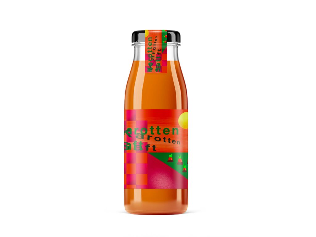
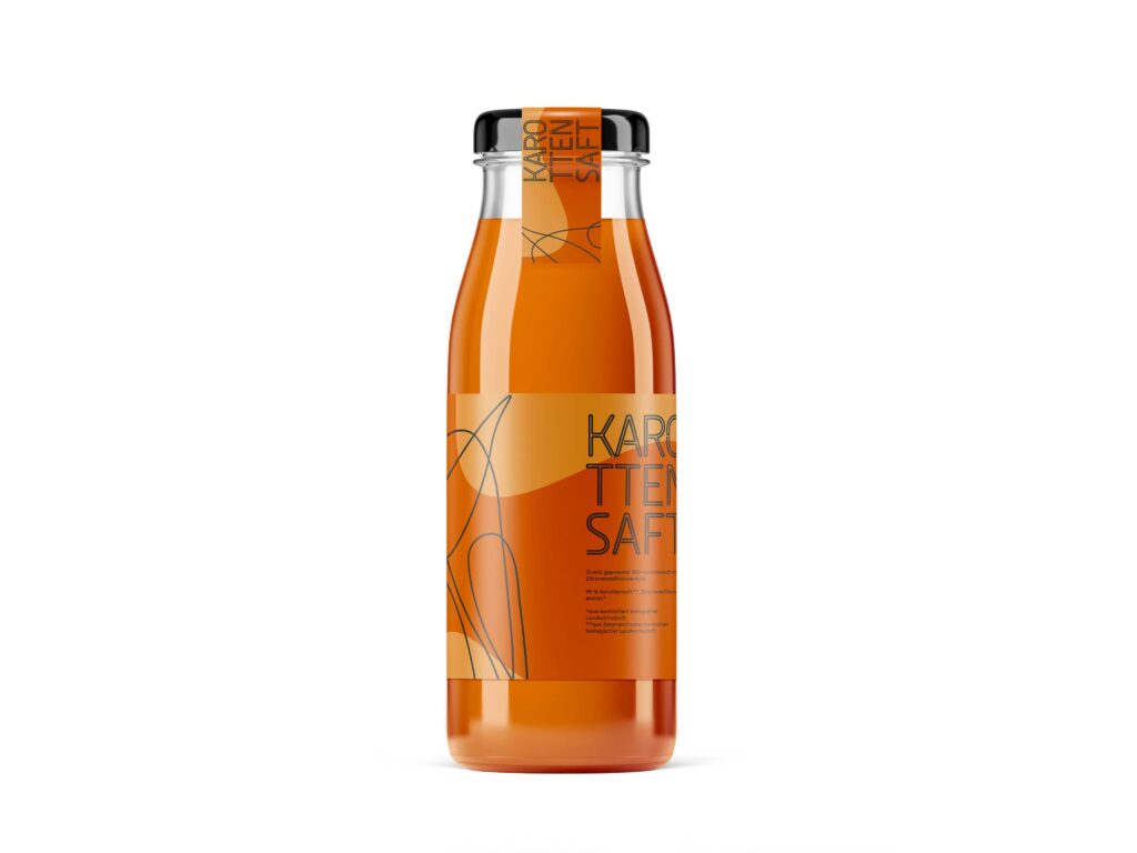
The aim of a maximalist web-design would be an organized chaos of different hierarchies, layers, textures, graphics, typography, and colors. Several attributes of maximalist web-designed could be defined by a number of designers.

  • Grandiose colors: A maximalist web-design should use a large and bold color scheme. Can also contain clashing colors as well as combinations of new and exciting compositions. 
  • Bold Textures: Distinct textures can help to draw attention to certain areas. Those distinct textures could be created by mixing colors with layers of a palette. 
  • Brave combinations: Maximalist websites play with the combination of several elements like images, graphics, animations which contribute to an extreme look.

In the research of Söderström, Carlsson and Mejtoft, the aim was to find out if millennials would prefer a minimalist or maximalist web-design approach. Therefore, two websites were created, both representing one approach. Both websites contained the same content and information and conveyed the same message. The survey involved 16 participants who were classified as millennials. The survey conducted by Söderström, Carlsson and Mejtoft showed that more than half of the participants (62,5%) liked the maximalist webpage the most. 31.3% liked the minimalist webpage the most and 6.2% had no preference between the both pages. 100% of the participants answered that they thought, that the maximalist webpage was the most innovative. Also, 71% of the participants classified the maximalist webpage as “modern”. Participants who liked the maximalist page more described it as more unique, outstanding and that it does create more interest. Many participants perceived that the maximalist design of the webpage suited the content it was made for (an art portfolio). Participants who were in favor for the minimalist page said that the content was presented in a more straightforward way and that it made the content clearer. Further, this party perceived the maximalist page as a bit messy. 

It must be said that it is very hard to measure such a subjective matter like the likeability of a website. Furthermore, there are many ways a minimalist or maximalist webpage can be presented, and this study included just one sample. Nevertheless, the authors suggest that it might be case that millennials perceive a maximalist webpage as more innovative as they are used to minimalist design. It must the highlighted that a webpage, maximalist, or minimalist, must always fit the person as well as the purpose (Söderström, Carlsson, & Mejtoft, 2019) In this case, an art portfolio was perceived as a well fit for a maximalist website design, to convey a creative an exciting message.