Muji Versus Maharaja: When (And Why) Minimalist Versus Maximalist Design Differentially Influence Consumer Self- Brand Connection

In my last research session I came a cross an article from:

Ngoc (Rita) To, University of Houston, USA
Vanessa M. Patrick, University of Houston, USA

NA – Advances in Consumer Research Volume 45 | 2017

Here are my most important findings from this article:

In some important aspects of marketing, aesthetics plays a very crucial role, for example in product creation, package design or website layouts. Therefore, the consumers perception of “beauty” can be an important trigger for behavior like product choice, the willingness to pay or the perception of quality. (To & Patrick, 2017) p. 258

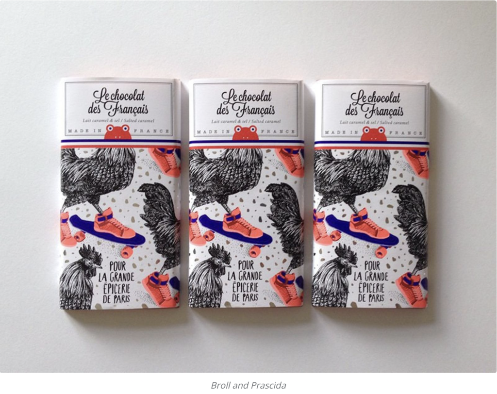
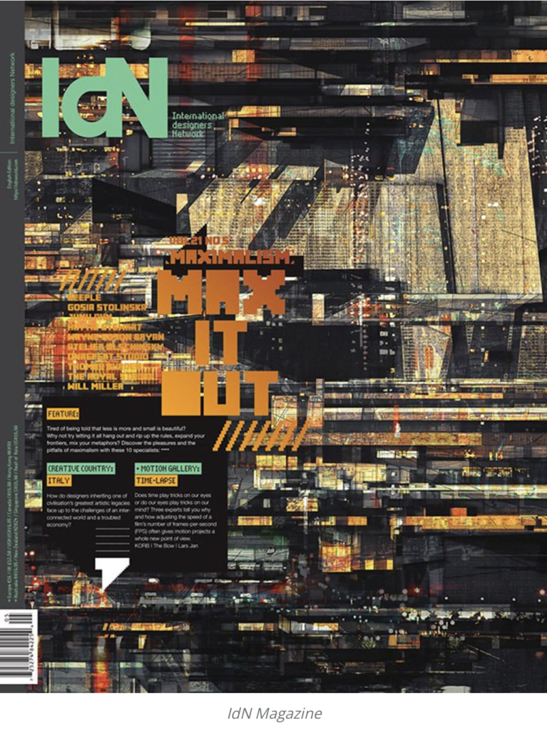
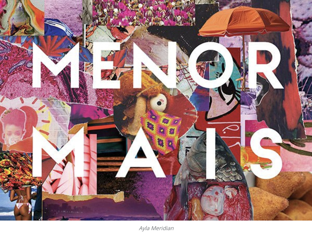
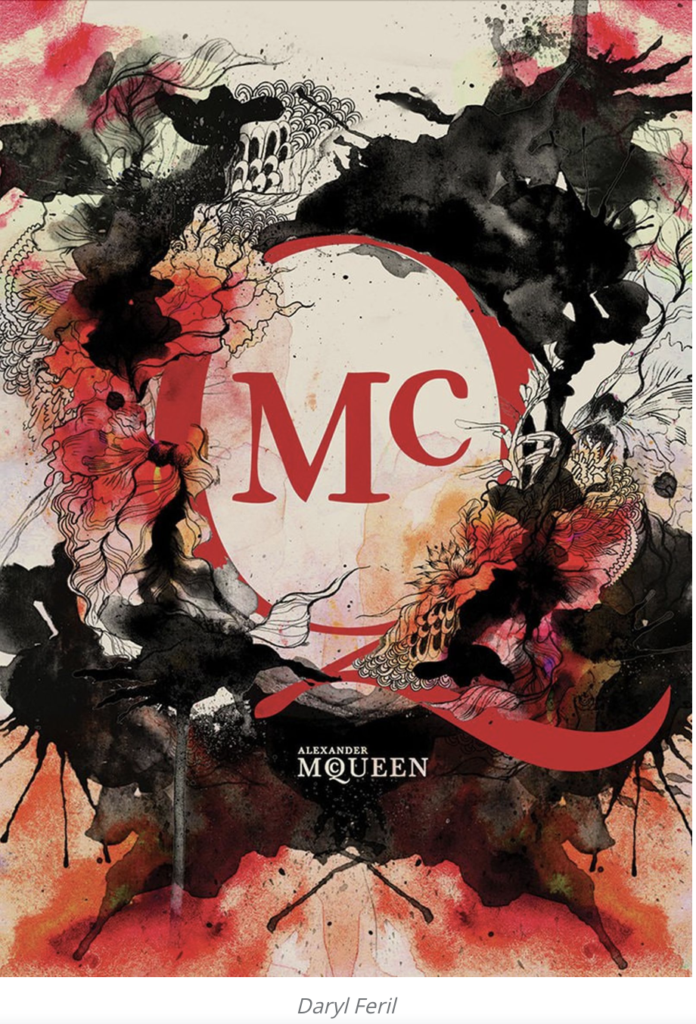
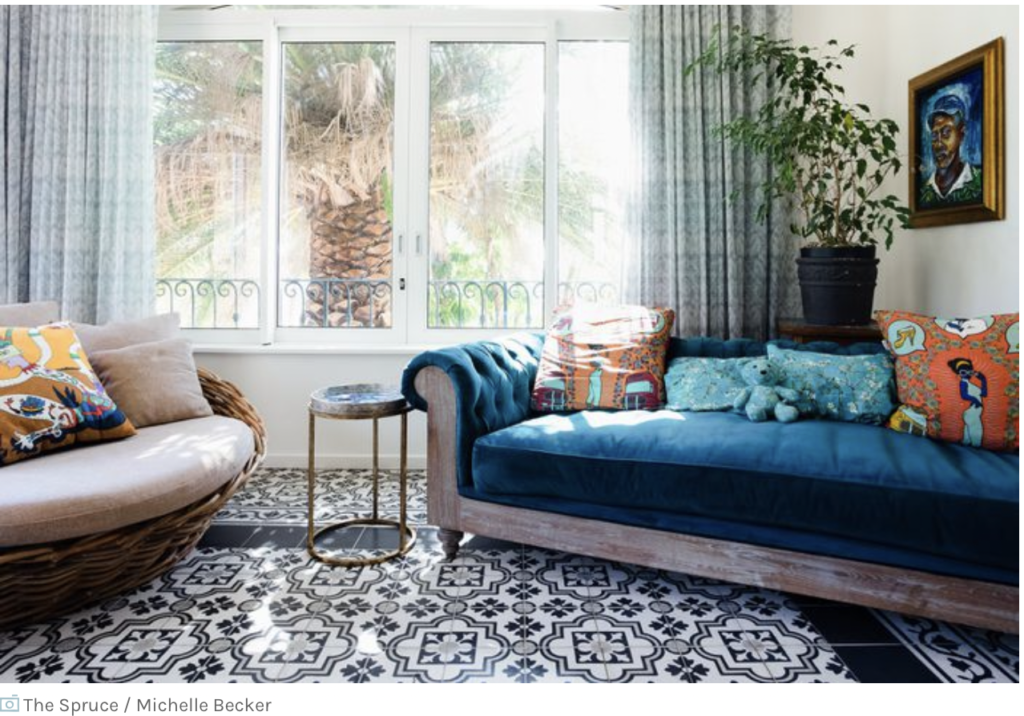
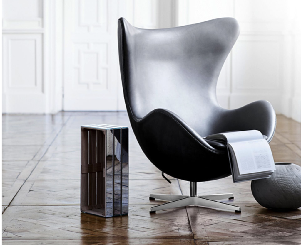
Recent studies in consumer behavior ask themselves the question which set of aesthetic features impact consumer’s consumption experience. A current study investigates how a specific design style, more precisely how a minimalist or maximalist design style, can influence consumer self-brand connection (SBC). Minimalist design can be characterized through simplicity through basic geometric shapes, limited decoration, and abundant white space. On the contrary, maximalist design is defined by richness, an abundance of geometric patterns with minimal white space. Although those visual elements are very diverse, brands have been using both styles to convey a luxury appeal. For, example, Apple’s minimalist design stands for luxury and high fashion but so does Versace’s, who’s brand image is full of decorative ornaments.

The authors suggest that certain types of aesthetics like minimalism and maximalism arouse distinct functional attitudes. The theory of functional attitudes proposes that people hold certain attitudes because they are useful, and those attitudes serve important social functions. Those social functions can be for instance, allowing people to express their own values (value-expressive attitudes) and facilitate self-presentation (social adjustive attitudes). Further, the authors propose that minimalist design causes more value-expressive attitudes. When people view minimalist art, the experience is often transformed into a more relatable happening, where the viewer can engage with the work of the creator. This effect also happens when a minimalist design is used in brand communication. Consumers get the freedom to develop their own meaning off the brand instead of just receiving the message. For example, the Japanese retail brand “MUJI” has a brand communication concept of “emptiness” which emphasizes simplicity and white space. In this way, consumers get the chance to develop and their own believes and perception of the brand. Due to the freedom of self-expression, which is inherent in its visual aesthetics, the authors suggest that minimalist design enhances SBC through the facilitation of value-expressive attitudes.

In contrast, To and Patrick hypothesize that maximalist design causes more social-adjustive attitudes, as maximalist aesthetics are often used for gaining social approval. The authors draw here from people’s direct experience with maximalist design which often happens in a specific social context where the goal of self-presentation is often in focus. For example, people often come across complex pattern moldings when they visit a cathedral or a five-star luxury hotel. Therefore, consumers seem to have developed a tendency for maximalist design if they seek to present a desirable self-image. Furthermore, people tend to associate maximalist design with impression-management motives to, for example, signal social prestige. Throughout history, well known figures and personalities often used intriguing creations to represent their stature, for example, the ornate interior in the Palace of Versailles. According to the suggestion that maximalist aesthetics are frequently used for gaining social approval, the authors predict that maximalist design enhances SBC by causing social-adjustive attitudes. Because of the different attitudes minimalist and maximalist design triggers in people, To and Patrick propose power as a moderator for the effects. Power in this context is defined as “asymmetric control over valued resources in social relations” (Rucker, et al. 2012) and can either foster agentic or communal orientations. Feeling powerful can lead people to be more agency-oriented (i.e. focused on oneself). This is because being higher in social hierarchy gives people the freedom to follow their own value. On the other hand, feeling powerless makes people more communal oriented, in other words, more focused on others. This is because being in a lower social hierarchy makes you more dependent on others for valued resources.

Therefore, To and Patrick suggest that minimalist design will enhance SBC for high-power consumer, whereas maximalist design will enhance SBC for low power consumers. These hypotheses were tested across five studies. In those studies, packaging design was manipulated in a way that the decorative elements of the package varied while the other features stayed the same. For relevancy reasons, studies one and two will now be elaborated more thoroughly. In the first study, the participants evaluated a minimalist vs maximalist design of a fictional tea brand. Then, their value-expressive and social adjustive attitudes were assessed. To and Patrick found out that minimalist design causes more value-expressive attitudes while maximalist design causes more social-adjustive attitudes. Very interesting is that both packaging designs were experienced as equally attractive and luxurious. In their second study, the authors focused on the hypothesis about power. The study showed that high-power participants felt a stronger SBC to minimalist design while low-power participants felt stronger SBC to maximalist design. 

Maximalism – magic or madness?

“Minimalism is the right way to go” – at least, this was the consensus of many up and until 2017. Brands became more focused on the idea that ‘less is more’, content became cleaner, living simpler and haircuts A-symmetrical. So, what would be the counter-reaction to the simple and pure way of being?  – Right, maximalism (Culture, 2019). para 1-3

Maximalism is based on excess, variety and being elaborate. It is all about exploring the potential of space, for example in a room or on a page. An example for maximalism would be the repetition of words or images to create a certain effect (Culture, 2019). Para 4

“If it hurts your eyes, it’s probably maximalism, or a solar eclipse.” – Maria Driver, content producer at Webflow.

Maximalism is the rebellion against minimalism. It ignores traditional conventions and emphasizes the expressive and playful that often refers to historic design and/or combines high culture with pop culture. For some, maximalism can be summarized as the following: magic and madness (Culture, 2019) (para 5-8).

How can a brand incorporate Maximalism?

The graphic design tool website Canva, shows ten steps how to create amazing maximalist designs by decadence, excess and extravagance (Gross, n.y.)

I) Be brave with color
In maximalist designs there is no room for being cautious with colors. The more outrageous, the better. The key is to use bold, bright, and saturated hues and experimenting with color pallets. Good colors are, for example hot reds, pinks, and oranges (Gross, n.y.)

II) Play with patterns and motifs
In a maximalist design patterns and motifs can be bold and contradictory. However, it is important to still aim for consistency across the pattern pallet or color scheme. This ensures harmony and an integrated design. Naturally, not every pattern needs to regular and repeated. Irregular patterns and a lack of formal arrangements are allowed, however in this case a consistent color pallet should be used to keep the images in harmony (Gross, n.y.)

III) Repeat, Repeat, Repeat
Sometimes, repetition really gets the point across, especially when it is used for aesthetic effects. This can be done, for example, through a repeated motif which reappears on different packaging’s of your product, or, by a range of repeating, clashing patterns. 

IV) Create optic illusions
Optical illusions appear where the visual perception of images is different from the objective reality. Used in maximalist design, optic illusions make your brain think longer about what is sees right now. The result is that viewers will soak in your artwork longer to understand message and meaning. 

V) Fill the page
While enough white space and room to breathe is the rule of thumb for minimalist design, certainly the difference is asked for is maximalism. But this does not mean filing the page just for the sake of it, but rather a fully integrated piece of design.

VI) Layer images
Layered images and graphics help to create a denser look. This not only helps to create more depth but also more decadence. 

VII) Collage it up
Like the bullet point above, also collages full of layered images and graphics are typical for maximalism. Still, despite all the layering to aim should always be to create a consistent image, meaning and message. 

VIII) Create fantasy
Maximalism is more about creating fantasy than creating excess.  To create that fantasy, you need vivid colors, showy patterns, decadent imagery, and rich design.

IX) Take a postmodern approach
Postmodern design was a reaction against modernism and its strict rules. A postmodern approach forgoes traditional conventions for the sake of playful and expressive graphic design, which often combines high culture with pop culture. 

X) Create organised chaos
In maximalism, colors, patterns, images, and repetition are used to capture the attention. But the aim is not uncontrolled excess but organized chaos, which appeals to the senses and conveys a message.

minimalism vs MAXIMALISM

With all the research I did about Scandinavian design I got inspired to shift my topic in a different direction. As Scandinavian design is all about minimalism and reduction, I also wanted to find out more about the opposite direction: maximalism. So, my new research idea: MINIMALISM VS MAXIMALISM

As a practical part (in the very future) I could design different versions of a logo (CI/CD), from super minimalistic to super maximal (maximalism?) and see which one is perceived better/ has better brand recognition. (so minimalism and maximalism in branding/marketing). I could show the designed logos to a focus group and then evaluate which one has the best brand recognition. And in general, I want to find out more about minimalism and maximalism in advertisements, how it works, how it is perceived.

As the trend right now is going heavily in the minimalistic direction, I wanted to look at the counter-reaction and really find out more about “maximalism”. Maybe there are some misconceptions about maximalism out there. Maybe the minimalistic way is not always the right way to go. I will find out.

But for now, let’s start with some research.

Maximalism is seen as the counter-reaction to minimalism. In maximalism, the motto is: the bigger, brighter, and busier the better. In terms of color, texture, and style, maximalism does not want to focus on one of them but rather use all of them collectively (Sullivan, 2021).

Minimalism emphasises reduction and focuses on one element at a time (either color or texture or size). Maximalism on the other hand is more about features like color, shapes, textures, tones and, creating an over-the-top design/environment with them (Sullivan, 2021).

Nevertheless, maximalism is not about clutter or overstuffing. While it embraces the idea of excess, it promotes repetition, patterns, bold palettes, intricate graphic patterns, and details. Maximalism is loud. It is composed of mixed patterns and saturated colors. Maximalism has some key characteristics which are: 

  • Layering
  • Repetitive patterns in prints such as florals, abstract, and animal prints
  • Rich, bold colors
  • Unique statement pieces
  • Mixing and matching of textures and colors
  • Multiples of items like books, statues, artworks etc.
  • Blending of styles—oftentimes but not limited to classic, eclectic, and boho

(Sullivan, 2021)

Scandinavian design/ Country differences

This week I wanted to find out more about Scandinavian design in general. I found some more interesting characteristics about Nordic design in general as well as some country differences.

Characteristics

Scandinavian design is characterized by a minimal and clean approach. The aim is to link functionality to beauty. Those principles apply to all elements of Scandinavian design from architecture to electronics but are most used in interior design including furniture, textile, ceramics, and lighting (Mc Crory, 2021).

Colors

Colors used in Scandinavian design are mostly neutral and monochromatic. Pops of colors are used to add extra accents. The colors used are oftentimes rooted in nature like plush pink, grey-blue or sage (Mc Crory, 2021).

Materials

Materials in Scandinavian design are often organic and therefore reflect the Nordic countries’ relationship to nature. Wood, cotton, and wool as well as house plants are very big players (Mc Crory, 2021).


Country differences:

Norway:

Norway has its own design identity consisting of durability, beauty, functionality, simplicity, and natural forms. As Norwegians naturally spend quite some time in darkness, they try to bring light and elegance to their home through their design. Norwegian design can be described as a quirky mix, cutting the edge, modern but also historical. It also has a strong emphasis on the minimalist aesthetic. 

Hans-Christian Bauer, an industrial designer who was born in Norway says: “Good products are objects that are instantly appealing and feels good to use, makes the user feel proud to use it and more connected to it.“In his work he unites warmth and individuality and brings a Norwegian touch to his designs.nAn essential part of Norwegian design is to bring as much natural light into your room as possible (Heal’s, 2018).

Hans-Christian Bauer, Hammershøi Salt/Pepper Grinders

Sweden

Because of the long and hard winters in Sweden the aim here is also bring as much natural light as possible into the room/home. Pale walls, floors and furniture reflect natural light. A distinguishing feature of Swedish design in the efficiency aspect. The Swedish approach to furniture design emphasizes minimalism, functionality as well as clear lines. Diversity is also a crucial element of Swedish design. In the color scheme you find a lot of whites and blues as well as pops of pastel color like yellows, green, pinks and dove-greys but also with red, purple, and gold. Bruno Mathsson was a Swedish furniture designer and architect whose work was based on modernism and functionalism. Despite from a clear and mute design, Sweden is also known for its crafts, including glass. It also introduces fun and bold colors in an effortless way (Heal’s, 2018).

Bruno Mathsson, Pernilla 69 Easy chair von Dux

Denmark

Danish design can be best described by the term “hygge” which relates to an atmosphere of warmth and comfort. However, Denmark’s design also has a history of innovation. Many designers combined new industrial technologies with ideas of simplicity and functionalism. Danish design lays an emphasis on enough space/room and scarce decoration. It was influenced by the German Bauhaus School which became a vital point of the Scandinavian design movement in the 1950s (Heal’s, 2018).

The architect Arne Jacobsen is best known for his iconic and futuristic design of the egg chair. Danish design generally has a very timeless style, so it is easy to incorporate it into any home. Typical Danish homes are characterized by enough room, clean lines, and minimalism. Windows and lamps are very important as well as light-colored fabrics and other accessories like candles (Heal’s, 2018).

Arne Jacobsen; egg chair

Scandinavian/Nordic Design

For my research and design project, I have decided to focus on Scandinavian Design. This topic would include, as a first step, a lot of research, and can later result into own creations of Scandinavian-inspired designs. In this project, the term Scandinavian design may include several aspects like: interior, print, product design, brand design, package design, etc.

Some of the research questions which will help to analyze and understand Scandinavian design are:

  • What is the essence of Scandinavian Design?
  • Which colors, patterns are used? Where is the inspiration taken from?
  • What does Scandinavian design tell us about the culture, mindset?
  • What is the theme of Scandinavian design? What emotions does it evoke at the end-user?
  • What does Scandinavian design communicate?

Master’s thesis

This topic also has the potential to become a master’s thesis. Some research points might be:

  • Analyzing Scandinavian design in all aspects and explain if/why people are drawn to it
  • Background of Scandinavian design
  • What is the essence of Scandinavian design? Does it attract people? – Why? What is the idea behind it?

As the topic “Scandinavian design” is very broad, it can be broken down into several focal points like:

  • Scandinavian illustration
  • Scandinavian brand design
  • Scandinavian product design/ package design

Research on Scandinavian/Nordic design

Scandinavian design can also be referred to as Nordic design. Nordic countries include Denmark, Finland, Norway, Sweden and, Iceland  (Design, 2020).

Scandinavian Design

Some very crucial aspects of Nordic design lie in a deep respect for functionality, clean lines and longevity. Also, white walls, neutral-colored furniture made of natural materials and, minimalistic décor are crucial elements. Scandinavian design is created to be in harmony with its environment. The minimalist approach of Nordic design is not only for aesthetics.  Less furniture helps to let light and air circulate in the rooms freely. The Nordics also believe that things are bought or made to last instead of being tossed after some months. That is why Nordic design makes use of materials shaped in classic ways to please one’s eye long lastingly (Cruz, 2018).

It is also important to mention the terms “Hygge” and “Lagom” in conjunction with Scandi design. Hygge is a purely Nordic word that cannot be translated into English. It is a practice and a feeling. The word is used to express the mood for comfort, cosines, contentment and well-being. The Swedish ethos of Lagom is what accurately defines Scandinavian lifestyle. Lagom focuses on moderation, frugality, simplicity. It can be translated as “enough”, “sufficient”, “adequate”, “just right” (Design, 2020).

Characteristics of the Scandinavian mindset and way-of-living also find themselves in Nordic illustrations, patterns or logos. Those are often inspired by nature, modern, minimalistic and have a clean composition. The color palettes are always consciously chosen and either consist of lighter and more neutral colors, sophisticated and elegant colors or colors with high contrast and brightness. As Nordic design has a minimalist and modern touch, sans serif typography is often used (Lant, 2017).


Works Cited

Design, L. T. (2020). Scandi Design: Why the Hype? Retrieved November 2021, from Love That Design: https://www.lovethatdesign.com/article/scandi-design-why-the-hype/

Cruz, C. (2018). A Brief History of Nordic Design. Retrieved November 2021, from Tales by Trees: https://www.talesbytrees.com/brief-history-nordic-design/

Lant, K. (2017). How to bring the flair of Scandinavian design to your design project. Retrieved November 2021, from 99designs: https://en.99designs.at/blog/design-history-movements/scandinavian-design/