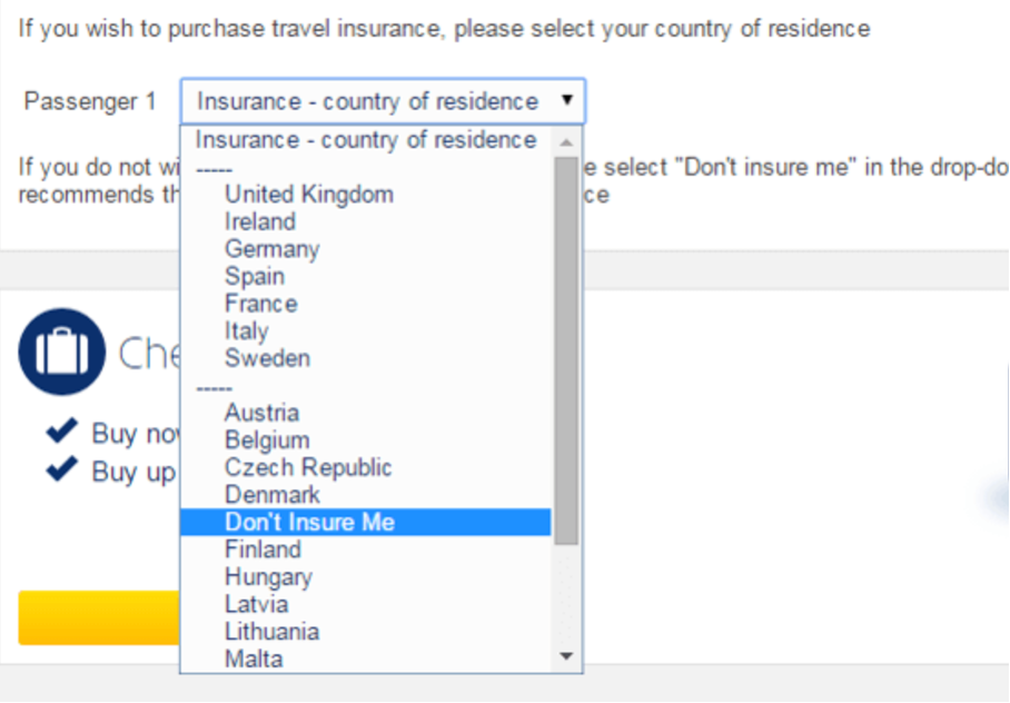
It has happened to almost everyone who spent at least some time in the internet, to be tricked into doing something that they did not intend on doing. In that case usually an interface or experience was specifically designed to manipulate users on purpose for the companies sake. This phenomenon of exploitation has a name: deceptive design patterns*. The prime example for this are travel insurances on airline websites, as they make it really hard to not buy it by hiding information, shifting positions and changing size and colors of buttons. Due to the fact that the term „deceptive design patterns*“ has now been established for more than 10 years, designers as well as users themself are aware of this method and some users even recognize them. Studies show that users have strong negative emotion, like annoyance, anger, frustration and worry, when identifying dark patters. However they still work.
Of course the phenomenon did not just pop up with the internet, but has existed for decades all the way back to salesman in the age of bartering. Since then psychological persuasion has been used to increase sales. The real question here is: When does it really become a deceptive design pattern*? And which specific psychological tricks work best and why? So this is what I want to focus on in my further research. According to Harry Brignull – THE expert on this topic – there is a greyzone and no certain point at which one is a deceptive design pattern*.
Another major question regarding the topic is, if deceptive design patterns* are ethically justifiable and how to convince designers that they are actually not. For this reason some European and national laws have recently been released to restrict using specific design patterns. For example did the European Government forbid to opt people in by default for newsletters and regulated the cookie consent manager. In the United Kingdom it is also not allowed in E-Commerce to sneak products into the shopping-basket of the user. Another attempt to actively fight against deceptive design patterns* is to raise awareness by publicly displaying examples of deceptive techniques, like on website deceptive.design (former darkpatterns.org). At some point this might also convince businesses to stop using this psychological design tool, as they might get an image problem because of user manipulation.
For me personally this topic is interesting from both the designer and also the consumers point of view. How can I train to recognize deceptive design patterns* immediately and on the other hand not get temped to create them, even it is serving the clients goal perfectly.
* formerly called “dark patterns”
Sources:
https://www.businessinsider.com/how-app-developers-keep-us-addicted-to-our-smartphones-2018-1
https://uxdesign.cc/what-is-addivtive-information-95df5ff689ea
https://www.darkpatterns.org/hall-of-shame
https://blog.hubspot.de/marketing/dark-patterns
https://doi.org/10.17011/ht/urn.202008245641
https://link.springer.com/chapter/10.1007%2F978-3-319-44902-9_9