#The Topic
The Holter Monitor Interface is quite dated, bulky, and unintelligible. Patients do not feel involved in the process and do not understand what parameters are being measured.
In a world where technology users are more educated and informed than ever before, leaving patients out of the loop feels paternalizing. Making users feel disconnected from their own condition poses risk to their own health.
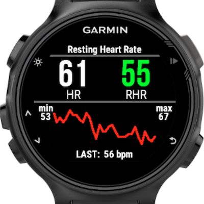
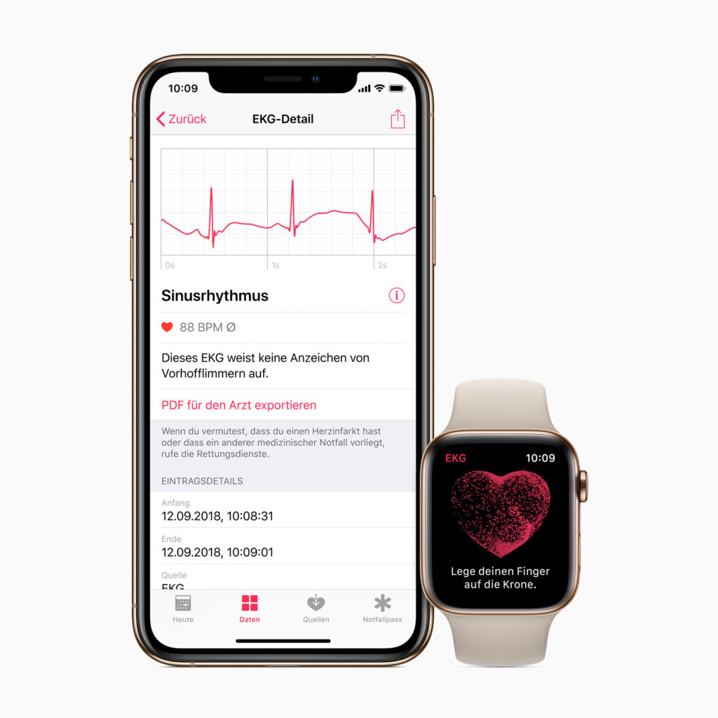
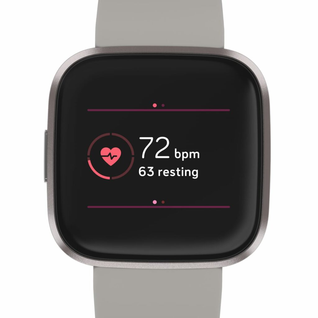
In the case of the Holter Heart Monitor, it is a much more advanced and capable device than the health wearables available in the market for consumers (e.g. Apple Watch, Miliband, Fitbit). But the interface in these wearables is more user-friendly and clear to inexperienced eyes.
Marrying the accuracy and depth of the data from the Medical Grade device with a tad of UX from the consumer–ready devices can help the patient understand what is going on in their body and be proactive towards a solution.
A better interface is the start of a change: From “patient”, by definition, waiting and passive, to an active player in their health status.
Garmin/Apple Watch/Fitbit


