There are Android app-design guidelines: https: //guides.codepath.com/android/Android-Design-Guidelines.
They also keep you updated on new changes: https://material.io/develop/android/components
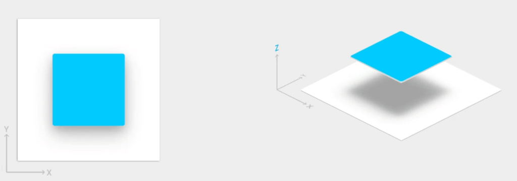
Same as iOS, Android always works with a dark and bright theme. Design can change over the years and updates and trends and currently its the “Material Style”. No opacity, but layers, structure and strong colors with dropdown-shadows to make it look like paper. The Shadow helps to show that layer, like an elevated look. (Transparency with iOS).
Animations in apps are handled with curved motion that pushes other content away or to the side.
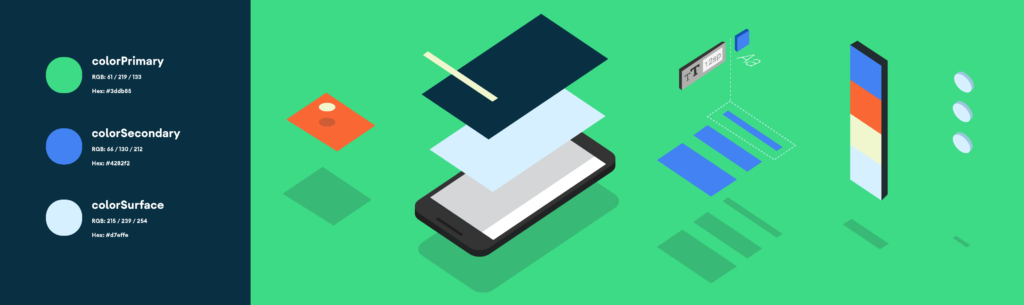
The current android color palette also doesn’t have to be followed in apps, but if you want to, here is there color theme: https://materialui.co/colors/
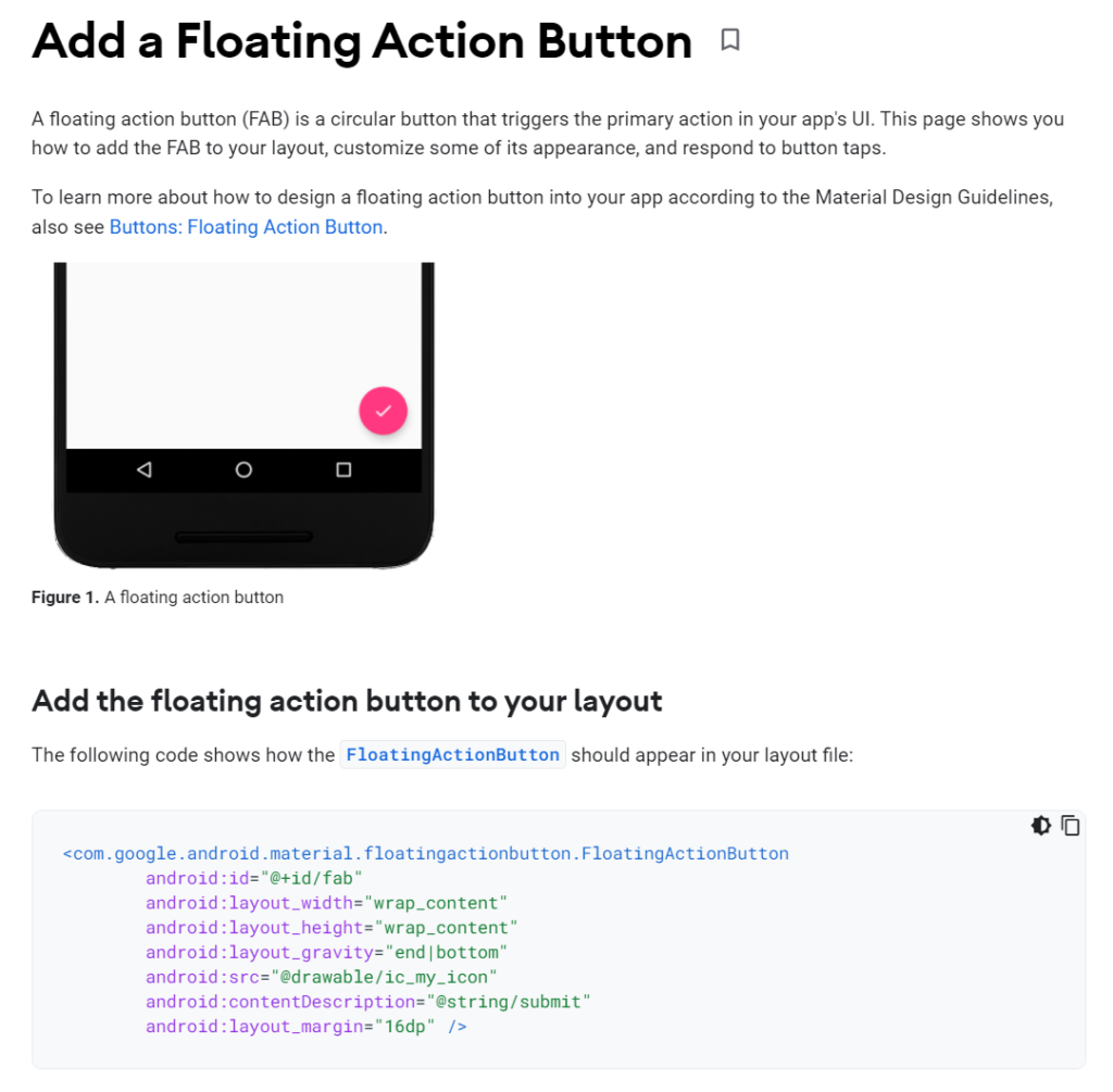
Android even offers their guideline navigation code: https://developer.android.com/guide/topics/ui/look-and-feel
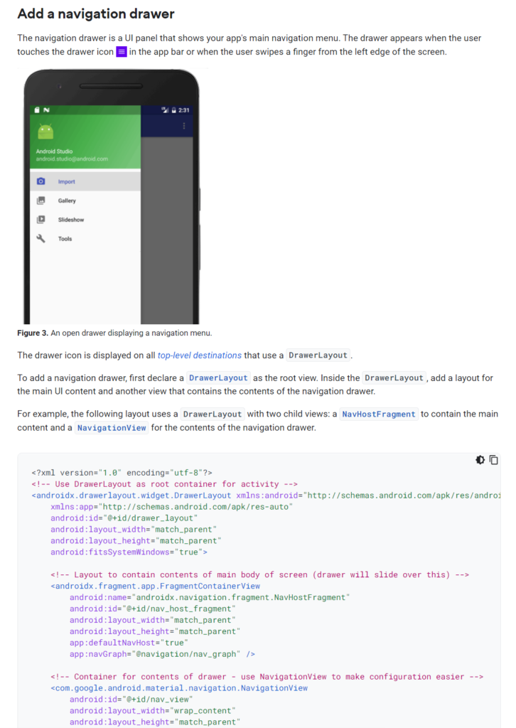
They use the App bar above, a tab bar, navigation on the left side and floating action buttons. Every single feature is offered in code form for easy access for developers!
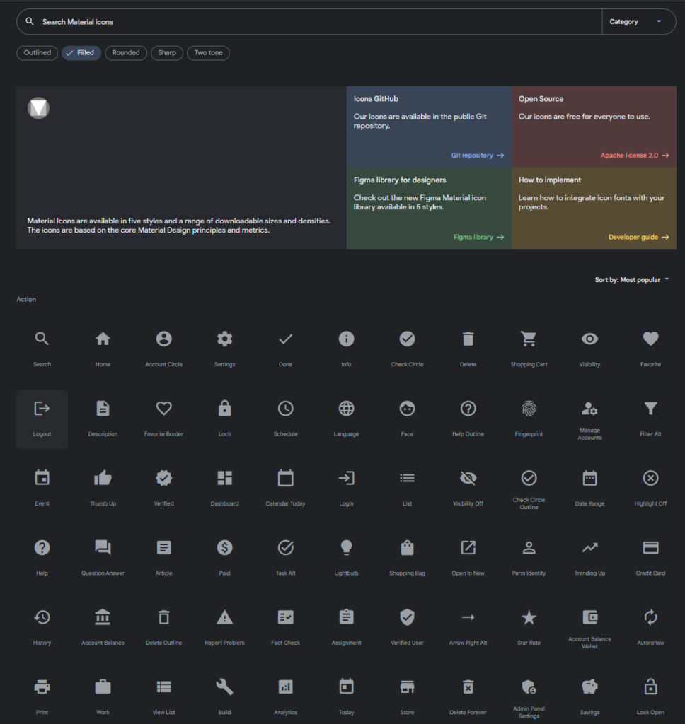
They also offer their guidlined icons: https://fonts.google.com/icons?selected=Material+Icons
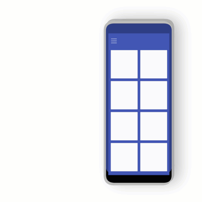
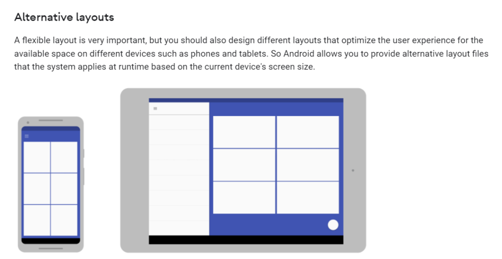
As Android has developed foldable smartphones, it is necessary to think responsive and work with cubic grids.
Android uses way more gestures (too many if you ask me). Include them in your app if you want: https://support.google.com/android/answer/9079644?hl=en#zippy=
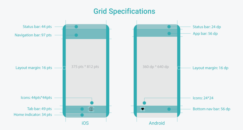
Difference between iOS & Android: