Gesture Evolution

Gesturing helps us communicate universal, through age, cultures and languages. Although there are differences, perhaps you should not thank a Greek with an open hand gesture, but in general you can communicate very well with pure common sense gestures.

There are three types of gestures: (besides sign language)

  • yes or no signals
  • imitating
  • iconic/pictogram gestures

Here an example from:

https://icog.group.shef.ac.uk/what-hand-gestures-tell-us-about-the-evolution-of-language/

Imagine that you are visiting a food market abroad and you want to buy a slice of cake. You know how to say “hello” in the native language, but otherwise your knowledge of the language is limited. When it is your turn to order, you greet the vendor and point at the cake of your choice. The vendor then places his knife on the cake and looks at you to see if you approve of the size of the slice. You quickly shake both of your hands and indicate that you would like a smaller width for the slice using your thumb and index finger. The vendor then cuts a smaller piece for you and you happily pay for your cake. In this example, you achieved successful communication with the help of three gestures: a pointing gesture, a conventional gesture, and an iconic gesture.

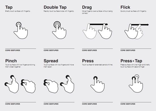
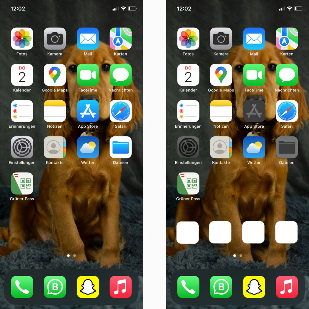
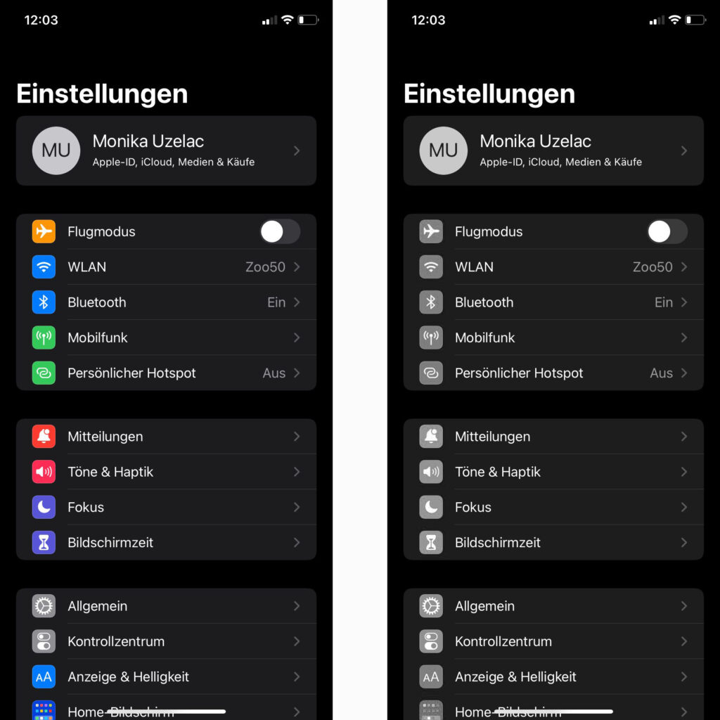
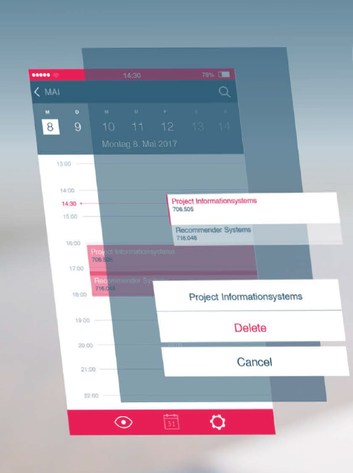
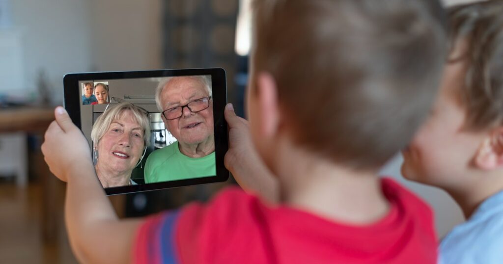
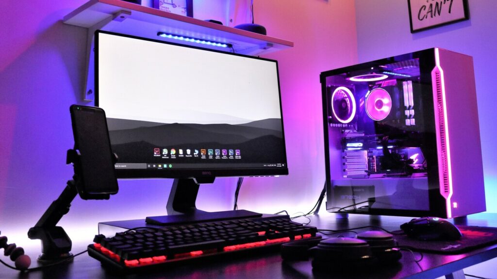
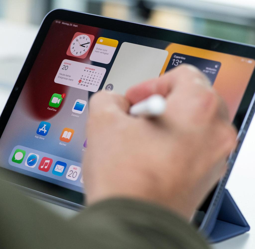
But in our little interactive technology world we learned new micro-gestures, that are now common for younger generations, but an error factor for the elder. We see them putting on glasses and holding the phone closer to their eyes instead of zooming, while children swipe on analog photos because they only know the new gestures.
When you tell your grandparents how to turn off your pc, they unplug it from the wall-outlet. (Which, repeated, breaks the computer).
Their common sense of “turning on and off” is not a button, but the electricity from the socket. And kids talk in commands to grandma’s radio as if its Alexa.
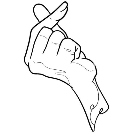
The old telephone gestures were circling for dial and thumb + pinky for calling. Ask your kids how to sign a call, they will now put their palm to cheek, which for elderly means “sleep”. Try giving a phone to an older person and watch how they won’t move away because they are used to cable and staying by the wall while on the phone. They memorized every number back then while we learned how to google and help ourselves.

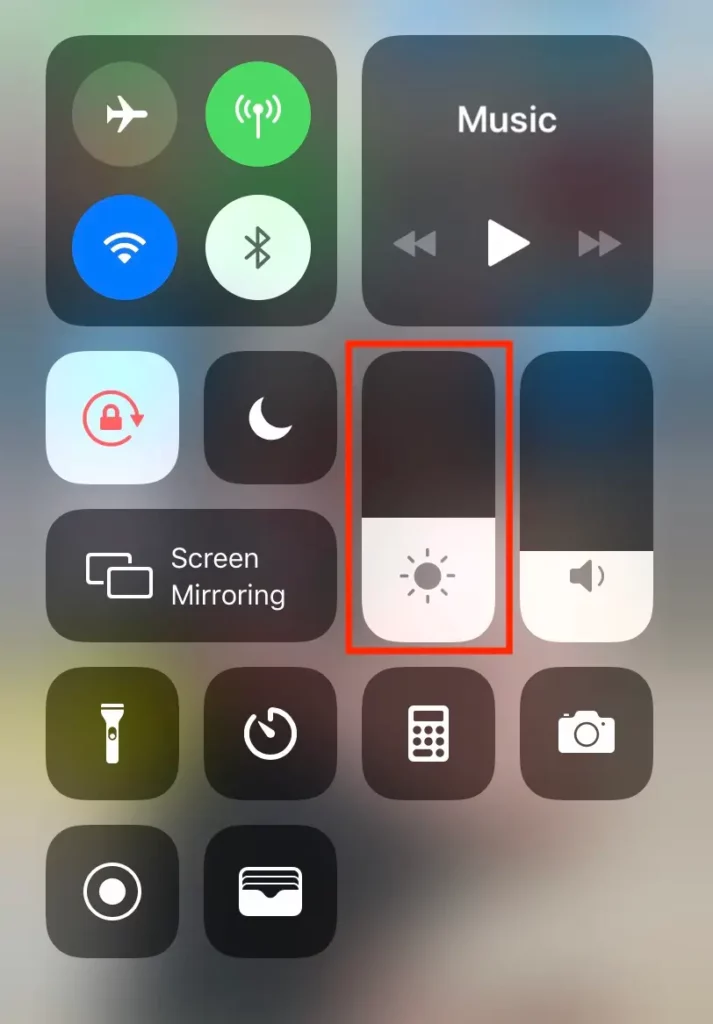
Older generations go to the service-centers to help them “repair” their phone, even if it was only the brightness turned down. While holding their phone, they mute it or turn the volume down because back then, volume and frequency were knobs to turn, not little inconvenient buttons on the sides where you hold your phone.
There are too many micro-obstacles in modern technology without giving elderly the chance to learn it in their learning speed and memory capacity.
I am wondering what will be the new sign for money, when we only use cards or our NFC Watches, Smartphones etc… Usually it was rubbing thumb, index finger and middle finger together to tell someone to pay, or that something is expensive.

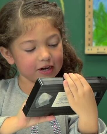
Remember the playback gesture? It was rolling or turning to the left with your hand, like rolling back tape. I remember doing that with a pencil with my old music cassettes. Now kids pin twice to the left because it’s the left double tap on the screen.

Unlearning Gestures

Throughout the years we have learned new movements and gestures with modern devices. Knowing them, and certainly using them, makes it easier and faster, but we all know the moment when things bug or freeze in a half rotation or else.
Some gestures differ from brand to brand or device model and size, but some gestures have manifested. We can see it in younger generations, who do not even know the old “call me later” sight, because phones do not look like that anymore.

But older generations, who’s brain and learning capacities are limited and their memory is restricted, have difficulties understanding those gestures. They even get in their way somehow.
“Why keeps my screen turning when I video-call you” – Device rotation
“Why is the picture so small” – Doesn’t know the zoom gesture
“How can see the other picture now” – flick the screen

Whilst knowing very little gestures, the overall screen-rotation and device-orientation is too big of a bite for their understanding point of view.

I noticed that while I was reading a Thesis in the library about Device Orientation from Stefan Kaltenegger CMS16. I was thinking that this could be another topic in my thesis, but the other way around. It would be limited or blocked by the app, because mobile-orientation and complex gestures are in fact a source of error for seniors.

Potential Changes to the Phone (iOS)

Possible Changes will be recorded in this Blogpost:

Several Settings aren’t shown and Screen-Brightness and Volume are on maximum Blocked (fixed). This can be changed in Settings, to how much to block the brightness and sound.

Disabled Apps are Grey and blocked, and can be removed in total from the Home screen. Special contacts (Family) can be added for an immediate call.

All Settings are blocked and can only be unblocked by the Senior Block – App (Name is not fixed yet)

Even here all App-Settings are blocked and can only be unlocked by the Senior-Block app, which is not grey. The only problem here is, in-App alerts such as location, etc. have to be unlocked before. Here is some problem solving required.

How does the App-Development Process look like?

It is far easier to develop for Android because Apple is way more strict! It is hard to pass the Apple-Store test. Here it is even more difficult as the app has to have access to the software to freeze and block features, which is a big “No way” at first for Apple and also Android. However-easier with Android.

Let’s say we start with Android. How do we develop an app?

As we start with Android, we would define the general features first and then build 2 prototypes. One For the app itself and one for a faked end result on the frozen smartphone, to see how seniors will cope with that and look for other suggestions, problems and so on. When finished with changes with both prototypes, eye tracking tests on the second prototype with seniors will be necessary. When every problem (at least in the beginning) is eliminated, we can proceed to find developers.

The question is, will there be ads in the free app, or will it be an 1,99€ app. The second choice will be better probably because this is usually an app that you open once and never again as it works in the background. It even has to work through turning on and off your mobile device.

How to make an intuitive App for Android

There are Android app-design guidelines: https: //guides.codepath.com/android/Android-Design-Guidelines.

They also keep you updated on new changes: https://material.io/develop/android/components

Same as iOS, Android always works with a dark and bright theme. Design can change over the years and updates and trends and currently its the “Material Style”. No opacity, but layers, structure and strong colors with dropdown-shadows to make it look like paper. The Shadow helps to show that layer, like an elevated look. (Transparency with iOS).

Animations in apps are handled with curved motion that pushes other content away or to the side.
The current android color palette also doesn’t have to be followed in apps, but if you want to, here is there color theme: https://materialui.co/colors/

Android even offers their guideline navigation code: https://developer.android.com/guide/topics/ui/look-and-feel

They use the App bar above, a tab bar, navigation on the left side and floating action buttons. Every single feature is offered in code form for easy access for developers!

They also offer their guidlined icons: https://fonts.google.com/icons?selected=Material+Icons

As Android has developed foldable smartphones, it is necessary to think responsive and work with cubic grids.

Android uses way more gestures (too many if you ask me). Include them in your app if you want: https://support.google.com/android/answer/9079644?hl=en#zippy=
Difference between iOS & Android:

What could be LESS for senior-Smartphones to make them MORE efficient.

There could be a differentiation between following features to the App:

  • Can be removed/darkened in grey
  • Can be adjusted to than be fixed

Adjustable to than be fixed:

  • Brightness and the volume can be adjusted to then not be editable outside the App-Konfiguration-Mode.
  • Apps and their location
  • Code and Password and FaceID
  • Wifi and Bluetooth Connections
  • “Do not Disturb”
  • Sounds and Ringtones
  • SOS Call
  • Home Screen Background and Watch Face
  • Font size and Language
  • Internet pages

Removed, darkened or frozen:

  • Apps
  • Dark mode
  • Flashlight
  • Wallet
  • Screenlock
  • App Library

How to make an intuitive but minimal App for iOS

People learned to use their phone and learned specific movements, directions and typical orientations. To not interrupt the learning, Designers adapt on those learned behaviors that showed to work and here are a few rules for iOS.

  • The importance is located always in the left upper corner to the right lower corner. Apps in the upper left Corner are important then Apps in the lower right corner. The same goes for features. Logos, Home buttons, back buttons, Main features are usually located on the left upper corner.
  • Alerts and other functions are layers not windows
  • In general work in layers, use transparency
  • An App can have both, a navigation bar and a tab bar, on the contrary, there is Android that uses Tab bars and side navigation that is either a layer or a block that moves the content to the side.
  • The user always needs feedback: Is the app loading, is there something wrong, did it send the information, etc. By using highlights/effects the user will know, that there is a reaction to his action. By using loading bars or percentages, the user won’t get unsure, but will wait until the end as he sees the progress.

Here is a link to Guidlines for iOS:

https://developer.apple.com/design/human-interface-guidelines/ios/overview/themes/

And an iOS Design Handbook:

https://designcode.io/ios-design-handbook

iOS has defined system colors which don’t have to be followed in the app!

Differences between iOS & Android:

How to make phones usefull for older people?

Seniors are easily overwhelmed with too much fast information. They are from another time and brains don’t learn faster with age, it is the opposite. In order to help with too much to learn, limiting functions, reactions and options to the most comfortable and useful once is key here.

Seniors are not interested in memes, podcasts, online shopping, digital files or navigation. They learned the minimal old way to find their way, but with the globalization they still wan’t to keep contact with their family and be able to see them in Video-calls and more. A phone is a smart device to do so, but it comes with too many features for seniors.

A block-app that allows to freeze features and put the important abilities on the main Home screen could be the solution.

If a Senior is better with more features or maybe is interested in, let’s say, sports, streaming or E-Mails, than this can just be added to the Home-Screen and not frozen. Also interest helps the brain to learn better, so grandparents that are interested in a specific more advanced feature are capable of learning it because passion drives them.

That means the app target group is actually the younger relatives and not the grandparents, but the outcome is indirectly targeted to seniors. The app is customizable by relatives or phone-services at shops.

Why do complicated digital devices work for us?

Cropped shot of a group of colleagues using their smart phones in synchronicity

Phones and other devices are packed with functions and options, so many, we do not even use. Why are we not overwhelmed with it and why do we keep using and learning more and more functions?
Well, I have no clear answer to it, but observing this topic and my main topic together, I see a difference.
A difference in why older people need less functions, or options taken from them to be able to use the devices, and why the new generations implement their devices so well.

First, it’s the aspect “growing up”. Growing up with implemented systems and habits is easy and builds a general understanding of the system and new changes in the system. This is missing for the older generation as the invention of phones and computers was targeted to a younger audience making the gap even larger. So many years passed thinking older people won’t need it, no one teaching them, no one inventing a version for seniors…. Many years fell into this ignoring gap.


The second aspect is “the circle around”. If you have work, friends, entertainment and school around you, that basically forces you to use multiple functions of your devices, you learn to implement it into your life and work even faster with it. It really does make your life easier with more functions.

The third aspect that I see is “reachability”. A phone is small, thin and always in your pocket, making it very accessible. So much even that we unconsciously learned a habit-movement like reaching always for our phone, checking if it is still there, or any notifications or even the time without really reading the time. We even forgot the “Watch” movement, although it is coming back with the Smart-watches.
The fourth aspect is “repetition, memory and signals”. Having many sources of notifications that use the same device like friends, family, work or school makes us always ready for signals like ringtones, vibrations and so one. So we are aware of them and react to them so we constantly reach to our phone which gets us to “repetition”. As we learn all the smart touches and movements, those implement into our memory. We swipe, we zoom, we learn all those commands.

Older people are not in those circles, do not react or hear those signals and so they do not learn those smart touches and movements, therefore it never implements into their life as the “automaticality” or “automotoricality” never reaches a point where it is not hard to work with anymore.
So it is very important to work on their needs to make devices simpler for them without cutting them from families that are in those smart-device-circles. This will be in the next post.

Why did primitive Things stay that way?

Some things were invented as a tool, very simple, but never got updated. Why? Because the simplicity and the habit of using it worked and got implemented well into a daily life.
For example Keyboards, Instruments or glasses. Some things stay the same to honor a tradition or a culture, like said before, instruments. But others worked in their simple usability.

The first Keyboard had the same Look and arrangement of letters like nowadays. Of course the technique behind it updated to electronic devices.

It is not like no one tried to change them in their functionality and usability with hopes to make them even better or easier, but these inventions did not implement because first of all, it was an intervention in the learned usability of the products before and second of all, they tried to put more functions on it. People didn´t like that. Simplicity is key.

Do you know those “Call now” commercials, where they try to sell you a kitchen product that can do all the things? How many people who fell for it actually use it? At the end they think it is easier to just use a knife and cut vegetables before trying to unpack the gadget and clean every unreachable blade or whole afterwards. Putting too much into something makes it too complicated, especially when it is unpractical in size, storage or rechability.
Other inventions that always stayed the same for it’s simplicity:
Glasses, books, cutlery, pencils, money, etc.

This post opens up a question:
“But why are Computers and mobile devices working for us even though they are packed with functions, even more than we ever use?” – I will try to find the answer to that in my next post.