People learned to use their phone and learned specific movements, directions and typical orientations. To not interrupt the learning, Designers adapt on those learned behaviors that showed to work and here are a few rules for iOS.
- The importance is located always in the left upper corner to the right lower corner. Apps in the upper left Corner are important then Apps in the lower right corner. The same goes for features. Logos, Home buttons, back buttons, Main features are usually located on the left upper corner.
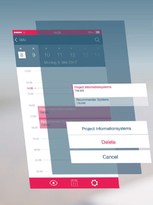
- Alerts and other functions are layers not windows
- In general work in layers, use transparency
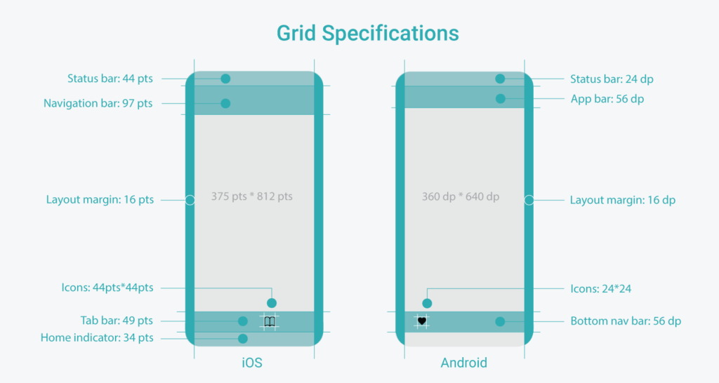
- An App can have both, a navigation bar and a tab bar, on the contrary, there is Android that uses Tab bars and side navigation that is either a layer or a block that moves the content to the side.
- The user always needs feedback: Is the app loading, is there something wrong, did it send the information, etc. By using highlights/effects the user will know, that there is a reaction to his action. By using loading bars or percentages, the user won’t get unsure, but will wait until the end as he sees the progress.
Here is a link to Guidlines for iOS:
https://developer.apple.com/design/human-interface-guidelines/ios/overview/themes/
And an iOS Design Handbook:
https://designcode.io/ios-design-handbook

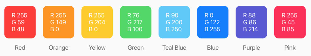
iOS has defined system colors which don’t have to be followed in the app!
Differences between iOS & Android: