In this short blogpost I want to analyze one examples of a deceptive design pattern* that I stumbled across during my research in detail.
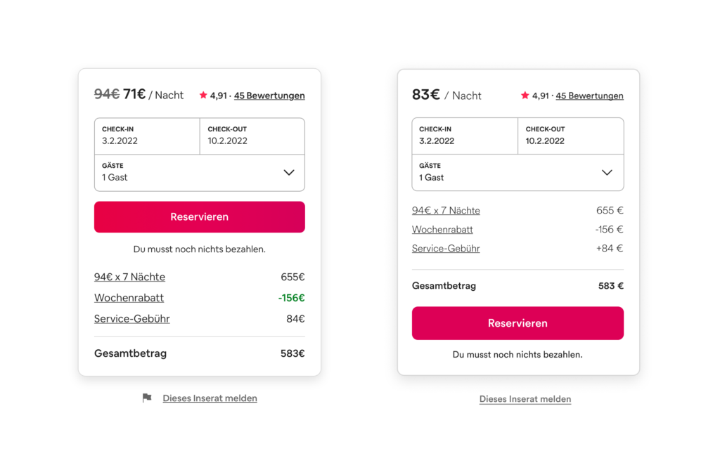
On every detail page of an apartment on airbnb there is a small overview on booking dates and prices (left image). The whole container is basically divided in two parts: a summary with a CTA and the calculation underneath. The hierarchy within this module is clear as the price per night is highlighted with big, bold font style. They use this number as the most representative value even if there are some additional fees added later on and it is not possible to book the apartment at that price. So to get the „real“ price per night the user has to manually divide the overall price for the stay including the service fee by the nights. The CTA is placed above the calculation, therefore some users might click on the pink button before they read about additional fees. Furthermore the weekly discount is displayed twice and highlighted whereas the fee is just in default text style. My suggestion to correct this deceptive design pattern* is to use the correct price per night including all fees, add a plus to the service fee amount and move the CTA to the bottom (right image).
* formerly called “dark pattern”