Good afternoon! I guess it was time for this series of two posts in which I finally show examples of what a good design and a bad design of the cookie window is. In this first post I have tried to select some cases that seem to me evidently malpractice, since they guide the user towards a specific option, biasing their choice when selecting their privacy policy.
These types of design are known as Dark Patterns, I will not go into further detail with them because my classmate Ana Mitterhauser is doing her research specifically about them. So, we go directly to show some of these applied to our specific topic:
Misdirection/Aesthetic Manipulation
This is the most common, it is a type of manipulation in which the design put the visual focus in the button “Accept all”, forgetting the rest of the options given. This can be done either by the use of color, size, font…
Examples:
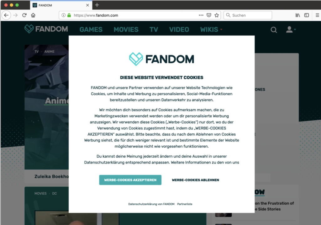
- Fandom: In this case the “OK” option is more prominent and guides the user’s eyes. In addition, shading the rest of the page inclines the user to that option since they believe that if they do not accept they will not be able to access the content.
- The guardian: As in the previous case, the background darkens and blurs slanting the user. In this case the option of not accepting cookies differs more clearly with a different font (in lower case), without color highlight and placed in a corner of the page while the other option is in the center.

Privacy Zuckering
Perhaps the best known, it is directly the design that takes care of deceiving users to share all their personal data. Despite being regulated by law in this type of patterns there is no clear output for the user to not accept or modify the data policy.
Example:
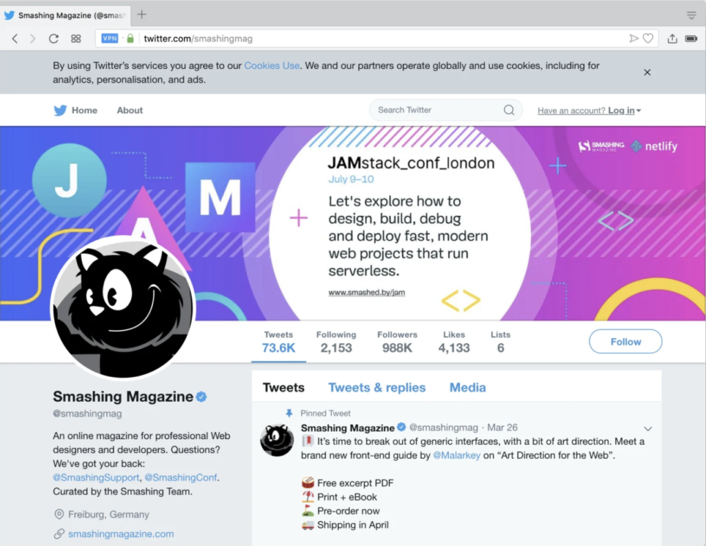
- Twitter: Informs you that cookies are used, but there is no option to adjust preferences, nor to give your explicit consent. Closing the cookie window on the top right button will be interpreted by the website as having accepted your policy.
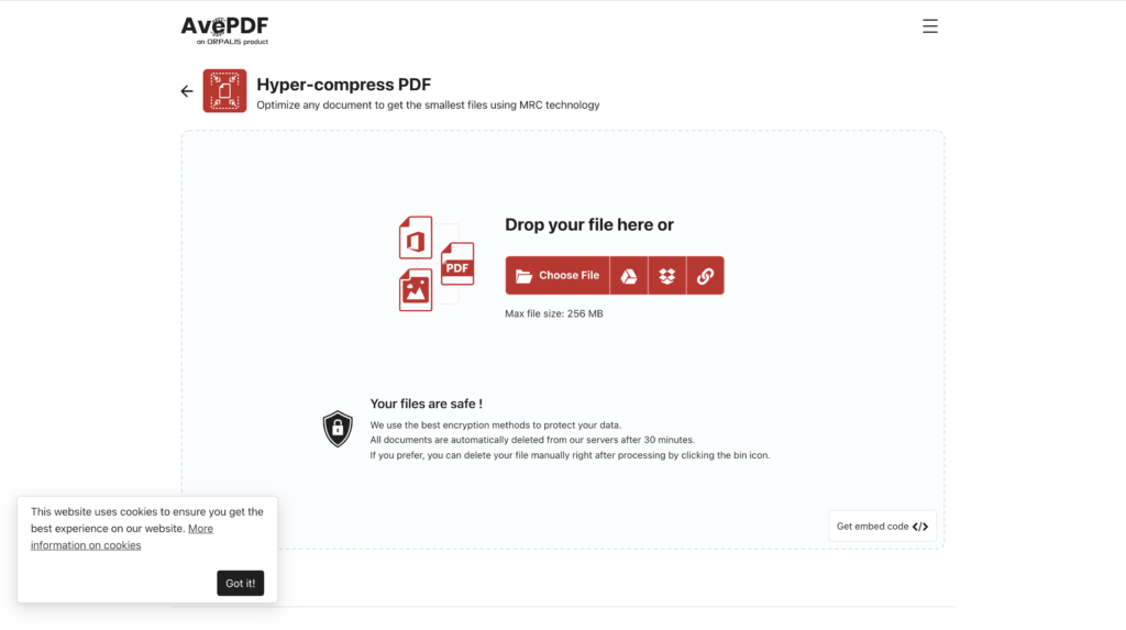
- AvePDF: informs you that the website uses cookies, however, does not give the option to accept or reject but directly from “okey”. The user is not informed that there is another alternative, believes that the only way to avoid giving their data is not to use the web.
Laberynth
Even in spite of all the examples above, once you pass the “first phase” in case you have chosen the options relating to setting cookies or reviewing the privacy policy another page will open in which you will be shown your options. Sometimes they have a more intuitive design and other times it’s a complete maze from which you don’t know how to get out or what you’re doing.
Example:
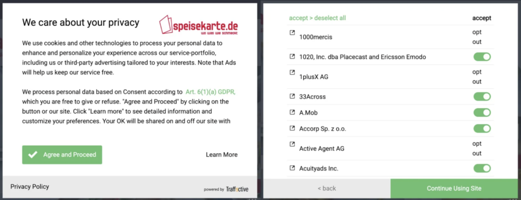
- Speisekarte: In this case it is not only an initial aesthetic manipulation, but if the user clicks “Learn more” hundreds of different selection options appear in which he has to cycle one by one. It doesn’t sound a very interesting plan. Furthermore, the “reject all” button is virtually invisible for the user to continue with their initial decision.
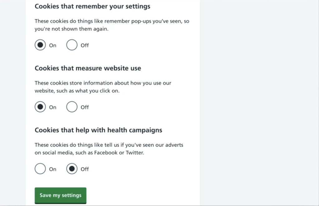
- NHS: In this other example, in case the user wants to customize their privacy policy, they are presented with a list of options that are already selected as “on”, in addition to not presenting a “reject all” button to make the implementation of the user’s decision more efficient.
Conclusions:
Once you have the habit of rejecting cookies by default, you are more receptive to finding many cases of questionable practices on the internet that do not seem to make life easier for the user but for the business behind the page. In fact, they succeed, and for many users, trading privacy is an acceptable cost for all the wonderful benefits that all those giants provide for nothing. However, not everything is negative, we can do something to change it and improve people’s lives, not only with regulations that protect the user but with UX/UI designers who design with the user in mind and create a relationship of security and trust between the brand and the user. We have in our hand the possibility of generating a more ethical and transparent design. In the next post I will give you examples and tips of how to do it.
That’s all for today, have you found any of these examples in your day to day? I’m sure now that you know you won’t be able to stop seeing them!
See you!
References and literature: