This week I found another „good“ example for a deceptive design pattern* to analyze.
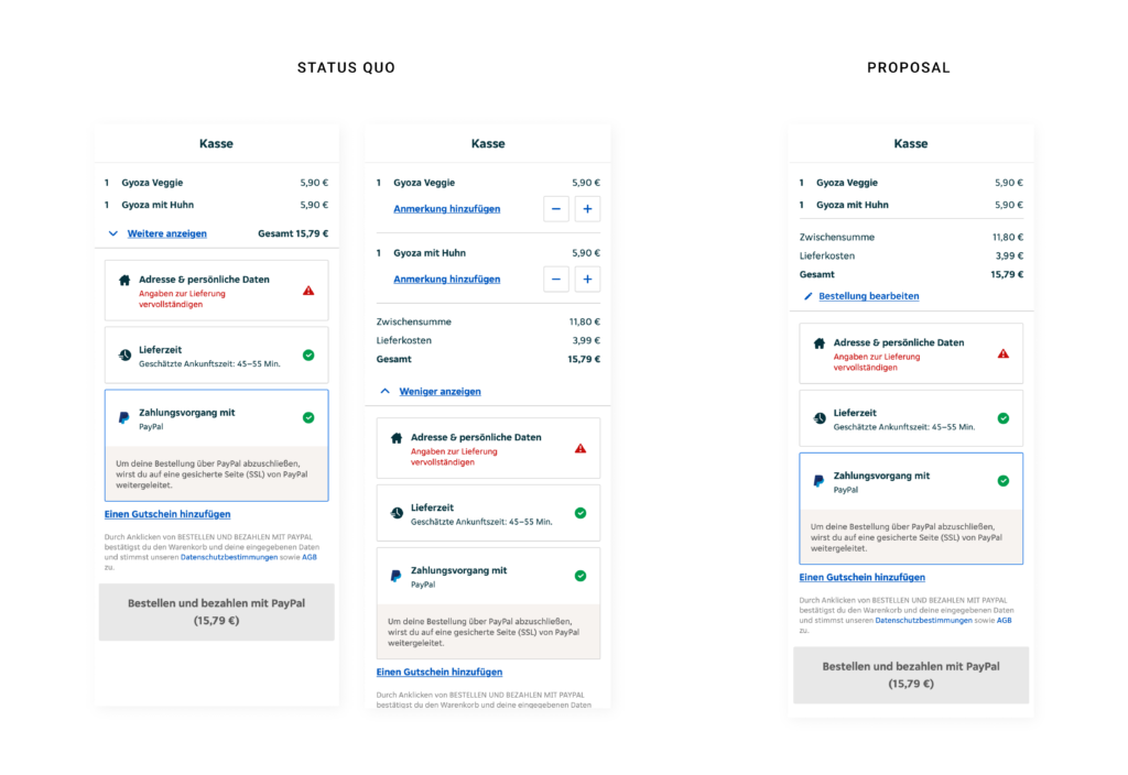
Within the checkout process on Lieferando.at they provide a short summary about the order and give feedback on filling out all relevant data to place an order. It seems like they list ALL cost and sum them up, but if you have a closer look the amount is bigger than the summary of the listed products. So the user has to click the button „Weitere anzeigen“ to see, that they add additional cost for delivery. As there would be enough space within viewport height to make the delivery fee visible from the start, it is clear that they want to hide it on purpose. Apart from additional cost they also give the options to edit the order or add notes for specific dishes in the extended version. Consequently it would increase the usability of the site to also change the wording from „Weiter anzeigen“ to „Bestellung bearbeiten“ („Edit order“). On the right hand side I added a quick-fix-design-proposal to cancel this deceptive design pattern* and enhance usability.
In this short blogpost I want to analyze one examples of a deceptive design pattern* that I stumbled across during my research in detail.
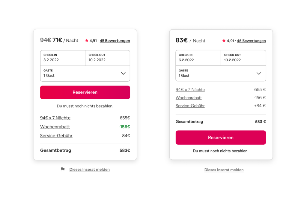
On every detail page of an apartment on airbnb there is a small overview on booking dates and prices (left image). The whole container is basically divided in two parts: a summary with a CTA and the calculation underneath. The hierarchy within this module is clear as the price per night is highlighted with big, bold font style. They use this number as the most representative value even if there are some additional fees added later on and it is not possible to book the apartment at that price. So to get the „real“ price per night the user has to manually divide the overall price for the stay including the service fee by the nights. The CTA is placed above the calculation, therefore some users might click on the pink button before they read about additional fees. Furthermore the weekly discount is displayed twice and highlighted whereas the fee is just in default text style. My suggestion to correct this deceptive design pattern* is to use the correct price per night including all fees, add a plus to the service fee amount and move the CTA to the bottom (right image).
In todays blogpost I want to get a bit more specific and list types of deceptive design patterns* with some extraordinary bad examples for those technique. I am going to use the 12 defined types of deceptive design patterns* from Harry Brignull.
Bait and Switch
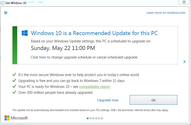
This pattern works with previous experience and common user interactions. The user wants to complete an action, but something different, undesired or even the exact opposite thing happens. The most famous example for bait and switch is the Microsoft update pop-up to Windows 10. Normally clicking the „x“-button in the upper right corner means closing the window without completing any action. In this case they switched the meaning to „Yes, let’s do this update“. Another common strategy is to simply switch „Yes“ and „No“ Buttons for additional add-ons in an e-commerce process.
In this case ads are hidden and they seem like they are actually part of the interface. Since they look like content or any kind of navigation, users are clicking them assuming it is a genuine interaction of the website. Prime example here are download buttons linking to different websites.
Forced Continuity
This pattern tricks users into continuing any kind of paid membership by charging them after a free trial without a warning or making it really hard to cancel on automatic renewed subscriptions.
Friend Spam
Users grant access to numbers or emails in their phone or connect their social media accounts in order to „find friends“ within this environment, but the product actually spams all contacts pretending to be the user himself.
Hidden Costs
A design that intentionally hides costs and makes product or service seem cheaper by adding additional costs or fees later on. As the user is already in the checkout process, it is more likely that he continues anyway even after realizing the price change. Usually those hidden fees are delivery costs or service fees.
Misdirection
This pattern is also known as aesthetic manipulation. Focusing the user’s attention on an interaction to distract them from something else. There are many different approaches on how to use this dark patterns as it does not have a simple context like many other types.
Price Comparison Prevention
Showing the price of products or service in a way that makes it difficult for the user to compare two items. One way of achieving this is work with different units and not showing price per weight. Another one is to show prices of products only on each subpage and never next to each other so the user has to remember the price and go back and forth to actually compare them.
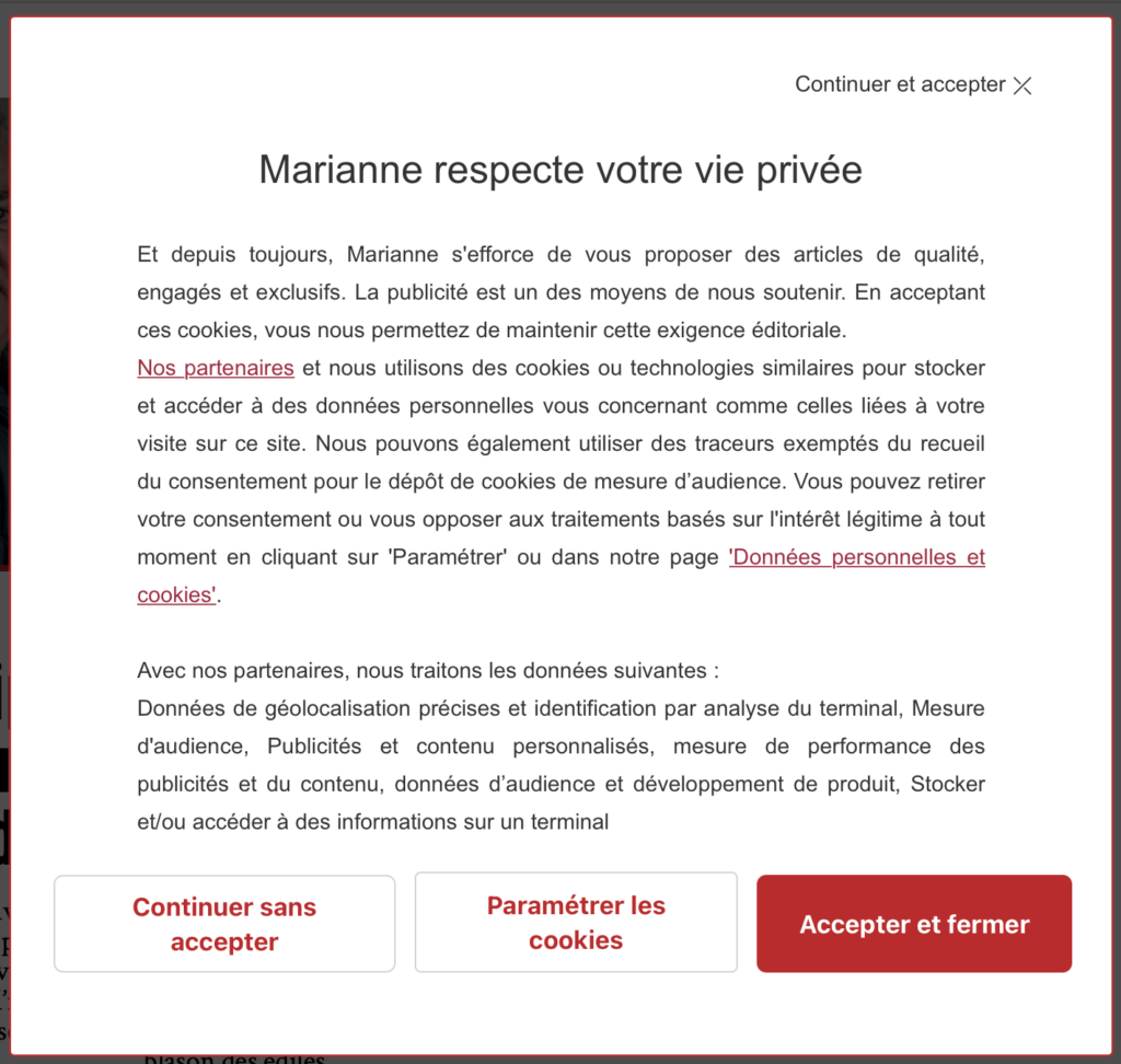
Privacy Zuckering
Maybe the most famous of all deceptive design patterns*: tricking users into agreeing to share all their personal information. Most users are aware that cookie-concent-managers make it difficult to opt out on purpose. Additionally this one is regulated by law.
“X”-Button is not simply closing the pop-up, but accepting all cookies. Screenshot: https://www.darkpatterns.org/types-of-dark-pattern/bait-and-switch
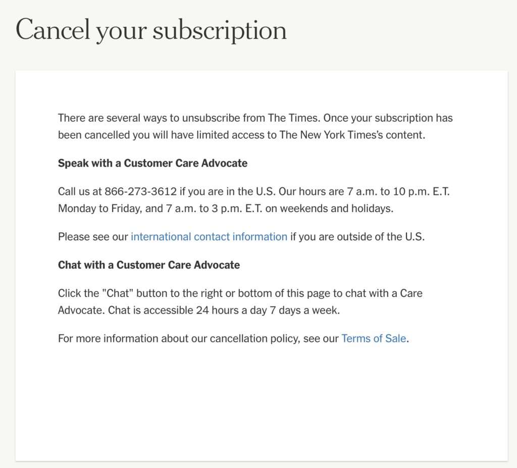
Roach Motel
The model describes that users easily get into a situation, but find it difficult to get out of it. This mostly happens when a user signs up for something quickly, but then is having a hard time to cancel the membership (e.g. with a phone call during business hours).
Users can not cancel by filling out a form, but have to interact with an employee. Screenshot: https://help.nytimes.com/hc/en-us/articles/360003499613-Cancel-your-subscription
Sneak into basket
Sneaking products into the users basket, that they did not add themselves. Sometimes this pattern is justified with making suggestions to enhance the user experience, but actually it is just tricking them into buying something by mistake.
Trick Questions
Using unnatural language, like double negatives, to confuse the user and manipulate their actions. Especially often this pattern is used in forms to get users to subscribe to the newsletter.
That’s it for today 🙂
Source: Harry Brignull: Types of Dark Patterns. In: https://www.darkpatterns.org/types-of-dark-pattern