Nerve Sensors in Inclusive Musical Performance

Methods and findings of a multi-day performance research lab that evaluated the efficacy of a novel nerve sensor in the context of a physically inclusive performance practice.

by Lloyd May and Peter Larsson

Making the musical performance more accessible is something that many artists, such as Atau Tanaka and Laetitia Sonami, as well as scientists, have been aiming for a while. Therefore many efforts go toward the “nerve-sensor” direction. With this kind of approach, the detection of signals from nerve fring is more likely to happen rather than the skeletal muscle movement, so performers with physical conditions have more control over the sensors.

Even though the variety of gestures wasn’t as broad as other gestural instruments offer, the affordance of communication of gestural effort was better as proved in the explorations made on different sound-practices like free improvisation and the development of a piece called Frustentions.

Thanks to the Electromyography, a technique used to measure the electrical activity of skeletal muscles and nerves through the use of non-invasive sensors placed directly on the skin, we have seen more and more people with muscle atrophy or compromised volitional control of skeletal muscles, having access to technologies, for example when it comes to gaming. But, as it usually happens, the broader the accessibility is the more potentially harmful lens can come with it. Therefore it is important to keep in mind that every individual is unique and be aware of the invisible boundaries that the technology can set around the people it’s supposed to serve.

The more people with different physical and mental abilities get involved in these sound-making explorations, the better and opener accessible the design of the interfaces will be.

For this specific exploration, there were 4 investigated parameters: sensor position, gesture types, minimal-movement gestures, as well as various sound-mapping parameters. The lab was structured into several sessions, each concluding with a performative exploration, as well as a structured public showcase and discussion at the end of the lab. Other research lines like minimal-movement “neural” gestures were also investigated but not much data could be gathered. The outcome of the session was the previous said composed piece: Frustentions. A fixed media composition developed during the workshop.

Three groups of gestures were determined during the sessions in order to record the needed data: Effort gestures, which were particularly suited to audio effects that are well-aligned to swelling such as distortion, delay, or reverb, and adjustment gestures, which often required full focus and were not necessarily accessible at all times during a performance; and trigger gestures.

The nerve sensor was compared with other interfaces like the MiMu glove, the Gestrument, and Soundbeam. Even though these other instruments allowed wider recognition of the number of gestures with better accuracy, it was more challenging to use with limited fine-motor capabilities. In addition, the wearable sensor afforded the performer greater opportunities to connect visually with ensemble members or the audience as there was no immediate requirement to view or interact directly with a screen.

Conclusions

Research aimed at making musical performance accessible to everyone is something that has multiple benefits, clearly on a physical level, but above all on a neural and psychological level. It is surprising how many things associated with leisure are out of reach for many people, simply because their physical condition does not meet the standards for which they are designed. The possibility that all these people can access activities of enjoyment represents a clear increase in the quality of life for them and for the people around them.

Nerve sensors are just one example, and thanks to this exploratory initiative we can get to know them and compare data with other instruments on the market. In more advanced stages of research, I would like to imagine that these interfaces are also used medically, to alleviate the effects of some diseases, improve physical conditions, and even reduce motor damage that originates in the brain by promoting nerve and muscle movement. Music is obviously a means of enjoyment, but together with science, it can be a means of healing.
Improving medical interfaces for patients

#The Topic

The Holter Monitor Interface is quite dated, bulky, and unintelligible. Patients do not feel involved in the process and do not understand what parameters are being measured.

In a world where technology users are more educated and informed than ever before, leaving patients out of the loop feels paternalizing. Making users feel disconnected from their own condition poses risk to their own health.

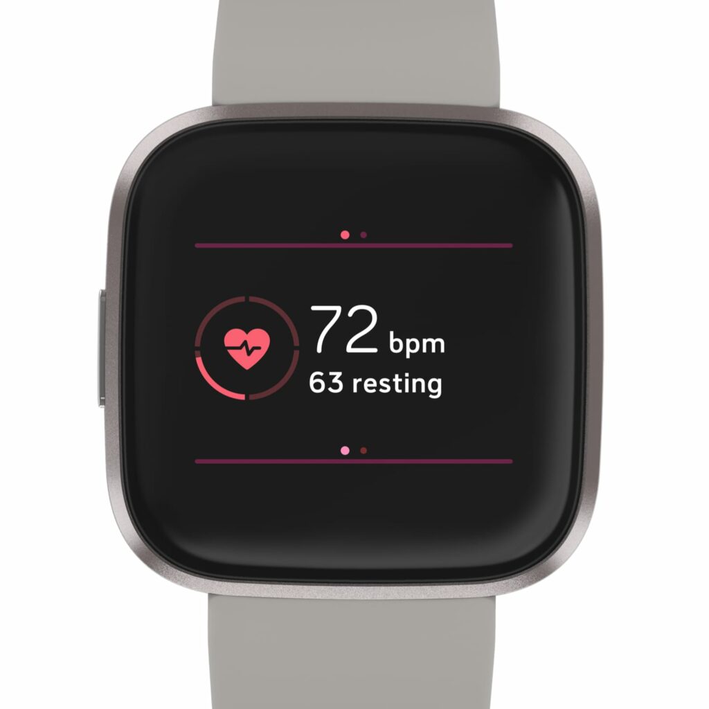
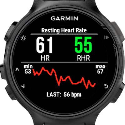
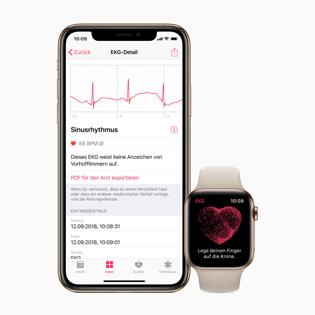
In the case of the Holter Heart Monitor, it is a much more advanced and capable device than the health wearables available in the market for consumers (e.g. Apple Watch, Miliband, Fitbit). But the interface in these wearables is more user-friendly and clear to inexperienced eyes.

Marrying the accuracy and depth of the data from the Medical Grade device with a tad of UX from the consumerready devices can help the patient understand what is going on in their body and be proactive towards a solution.

A better interface is the start of a change: From “patient”, by definition, waiting and passive, to an active player in their health status.

Garmin/Apple Watch/Fitbit

UI principles of in-car infotainment

| design challenges and principles from the car navigation system developer company TomTom

As it was stated in my earlier blog entry, one of the current cockpit design trends is the multiplicity of screens in cars. This increasing display real-estate is creating challenges for automotive UX designers in creating an effective driver experience instead of displaying as much beautiful information as possible and as a result distracting the driver.

The navigation system and mapmaker company TomTom is also discussing this topic with their principal UX interation Designer Drew Meehan in a blog post, with insightful content about the design principles to be considered.

Finding balance in information overload

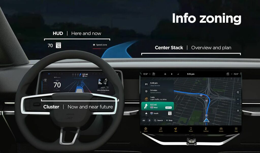
The keyword of building an interface with informational balance is: “action plus overview”. When looking at several screens, the shown information should be clustered to provide hints for next actions, and further give an overview of the car’s journey. This should be achieved by sorting the information shown on separate screens to compensate each other.

An example would be a car equipped with head-up display (HUD), a cluster behind the steering wheel and a central display. On the HUD only the current status information would be shown, about the “here and now”. The cluster would show information about oncoming actions in the near future. The central stack would have the job to give the complete overview about the journey, arrival time and complementary info such as refueling/recharging possibilities.

This structure creates a flow of eye movement, which helps the driver will understand the information placing easily and know where to look for specific interests.

Information structure by TomTom for in-car interfaces (source: see below)

Challenges in automotive interface design

There are some aspects and strategies that need to be considered when designing in-car interfaces:

  • Responsive and scalable content according to screen size: complying with different screen sizes in different vehicle models of a brand
  • Adaptive content: displaying only the needed information for the current driving situation. This requires prioritization of the information according to drivers’ needs. —> if the fuel/battery charging is critical, the next stations should be displayed. If the tank/battery is full, the screens can focus on less data. —> if there is no immediate route change action necessary, e.g. straight highway for 50 km, other data from other driver assistance systems could be shown (e.g. line keeping). —> in the city with intense navigation needs, the best could be to show prompt actions on the HUD, closest to the drivers’ eyeline for easy help.
  • Creating one interface ecosystem: all screens should be connected and not segregated. The screens and the shown information should create continuity and complement each other.
  • Customization options: despite good information balance, some people could be overloaded and stressed by multiple screens. They should be allowed to change screen views and positions of content.

TomTom’s UX department has done user research with varied screen info content. They found that “users want easy, glanceable and actionable information”, which reduces cognitive load and stress.

In summary, the UI design has to support the drivers’ actions by showing essential, easily digestable information. It should be placed where the driver mostly expects the content to be and have just the right amount of detail, according to the current driving situation.

Source

Online article by Beedham, M.: Informing without overwhelming, the secret to designing great in-car user experiences, 13.10.2021.
Retrieved on 09.01.2022.
https://www.tomtom.com/blog/navigation/designing-effective-in-car-user-interfaces/