Last semester, I was able to research into many aspects of unisex and gender-neutral design within different design sectors while specifically focussing on the fashion industry and branding. I gained a lot of insight on significant factors to consider before developing a corporate identity and what external obstacles as well as internal strategic decisions need to be considered to fully enable a successful execution. After this very theoretical period of research, this semester the task was given to use an experimental approach within our fields of gained expertise and use our creativity and curiousness to discover different aspects in a more hands on methodology.
My struggle of finding the right topic
I have to admit, at first I was very unsure as to how I could apply an experimental perspective on a quite strategic and intentional practice which comes with developing a brand identity. With every establishment of a corporate identity incl. imagery, logo, colours, graphics and typography, comes very thought-out, well considered research and then ultimately the design. With only little room for experimentation in the trial and design phase, it took some restructuring of my thoughts till I ended up with an experiment I deemed useful within my field of research.
My previous research basically resulted in what 4 years of Marketing Bachelor study taught me: it all depends on the target group. I was unsure if an experimentation could emerge from that, by looking into different target groups as well as even different cultures where unisex fashion and other products are much more present and “normal”. Not being 100% certain on the topic and wanting to be more experimental than researching for another semester, within another one of the countless brainstorming sessions, a fellow student of mine mentioned a topic that inspired me to develop the experiment I will now be focussing on the coming few weeks. She, in basic terms, asked: what makes a design female, male or gender-neutral? Even though this was the topic I researched last semester theoretically in detail, while coming up with experiments I seemed to have lost the bigger picture. With only a simple nudge into this direction, I came up with an idea.
The experiment for the upcoming weeks
My topic for this semester will be: where is the boundary between a design being stereotypically assigned female or male? If one component of a brand identity is “male” and the rest “female”, does society then deem the design male or female? Or is this maybe even the key to gender-neutral design? Mixing different societally considered male and female components together? And if yes, how should the ration be?
After finding my research topic, I am excited to see what the result of this research may be. For the next blog post I will start to plan how I can structure my experiment, and what the content for it will be.
NOTE: Before we start, in order to not confuse the terms, I’d like to clarify that the English word for “corporate design”, when referring to the 4 elements of a corporate identity, is called “corporate identity”. Therefore, the English word “corporate identity” is the German word for “Corporate Design” and will be used throughout this article. With that only one element “Design” is meant, without including the other elements “Culture”, “Behaviour” and “Communication”. Source: IONOS. 2019. Corporate Identity. July 31. Accessed December 14, 2021. https://www.ionos.at/startupguide/unternehmensfuehrung/corporate-identity/.
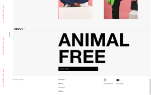
After researching into gender-neutral design in different sectors like e.g. product design of smartwatches, taking a closer look into the fashion sector and their corporate identity can show the current situation of competitors in the market. When searching for gender-neutral or unisex fashion brands, a handful of articles pop up introducing companies that offer clothing for all genders. Throughout this article I will analyse the different brands based on their corporate identity and their components of logo, colours, typefaces, images and graphical shapes.
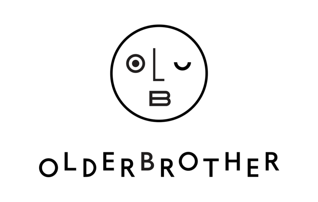
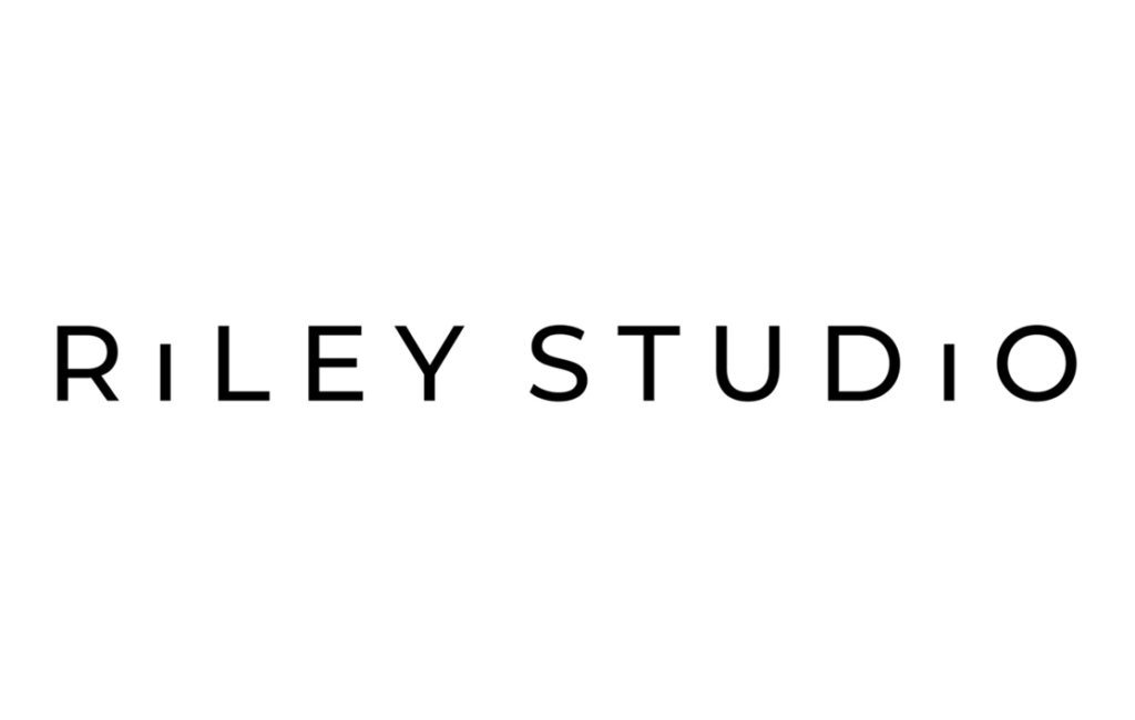
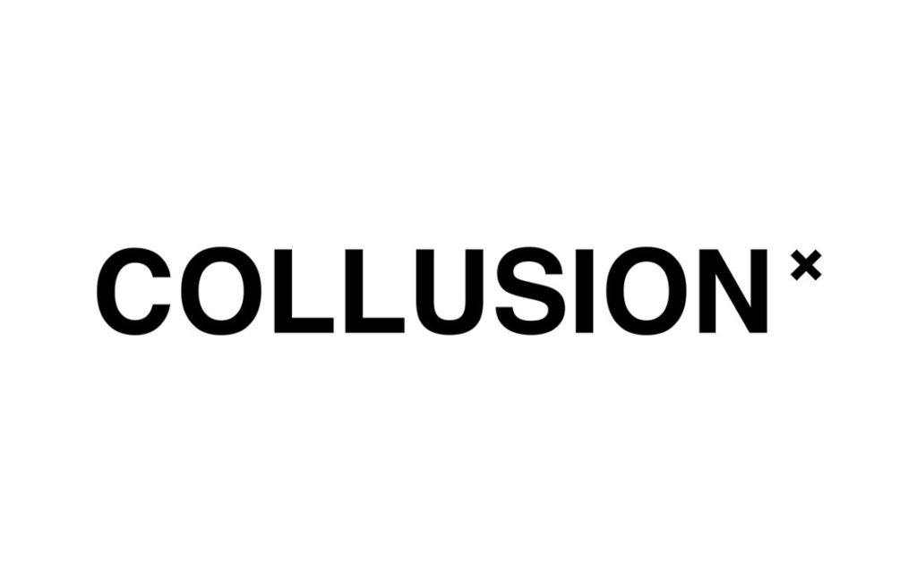
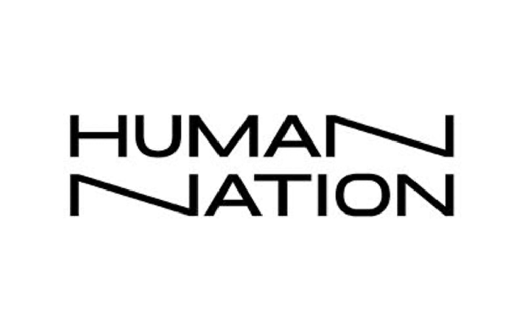
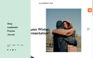
For the comparative analysis I chose four companies: Olderbrother (https://olderbrother.us , Riley Studio (https://riley.studio), Collusion (https://www.collusion.com) and Human Nation (https://thehouseoflrc.com/pages/human-nation). On first glance when choosing the websites, it is surprising to say that all use a white background with a black typography-based logo. This is somewhat foreseeable as black and white are often seen as safe gender-neutral colours, however I did expect to see more variety.
Left to right: Logos from brands Olderbrother, Riley Studio, Collusion & Human Nation
Logo comparison
Olderbrother
Riley Studio
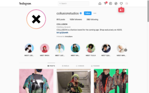
Collusion
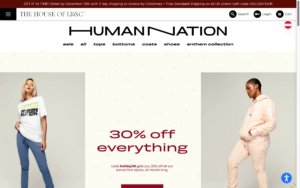
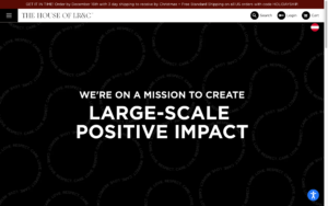
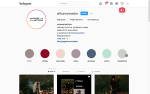
Human Nation
Combination logo (wordmark & logomark)
Wordmark logo
Wordmark logo (Potentially also combination logo with “x” as logomark)
Wordmark logo
Sans serif typeface
Alternation of characters in the wordmark
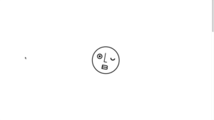
Logomark: smiley face within circle where eyes, nose and mouth consist of letters “o”, “l” and “B”
Sans serif typeface
Shorter “i” to create interest
For childrens’ sub brand: addition of “little” in front in a script typeface
Sans serif typeface
One written word incl. addition of “x” at end in smaller font size
Other styled decorative typefaces used on clothes
Sans serif typeface
incl. a play in typography with two “n” stretched out
Other styled decorative typefaces and variations used on clothes
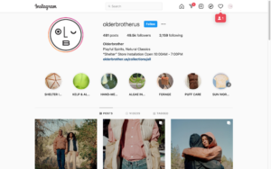
Wordmark alone used as logomark
Wordmark: top of website
Logomark: bottom of website, loading screen, social media icon, products
Both: clothing tags
Use of one logo throughout website
On clothing labels sometimes only use of “riley”
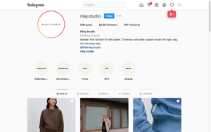
Even on social media the one variation of the wordmark is only used
“RS” monogram logo used for website icon in tabs
Use of wordmark throughout, also prominently on clothes
Use of “x” as logomark, e.g. social media or website icon
Use of logo throughout, also on clothes
Sometimes only referred to as “human”
Animated wordmark on video visuals
Colour comparison
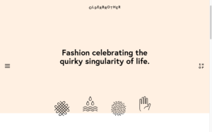
Olderbrother
Riley Studio
Collusion
Human Nation
Neutral colours with hint of two pastel accent colours
Heavy use of black and white and sometimes grey –> white background with black typography
Sporadic use of accent colours peach and mint green
White buttons with black outline, hover changes to black Mint green: menu Peach: background of header for one page
Only use of white, greys and black
Dark grey buttons with white typo Dark grey footer
Light grey banner at top
Neutral and pastel colour palette with accent colour
Logo alternates: with dark background white, with light background black
Accent colour red for announcement and sale
Purple buttons with black typo for product categories
Light yellow buttons with black typo for filter options
Salmon colour for options e.g. load more, sort button
Coloured or light grey backgrounds with black typo
Neutral colour palette
Mostly white background with black typo or black background with white typo
Sometimes words are highlighted with box surrounding the opposite colour e.g. white with black typo and highlight black square with white typo
Coloured background with either black or white typo
Examples of colour use at bottom of page.
Typography comparison
Olderbrother
Riley Studio
Collusion
Human Nation
Sans serif typeface
Sans serif typeface
Sans serif typeface
Sans serif typeface
Different weights for headings, body, footer, prices
Bold for headings, navigation bar Semibold for subheadings, buttons, product names Regular for footer, page links, body Light for prices
Play with typography like in logo –> “shop” as a square, also animated
Smaller font size in general, bigger for headings
Different weights for headings, buttons, navigation bar
Semibold for headings Bold for sub navigation categories Regular for page links, banner, prices Light for navigation headings, body
Font size according to hierarchy: body smaller, subheading bigger, headings big
Full caps only used, except long body e.g. in “about” section
Animated banner to the left in accent colour
Use of semibold, bold and heavy fonts
Semibold for body Bold for subheadings Heavy for headings
Use of big font size
ither use of two fonts or two different width typefaces
Use of caps in logo Otherwise use of all small letters, no caps (except add to cart button) other buttons small, small letters even at beginning of sentences
Use of both bold and light fonts for headings (sometimes at the same time)
Bold for parts of heading, product names, prices, navigation bar Regular for body, banner, cart & login, page links Light for parts of heading
Examples of use of typography at bottom of page.
Image comparison
Olderbrother
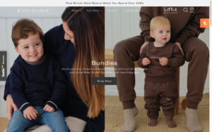
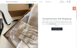
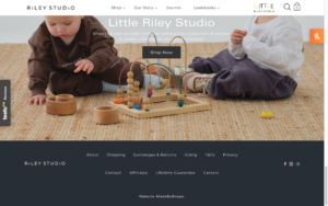
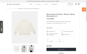
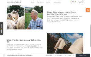
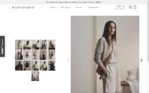
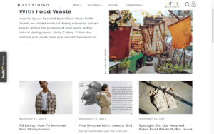
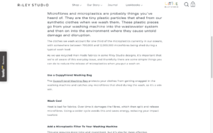
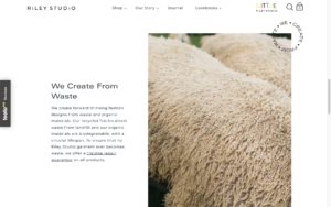
Riley Studio
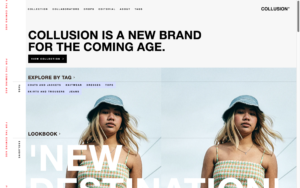
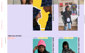
Collusion
Human Nation
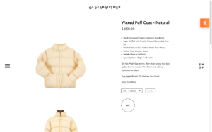
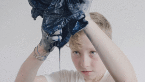
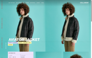
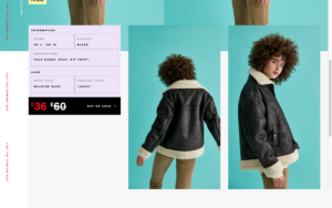
Product imagery very clean, white background, studio cropped images of products worn
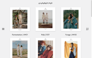
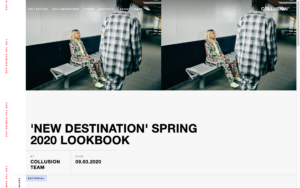
Product imagery clean, white background, also images on models with more of a clean lookbook feel
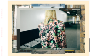
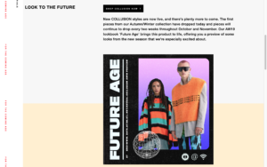
Product imagery studio images, bright colours, loud, colourful, collage style
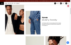
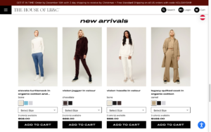
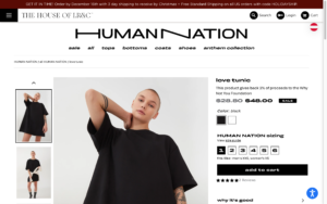
Product images model studio images, neutral backgrounds
Lookbook images neutral imagery, low contrast, clean poses of models, more artistic
Also, imagery not featuring the clothes to set the mood
Also use of still imagery with single movements
Lookbook images, “about” images, neutral images, artistic product imagery without models, neutral poses of models
Lookbook images colourful, vibrant, edited, added graphics, effects, fun backgrounds
Focus on studio images with or without props, some images outdoor, product images outdoor
Examples of image use at bottom of page.
Graphic comparison
Olderbrother
Riley Studio
Collusion
Human Nation
White space, images placed with borders, typo smaller or none –> pictures talk for themselves, minimalistic
Use of icons for explanation of process, fine line thickness, similar style as logomark
Graphic logo in middle of screen while loading –> animated (turns)
Use of white space, no large font size, use of coloured rectangular buttons, rectangular footer with infos at bottom in grey, not a lot of use of graphics
Icons (only outline) for search and shopping cart,
Banner at top in light grey
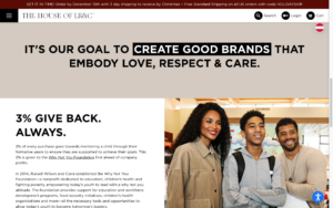
Use of typographic circle “we create from waste”
Retro, loud colourful use of graphics, Street style reflects style of clothing, colourful buttons/ rectangular shapes to highlight certain info e.g. headings, etc, asymmetric shapes, use of textures, cut-outs, outlines (around elements of images)
Use of neutral colour rectangles for signaling new section, typography highlighted with rectangular background underneath text,
Use of typography to create graphic shapes à swirly lines reading “respect, care, love”
Use of round buttons with icons for search, cart, login, country selection
Examples of use of graphical means at bottom of page.
Summary
The analysis shows that there are different approaches to gender-neutral design. In general, it can be summarised that the corporate identity reflects the style of clothing. Brands like Olderbrother and Riley Studio that sell classic, neutral clothing also make use of these means in their corporate identity whereas Collusion that has more tailored clothing to Millennials/Gen Z generations, so a younger target group, make use of more street styled graphical means as well as imagery and colours. Interesting to see is that brands that are considered more classic utilise more classic gender-neutral colours such as grey, beige, white, black. In comparison to that, younger brands break the stereotypes of gendered colours by also using gender assigned colours such as lilac or pastel pink. This perhaps reflects the movement described in previous blog posts, where gender boundaries are becoming more fluid and therefore younger generations are more likely to accept different gender boundaries.
Examples logo, typo, image & graphics:
Olderbrothers
Riley Studio
Collusion
Human Nation
Literature
Collusion. n.d. Collusion Homepage. Accessed December 14, 2021. https://www.collusion.com.
Previously we had defined for ourselves what is meant by unisex, however oftentimes when using the expression other terms like “ungendered” and “gender-neutral” pop up. Is there a difference and if any, what differentiates them?
Unisex controversy: is unisex actually unisex?
When researching more into differences between unisex and gender-neutral you come across many articles questioning the integrity of unisex clothing. It is stated that often brands use the term to sound diverse but to only describe clothing that already exists for the different genders like t-shirts and jeans. Moreover, when fashion companies design new unisex clothing lines the fits are often tailored to females, to make more masculine and boxy shapes available for women but often not vice versa. Critics say that these fashion collections also do not include women with more curvy bodies but rather fit the more androgynous looking bodies anyway. Some sources state that exactly this is the difference between unisex and gender-neutral: unisex clothing describes fashion that uses boxy and oversized, masculine fashion to fit both men and slender women, whereas gender-neutral clothing incorporates interchanging fashion for both genders and all body types. The difference to the term ungendered lies in the two genders: gender neutral refers to both and ungendered to none.
Unisex design world: an example of an experiment analysing gender patterns
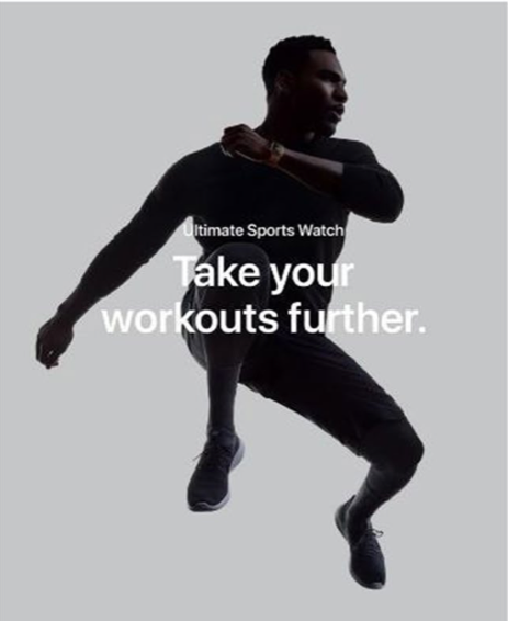
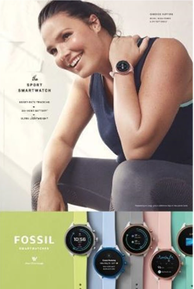
When talking about unisex fashion design, it is interesting to analyse other design industries that have adapted unisex strategies to attract both genders. Packaging design being the most common, I want to analyse other industries and focus on where a unisex branding strategy and design was adapted. While researching I found an interesting article about gender and its influence on preferences in design for “digital health wearables” or in other words: smartwatches, by Esfahani and Sareh from the “International Journal on Interactive Design and Manufacturing” from 2021.
A study about gender patterns and the differences between the product design of smartwatches
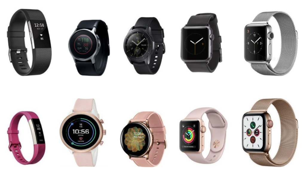
The study conducted within the article included a participatory design session with two groups, one with 3 men and one with 3 women. They were first shown watches from different companies from FitBit, Fossil, Samsung and Apple and advertisements from these companies. The images are shown below.
Top: smartwatches targeted towards men, Bottom: smartwatches targeted towards women, From left to right: Fitbit, Fossil, Samsung and Apple
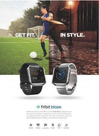
From left to right: Fitbit, Apple and Fossil
The most interesting findings are listed below:
Theme 1: Gendered aesthetics
All females interested in products targeted towards females
Associated specific colours with specific genders
Associated all gender-neutral products to be more masculine
Especially Apple Watch: masculine, although advertised as gender-neutral
Due to specific features: large square screens & wide straps in silver to be linked to males
In general: attitudes more open to the rules and norms of gender patterns
All males identified product language targeted towards males
Through stereotypical colours such as ‘pink for girls’ and ‘blue for boys’
Classify particular colours as female or male and intentionally assign gender values to products
Dark colours: stereotypical colour for men –> comparison to cosmetic products targeted towards men –> prefer products attached with masculinity
Avoid products not meant for males
Both genders identified gendered colours: dark colours for males & bright colours for females
References from gender imperatives and fears of the norms of appropriate gender stereotypes –> influences of advertising
All participants agreed that smartwatches looked more masculine
Theme 2: Masculinity
All male participants identified following attributes for male targeted advertisements:
minimal information, not long to read, more rigid, infographics to portray info –> less time to read
observations from their gender identity & societal norms
attributes influenced and derived from the society and its expectations (e.g. pressure from peers & parents to behave within traditional gender roles)
often fear of being perceived as homosexual: main motives for young males to act within the stereotypes
My analysis of the results of the study
This study shows precisely what I conveyed above: unisex is a hard design concept to implement within the norms of society as especially for males any attributes that are in any way associated with females are seen as “homosexual” and not fitting within their gender identity. This fragile masculinity that relies on vehemently staying within these roles drives brands to counterfeit this by designing gender-neutral or unisex products more towards male design preferences within gender norms. As a result, females view these as targeted more towards men. This reflects the trends within fashion industry as well, where unisex fashion is often only masculine clothing, like oversized fashion targeted also towards females.
A hypothesis I have formed is that gender neutral clothing in general perhaps has a different target group than the other categories of unisex products, as men that want to wear skirts and more feminine cuts are more secure in their masculinity and do not rely on staying within gender norms. This could also be due to the fact of being genderfluid or -queer or even agender. Therefore, it might be interesting to analyse which target group is interested in gender neutral fashion in general and to analyse other fashion companies and how they advertise to their target group.
Esfahani, Bahar Khayamian, and Pooya Sareh. 2021. “Insights into the role of gender in aesthetic design: a participatory study on the design of digital health wearables.” International Journal on Interactive Design and Manufacturing 173-185.
Morgan, Ashley. 2019. “Why the Terms Unisex and Gender Neutral are not Fit for Purpose in Contemporary Clothing and Fashion Design.” Journal of Textile Science & Fashion Technology.