NOTE: Before we start, in order to not confuse the terms, I’d like to clarify that the English word for “corporate design”, when referring to the 4 elements of a corporate identity, is called “corporate identity”. Therefore, the English word “corporate identity” is the German word for “Corporate Design” and will be used throughout this article. With that only one element “Design” is meant, without including the other elements “Culture”, “Behaviour” and “Communication”.
Source: IONOS. 2019. Corporate Identity. July 31. Accessed December 14, 2021. https://www.ionos.at/startupguide/unternehmensfuehrung/corporate-identity/.
After researching into gender-neutral design in different sectors like e.g. product design of smartwatches, taking a closer look into the fashion sector and their corporate identity can show the current situation of competitors in the market. When searching for gender-neutral or unisex fashion brands, a handful of articles pop up introducing companies that offer clothing for all genders. Throughout this article I will analyse the different brands based on their corporate identity and their components of logo, colours, typefaces, images and graphical shapes.
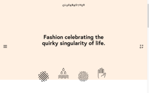
For the comparative analysis I chose four companies: Olderbrother (https://olderbrother.us , Riley Studio (https://riley.studio), Collusion (https://www.collusion.com) and Human Nation (https://thehouseoflrc.com/pages/human-nation). On first glance when choosing the websites, it is surprising to say that all use a white background with a black typography-based logo. This is somewhat foreseeable as black and white are often seen as safe gender-neutral colours, however I did expect to see more variety.
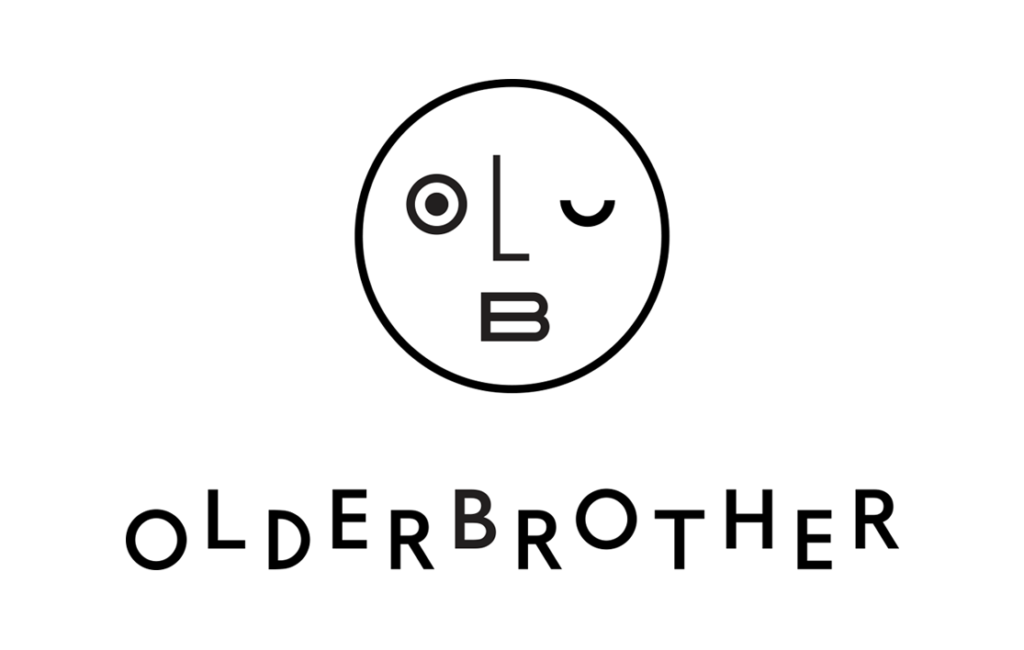
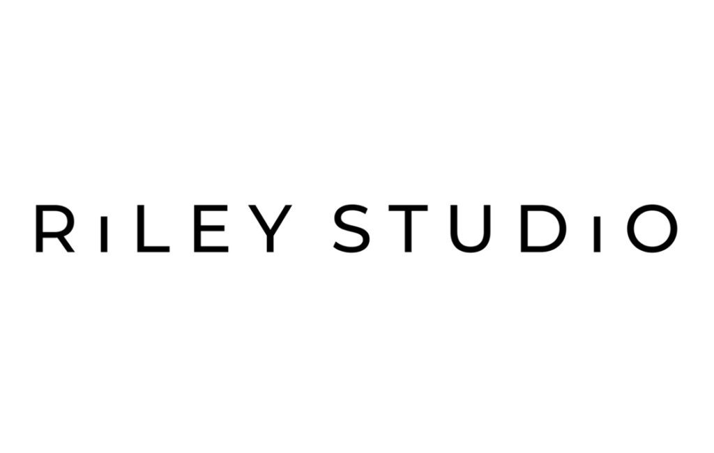
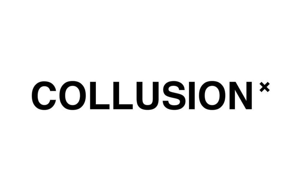
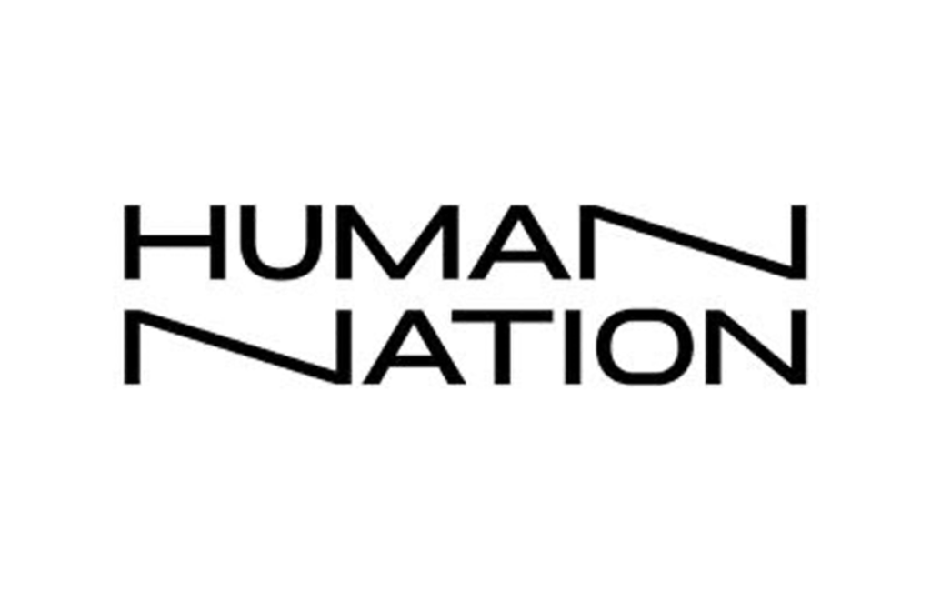
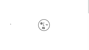
Left to right: Logos from brands Olderbrother, Riley Studio, Collusion & Human Nation
Logo comparison
| Olderbrother | Riley Studio | Collusion | Human Nation |
|---|---|---|---|
| Combination logo (wordmark & logomark) | Wordmark logo | Wordmark logo (Potentially also combination logo with “x” as logomark) | Wordmark logo |
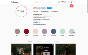
| Sans serif typeface Alternation of characters in the wordmark Logomark: smiley face within circle where eyes, nose and mouth consist of letters “o”, “l” and “B” | Sans serif typeface Shorter “i” to create interest For childrens’ sub brand: addition of “little” in front in a script typeface | Sans serif typeface One written word incl. addition of “x” at end in smaller font size Other styled decorative typefaces used on clothes | Sans serif typeface incl. a play in typography with two “n” stretched out Other styled decorative typefaces and variations used on clothes |
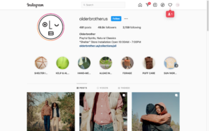
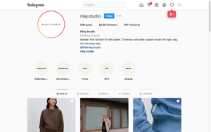
| Wordmark alone used as logomark Wordmark: top of website Logomark: bottom of website, loading screen, social media icon, products Both: clothing tags | Use of one logo throughout website On clothing labels sometimes only use of “riley” Even on social media the one variation of the wordmark is only used “RS” monogram logo used for website icon in tabs | Use of wordmark throughout, also prominently on clothes Use of “x” as logomark, e.g. social media or website icon | Use of logo throughout, also on clothes Sometimes only referred to as “human” Animated wordmark on video visuals |
Colour comparison
| Olderbrother | Riley Studio | Collusion | Human Nation |
|---|---|---|---|
 |  |  |  |
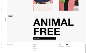
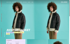
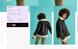
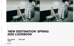
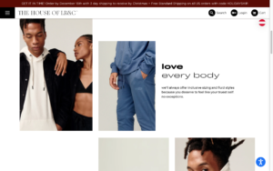
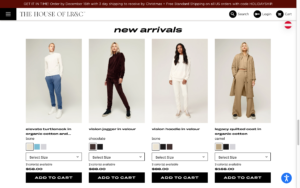
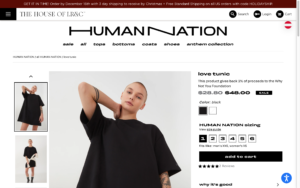
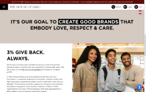
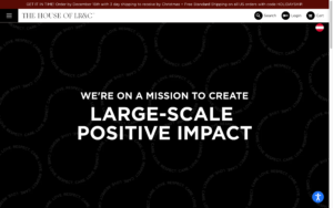
| Neutral colours with hint of two pastel accent colours Heavy use of black and white and sometimes grey –> white background with black typography Sporadic use of accent colours peach and mint green White buttons with black outline, hover changes to black Mint green: menu Peach: background of header for one page | Only use of white, greys and black Dark grey buttons with white typo Dark grey footer Light grey banner at top | Neutral and pastel colour palette with accent colour Logo alternates: with dark background white, with light background black Accent colour red for announcement and sale Purple buttons with black typo for product categories Light yellow buttons with black typo for filter options Salmon colour for options e.g. load more, sort button Coloured or light grey backgrounds with black typo | Neutral colour palette Mostly white background with black typo or black background with white typo Sometimes words are highlighted with box surrounding the opposite colour e.g. white with black typo and highlight black square with white typo Coloured background with either black or white typo |
Typography comparison
| Olderbrother | Riley Studio | Collusion | Human Nation |
|---|---|---|---|
| Sans serif typeface | Sans serif typeface | Sans serif typeface | Sans serif typeface |
| Different weights for headings, body, footer, prices Bold for headings, navigation bar Semibold for subheadings, buttons, product names Regular for footer, page links, body Light for prices Play with typography like in logo –> “shop” as a square, also animated Smaller font size in general, bigger for headings | Different weights for headings, buttons, navigation bar Semibold for headings Bold for sub navigation categories Regular for page links, banner, prices Light for navigation headings, body Font size according to hierarchy: body smaller, subheading bigger, headings big | Full caps only used, except long body e.g. in “about” section Animated banner to the left in accent colour Use of semibold, bold and heavy fonts Semibold for body Bold for subheadings Heavy for headings Use of big font size | ither use of two fonts or two different width typefaces Use of caps in logo Otherwise use of all small letters, no caps (except add to cart button) other buttons small, small letters even at beginning of sentences Use of both bold and light fonts for headings (sometimes at the same time) Bold for parts of heading, product names, prices, navigation bar Regular for body, banner, cart & login, page links Light for parts of heading |
Image comparison
| Olderbrother | Riley Studio | Collusion | Human Nation |
|---|---|---|---|
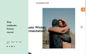
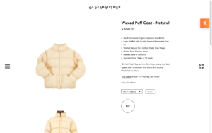
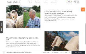
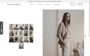
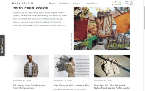
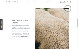
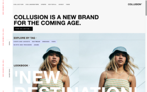
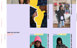
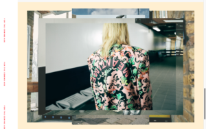
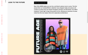
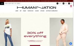
| Product imagery very clean, white background, studio cropped images of products worn | Product imagery clean, white background, also images on models with more of a clean lookbook feel | Product imagery studio images, bright colours, loud, colourful, collage style | Product images model studio images, neutral backgrounds |
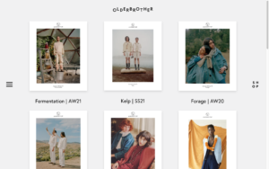
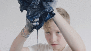
| Lookbook images neutral imagery, low contrast, clean poses of models, more artistic Also, imagery not featuring the clothes to set the mood Also use of still imagery with single movements | Lookbook images, “about” images, neutral images, artistic product imagery without models, neutral poses of models | Lookbook images colourful, vibrant, edited, added graphics, effects, fun backgrounds | Focus on studio images with or without props, some images outdoor, product images outdoor |
Graphic comparison
| Olderbrother | Riley Studio | Collusion | Human Nation |
|---|---|---|---|
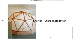
| White space, images placed with borders, typo smaller or none –> pictures talk for themselves, minimalistic Use of icons for explanation of process, fine line thickness, similar style as logomark Graphic logo in middle of screen while loading –> animated (turns) | Use of white space, no large font size, use of coloured rectangular buttons, rectangular footer with infos at bottom in grey, not a lot of use of graphics Icons (only outline) for search and shopping cart, Banner at top in light grey Use of typographic circle “we create from waste” | Retro, loud colourful use of graphics, Street style reflects style of clothing, colourful buttons/ rectangular shapes to highlight certain info e.g. headings, etc, asymmetric shapes, use of textures, cut-outs, outlines (around elements of images) | Use of neutral colour rectangles for signaling new section, typography highlighted with rectangular background underneath text, Use of typography to create graphic shapes à swirly lines reading “respect, care, love” Use of round buttons with icons for search, cart, login, country selection |
Summary
The analysis shows that there are different approaches to gender-neutral design. In general, it can be summarised that the corporate identity reflects the style of clothing. Brands like Olderbrother and Riley Studio that sell classic, neutral clothing also make use of these means in their corporate identity whereas Collusion that has more tailored clothing to Millennials/Gen Z generations, so a younger target group, make use of more street styled graphical means as well as imagery and colours. Interesting to see is that brands that are considered more classic utilise more classic gender-neutral colours such as grey, beige, white, black. In comparison to that, younger brands break the stereotypes of gendered colours by also using gender assigned colours such as lilac or pastel pink. This perhaps reflects the movement described in previous blog posts, where gender boundaries are becoming more fluid and therefore younger generations are more likely to accept different gender boundaries.
Examples logo, typo, image & graphics:
Olderbrothers
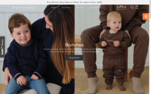
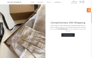
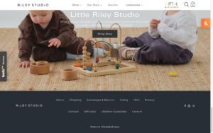
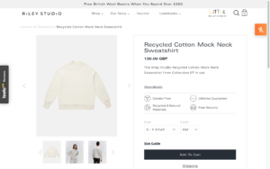
Riley Studio
Collusion
Human Nation
Literature
Collusion. n.d. Collusion Homepage. Accessed December 14, 2021. https://www.collusion.com.
IONOS. 2019. Corporate Identity. July 31. Accessed December 14, 2021. https://www.ionos.at/startupguide/unternehmensfuehrung/corporate-identity/.
Olderbrother. n.d. Olderbrother Homepage. Accessed December 14, 2021. https://olderbrother.us.
Riley Studio. n.d. Riley Studio Homepage. Accessed December 14, 2021. https://riley.studio.
The House of LRC. n.d. Human Nation Homepage. Accessed December 14, 2021. https://thehouseoflrc.com/pages/human-nation.