Unisex fashion branding as an experiment?- my thought process on finding a topic

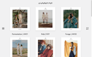
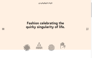
Last semester, I was able to research into many aspects of unisex and gender-neutral design within different design sectors while specifically focussing on the fashion industry and branding. I gained a lot of insight on significant factors to consider before developing a corporate identity and what external obstacles as well as internal strategic decisions need to be considered to fully enable a successful execution. After this very theoretical period of research, this semester the task was given to use an experimental approach within our fields of gained expertise and use our creativity and curiousness to discover different aspects in a more hands on methodology. 

My struggle of finding the right topic

I have to admit, at first I was very unsure as to how I could apply an experimental perspective on a quite strategic and intentional practice which comes with developing a brand identity. With every establishment of a corporate identity incl. imagery, logo, colours, graphics and typography, comes very thought-out, well considered research and then ultimately the design. With only little room for experimentation in the trial and design phase, it took some restructuring of my thoughts till I ended up with an experiment I deemed useful within my field of research. 

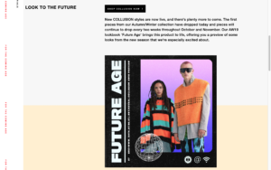
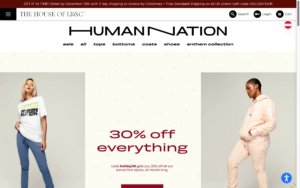
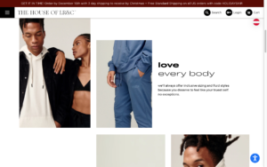
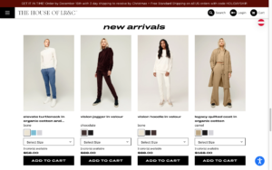
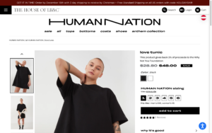
My previous research basically resulted in what 4 years of Marketing Bachelor study taught me: it all depends on the target group. I was unsure if an experimentation could emerge from that, by looking into different target groups as well as even different cultures where unisex fashion and other products are much more present and “normal”. Not being 100% certain on the topic and wanting to be more experimental than researching for another semester, within another one of the countless brainstorming sessions, a fellow student of mine mentioned a topic that inspired me to develop the experiment I will now be focussing on the coming few weeks. She, in basic terms, asked: what makes a design female, male or gender-neutral? Even though this was the topic I researched last semester theoretically in detail, while coming up with experiments I seemed to have lost the bigger picture. With only a simple nudge into this direction, I came up with an idea.

The experiment for the upcoming weeks

My topic for this semester will be: where is the boundary between a design being stereotypically assigned female or male? If one component of a brand identity is “male” and the rest “female”, does society then deem the design male or female? Or is this maybe even the key to gender-neutral design? Mixing different societally considered male and female components together? And if yes, how should the ration be? 

After finding my research topic, I am excited to see what the result of this research may be. For the next blog post I will start to plan how I can structure my experiment, and what the content for it will be.

Unisex/ gender-neutral clothing companies – a comparative analysis

NOTE: Before we start, in order to not confuse the terms, I’d like to clarify that the English word for “corporate design”, when referring to the 4 elements of a corporate identity, is called “corporate identity”. Therefore, the English word “corporate identity” is the German word for “Corporate Design” and will be used throughout this article. With that only one element “Design” is meant, without including the other elements “Culture”, “Behaviour” and “Communication”. 
Source: IONOS. 2019. Corporate Identity. July 31. Accessed December 14, 2021. https://www.ionos.at/startupguide/unternehmensfuehrung/corporate-identity/.

After researching into gender-neutral design in different sectors like e.g. product design of smartwatches, taking a closer look into the fashion sector and their corporate identity can show the current situation of competitors in the market.  When searching for gender-neutral or unisex fashion brands, a handful of articles pop up introducing companies that offer clothing for all genders. Throughout this article I will analyse the different brands based on their corporate identity and their components of logo, colours, typefaces, images and graphical shapes.

For the comparative analysis I chose four companies: Olderbrother (https://olderbrother.us , Riley Studio (https://riley.studio), Collusion (https://www.collusion.com) and Human Nation (https://thehouseoflrc.com/pages/human-nation). On first glance when choosing the websites, it is surprising to say that all use a white background with a black typography-based logo. This is somewhat foreseeable as black and white are often seen as safe gender-neutral colours, however I did expect to see more variety. 

Left to right: Logos from brands Olderbrother, Riley Studio, Collusion & Human Nation

Logo comparison

OlderbrotherRiley StudioCollusionHuman Nation
Combination logo (wordmark & logomark)Wordmark logoWordmark logo
(Potentially also combination logo with “x” as logomark)
Wordmark logo
Sans serif typeface
 
Alternation of characters in the wordmark
 
Logomark: smiley face within circle where eyes, nose and mouth consist of letters “o”, “l” and “B” 
Sans serif typeface
 
Shorter “i” to create interest
 
For childrens’ sub brand: addition of “little” in front in a script typeface
Sans serif typeface
 
One written word incl. addition of “x” at end in smaller font size
 
Other styled decorative typefaces used on clothes
Sans serif typeface
 
incl. a play in typography with two “n” stretched out
 
Other styled decorative typefaces and variations used on clothes
Wordmark alone used as logomark
 
Wordmark: top of website
 
Logomark: bottom of website, loading screen, social media icon, products
 
Both: clothing tags
Use of one logo throughout website
 
On clothing labels sometimes only use of “riley”
 
Even on social media the one variation of the wordmark is only used
 
“RS” monogram logo used for website icon in tabs
Use of wordmark throughout, also prominently on clothes
 
Use of “x” as logomark, e.g. social media or website icon
Use of logo throughout, also on clothes
 
Sometimes only referred to as “human”
 
Animated wordmark on video visuals

Colour comparison

OlderbrotherRiley StudioCollusionHuman Nation
Neutral colours with hint of two pastel accent colours

Heavy use of black and white and sometimes grey
–> white background with black typography

Sporadic use of accent colours peach and mint green

White buttons with black outline, hover changes to black
Mint green: menu
Peach: background of header for one page
Only use of white, greys and black

Dark grey buttons with white typo
Dark grey footer

Light grey banner at top
Neutral and pastel colour palette with accent colour

Logo alternates: with dark background white, with light background black

Accent colour red for announcement and sale

Purple buttons with black typo for product categories

Light yellow buttons with black typo for filter options

Salmon colour for options e.g. load more, sort button

Coloured or light grey backgrounds with black typo
Neutral colour palette

Mostly white background with black typo or black background with white typo

Sometimes words are highlighted with box surrounding the opposite colour e.g. white with black typo and highlight black square with white typo

Coloured background with either black or white typo
Examples of colour use at bottom of page.

Typography comparison

OlderbrotherRiley StudioCollusionHuman Nation
Sans serif typefaceSans serif typefaceSans serif typefaceSans serif typeface
Different weights for headings, body, footer, prices

Bold for headings, navigation bar
Semibold for subheadings, buttons, product names
Regular for footer, page links, body
Light for prices

Play with typography like in logo –> “shop” as a square, also animated

Smaller font size in general, bigger for headings
Different weights for headings, buttons, navigation bar
 
Semibold for headings
Bold for sub navigation categories
Regular for page links, banner, prices
Light for navigation headings, body

Font size according to hierarchy: body smaller, subheading bigger, headings big
Full caps only used, except long body e.g. in “about” section

Animated banner to the left in accent colour

Use of semibold, bold and heavy fonts

Semibold for body
Bold for subheadings
Heavy for headings

Use of big font size
ither use of two fonts or two different width typefaces
 
Use of caps in logo
Otherwise use of all small letters, no caps (except add to cart button) other buttons small, small letters even at beginning of sentences
 
Use of both bold and light fonts for headings (sometimes at the same time)
 
Bold for parts of heading, product names, prices, navigation bar
Regular for body, banner, cart & login, page links
Light for parts of heading
Examples of use of typography at bottom of page.

Image comparison

OlderbrotherRiley StudioCollusionHuman Nation
Product imagery very clean, white background, studio cropped images of products wornProduct imagery clean, white background, also images on models with more of a clean lookbook feelProduct imagery studio images, bright colours, loud, colourful, collage styleProduct images model studio images, neutral backgrounds 
Lookbook images 
neutral imagery, low contrast, clean poses of models, more artistic
 
Also, imagery not featuring the clothes to set the mood

Also use of still imagery with single movements
Lookbook images, “about” images, neutral images, artistic product imagery without models, neutral poses of modelsLookbook images colourful, vibrant, edited, added graphics, effects, fun backgroundsFocus on studio images with or without props, some images outdoor, product images outdoor
Examples of image use at bottom of page.

Graphic comparison

OlderbrotherRiley StudioCollusionHuman Nation
White space, images placed with borders, typo smaller or none –> pictures talk for themselves, minimalistic
 
Use of icons for explanation of process, fine line thickness, similar style as logomark
 
Graphic logo in middle of screen while loading –> animated (turns) 
Use of white space, no large font size, use of coloured rectangular buttons, rectangular footer with infos at bottom in grey, not a lot of use of graphics
 
Icons (only outline) for search and shopping cart,
 
Banner at top in light grey
 
Use of typographic circle “we create from waste”
Retro, loud colourful use of graphics, Street style reflects style of clothing, colourful buttons/ rectangular shapes to highlight certain info e.g. headings, etc, asymmetric shapes, use of textures, cut-outs, outlines (around elements of images)Use of neutral colour rectangles for signaling new section, typography highlighted with rectangular background underneath text, 
 
Use of typography to create graphic shapes à swirly lines reading “respect, care, love”
 
Use of round buttons with icons for search, cart, login, country selection
Examples of use of graphical means at bottom of page.

Summary

The analysis shows that there are different approaches to gender-neutral design. In general, it can be summarised that the corporate identity reflects the style of clothing. Brands like Olderbrother and Riley Studio that sell classic, neutral clothing also make use of these means in their corporate identity whereas Collusion that has more tailored clothing to Millennials/Gen Z generations, so a younger target group, make use of more street styled graphical means as well as imagery and colours. Interesting to see is that brands that are considered more classic utilise more classic gender-neutral colours such as grey, beige, white, black. In comparison to that, younger brands break the stereotypes of gendered colours by also using gender assigned colours such as lilac or pastel pink. This perhaps reflects the movement described in previous blog posts, where gender boundaries are becoming more fluid and therefore younger generations are more likely to accept different gender boundaries.

Examples logo, typo, image & graphics:

Olderbrothers
Riley Studio
Collusion
Human Nation

Literature

Collusion. n.d. Collusion Homepage. Accessed December 14, 2021. https://www.collusion.com.

IONOS. 2019. Corporate Identity. July 31. Accessed December 14, 2021. https://www.ionos.at/startupguide/unternehmensfuehrung/corporate-identity/.

Olderbrother. n.d. Olderbrother Homepage. Accessed December 14, 2021. https://olderbrother.us.

Riley Studio. n.d. Riley Studio Homepage. Accessed December 14, 2021. https://riley.studio.

The House of LRC. n.d. Human Nation Homepage. Accessed December 14, 2021. https://thehouseoflrc.com/pages/human-nation.

But what exactly is meant by unisex?

Before we go into what unisex entails and how to define the word, it is important that we pinpoint the constructs that lead up to the term. Unisex and unisex fashion plays with the cultural concepts of gender and society and how gender boundaries are perceived, so therefore when we start from a broader perspective, the question we must ask ourselves first is: what is “gender”? 

Gender vs. sex

The construct “gender” frequently leads to confusion as it is often interchanged and mistaken for the term “sex”.  When referring to the sex of a person, it includes the division of society into male and female reproductive organs as well as sexual identity and desire/activity. Gender on the other hand, is defined by Sally McConnell-Ginet as following:

“The word gender […] refers to the complex of social, cultural, and psychological phenomena attached to sex, a usage common in the behavioral and social sciences.”

McConnell-Ginet, Sally. 2014. “Gender and its relation to sex: The myth of ‘natural’ gender.” In The Expression of Gender, by Grenville Corbett, 3-38. Berlin/Boston: Walter de Gruyter GmbH.

To further define what is meant by the social, cultural and psychological aspects, McConnel-Ginet clarifies the term sociocultural gender, as “a matter of […] the significance attached to that division [of female and male], the institutions and ideologies, the pre-scribed and claimed identities, and the array of social practices that sustain those institutions, ideologies, and identities.” This means that e.g. gender roles play an important part within gender constructs, which will be further defined below.

Gender roles, boundaries and stereotypes- what’s the difference?

Gender roles have been present for a long time, however the term was first coined by in the 1950’s by John Money. He refers to these as things that reveal a person being a woman or man, including sexuality, habits, attitude and behaviour. He also mentions conversation topics, dreams and speech determining the gender of a person. It has to be said that as this definition was published about 70 years ago, with multiple generations following, this explanation can be seen as somewhat bizarre. Nowadays gender roles and with that, boundaries, still exist within society and are usually present already from a young age. According to a paper by Anne-Kathrin Meyer’s, this happens in order to distinguish between groups and simplify the complexity of the social world and is necessary for adaptive living. Often, these roles fall into stereotypes, which are socially shared opinions on characteristics such as behaviour, capabilities and other individualities. These can be realistic but can also often be untrue and too simplified. In terms of gender, these often also negative stereotypes are occasionally found within categories like school subjects or sports, where girls are said to have a disadvantage. As these boundaries and stereotypes are a social construct, society is starting to reveal inconsistencies in gender both physically and psychologically and rethink split gender models. Through this shift, the term unisex is gaining popularity.

Unisex and fashion:

Unisex as a concept showcases an interplay between gender boundaries and roles and is continuing to gain presence within society. The term itself is also very subjective and fluid and can therefore be interpreted in many ways, with artists in the design world varying their understanding of the term immensely. In the Collins Dictionary the term is described as “[…] designed, or suitable for both sexes; not distinguishing between male and female; undifferentiated as to sex”. The term is not only limited to the fashion world but can also refer to places such as hairdressers or bathrooms. In fashion, unisex usually refers to clothing that does not comply with the socially and culturally assigned gender boundaries within clothing. This can be either by e.g. men wearing dresses or women wearing boxer shorts. Another form of unisex fashion encompasses basic clothing, accepted by society for both sexes like t-shirts and jeans, tailored for the wear of both through inclusive sizing and use of colours, graphics and patterns. 

Now that the basic terms are clear, the research can continue on e.g. differences, if existing, between ungendered and genderneutral clothing.


Literature

Collins Dictionary. n.d. Definition von unisex. Accessed November 24, 2021. https://www.collinsdictionary.com/de/worterbuch/englisch/unisex.

Hively, Kimberly, and Amani El-Alayli. 2014. ““You throw like a girl:” The effect of stereotype threat on women’s athletic performance and gender stereotypes.” Psychology of sport and exercise 48-55.

Kuo, Yu-Pei, Jirawat Vongphantuset, and Eakachat Joneurairatana. 2021. “From Eastern Inspiration to Unisex Fashion: a Case Study on traditional Chinese Shenyi Attire.” Humanities, Arts and Social Sciences Studies 535-546.

McConnell-Ginet, Sally. 2014. “Gender and its relation to sex: The myth of ‘natural’ gender.” In The Expression of Gender, by Greville Corbett, 3-38. Berlin/Boston: Walter de Gruyter GmbH.

Meyer, Anne-Kathrin. 2021. Mutter-Bonus in familienrechtspsychologischen Entscheidungskontexten. Eine experimentalpsychologische Untersuchung. PhD Thesis, Hagen: FernUniversität in Hagen.

Money, John. 1973. “Gender role, gender identity, core gender identity: usage and definition of terms.” Psychoanalysis (Johns) 397-403.