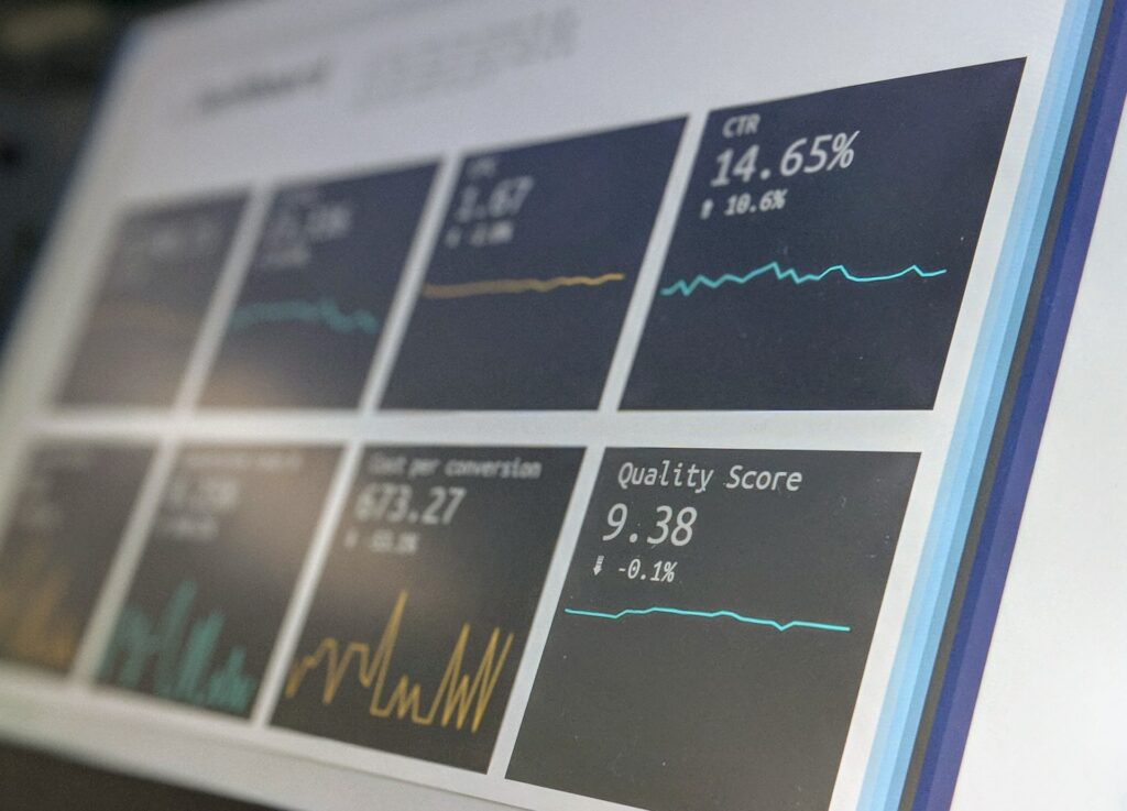
Designing calorie tracking app for healthy habits building


Key Words
Design; Motivation; User Experience; Calorie Tracking; Habit builder.

Obesity and being overweight have become major public health concerns in the United Kingdom, with a staggering two-thirds of adults falling into this category. This puts them at an increased risk for a wide range of chronic health conditions, including heart disease, diabetes, and certain types of cancer. These conditions not only affect the individual’s quality of life but also put a strain on the healthcare system.
Traditionally, public health support for weight loss has focused on providing information about healthy eating and lifestyle. However, the advancements in technology, specifically the internet and mobile applications (apps), it has opened up new possibilities for providing long-term motivational support to individuals looking to lose weight. These apps can provide personalized feedback, set achievable goals, and offer a wide range of features such as tracking progress, connecting with others, and having access to a wealth of information.
In addition, with the increasing use of smartphones and the internet, these apps are accessible and convenient, making it easier for individuals to access the support they need to make positive changes to their lifestyles. Moreover, the apps can be used to provide continuous support and encouragement, even when the individual is away from a healthcare provider. This type of support is crucial in promoting long-term weight loss and improving overall health outcomes.
In conclusion, weight-related issues are becoming a major public health concern in the UK, and the advancements in technology, specifically the internet and mobile applications (apps) open up new opportunities for providing long-term motivational support to individuals looking to lose weight. Thus, health professionals and researchers should consider developing and promoting the use of these apps to support weight loss and improve overall health outcomes. The use of technology to track and manage one’s health has become increasingly popular in recent years, with many individuals turning to mobile apps as a convenient and accessible tool for achieving their health and wellness goals. One specific area where mobile apps have seen widespread use is in the realm of dietary tracking and management. The Apple App Store, for example, features hundreds of apps in the Health & Fitness category that allow users to track their calorie intake and monitor their diet.
According to a survey conducted by the Pew Research Center, 31% of health app users reported using these types of apps to track their diet. However, while the popularity of these apps is clear, research suggests that many of these apps may be limited in their effectiveness in promoting long-term changes in dietary behavior. One key area where these apps are lacking is in their integration of health behavior theory. Health behavior theory provides a framework for understanding how individuals make decisions related to their health and how to design interventions that are most likely to be successful in promoting positive behavior change.
Despite the potential benefits of incorporating health behavior theory into dietary tracking apps, previous research has found that many of these apps are void of such integration. To date, there has not been a comprehensive examination of how popular calorie-counting apps include health behavior theory. This is a significant limitation as methodologies used in previous studies are useful for providing a general overview of the content, but their limited scope makes it challenging to identify all of the instances of health behavior theory integration.
In order to address this gap in the literature, the purpose of this study is to conduct an extensive content analysis of the 10 most popular calorie-counting apps from the Health & Fitness category of the App Store. Specifically, the purpose of this analysis is to evaluate the presence of health behavior theory in the selected calorie-counting apps when used extensively over the course of one week. The findings of this study will provide insight into the current state of dietary tracking apps and inform future development of these types of apps to better promote long-term changes in dietary behavior.


The main question of this paper is to understand how user behavior and motivation will change once
we simplify a user path.
The task is to develop an interface that will help users to manage their daily diet easily and, in this
way, to promote a healthy lifestyle.
I am planning to take references from Pei-Yu C.Jen-Hao C. Hao-Hua C. Jin-Ling L. “Enabling
Calorie-Aware Cooking in a Smart Kitchen” in the book Persuasive Technologies, pp 116–127 (Oulu,
Finland, June 2008); Neeraj K. Consuelo L. Clara M. Swanand P. Bixia S., Alfred K. CalNag:
Effortless Multiuser Calorie Tracking (University of California, Irvine, CA, USA; 2016)
The purpose of this thesis is to create a user-centric calorie-tracking app with an external scale. From
From the technical point of view, the external scale will be connected to the app wirelessly, once a user will
place a product on the scale and take a photo of it the system will suggest products with
information on a screen, so that way, users can easily add products and count calories.
The Structure of the thesis is a classic one, I will start with the theory, finding literature, good practice
examples, and user research, and then will dedicate the majority of the time to building the working
prototype.
I am dedicating two months to research and data collection. Another two months for the first draft and
editing and the rest of the time are for creating a layout and final corrections.
Master’s Thesis Evaluation

Design and evaluation of mobile fitness application to encourage people in physical activity Raquel Catalina Vaquero and Rodolfo Morales Lopez

1.1 Level of design

In my opinion, the level of design is not developed quite well. They have old fashion tables and the image quality is low. Some information in the tables is hard to read because they didn’t adjust the font size. The example screens which are shown are not big enough to read data on them clearly. The style of the whole Master thesis is classic, the layout is typical for research papers. The whole text is not centered. 

1.2 Degree of innovation

This research paper is focusing on designing and evaluating the iOS mobile application. The app is about fitness and how to anchorage people to train more (with a trainer or without). The field of study is User Experience Design and Interaction Design.

1.3 Independence

The Research paper-making process wasn’t independent. The authors got external help from the SportyFly OY. members. The main author is still Raquel Catalania Vaquero and Rodolfo Morales was helping with it. 

1.4 Outline and structure

I think that structure and outline are in their places, they are logical and understandable. There is an Abstract, Division of Work, Table of Content,  Introduction, Literature Review, Theory, Content, Prototype, Evaluation, Discussion and Conclusion, Bibliography, List of figures, List of Tables, List of Symbols and Abbreviations. 

1.5 Degree of communication

Raquel and Rodolfo have a clear and structured way of communication. They use many sources to prove their point, many references help to understand the topics they are talking about better. The way of the thesis is structured really well and you always can find a point where you were before, I think that list of symbols and Abbreviations is really helpful in this kind of paper. 

1.6 Scope of the work

The project was based on cooperation with an existing company. They created an app that helps people do more sports, they based their approach on User Experience Design and User Centric Design methodology. They start with briefing and understanding all complications the previous version had. They did great User Research which helped them to understand how to redesign an app better.

1.7 Orthography and accuracy

From the language perspective of view, the research is on a good level, you can easily understand what the authors wanted to communicate, I personally didn’t find mistakes(Orthographic or grammatical). Sometimes text wasn’t visible enough to read. 

1.8 Literature

Literature Quantity is brought, they included a lot of useful design books. There were also a lot of online references which will also be helpful in my own Master’s Thesis. 

Bibliography 
Raquel, C; Rodolfo, M; “Design and evaluation of mobile fitness application to encourage people in physical activity” Master’s Thesis  Tampere University of Technology,  September 2016;

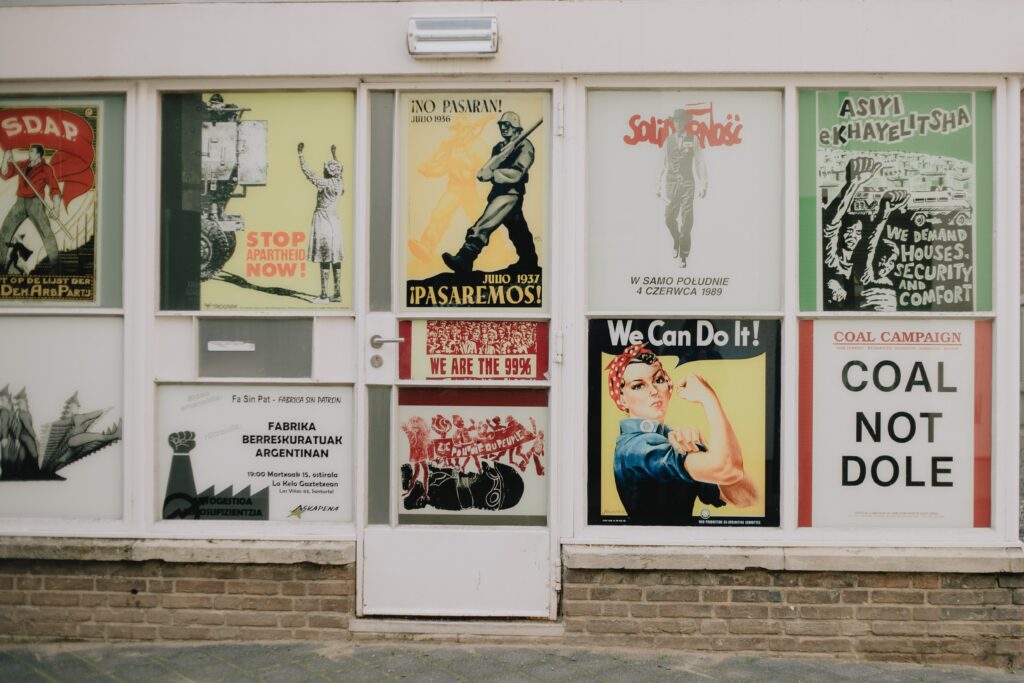
Design and Research 2: Propaganda

Today, we swallow information on the Internet without even thinking about whether it is worth checking. The media pushes us to certain values and opinions under the guise of curiosities or information that does not concern us, which we accidentally saw on the internet. Based on this, we build a pattern and an image about a topic without realizing that in reality, it could be the complete opposite. People are not inclined to actually verify information; it takes time and energy. Depending on how much time we spend online, our brain is still digesting this information, even if we are not consciously aware of it. The media manipulate the status quo with ease, because who will check every piece of data seen on the Internet? Another question – is it even possible? What could then be said about important information the masses should see and which emotionally touches almost every person?

Propaganda is the systematic dissemination of facts, arguments, rumors, and other information, including deliberately false information, in order to influence public opinion. The word comes from the name of a Catholic organization created in 1622, the Congregatio de Propaganda Fide (Congregation for the Propagation of the Faith). Propaganda is also seen as a pre-planned and purposeful spiritual influence on the audience, the purpose of which is to attract the audience to the side of the one who conducts the propaganda, that is, to control thinking and behavior. Ultimately, propaganda is a collection of certain structures, and fragments of symbols that influence human perception and behavior.

Generally speaking, propaganda theories were also the first theories to focus on the media, its content, influence, etc. researchers tried to explain how the media can use this or that information by influencing people, as a result of which they learn certain points of vision. At the time, the simplistic stimulus-response theory of mass communication dominated, according to which the media could deliver stimuli to each person in a certain way that would be equally perceived by all recipients and cause them to have similar or congruent reactions. The power of propaganda is related to the vulnerability of human consciousness, and not to the characteristics of specific messages. A crisis or political conflict is potentially dangerous, as it leads to mass psychoses and exacerbates people’s susceptibility to propaganda. There is also the opposite view that a successful propaganda campaign must have a long, carefully designed strategy, during which it is necessary to create certain symbolic images and teach people to associate the required emotions with them.

Why do we need propaganda? What are its main goals for today? Propaganda is one of the main means of political manipulation. Propaganda cannot be compared to advertising. Advertising is closer to self-presentation or to the informational genre. Advertising primarily affects people’s emotions. Propaganda affects both the emotions and the minds of people. Accordingly, propaganda can be negative or positive. Positive propaganda seeks to communicate certain beliefs to the consumer in an understandable way. The purpose of positive propaganda is to promote social harmony and education of people in accordance with generally accepted values. As an example, campaigns for the protection of the environment also often use propaganda mechanisms to convey information. There’s nothing wrong with that, as a lot of people started to think about it now. Problems begin when the mechanisms of influence that are involved in propaganda are used for the selfish purposes of politics.

How to save yourself from the influence of propaganda? We are idle to check every information that is around us. Plus, you need a huge amount of knowledge to critically evaluate it, and this is one of the main ways. The only thing we can do is to critically analyze, and perceive everything and not believe in one source. Build the perception of various topics based on several sources. Unfortunately, our brain will still build an imagination about the world even if the source is not checked, so if you have not verified the information, try not to spread it further. So we can stop influencing others with an opinion that is not based on verified information and transfer it further like a virus.

When I thought about how to fix this problem, I came up with the idea of creating a program that will check the information for us. Agree when we have a notification that the information in this article is subject to propaganda, we will perceive the content in a completely different way. Uniting programming and theoretical knowledge about propaganda that will be collected from various examples, we can get a fairly useful tool. The only question is how to use it. Since in order to check the information for veracity, I would need an incredibly large database that would be independent and renew itself on different sources, which in its essence should involve artificial intelligence. Unfortunately, I definitely don’t have enough time for such a version, so I decided to make a demo version as an example. I will collect a database of the most common propaganda techniques with different slogans. The program will have to check the text for sensitive content and look for words that provoke emotions. So in the first version, I will be able to make warnings for users when absorbing all sorts of content.

Propaganda is a tool that allows you to manipulate large masses of people. Everyone is subject to it in one way or another. The conclusion is quite simple. Do not believe everything that is written on the Internet. Do not believe even some of the theses given in this article. My goal is to prevent you from creating an alternate universe in your head. This way we can protect ourselves and others from obvious manipulation in the first place.

Des&Res 2. How to bring Lab closer to the streets

Today, design is rapidly developing in various areas of our lives. Design thinking began to be used in medicine, biology, products, and much more. People realized that by combining different disciplines we can achieve much better results. At the university, we are often told that by gathering specialists from different fields, we can consider the same project from different angles and understand it more holistically by looking at it from the faces and perspectives of different people. Now global companies clearly select employees with different backgrounds and different temperaments to work on the same task. At Design Week 2022 in Graz, we also had such an amazing experience.
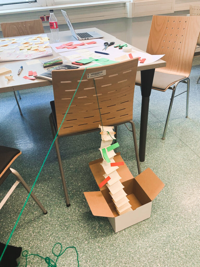
This year, as students of Fh-Joaneum, we had the opportunity to work at Karla Molins Pitarch’s workshop, which was called UXD How to bring Lab closer to the streets. We spent a whole week working on the project from the very beginning to finish. The task was to understand and convey complex information with the help of design for people who are not related to biology in any way. The tutor divided us into two-person groups and we, as people with different backgrounds, had to design something new for our consideration.
From day one, we received a special Toolkit designed by Karla. It was supposed to help us in the process of creating our product. The purpose of the toolkit itself was to unite people from different areas and facilitate the process of joint work with the help of detailed information describing each step in the design process. The toolkit itself contained such subdivisions as knowledge, transdisciplinarity, applied design research, and outreach. Everything started with the lab and led to the street. Each of the divisions contained points that had to be completed in order to move to the next step. Each of the divisions was described in detail so that people who encountered the process for the first time could find everything they need and understand what to do next. Personally, the toolkit really helped me, even though I have been working with the design thinking method for quite some time. He helped me remember the process and follow it in detail. I plan to use it also in the process of writing my master’s thesis.
Unfortunately, we, people who did not have general knowledge of the topic of biology, needed to understand the theme of our workshop from the basics. Our task was to realize what chromatin is and how DNA is built on its basis. We needed to create some design system that would tell people who need clarification what exactly chromatin is.”Chromatin is a nucleoprotein that forms the basis of chromosomes. It consists of DNA and proteins (mainly histones). Chromatin is found inside the nucleus of cells of eukaryotes and archaea that have histones. In a broader sense, chromatin is sometimes also called the substance of the nucleoid in bacteria. It is in the composition of chromatin that genetic information is realized, as well as DNA replication and repair.
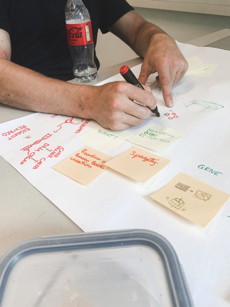
The first day was quite busy. We were divided into two personal groups and we started brainstorming. The task was a joint effort to understand what chromatin is and show us what it is associated with the studs. In the further process, it really helped, because many of us found the beginning of bare ideas in brainstorming. My colleague and I decided to design a game that would mechanically show the operation of chromatin and DNA. We decided to target schools and educational institutions as places to use the game, and students became our main target group. The most difficult thing was to explain to someone what chromatin is if you are not an expert in it yourself. Especially when you have one day of experience with the topic.

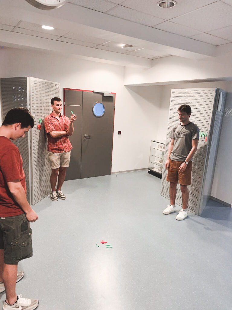
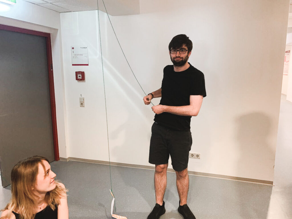
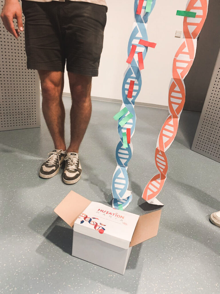
The next day we were scheduled to design low-quality prototypes and we moved to the next stage with Carla’s toolkit. We were still trying to figure out how chromatin works and how to show it in a game for children so that they do not lose interest and it helps them in the learning process. The main element in the game was the transfer of genes from one DNA stream to another. We wanted to give children the opportunity to collect good genes and get rid of bad ones. It was important to involve the players in the process and allow them to play a major role. After the first layouts and attempts, we decided to test the game on our colleagues in order to identify the main problems in the process and be the first to receive feedback from users. After the testing process, we realized that we made several mechanical mistakes in the game itself and that is focused on the process of creating DNA and not on chromatin. In the end, we added a few interesting things so that the main thing in the game still remains chromatin. In order to better understand the processes that take place during the creation of DNA, we began to look for people in our circle of friends who are professionally connected with biology, this really helped in the final result. The last day turned out to be the most difficult because it was then that we had to finish all the drafts so that we could present them well the next day. Under the pressure of time and our efforts, we tried to finish everything before the final deadline.
A little about the game itself. The game is based on the process of DNA creation and gene transport. The main element is the player, which is attached to his individual DNA. When a player chooses to collect more good genes from a chromatin point or throw bad genes at one of their opponents, they open themselves up and are vulnerable to attacks. The game is designed for 2+ players because the main task is to take away as many good genes as possible. The person with the best genes wins. Also, the game stops when the first player gets rid of all bad genes.

The whole design week ended with a presentation, everyone could show what he had been working on all these days. Personally, I want to add that I would never change my workshop to another one. An incredible experience, working with wonderful people, and a wealth of knowledge. The week turned out to be productive and interesting.

NIME: Exploring Identity Through Design: A Focus on the Cultural Body Via Nami

Sara Sithi-Amnuai

In this article, the author reveals the theme of personal identity and cultural body. Identity is very closely linked to the culture in which we were born. This culture, in turn, is inventive and full of art, music, and dance. The author focuses on the fact that the topic of the design and application of gesture controllers is not widely discussed. The goal of the author of this article is to embrace the cultural body, incorporate it into existing gesture controller design, and how cultural design techniques can expand musical/social affiliations and/or traditions in technological development. Sara Sithi-Amnuai’s article discusses the design of Nami, a custom-made gesture controller, and its applicability to extending the cultural body. We develop freedom of action by perceiving the world in terms of our self-identity and collective identity. According to the definition of references to which the author refers, “the mind is inseparable from our bodily, situational and physical nature” she also notes that in the aggregate all this is called consciousness. Our bodies absorb movement and experience through the senses, vision, and sensations, which influence how we relate to our environment and how we behave.
What is this cultural body? The author says that this is a body subject, “marked by culture” and “talking” about cultural practice, itself, and history. Dancers, for example, often notice that their body is intimately tied to their identity and vision of themselves. Often after their career ends they no longer understand themselves and it is very difficult for them to embark on the path of recovery.
In the article, the author also points out many practices related to design. Design stages often take place in 4 steps:
1. Sketching phase includes an input (“data”), functionality (“model”), and material/form.
2. Concept phase includes training data, ML model (training engine), and data/form relationship.
3. Critical Thinking phase includes purpose, intentions, culture, and material/form exploration.
4. Reflections phase includes input, functionality, and final materials/form.

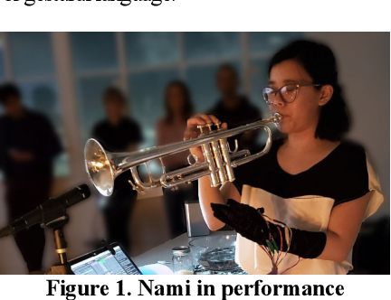
One of these devices that allow you to get a musical and cultural experience is NAMI. NAMI is a glove interface designed for live electro-acoustic musical performance, primarily relying on an augmented instrument. The goal of NAMI was to explore and develop a new sign language beyond the effective trumpet gesture and to integrate it with the author’s own experience and her cultural body. The trumpet was used with additional sensors which provided additional sound control options. The trumpet provides freedom of movement for the left hand, while the right hand supports the instrument. The fundamental connection between the musician and the trumpet exists between the musician’s lips and the mouthpiece and then extends to the fingers. This scheme allows the executor to access multiple controls at the same time. The performer can play the instrument (trumpet) with the right hand and operate multiple controls in real-time, exploring, expanding, and amplifying the sound of the trumpet with the left hand.

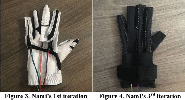
The author of the article also pays a lot of attention to materials and techniques for creating pearls. The first thing Sara Sithi-Amnuai remembers is that the shape of the dodge reflects the essence of the culture for which the gloves were designed. Materials We have chosen for affordability, only materials that could be easily recreated on a small budget and used in a wide range of sports or casual activities. In the third development, the glove was designed to fit every hand size. A wrist strap allows the user to lock the glove and sensors in place, however, the fingerless design allows for flexible sensor placement depending on hand size.
In conclusion, I want to say that the article opens up a new understanding of the manipulation of music based on the individual experience of the performer. Which in turn leads to more refined and culturally rich performances.

How to make projects relying on the medical information

When designing for medicine, the designer must be aware of various aspects of this field. He must analyze how the processes run in a particular medical institution and the first thing he must pay attention to is the medical aspects of the problem he is trying to solve.
In a short time, the designer or design team must delve into the medical aspects of the prescribing problem and use  three sources of information:

  1. Visual medical information
  2. Written medical information
  3. Scientific medical information.

Visual medical information must be collected during the procedure the designer is investigating, such information can indirectly stimulate motivation and inspiration for superior product design. Written medical information is found mainly in brochures, through which the patient is informed about the treatment. The Internet is also an important source of information. 

Scientific medical information gives state of the art research in the form of congressional reports. The designer must understand that the researcher has hidden desires that need to be found. It should be part of an open discussion with all interested parties. The designer or design team must extract all medical information to find out the requirements and wishes of all medical parties involved in the treatment and then come to the design of the product.
Optimization should always be a topic of discussion to come up with the best product design. In a fuzzy interface, designs with medical information require special attention to communication between the designer and the specialist, otherwise, opportunities for optimized product design may be missed. Knowledge must be brought directly to the level of understanding and exchange of medical and technical information. Shared information must be known to all parties involved for the success of the project. Projects with medical science as their starting point require a new approach to design development.

Medising trends

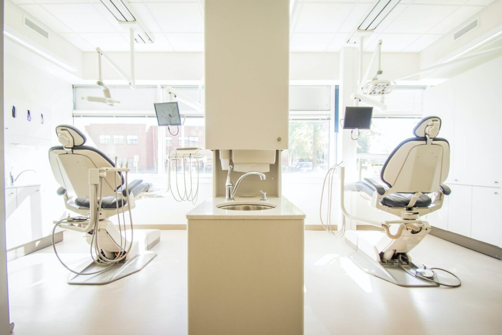
People are realizing more and more that design in medicine is very important. Previously, companies producing medical devices strongly focused on the engineering aspect, where now, over several years, significant progress can be noticed in the aspect of design. The aim of cooperation with designers is to increase the satisfaction of patients and medical staff, i.e. direct users. The design is directly oriented towards improving the relationship between the user and the devices by changing the appearance of the other to reduce fear and stress for the patient. The positive psychological effect achieved by using well-designed medical equipment improves the relationship between the patient and the doctor too. Designers are able to design useful interfaces with functionalities that can be guessed by looking at them.
The Philips company began research under the name Ambient Experience Design, which was to combine medical engineering with design to increase the level of patient satisfaction. As part of the program, rooms with computed tomography have been equipped with equipment of pleasant soft shapes. In addition, smoothly changing lighting and displaying pictures on the walls during the research, absorbing the attention of children and relaxing adults. It turned out that thanks to this, patients are less afraid of tests and are calmer, and the tests themselves have to be repeated less often because the number of errors resulting from undesirable movements of the patient has decreased. The DLR Research Institute has developed a robot design that could assist in surgical operations. The robot has a part that is similar in shape to a human arm, thanks to which they can efficiently assist the surgeon without taking up too much space. In addition to the robotic arms, the MIRO project also includes compatible designs of the operating table, the surgeon’s console, and the support system supporting the robot arms. The casings of all devices are easy to clean and carefully hide all mechanical elements and electronics. The project was awarded the IF Product Design Award in the “advanced studies” category.
Nowadays, we can see some standout design trends in medicine. The first is the ability to communicate between the patient and the device. Another important trend concerns the change of the language of shapes, spaces with large smooth surfaces broken by sharper lines beginning to dominate. The dominant color is white, complemented by small color accents which, due to their neutrality, look clean and modern. The important part is to make the medical devices be clean and not just pretend to be clean, hence the growing popularity of smooth, shiny materials that are easy to clean and which, in combination with the white where even small details are visible.
The medical design has great potential due to the enormous variety of areas, and at this time it badly needs specialists who will be able to develop and support progress in this field.

Empathy in designing a program for cancer patients

Why is empathy in medical application design so difficult? Empathy is the ability to empathize with other people’s situations without having to live the same experience. Thanks to it, we can understand the problems they are struggling with and the feelings that they are going through. Unfortunately, in designing for sick people, we cannot feel and close to what they are experiencing now, we can process information only under the prism of our own experiences and the only thing we can do is, at least, generally imagine what a person was going through. That is why we need to do thorough research and talk to patients, but unfortunately, that will not be enough.

In my research, I do not have the opportunity to do an interview yet, but I need at least a little closer to the experience and feelings of one of the target groups. That is why I decided to take the appropriate steps. I found patient interviews and started watching them. I must admit that it is hard because the topic is unfortunately very difficult.

If you are interested, you can watch some interviews on this page: https://www.cancerquest.org/videos/interviews/patient

Principles of data analysis in health care

Various analytical tools are used to analyze data in the medical area, thanks to which it is easier to make decisions based on facts. These methods later help in planning, measuring, designing, and educating. Now the global health service is suffering from shortages among doctors and nurses who make primary care. As a result, already overworked specialists have to perform their duties even faster. Unfortunately, the situation is predicted to be even more difficult over the next few years, here the only right solution is to analyze the data and design a system that will make the process easier.

The benefits of analyzing medical data can be: faster delivery of results, making permanent changes, and later designing a new process that will be better, reducing the risk and the number of errors. The first step may be to introduce appropriate programs and artificial intelligence to the health system, which in the future may take on some of the responsibilities. These tools can absorb huge amounts of information and learn from many different types of data.

Research-based on:https://www.ibm.com/pl-pl/watson-health/learn/healthcare-analytics

App Cancer.Net

One of the first steps is to begin analysis from an understanding side of a patient. The reason is very simple, there is a lot of information about this in the global network.
First, I started by analyzing some of the applications that help patients in the treatment process. Today we’ll take a look at Cancer.Net specifically. I liked the application because it is really user-friendly and it has many functions that help in various aspects of a cancer patient’s life.
The application helps to track the symptoms and add new ones if they appear, write them down in the calendar and watch how the treatment process is going. If the patient has any questions, he has the opportunity to contact a specialist and ask him a question, and the program already has basic questions to which you can immediately find an answer. The application allows them to add doses of all pills that the patient takes. You can write down the date when you need to take the next dose, take a photo in case they forget what the box looks like, and also write down short notes to themselves in the future. Patients have the ability to add their own health care provider for better contact with the hospital and make the next appointment. A patient always has access to data about his health, which the program takes from the smartwatch and phone.

If you want to see it, I will leave you a link to the application here: https://www.cancer.net/navigating-cancer-care/managing-your-care/cancernet-mobile