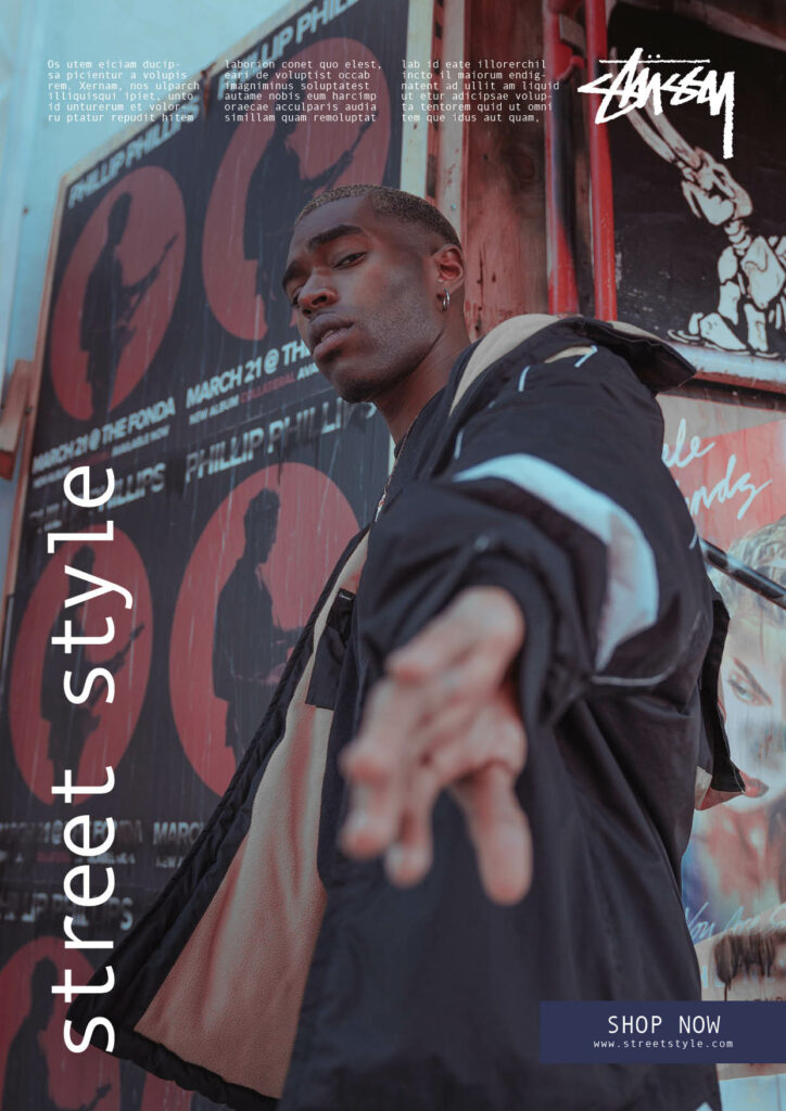
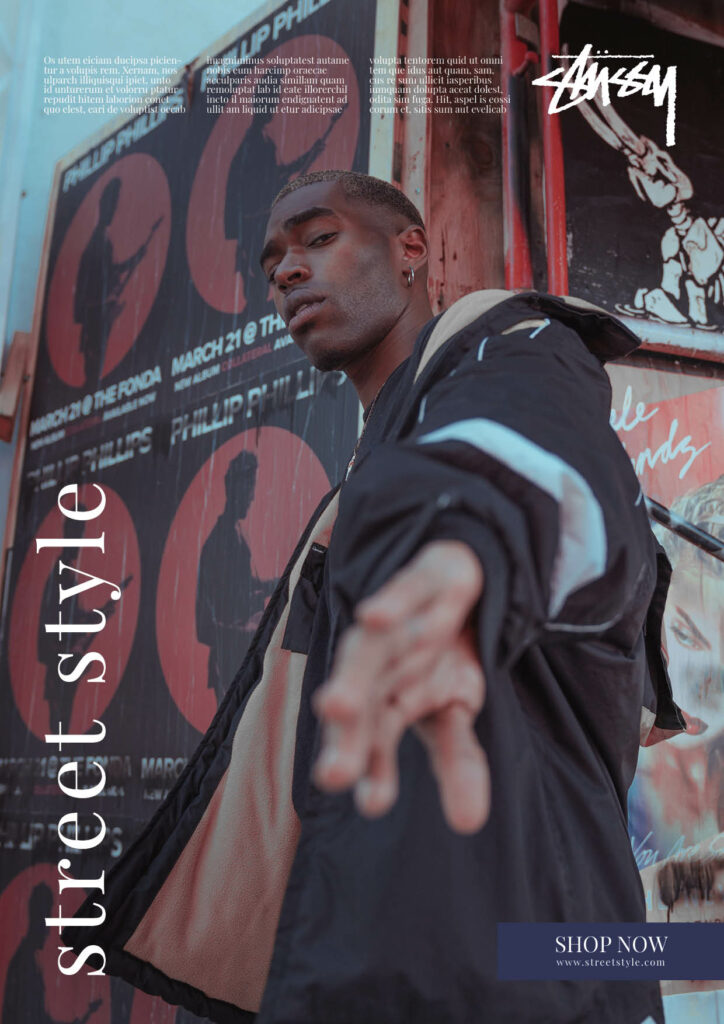
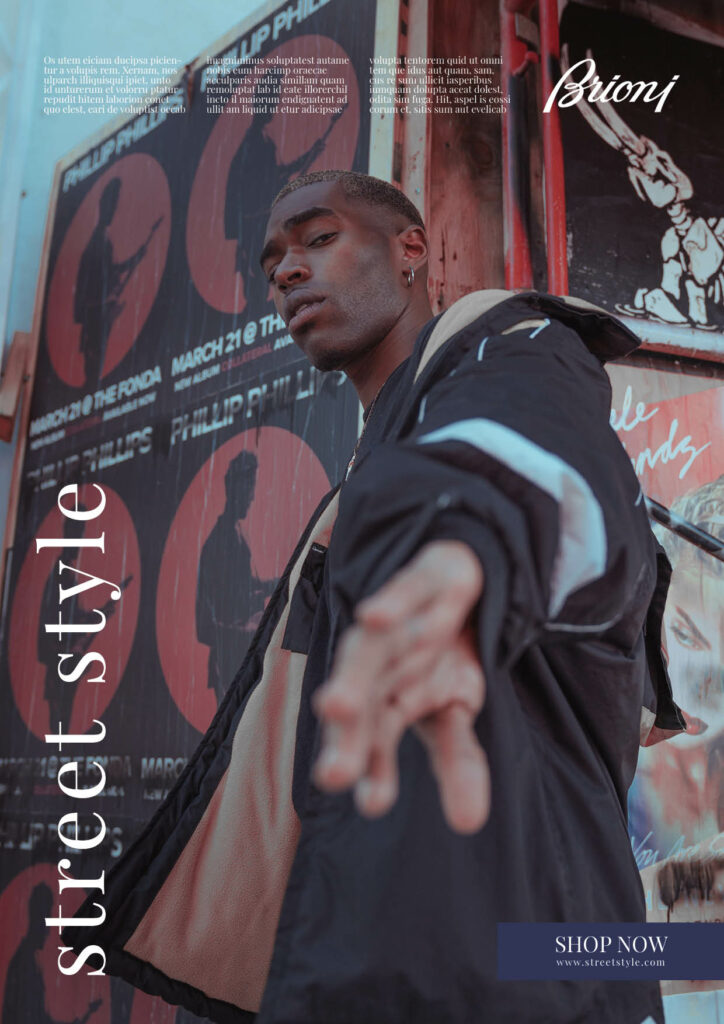
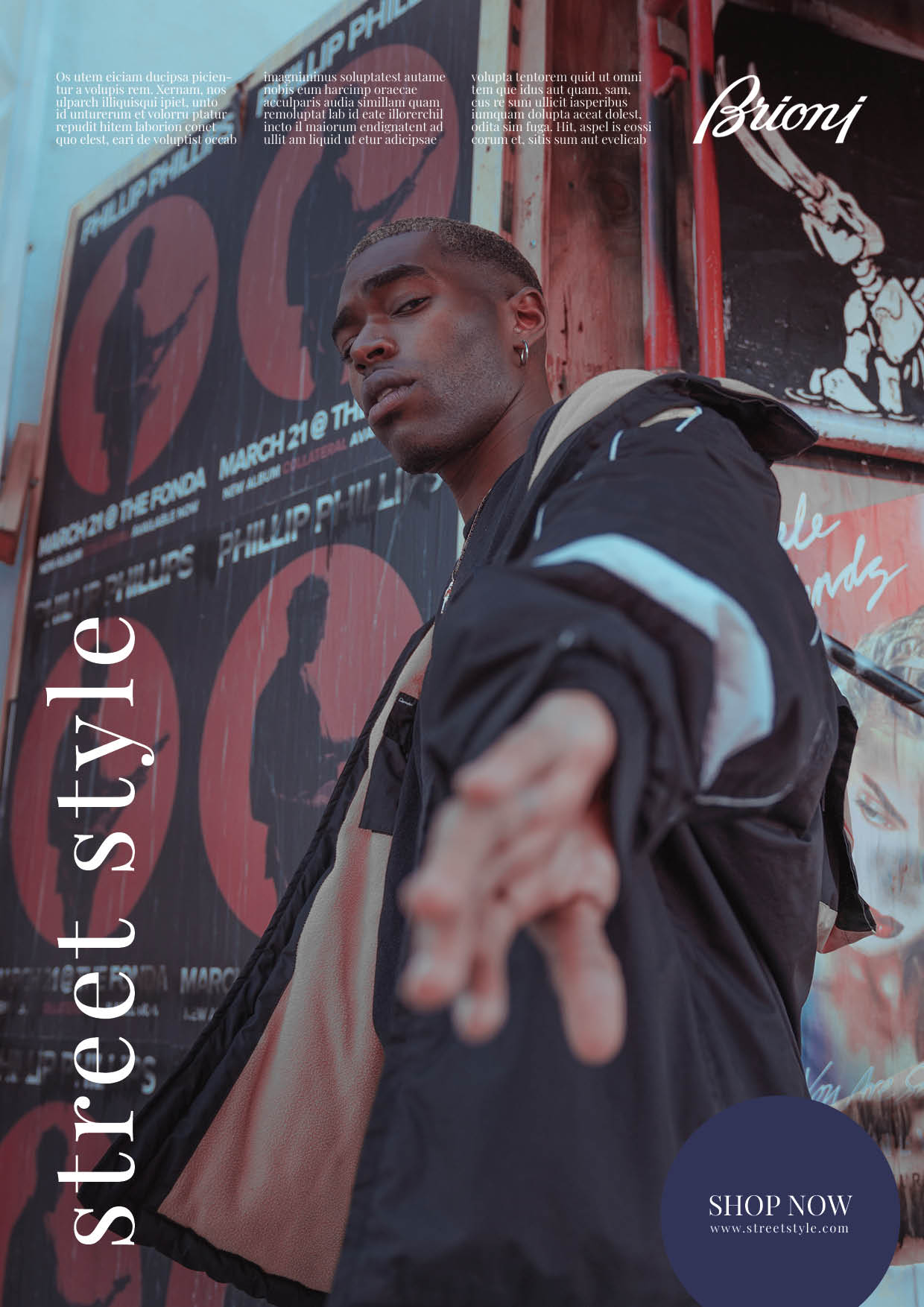
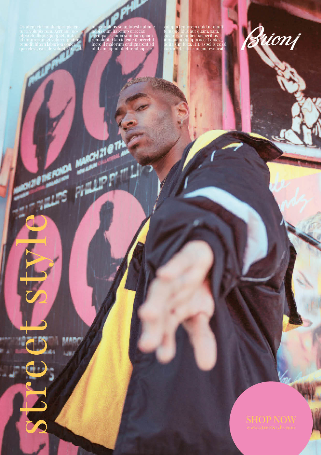
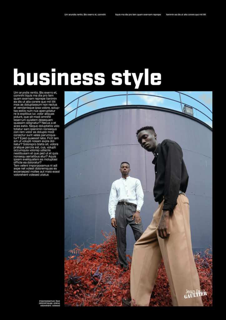
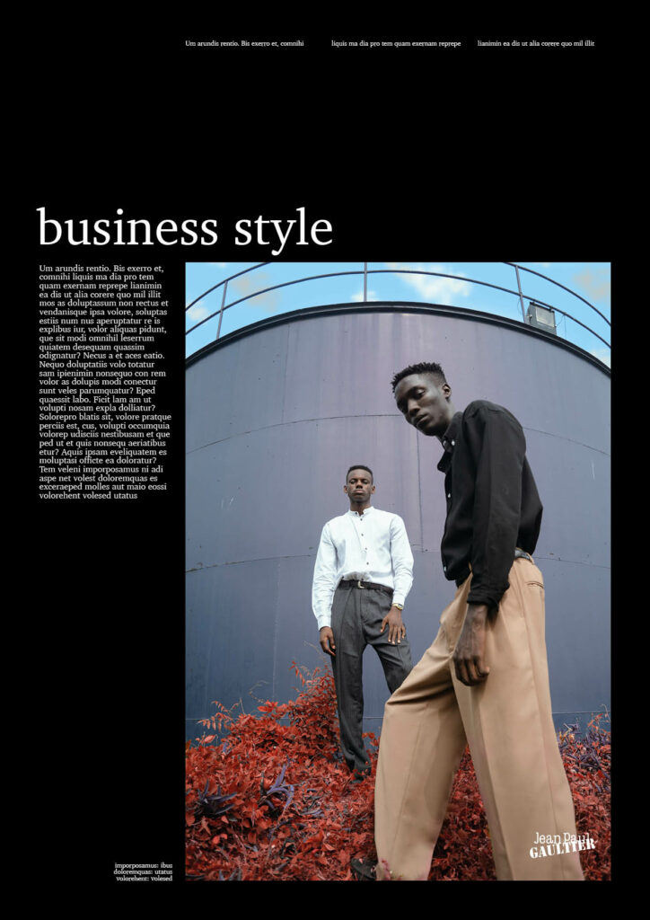
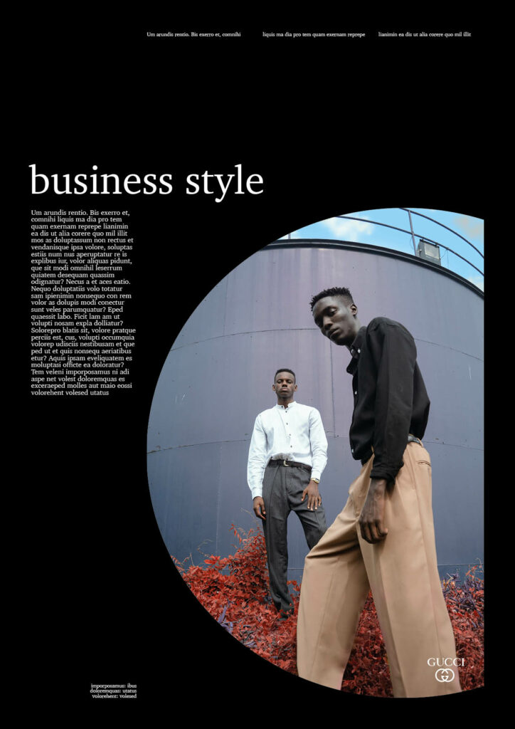
To stay within the topic of fashion branding, I decided to firstly experiment within the fashion graphic design industry. I structured the experiments based on different fashion styles as I think different styles are more likely and some less likely to be considered “more” or “less male/female. Based on “male” considered images, I changed components within typography, logos, graphics and lastly colours to showcase the process of adding more and more stereotypically considered female components of design. Here is the outcome:
Experiment 1: Street style
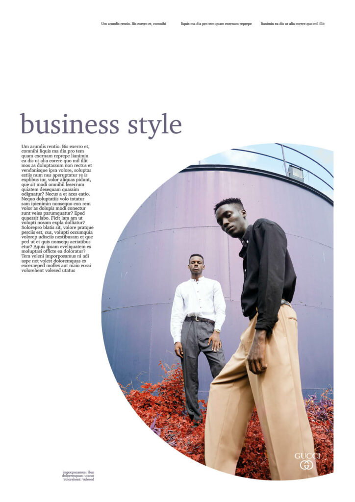
Experiment 2: Business style

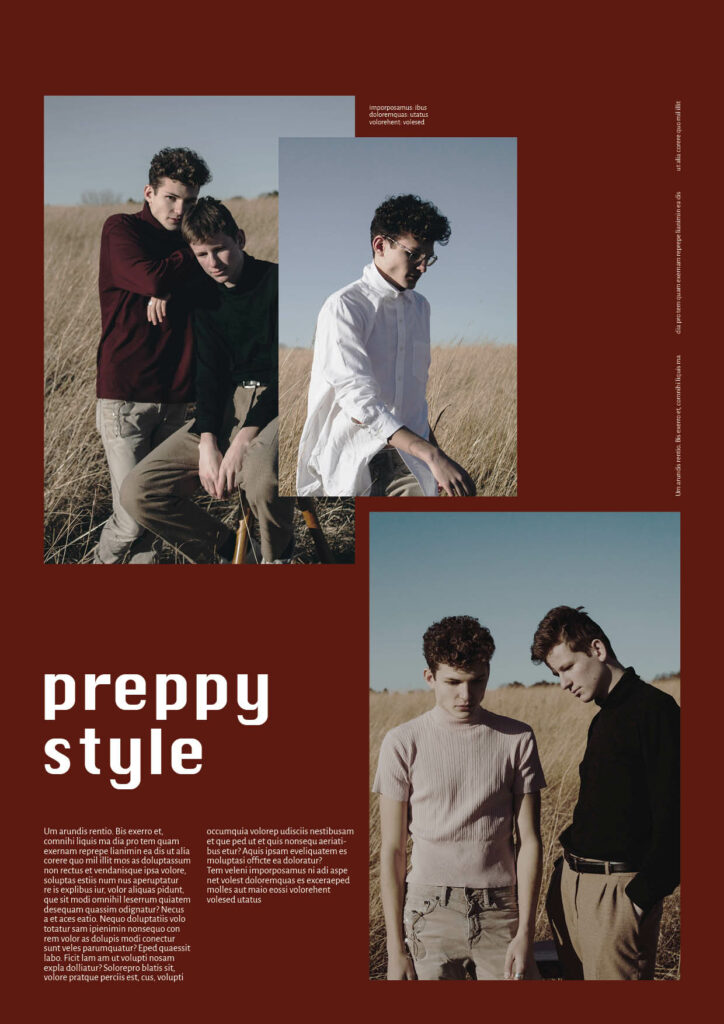
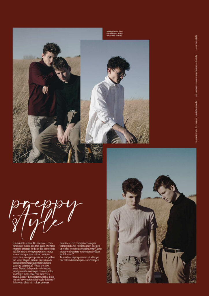
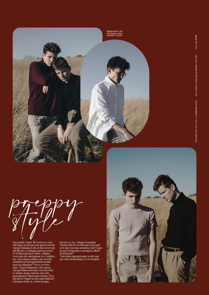
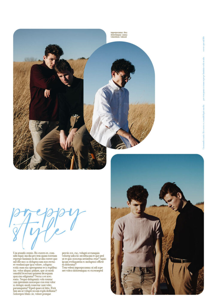
Experiment 3: Preppy style
Thoughts
As I assumed I feel it’s quite hard to make male dominated pictures “more female” only through changing characteristics such as typography and graphics. Even after completely changing colours of the design, I think the designs still are quite male dominated through the imagery. This makes me assume that imagery has a very high impact within gendered design. Colours as well as typography however, also have quite a large impact, whereas graphics and logo have less. As assumed in fashion styles like “preppy” it was easier to regender the design and make it more stereotypically female, whereas street style and business style was harder. The outcome to me actually feels more feminine despite the “male” imagery. I am excited to see if the female imagery shows a similar outcome, as previous research suggested.