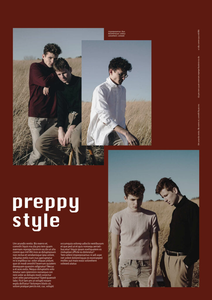
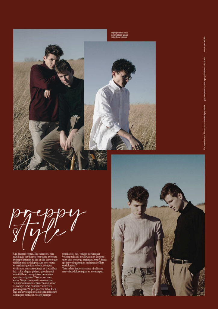
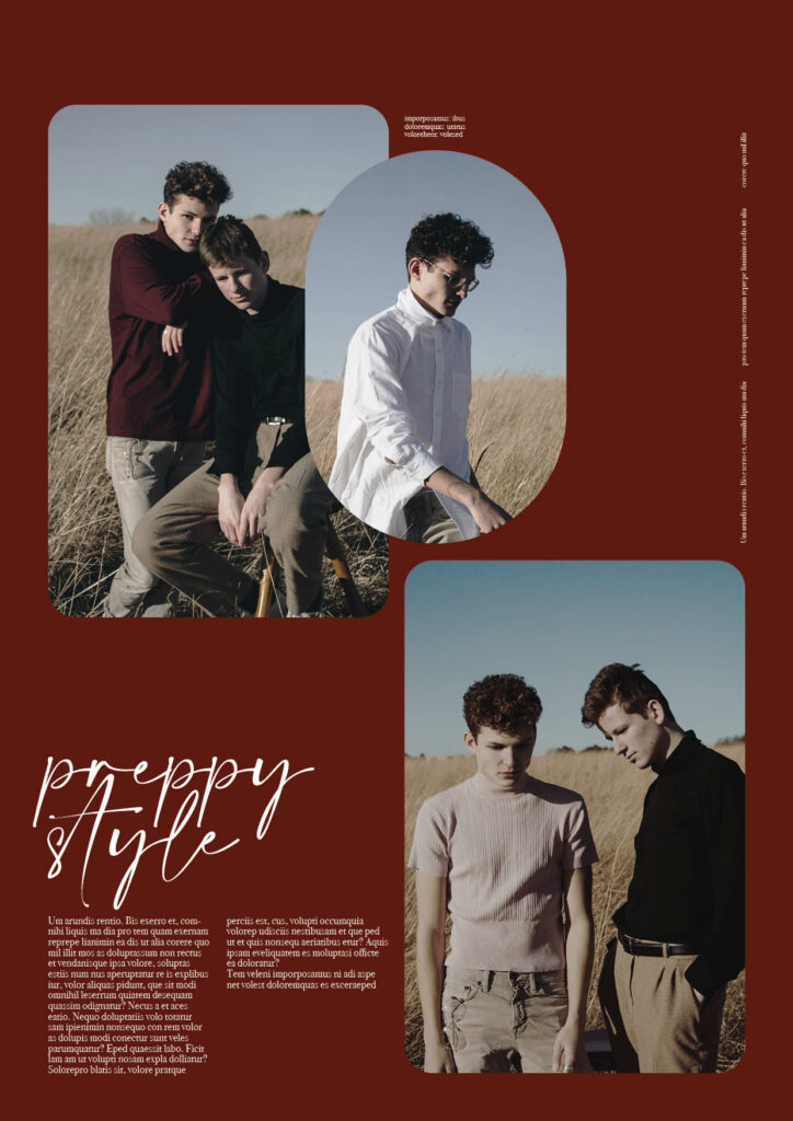
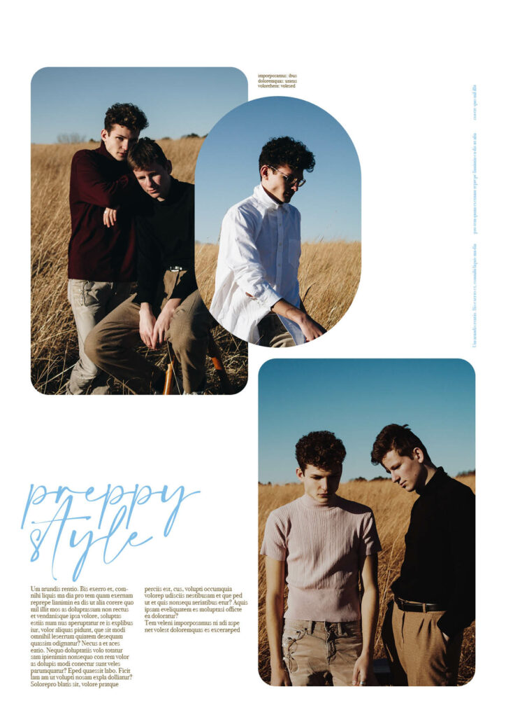
NOTE: In order to make communication easier, in this blog post I will refer to stereotypically perceived male design attributes of the components of a corporate identity (image, logo, graphics, logo and colours) as “male” and typically female assigned as “female”. As this bases on stereotypes it in no way suggests that this is always the case and that design attributes can be categorised in such a way. Society nowadays is so diverse and ultimately the division into male and female is not possible. However as it was my aim to find these “grey areas” between stereotypically male and female design to be able to pinpoint where gender-neutral design starts, I will use these stereotypical assignments I researched in semester 1.
My aim for the semester was to test gendered design and what characteristics make a design more targeted towards a certain gender. I was hoping to see if there is a generalised formula you can utilise if you want to adapt branding/ design to be considered gender-neutral. I wanted to keep a certain aspect to base the design on and decided to keep the imagery static while step by step changing other gendered characteristics like typography, graphics, logo and colours.
After having experimented with different layouts and different industries using gendered characteristics, the outcome can be found in the specific blog posts. Here is the detailed analysis.
Experiments in fashion
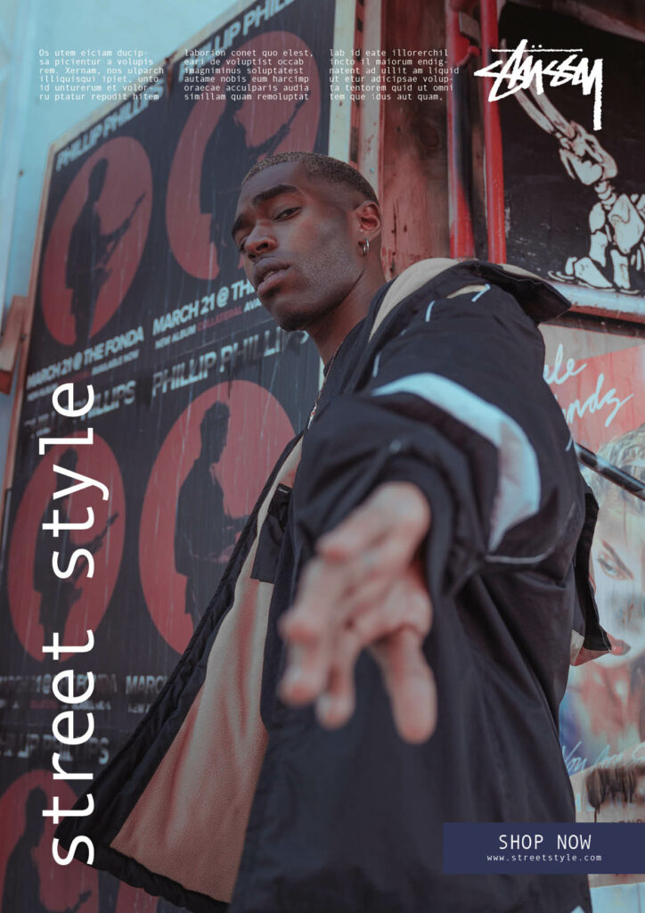
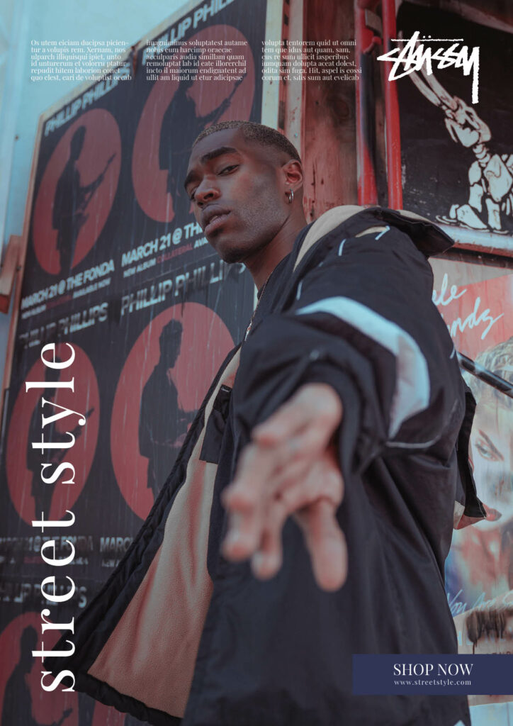
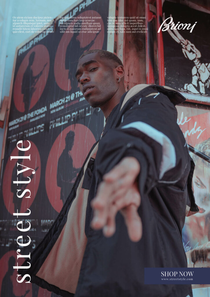
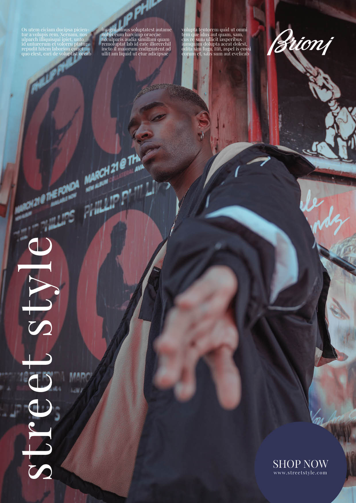
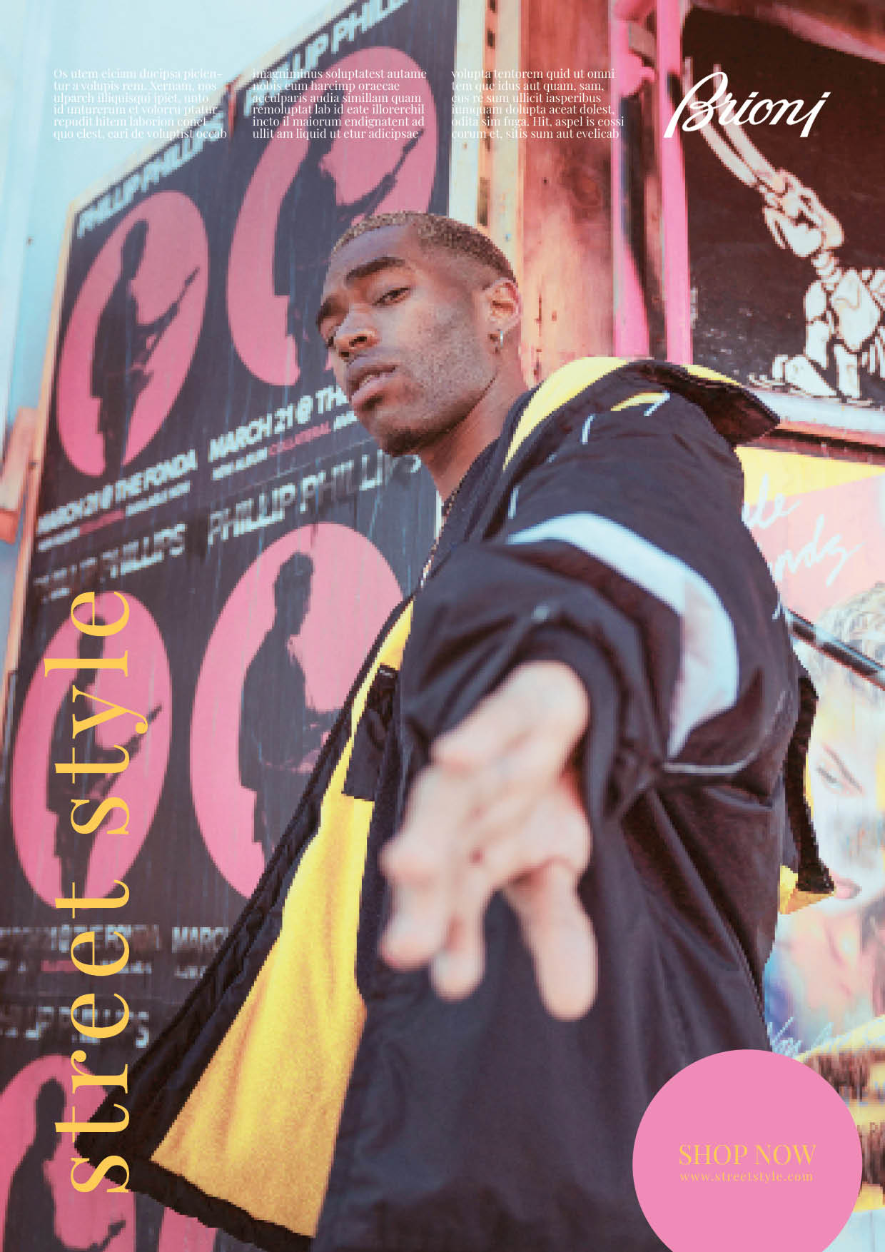
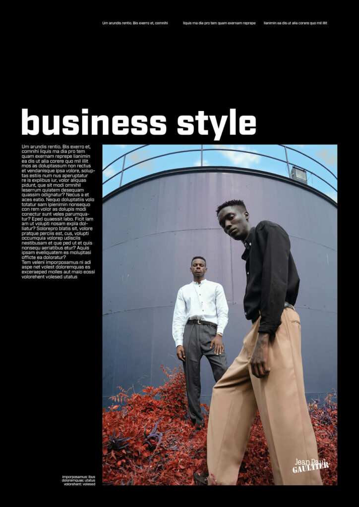
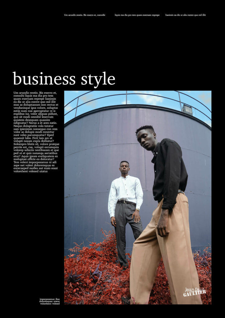
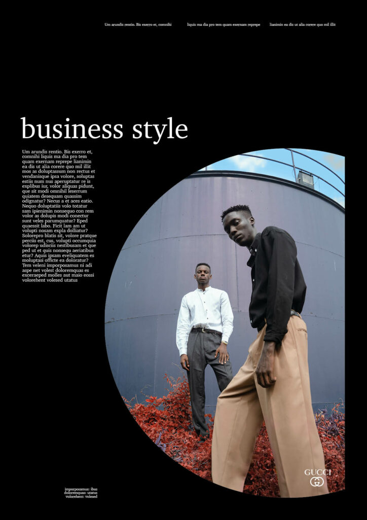
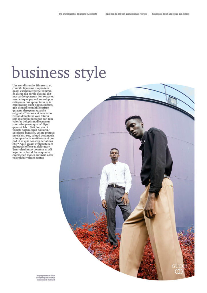
MALES. What I already expected before starting to work with designs for fashion imagery was that there would be differences between the different styles and their perceived gender. Street style on the one hand is usually perceived very male, however in the last few years has started to shift to often being unisex. Therefore I wanted to see if this change has impacted the way we design for this style industry. I also wanted to take a closer look at other styles like business which is still very classic and therefore more targeted towards males or “preppy” where the male fashion is often already quite feminised. In general, I was also aware that choosing imagery that only portrayed men, would influence the perceived gender already a lot.
I have to say I was quite surprised by the outcome of the fashion experiments. In the areas, like street style where I expected the transition to be easier, I feel like the step-by-step targeting towards women did not completely work but on the other hand, the imagery related to business was more successful. I do believe the “moods” of the images here had quite a large impact on the design as a whole, so perhaps using imagery with both genders would make this easier. As already stated throughout the different experiments, I felt like the images, typography and colours had the most impact in the end, so I started to focus on those.
FEMALES. Here I also structured the experiments into categories and expected some areas like street style to be easier to make perceived male and high fashion to be the 2nd. Accessories (sunglasses, beauty, scarves) I expected to be the hardest as this is an industry typically targeted towards women.
In general, it was a lot harder to change female designs to male, as expected. From the research in the first semester it was clear that male stereotypes of being perceived less strong aka. female was associated with failure as a man, so this transition not working does not surprise me. In the areas like street style, however I feel like it was easier.
Experiments in other industries
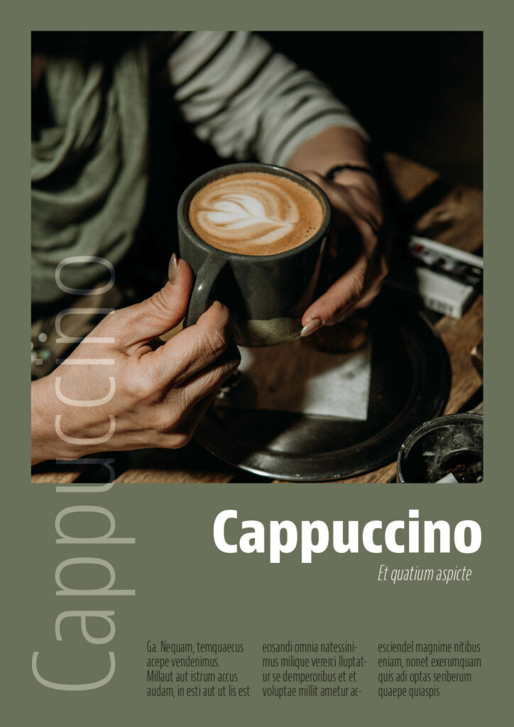
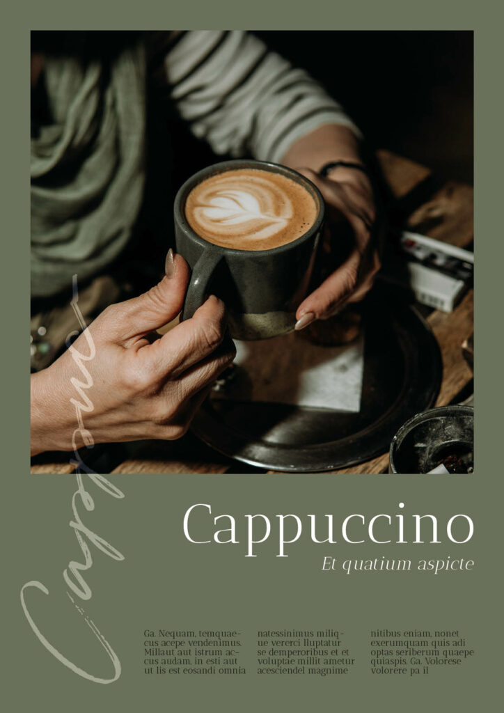
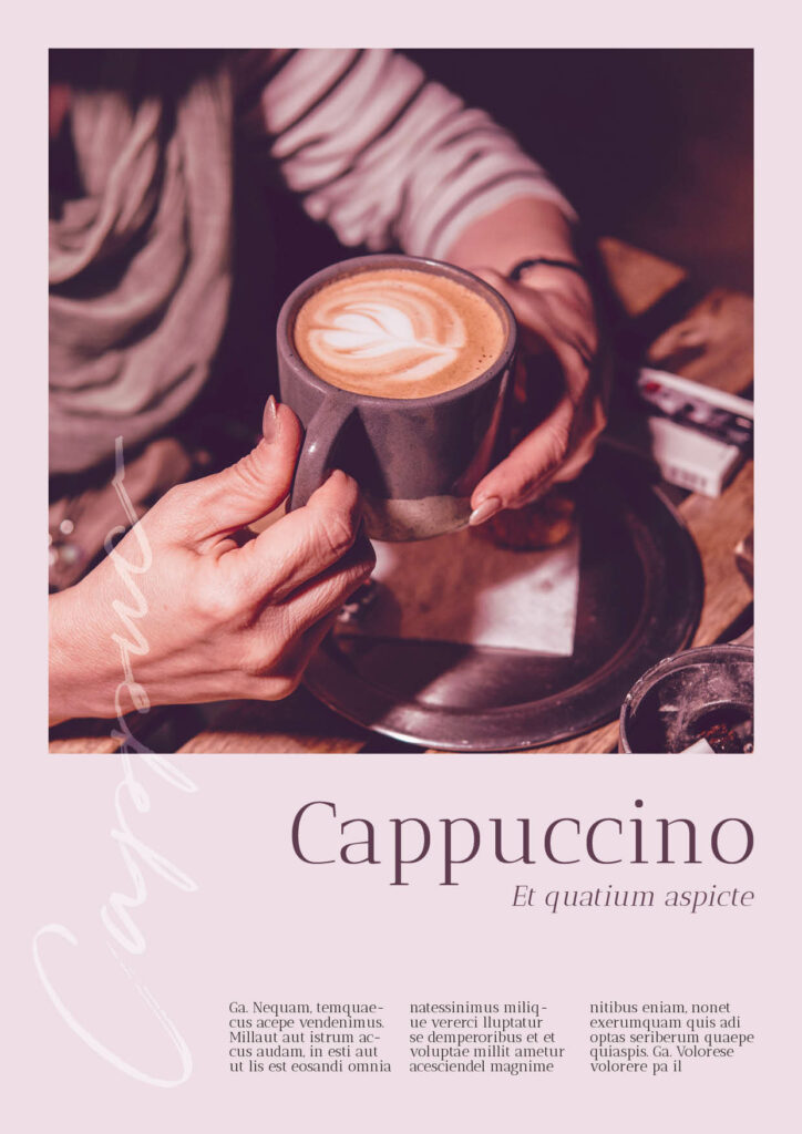
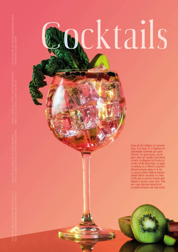
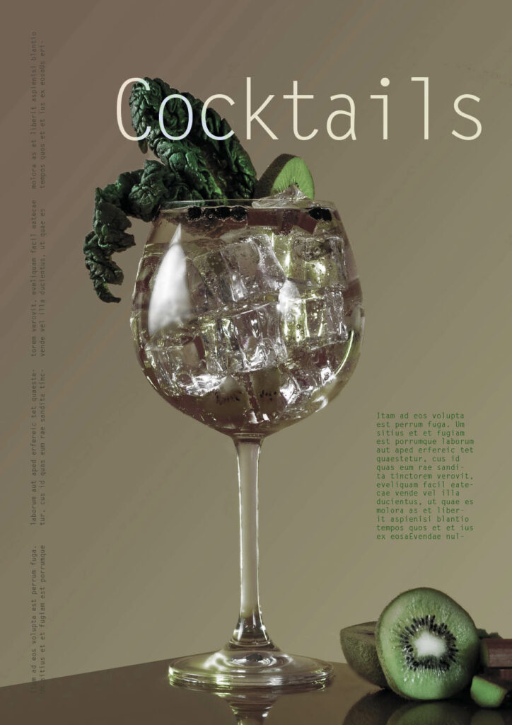
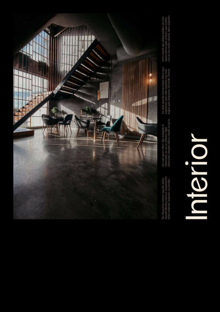
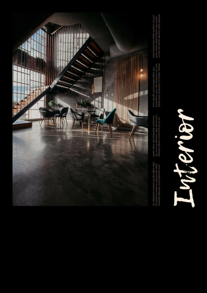
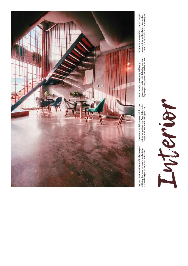
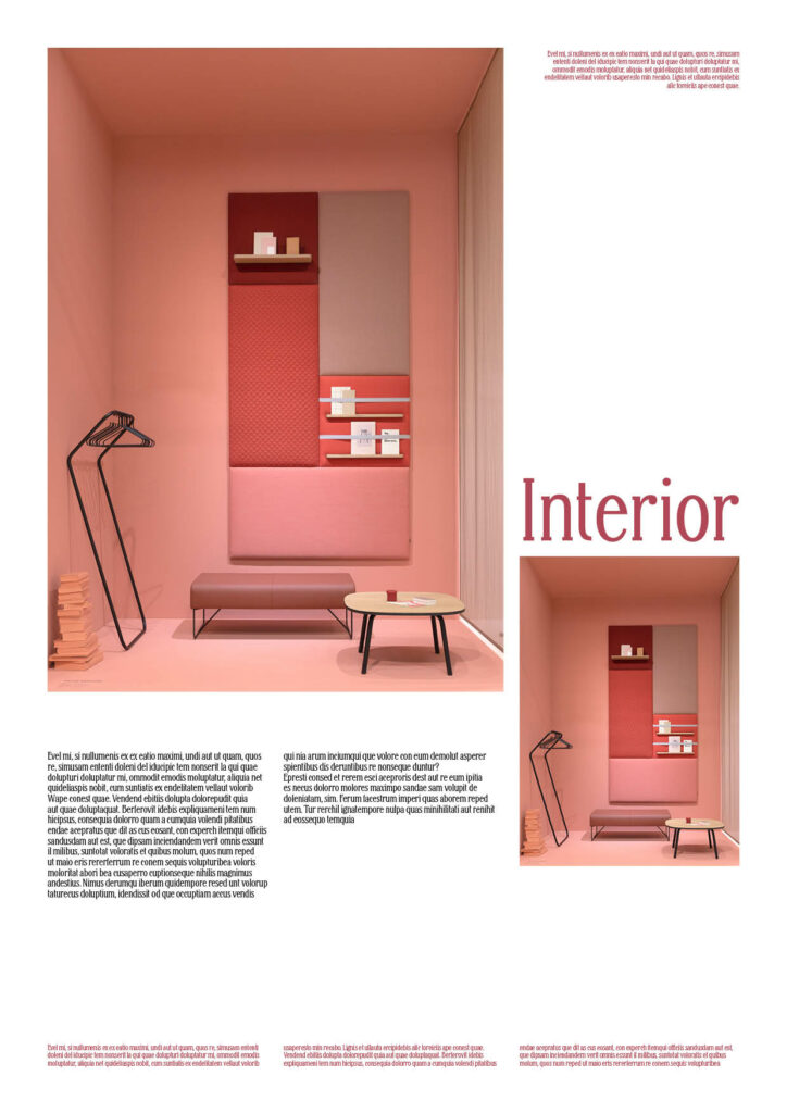
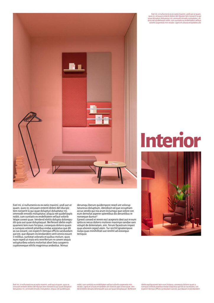
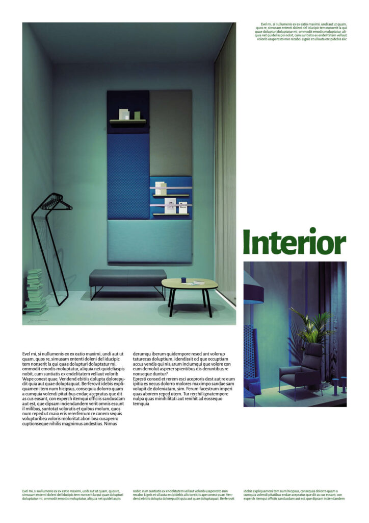
As touched upon before I wanted to analyse if people effect the way we perceive a gender in design. For that I chose the categories product (drinks) and interior design as both are very diverse and rather gender-neutral. Here I could really closely analyse the impact of different components of a corporate identity.
For both product and interior design, I feel like the transition to the opposite gender worked. As assumed before the lack of people and therefore gender-neutrality probably helped with that. Here I think the colours were the biggest impact on the design and usually were, in my opinion, the point of transition. In general, these industries provided a lot of space for interpretation and gave me room to experiment quite a lot.
Conclusion
In general, it can be said that changing the perceived gender is not as easy as it seems to be. A lot of factors also play a role that are not taken into consideration between the components of a corporate identity like the mood of the imagery, the presence of people or the often associated gender with an industry (like cars, sports, beauty, etc.). As assumed, turning male into female designs was much easier due to the societal issues with masculinity vs femininity and the female “disadvantage”. However some industries where a change is on track, like in street style, it is not as big of an obstacle. I do believe however, that I have not as hoped discovered clear “grey areas” which indicate gender-neutrality and can give an indication on how many female vs male characteristics equal gender-neutral design. I believe it has much more to do with a lot of other factors that have be considered individually when wanting to design gender-neutral. Some factors do have a larger impact than others, like colour, image or typography but in the end, unfortunately there is no “one rule fits all” solution to gender-neutrality in design.
