#4 AR in e-commerce – what’s already out there?

The fourth in the league of blog entries on the topic of UX in the fashion industry offers some examples of companies that are using augmented reality for their e-commerce businesses. This part of my research is dedicated to find out how companies include the technology and what goals they are pursuing with it.

According to IBM’s 2020 U.S. Retail Index report, the pandemic accelerated the shift to digital shopping by roughly five years. According to a Neilsen global survey from 2019, consumers listed Augmented and Virtual Reality as the top technologies they’re seeking to assist them in their daily lives. In fact, just over half said they were willing to use this technology to assess products. AR has proven that it can add enormous value for consumers in the shopping journey. Therefore, some brands are already re-imagining retail to provide a better shopping experience for their users.

Taking a look at existing products

A virtual “try-before-you-buy” experience is already implemented by IKEA, offering a free App called IKEA Place. The app lets users virtually place furnishing in their space.

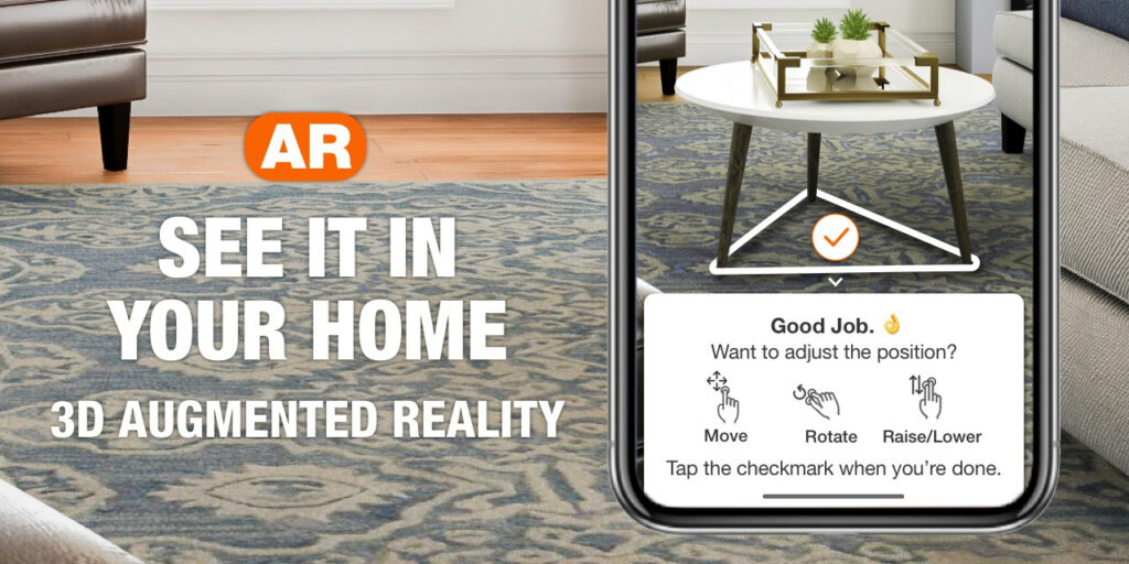
The home improvement retailer Home Depot added augmented reality capabilities to its app and mobile web before the pandemic. The feature helps lift engagement and conversion as consumers spend more time shopping on their phones.
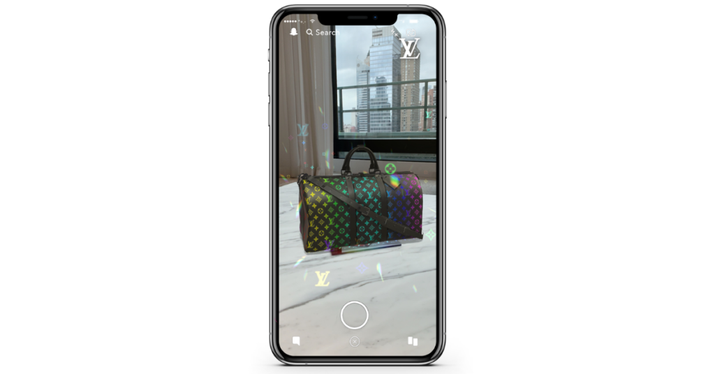
For consumers to virtually try on luxury fashion, AR became an essential tool for brands such as Louis Vuitton and Gucci. Among some innovative AR collaborations, Gucci launched a virtual shoe ‘try-on’ called Lenses through the Snapchat platform.
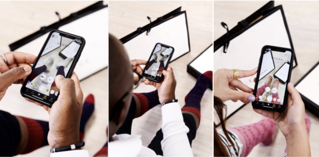
Gucci’s virtual shoe try-on
With AR, Louis Vuitton allows users to play around with their luxury products

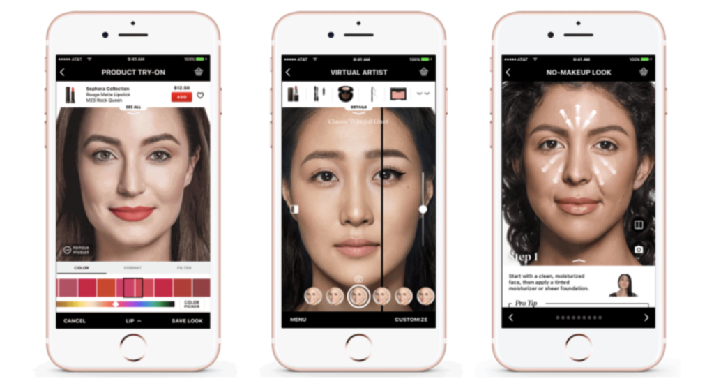
Physical stores reopening again, requires a high level of hygiene and safety. In response beauty retailer Sephora offers customers to test out makeup products with AR. Another beauty retailer, Ultauses the app GLAMlab to increase customers engagement to find the right shade of foundation.
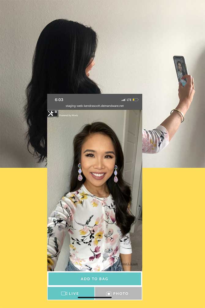
The jewellery brand Kendra Scott introduced an AR tool enabling customers to virtually try-on different earring styles from the comfort of their homes.
All AR examples have the same aim: to help consumers to find the right product by offering them a preview of the product. Ar in retail seems to work and boost conversion for products such as furniture, home appliances, accessories, jewellery, shoes and makeup. Nevertheless, I couldn’t find running AR applications that are used for trying on clothes virtually and helping customers to find the right fit and size. Since body types differ enormously, clothes look different on everybody and pose a great challenge for implementing AR in the online shopping experience for garments.

In order to make this topic more tangible, I will take a look at the approaches of size guiding of clothes in online shops. The next blog entry will show best practice examples of size guiding online.

REFERENCES

https://www.ibm.com/thought-leadership/institute-business-value/report/consumer-2020

https://hbr.org/2020/10/how-ar-is-redefining-retail-in-the-pandemic?registration=success
[Data Safety #5] Dark Patterns. Practical Examples

Good afternoon! I guess it was time for this series of two posts in which I finally show examples of what a good design and a bad design of the cookie window is. In this first post I have tried to select some cases that seem to me evidently malpractice, since they guide the user towards a specific option, biasing their choice when selecting their privacy policy.

These types of design are known as Dark Patterns, I will not go into further detail with them because my classmate Ana Mitterhauser is doing her research specifically about them. So, we go directly to show some of these applied to our specific topic:

Misdirection/Aesthetic Manipulation

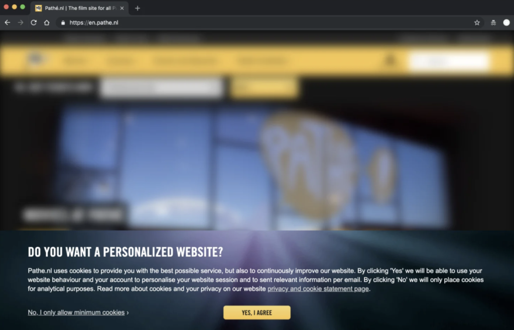
This is the most common, it is a type of manipulation in which the design put the visual focus in the button “Accept all”, forgetting the rest of the options given. This can be done either by the use of color, size, font…

Examples:

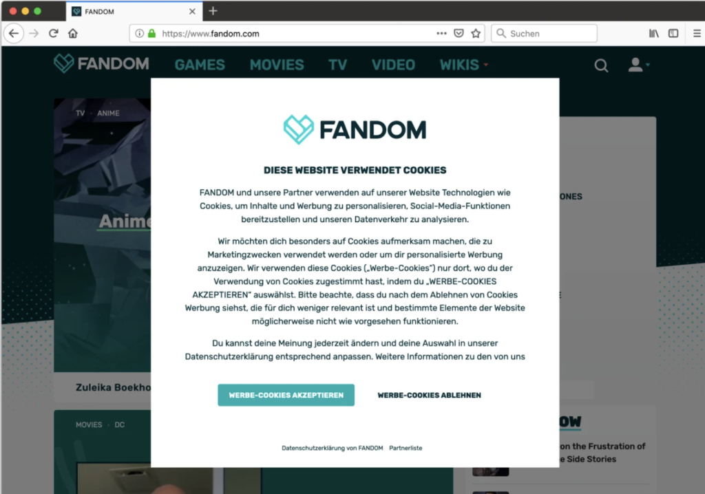
  • Fandom: In this case the “OK” option is more prominent and guides the user’s eyes. In addition, shading the rest of the page inclines the user to that option since they believe that if they do not accept they will not be able to access the content.
  • The guardian: As in the previous case, the background darkens and blurs slanting the user. In this case the option of not accepting cookies differs more clearly with a different font (in lower case), without color highlight and placed in a corner of the page while the other option is in the center.

Privacy Zuckering

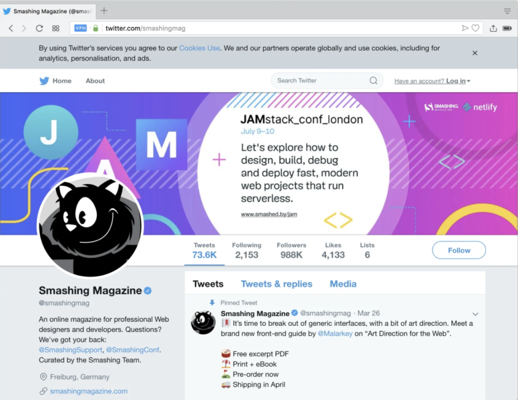
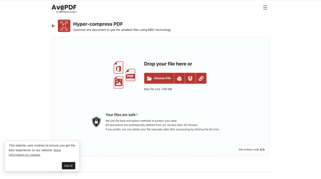
Perhaps the best known, it is directly the design that takes care of deceiving users to share all their personal data. Despite being regulated by law in this type of patterns there is no clear output for the user to not accept or modify the data policy.

Example:

  • Twitter: Informs you that cookies are used, but there is no option to adjust preferences, nor to give your explicit consent. Closing the cookie window on the top right button will be interpreted by the website as having accepted your policy.

  • AvePDF: informs you that the website uses cookies, however, does not give the option to accept or reject but directly from “okey”. The user is not informed that there is another alternative, believes that the only way to avoid giving their data is not to use the web.

Laberynth

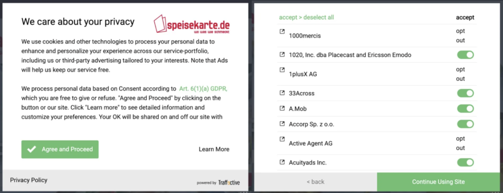
Even in spite of all the examples above, once you pass the “first phase” in case you have chosen the options relating to setting cookies or reviewing the privacy policy another page will open in which you will be shown your options. Sometimes they have a more intuitive design and other times it’s a complete maze from which you don’t know how to get out or what you’re doing.

Example:

  • Speisekarte: In this case it is not only an initial aesthetic manipulation, but if the user clicks “Learn more” hundreds of different selection options appear in which he has to cycle one by one. It doesn’t sound a very interesting plan. Furthermore, the “reject all” button is virtually invisible for the user to continue with their initial decision.
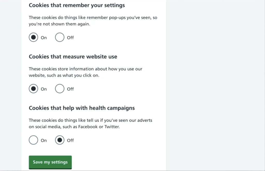
  • NHS: In this other example, in case the user wants to customize their privacy policy, they are presented with a list of options that are already selected as “on”, in addition to not presenting a “reject all” button to make the implementation of the user’s decision more efficient.

Conclusions:

Once you have the habit of rejecting cookies by default, you are more receptive to finding many cases of questionable practices on the internet that do not seem to make life easier for the user but for the business behind the page. In fact, they succeed, and for many users, trading privacy is an acceptable cost for all the wonderful benefits that all those giants provide for nothing. However, not everything is negative, we can do something to change it and improve people’s lives, not only with regulations that protect the user but with UX/UI designers who design with the user in mind and create a relationship of security and trust between the brand and the user. We have in our hand the possibility of generating a more ethical and transparent design. In the next post I will give you examples and tips of how to do it.

That’s all for today, have you found any of these examples in your day to day?  I’m sure now that you know you won’t be able to stop seeing them!

See you!

References and literature:

[Data Safety #4] Interviewing users

¡Happy New Year 2022!

Finally I was able to take advantage of the Christmas holidays to make use of my close circle for conducting a few interviews with the end users. Perhaps it is not the best methodology, since we have no specific product to develop, but I have focused it as a continuation to deepen and test the initial results of the survey type test that I showed in the previous post. I hope that the results of the research can be extended in this way.

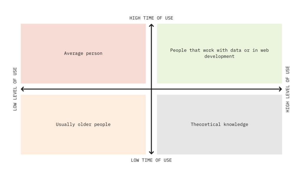
Having as a public any user of the network, I have tried to establish two key parameters when selecting different profiles for interviews:

–  Level of use

Here I divided people who design, program, or work with sensitive data. In general, those who are not only users, but are also part of the structure that handle data. On the other hand, we have those who are only passive users of this type of service.

–  Time of use

For this one I made a simple division between people who are most exposed to the internet and spend more time per day on a screen, so they are accustomed to read and understand the architecture of a web, as well as react agilely to pop-up and visual inputs. And with those who spend less time than average at day or week in front of the desk or with a mobile device.

This division seemed to me more accurate and efficient to establish a demographic categorization by age, gender or studies; since they are factors that I think relate directly to the user’s response to the cookie window.

Diagram 2×2

Understanding the division and choosing at least one person to cover each quadrant to be able to cover all combinations, I planned the interview script as follows:

  1. Introduction in which the person presents himself and recounts his or her living situation: studies and career.

Examples of questions: how old are you? what are you doing with your life? do you study? do you work? In what?

2. Relationship to technology, time of use.

Examples of questions: Do you get along with computers? Do you work with computers? Do you use computers in your day to day? Do you think you are dependent on mobile? Do you think you could stop using it if you wanted to?

3. Feelings/beliefs regarding the issue of data security and cookies

Examples of questions: Do you feel sure leaving your data on the net? Are you afraid of what they might know about you/do with them? What do you feel when an ad appears about something you’ve said, previously searched for? Do you do anything to avoid giving out your data? Do you mind being asked about your data or consent?

4. Specific question about the design of the cookie window and/or your rights as a user.

Examples of questions: What choice of days when you get the cookie question? Do you know if you can ask a platform to delete your data?

Conclusions

I do not plann to make public the literal transcript of each of the interviews, only to highlight the differences or surprises I have had when analyzing the users answers to each question and sharing it. In general, all the answers were similar to the majority percentages of the test type, they worry about the use of their data for purposes you do not know; but nevertheless they do not hesitate to accept without reviewing the conditions of each website in relation to data protection.

There were some comments that were repeated and that had not been included in the previous test questionnaire as the recognition by the average user that their data is given as payment to access internet content free of charge. For example, YouTube ads in their videos annoy them, but as they are given the option to pay to access the content without advertising interruptions, they accept better to watch the add. It seems that this fact is related in the mind of the user in the same way by changing the advertising vision by its data transfer to advertise its profile; that is, as a transaction in which the user, the advertisers and the owners of the website participate. Thus, they give their data when they believe that the product they access (the website) cannot be given to them if they do not give something.

Another interesting behavior is that most users understand that their data can serve as specific advertising purposes in their profile, many recognize that after searching for a product in the network appear ads of this same product. However, they consider that it does not affect them, that is, that the belief of knowing the functioning makes them assume that they will not be affected by the ad, that it will not achieve its purpose because they are not sensitive to it.

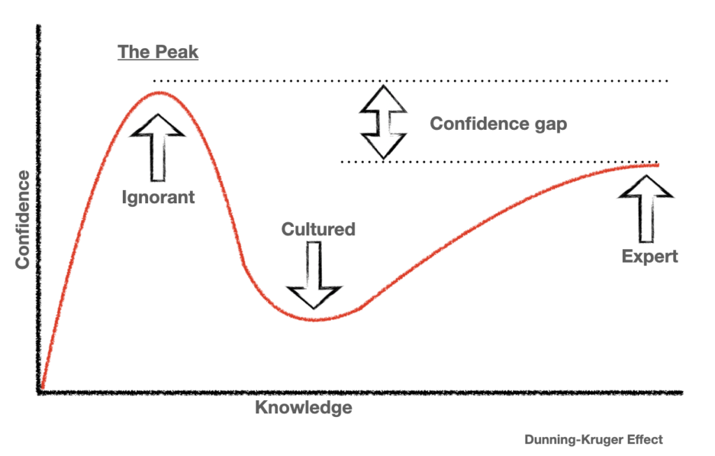
It seems a dangerous belief and also a false one, the fact of knowing how something works does not exempt you from being affected. And, in fact, it makes you more likely to be fulfilled without you noticing as you reflex less about it (Dunning-Kruger effect). It is also a false way of thinking since they only believe they know what it is, but only relate them to a known and partial part of the uses that can be given to their data. This does not seem to affect the user who is in the top right quartet, that is to say those who work with data, who are also the only ones who correctly answer questions about their data rights. This type of user understands that he is permanently exposed to this type of manipulation and tends to protect more which websites access part of his data.

Drunning-Kruger Effect

As final information-pill, some users claim to try to “confuse” the algorithm by subscribing to product websites that would never look for or searching for items that they do not need so that the profile they have of this does not resemble reality.

What do you think of this trial?

Thank you very much for reading me, see you in the next post where we will see negative examples (dark patterns) of cookie window.

References:

  • Designing for the digital age by Kim Goodwin

[Data Safety #2] User’s rights

As I commented in my first post the GDPR was approved by the European Commission in 2018 to protect the privacy and rights of individuals with regard to personal data. These rights apply to any person whose personal data (PD) is processed by a controller or processor.

  • Personal data (PD) is any form of data that can be used to identify a person. It obviously refers to your name, identification number, location data and online identifiers, but also to physical and demographic factors such as physical, psychological, genetic, mental, cultural data or even a person’s social identity and opinion.

This touches directly on aspects such as online marketing, but also on some specific areas such as health or scientific research. They would need to disconnect that data from other personal identifiers, creating identification codes to disaggregate the information. But all of this concerns developers or back-end programmers more than designers, so I’m going to make a brief list of the rights that I do think we should know impetuously:

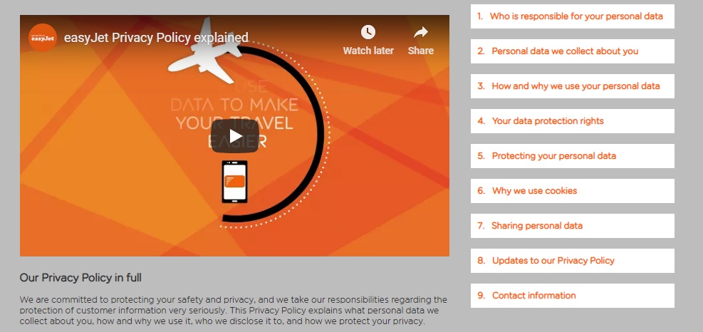
  • Right to be informed: the subject must know that their data is being used and why, among other things, a good example is this one from EasyJet:
EasyJet Screen about their privacy policy
  • Right of access: the subject is guaranteed to know what data has been collected about him and how it has been processed.
  • Right to rectification: allows the subject to make changes on their data to correct them.
  • Right to Oblivion: guarantees subjects the possibility of deleting their data if they do not want to be processed anymore and also that the controller stops storing them.
  • Right to restriction of the process: right of the subject to limit the processing of his data.
  • Right to obligation of notification: user must be notified of modifications, rectifications, restrictions or deletions of procedures
  • Right to data portability: allows the subject to request the personal data that has provided to a controller and to transmit that data to another controller of them choice.
  • Right to object: the subject can say that does not want them data to be processed or to be further processed.
  • Right to subjective data: includes not being subject to a decision based solely on an automatic process, this directly attacks the so-called profiling.

Let’s take an easy example, if in the fitness app you use to count your steps, the company decides to sell your GPS location data, it will need to inform users before and that they give you consent both to collect and store this data and for the other uses that will be given to them.

Returning to our protagonist, cookies are not only regulated under the GDPR, but also by the EU regulation of ePrivacy, which has come to be known as the cookie law. This law is interesting because aims to simplify the rules regarding cookies and streamline cookie consent in a more ‘user-friendly‘ way. In practice it, among others means that EU websites and websites with EU visitors, will not need to show those cookie consent pop-ups anymore.

Hurray, that is indeed more user-friendly and less of a hassle for website owners. For that to happen, we need to understand common pain points that users have and establish interface patterns that designers and developed could easily use. In any case, although the forms are flexible, we must remember the obligation that the site options offer users to accept or reject the use of cookies or other identifiers.

This might also work against the business goals of the company that is heavily dependent on advertising and maximizing customer fees. However, there is a fine line between techniques used to keep users on the site and exploiting their privacy.

And it will be a complicated task, because, although all the information must be provided in a clear and sensitive way, it must also be done in a comprehensive manner. The organization’s policy page should clearly show:

  • Information about the organisation that will process your personal data
  • The reason why the organisation will use your personal data
  • How long your personal data will be kept
  • Details of any other company or organisation that will receive your personal data
  • Information about your data protection rights (access, rectification, deletion, complaint and withdrawal of consent).

Most laws lag behind technological advances, so both are constantly changing. Therefore, as designers we need to take these rights into account when designing screens and interactions. All this applies not only to web design, but also to the design of mobile applications and devices with the so-called Internet of Things (IoT).

Special mention to those who work with minor subjects, since the law speaks of this group of age specifically and have different rights!

I am sorry that the post is so theoretical, but it was necessary this base to build on it, the following entries will be more based on user interviews and practical examples.

See you around!

Literature and references:

[Data Safety #1] Do you like ‘cookies’?

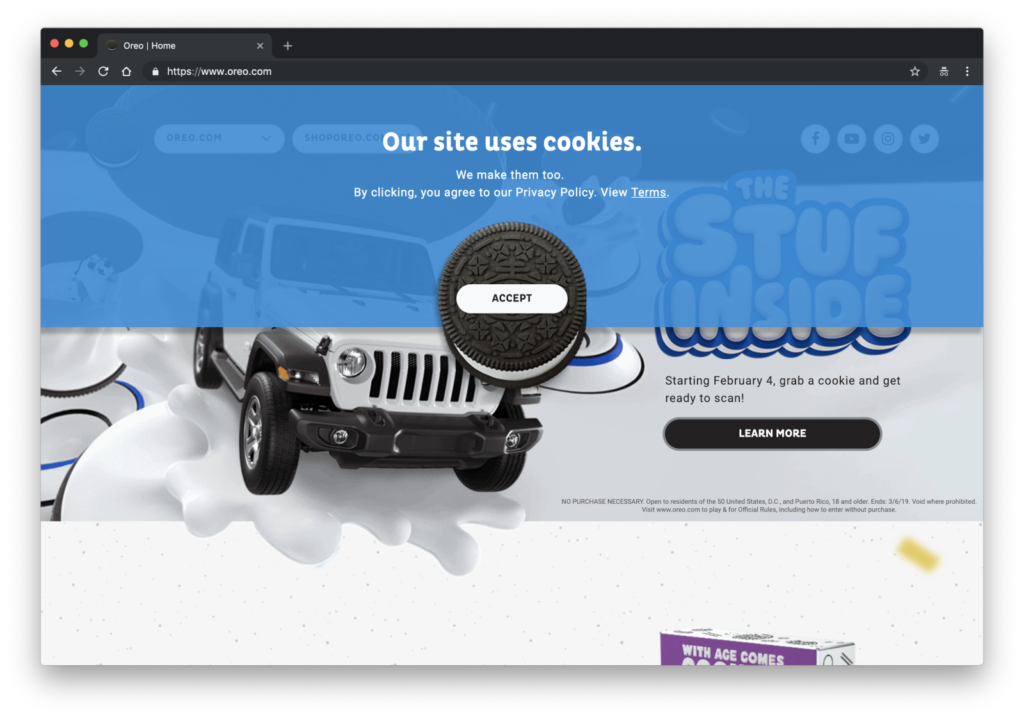
Perhaps when you have read the title, it has come to your mind a picture of those sweets made of butter, milk and flour; and even perhaps you have imagined them with chocolate chips. However, the question was about the new ‘cookies’ of the web pages, maybe this image sounds to you:

Oreo Cookies

In case you didn’t know, cookies refer to the pieces of data that the website collects from users. Before 2018 it was optional to ask users for permission to collect such data, but upon approval of the General Data Protection Regulation (GDPR) by the European Commission it is mandatory that users give their consent both for the websites to collect their data and for what they can use them.

This gives UX/UI designers the obligation to know the rights of users with respect to data protection and to communicate them in the best possible way. It is a new role and very important, since it is very complicated to establish a design that balances the right to information and a clear, direct and efficient communication. Because if it’s not usable, it’s also not safe.

Questions about accepting the privacy policy are necessary and also a tool to empower the user, however, most users are annoyed. This is due to many issues, which we must research about, but above all it is because of the constant appearance of tabs and windows that pop every time they enter a new website, interrupting them for their original purpose. This leads many times to the user accepting the terms and conditions without even knowing what they are doing. Avoiding this situation is in our hands as designers, and it is also our duty.

Data Protector

The purpose of these small pills is to provide the necessary tools and information to designers (and, of course, interested people) on this new issue. I have divided the deliveries into the following topics:

  1. User’s rights.
  2. Brief summary of interviews.
  3. Dark Patterns. Practical Examples.
  4. White Hats. Practical Examples
  5. Role of UX/UI designers.
  6. Research’s conclussions.

Follow the deliveries if you want to know more. For now, i leave this video to warm up.

See you!