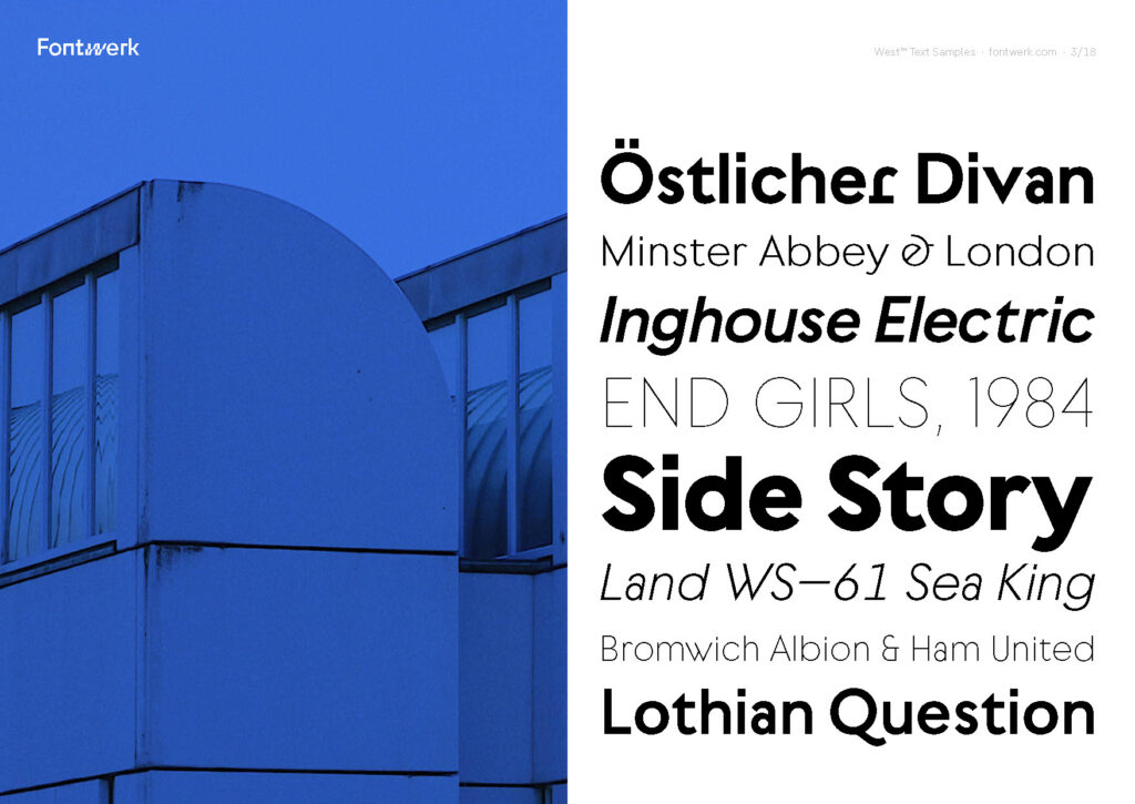
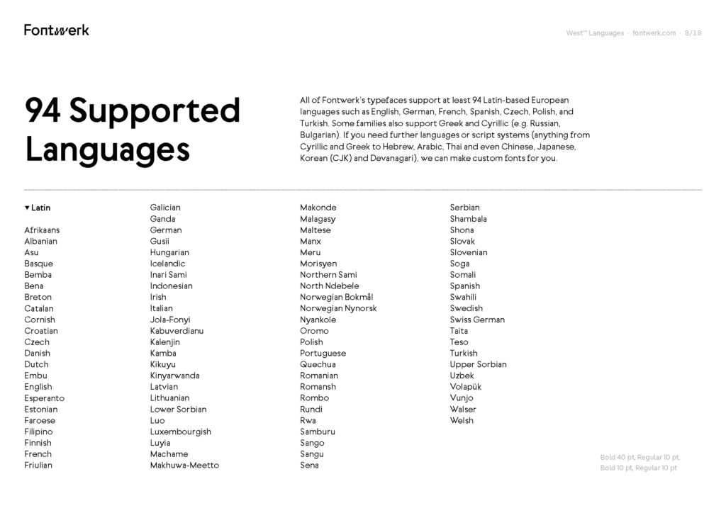
In meinen letzten Posts habe ich ja schon erwähnt, dass Recycling zwar beim Einkauf beginnt, im Grunde liegt die Verantwortung aber auch bei Herstellenden, die unklare Bedingungen schaffen, nach wie vor billig produzieren und es oft eine Frage des Einkommens ist, ob nachhaltige Produkte bzw. recyclebare Produkte ihren Weg in unsere Einkaufswägen finden.
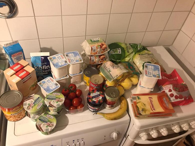
Unter “typischer Einkauf” findet sich dieses Bild auf Platz 2 der Google Bildersuche. Dieser Einkauf gehort laut Quelle einem “funktional-gekleideten, Mitte-20 jährigen, der bei Aldi einkauft”.
Eine auf den ersten Blick eher schwierige Einteilung und ob es wirklich repräsentativ ist, kann ich vermutlich bezweifeln. Allerdings lässt sich aber trotzdem ein relativ nachvollziehbares Bild davon machen, mit welchen unterschiedlichen Verpackungen wir es täglich zu tun haben. Und das ist vor allem in großen Mengen Plastik.
Verpackungen sind laut Markus Joutsela, Unterrichtender auf der Aalto Universität in Helsinki, beschreibt Verpackungen als besonders entscheidend, wenn es um Müllvermeidung oder Zirkularität bei Materialien geht, da nahezu welteit Menschen von dem Thema betroffen sind.
Every part of the packaging ecosystem and value chain is critical — from material choices, logistics and retail options to visual communication and branding. At each step of the way, there is an opportunity for a design intervention.
Markus Joutsela (2020)
Er beschreibt auch das Design als zentrales Element für die “User Experience and Education”.1
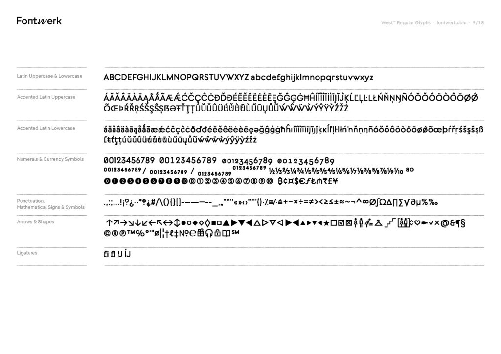
Es gibt einige Beispiele dafür in welche Richtung es gehen könnte. Sowohl kommerzielle Produkte, als auch Experimente/Awareness Projekte. Nachhaltiges Packaging Design muss, wie in einem vorigen Post bereits beschrieben keine grünen Pastellfarben enthalten, es sollte selbsterklärend sein und nur aus Komponenten bestehen, die auch tatsächlich notwendig sind und gebraucht werden. Es sollte klar erkenntbar sein woraus es besteht, wie es verwendet und auch wieder entsorgt wird.

Designers: Yang Guo, Qiaoge Yang & Wenju Wu
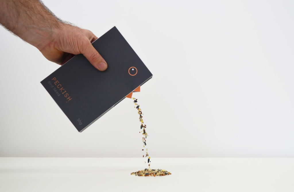
Quelle: https://packagingoftheworld.com/2016/07/peckish-bird-seed-student-project.html
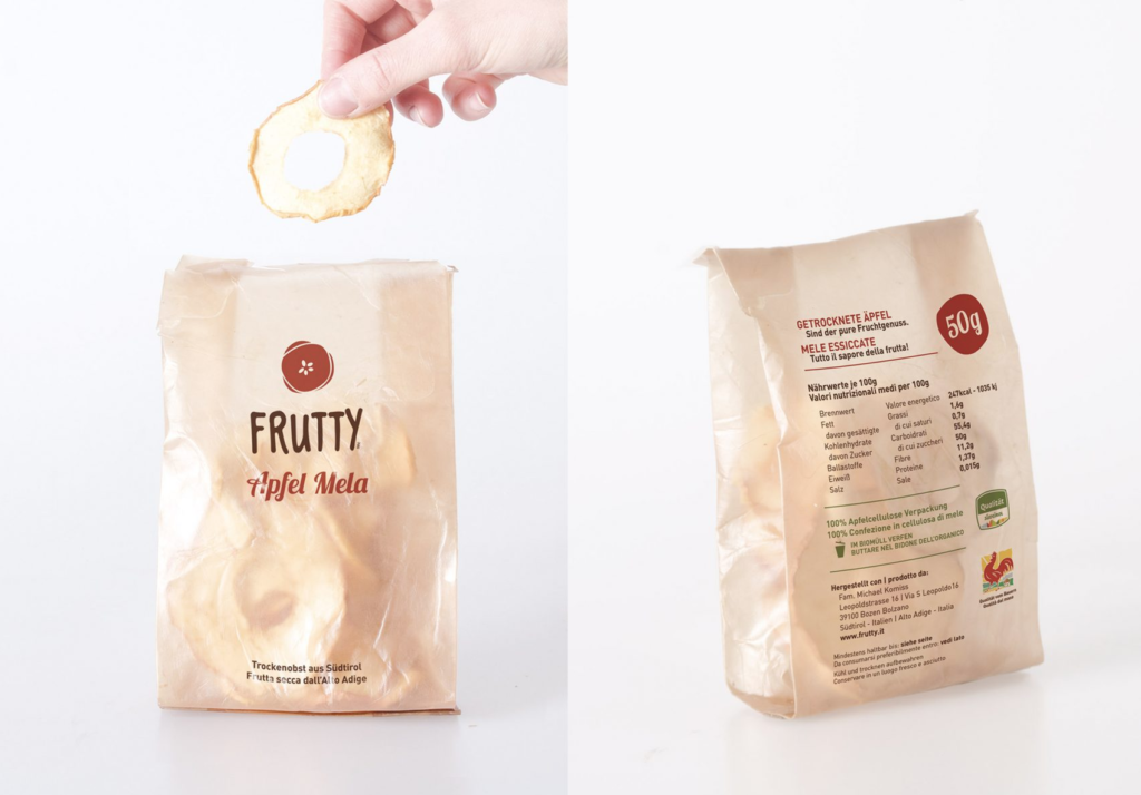
Beide Beispiele haben gemeinsam, dass es sich um Verpackungen handelt, die aus einem Material bestehen – Papier/Karton. Natürlich kann nicht jedes Lebensmittel so verpackt werden. Besonders spannend fand ich allerdings die Geschichte zum zweiten Projekt, dem Produkt für Vogelfutter. Da es sich um ein Studierenden Projekt handelt, welches online gestellt wurde, gab es besonders viele Informationen. Das Produkt entstand aus einem Kurs heraus, bei dem die Aufgabenstellung folgende war: ” Take an item from a supermarket shelf that is worth £1 (approx.) and then re-design and repackage the item and in someway give the product “added value”, so it can be replaced on the supermarket shelf and sold for double the price.”
Die Preisfrage, ob das Produkt nur aufgrund von Design einen höheren Preis erhalten sollte, ist etwas schwieriger zu beantworten. Da wir in einer Konsumgesellschaft leben, die dringend mehr Bewusstsein für ihre Gewohnheiten braucht, sollte grundsätzlich jedes noch so günstige Produkt Wert für uns haben und auch so aussehen. Der Preis eines Lebensmittel definiert sich außerdem auch oft noch durch die Bedingungen unter denen es produziert wurde und diese sind ebenfalls zu überdenken.
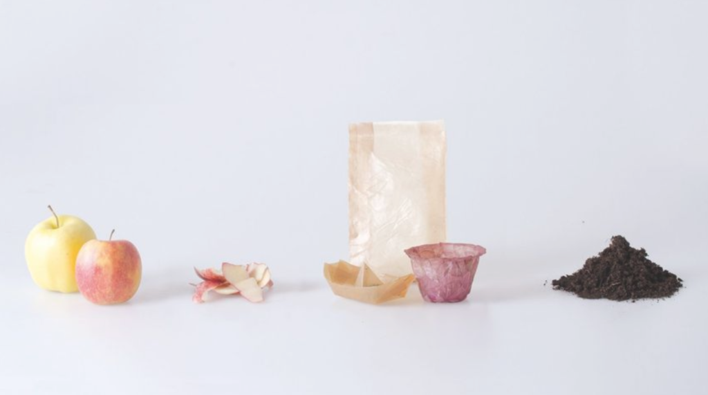
Quelle: https://www.dezeen.com/2018/11/13/sustainable-food-packaging-emma-sicher-peel/
Quelle: https://www.dezeen.com/2018/11/13/sustainable-food-packaging-emma-sicher-peel/
Ansatz der italienischen Designerin Emma Sicher, für ihr Projekt auf der Freien Universität Bozen, war es biologisch abbaubare Verpackungen aus fermentierten Bakterien und Hefe herzustellen, um ein Umdenken bei Verpackungen zu schaffen. Unternehmen sollten Verpackungen als natürliche “Schale” der Lebensmittel andenken. Daher kam das Projekt zustande aus Obst und Gemüseresten plastik-artiges Papier herzustellen.2 Ebenfalls aus Fruchtabfällen ist die “Temporary Hanbag” des Design Studios “Sonnet155”.
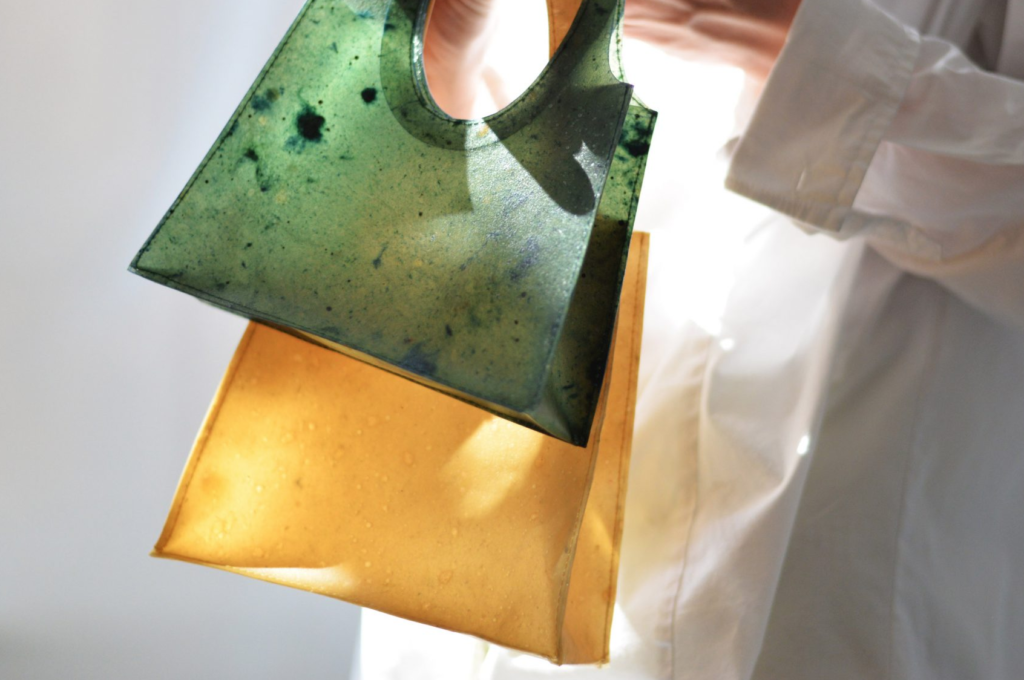
Quelle: https://www.dezeen.com/2021/04/27/sonnet155-lobke-beckfeld-johanna-hehemeyer-curten/?li_source=LI&li_medium=bottom_block_1
Doch wie sieht das Packaging der Zukunft aus? Recyclebar? Biologisch abbaubar?
Mittlerweile gibt es ein eigenes Masterprogramm in Spanien mit dem Titel “Beyond Packaging”, dass sich genau mit dieser Frage auseinandersetzt. Marc Panero, Graifker und Direktor des Masters erklärt in einem Interview über den Studiengang, dass reine Recyclebarkeit als Ansatz für die Zukunft nichtmehr ausreicht. Verpackungen müssen uns über unser Konsumverhalten aufklären. Er beschreibt in diesem Interview, dass Packaging Design bisher vor allem Markt getrieben war und die Bedürfnisse der Herstellenden befriedigen sollten. Design wird wiederum verwendet um eine emotionale Verbindung zwischen Menschen und Produkten herzustellen und damit das Kaufverhalten zu beeinflussen. Diese emotionale Verbindung muss neu konnotiert werden. Außerdem sei Packaging mittlerweile eine soziologische und politische Angelegenheit. Es gibt bestimmte, einzuhaltende Gesetze. Er argumentiert daher, dass auch andere Einflüsse aus Philosophie und Technologie in die Entwicklung von Packaging Ansätzen miteinzubeziehen wären. Unser Konsumverhalten, beschreibt er außerdem als sehr einflussreich, um Marken und Herstellende unter Druck zu setzen.3
1: Joutsela, Markus (2020): Purposeful packaging. online auf: https://helsinkidesignweek.com/2020/09/10/purposeful-packaging/?lang=en. Zugriff (20.06.22)
2: Hitti, Natashah (2018): Emma Sicher makes eco-friendly food packaging from fermented bacteria and yeast. online aus: https://www.dezeen.com/2018/11/13/sustainable-food-packaging-emma-sicher-peel/. Zugriff (20.06.22)
3: ELISAVA Disseny i Enginyeria BCN (2022). Master Beyond Packaging - Elisava. Montag, 7. März 2022 um 10:51 EST. https://vimeo.com/685507011. Zugriff (20.06.22)