While the composition should of course always be in the back of my mind while developing the logic and mappings, the part in Ableton is where the music finally comes into play. I have not found a great workflow for creating such a composition yet, since I mostly end up changing mappings around, but I think when the time comes that I know my mappings quite well, the workflow also becomes a little easier and more intuitive.
I think that Ableton is a great choice for exactly this type of application because it was developed for live settings – which this installation also belongs to. Ableton’s session view is arranged in clips and samples that can be looped and will always play in sync, without an ending time. I am mostly playing all tracks at once and use the MIDI parameters to turn up the volume of certain tracks at certain points.
Composing for this format reminds me a lot of what I know about game sound design, since the biggest challenge seems to be to create a composition that consists of parts that might play together in ways one can barely anticipate, while it should still always sound good and consistent.
For the proof-of-concept composition, I used some stereo atmosphere I recorded myself and adjusted the width of it depending on the dispersion of the particles. A pad with many voices was also always running in the back, with slight pitch adjustments depending on the particle average position, as well as a low pass filter that opens when one’s arm is lifted up and closes when it is pointing downwards. With each soft movement, a kind of whistling sound is played, that is also modulated in pitch, depending on the arms position (up/down). This whistling sound also gets sent into a delay with high feedback, making it one of the only sounds at that level that reveals the BPM. As soon as the second level is reached, a hi-hat with a phasor effect on it starts playing, bringing a bit more of a beat into the soundscape. The phasor is controlled by the average velocity of the particles. The pattern of the hi-hat changes with a five-percent chance on every hard movement. The third level slightly changes the pad to be more melodic and introduces a kick and different hi-hat patterns. All in all, the proof-of-concept composition was very fun to do and worked a lot better than expected. I am looking forward to spending more time composing next semester.
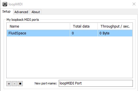
To be able to send MIDI data to Ableton, there is a need to run a virtual MIDI cable. For this project, I am using the freeware “loopMIDI”. This acts as a MIDI device that I can configure in Pure Data’s settings as MIDI output device and in Ableton as MIDI input device.
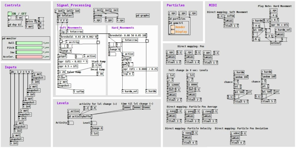
In Pure Data, I need to prepare data to be in the right format (0 to 127) to be sent via MIDI and then simply use a block that sends it to the MIDI device, specifying value, device, and channel numbers. I am mainly using the “ctlout” block, which sends control messages via MIDI. I did experiment with the “noteout” block as well, but I did not have a need for sending notes so far, since I rather adjust keys and notes dynamically in Ableton.
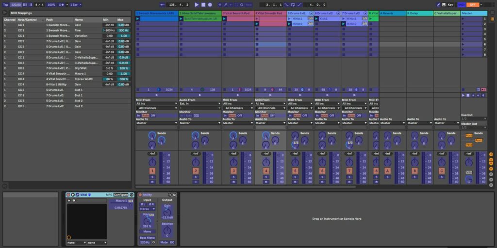
There is a mapping mode in Ableton, which lets one map almost every changeable parameter to a MIDI pendant. As soon as I turn on the mapping mode, I can just select any parameter that I want to map, then switch to Pure Data, click the parameter that I want to map to the Ableton variable, and it will immediately show up in my mapping table with the option to change the mapping range. While this approach is very flexible, it unfortunately is not very well structured since I cannot read or edit the mapping table in another context (which would be very useful to avoid mistakes while clicking).
The logic module (still in the same Pure Data patch) is responsible for the direct control of the soundscape. This comprised translating the processed sensor data into useful variables that can be mapped to parameters and functions in Ableton, ultimately leading to an entertaining and dynamically changing composition that reacts to its listeners’ movements. Over the course of this semester, I wrote down various functions that I thought might be adding value to the soundscape development – but I soon realized that most of the functions and mappings just need to be tried out with music for me to be able to grasp how well they work. The core concepts I have currently integrated are the following:
Soft movements
Great to use for a direct feel of control over the system since each movement could produce a sound, when mapped to e.g., the sound level of a synth. An example might be something like a wind sound (swoosh) that gets louder the quicker one moves their hand through space.
Hard movements
Good for mapping percussive sounds, however, depending on one’s movements sometimes a little off and therefore distracting. Good use for indirect applications, like counting hard movements to trigger events, etc.
Random trigger
Using hard movements as an input variable, a good way to introduce movement-based but still stochastic variety to the soundscape, is to output a trigger by chance with each hard movement. This could mean that with each hard movement, there is a 5% chance that such a trigger is sent. This is a great way to change a playing midi clip or sample to another.
Direct rotation mappings
The rotation values of the watch can be mapped very well onto parameters or effects in a direct fashion.
Levels
A tool that I see as very important for a composition that truly has the means to match its listeners’ energy, is the introduction of different composition levels, based on the visitors’ activity. How such a level is changed is quite straight forward:
I am recording all soft movement activity (if a soft movement is currently active or not) into a 30 second ring buffer and calculate the percentage of activity within the ring buffer. If the activity percentage within 30 seconds crosses a threshold (e.g., around 40%), the next level is reached. If the activity level is below a threshold for long enough, the previous level is active again.
While by using all those mechanisms I could reach a certain level of complexity in my soundscape already, my supervisor inspired me to go a step further. It was true that all the direct mappings – even if modulated over time – had the risk to get very monotonous and boring over time. So, he gave me the idea of using particle systems inside my core logic to introduce more variation and create more interesting mapping variables.
Particle System
I found an existing Pure Data library that allows me to work with particle systems which is based on the Graphics Environment for Multimedia (GEM). This did however mean that I had to actually visualize everything I was calculating, but I figured out that at least for my development phase this was very helpful, since it is difficult to imagine how a particle movement might look just based on a table of numbers. I set the particles’ three-dimensional spawn area to move depending on the rotation of the three axes of the wristband. At the same time, I am also moving an orbital point (a point that particles are pulled towards and orbit it) the same way. This has the great effect that there is a second velocity system involved that is not dependent directly upon the acceleration of the wristband (it however is dependent on how quickly the wristband gets rotated). The actual parameters that I use in a mapping are all of statistical nature: I calculate the average X, Y and Z position of each particle, the average velocity of all particles and the dispersion from the average position. Using those averages in mappings introduces an inertia to the movements, which makes the compositions’ direct reactions to one’s motion more complex and a bit arbitrary.
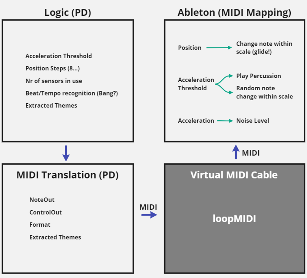
Before I write about the core logic part, I would like to lay out how the communication between Pure Data and Ableton looks like. Originally, I had planned to create a VST from my Pure Data patch, meaning that the VST would just run within Ableton and there is no need to open Pure Data itself anymore. This also gave me the idea to create a visualization that provides basic control and monitoring capabilities and lets me easily change thresholds and parameters. I spent some time researching possibilities and found out about the Camomile package, which wraps Pure Data patches into VSTs, with visualization capabilities based on the JUCE library.
However, it did not take long until I found several issues with my communication concept: First off, the inputs of the Expert Sleepers audio interface need to be used, while any other interface’s (or the computer’s sound card’s) outputs must be active, which is currently not possible natively in Ableton for Windows. There would be a workaround using ASIO4ALL, but that was not a preferred solution. Furthermore, a VST always implies that the audio signal flows through it, which I did not really want – I only needed to modulate parameters in Ableton with my Pure Data patch and not have an audio stream flowing through Pure Data, since that would give me even more audio interface issues. This led me to move away from the VST idea and investigate different communication methods. There were two more obvious possibilities, the OSC protocol and MIDI. The choice was made quite quickly since I figured that the default MIDI resolution of 128 was enough for my purpose and MIDI is much more easily integrated into Ableton. Now with that decision made, it was a lot clearer what exactly the core logic part needs to entail.
Following the signal flow, in Pure Data the wristband sensor data gets read in and processed; and modulators and control variables get created and adjusted. Those variables are used in Ableton (Session View) to modulate and change the soundscape. This means that during the installation, Ableton is where sound gets played and synthesized, whereas Pure Data handles the sensor input and converts it into logical modulator variables that control the soundscape over short- and long-term.
While I separated the different structural parts of the software into own “modules”, I only have one Pure Data patch with various sub-patches, meaning that the separation into modules was mainly done for organizational reasons.
Data Preparation
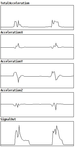
The first module’s goal was to clean and process the raw sensor data in a way for it to become usable for the further process steps, which I spent a very substantial amount of time with during this semester. It was a big challenge to be working with analogue data that is subject to various physical influences like gravity, electronic inaccuracies and interferences and simple losses or transport problems between the different modules, but at the same time having a need for quite accurate responses on movements. Additionally, the rotation data includes a jump from 1 to 0 each full rotation (like it would jump from 360 to 0 degrees) which also needed to be translated into a smooth signal without jumps (converting to a sine was very helpful here). Another issue was that the bounds (0 and 1) were rarely fully reached, meaning I had to find a solution how I could reliably achieve the same results with different sensors at different times. I developed a principle of using the min/max values of the raw data and stretching that range to 0 to 1. This meant that after switching the system on, each sensor needs to be rotated in all directions for the Pure Data patch to “learn” its bounds.
I don’t calculate how the sensor is currently oriented in space (which I possibly could do, using gravity) and I soon decided that there is no real advantage in using the acceleration values of the individual axis, but only the total acceleration (using Pythagorean triples). I process this total acceleration value further by detecting ramps, using the Pure Data threshold object. As of now, two different acceleration ramps are getting detected – one for hard and one for soft movements, where I defined a hard movement, like one would move a shaker or hit a drum with a stick, and the soft movement is rather activated continuously as soon as one’s hand moves through the air with a certain speed.
I originally imagined that it should be rather easy to let a percussion sound play on such a “hard movement”, however, I realized that such a hand movement is quite complex, and a lot of factors play a role in playing such a sound authentically. The peak in acceleration when stopping one’s hand is mostly bigger than the peak when starting a movement. But even using the stopping peak to trigger a sound, it doesn’t immediately sound authentic, since the band is mounted on one’s wrist and peaks at slightly different moments in its acceleration than one’s fingertip or fist might do.
Leaving speakers aside, the hardware requirements mainly consist of wireless wristbands with accelerometers and gyro sensors, a computer that can run Pure Data and Ableton and everything that it takes to get the wristbands and the computer to communicate.
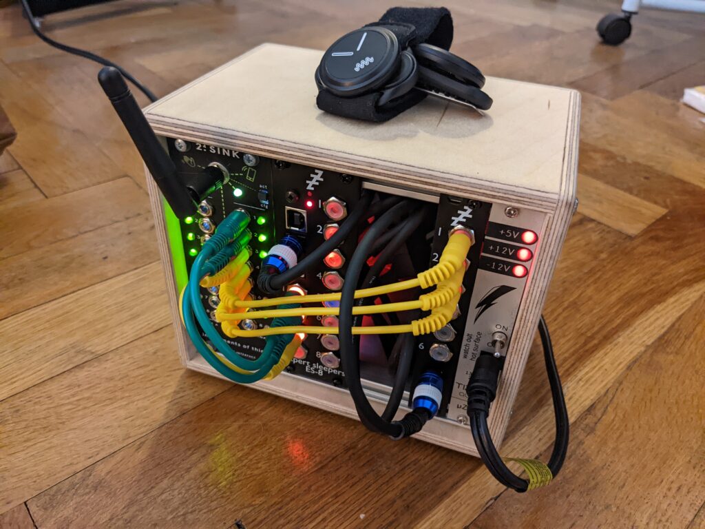
As I had planned last semester, I got to try out the 2.4SINK Kit by Instruments of Things, which is a set of wireless wristband sensors and a receiver. The receiver is made for modular Eurorack setups, meaning that wristband movements will be translated into control voltages (CV’s) that can in turn be used to modulate synthesizers or effect panels. This is of course not necessarily optimal for my application, where I need all the wristband data in my laptop anyway. Thankfully, I was not the first one at my university that wanted to use the 2.4SINK Kit in that way: The module was already built into a small Doepfer box, together with an Expert Sleepers USB Audio Interface, that allowed me to receive up to 10 CV inputs (including the input expansion module) via USB on my laptop.
Wristband sensors
The sensors look very sturdy and of good quality, but also thin and subtle. On the backside, each watch has two metal pins that are used to switch the sensor on (if both pins are touched at the same time), as well as they are used as a mounting contraption to fit them on belt clips or fabric wristbands (“click-mount”). As soon as a sensor is switched on, it will go into calibration mode, which means that it is of utter importance to have the sensor lying still on a flat surface during this process (otherwise the values will drift off constantly).
Receiver
The receiver consists of an antenna, a little toggle button that switches between “configuration” and “active” mode and 16 dynamically configurable outputs. When switched on, the 2.4SINK receiver will create a wireless LAN network, which, if accessed, will provide the opportunity to visit the configuration page of the 2.4SINK Kit. On the configuration page, it is possible to change a few global settings, as well as individual settings for all 16 outputs (while the switch on the receiver is set to “configuration mode”). For each output, it is possible to choose which parameter of which sensor (up to seven sensors can be connected) should modulate the output. For each sensor, six parameters can be chosen:
Rotation X
Rotation Y
Rotation Z
Acceleration X
Acceleration Y
Acceleration Z
Furthermore, it is possible to output LFO signals that are modulated by the sensor’s parameters. However, this is much more interesting for a modular setup and not very suitable for my use case.
USB Interface
The Expert Sleepers USB Interface (ES8 plus ES6 input expansion module) works just as most other USB audio interfaces do. The CVs are normalized as input signals ranging from -1 or 0 (depending on the type of input: unipolar/bipolar) to 1.
While there were only two sensors available, the 2.4SINK receiver would have still supported to read out all parameters from both sensors (six plus six parameters, while the receiver features 16 outputs), but the true bottleneck in this case was the Expert Sleepers audio interface, which only has 10 inputs, meaning that not even all parameters from both sensors could be read simultaneously. This led me to the decision that the outcome for this semester would only be a proof-of-concept demonstration with only one sensor.
Last semester I spent a lot of time on conceptualizing the whole installation as such. I had a very wholistic approach, where the sound was clearly a main attraction, but all the other details seemed just as important. And during developing this concept and contemplating what I want it to convey (and if I want it to convey something), I also came up with the name “The Emotional Space”. As a quick recap – I framed my concept in one sentence like follows: “The Emotional Space describes a room that reacts at least as much to the mood of its visitors as the other way around”. While this might not be very easy to understand immediately, it does transport my artistic approach quite well: I wanted to create an installation that not only emphasizes, but downright lives through the individual ways a visitor might want to experience it.
When this semester arrived, a lot of feedback and contemplation followed, and I realized that I am not fully standing behind the concept anymore. I got confused comments about the word “emotional” in the title and started questioning how appropriate it is – do I dare to claim to change people’s emotions with my installation? How fitting is such a term to describe a room? With those doubts in mind, my whole concept slightly lost its grounding and I had to clear my mind and define what I really wanted to spend my time with during this project. But then again, being a sound design student, the choice was clear: I wanted to work with sound.
When I stopped thinking of the project as an installation, I quickly realized that what I wanted to achieve is easy to describe: I would like to create an explorative, interactive composition. And funnily, that description does not contradict anything I worked out last semester– it is rather a slightly more focused phrasing. While knowing what exactly I want to work on gave the project its direction back, I was still not happy with the word “emotional” in the title. But over the course of this semester, I enjoyed to “The Fluid Space”, which has a little more of a neutral standing and might not create too many expectations in its visitors. Some might disregard those topics as superficial, but I have a strong sense that this process was very crucial for me to know what exactly I am working towards. What I am now striving to create, is rather a format than an installation. Of course, the presentation of this format will still be embedded into an installation that may still follow the wholistic values I had in mind last semester. However, I want to further discover the possibilities of the format of explorative, interactive compositions, aided by the sensors I have in place. My modular approach should make it possible to get entirely different kinds of composition – also in their arrangement and interactivity – while working with the same core logic.
_The international week 2022 hosted by FH JOANNEUM was an interesting event. I attended Luis Daniel Martínez Álvarez workshop (#9) called “Aesthetic Echoes of Terror: Construction of the sound Atmospheres of the Uncanny Valley for Videogames and Cinema”. I tried to gather as many thoughts as possible here in this post.
I will start with a short summary of the workshop; the lecturer was Danny from Mexico, and his profession is sound design combined with storytelling – mainly scary stories. He gave us a deep dive in how and why specific sonic patterns appear frightening to us, and how to fabricate such experiences. It was a fascinating topic with even better insights, even for a person like me, which has little experience with sound design. We then went on and collectively wrote a little horror story inspired by our deepest fears; the result was “No-Scream//Nose-Cream”. It’s about a hellish clown, which steals noses while the whole world is falling into the hands of ice cream zombies. Sounds like a weird, and that’s because how it was created: We took a piece of paper, and everybody wrote one sentence and then handed the paper to the next person, to continue the story from this point. This approach created this fever dream of a story within two passes.
After that was done, we then collected a vast array of different sounds of noises in the city, grabbed a Zoom-Recorder and ventured into the city to record said noises. We spent the whole first Day in the city, listening to various sound emitters and recorded those. The goal was to generate a composition for our scary story with these sounds, and so we searched up different places with different atmospheres (like a church) and collected enough sound samples to accommodate every detail of our story.
As I mentioned before, I’m not a sound designer – although I enlisted for this specific workshop because of my previous occupations; game design and cinema enthusiast. The attentive reader might remember that I recently wrote a blog post about how some colleagues and me did an attempt on creating a horror game in unity. So, it was an easy decision for me, what workshop to attend when I read the possible options. I wanted to learn more about the soundscapes of the horror genre and how they are made, and I was not dissatisfied.
But one little hiccup which me (an interaction designer) and a colleague (a media designer) faced, was the fact that we were both a little out of our fields here. So, as we now had all our sounds together, we had to quickly learn an audio software (through an excellent crash curse by Danny) and get to composing – something none of both of us ever did. The tasks for this week were to create two compositions; one for our story and one where we did the score for a little 60 second snippet of a horror movie/series/etc of our choice.
We were both thrown into cold water in a workshop with no prior knowledge of its topics, having no clue of composing and trying to figure out baby steps in this field. Naturally, the sound designers did a task which took as nearly two Days in under 10 minutes and it the results sounded amazing. This was kind of demoralizing to be honest, but it was nice to see what can be achieved when you profile in this topic. To not be completely emotionally destroyed we settled on the taking-part-medal, and just played and experimented around with the sounds, and although our lacking skill had interesting outcomes. Although we had little to no experience, we had great fun and really enjoyed ourselves. Turns out, it’s not always about being good in something from the get-go, but it’s about committing and having fun on the way.
All in All, it was an interesting and wonderful experience and I want to commit some special words to our lecturer, Danny – a wonderful and friendly guy from Mexico who studied music and composition. He knew a great deal about his topics and had great fun in relaying all those information to us; but I think what made the week such a success for our group was his inviting and open personality. If I could rate Danny as a lecturer, I’d give him a 10/10 – it was an absolute blast.
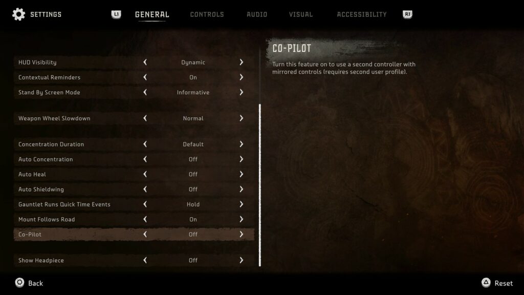
_Horizon Forbidden West is apparently considered one of the new contenders for best Accessibility in Games for the year 2022; and since I had the opportunity to get my hands onto that game, I’d say it’s time for a little case study of my own. Also, this game runs on the same Engine which made DEATH STRANDING possible, but a different Studio. Since I kind of already evaluated this other game, I was curious how they did it, giving the fact that DEATH STRANDING didn’t do that well. When I booted it Horizon for the first time, I immediately noticed one of the big points in the main menu – ACCESSIBILITY – and I was curious, which and how good their Accessibility measures & efforts were.
I took a quick gander over their accessibility options and was generally impressed by their efforts in the first moments. Scrolling through the different modifications, I headed to the menu points I always search up every time I start a new game, to language and subtitles. Generally, am I interested in which languages (audio/video) that game is available and how the default subtitles are set up.
Straight of the bat, the default subtitles are quite hard to read – small, white, and mostly on bright backgrounds. You can though, change them quite easily to a slightly larger version with also a black background – but there is still room for improvement.
Staying with graphic settings; in the game there is a mechanic called “using the Focus”, meaning that you can press a button to enable an ‘virtual’ overlay in the game world to highlight important objects or crucial information. In this universe, the “Focus” is a little apparatus which sits on your temple (close to your ear, where all your four skull bones join) and projects some sort of augmented reality view into your sight. This is a nice concept, but poorly executed in my opinion. What it does, is it brings a pinkish overlay – which is not changeable from the get-go – to everything in the game world to show said information. In the end, it has small and hard to see icons and often it takes me more time to differentiate what is important or just pinkish noise accidently misinterpreted by my eyes as crucial data. In the first game there was this option after finishing the game to unlock new styles for said focus, so you could change the colour schemes to your liking – or to better say, needs. Such an accessibility option should not be locked away behind the barrier of ‘finishing the game’.
While talking about the functions of the game mechanic Focus, one other use of it while combat – or should I say strictly before engaging/combat, that’s what bothers me – is to plot our plan to engage and attack your enemies. You look at their walking patters, their strengths and weaknesses, the works. But this is inherently where the problem; often you are faced with a vast array of different foes, which all have different ways to be brought down efficiently. So, you often must, in the middle of stressful combat, enter the focus view to see the enemies’ weaknesses. This context info is there to make it easier for you, but ultimately it either annoys you the get a hold of this information, you struggle to get a quick glance, or it rips you completely out of the fight/immersion; because you pressed the touch bar fast enough to open your enemy database overlay menu. Now you can, in all silence and peace read everything up to your hearts content about a specific enemy, just to press the touch bar again and are maybe, quite possibly, be overwhelmed by all the action what was going on and you kind of forgot about it. Such information is just not easily available, but it should be.
Even before you even engage in a fight, often you enter the hostile premises in stealth mode – the enemies are completely oblivious to your presence. To hold up this fragile status quo, you use the environment to conceal your movements, while you close in on them to get the first strike. You sneak around in some read flora, which is conveniently sprinkled generously around the whole map – but the only way the game communicates to you, that you are now in fact considered ‘in stealth’ is through a soft and gentle rumbling of the controller while you traverse said reddish plants. There is no other visual indicator (e.g., an icon or else) except your character crouching in the bushes and some faint and distant rustling noises from the grass, which gets also easily drowned out by all the other sounds. So, now you often are not sure where you are being in stealth begins and where it ends, leading to some little hiccups in your predatory path to your victim and they may see you approaching. The way of how haptic feedback is generally used in this game is interesting and enjoyable, but for some folks it might be to much of a barrier to enjoy the game properly.
Some of the input patterns in the game can be very complex, and cannot be made easier, for example it took me quite a long time to get a grasp of their grappling hook jump boost mechanic, which needs serval factors to get a satisfying result. You need to be in reach of a grappling point, jump, smash the x-button to connect to the point, and while you are pulled towards it, start smashing the o-button to use your momentum to boost yourself to higher heights. Once I figured it out, it works quite well for me, but I can’t imagine not everyone gets that far with it. Also, while in close combat, there are several combos with varying uses to overpower you enemies – they offer some interesting telegraphing points to show you when exactly to press an attack button, but in the end, in the heat of combat it boils down to you just repeatedly smashing both attack buttons interchangeably and hoping for the best. There is room for some people to perfect this craft for sure, but some will stay on smashing level – but it also works out to have fun with the game.
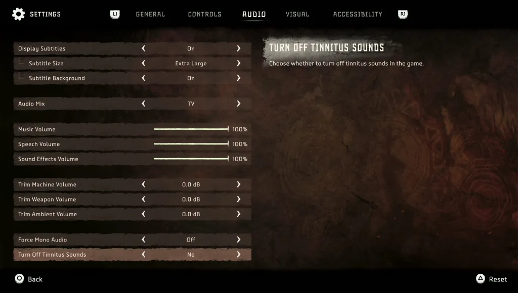
But not to say they didn’t offer the opportunity to automate some input tasks; I’ve spotted the opportunity to enable the automatic deployment of your parachute while falling great hights – a welcome and handy option. It spares you from demoralisation of jumping of some cliff accidently and then loosing your progress to an untimely death caused by gravitational pull on your existence and the following impact force. Talking about loosing your progress, this is a part they got exactly right; they often and on smart points set very well designed autosaves, so your progress isn’t that lost all together. They track and keep most of your picked up items (except story items), your map discoveries and so on. While also browsing some of the settings, I even discovered another nice accessibility/quality of life option – the possibility to turn off all tinnitus sounds. For some people, the constant sound of ‘phiiiiiiiii……’ while you battle against the enormous machines with their metric ton of explosions in this game can get really tiresome, so this helps a great deal I’d say.
Lately, they even rolled out a big update to the game, adding new modes and features. Maybe, there also were some improvements to accessibility – but I got to check it out again. All in all, I’d say it there was an attempt on inclusiveness as far as I am concerned, but not as a deep dive as some other games (e.g., TLOU: PII) have already achieved.
One interesting Idea or Theory I stumbled upon while reading randomly through various accessibility reports was, that each attempt to create more immersion in games somehow keeps adding more and more barriers for others – like adding a highly sophisticated system for locating game objects through sound. A cool feature for everybody who can hear, but as soon you start to rely on this technology for you game design, it could get inaccessible for some people with hearing problems.
As a concluding insight I’d say, an opportunity for me to use all these rather specific and far spread knowledge about approaches to Universal design in Games and other coherencies in this industry would be to work as an UX/UI consultant for games. I’d see myself doing that and I am growing quite fond of that idea – but to digging deeper into this concept is for another time.
Smart home, smart meter, these terms are sprouting from the floors in the home sector like no other. Everyone wants to live more comfortably and more simply. Everything should be smart and make everyday life easier. Mostly, however, these are lifestyle products, but less about things that inform about the general own consumption. Ok. For the most part understandable – you’d rather be entertained instead of seeing what you’re consuming. I think, however, something fundamental must be changed in this attitude and rather the advantage to be seen, if one understands the own consumption, analyzes and in the best case responsibly can steer.
Searching for the right data.
My concept should be mostly about the own energy budget, it should be prepared data that arise from water and electricity consumption and generation. Therefore, data of the suppliers, costs, and the various influences on the price, the energy network in particular of the suppliers, as well as the own data in the household, through electricity meters, smart meters, etc. are of interest to me. This data should then be put into a meaningful relation, updated in real time and reflect the information in two modes: informative + abstract. Thus, the product can be used as an informative overview and control terminal, but also as regenerative data art to become a lifestyle product.
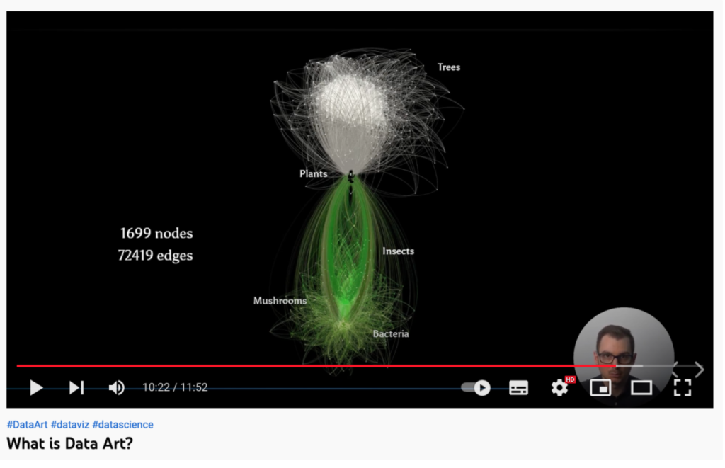
What is Data Art?
Data art or also referred to as data-driven art is based on data sets and thus conveys emotions. Compared to data visualization, which only visualizes data, or generative art, which creates emotions by chance, the art of creating data art is that it is explained in an understandable and appropriate way. Data art can be many things, from images, videos, interactive works or physical representation, so-called data physicalization can also be encoded sounds or music, this is then called data sonification. But this is relatively difficult, because pleasant tones and a sound spectrum generated by data do not always harmonize.
The next steps will be: Clearly define the concept and also the scope and find out the perfect target group for it. Also, I want to get more familiar with the already existing tools for energy budget measurements and determine which program and tools I need to implement the project.