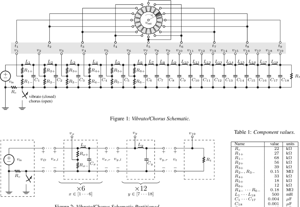
My first experiment was to simulate the delay line with Pure Data, based on the research carried out in the previous phase of this project. Originally, the analog delay line is part of the Hammond Vibrato Scanner unit and it incorporates a series of second-order audio filter stages where each stage is shifted in phase relative to the previous one. This results in an increasing time delay between every successive step of the line (about 50μs per filter stage). This is then fed into a scanner, which is a single-pole 16-throw air-dielectric capacitor switch connecting nine selected taps from the line to the output.
As the scanner gradually transitions between these taps, it alternates the phase shift applied to the sound, causing slight variations to the pitch that result in a vibrato effect. The depth of the vibrato depends on the width of the frequency shift fed into the scanner, which means that scanning about one-third of the delay line would produce a lighter vibrato effect while scanning the whole line would significantly increase its depth. In addition to the vibrato, a chorus effect can also be achieved by mixing the dry input signal with multiple outputs on the delay line, or a chorus-vibrato by mixing the dry signal with the output of the vibrato.
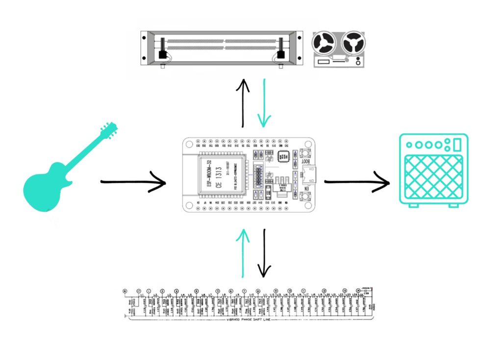
Initially, I proposed the development of an analog multi-effects chain unit that combines different types of vintage audio components with the capabilities of modern microcontrollers. The core element of this device would have been an analog delay line which, when sampled in different sequences, produces different modulation effects. The unit could be expanded with additional analog modules such as spring reverbs and tape delays daisy-chained in interchangeable order and controlled by the same central ESP32 microcontroller. The user interface would be divided between a minimalist control panel on the device and a mobile app that allows for detailed parameter settings.
Due to difficulties in designing an analog circuit that could sample the delay line, I decided to take my project to the digital domain and create a digital multi-effects chain instead. After gaining extensive experience with Pure Data and the Bela Board in the first part of this semester, I decided to use these technologies for the project. The main plan remained essentially the same as proposed in the first semester, only the hardware had been replaced.
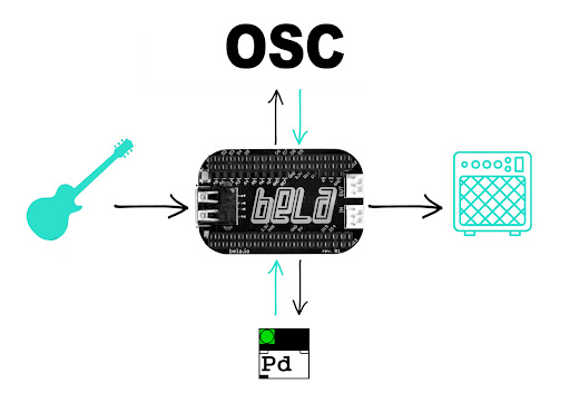
My new plan is to establish a community-oriented product by incorporating various open-source technologies. I propose the development of a digital multi-effect unit that combines the flexibility of Pure Data with the ultra-low latency of Bela and the integrability of the open sound control protocol. The core element of the effect chain is a delay line that produces different modulation effects. By design, the unit can be expanded with additional effect modules that are controlled by the same open sound control interface.
“The greatest threat to our planet is the belief that someone else will save it.”
— Robert Swan, Author
Today, the word “sustainability” is widely applied to define the processes, measures and actions through which humanity avoids the exhaustion of natural resources to maintain an ecological balance that does not allow the quality of life of modern societies to decrease. Sustainability has these following three dimensions:
Social
Economic
Environmental
Taking these three pillars into account it becomes clear that all topics written about before in my blog entries are included in the topic of sustainability. So first of all I want to refine the working title of my research to Sustainable UX. So my Master’s thesis is intended to build on these three pillars of sustainability. The three dimensions as stated above should include popularising social diversity and equity, the 3 Rs (recycle, reuse, reduce), inclusive design, integrating environmental and social values, green consumerism …
“Interdisciplinary integrates separate disciplinary data, methods, tools, concepts, and theories in order to create a holistic view or common understanding of a complex issue, question, or problem.”
— Wenger, 1999
There is a parallel between design and interdisciplinarity. (design can be considered as a discipline and an industry.) Both are defining features of contemporary innovation practice. Interdisciplinarity is broadly defined as “the integration of knowledge across disciplines, both narrowly and broadly, and the exchange between disciplines and society.” (Frodeman, 2016)
At the same time, design connects multiple fields of knowledge and industries. Design permeates the complex realm of physical and digital products, blurring the boundaries of human interactions and experiences. Today’s design practice requires systems thinking and the collaboration of multiple disciplines to holistically solve complex human challenges. Thus innovation in the age of the circular economy requires comprehensive practice and an interdisciplinary process that brings together the systemic view of different disciplines – to define opportunities, design sustainable solutions with long-term impact and scale innovation. Circular innovation is about creating new value that balances the benefits for all stakeholders on the planet, rather than focusing on the needs of a single customer. By becoming more interdisciplinary, ecosystems for businesses and the environment can be created that become more circular and resilient.
Speculative design could be a possible approach, together with design thinking, to tie the complex problem of interdisciplinarity for Sustainable UX. It is one of the most exciting ways for designers to practice problem solving through design. With the help of design thinking and other methods, scopes can be expanded and transboundary systems and prototypes can be developed that stimulate discussion about alternative ways of living and allow the imagination to flow freely. Design speculation has the potential to become catalysts for redefining the way we relate to reality and cultures.
Although the topic “Augmented Reality in Education” is super interesting and definitely has potential for a master’s thesis, I realized that I don’t want to pursue it further. I originally chose it because I had little prior knowledge about AR and wanted to “plunge into uncharted waters”. However, I soon realized that it didn’t really fit my strengths and interests.
Therefore, I used the past semester to find a new topic for my master’s thesis. I started off with writing a list of requirements. My Master’s thesis should…
… have societal relevance and added value for people/the environment
… focus on visual design and user experience, since that’s where my strengths lie
… be realizable from abroad, since I’m planning to go on Erasmus
Having my list in mind, I started brainstorming. I read articles and abstracts of existing Master’s theses in the field of UI/UX design, I browsed through design platforms like Behance and collected examples, ideas and inspiration. So I made a looong list in the notes app on my phone with raw ideas that came to my mind during research. In the end that list ranged from female leaders in the interaction design field to accessibility issues to family banking to blood donation to pet adoption… and more. As a next step I started to narrow that list down and came to the conclusion that I wanted to work on a UX case study for some mobile app or web application following a design process (e.g. Human Centered Design Process, Design Thinking). I felt that I was finally getting somewhere, but the most important part was still missing: The concrete topic. A mobile app for WHAT? There is already an app for everything, I thought – What could I possibly create that would have an impact? That was when I realized that talking to other people might help. So I asked my sister, who is a doctor, if there was anything in her daily life at the hospital which could be improved by digitalization. And actually there was a lot ;). Ranging from analog patient files to rehab programs for stroke patients, she had some ideas where I could see potential. But it should be something that was within the scope of a Master’s thesis (e.g. digitizing the complete patient management system of a whole association of Austrian hospitals was not). In the end there was one idea left, that would perfectly fit my plan as well as my skills: A mobile app which would help pregnant women with gestational diabetes (GDM) to keep track of their blood sugar, diet, exercise and therapy.
What is GDM?
Gestational diabetes mellitus (GDM) is one of the most common complications of pregnant women affecting up to 20% and can lead to many unfavorable outcomes for both mother and newborn. Hence, screening pregnant women for GDM and adequate treatment is essential for the short- and long-term outcome of mother and child. Being diagnosed with GDM comes with major effort including exercise, nutritional therapy, blood glucose monitoring and documentation four times per day, medical appointments every one to three weeks and in many cases insulin injections. Thus, patients tend to struggle with their compliance. Especially doctor appointments can be time-consuming, as patients usually have to document their measurement data in an analog diary. These data are then manually reviewed by the doctor and compared with data stored directly on the blood glucose meter to check for the patient’s reliability (Alfadhli, 2015).
The road ahead
Based on this medical procedure, the aim of my thesis is to find out how a mobile app could support the process of monitoring and analyzing blood glucose data and which advantages it could have for both the patient and the doctor. There are already several diabetes-monitoring apps on the market but none of them appear to be tailored to GDM patients. Therefore, this project offers the potential to specifically address the requirements and needs of GDM patients and provide them with a digital monitoring solution as an alternative to an analog diary. The concrete idea is to design and evaluate a high fidelity prototype of a mobile app using the design thinking process, which is an iterative process that includes five phases. Potential features of the app are:
automatic data transfer from the glucose meter to the app as well as the possibility to enter relevant data manually
automatic generation of comprehensive statistics with the ability to detect limit violations
reminders and notifications (e.g. blood glucose measurment, insulin injection, exercise)
suggestions on diet and exercise based on previously entered data
well-founded information about GDM (e.g. videos, articles, FAQs)
possibility to download a report for the doctor.
Conclusion
After spending so much time researching, brainstorming and talking to people I think I finally found a topic, that I “burn for” (as we say in german). I think the app could really help people affected by GDM and isn’t just another useless app on the market. As the Erasmus application required an abstract of the thesis topic, I have already written a preliminary research proposal and I am happy to have DI (FH) Anika Kronberger, MA as my supervisor.
________________
Sources:
Alfadhli E. M. (2015). Gestational diabetes mellitus. Saudi medical journal, 36(4), 399–406. https://doi.org/10.15537/smj.2015.4.10307
| a summary on first thoughts and findings on my possible master thesis topic
While I was continuing my research about different in-vehicle interface solutions and future trends, it became clear for me, that driver assistance systems and “autopilot” (autonomous driving) functions play a major role in the cockpits’ features. By assistance systems I mean on the one hand features like lane-keeping, speed control, parking and front distance controls, and on the other hand speaking assistants like Siri or Alexa built in to control navigation and other features. When thinking about the needs of interfaces and the human-machine-interaction with these assistants, for me the most interesting topic is how to get humans to trust the machine that they give the control over?
If Alexa cannot tell the exact weather outside or doesn’t find the song you want to hear, you forgive her and try another time. But if your car does an emergency braking without any reason or does not stop at a red light in autonomous mode, possibly threatening your life, you won’t forgive it and will probably never hand over the control again.
These are my thoughts why I would like to research this topic further:
How can we create trust in the vehicles’ assistance systems via interfaces and newest technologies, like augmented reality?
With carrying out case studies, user surveys and user testing of different concepts about existing solutions and new proposals, whether they help to build trust or not, I could imagine to create a master thesis on this question. But for that I start now with researching existing articles and papers on the topic of trust in the context of product design, UX and HCI. While researching keywords for the topic, I came across some scientific papers and articles available online, from which I want to sum up some interesting ideas here. These are only the first ideas I found, at the end I list up all publications that I found to be relevant to the topic as well.
Attributes of a product to build trust
In an article on uxdesign.cc about designing better products by building trust, Aimen Awan [1] mentions Erik Erikson’s stage model, where trust and mistrust is the first psychosocial development phase of a human being, until it has reached about 18 months of age. This period shapes their view of the world and their personality, so it is regarded as the most important period in a child’s life. [2] While the psychologists like Erikson see trust as a personal attribute and behavioral intention, there are other disciplines which handle the topic differently. Sousa, Dias and Lamas [4] describe the approach of computer scientists as observing trust as a rational choice against measurable risks. Further their second aspect of trust is the user’s cognition and affection, meaning the confidence in the system and their willingness to act. [4]
Awan further discusses the results of a study and experiment by P. Kulms and S. Kopp that people’s willingness to trust computer systems depend on the fundamental attributions of warmth and competence. When lacking the time and cognitive resources, people’s interpersonal judgements are mostly based on these two dimensions of social perception. [3]
Warmth can be described in HCI as confidence in the product, that it will help us reach a given goal. The overall user experience, design quality and visual consistency are largely influencing our perception of “warmth”, like transparent information display throughout the user’s journey with the product. E.g. if all details of a transaction are shown before decision making, we perceive the system as trustworthy and having good intentions. [1][3]
Competence is related to perceived intelligence – that a product can perform a given task accurately and efficiently. [1][3] As Awan mentions, Don Norman’s and Jacob Nielsen’s basic principles about usability represent the features of a product to be perceived as competent. Here Nielsen’s heuristics of “User freedom and control” are highlighted in particular. Unlike in human-human relationships, in HCI competence is not overruled by honesty, but is a crucial factor to build trust. [3]
She further discusses the importance of competence at the early stages of trust, depicted by expanding the trust pyramid model of Katie Sherwin. [5] In this new expanded concept, the foundational levels are the baseline relevance and trust that needs can be met and the interest and preference over other available options. These are definitely relying on the competence of the system and if these basic requirements are met, deeper trust can be built with personal and sensitive information (Level 3). From this level on the trust is deepened by perceived warmth, that could further lead to the willingness to commit to an ongoing relationship and even to recommendations to friends. [1] These stages may be more simple in the specific regard of automotive assistance systems, as in a car there aren’t several available options for the same task to choose from and only few tasks would require personal information. Nevertheless the concept can be relevant to an overall analysis of the topic.
Deriving design elements from theory to support trust
Four professors of the University of Kassel, Germany have made an experiment in 2012 on how to define Trust Supporting Design Elements (”TSDE”) for automated systems using trust theory. [6] They validated their findings through a laboratory experiment / user testing with 166 participants on a “context sensitive, self-adaptive restaurant recommendation system”, the “Dinner Now” app. Although this app has no similarities to driver assistance systems, the concept of deriving TSDEs could work generally.
Their motivation to write a work-in-progress paper was the often perceived lack of consideration of behavioral research insights in automation system design. There is potential to raise the achievable utility of products when behavioral truths are implemented into the development process. [6]
Here, the definition of trust by Lee and See [7] was highlighted as “the belief that an agent will help achieve an individual’s goal in a situation characterized by uncertainty and vulnerability”.
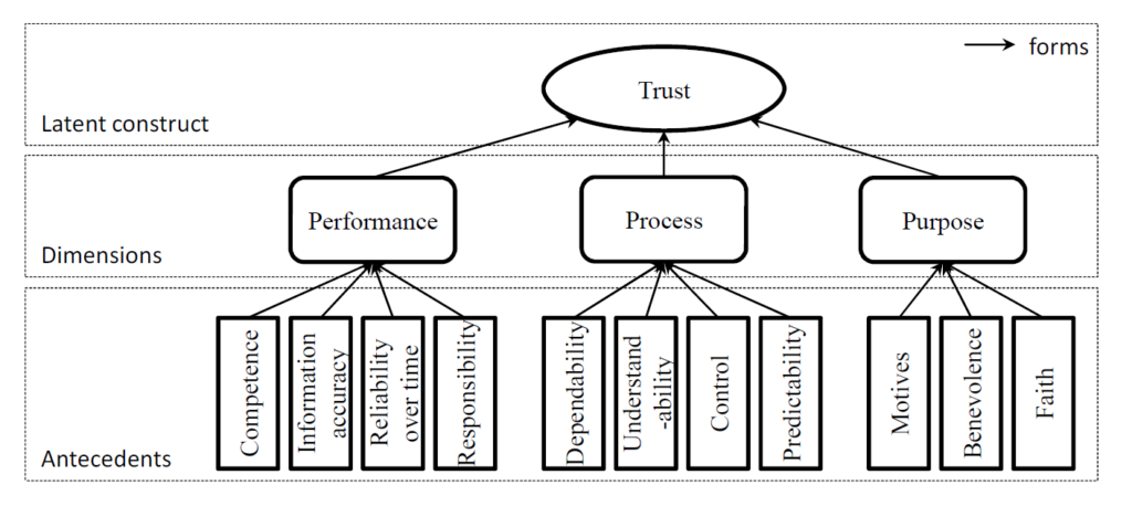
By applying the behavioral study concept of three identifiable dimensions of a user’s trust in automated systems (performance, process and purpose), Söllner et Al. created the following model of formation of trust (see Figure 1). The three dimensions are further based on indicators / antecedents [8], that cover different areas of the artifact and its relation to the user.
Figure 1: The formation of trust in automated systems – by Söllner et Al. [6]
These antecedents are in short detail [8]:
Competence – helping to achieve the user’s goal
Information accuracy – of the presented information by the artifact
Reliability over time
Responsibility – the artifact having all functionalities to achieve the user’s goal
Dependability – consistency of the artifacts behavior
Understandability – how the artifact works
Control – how much the user feels to have the artifact under control
Predictability – anticipation of future actions of the artifact
Motives – how well the purpose of the artifact’s designers is communicated to the user
Benevolence – degree of positive orientation of the artifact towards the user
Faith – general judgement, how reliable the artifact is
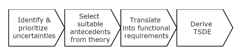
The paper describes a four-step model to systematically derive TSDEs from behavioral research insights (Figure 2) [6]:
Identifying the uncertainties of the system that the user faces and Prioritizing the uncertainties based on their impact
Choosing suitable antecedents to counter each uncertainty
Interpreting and translating the antecedents into functional requirements
Including these requirements into the design process and creating TSDEs
Figure 2: The process steps to derive TSDEs – by Söllner et Al. [6]
In the case study, the specific uncertainties based on test-user prioritization were the quality of restaurant recommendations, the loss of control in the app and the reliability of user ratings.
Thus the selected antecedents were understandability, control and information accuracy. For keeping developments costs in acceptable range, only one factor was considered for each uncertainty.
From these antecedents, new requirements and features of the app were derived – like additional information to for more transparency, additional filtering possibilities for more control and friend’s ratings option for more reliability.
The final user studies and questionnaires resulted in the validation of the model to be effective and suitable to derive valuable design elements – the TSDEs were appreciated by the participants and the trust and chances of future adoption of the app were enhanced. [6]
To enhance in-vehicle user interfaces a similar approach could be applied to find helpful solutions strengthening the trust in the system.
Building trust in self-driving technology
In 2020, Howard Abbey, an autonomous car specialist ar SDB Automotive gave a presentation on “How Can Consumers Understand the Difference Between Assisted and Autonomous Driving?”. Emily Pruitt summed up the five key takeaways of this talk, how to increase the user’s understanding and adoption of ADAS systems. [9]
Design out potential misuse Users will push the limits of reasonable safety of automated systems. Therefor the systems have to be designed in a way to prohibit any misuse possibility. E.g. warn the driver if hands are off the steering wheel or eyes are not on the road, or stop self-parking assistance when doors get opened. It has to be clarified for the user, what is assistance and what is autonomous.
Use common naming Safety critical features should have naming conventions across different OEM platforms. As long as there are different descriptions for similar systems, the driver cannot rely on their previous experiences and has to learn the systems in case of change of vehicles again and again. (Currently there are 100+ names for emergency braking, 77 for lane departure, 66 for adaptive cruise control and 57 for blind spot monitoring. Though progress is already made by SAE International together with other organisations to recommend common naming, so that drivers can be educated on the same fundamentals)
Be clear SDB Automotive carried out a user study on driver interaction with HMI systems – assigning them tasks to use assistants and and measuring completion time and mental workload. The assessment was done in regard to differences in HMI systems of several manufacturers. Results show three issues that lead to comprehension difficulties when finding the right system, engaging it and reading its feedback:
confusing display graphics
unclear system status
inconsistent icons
Unify Systems Several industry experts believe that ADAS systems should be simplified or combined if possible, as the number of seemingly similar systems is growing. Drivers shouldn’t think about the functionality of systems to choose for the specific situation, instead of focusing on the road. One holistic overall system should work in the background and “take care of the complexity for the user”.
Give simple choice Within the holistic system, there is no need to let the driver choose from seemingly similar systems and get confused (e.g. cruise control vs. automated cruise control vs. traffic jam assist). The options should be held simple with driving states: manual, mixed or autonomous.
[9]
Further questions
Further questions arise if we think about state-of-the-art (2022) and future technologies – also with regard to the possibilities of multimodal interaction and augmented reality.
Are the further above mentioned antecedents applicable for fully automated, safety critical systems and are there further ones?
How can we find the most suitable design solutions to fulfill the specific requirements to build more trust?
What augmentation technologies apply the best as additional solutions? Visual, sound or haptic feedbacks, or all of them?
Vehicles can be used for many tasks. Are there different use cases with special uncertainties to be consider?
Vehicles’ user groups vary a lot. Are there design solutions that can fulfill requirements for different use cases and user groups?
What different trust aspects arise when the automated system is equipped with Artificial Intelligence?
During my research per date I found many more scientific publications that are of interest and have to be read next. I hope to find material to be able to answer these questions. I just found a master thesis from the Chalmers University of Technology written in 2020 (see at the bottom of the list below) that already discusses my proposed topic very similarly. So further on I have to focus on the still to be researched areas to build my master thesis on, like probably the AR implementations in regard of the trust issues.
Literature sources to consider further:
Söllner, M.; Hoffmann, A.; Hoffmann, H. & Leimeister, J. M. (2011): Towards a Theory of Explanation and Prediction for the Formation of Trust in IT Artifacts. In: 10. Annual Workshop on HCI Research in MIS, Shanghai, China.
Lee, J. D. and See, K. A. (2004) ‘Trust in Automation: Designing for Appropriate Reliance’, Human Factors, 46(1), pp. 50–80. doi: 10.1518/hfes.46.1.50_30392.
Hoff, K. A. and Bashir, M. (2015) ‘Trust in Automation: Integrating Empirical Evidence on Factors That Influence Trust’, Human Factors, 57(3), pp. 407–434. doi: 10.1177/0018720814547570.
Parasuraman, R. and Riley, V. (1997) ‘Humans and Automation: Use, Misuse, Disuse, Abuse’, Human Factors, 39(2), pp. 230–253. doi: 10.1518/001872097778543886.
Molina, M. D. and Sundar, S. S. (2022) ‘Does distrust in humans predict greater trust in AI? Role of individual differences in user responses to content moderation’, New Media & Society. doi: 10.1177/14614448221103534.
Dixon L., Megill W., Nebe K. (2019).: Trust in Automation: An On-Road Study of Trust in Advanced Driver Assistance Systems. In: VEHICULAR 2019: The Eighth International Conference on Advances in Vehicular Systems, Technologies and Applications, Rome, Italy
Steven D. Lubkowski, Bridget A. Lewis, Valerie J. Gawron, Travis L. Gaydos, Keith C. Campbell, Shelley A. Kirkpatrick, Ian J. Reagan, Jessica B. Cicchino: Driver trust in and training for advanced driver assistance systems in Real-World driving, Transportation Research Part F: Traffic Psychology and Behaviour, Volume 81, 2021, Pages 540-556, ISSN 1369-8478, https://doi.org/10.1016/j.trf.2021.07.003. (https://www.sciencedirect.com/science/article/pii/S1369847821001625)
Julia Orlovska, Fjollë Novakazi, Bligård Lars-Ola, MariAnne Karlsson, Casper Wickman, Rikard Söderberg: Effects of the driving context on the usage of Automated Driver Assistance Systems (ADAS) -Naturalistic Driving Study for ADAS evaluation, Transportation Research Interdisciplinary Perspectives, Volume 4, 2020, 100093, ISSN 2590-1982, https://doi.org/10.1016/j.trip.2020.100093. (https://www.sciencedirect.com/science/article/pii/S259019822030004X)
[3] Kulms P., Kopp S. (2018): A Social Cognition Perspective on Human–Computer Trust: The Effect of Perceived Warmth and Competence on Trust in Decision-Making With Computers. Front. Digit. Humanit. 5:14. doi: 10.3389/fdigh.2018.00014 retrieved on 11.07.2022 from: https://www.frontiersin.org/articles/10.3389/fdigh.2018.00014/full
[8] Söllner, M.; Hoffmann, A.; Hoffmann, H. & Leimeister, J. M. (2011): Towards a Theory of Explanation and Prediction for the Formation of Trust in IT Artifacts. In: 10. Annual Workshop on HCI Research in MIS, Shanghai, China.
Today, we swallow information on the Internet without even thinking about whether it is worth checking. The media pushes us to certain values and opinions under the guise of curiosities or information that does not concern us, which we accidentally saw on the internet. Based on this, we build a pattern and an image about a topic without realizing that in reality, it could be the complete opposite. People are not inclined to actually verify information; it takes time and energy. Depending on how much time we spend online, our brain is still digesting this information, even if we are not consciously aware of it. The media manipulate the status quo with ease, because who will check every piece of data seen on the Internet? Another question – is it even possible? What could then be said about important information the masses should see and which emotionally touches almost every person?
Propaganda is the systematic dissemination of facts, arguments, rumors, and other information, including deliberately false information, in order to influence public opinion. The word comes from the name of a Catholic organization created in 1622, the Congregatio de Propaganda Fide (Congregation for the Propagation of the Faith). Propaganda is also seen as a pre-planned and purposeful spiritual influence on the audience, the purpose of which is to attract the audience to the side of the one who conducts the propaganda, that is, to control thinking and behavior. Ultimately, propaganda is a collection of certain structures, and fragments of symbols that influence human perception and behavior.
Generally speaking, propaganda theories were also the first theories to focus on the media, its content, influence, etc. researchers tried to explain how the media can use this or that information by influencing people, as a result of which they learn certain points of vision. At the time, the simplistic stimulus-response theory of mass communication dominated, according to which the media could deliver stimuli to each person in a certain way that would be equally perceived by all recipients and cause them to have similar or congruent reactions. The power of propaganda is related to the vulnerability of human consciousness, and not to the characteristics of specific messages. A crisis or political conflict is potentially dangerous, as it leads to mass psychoses and exacerbates people’s susceptibility to propaganda. There is also the opposite view that a successful propaganda campaign must have a long, carefully designed strategy, during which it is necessary to create certain symbolic images and teach people to associate the required emotions with them.
Why do we need propaganda? What are its main goals for today? Propaganda is one of the main means of political manipulation. Propaganda cannot be compared to advertising. Advertising is closer to self-presentation or to the informational genre. Advertising primarily affects people’s emotions. Propaganda affects both the emotions and the minds of people. Accordingly, propaganda can be negative or positive. Positive propaganda seeks to communicate certain beliefs to the consumer in an understandable way. The purpose of positive propaganda is to promote social harmony and education of people in accordance with generally accepted values. As an example, campaigns for the protection of the environment also often use propaganda mechanisms to convey information. There’s nothing wrong with that, as a lot of people started to think about it now. Problems begin when the mechanisms of influence that are involved in propaganda are used for the selfish purposes of politics.
How to save yourself from the influence of propaganda? We are idle to check every information that is around us. Plus, you need a huge amount of knowledge to critically evaluate it, and this is one of the main ways. The only thing we can do is to critically analyze, and perceive everything and not believe in one source. Build the perception of various topics based on several sources. Unfortunately, our brain will still build an imagination about the world even if the source is not checked, so if you have not verified the information, try not to spread it further. So we can stop influencing others with an opinion that is not based on verified information and transfer it further like a virus.
When I thought about how to fix this problem, I came up with the idea of creating a program that will check the information for us. Agree when we have a notification that the information in this article is subject to propaganda, we will perceive the content in a completely different way. Uniting programming and theoretical knowledge about propaganda that will be collected from various examples, we can get a fairly useful tool. The only question is how to use it. Since in order to check the information for veracity, I would need an incredibly large database that would be independent and renew itself on different sources, which in its essence should involve artificial intelligence. Unfortunately, I definitely don’t have enough time for such a version, so I decided to make a demo version as an example. I will collect a database of the most common propaganda techniques with different slogans. The program will have to check the text for sensitive content and look for words that provoke emotions. So in the first version, I will be able to make warnings for users when absorbing all sorts of content.
Propaganda is a tool that allows you to manipulate large masses of people. Everyone is subject to it in one way or another. The conclusion is quite simple. Do not believe everything that is written on the Internet. Do not believe even some of the theses given in this article. My goal is to prevent you from creating an alternate universe in your head. This way we can protect ourselves and others from obvious manipulation in the first place.
Since the second half of the semester, I decided to change my topic. Researching about Augmented Reality Storytelling was interesting, but I do not feel that I want to continue doing my research in that direction. Thinking about another topic was also hard for me, because I always have a hard time making decisions, but I think I have found a new interesting field, which I would like to focus during the course. It is the relationship between Artificial Intelligence and Design. I am not quite sure where exactly this path will lead me, but I really enjoyed learning about it and thinking about it’s possibilities.
What is Artificial Intelligence?
There are several definitions for AI. For example, John McCarthy’s (computer scientists) defines AI as following:
“It is the science and engineering of making intelligent machines, especially intelligent computer programs. It is related to the similar task of using computers to understand human intelligence, but AI does not have to confine itself to methods that are biologically observable.”
In general, Artificial Intelligence is the simulation of intelligence processes associated with humans through machines. Examples for this processes can be the ability to reason, discover the meaning of something, generalize of learn from past experiences. As for now, there is no machine able to match the human flexibility over wider domains or in basic everyday knowledge. But, there already are some processes with the ability to perform certain specific tasks with the same or even higher level than experts. Today, we already have a lot of touchpoints with AI. Sometimes, it is obvious, for example if we use systems like Siri (Apple), or Alexa (Amazon). But we also deal with it through search engines or recommendation algorithms (like YouTube, Amazon or Spotify).
There are two different types of Artificial Intelligence:
Weak AI (or Narrow AI) Weak AI is created/trained to perform a specific tasks and is not able to function without human interaction. It is the type of AI, which we deal with in everyday life, like on speech recognition devices.
Strong AI Strong AI is made up of Artificial General Intelligence (a theoretical form of AI, where Artificial Intelligence matches human intelligence, which means it would have self-aware consciousness) and Artificial Super Intelligence (it would even pass the human intelligence), which is, for now, only theoretical without any practical examples.
Can Artificial Intelligence be creative?
During my research, a lot of times this question popped up. Creativity is often perceived to be connected with people, certain methods or tools – not with computers. But do computers also have the ability to be creative? Well, they are to a certain level. For example: IBM (International Business Machines Corporation – an American multinational technology corporation) was asked by 20th Century Fox to create a trailer for their horror movie “Morgan” with the use of their AI “Watson”. Watson analysed the visuals, sound and composition of other horror movie film trailers and with that knowledge managed to create a trailer. You can see the outcome and a more detailed explanation in this video:
This shows that AI has the ability to be creative – to a certain extent. As for now, AI is only able to show creativity with the help of humans. For Watson, it was only possible to create a trailer by analysing other trailers and use deep learning in order to create patterns to understand how a trailer for horror movie works. Only with that knowledge, Watson was able to produce something similar to that.
“It’s easy for AI to come up with something novel just randomly. But it’s very hard to come up with something that is novel and unexpected and useful.” – John Smith, Manager of Multimedia and Vision at IBM Research
How can we co-create with Artificial Intelligence?
To answer the questions, I have taken a look into various projects to find examples on how AI is already used to co-create. I realised that most of the projects I saw could be either categorized in an AI that we, as designers, could profit while creating or AI that we can include in our projects, so that the user can profit from it, or both. Here are some selected examples, which I found especially interesting:
Airbnb – Sketching Interfaces
Airbnb created a tool to transform low fidelity prototypes into code by using AI. You just have to scan your hand drawn wireframes and the AI transforms it into a prototype. This could really speed up the process of prototyping and visualizing ideas in general.
There are many AI that can be used to create images or other assets. One example of this experiments is described in this article of medium.com. The AI is used to turn photographs of real objects into abstract illustrations. It is a part of Google Artists and Machine Learning initiative.
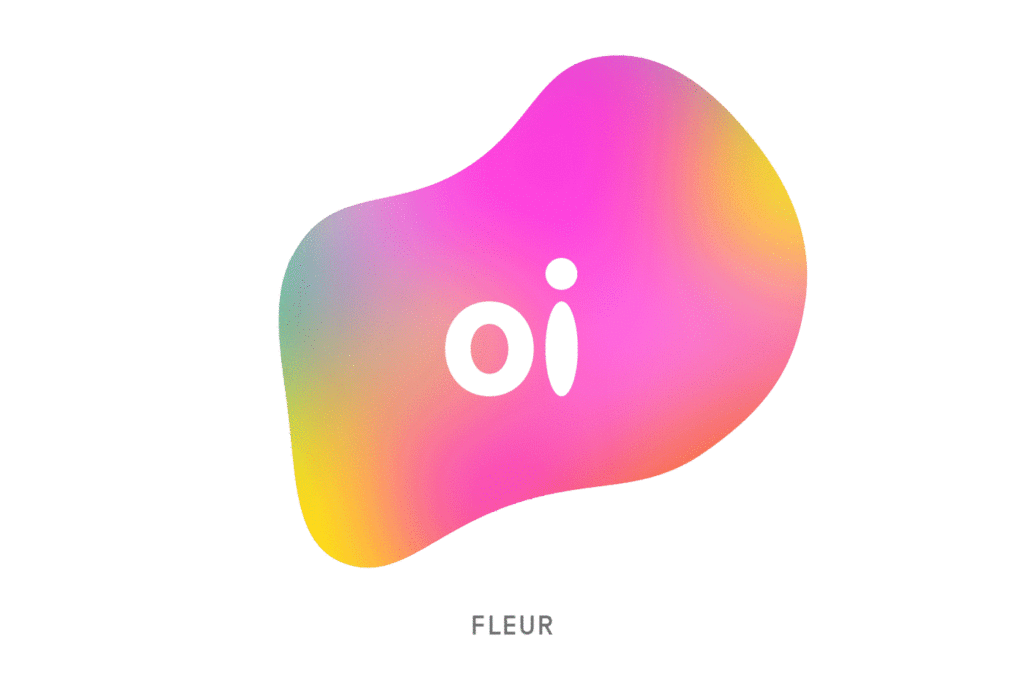
The berlin based studio Onformative created a tool to transform the logo of Oi, a Brazilian telecommunication brand, in fluid shapes through the use of sound input. The outcome is a sound-reactive interactive logo.
The interaction and product designer Xinyue Yang created a tool that uses speech to create animations. You just say what you would like to see in a scene and the program creates an animation out of the information.
To see more interesting projects and experiments with AI, I highly recommend taking a look at these two websites, where a lot of interesting projects are listed:
by Laura Varhegyi, Mira Kropatsch and Marton Szabo-Kass
Design is a discipline, but also an approach and a mindset.
/Emilio Lonardo/
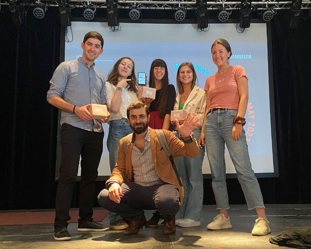
During this year’s International Design Week (10.-13.05.2022) at the FH Joanneum’s Institute for Design and Communication, we participated in the workshop of Emilio Lonardo. He is a designer and CEO of the company D.O.S. Design Open Spaces in Milan, Italy, and was invited to do a four-day workshop with the title “Augmented Habitat (AugH)”. We were a group of 7 students participating, coming from the master courses Communication Design, Exhibition Design and Interaction Design of FHJ.
Each day we had icebreaker exercises and larger tasks which taught us about the approach of augmented habitats. At the end of the week, we were able to use our newfound understanding, to produce a final product. On Friday, all results had to be presented to the whole audience of the International Design Week.
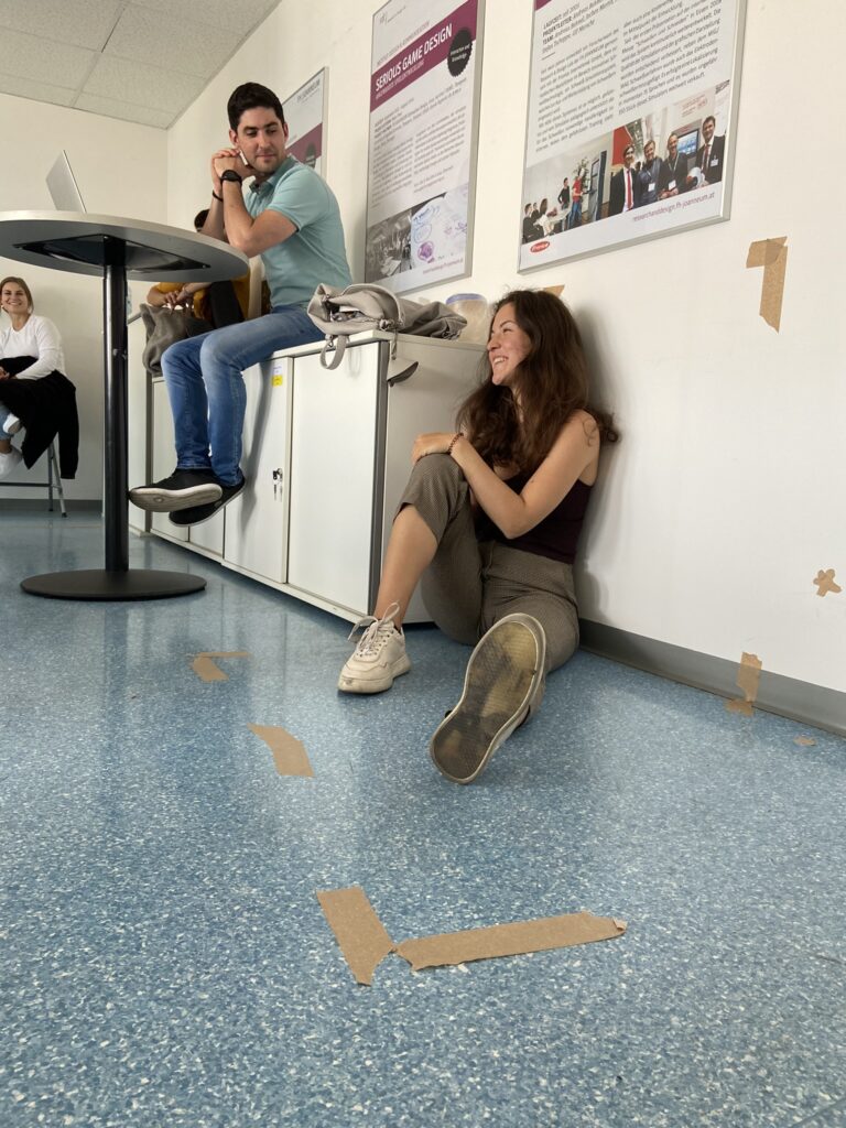
Speed Dating
It takes 7 seconds to generate a first impression of a person. To get to know the group at the beginning of the week, everyone had 7 seconds to talk with each participant and form an idea about them (we didn’t know all the participants before). After the seven seconds were over, we wrote down our personal thoughts about the person, who he/she might be and what trades they probably have. Afterwards, we collected the anonymous notes and read them out loud, one after the other. Each note had to be accepted and taken by someone. We of course never knew for sure if the trades were meant for us, but we had to think about how others might perceive us (in a speed dating situation). As the last part, we summed up our chosen notes and presented ourselves in front of the group, with those trades and a little story about us combining them.
It was insightful and challenging to think about our outside perception and image we show others.
Our own spaces
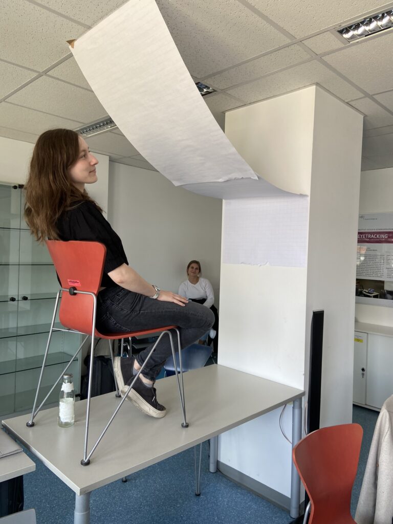
We wanted to actively use the space around us and therefore selected a space in the classroom we could modify with furniture, our stuff, masking tape and paper in several ways. And not only to change the set up, but also think about the way we want to function and the type of relationship we want to create. We defined the dimensions with masking tape and someone also left a gap open for the entry of the defined space. We started to see many elements we didn’t consider before, like the light and the view, so the way we positioned ourselves to the windows became crucial, just to have the perfect lighting condition. These spaces turned out to be multi-functional and very minimalistic. We presented our ideas to the group. These spaces were meant to be separating us, but also to share it and to have visitors coming over. We also had to come up with a pose for the space, because our own body was also a parameter in the realm we created and to showcase the relationship we fostered in the space.
Own space concept #1Own space conceptsOwn space concept #2
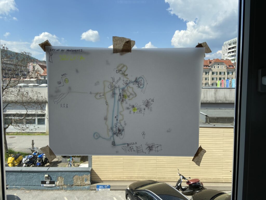
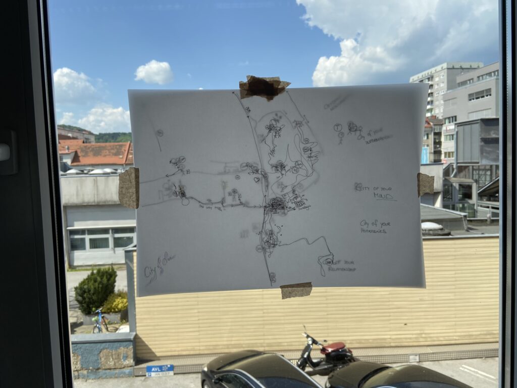
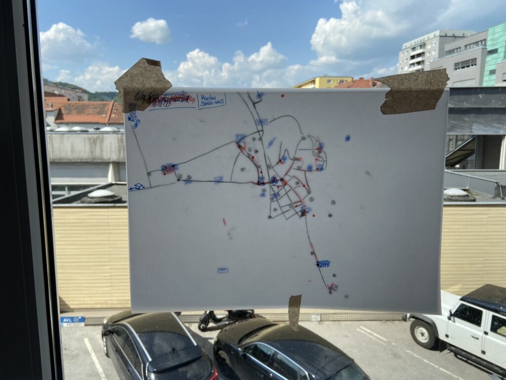
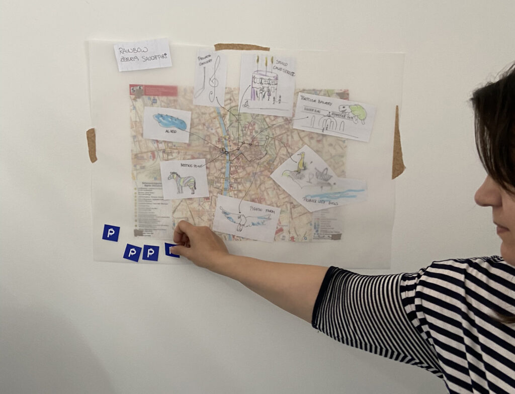
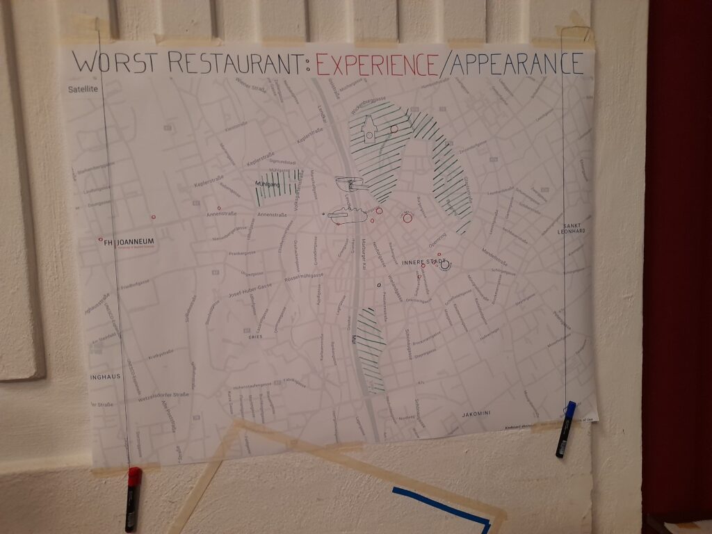
Our personal city maps
Through five different topics, we have created our own city maps by drawing on see through paper on top of the real city map of Graz. We highlighted locations, streets and areas to draw our own
City of monuments: orientation signal elements, symbols and images that serve as visual references,
City of information: all the places where we talked on the phones, took photos, got or gave information,
City of itineraries: all the places where we commuted or parked or left a trace,
City of our mind: all the places where we had spiritual or emotional events or experiences,
City of relationships: all the places where we met, joined, hugged, flirted or kissed someone.
By putting these different maps on top of each other, we could reveal our personal spatial areas of interests in Graz. It gave us a birds-eye view on the streets and places that we use the most or not at all. By comparing the personal maps of the participants, the city’s hotspots could be highlighted, as well as the differences in their lives, motion ranges and individual favourites. As in other exercises, here we could also see how different the perception of people can be about the same city.
Personal city maps example 1Personal city maps example 2Personal city maps example 3
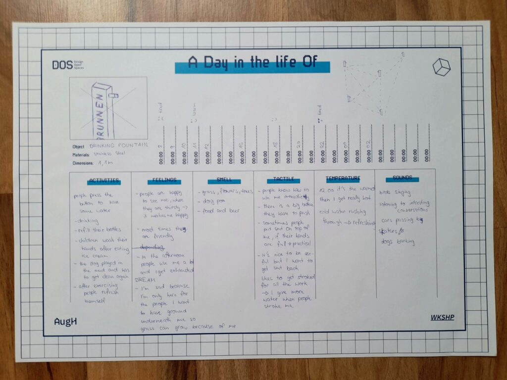
A day in the life of
For this exercise we had to select an urban artefact and write down their “daily routine”. This was all about the meaning an object could hold when they are alive and finding deeper understanding in their needs, feelings and relationship with their surroundings, people and animals. We put ourselves in the shoes of a storyteller, gave the artefacts a backstory and filled out the template for the daily routine with time stamps and the categories: Activities, Feelings, Smell, Tactile, Temperature and Sound. Emilio gave us some great input and we knew we had to dig deeper to find new connections in the stories and came up with new ways these objects could communicate with each other and the outer world. The stories couldn’t get crazy enough, so that was very fun, and also insightful to change the perspective and think about interactions in another way.
A Day in the life Of… Template by D.O.S.
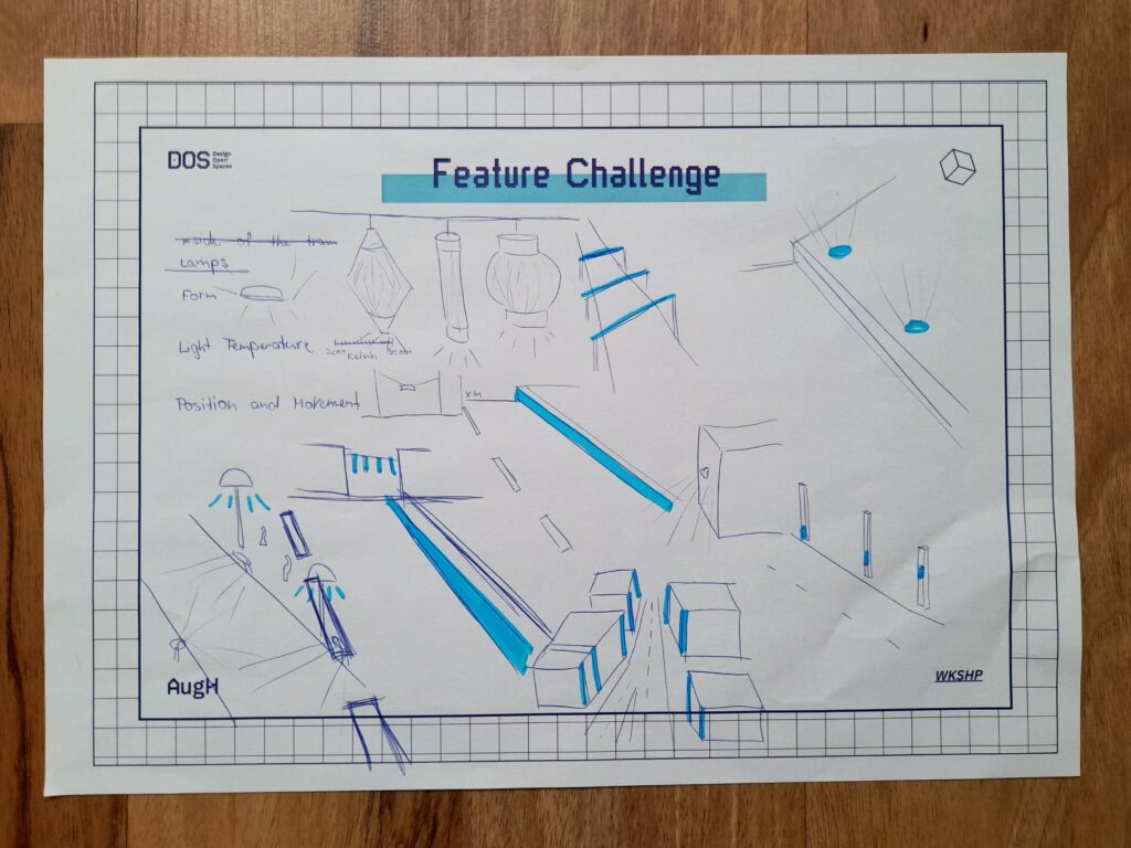
Redesigning city objects – Feature challenge
Every object in the public spaces has its purpose and was (mostly) designed to fulfil some specific needs. In this task, we first had to choose an object in the urban public space, and write down their three main physical characteristics – like materials, forms, dimensions, etc.
Next, we had to redesign the chosen object without using its earlier mentioned three features.
By this, we were forced to think outside the box and concentrate on solving the main problem and purpose of the object in new ways. It was interesting to think about the habits of citizens in interaction with city objects, and how these habits can change if we redesign the objects.
Feature Challenge draft example for city lights
SAugHFari
Everybody sees the city differently, and the inspiration and possibilities bound to certain places. In this task, we created Safari Tour concepts through the city of Graz with 6 to 7 stops we found interesting, that are also attractions of the places. There we had to take pictures, observe what was happening, pay attention to the people and take notes. The next day we chose a theme for our SAugHFari and made a presentation with the SAugHFari route on the map – explaining the concept, our ideas and the specific features of the tour. We then rated the trips we would join with 6 sticker coins for each of us to vote with. The trips were about places to hang out with friends, enjoy the city atmosphere, see animals or have different sensory experiences. The SAugHFari with the topic: restaurants not to visit won in the end. The selected concept was the base of the final task.
A SAughFari map example
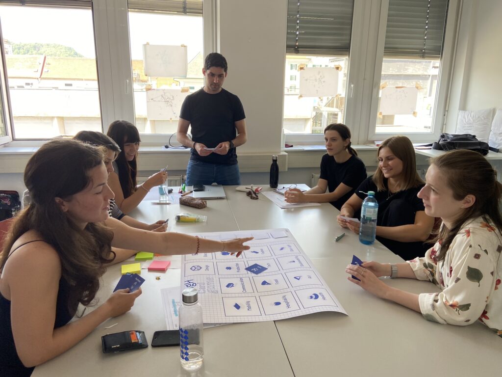
AugH Card Game
Emilio introduced a new brainstorming method to generate ideas for the final product concept. It was a simple card game about communication and connecting different goals in the project. A big sheet of paper had many fields with disciplines on it, like production, finance, mobility, etc. and we got six hand cards from piles like topics, technologies and action. We could put a card on a field and then had to say something linking the two areas together, to keep the conversation going. When we had no cards left, we could draw six cards from the piles again. The actions were fun, because if someone was talking for too long we had the option of a card with “stop talking” or we could just ask further questions by putting the action card down. We were talking for a long time until we had said everything, and then we could use some of the ideas we had and go to the implementation phase of the final project.
Brainstorming with the AugH Card Game
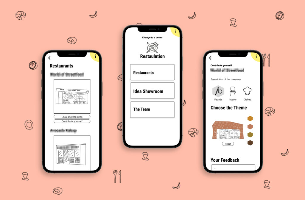
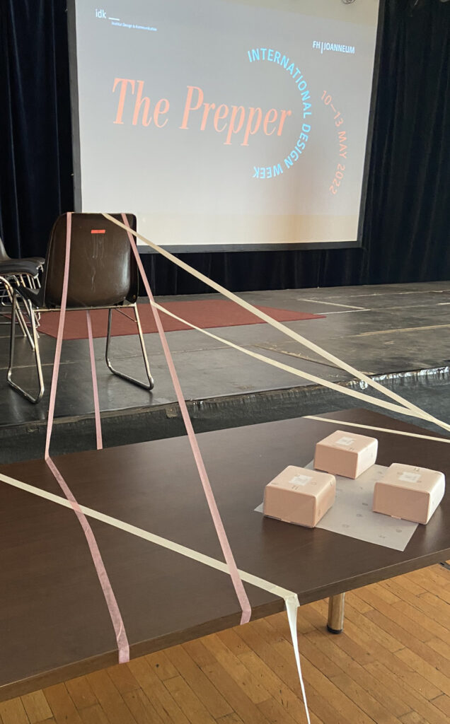
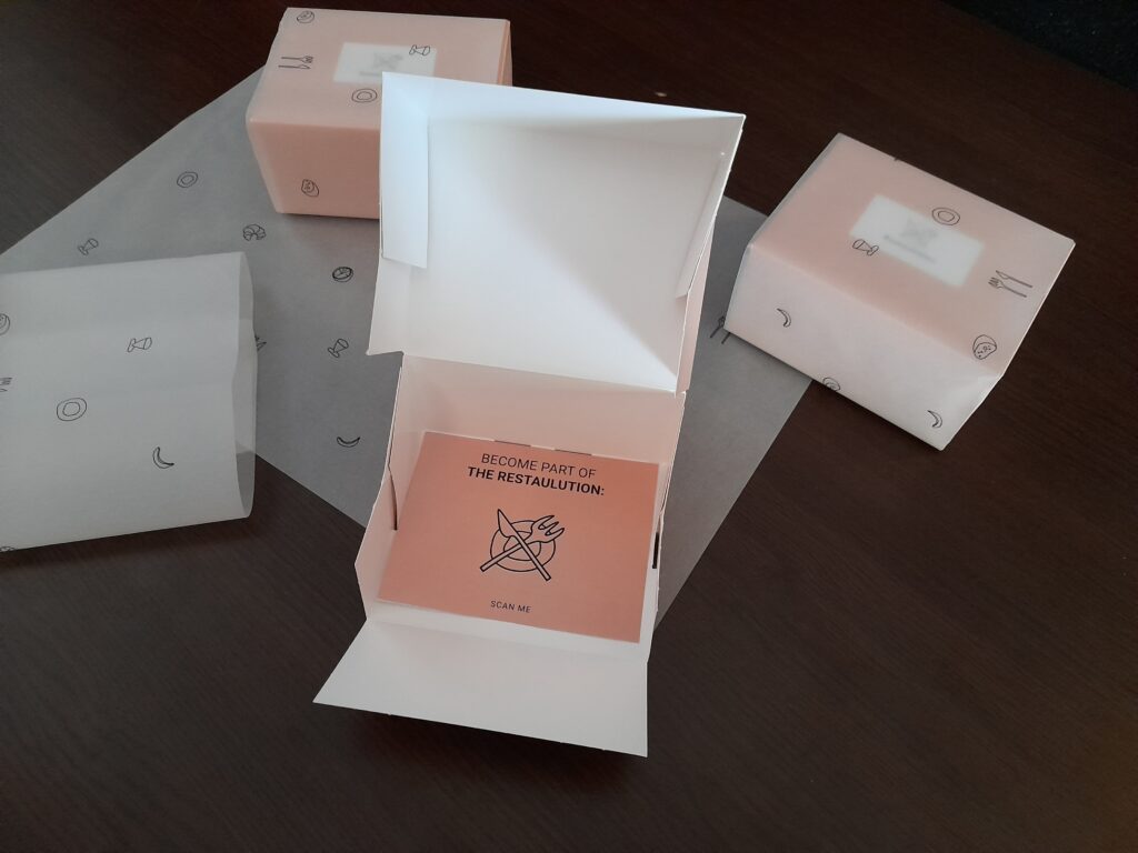
Final task: Restaulution
As a final task and project, we chose the most liked SAugHFari trip – from Jasmina Dautovic about the worst restaurants in Graz – and created an Augmented Habitat project concept based on it. The SAugHFari was dealing with the phenomenon of restaurants throughout the city that are not looking very trustworthy or inviting and giving some examples, where you wouldn’t go if you had a chance. So we thought about solutions, how to help these places to change.
After brainstorming about different implementation possibilities, we described the idea of a platform to help these uninviting restaurants with professional advice and community support.
We named the concept “Restaulution”: the restorative solution to revolutionize restaurants.
The base of the concept is a toolbox consisting of professional design solutions by architects and chefs, that serve as guidance and idea collection for every restaurant owner, who wants to upgrade and redesign their facility and service. Architects, interior architects and chefs could provide building blocks (well proven designs, style guides, recipes, etc.) combined with individual consultation options to the toolbox, from which the participating restaurants could choose from.
The framework would be a digital platform (app and website) to host all features of the concept:
Listing the toolbox contents (design and culinary) and cooperation possibilities with professionals
Providing different configuration options for the restaurants
Providing feedback possibilities for old and new customers to assess current designs → get feedback on what the customers want and expect
Showcasing design concepts and new ideas for the public – with possibility for the audience to rate them → get real customer feedback on new ideas
Announcing and showcasing newly implemented design upgrades of the restaurants to attract attention and convince the audience
Listing all participating restaurants and giving a guide to citizens and tourists about the ongoing projects – advertising possibility
We also built a provisional clickable prototype of the app to visualize the concept. This was made available during the final workshop presentations (read below).
With this concept, we wanted to enhance the city itself as our habitat and improve the quality of living. Uninviting restaurants are mostly neglected and not considered to be a problem, but how much better would the image of the city be if there were only high quality services everywhere?
Concept Logo
Dear Reader!
If you have interest, further ideas or feel the potential of the concept and have some possibility and resources to develop the platform further with us, don’t hesitate to contact us – we are open for collaboration to bring Restaulution to life!
For the execution of this project there would be a leading management team who would cooperate with the city. There are funds to improve certain neighbourhoods and it is also meant to improve the city as a whole enhancing the uniqueness of the communities. We want the restaurant owners to perform their best and with professional support from many disciplines they can also reach their goal and therefore also contribute to the prosperity of their community.
The second important link to the refinement of their establishment is the voice of the people living in the city. They can give feedback and also be part of the design development and vote for their favourite design of the facade and interior.
We evaluated the journey of the Restaulution with the CoDE principle (2 scenarios: Continuation, Deterioration, Ending), in the future, 30 years from now. If the project is doing well, we can update all the restaurants and shops that need our support and this project can be extended to more cities in Austria and Germany.
The project could also get really successful for a couple of months or years, with a lot of support, but then later drop in interest and eventually die.
If the project isn’t managed wholeheartedly from the beginning and the team isn’t well selected or the communication and management fails at one point the project can’t be executed and start to function. But with all the weaknesses eliminated, a great team setup and a lot of support from leading design agencies and the Creative Industries Styria the project can open whole new possibilities for the city.
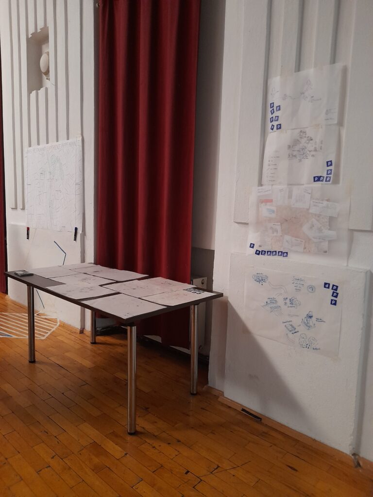
Final Presentation
We showcased our workshop results on the last day, but not like every other group of the International Design Week via Powerpoint presentations on the stage. Instead, we built stands around the hall, so people had to stand up and come to us, and also try out our final product. In one corner, people could scan the QR-Codes that would forward them to PDF slides and show the activities we did that week. On the other side people could look at our maps and mark on a big map their worst restaurant experiences and memories in Graz. In the front people could try out our product and open the imaginary “toolbox” packaging with our Restaulution logo, which invited them to become part of the project. The packaging had a hidden NFC chip which redirected people to our prototype they could try out, when they scanned it with their phone. We were all at different stations explaining our project and helping them to navigate through our stands and on the prototype. The audience was very interested and liked the ideas and the execution.
The Restaulution “Toolbox”
Final thoughts about our workshop
The way a space is designed determines how we use it and behave in it. As designers, we are trained to adapt our solutions to the behaviour of the target group. But it is through more visionary approaches, such as in this workshop, that we begin to think about the fundamental essence of the relationship between people and spaces. This way of thinking allows one to find new approaches that reshape behaviour and, by extension, society.
We had a great time with Emilio, who gave us a lot to think about and handed us tools we could use to broaden our imagination when it comes to problem-solving. With all the activities, he challenged us to think in new ways and starting from other directions when designing. We were fortunate to have an interdisciplinary group of people who could inspire and complement each other with different skills, backgrounds, interests and experiences.
With a multidisciplinary approach in design, it is much easier to tell a story and reflect other parts and aspects of a place, brand, product, etc.. We broke down places into separate compartments when it comes to reimagining and shaping a space. This made it a lot easier to think of pieces coming together and the use of a place / space. Not only things like thresholds, facades and ceilings define a space, but also soft components like light, sound, pollution and time.
We were tackling design, design thinking, public urban space & product design and our habitats from different points of views. The tasks challenged our creativity to perceive and think about our surroundings differently, including not only objects, but humans and their relationship as well. If one had to describe the feeling of the workshop in one sentence, it would be: a fresh wind of new approaches, which were brought closer to us in a playful way.
Such international cooperations like this workshop are essential for designers to broaden their perspectives and get to know different people with unique mindsets. We will hope and search for similar opportunities in the future as well.
This Blogpost is rather intended to help me shape my research topic than actually gathering a lot of new information/dive in deep into a subtopic as I am currently working on my research proposal. To get back on track I am going to start with a short summary about what happened so far.
Summary
By definition, making deceptive design patterns means „designing an interface or experience in a way to manipulate users on purpose for the companies sake.“ This can be translated into using a design approach to trick user into doing something they did not intend on doing. There are various different types of deceptive design patterns (11 types according to Brignull), which was the starting point of my research. However the prime example tangential to each of us is the cookie consent manager. Usually the acceptance-button is way bigger than all the others and additionally adjusting Cookies-Settings is difficult and time consuming. Almost never you can find „Decline all“ as primary button. This is an ethical question and we as designers are definitely responsible to find a balance between clients/their business and the user. Therefore we need to rethink all our UX decisions in order to know when it turns into a deceptive design which should always be avoided. Deceptive design patterns are usually influencing decision making and there are two ways of doing this: Finding quick and simple solutions based on our emotions and slower, conscious decisions by processing all available data. 95 % of the time we decide unconsciously and just go with our gut. A quite common way to influence decision making is Nudging, which is achieved by changing process without limiting choice, for example opt in organ donors by default to increase the number of them. To use this strategy in a negative way turns it into a deceptive design pattern real quick. Within my research I also analyzed to examples of deceptive design patterns and showed a suggestion on how it is would be more user friendly. In both cases the UI and visual feel do not change at all with this small adaptations, which proves that they did it on purpose and it could be reversed easily. I also did an excursion in my research on data tracking since it is a related topic. For 2 years there have been new privacy rules in Europe, however the big players still ignore this. But in the future there will be consequences for instance a recent ruling that would make google analytics illegal. I also had a closer look on principles of good design by legends like Donald Norman, Ben Shneiderman, etc. Doing the opposite of those rules is basically an instruction for deceptive design patterns. But this also means this is the way to reverse/avoid them. Just follow the most important rule: Good design is honest.
Main focus points of the thesis and next steps
In my thesis I want to start with a more detailed research phase on the topic, then use the knowledge to apply it on real life examples and develop something new out of it. Following theory will be tackled:
Ethics in UX Design (Universal Design, Codes of conduct in UX, Critical Design)
Psychology of Perception (Human senses, Persuasion, Manipulation/Deception)
Existing Design Guidelines in UX (Golden Rules of interface design, Usability Heuristics, …)
My next steps are to collect a lot of different examples, analyze and try out ways to revert them. Furthermore I want to define a good way how to communicate the problem of deceptive design with clients and make them understand why this is not the smartest way to design and that satisfied users increase profits in the long run. Hence the thesis is a handbook for designers how to actively work against deceptive design.
Idea of a new platform for designers
The idea is to use all this research to create a new platform for designers to fight deceptive design. The main inspiration is Harry Brignull’s website deceptive.design, but instead of just collecting examples in a hall of shame I want to create a community that turns those examples into light patterns. This will be achieved by making weekly, open for public, design challenges with the goal of reverting a specific dark pattern of a company and increase its usability. Consequently companies have free access and input on how to change their products for the better including possible designers that they can hire. Furthermore the platform should serve as a place of exchange for designers about deceptive design and thus give more attention to the problem. The aim of the thesis is to shape the concept of the platform, do research on target group and stake holders, design a functioning prototype and evaluate it in a usability test or execute a heuristic evaluation.
Dark Patterns to Deceptive Design
There has been a very recent change in the wording of dark patterns. In order to be more clear, inclusive and prevent the further association between the words „dark“ and „bad“, many companies and individuals adapted the term to deceptive design patterns. Taking action against racism by reflecting and actively avoiding negative linguistic stereotypes is very important in todays society in my point of view, which is why I decided to change the term in all my previous articles and am going to use the term „deceptive design patterns“ from now on.
List of Literature
In order to check if there is a reasonable amount of literature on my topic available I decided to start a collective list of books and articles to quote in my thesis.
Alrobai, Amen, John McAlaney, Huseyin Dogan, Keith Phalp, und Raian Ali. „Exploring the Requirements and Design of Persuasive Intervention Technology to Combat Digital Addiction“. In Human-Centered and Error-Resilient Systems Development, herausgegeben von Cristian Bogdan, Jan Gulliksen, Stefan Sauer, Peter Forbrig, Marco Winckler, Chris Johnson, Philippe Palanque, Regina Bernhaupt, und Filip Kis, 9856:130–50. Lecture Notes in Computer Science. Cham: Springer International Publishing, 2016. https://doi.org/10.1007/978-3-319-44902-9_9.
Gray, Colin M., Yubo Kou, Bryan Battles, Joseph Hoggatt, und Austin L. Toombs. „The Dark (Patterns) Side of UX Design“. In Proceedings of the 2018 CHI Conference on Human Factors in Computing Systems, 1–14. Montreal QC Canada: ACM, 2018. https://doi.org/10.1145/3173574.3174108.
Nielsen, Jakob. „Enhancing the Explanatory Power of Usability Heuristics“. In Proceedings of the SIGCHI Conference on Human Factors in Computing Systems Celebrating Interdependence – CHI ’94, 152–58. Boston, Massachusetts, United States: ACM Press, 1994. https://doi.org/10.1145/191666.191729.
Norman, Donald A. The design of everyday things. Revised and Expanded edition. New York, New York: Basic Books, 2013.
Shneiderman, Ben. Designing the user interface: strategies for effective human-computer-interaction. 3rd ed. Reading, Mass: Addison Wesley Longman, 1998.
Shneiderman, Ben, Catherine Plaisant, Maxine Cohen, Steven M. Jacobs, und Niklas Elmqvist. Designing the user interface: strategies for effective human-computer interaction. Sixth Edition. Boston: Pearson, 2017.
Maier, Maximilian, und Rikard Harr. „Dark Design Patterns: An End-User Perspective“. Human Technology 16, Nr. 2 (31. August 2020): 170–99. https://doi.org/10.17011/ht/urn.202008245641.
Ardito, Carmelo, Paolo Buono, Danilo Caivano, Maria Francesca Costabile, und Rosa Lanzilotti. „Investigating and Promoting UX Practice in Industry: An Experimental Study“. International Journal of Human-Computer Studies 72, Nr. 6 (Juni 2014): 542–51. https://doi.org/10.1016/j.ijhcs.2013.10.004.
Bardzell, Jeffrey, und Shaowen Bardzell. „What Is ‚Critical‘ about Critical Design?“ In Proceedings of the SIGCHI Conference on Human Factors in Computing Systems, 3297–3306. Paris France: ACM, 2013. https://doi.org/10.1145/2470654.2466451.
De Martino, Benedetto, Dharshan Kumaran, Ben Seymour, und Raymond J. Dolan. „Frames, Biases, and Rational Decision-Making in the Human Brain“. Science (New York, N.Y.) 313, Nr. 5787 (4. August 2006): 684–87. https://doi.org/10.1126/science.1128356.
Edwards, Ward. „The Theory of Decision Making.“ Psychological Bulletin 51, Nr. 4 (1954): 380–417. https://doi.org/10.1037/h0053870.
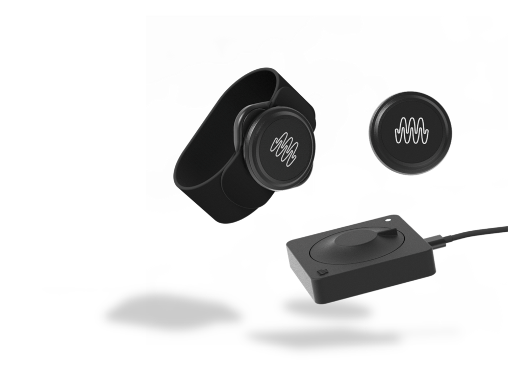
The biggest change that I await to happen next semester is to receive the SOMI-1 kit from Instruments of Things. This new kit will only come out during summer, but basically entail exactly what I need from it: the wristband sensors look and can do pretty much the same as the ones from the 2.4SINK kit, but the receiver is just a small USB interface, meaning there is no analogue data to clean up anymore. This of course makes the time I spent cleaning this data feel a little redundant, but this also gets rid of the bottleneck, allowing me to read out data from more than one sensor simultaneously, too. Which also brings me to my next point: I will spend some time on planning the multi-sensor mapping – basically defining what influence each sensor has on the soundscape when more than one sensor is active.
Other than that, I will want to spend a lot of time on the actual composition. And furthermore, I would like to plan the installation, since I would like it to be a multi-sensory experience. Either way, I am very much looking forward to spending more time on this project.