Ethical Practices in Interaction Design

Since my last post I started to deepen my topic and reflect on the different approaches I can use in my master’s thesis. However a clear outcome hasn’t been defined and will emerge after some interviews with experts to have a specific problem I want to address in my thesis.

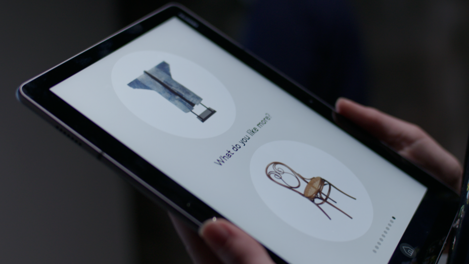
Principles like Eudaimonia-Centered Design contribute to the development and improvement of products for human flourishing. I’m interested in an in depth look on how design elements can support well-being and healthy behaviors in humans. First, I need to understand the human response to esthetics and sensory stimuli in HCI. For this user tests, A/B tests and interviews are necessary. The design elements that will be evaluated in the next step include UI elements, micro interactions and on the other side of the spectrum user-flows. And in combination how can they create better user experience on the outlook of human well-being.

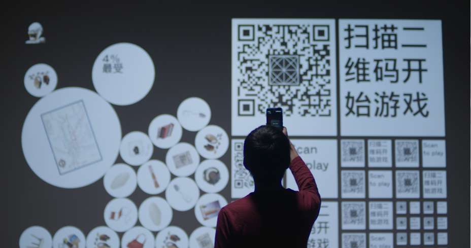
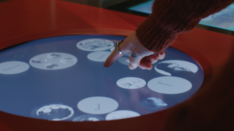
There are multiple frameworks and methods for ethical design. They include cards with question and proposals to improve products and services for people. In the theoretical part they will be examined and verified. Relevant design principles and strategies are openly discussed that could be implemented in the design steps for designers. Interviews with experts in this field who work with ethical design in HCI could give more description on the tool and procedure that are being used to develop products. This would be also the basis for the development of the design elements.

Psychology and Technology are field that overlap in HCI, studies show effects of technology use on the psychological well-being. Personal informatics technology is a way to refelct on positive experiences and emotional well-being. Users can track habits and mood to help build skills and gain knowledge about themselves and create goals they can strive for.

References:

Towards Happiness: Possibility-Driven Design by Pieter Desmet, Marc Hassenzahl

Engagements and Articulations of Ethics in Design Practice by Christian Dindler, Peter Gall Krogh, Kasper Tikær, Peter Nørregård

User Friendly. How the Hidden Rules of Design Are Changing the Way We Live, Work, and Play by Cliff Kuang, Robert Fabricant

Design for Wellbeing: An Applied Approach by Ann Petermans, Rebecca Cain

Designing for Motivation, Engagement and Wellbeing in Digital Experience by Dorian Peters, Rafael A. Calvo, Richard M. Ryan

Things We Could Design: For More than Human-Centered Worlds by Ron Wakkary

Evaluating Hedonic and Eudaimonic Motives in Human-Computer Interaction by Katie Seaborn

Critical Evaluation of a master’s thesis

Designing Future-Friendly Content: Modeling production data for industrial applications by domain experts

By Diana Solkazian

Level of design

The layout was designed according to the guidelines of the FH in Salzburg, therefore it is in Times New Roman with consistent spacing and has a serious look.

Degree of innovation

The thesis is about the development of an engineering tool integrated in an international software platform from the Austrian company Copa-Data. Different methods were compared and analyzed and UCEID was used in the end. User tests and the development of high-fidelity prototypes was another part of the work.

Independence

The work is autonomous and in cooperation with Copa-Data. The author wasn’t just highlighting the progress and the results of the thesis, but also included unexpected events occurred during the usability tests. Which also gave her valuable learnings because she did remote tests for the first time. These are also little details that show that the work was developed independently.

Outline and structure

The table of content is well structured and gives a great overview over the thesis. The structure is very clear and logical, and each chapter ends with a summary. The author added a list of figures, that gives deeper insights especially to designers who want to take a quick look at the documentation of the project without the theoretical research. She used an appendix for all other relevant prototypes, the survey and the link to the figma prototype.

Degree of communication

Diana has a very accurate literary expression, and her writing style is at a very high level. This makes her work even more sophisticated. She presents a theoretical background and has a clear understanding of the topic. The author uses many references to other sources and breaks down the complexity of the work in many interesting smaller paragraphs. This makes it very easy and fascinating to read. She was very thorough, and her thesis gives a great example of the structure, terminology, and case study of a master’s thesis. She could have shown more of the product or the documentation, but this was probably not possible because of privacy reasons.

Scope of the work

The UCEID framework was the basis of her methodology. She also used a user-centered approach and the ecological interface design to develop the new interface. The results are based on user testing and a survey. Concluding there is a good variety of theoretical background and methods being used.

Orthography and accuracy

I couldn’t find any errors or misspelling in the thesis. She has a very deliberate way of expressing herself that guides the reader through her work.

Literature

When you look through the resources you see that Diana researched in detail about the different topics. There are many online sources, but also books found on google books and scientific sites. The sources are comprehensive and correctly cited. 

Solkazian, Diana: Designing Future-Friendly Content: Modeling production data for industrial applications by domain experts. Mag. -Arb. FH Salzburg. Salzburg 2021.

Beyond good UX

My current research has led me to immersive experiences where people can dive into a new world and interact with an environment. But I got occupied with another topic and a question peaked my interest. Can a good user experience be bad for the user? The answer may seem obvious, great UX can lead to hours of engagement and low user-frustration with an application. But the system was designed that way.

We develop and design new addictive products with less and less obstacles and friction-less interactions and infinite-scrolls that are so highly immersive that people spend hours looking at their screens that keeps them so powerfully occupied. Technology has a huge effect on our mental structure and uses our psychological mechanism to manipulate our behavior.

Even user-centered design seems to be all about low error-rate and high conversion. In order to create a pleasant experience. We mustn’t mistake user-centered design with convenient consumption. Design could aim higher giving people their attention back and hand them a tool that benefit their needs and nobody else’s.

Eudaimonia-Centered Design

With eudaimonia-centered design human well-being is in the center. Aristotle argued that eudaimonia – human flourishing is the highest end we all strive for. It requires virtuous activity and not just being in a state of mind. So finding meaning and engagement in the things we do. This can be translated and implemented when we design new products for people. User-centered design does a great job, by putting learned patterns and behavior into the design process. Products get more accessible and user friendly in this sense. Eudaimonistic-centered design does the same but goes a step further and asks whether the product in itself is good for the user’s well-being.

Possibility-Driven Design

Possibility-driven design is an approach that draws upon happiness to motivate the design of future technologies. Pieter Desmet and Marc Hassenzahl argue that problem-solving became an obsession beyond the acceptable. Problem-driven design is primarily about avoiding, solving, or neutralizing the negative, the moment it arises. But avoiding the problems in a design or system is not equal with a pleasurable experience. With every design iteration the solution evolves another problem and this never ending-cycle focusing on the problems rather the possibilities to transform and transcend an object, leaves us with new issues we never had to deal with before. Through the mindset of activities being problems that could be improved, our day-to-day activities became chores we want to avoid, than to simply looking at them in a pleasurable way. Because possibilities can become future prospects that drives innovation and to create new beneficial systems for people.

The main question for my thesis is:

How can immersive technology benefit our well-being?

Technology has the potential to thrive people’s ambitions and to contribute to their well-being. I want to explore the positive and negative effects of engaging technology. Comparing different studies on the impact on our mental health to find out what brings us peace and improve our life.

Steps for my thesis:

  • Collect evidence of harmful technology
  • Gain knowledge about technology having a positive effect on our well being
  • Create a system that promotes well being

References:

Eudaimonistic-centered design https://uxdesign.cc/eudaimonistic-centered-design-92b69654ee25

Digital products should be non-harmful. It’s time we embraced that. https://uxdesign.cc/digital-products-should-be-non-harmful-its-time-we-embraced-that-44d0ca139d1a

Towards happiness: Possibility-driven design https://www.researchgate.net/publication/233850646_Towards_Happiness_Possibility-Driven_Design

There are already some incredible guides to take control over our phones: https://www.humanetech.com/take-control

The Treachery of Sanctuary

Designed by Chris Milk

The Treachery of Sanctuary is an experience of birth, death, and transfiguration and the creative process. It projects the transformation of the participants’ shadow on a white panel. It is an older project, Milk made 10 years ago but it is still simple and impressive.

The work consists of three 30-foot high white panel frames suspended from the ceiling on which digitally captured shadows are reprojected. A shallow reflecting pool sits between the viewers and the screens. In the background, an openFrameworks application utilizes the Microsoft Kinect (Kinetic Connect Controllers) SDK for Windows and infrared sensors. This talks to a front end running Unity3D in which articulated 3D models of birds interact with the shadows captured by three hidden Kinects.

In the first panel the body disintegrates into birds, the moment of birth or the moment you have an idea. The second panel is representative of the critical response, eighter by yourself or the outside force. This is what it feels like to have your purest expression picked apart by a thousand angry beaks, it represents death. The third panel, where you sprout the giant wings, represents the transfiguration. When you overcome death and the idea is transformed into something larger.

Thoughts

You can see the artist behind this project. Overall, it’s a great illusion to transcend into a bird, it is pretty magical to see your shadow transforming. Not that immersive but perception wise, a very nice project.

References:

The Treachery of Sanctuary https://www.sundance.org/projects/the-treachery-of-sanctuary

The Treachery of Sanctuary http://milk.co/treachery

Meet Director Chris Milk And Check Out His Latest Installation The Treachery Of Sanctuary https://www.vice.com/en/article/4x4jyb/meet-director-chris-milk-and-check-out-his-latest-installation-ithe-treachery-of-sanctuaryi

Aura at the Notre-Dame Basilica

Designed by Moment Factory

Aura is a multimedia installation inside the Notre-Dame Basilica in Montreal. It uses light, sound and video mapping to showcase the basilica in a completely new way. The story has three acts: The Birth of Light, The Obstacles and The Open Sky. The story contains religious themes and highlights the gothic structure.

To use the church’s interior as a canvas, the team did a complete 3D scan of the space, ensuring that all details would be perfectly matched to the projections. Due to the multifaceted nature of the project, it took over a year of work, including sound recording and visual imagery to move the installation from idea to reality.

The complexity of the architecture made it more difficult to plan ahead. They had to make tests with projectors on a weekly basis. Oftentimes it was trial and error, when something didn’t work, they had to come up with a different solution and test the new idea.

The moment factory who created the installations used 21 projectors, 140 lights, and 20 mirrors for the lighting and projections. Marc Bell and Gabriel Thibaudeau used 30 musicians and 20 chorists for the music. The results are an incredible transformation throughout the performance, as light, color, and sound are used to create a unique mood.

Thoughts

Aura is an incredible immersive experience, and the projection is well done. The only thing that would enhance the experience is live music. The acoustics are incredible in churches.

References:

Aura at the Notre-Dame Basilica https://momentfactory.com/work/all/all/aura

19th-Century Gothic Church Is Transformed into an Immersive Wonderland Inside https://mymodernmet.com/moment-factory-multimedia-installation/

Best Practice

In the upcoming posts we will look at best practice examples of exhibitions, installations and experience centers. The analysis will cover the interaction itself, how immersive it is and the implementation.

LAVA Centre

Designed by Basalt Architects and Gagarín

The LAVA Centre is a fully interactive exhibition based in Hvolsvöllur on Iceland. It’s an educational exhibition centre that teaches people about volcanology while experiencing the extreme forces associated with volcanic eruptions and earthquakes. Every installation was based on the best scientific knowledge available from both recorded data and live data from leading geological institutions and universities in Iceland.

It’s fully interactive, so every exhibit is either triggered or shaped by visitors’ motion or behavior. Visitors get to create Iceland, shape the crust with magma intrusions and eruptions that result in mountains, rift valleys, islands, floods, craters and more. Nature has its own platform that one can’t compete with, so the designers also recreated elements with a certain abstraction in mind, allowing the esence of the phenomenon to shine through.

The project includes over 20 interactive installations in four large halls and four corridors. Half of the installations can be considered immersive. Every exhibit was custom made by the Basalt Architects and Gagarín design team.

In the Seismic Zones there is an interactive wall that responds to visitors’ movements and three shaking platters! At once this installation surprises the visitors and educates them about the Rift zone, the Shear zone, and the Volcanic flank zone.

The Volcano Corridor allows guests to walk from the present into the past and learn about every eruption in Iceland over the last 100 years, while triggering the explosive light and soundscape of lava flow.

In the Earthquake Corridor, visitors can experience known earthquakes that shook Iceland over the last 20 years. The earthquake simulator uses the actual seismic data that was recorded when the quakes took place.

The Lava corridor is an audioscape on lava and geothermal areas, both common derivatives of volcanic activity. In the Volcanology room visitors can learn about all the different types of volcanoes and volcanic systems found in Iceland.

The Tephra Corridor gives people the opportunity to experience the visual disruption associated with eruption underwater or under a glacier.

Thoughts

To create an engaging experience of volcanic eruptions and the flow of magma is a difficult task. I think they did a great job, there isn’t much text or instruction included. They created something, that can’t be experienced in real life, it’s abstract and impressive to shape the land by yourself on an interactive wall or to track a volcanic eruption from the underground and to feel the earth shaking. You can control the magma flow and recreate a landscape to your desire, like you’re natures force. It’s pretty impressive.

References:

LAVA Centre https://segd.org/lava-centre

Lava Centre https://gagarin.is/work/lava-centre

Analog/Digital Environments

In this article we will look at other types of installations and projections to see what other settings we can use as designers for immersive experiences.

Projection Mapping

Projection mapping is a 3D video projection technique using physical environments and objects as the surface for a projection, instead of a screen. Light, colors and oftentimes sound is used to outdraw a story with the edges of a building being the only boundaries for the scenery. Architectural elements, such as facades, are filled with life through precise lighting of the projection surface. The structure dissolves and the illusions take over. Houses bend or fall apart, 3D objects move in the direction of the audience.

AV Installations

Worth mentioning are Audio-Video Installations using giant or more smaller screens, showing videos or animations. They are often used in exhibitions and public places and are most times not interactive. But in the lobby of the Terrell Place in Washington DC there is an installation with motion-activated screens responding to the people going by.

Immersive Sensory Rooms

CAVE (Cave Automatic Virtual Environment) is a virtual reality environment consisting of a cube-shaped VR room you can enter. The walls, floors and ceilings are projection screens and with a VR headset, that is synchronized with the projectors, the user can walk around an image to study it from all angles. Sensors within the room track the viewer’s position to align the perspective correctly.

References:

Projection mapping https://www.barco.com/en/solutions/projection-mapping

Videomapping Projection https://www.visualimpression.de/en/3d-visualisierung/videomapping-projection/

Amazing Screen Installation http://www.fubiz.net/en/2016/07/30/amazing-screen-installation/

CAVE (Cave Automatic Virtual Environment) https://whatis.techtarget.com/definition/CAVE-Cave-Automatic-Virtual-Environment

Immersive Experience

In this blog post we will look at the fundamentals of immersive experiences. What makes them immersive in the first place?

What is an Immersive Experience?

An immersive experience is pulling a person into a new or augmented world, giving them space to explore and engage on their own and enrich everyday life via technology. We must start with a purpose when designing an immersive interaction or installation. Understanding the human condition, how they behave, feel and think about the world around them, gives us information how we can build stories they can be part of. Great immersive experiences make the user discover the story themselves. That’s really the key to creating a compelling immersive experience.

If the experience doesn’t have a purpose, the technology becomes a gadget. Making a 360° Video is nice, but if you can’t engage, if it doesn’t feel reel to you, then why bother. You could just use a screen.

You’ve got to start with the customer experience and work backwards to the technology. You can’t start with the technology and try to figure out where you’re going to sell it.

– Steve Jobs, 1997

Strategies to Create an Immersive Experience

1. Start with the Big Idea

Always start with the concept, the big idea, not the implementation and what tools to use. The experience is in the foreground, when people are using the tools (headset, controllers), they should melt into the environment and become invisible. This is the goal.

Start asking these questions: What do you want people to feel? To experience? What role do your visitors play in the story? What is their purpose? What is the message you want to leave them with?

When you know what their journey will look like you can choose the elements that will bring that idea to life.

2. Nail the Details

The little, transformative things are what bring a setting to life. Details in the visualization but other sensations as well, can make the experience becomes more immersive. Things like sound, video quality and intuitive interaction make the immersion even greater.

Also providing a sense of place and what is beyond that place gives a greater impression of the story and that is part of something larger. This is as true for an immersive environment that never leaves a small room, or an epic feature film.

3. Incorporate Location-Based Interactions

A powerful marketing tool is geofencing, it utilizes location data to establish a virtual territory. Like walking into a store and having a discount code automatically pop up on your phone. Location-based interactions can be used in different scenarios. A story could be presented on your phone while you go through an exhibition, showing you hidden details and facts to the objects. Or at a conference or meeting you could be easily connected with other people who share the same value as you do and locate them.

4. Enable Multi-User Interaction

Creating connections between people or make them interact together in the environment extend their experience. Enabling socializing in an event makes it more immersive.

5. Use Positional-Tracking Hardware

Most mobile VR headsets like Oculus Go, Samsung Gear VR and Google Daydream View only have rotational tracking, you can look around and tilt your head, but your position is fixed to one spot, you are not part of the world. A great VR experience lets you move through the virtual world physically to gain a feeling for the space. Positional tracking hardware uses sensors to assess motion and position relative to its environment.

A successful immersive experience is the sum of its parts, and sometimes the simplest use of technology is the best solution. The goal has to be well defined, what the user should see and feel. Interactions should be simple and take low effort.

References:

Designing for Interactive Environments and Smart Spaces https://www.toptal.com/designers/interactive/designing-for-interactive-environments-and-smart-spaces

What is an Immersive Experience And How Do You Create One? https://clevertap.com/blog/immersive-experience/

The 6 Secrets To Creating A Truly Immersive Experience https://www.forbes.com/sites/sethporges/2016/06/09/the-6-secrets-to-creating-a-truly-immersive-experience/?sh=27aeeb223918

How virtual reality positional tracking works https://venturebeat.com/2019/05/05/how-virtual-reality-positional-tracking-works/

Difference between VR, AR, MR, XR

Let’s start with the basics. We first must know the difference between these technologies, to be able to adapt future projects to the right environment.

Reality as a construct

What we perceive with our senses seems to be reality, whether what we perceive comes from the digital or the physical world. Take for instance watching a movie, we know it is not real, but it feels real to us. It triggers emotions, we feel empathetic to characters and we create connections with them.

It’s really important to understand we’re not seeing reality. We’re seeing a story that’s being created for us.

– Patrick Cavanagh, Research Professor

The virtuality continuum is a scale that goes from reality to virtuality. In it, technologies can be categorised by how immersive they are. The virtuality continuum is a theoretical framework introduced in 1994 by Paul Milgram and Fumio Kishino. It helps us visualize and understand the differences between the various technologies that exist today.

XR

Extended Reality is the real-world environment with technology overlapping, it includes AR, MR and VR. It is blurring the line between the physical and the digital world. The technologies AR and MR overlap with reality and thus also create different impressions and impact towards the environment. We could see that when Pokémon Go came out.

There are no mental models in how to interact in XR, it’s a new area and a lot has to be designed, tested and standardized.

AR

Augmented reality allows us to overlay digital elements into the real world. Using a screen that display real surroundings with digital elements, but they don’t interact in any way. It has its limitations but is still extremely powerful, not for immersive environments but can be used as a tool for solving problems.

MR

Mixed Reality goes a bit further because the digital overlay can interact with the physical world. MR gets input from the environment and will change according to it. It removes the boundaries between real and virtual interaction via occlusion. Your physical surroundings become your boundaries. The lines here became blurry what really exists and what seems to exist in the real worlds.

VR

Like the name suggests Virtual Reality is an immersive digital environment and the physical world has no part in it. VR takes advantage of the visual and auditory systems, this world seems real to us.

The perception of our environment has a huge effect on us. We should keep that in mind. VR should never be too intense for us to handle, like standing on a plank at the top of a skyscraper and looking down. We need to feel save when entering a new world. Participants should always know that the extensions aren’t real but can still enjoy the journey. Like watching a movie.

References:

Beyond AR vs. VR: What is the Difference between AR vs. MR vs. VR vs. XR? https://www.interaction-design.org/literature/article/beyond-ar-vs-vr-what-is-the-difference-between-ar-vs-mr-vs-vr-vs-xr

XR: VR, AR, MR—What’s the Difference? https://www.viget.com/articles/xr-vr-ar-mr-whats-the-difference/

How will user experience shape exhibition spaces?

Museum visits are quickly becoming more personalized and interactive with the help of technology. The traditional medium like painting, drawing, and sculpture has been transformed into new forms such as virtual reality, digital installations, and projection mapping. Touch, physical participation, and social interaction become essential qualities. Interactive exhibitions have the power to pull the audience closer to artworks, performances, and installations. An act of engagement creates a more memorable experience. Digital art installations offer new opportunities for viewers to actively participate in the artwork. Nowadays, the adoption of VR exhibits is increasingly common both in large and small museums because of their capability to enhance the communication of the cultural contents and to provide an engaging and fun experience to its visitors.


Not only museums want to give their visitors an incredible experience, brands often use interactive elements and AV Installation for an astonishing experience. What ways are there to invite people to engage with an object? How much information does the user need for the interaction and how does he/she continue the journey of exploring? How can storytelling be implemented with different media in exhibitions?

The possibilities are endless when it comes to telling an interactive story in an exhibition space. This is what it makes it so fascinating. Creating individual solutions based on the theme, space and the mission of the exhibition.

There are a lot of potentials because, there are no rules or methods yet. You are not limited in terms of technology, you can use what already exists, like VR headsets and screens. But you can tinker and fiddle with technical components, like buttons and interactions to create new experiences. Design, technology and psychology intertwine for this working area.


Literature:
• Designing Interactive Museum Exhibits: Enhancing visitor curiosity through augmented artefacts, by Luigina Ciolfi
• Exhibition Design, by David Dernie
• Interaction Design: From Concept to Completion, by Jamie Steane and Joyce Yee
• The Future of Museum and Gallery Design: Purpose, Process, Perception, by Suzanne MacLeod, Tricia Austin, Jonathan Hale and Oscar Ho Hing-Kay
• Designing Science Museum Exhibits with Multiple Interactive Features: Five common pitfalls, by Sue Allen and Joshua Gutwill