Augmented Reality opens new possibilities of storytelling. With Augmented Reality, you are not just watching a story been told. You are immersed in the experience and become part of the story.
“We witness stories our entire lives. All the storytelling mediums we know and love are ones where an author recounts a tale and we bare witness to that tale. What gets me so excited about these immersive mediums is it feels like we’re crossing the threshold from stories we witnessed to stories we live as our own.” – CEO of the VR tech and entertainment company, Within
You experience the story as a character of it, you can interact with other characters and they interact with you and you have the ability to influence the story. You walk away with the memory of your own story and not of just media you have consumed.
Three main components of Augmented Reality Stories
In most of AR scenes, you need to focus of the three main aspects.
1. Assets
Assets are all the elements of a AR story, like 3D or 2D models, audio files or videos. They help you tell your story. 3D models, especially when they are combined with audio, can create an immersive experience by taking the user into the world of the story. 2D aspects can also be an important part, for example by providing information via text.
Something you need to also keep in mind is on which device the user will be experiencing your AR story. Not every user is using the latest device, so you need to pay attention on the size of your assets.
2. Interactions
While creating an AR story, you have to consider, how you want the user to be able to interact with the story. These could be through really simple interactions, like the user can for example rotate assets, take a closer look at some of them or look at the scene from a distance. Or more complex ones, for example interacting with characters, speak to them and in order to that influence the story.
3. Environment
Augmented Reality takes place in the real world. So you need to consider where it takes place and how it does influence the role of the user. Does it take place in a room, like the surface of a table, where the user is in the middle of the story, or does the story take place outside, where the assets are far away and the user gets the role of an observer.
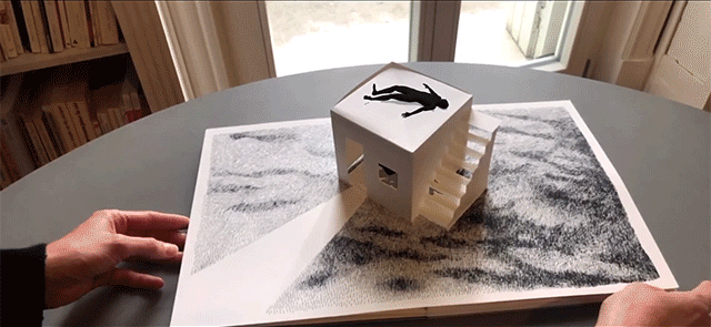
Example: Between Worlds by Skip Brittenham
A great example of storytelling with Augmented Reality is Skip Brittenhams book “Between worlds”. Through the use of the Augmented Reality technologies, the fantasy world becomes alive in interactive 3D.
Today’s blogpost is about : listening to nature. But first of all, what means listening ?
Listening is the active process of receiving and responding to spoken (and sometimes unspoken) messages.
Listening is not just hearing what the other party in the conversation has to say. “Listening means taking a vigorous, human interest in what is being told us,” said poet Alice Duer Miller. “You can listen like a blank wall or like a splendid auditorium where every sound comes back fuller and richer.”
So listening to nature can be litterally finding a way to hear it, or inventing more abstracted ways to pay attention to it.
Hearing nature
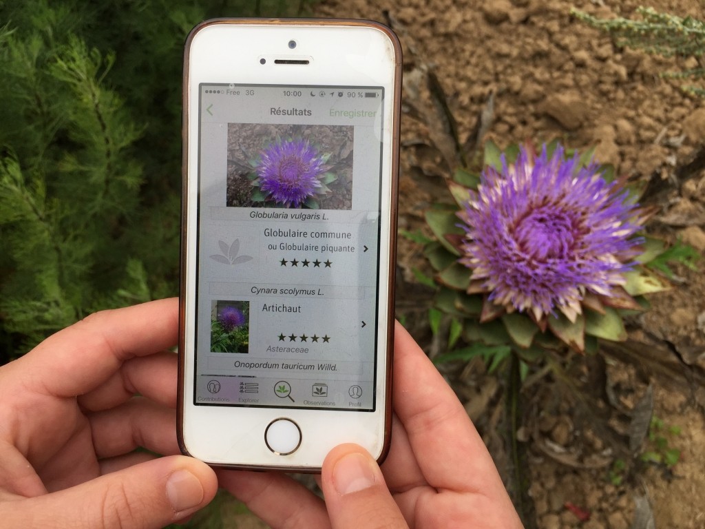
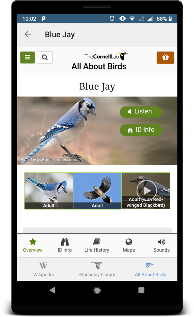
Some applications are making us closer to nature by teaching us names. Maybe you have it in your own pocket ! Pl@ntNet1 gives us plants names if you scan it, BirdNET2 the bird names with their sound… This is not revolutionnary, but at least, putting names on plants or animals we see is a good start to feel closer to them, as knowing other humans name might creates a closer relationships.
Pl@ntNet
BirdNET
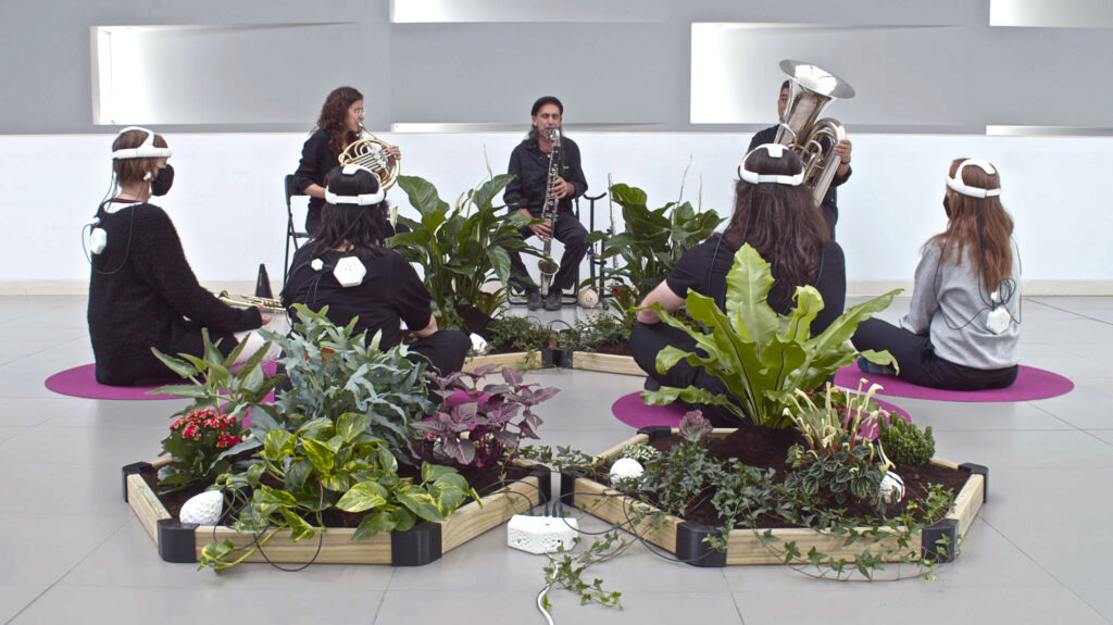
Nowadays, we have way to listen to nature… for real ! With the little help of electronic devices you can transform plant’s elecricity into sound or music3. How does it work ? First, you have to connect some alligator cables to the leaves, roots or stalk of plant. Then, a MIDI device is capting the electrical signal going through the plant, emphasize it and then translate it into music.
Some artists embraced this process and are making concerts with humans and plants, for example, Jean Thoby4. Personnally, I find this kind of music very relaxing and in my head, it is really associated to nature. I couldn’t imagine other sounds coming from it.
France Bleu
What is also really interesting in this concept is that the sounds depends on every plant and it’s environment. The kind of plant, it’s size, the weather, the wind, the surrounding, all those factors can have an influence on the electrical signal of the plant. This way, humans and plants can interact. The art performance Beyond Perception mesures electrical signals from humans and plants while playing music together to see how thay affect each other5. And the results are quite surprising : impossible to know if you are looking to the plant’s signal or human ! We seem to react the same way to music.
Beyond perception, Maria Castellanos, Alberto Valverde
Giving nature a voice
Now we know we can hear nature like sounds or music. But what about giving it a real voice ? How can we do so ?
For now, I found nothing that was giving nature a voice like humans, but an abstract way to do so is with the creation of a juridical status for a nature entity. In Ecuador, the river Rio Vilcabamba has now a juridical status since 20116. This means that the river can sue every entity that harms it and has power to defend itself.
The Rio Vilcabamba
Listening to nature
We can also use technology associated to nature to understand more in depth the natural changes that can affect humans. A sort of animal internet.
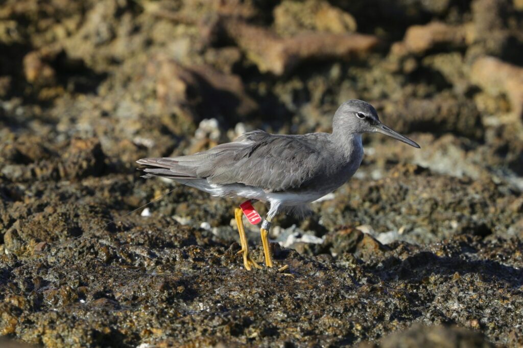
The Kivi Kuaka expedition7 is a french project studying birds behavior to predict natural disasters. Scientists are putting some little GPS chips on the back of birds and then follow their signals. This way, instead of using high tech devices, nature could also gives us informations via birds.
Kivi Kuaka expedition
One way to get closer to nature would be maybe to learn again how to read the signs it gives us. Signs of sickness, signs about the events to come, the weather, the seasons.
Hello again! In this 3rd blog entry I will give an overview of the technology behind AR that makes the magic happen. Let’s go.
Technology
To superimpose digital media on physical spaces in the right dimensions and at the right location 3 major technologies are needed: 1) SLAM, 2) Depth tracking and 3) Image processing & projection
SLAM (simultaneous location and mapping) renders virtual images over real-world spaces/objects in the right dimensions. It works with the help of localizing sensors (i.e. gyroscope or accelerometer) that map the entire physical space or object. Today, common APIs and SDKs for AR come with built-in SLAM capabilities.
Depth tracking is used to calculate the distance of the object or surface from the AR device’s camera sensor. It works the same a camera would work to focus on the desired object and blur out the rest of its surroundings.
Then the AR program will process the image as per requirements and projects it on the user’s screen (For further information on the “user’s screen” see section “AR Devices” below). The image is collected from the user’s device lens and processed in the backend by the AR application.
To sum up: SLAM and depth tracking make it possible to render the image in the right dimensions and at the right location. Cameras and sensors are needed to collect the user’s interaction data and send it for processing. The result of processing (= digital content) is then projected onto a surface to view. Some AR devices even have mirrors to assist human eyes to view virtual images by performing a proper image alignment.
Object detection
There are two primary types used to detect objects, which both have several subsets: 1) Trigger-based Augmentation and 2) View-based Augmentation
Trigger-based Augmentation
There are specific triggers like markers, symbols, icons, GPS locations, etc. that can be detected by the AR device. When pointed at such a trigger, the AR app processes the 3D image and projects it on the user’s device. The following subsets make trigger-based augmentation possible: a) Marker-based augmentation, b) Location-based augmentation and c) Dynamic augmentation.
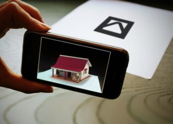
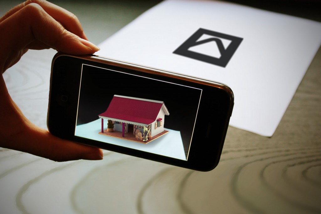
a) Marker-based augmentation
Marker-based augmentation (a.k.a. image recognition) works by scanning and recognizing special AR markers. Therefore it requires a special visual object (anything like a printed QR code or a special sign) and a camera to scan it. In some cases, the AR device also calculates the position and orientation of a marker to align the projected content properly.
Example for marker-based augmentation with a special sign as trigger
b) Location-based augmentation
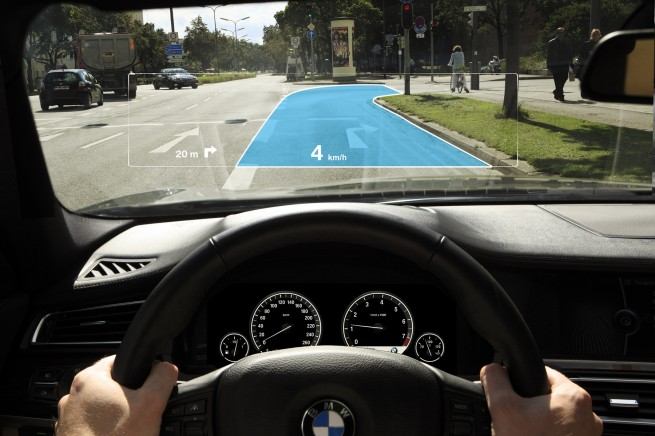
Lacotion-based (a.k.a. markerless or position-based augmentation) provides data based on the user’s real-time location. The AR app picks up the location of the device and combines it with dynamic information fetched from cloud servers or from the app’s backend. I.e. maps and navigation with AR features or vehicle parking assistants work based on location-based augmentation.
BMW’s heads-up display as an example of location-based augmentation
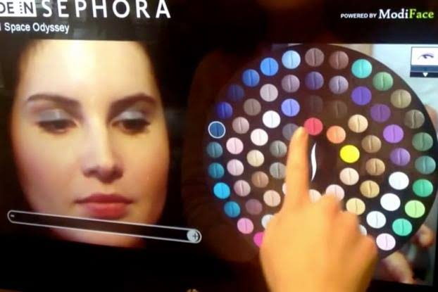
c) Dynamic augmentation
Dynamic augmentation is the most responsive form of augmented reality. It leverages motion tracking sensors in the AR device to detect images from the real-world and super-imposes them with digital media.
Sephora’s AR mirror as an example of dynamic augmentation. The app works like a real-world mirror reflecting the user’s face on the screen.
View-based Augmentation
In view-based methods, the AR app detects dynamic surfaces (like buildings, desktop surfaces, natural surroundings, etc.) and connects the dynamic view to its backend to match reference points and projects related information on the screen. View-based augmentation works in two ways: a) Superimposition-based augmentation and b) Generic digital augmentation.
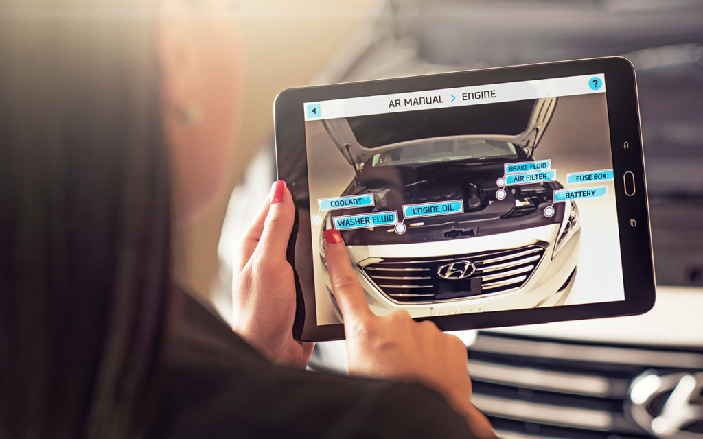
a) Superimposition-based augmentation
Superimposition-based augmentation replaces the original view with an augmented (fully or partially). It works by detecting static objects that are already fed into the AR application’s database. The app uses optical sensors to detect the object and relays digital information above them.
Hyundai’s AR-based owner’s manual allows users to point their AR device at the engine and see each component’s name + instructions for basic maintenance processes.
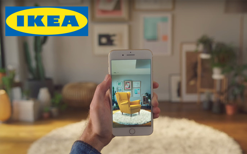
b) Generic digital augmentation
Generic digital augmentation is what gives developers and artists the liberty to create anything that they wish the immersive experience of AR. It allows rendering of 3D objects that can be imposed on actual spaces.
The IKEA catalog app allows users to place virtual items of their furniture catalog in their rooms based on generic digital augmentation.
It’s important to note that there is no one-size-fits-all AR technology. The right augmented reality software technology has to be chosen based on the purpose of the project and the user’s requirements.
AR Devices
As already mentioned in my previous blog entry, AR can be displayed on various devices. From smartphones and tablets to gadgets like Google Glass or handheld devices, and these technologies continue to evolve. For processing and projection, AR devices and hardware have requirements such as several sensors, cameras, accelerometer, gyroscope, digital compass, GPS, CPU, GPU, displays and so on. Devices suitable for Augmented reality can be divided into the following categories: 1) Mobile devices (smartphones and tablets); 2) Special AR devices, designed primarily and solely for augmented reality experiences; 3) AR glasses (or smart glasses) like Google Glasses or Meta 2 Glasses; 4) AR contact lenses (or smart lenses) and 5) Virtual retinal displays (VRD), that create images by projecting laser light into the human eye.
In order to approach the problem from the initial topic, which aims to study interaction for children in educational exhibitions, it is necessary to divide the problem into parts.
Therefore and starting from the beginning, it is time to study and analyse the differences in UX for adults and children. Creating an interface for kids is not simply a matter of using something made for adults and then changing the language for “dummies”. Designing interfaces for children goes much further than that.
One of the most important and most frequently mentioned issues throughout the different articles reviewed is the importance of focusing the design on the right age group. The age steps in children are much stronger than in adults. When we create a prototype aimed at older people, we can determine a target with an age range of 20 years difference. In contrast, in children the difference of 4 years of age already implies big changes related to skills and abilities. That is why in the next analyses we will try to focus the search on a target age range of 6 to 8 years, ages at which children are able to read, but still have a limited vocabulary.
After reading a large number of articles related to the subject, we have extracted the most important points (even though they may sometimes seem obvious) that have been most frequently repeated among authors. Some of the things to keep in mind are:
Children need instant feedback with every action. This means not only informing the user that something has been clicked, but also keeping in mind that problems need to be broken down into small pieces.
Multiple navigation is complicated to understand, so it is easier for them to receive information in the form of a story. This means that storytelling is key in children’s interfaces.
Reading ability varies with age, but it is true that children usually avoid reading. So, if texts are added, they should be very concise, adapted and direct.
The adaptability of the interface takes into account several concepts such as font size and colour. In case of interfaces for children, font sizes should always be between 12pt and 14pt and colours should be saturated and vivid. This is a concept that normally in interfaces for adults can be distracting, but it is something that keeps children interested and connected with the content. A similar idea includes the use of sounds and animations.
Children tend to have an explorative attitude towards interfaces, “mine-sweeping” the screen.
Finally, it is important to bear in mind that children tend to take everything they see literally, so it is necessary to think deeply about the use of icons and images.
With this little research, it is time to look at existing children’s displays that may or may not meet these points.
Earlier, we talked about software that has revolutionized the way we organize our jobs and enable collaborative work. We focused on free software that was accessible to professionals and academics. But we discovered that both novice and experienced users have problems performing specific tasks, and these results were discovered through user testing. And today we are going to discuss a user test done by students of L’École de Design, realized by Arslan Sifaoui, Théo Geiller and Raphaël Perraud.
Test process
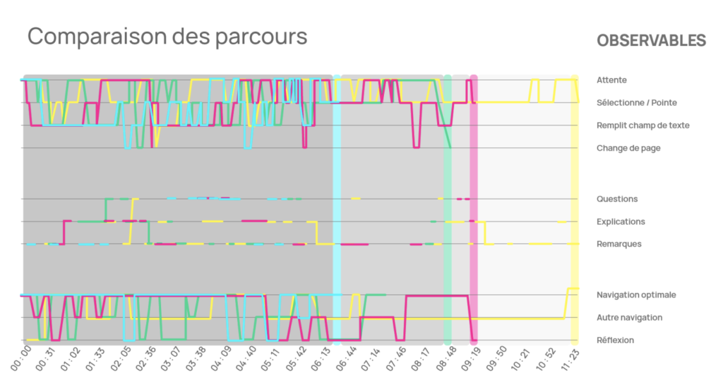
They started with a test of 5 seconds followed by a survey for a general understanding of the software. They then moved on to a more complete and progressive course followed by a survey to verify the understanding of the actions performed. Finally, they asked users for their impressions using open-ended questions to evaluate the quality of the product, as well as the quality of their tests.
For this preliminary test of 5 seconds (Rapid desirability test), the user will be installed in front of the computer and then be exposed for 5 seconds in front of the system so that he can express his impression. He will have to answer a series of quick questions spontaneously and describe on a blank sheet of paper the elements of the interface that he has retained. They asked for their impressions of the aesthetics of the system, the elements of the system they retained, and the functionalities they identified.
Before moving on to the pathways, they asked a sample of people to complete an introductory questionnaire on their profiles to target those who were interested in the tool and to highlight their uses/behaviors using a comparative table.
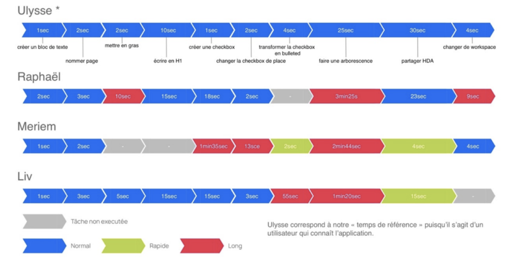
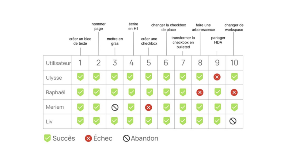
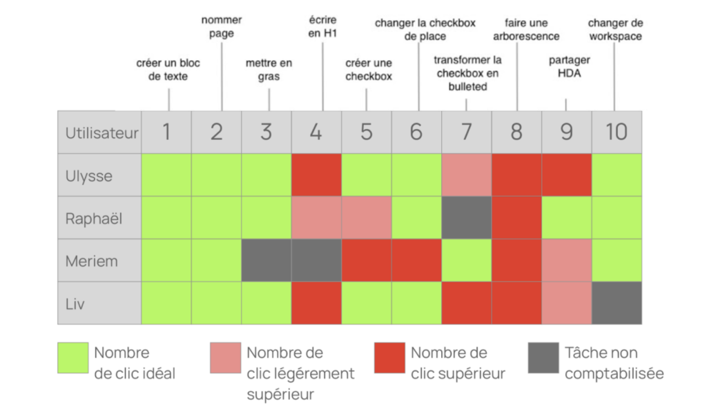
The course consisted, first of all, of editing a page where the user will have to operate as follows: write a text, put it in bold, create a checkbox, change the checkbox of place and finally transform it into a smart list. The next step will consist in creating a tree structure which will have to be shared and finally to change the workspace. This path will allow the desirability of this product and also measure tasks success and time spent. This data was compiled into a timeline, a table of numbers of clicks, and a timeline of activities.
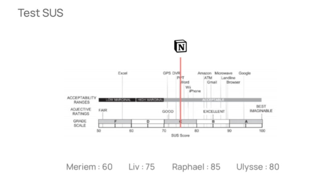
They administered a SUS test to the users with ten questions on a scale of 1 to 5 points to determine their views on the system to assess accessibility. The results of this questionnaire will be collected to compare the scores between users.
Finally, a qualitative questionnaire with sentence completions was administered to determine the weak and strong points of the concept, to measure the desirability of the product.
Analysis results
The introductory survey showed that the users were digital natives, so they were among the potential users, but three of them answered that they preferred to take notes on paper. In the five-second test, the users had a rather good impression of the system, they could identify the navigation area, the structure of the page, the content, and the overall functionality.
With this time analysis, they were able to judge whether the user was able to complete a task over a normal (blue), fast (green), or long (red) time spent. The first competitor (Ulysse) is a regular user of Notion and uses it only for note-taking. On the other hand, the other users had more difficulties on some tasks than others and could perform simple actions, but we can observe that the novice competitors could quickly share a document.
All the tasks were completed, but we can notice that they got stuck on some steps that took them a little bit more time as we had previously seen on the time analysis, such as creating a check-box, changing the workplace, making a tree structure, sharing a document and putting in bold. This time-consuming task is the result of a fairly large number of clicks.
We can notice a correlation between the duration of the task and the number of clicks. The longer the task is going to be, the higher the number of clicks is going to be. That this is remarkable with the creation of a tree structure.
We can notice a clear difference in the user path since the fastest user (blue) serves as a reference among the other users who took time to perform certain tasks because they were exploring the software in depth.
The result of the SUS test qualified the notion software as a good software in terms of its acceptability.
Following the qualitative questions, users reported a good understanding of the system with content creation, prioritization, and work sharing. They were able to experience a tool that breaks the standards of other note software. However, they expressed frustration with the completion of certain tasks, such as the need for time to learn and get used to the system.
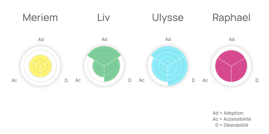
They summarized the results using three criteria: desirability (D), accessibility (Ac), and adoption (Ad). These indicators show the interest in the product (5 seconds test), the understanding of the functionalities (user path), and the ease of use of the product (SUS test).
Conclusion
We can notice that with the help of this user test that the users feel satisfied with the use of this product despite the problems encountered through this tool that has affected the accessibility of this product. The uncluttered aspect of the interface can make the user get lost in the very dense windows and feel frustrated when failing to perform certain tasks. The synthesis of the experience could show that the product is understood by the user even if features like workspace and tree structure are sometimes despised.
This could give me a perspective in this research, as the FH Joanneum University is appropriating a multitasking software to perform online courses as well as online assignment delivery.
I would like to explore in more detail the possibilities that Microsoft teams bring to the daily life of students and teachers. I would also like to investigate the use and usability of this product.
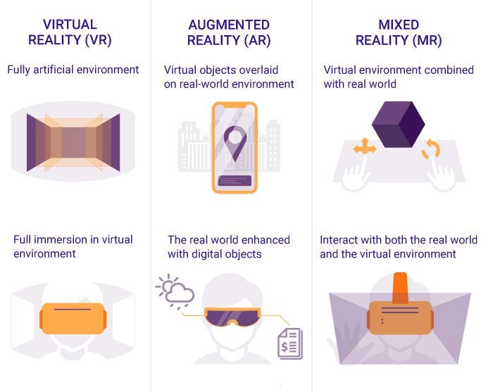
Hello again! My second blog entry will be about the the differences between four concepts: Extended Reality (XR), Augmented Reality (AR), Virtual Reality (VR) and Mixed Reality (MR).
XR, AR, VR, MR,… What??
Extended Reality (XR): XR is a “catch-all”-term for technologies that enhance or replace our view of the real world. This can be done through overlaying or immersing computer text and graphics into real-world and virtual environments, or even a combination of both. XR encompasses AR, VR and MR.
Augmented Reality (AR): AR enhances our view of the real world by overlaying the real-world environment with digital content across multiple sensory modalities. It detects objects in the real-world environment and overlaps those with computer-generated data such as graphics, sounds, images, and texts. In other words: AR comines the real world with the digital world. Users can experience AR very easily through an smartphone application, but also through special AR wearables (i.e. headsets, glasses), displays, projectors or even contact lenses.
Virtual Reality (VR): While AR enhances the user’s real environment, VR completely replaces it with a virtual one. By using full-coverage headsets the user’s real-world surroundings are completely shut out while using. Advanced VR experiences even allow users to move in a digital environment and hear sounds. Moreover, special hand controllers can be used to enhance VR experiences.
Mixed Reality (MR): MR is the newest of these immersive technologies and combines aspects of AR and VR. When experiencing MR, virtual content is not only overlaid on the real environment (as in AR) but is anchored to and interacts with that environment. Instead of relying only on remote control devices, smart glasses, or smartphones, users can also use their gestures, glancing or blinking, and much more to interact with the real and the digital world at the same time.
Long Story short:
Extended Reality (XR) is an umbrella term for technologies that enhance or replace our view of the real world
Augmented Reality (AR) overlays virtual objects on the real-world environment
Virtual Reality (VR) immerses users in a fully artificial digital environment
Mixed Reality (MR) not just overlays but anchors virtual objects to the real world
For a better understanding, I found this nice infographic:
Comparison of VR, AR and MR
Okay, got it. But why AR?
As far as I know at this point, all three techniques – AR, MR & VR – can be useful for educational purposes. The choice of the technology might depend on several factors like the field of education, the equipment or the target group. Still, I chose to focus on AR for several reasons: 1) I like the idea of learning new things by enhancing the user’s environmental view instead of replacing it like it is with VR (my subjective opinion); 2) AR is easily accessible via smartphones or tablets, while VR and MR need more advanced technology (i.e. headsets). There might come up more advantages (and maybe some limitations and disadvantages too) the further I dive into the topic, let’s see. But that’s it for now! 🙂
In the 60’s, a wave of visionaries had big ideas of developing an ideal way of living through creating perfect societies in big cities. The famous Corbusier pioneered with his project named “Ville Radieuse”. Its intentions of being realized in the middle of Paris were never carried out, as it meant the demolition of huge amounts of built areas. It did however spark ideas of similar projects such as Walt Disney’s EPCOT and Oscar Niemeyer’s Brasilia, both designed in the late 60s. They all shared the fact that they were built on empty plateaus, or “clean slates”.
Visions of these places was to build an ideal society. Their mission consisted of correcting the chaos of existing big cities with an aim of creating well-functioning systems for people to thrive in together.
Le Corbusier’s Ville Radieuse vision of perfection was a city strictly divided into districts where business, entertainment and residential areas are separated. In the residential areas the goal was to accommodate the maximum amount of natural daylight, a minimum of noise and immediate closeness to recreational facilities. In his vision he also wanted to provide efficient communication networks and reduce urban traffic, which was largely considered as an enemy.
Largely inspired by Le Corbusier’s methods were the “Pilot Plan” of Brasilia developed by Costas and Oscar Niemeyer. If you cross Brasilia by plane in the night you’ll see concentrated neon lights in the shopping area, while other areas are diffusely lit, because of the segregation of uses, vehicles and people. The city is built in the form of an airplane, hence the name “the pilot plan”. Every block in the city has local facilities for everyday use and a primary school within 800 meter of every home. The city was initially built without classical architecture, without slums. Rational planning, heaps of space and clean lines makes the layout, and the city was to be traversed by car.
Closeness to facilities were key aspects for all these plans. The initial idea was to fulfill the 5-10-15 rule. 5 minute commute to the things you use every day, 10 minutes to the places you go once a week, and 15 minutes to places you go the once a month.
Another ideal for these visionary plans was the separation of cars to the rest of the city. The plans were made to optimize mobility within the population. Also it was made to reduce the noise pollution in residential areas.
Recreational areas were highly prioritized as the visionaries recognized peoples needs also after work or school. Daylight and green areas with room for culture were means to the solution. However, when carried out in practice, these plans didn’t develop into the dreamy places they were meant to be.
Aftermaths of the plans of Ville Radieuse was that it was criticized for ignoring residents’ habits. As was Brasilia which didn’t provide public spaces for urban encounters in it’s strictly planned layout. Today two and a half million citizens live in the capital of Brasilia, that’s five times the originally planed mass. The consequence is an insufficient transport system, segregation and neglected public spaces. The same issues of healthy living, traffic, noise- and air pollution as well as transportation are still issues for urban planners today.
Ultimately, I think that these plans failed because they put a common stamp on all the needs and motivations of their users. As the scale of the plans grow, they also lost their room for change and diversity. Symmetry and predictability make up for efficient cities at a macro level, but the micro communities all over the cities might suffer from it. We can’t carry many times our own weight, we’re not ants. We also don’t thrive in monotone surrounding, and we have a big need to be heard. I do however think that extensive planning to achieve long-term infrastructural goals are necessary for a sustainable future. My initial thought is however, that planning for ideal societies from blank slates have to happen a smaller level than the macro-level these visionaries set out for.
The end game for this research is for now to find the place for interaction design within this vision of a development for a ideal society built in a more isolated environment. To get there, there initial questions I want to answer is:
How have big projects from scratch started, and what failed?
How are similar more recent projects like?
What are common working methods between urban planners, architects, designers and political deciders?
What is co-creative design contributing to this perspective?
How did they present the projects for everyone to understand and carry it through?
| a short and basic definition on Augmented Reality, the first implementations in vehicles and current innovation trends
What exactly is Augmented Reality and when was it first used?
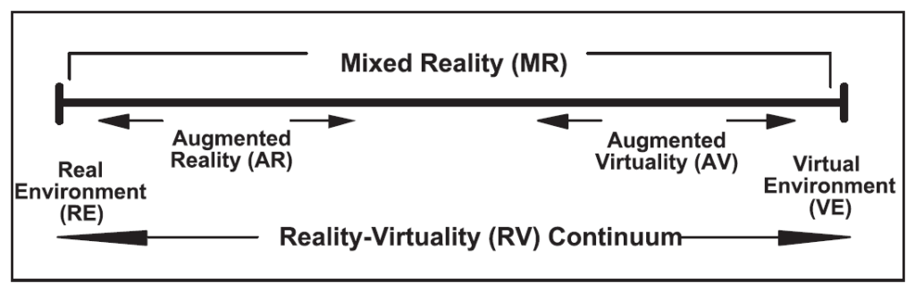
To have a clear distinction between related expressions, Paul Milgram’s Reality-Virtuality Continuum from 1994 shows the relation of Augmented, Mixed and Virtual reality in a very comprehensible way. [3] As shown in the illustration below, AR is the evolution of real environments in the direction of complete virtuality, but still having a majority of real content. Augmented Virtuality on the hand would describe systems using more virtual than real models.
Illustration by P. Milgram and H. Colquhoun Jr., in A Taxonomy of Real and Virtual World Display Integration [4]
To have an official definition, in The Concise Fintech Compendium AR is described as “an enhanced version of the physical, real-world reality of which elements are superimposed by computer generated or extracted real-world sensory input such as sound, video, graphics or haptics.” [1]
Already in 1997 R. T. Azuma stated three essential characteristics of AR systems [2]:
combining reality with a virtual world
interacting in real-time
registering in 3D space
Azuma also described the two basic possibilities of combining virtual inputs with the real world: virtual objects can be added to the real perception or real objects can be hidden by overlaying virtual effects. This may be possible not only for optical perception, but also for sound and haptics. He described systems with speakers and microphones, altering the incoming sound of our surroundings (like today’s noise-cancelling), or gloves with additional haptic feedback of simulated forces. [2] Basically AR could help us to enhance all of our senses, but it is mostly implemented in visual systems. [6]
After reading basics theories on Augmented Reality from the early 1990’s, one wouldn’t think that the first personal AR system was developed in 1968 at the Harvard University by Ivan Sutherland, the “father of computer graphics” – a HMD (Head-Mounted-Display) system. [8]
Regarding vehicles and and the first implementation of AR, we have to go even further back in time. The predecessor of today’s BAE System plc., Elliot Flight Automation along with Cintel claim the development of the first Head-Up-Display (HUD) in operational service in 1961 – for a military aircraft of the British Royal Navy, the Blackburn Buccaneer. [9]
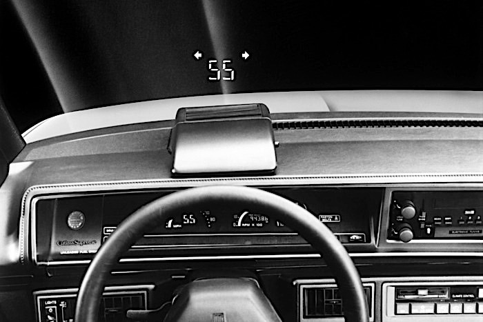
The first HUD in a passenger car is stated to be used in the Oldsmobile Cutlass Supreme Indy 500 pace car made by General Motors in 1988. [10] Following photo depicts this very simple AR solution on the windscreen.
In the last decades, AR was further decveloped and implemented in many different areas, and with the evolution of displays, projectors and computer graphics, we can have now our own AR applications on our smartphones or passenger cars. While starting to dig deeper into existing automotive AR solutions, I found the following interesting study as a foundation to enclose my topic of interest.
AR innovations in the automotive industry today
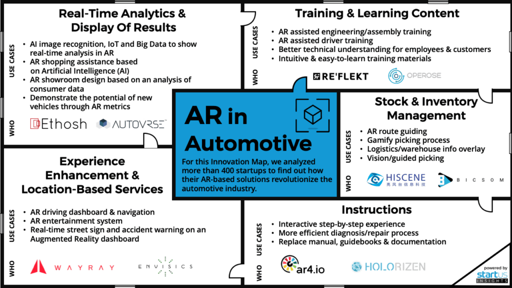
A study carried out by the Austrian “innovation intelligence company” StartUs GmbH analysed over 400 startups and created an overview on the most innovative use cases of AR in the automotive industry [7]:
The study chart by StartUs GmbH [4]
They state that the the total augmented reality automotive market is growing by 177% every year and will reach $5.5 billion by 2022. [7]
From their five areas of innovation my main focus will be on “Experience Enhancement”. The use cases are see-through displays, windshield projectors or various wearables, that can help the driver with additional, immediate information on important events of the surroundings without any distraction. [7]
Existing solutions for this area will follow in my further research.
[2] Azuma, R. T.: A Survey of Augmented Reality. In: Presence: Teleoperators and Virtual Environments. 6, Nr. 4, 1997, S. 355–385
[4] Milgram, P., Colquhoun Jr., H.: A Taxonomy of Real and Virtual World Display Integration. In: Mixed reality: Merging real and virtual worlds, Springer, 1999, p. 1-26
Within todays blogpost I tried to focus more on the psychological aspect of decision making in general and researched some psychological models.
Decision making is the key element of user interaction, hence a big opportunity to manipulate user behavior purposely. For this we need to understand how the process of decision making works. Cognitive psychology research states that there are two opposing systems within human decision making. One works unconsciously, quick and without any effort as it is based on emotions and finding a simple solution. The other one is rather slow and conscious, because it relies on processing data, thinking through possible outcomes and making reasoned choices. Most of the time (95 % of cognitive activity) decisions are made unconsciously – using the first system. Those are intuitive choices and usually linked to going with your gut („Bauchgefühl“). Another important factor in the decision making process is the mood of the user. This in turn can be consciously controlled by various design aspects (e.g. color, visuals or creating experiences). A common way to influence user decisions is nudging. Nudges are defined as following: “changes in choice architecture that predictably influence decisions without restricting freedom of choice” (Peer, E.: Nudge me right: Personalizing online nudges to people’s decision-making styles. SSRN Electronic Journal. 2019, January 29). A famous (positive) example for this is the default choice for organ donors to make it an effort to opt out. Of course this can also be implemented in a negative way and be turned into a deceptive design pattern*.
Don Norman also researched on how emotions influence user behavior in his book „Why we love (or hate) everyday things“. He refers to three levels of the emotional system: the visceral, behavioral and reflective levels. Firstly visceral design is all about the visual aspect of objects or websites. As many objects and companies offer one and the same function, the „looks“ or branding is the only way to differentiate between them. Especially colors, shapes or styles play a big role here. Secondly behavioral design is defined by usability and the way the products works in an environment. Creating pleasure and enjoyment by using the product is the main goal to create positive emotions. Last but not least reflective design is about rationalization of a product. Reflecting on all known information about this product and making a thoughtful decision. So this aligns with our second system of decision making – the conscious one.
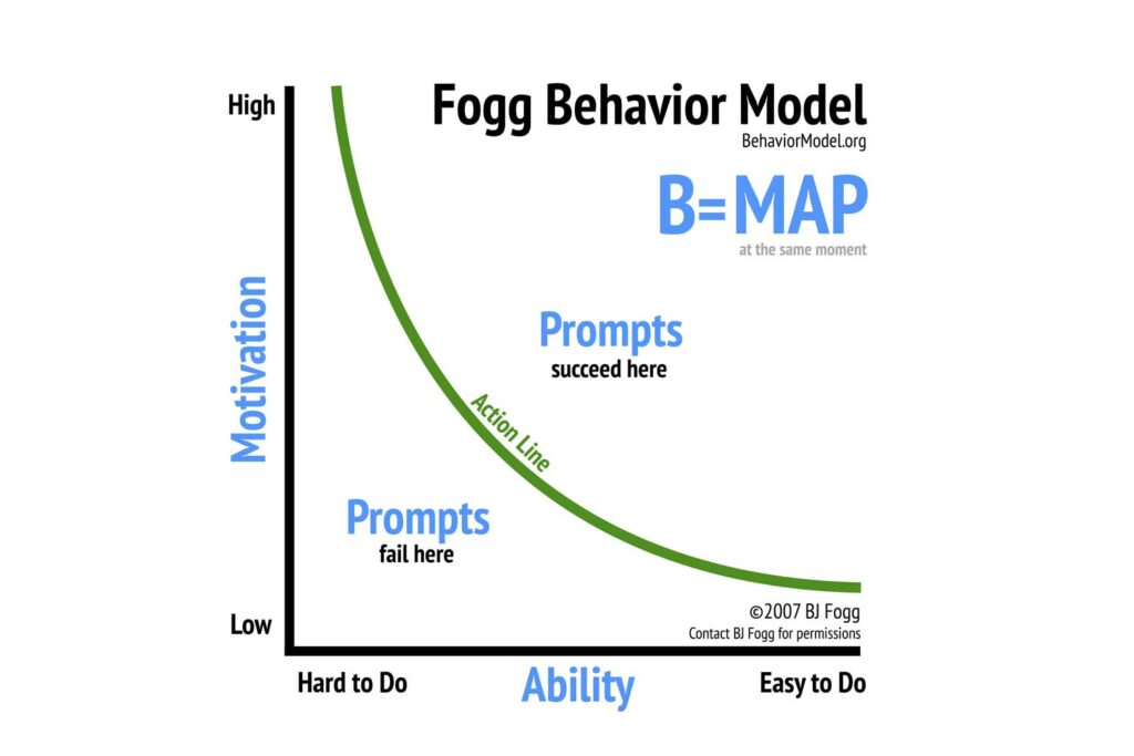
Source: https://behaviormodel.org
In Foggs behavior model he describes how behavior can be changed with a trigger depending on motivation and ability. The higher the motivation and the easier the task, the more likely is a trigger to succeed. Motivation itself can be divided in intrinsic motivation, triggered through curiosity or meaning, and extrinsic motivation, referring to money or rewards. While extrinsic factors work better for basic routine tasks, complex tasks usually need intrinsic drivers. Examples for ability factors, that can be shaped by designers, are time, resources, effort, …
Next steps:
Analyze specific tools of „dark psychology“
Find best (or in this case worst) practice examples for each tool
Find out if they can be reversed / turned into a light pattern
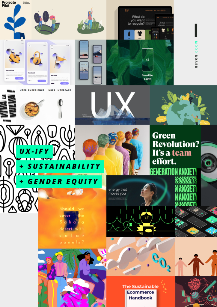
Establishing User Experience by adapting to defined standards for today’s society.
The topic arose on the basis of problems that I personally have noticed. This encloses issues for UX-Designers in the work context and which that play a current role in societal life. The idea is to connect these subjects to establish UX comprehensively and holistically.
1) Reputation of UX in general
It is hard-pressed to find any product with a user interface that is not subject to UX principles. However, there seems to be a certain contradiction between the recognized importance of UX for the product and the actual influence or relevance granted to the UX team in companies.
UX has existed in the high-tech industry for several decades, however for a long period it has not had a unified name while also not having been marked by high relevance. This has changed to a certain extent over the years, but still to less to make a general difference.
So it is part of the problem’s statement to find a way to further establish UX f.e. in companies context.
Questions for further research:
++ In which professional fields is UX already established? ++ What are the benefits of UX for a company? ++ Is UX measurable?
2) Sustainability in digital technologies
Currently, a highly politicized issue is that of sustainability. There are various guidelines on how a website and digital design can be made more sustainable and thus more accessible in order to reduce energy consumption. And there are as well a lot of concepts to use ICT to develop sustainable output. Although a community has formed around the topic of ‚Green Web’ and sustainability during the last decade, it is still too little of a controversial topic within interaction design and it is lacking in general awareness and power.
So I asked myself if it is possible to integrate meaningfully the issue of sustainability into the field of UX to further strengthen its significance and reputation.
Questions for further research:
++ What is the current value of sustainability in Interaction Design? ++ What does sustainable Design/UX/ICT mean? ++ Is there an existing connection between sustainability and UX?
3) UX and gender equity
As I mentioned before UX is not as established as it could or even should be. One question that arise to me is: Does UX need a redesign not only in terms of sustainability but in terms of gender equity. A lot of (digital) products are designed on the standards of male persons. Furthermore designs are often built on stereotypes. Likewise the topic of sustainability, to establish UX usefully the standards have to change, which is why I also want to have a look on the aspects of integrating gender equity in UX for its establishment.
Questions for further research:
++ What is the role of gender equity in the field of interaction design? ++ How can we design gender sensitive? ++ Why is gender equity in design significant?
In the following blog entries, I will discuss the results of my research from each of the areas listed above (1, 2, and 3).