Knowledge is power. Nowadays all kinds of sensors are continuously gathering data about our behavior, our physical activity levels, and different health indicators like blood pressure, blood oxygen levels, and more. All of this can be monitored through phones, smartwatches and other IoT devices conceived specially for medical applications
What happens with all this data? Raw data is useless if we don’t know what we are looking for.
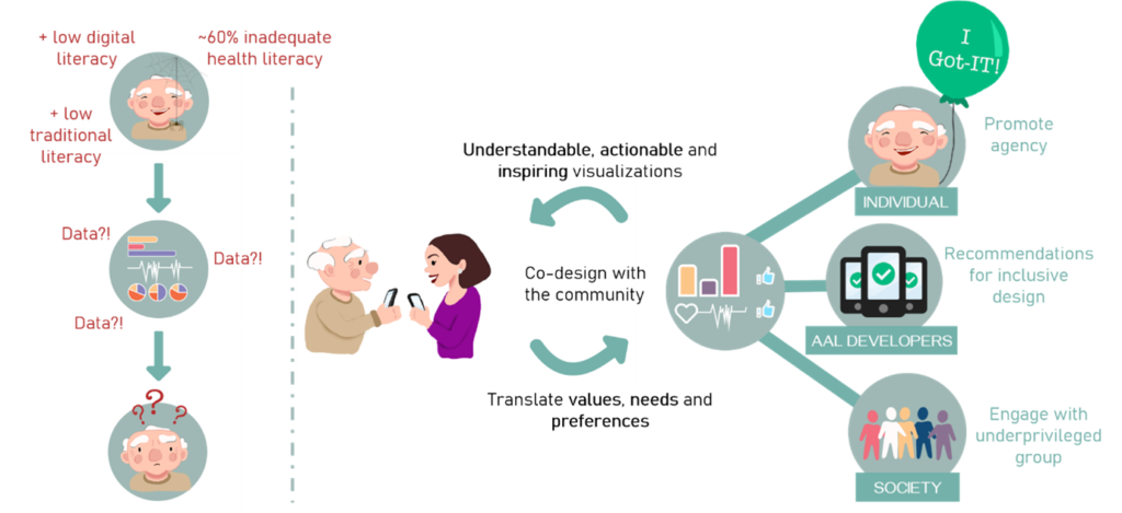
A good strategy for data visualization is the key to the proper use of data.
When trying to create a better user experience for both health professionals and patients, we need to distinguish which information is needed for each side and how it should be presented:
Medical Staff: An overloaded system can be helped by synthesizing and simplifying the amount of data that the doctors need to analyze.
A good presentation of numbers and facts can help the doctors identify low-risk patients faster, so they can prioritize and leave more time for those who really need it.
Patient: Being a patient is already a stressful situation. Medical terms that patients are not familiar with and uncertainty don’t help make the situation more comfortable. Feeling lost and uneducated is not the feeling of reassurance that a medical visit should give.
Presenting facts and figures in a clear and didactic way will make the patient feel included in the process and learn about the condition, gaining implications for the treatment.
_ Literature
http://ehealthmasterminds.com/visualize-your-data/
https://www.eecs.harvard.edu/~kgajos/papers/2020/fischer20visualization.pdf